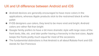
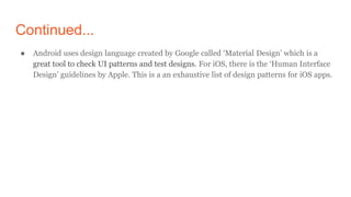
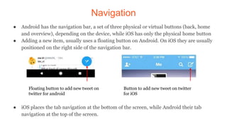
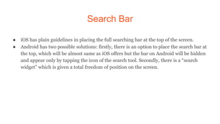
iOS vs. Android design
UX and UI difference between Android and iOS
● Android devices are generally encouraged to have more colors in the
applications, whereas Apple products stick to the restrained black & white
pallet
● If iOS designers use colors, they tend to be more vivid and bright. Android
colors are rather flat than bright
● Google family prefers to have a bit more dramatic style with large sizes of the
front texts, title, etc. and later prefer having a hierarchy in the text sizes. Apple
keeps the fronts pretty much equal for most of the occasions
● The fundamental distinctions is that Android is all about Roboto front and iOS
stands for San Francisco
Continued...
● Android uses design language created by Google called ‘Material Design’ which is a
great tool to check UI patterns and test designs. For iOS, there is the ‘Human Interface
Design’ guidelines by Apple. This is a an exhaustive list of design patterns for iOS apps.
App Icons
● iOS icons have square shape with rounded corners and they can’t have transparent
background
● Android icons are allowed to have transparent background, so you can basically work
with any shape that fits the icon area
Android iOS
Navigation
● Android has the navigation bar, a set of three physical or virtual buttons (back, home
and overview), depending on the device, while iOS has only the physical home button
● Adding a new item, usually uses a floating button on Android. On iOS they are usually
positioned on the right side of the navigation bar.
● iOS places the tab navigation at the bottom of the screen, while Android their tab
navigation at the top of the screen.
Floating button to add new tweet on
twitter for android
Button to add new tweet on twitter
for iOS
App Settings
For Android there is a
hamburger menu
For iOS, there is the familiar
bottom tab approach, but
without the labels.
Back Button
● Android devices have a real back button whereas Apple does not include such a tool to
their phones. The back button on the Android gives an opportunity for the users to go
back in the app to the previous screens they have opened earlier.
● While iPhone users are lacking such a possibility and usually the app design has to be
built taking into consideration this factor. The iOS app designers traditionally place the
button at the top left corner.
Back button
for iOS
Back button
for Android
Search Bar
● iOS has plain guidelines in placing the full searching bar at the top of the screen.
● Android has two possible solutions: firstly, there is an option to place the search bar at
the top, which will be almost same as iOS offers but the bar on Android will be hidden
and appear only by tapping the icon of the search tool. Secondly, there is a “search
widget” which is given a total freedom of position on the screen.
Thank You!

iOS vs Android design

  • 1.
  • 2.
    UX and UIdifference between Android and iOS ● Android devices are generally encouraged to have more colors in the applications, whereas Apple products stick to the restrained black & white pallet ● If iOS designers use colors, they tend to be more vivid and bright. Android colors are rather flat than bright ● Google family prefers to have a bit more dramatic style with large sizes of the front texts, title, etc. and later prefer having a hierarchy in the text sizes. Apple keeps the fronts pretty much equal for most of the occasions ● The fundamental distinctions is that Android is all about Roboto front and iOS stands for San Francisco
  • 3.
    Continued... ● Android usesdesign language created by Google called ‘Material Design’ which is a great tool to check UI patterns and test designs. For iOS, there is the ‘Human Interface Design’ guidelines by Apple. This is a an exhaustive list of design patterns for iOS apps.
  • 4.
    App Icons ● iOSicons have square shape with rounded corners and they can’t have transparent background ● Android icons are allowed to have transparent background, so you can basically work with any shape that fits the icon area Android iOS
  • 5.
    Navigation ● Android hasthe navigation bar, a set of three physical or virtual buttons (back, home and overview), depending on the device, while iOS has only the physical home button ● Adding a new item, usually uses a floating button on Android. On iOS they are usually positioned on the right side of the navigation bar. ● iOS places the tab navigation at the bottom of the screen, while Android their tab navigation at the top of the screen. Floating button to add new tweet on twitter for android Button to add new tweet on twitter for iOS
  • 6.
    App Settings For Androidthere is a hamburger menu
  • 7.
    For iOS, thereis the familiar bottom tab approach, but without the labels.
  • 8.
    Back Button ● Androiddevices have a real back button whereas Apple does not include such a tool to their phones. The back button on the Android gives an opportunity for the users to go back in the app to the previous screens they have opened earlier. ● While iPhone users are lacking such a possibility and usually the app design has to be built taking into consideration this factor. The iOS app designers traditionally place the button at the top left corner. Back button for iOS Back button for Android
  • 9.
    Search Bar ● iOShas plain guidelines in placing the full searching bar at the top of the screen. ● Android has two possible solutions: firstly, there is an option to place the search bar at the top, which will be almost same as iOS offers but the bar on Android will be hidden and appear only by tapping the icon of the search tool. Secondly, there is a “search widget” which is given a total freedom of position on the screen.
  • 10.