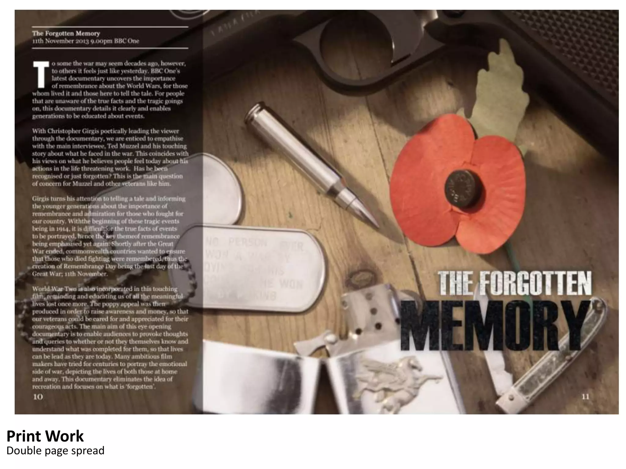
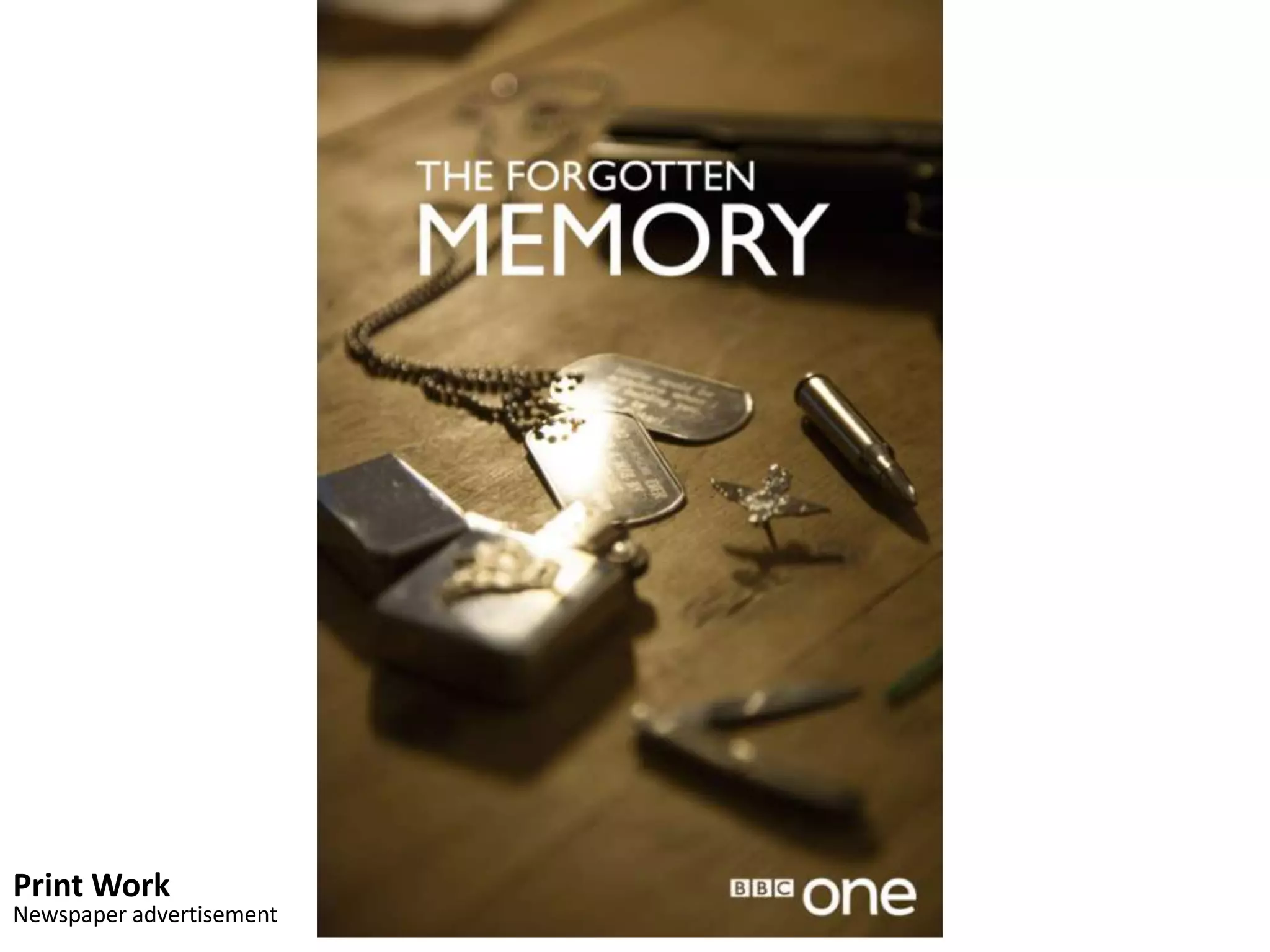
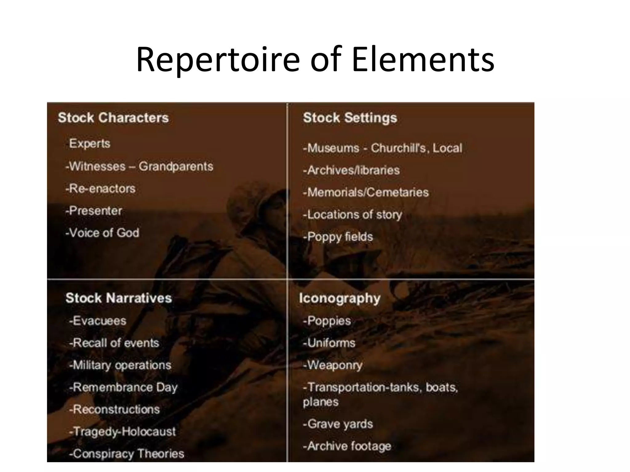
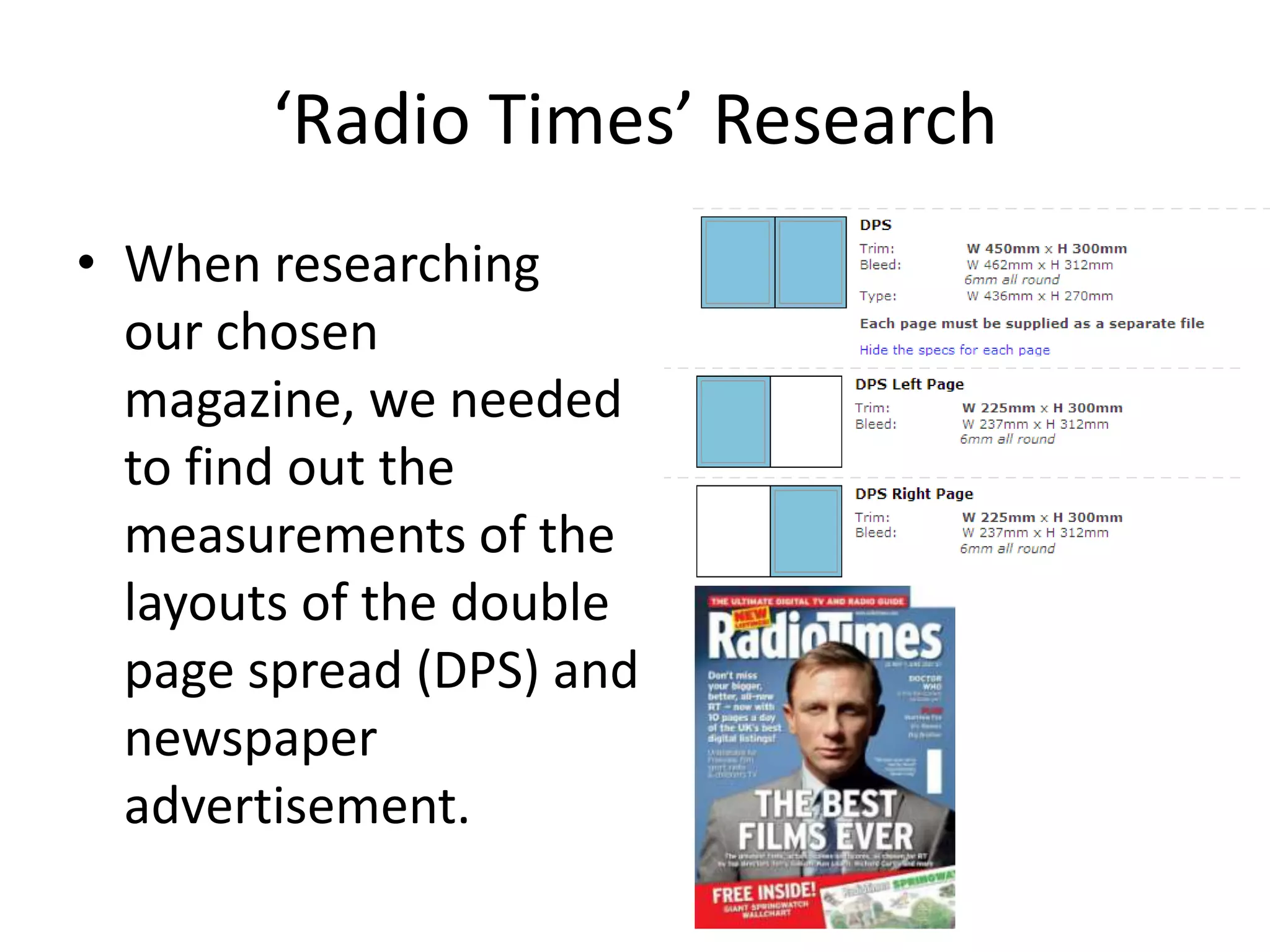
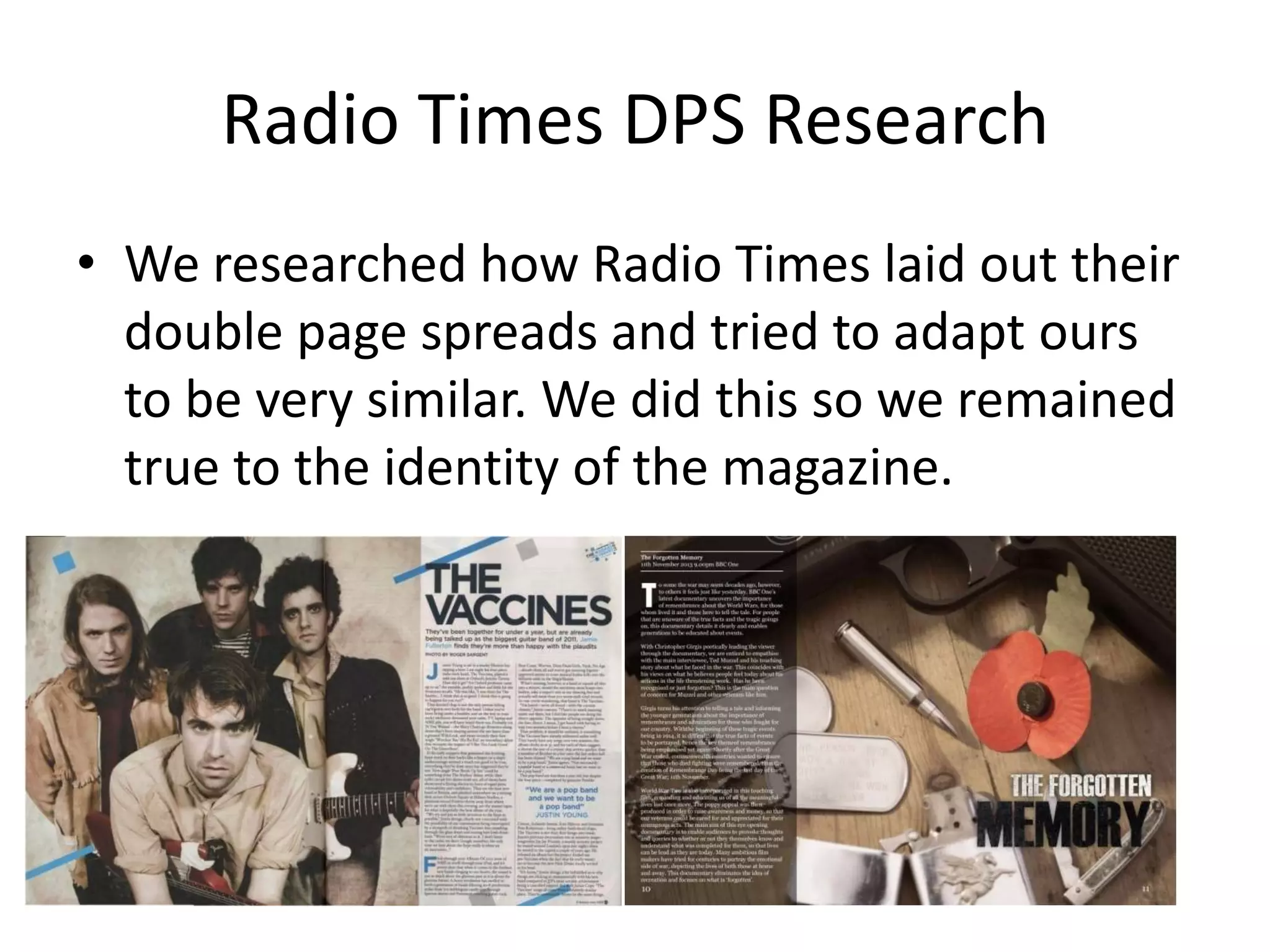
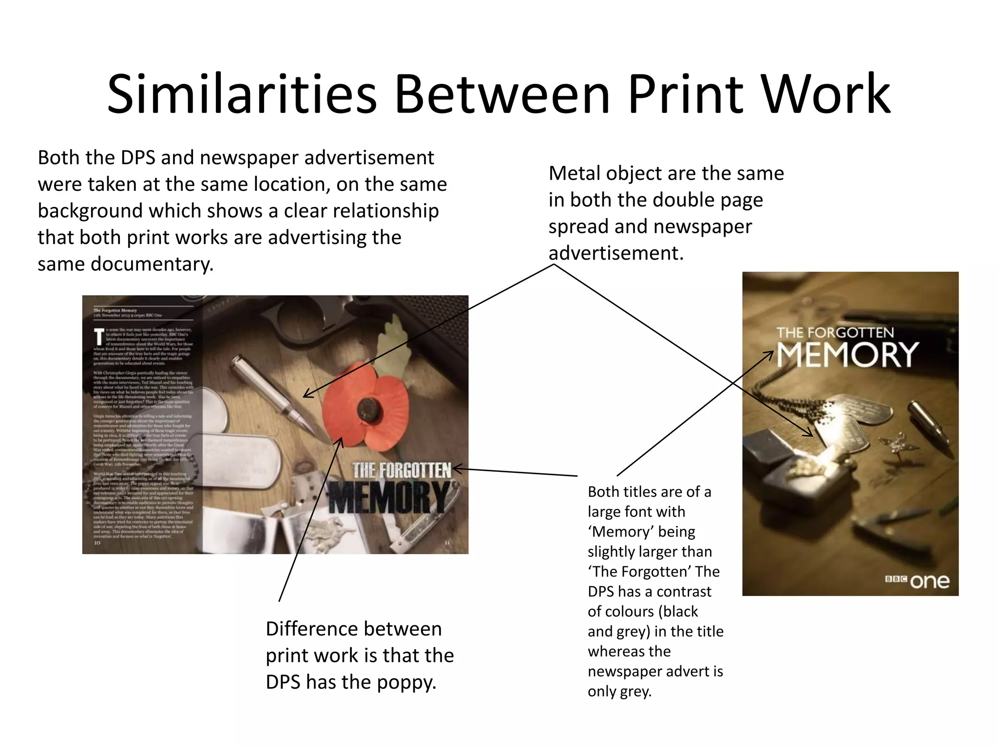
How effective is the combination of
 your main product and ancillary
               texts?
           By Chris Girgis
Final Product
• The Genre we chose for our documentary was
  War. More specifically World War II. This is
  why we based most of our documentary on
  the ‘remembrance’ theme.
• To maintain the theme of war we chose
  specific iconography that suited remembrance
  day. For example the use of a poppy on our
  interviewee and on the beach.
Final Product
• There is a clear link between the documentary and the
  print work. This is due to the same iconography used
  (poppy) and the general war theme of the print work.
  For example the gun, bullet and dog tag. The plain
  wood background also gives an old fashion feel to the
  print work. Had this been a different background then
  there would be a more action feel to the piece.
• There is a more precise link between both print works
  because some of the objects used are the same in both
  print works and they were shot in the same
  background.
Print Work
Double page spread
Print Work
Newspaper advertisement
Print Work
• To get our print work advertisement to the same
  standard of our broadcasters, we had to research
  into the layout of some of their war documentary
  advertisements. Here we looked at where the
  BBC logo would be placed and sizing. It also gave
  us an idea of what iconography to include into
  our print work to keep the misé en scene of our
  documentary and print work the same. Research
  also went into our chosen magazine ‘Radio Times’
  about the layout of text that would go with our
  double page spread and the newspaper
  advertisement.
Repertoire of Elements
Research
• We created a repertoire of elements grid to enable
  us to tick off our work with the grid in order to
  maintain and stick to the war genre of our
  documentary. This made research easier as we had
  an idea of what to research whilst making the
  documentary. This included key characters, scenery,
  key iconography and story line.
Print Work Research
• When creating the double page
  spread, even though we wanted
  the theme of remembrance to be
  carried on throughout our work,
  we decided that the newspaper
  advertisement should be
  minimalistic with colours.
  Although the colours are
  minimalistic the war genre is
  clearly portrayed in the poster due
  to the key iconography that is
  associated with war. The
  minimalistic colours work well
  here as it signifies the old fashion
  era. Therefore causing people to
  think of past wars (WWII)
‘Radio Times’ Research
• When researching
  our chosen
  magazine, we needed
  to find out the
  measurements of the
  layouts of the double
  page spread (DPS) and
  newspaper
  advertisement.
Radio Times DPS Research
• We researched how Radio Times laid out their
  double page spreads and tried to adapt ours
  to be very similar. We did this so we remained
  true to the identity of the magazine.
Similarities Between Print Work
Both the DPS and newspaper advertisement
were taken at the same location, on the same     Metal object are the same
background which shows a clear relationship      in both the double page
that both print works are advertising the        spread and newspaper
same documentary.                                advertisement.


                                                     Both titles are of a
                                                     large font with
                                                     ‘Memory’ being
                                                     slightly larger than
                                                     ‘The Forgotten’ The
                                                     DPS has a contrast
                                                     of colours (black
                        Difference between           and grey) in the title
                        print work is that the       whereas the
                                                     newspaper advert is
                        DPS has the poppy.           only grey.
Relationship Between Print Work and
             Documentary
• Between all our work I think that it is clear that
  the same theme of ‘remembrance’ is maintained
  throughout. This was done by us using
  same/similar iconography. For example the poppy
  used in the documentary five minute extract and
  the DPS.
• This link between the DPS and the newspaper
  advertisement is also very clear as the have the
  same background and also the same objects in
  them with the only exception that the newspaper
  advertisement doesn't have a poppy.

How effective is the combination of your main

  • 1.
    How effective isthe combination of your main product and ancillary texts? By Chris Girgis
  • 2.
    Final Product • TheGenre we chose for our documentary was War. More specifically World War II. This is why we based most of our documentary on the ‘remembrance’ theme. • To maintain the theme of war we chose specific iconography that suited remembrance day. For example the use of a poppy on our interviewee and on the beach.
  • 3.
    Final Product • Thereis a clear link between the documentary and the print work. This is due to the same iconography used (poppy) and the general war theme of the print work. For example the gun, bullet and dog tag. The plain wood background also gives an old fashion feel to the print work. Had this been a different background then there would be a more action feel to the piece. • There is a more precise link between both print works because some of the objects used are the same in both print works and they were shot in the same background.
  • 4.
  • 5.
  • 6.
    Print Work • Toget our print work advertisement to the same standard of our broadcasters, we had to research into the layout of some of their war documentary advertisements. Here we looked at where the BBC logo would be placed and sizing. It also gave us an idea of what iconography to include into our print work to keep the misé en scene of our documentary and print work the same. Research also went into our chosen magazine ‘Radio Times’ about the layout of text that would go with our double page spread and the newspaper advertisement.
  • 7.
  • 8.
    Research • We createda repertoire of elements grid to enable us to tick off our work with the grid in order to maintain and stick to the war genre of our documentary. This made research easier as we had an idea of what to research whilst making the documentary. This included key characters, scenery, key iconography and story line.
  • 9.
    Print Work Research •When creating the double page spread, even though we wanted the theme of remembrance to be carried on throughout our work, we decided that the newspaper advertisement should be minimalistic with colours. Although the colours are minimalistic the war genre is clearly portrayed in the poster due to the key iconography that is associated with war. The minimalistic colours work well here as it signifies the old fashion era. Therefore causing people to think of past wars (WWII)
  • 10.
    ‘Radio Times’ Research •When researching our chosen magazine, we needed to find out the measurements of the layouts of the double page spread (DPS) and newspaper advertisement.
  • 11.
    Radio Times DPSResearch • We researched how Radio Times laid out their double page spreads and tried to adapt ours to be very similar. We did this so we remained true to the identity of the magazine.
  • 12.
    Similarities Between PrintWork Both the DPS and newspaper advertisement were taken at the same location, on the same Metal object are the same background which shows a clear relationship in both the double page that both print works are advertising the spread and newspaper same documentary. advertisement. Both titles are of a large font with ‘Memory’ being slightly larger than ‘The Forgotten’ The DPS has a contrast of colours (black Difference between and grey) in the title print work is that the whereas the newspaper advert is DPS has the poppy. only grey.
  • 13.
    Relationship Between PrintWork and Documentary • Between all our work I think that it is clear that the same theme of ‘remembrance’ is maintained throughout. This was done by us using same/similar iconography. For example the poppy used in the documentary five minute extract and the DPS. • This link between the DPS and the newspaper advertisement is also very clear as the have the same background and also the same objects in them with the only exception that the newspaper advertisement doesn't have a poppy.