EVALUATION
Question one:
In which ways does your media product use, develop or challenge forms and conventions of
real media products
SIMILAR FILMS (RESEARCH)
We wanted to create a 15 rated film that a Marvel/ DC comic
vibe to it as that is where we received most of our inspiration
for the film from.
EXAMPLE OF HOW WE USED
SIMILAR FILMS
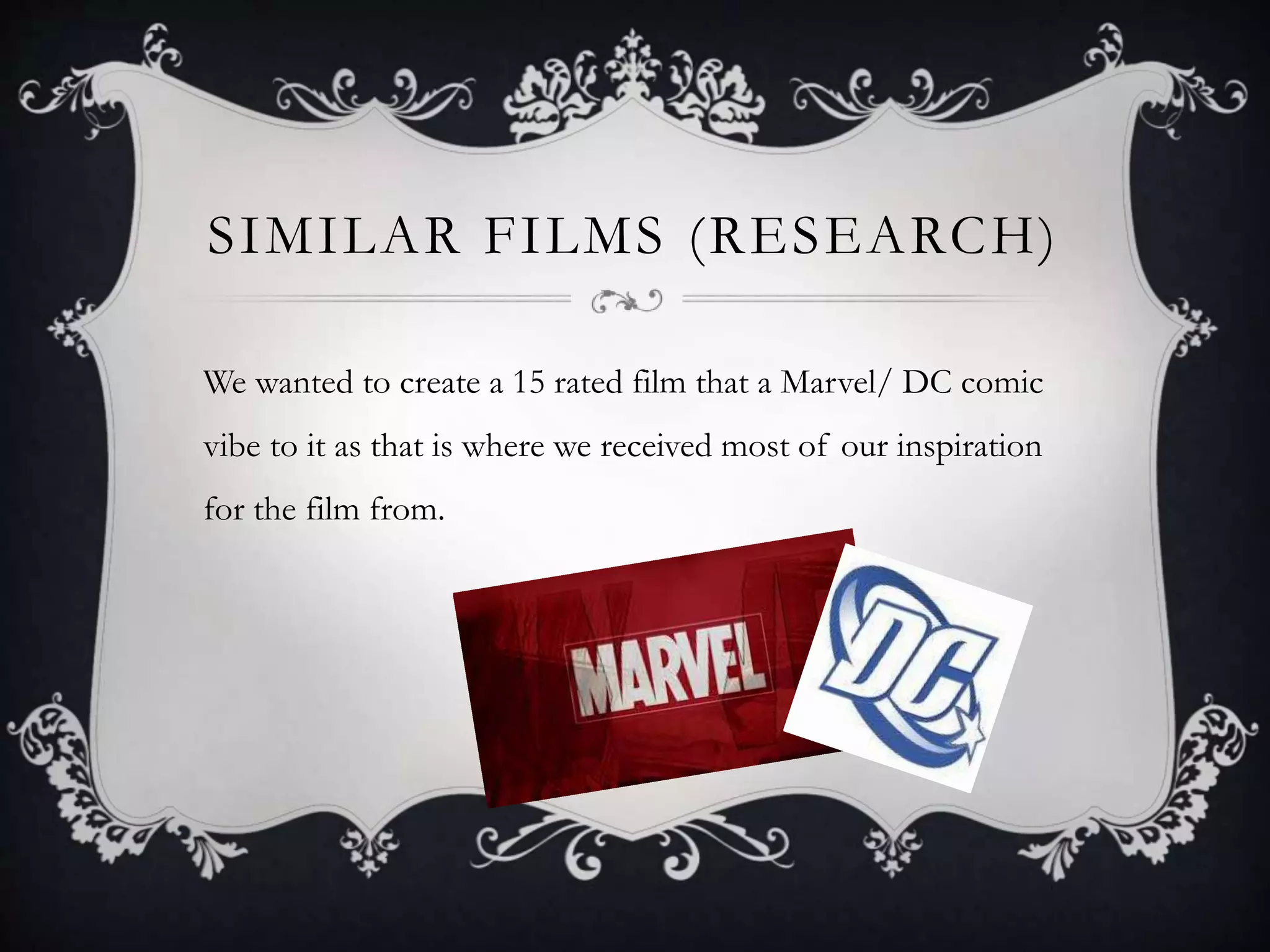
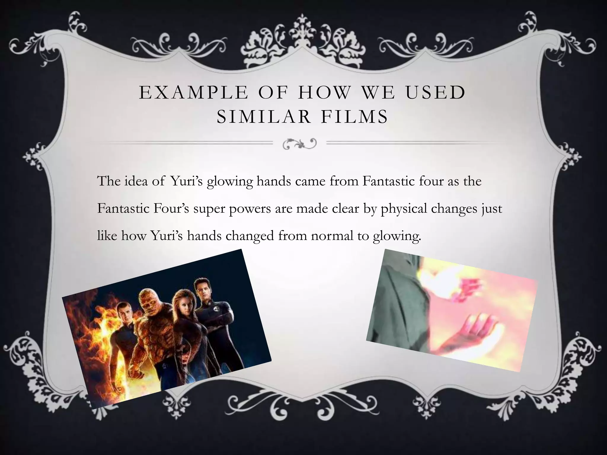
The idea of Yuri’s glowing hands came from Fantastic four as the
Fantastic Four’s super powers are made clear by physical changes just
like how Yuri’s hands changed from normal to glowing.
NARRATIVE
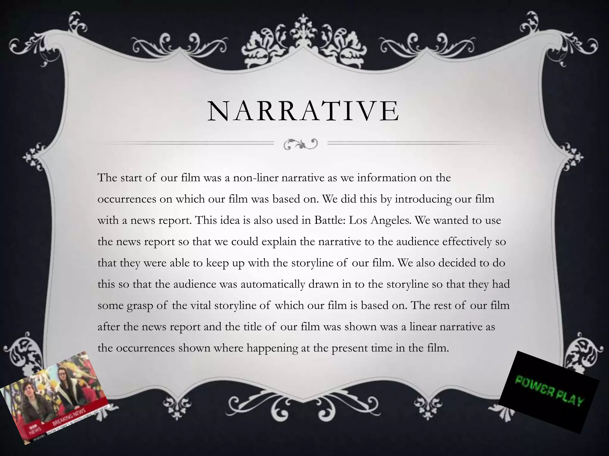
The start of our film was a non-liner narrative as we information on the
occurrences on which our film was based on. We did this by introducing our film
with a news report. This idea is also used in Battle: Los Angeles. We wanted to use
the news report so that we could explain the narrative to the audience effectively so
that they were able to keep up with the storyline of our film. We also decided to do
this so that the audience was automatically drawn in to the storyline so that they had
some grasp of the vital storyline of which our film is based on. The rest of our film
after the news report and the title of our film was shown was a linear narrative as
the occurrences shown where happening at the present time in the film.
GENRE
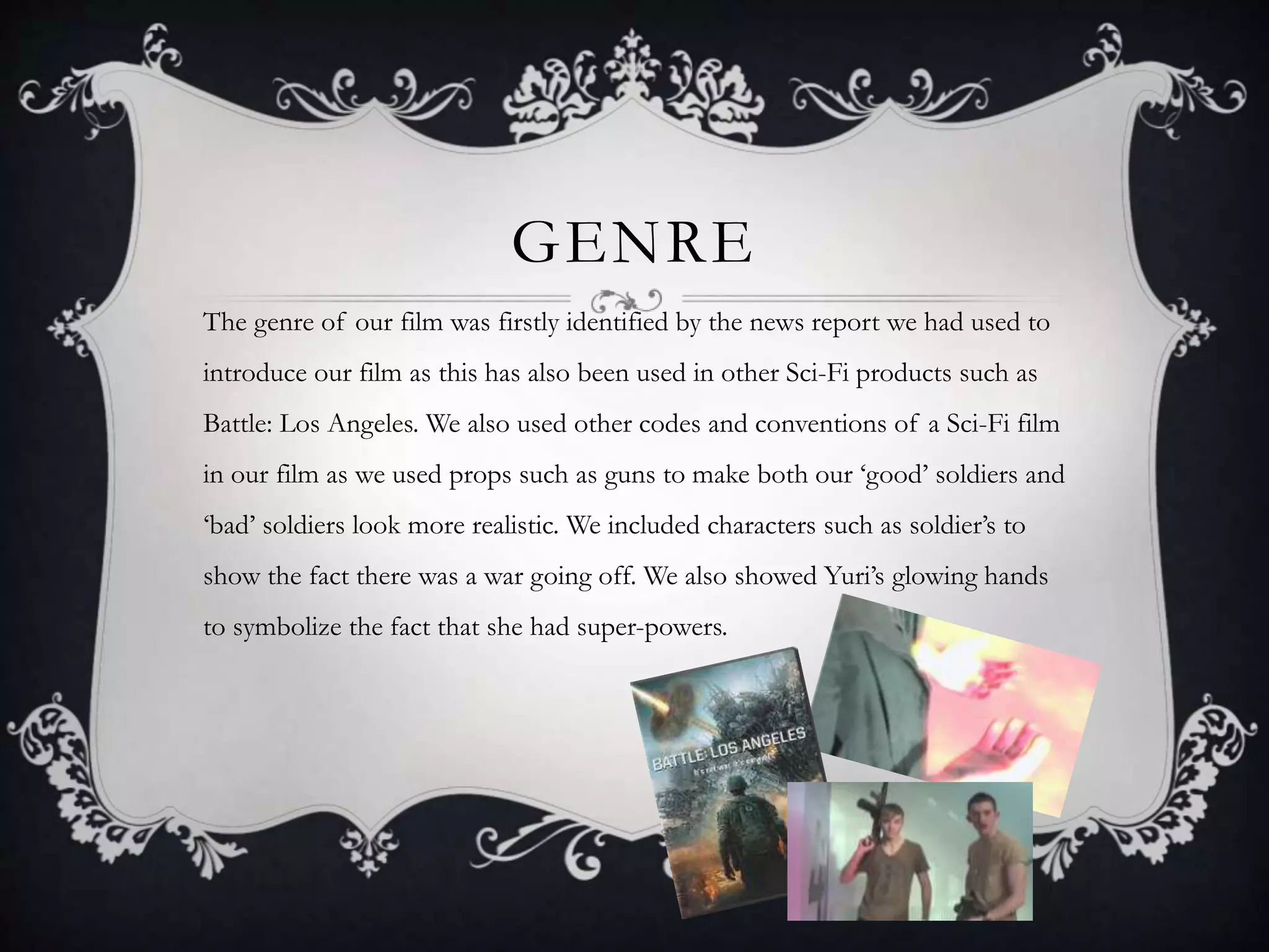
The genre of our film was firstly identified by the news report we had used to
introduce our film as this has also been used in other Sci-Fi products such as
Battle: Los Angeles. We also used other codes and conventions of a Sci-Fi film
in our film as we used props such as guns to make both our ‘good’ soldiers and
‘bad’ soldiers look more realistic. We included characters such as soldier’s to
show the fact there was a war going off. We also showed Yuri’s glowing hands
to symbolize the fact that she had super-powers.
CAMERA, ANGLE, SHOT,
MOVEMENT AND POSITION
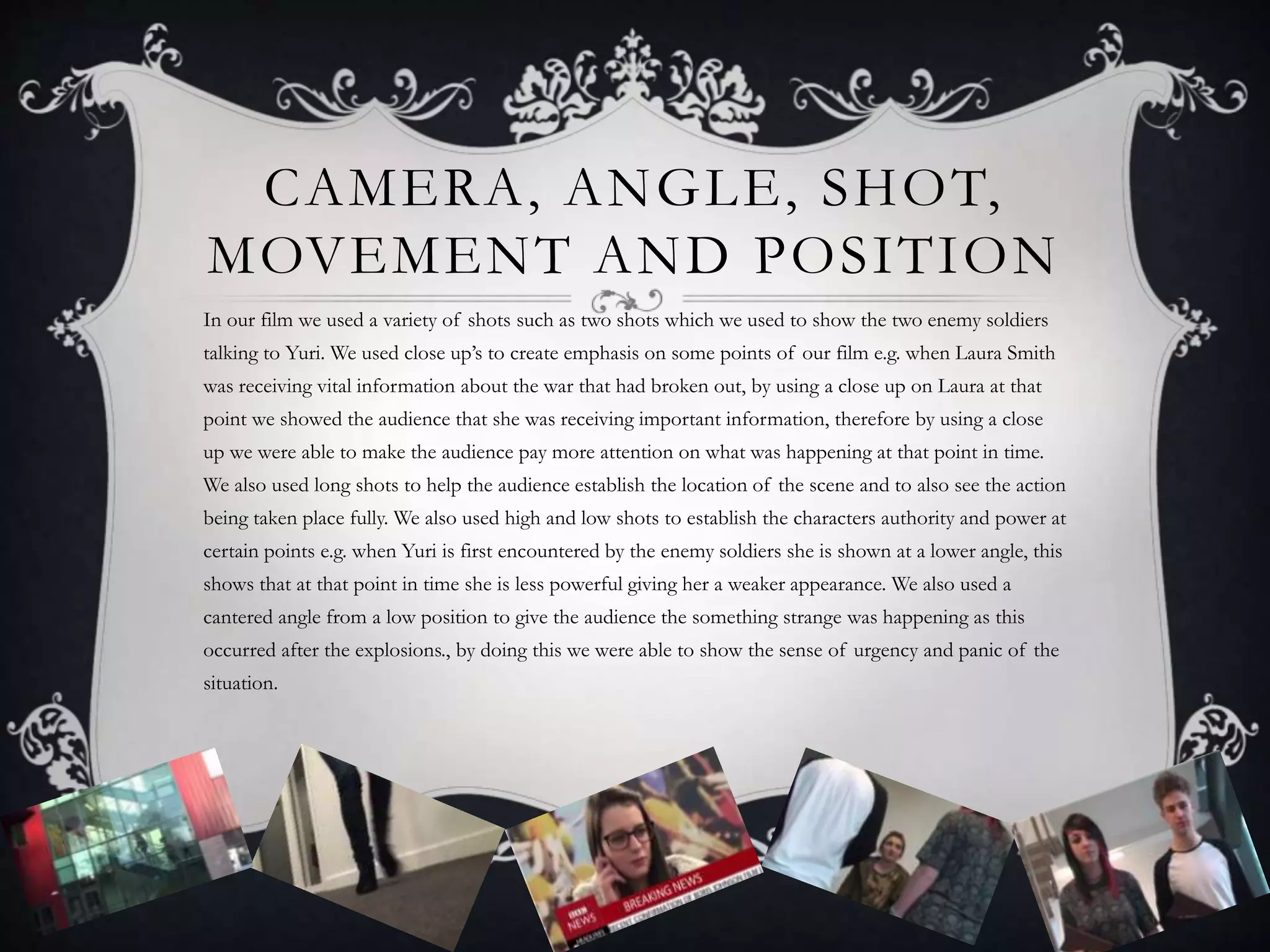
In our film we used a variety of shots such as two shots which we used to show the two enemy soldiers
talking to Yuri. We used close up’s to create emphasis on some points of our film e.g. when Laura Smith
was receiving vital information about the war that had broken out, by using a close up on Laura at that
point we showed the audience that she was receiving important information, therefore by using a close
up we were able to make the audience pay more attention on what was happening at that point in time.
We also used long shots to help the audience establish the location of the scene and to also see the action
being taken place fully. We also used high and low shots to establish the characters authority and power at
certain points e.g. when Yuri is first encountered by the enemy soldiers she is shown at a lower angle, this
shows that at that point in time she is less powerful giving her a weaker appearance. We also used a
cantered angle from a low position to give the audience the something strange was happening as this
occurred after the explosions., by doing this we were able to show the sense of urgency and panic of the
situation.
CONTINUITY & EDITING
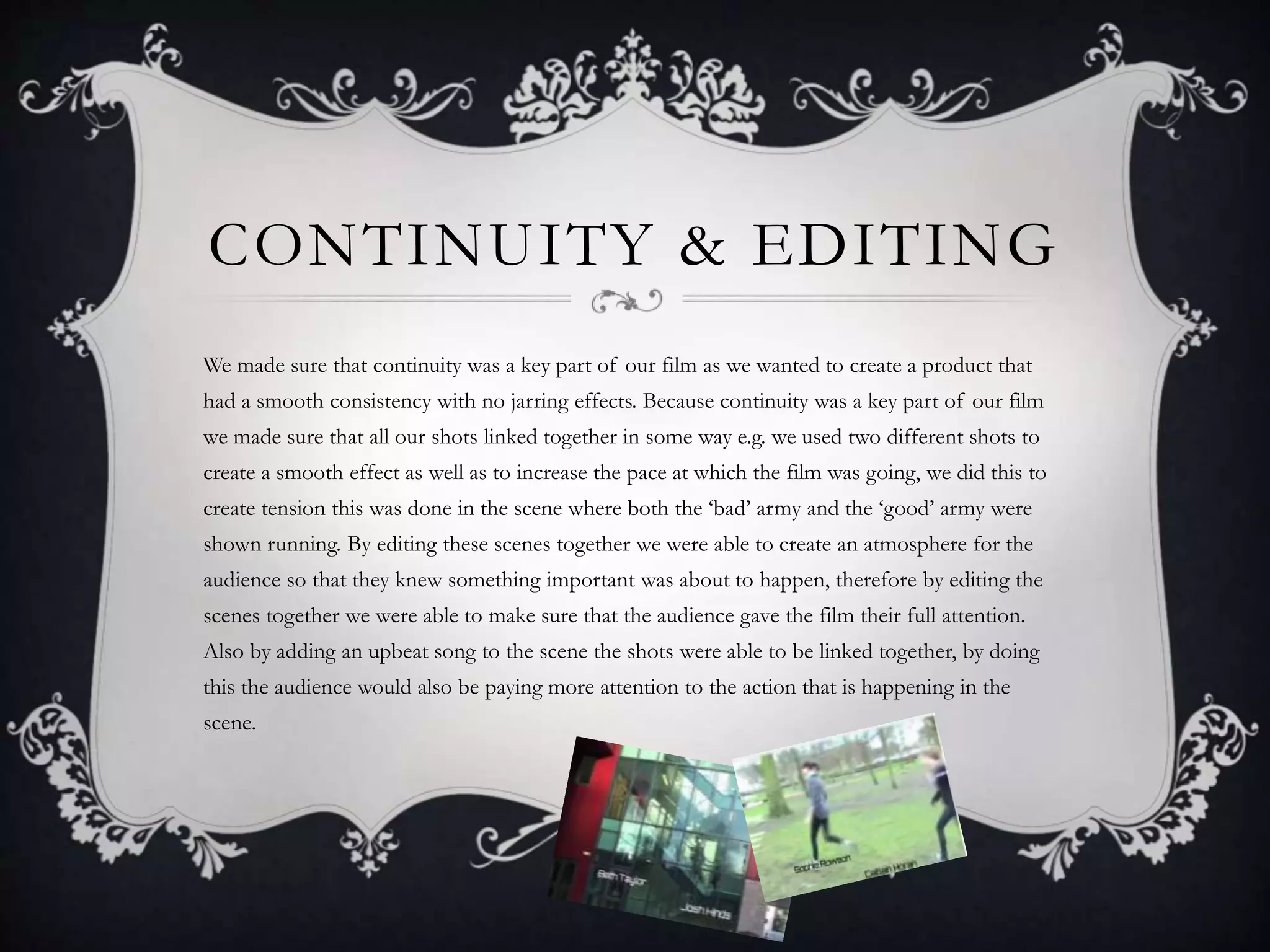
We made sure that continuity was a key part of our film as we wanted to create a product that
had a smooth consistency with no jarring effects. Because continuity was a key part of our film
we made sure that all our shots linked together in some way e.g. we used two different shots to
create a smooth effect as well as to increase the pace at which the film was going, we did this to
create tension this was done in the scene where both the ‘bad’ army and the ‘good’ army were
shown running. By editing these scenes together we were able to create an atmosphere for the
audience so that they knew something important was about to happen, therefore by editing the
scenes together we were able to make sure that the audience gave the film their full attention.
Also by adding an upbeat song to the scene the shots were able to be linked together, by doing
this the audience would also be paying more attention to the action that is happening in the
scene.
SOUND
In our film we had diegetic sound as we added a fast pace song to build tension
towards the end of the film as that was when the most action was happening.
Therefore by adding a fast pace song the audience will be aware that there is more
action coming up so will be able to prepare themselves for what they may be about
to see. Even though we didn’t rhythmically edit the shots to the music but we
believe the music itself brought emphasis on the action which is about to occur.
The upbeat song also liked the shots in the scene together as I believe the song
matched the actions taking place. E.g. because the song used in the film was upbeat
it linked in nicely with the two rival armies running to battle.
MISE-EN-SCENE
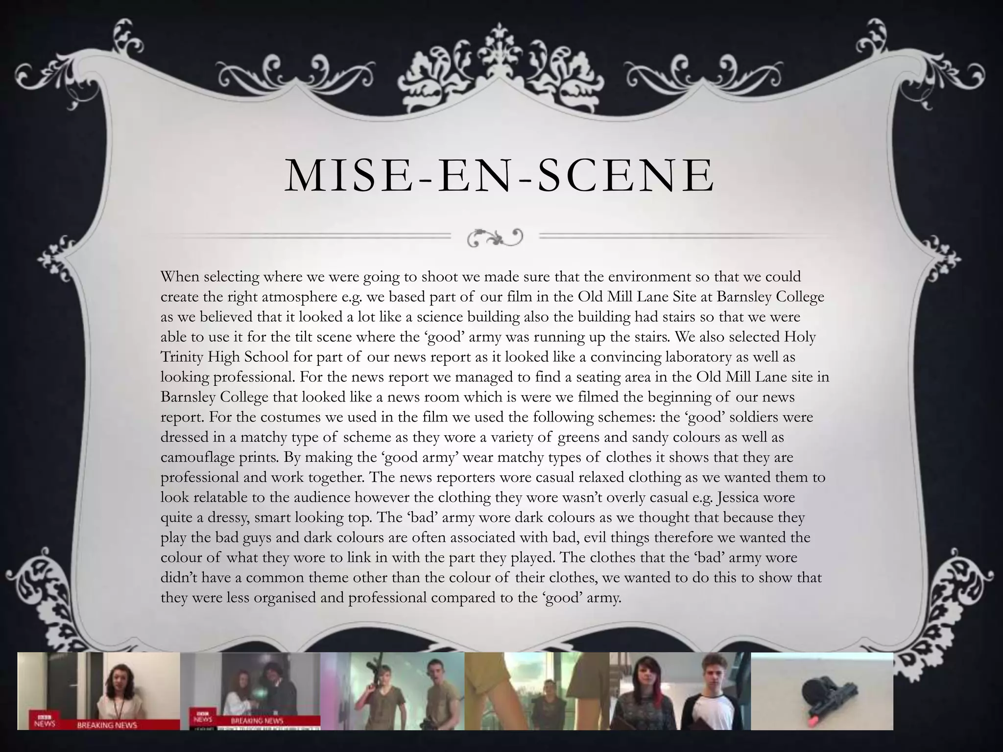
When selecting where we were going to shoot we made sure that the environment so that we could
create the right atmosphere e.g. we based part of our film in the Old Mill Lane Site at Barnsley College
as we believed that it looked a lot like a science building also the building had stairs so that we were
able to use it for the tilt scene where the ‘good’ army was running up the stairs. We also selected Holy
Trinity High School for part of our news report as it looked like a convincing laboratory as well as
looking professional. For the news report we managed to find a seating area in the Old Mill Lane site in
Barnsley College that looked like a news room which is were we filmed the beginning of our news
report. For the costumes we used in the film we used the following schemes: the ‘good’ soldiers were
dressed in a matchy type of scheme as they wore a variety of greens and sandy colours as well as
camouflage prints. By making the ‘good army’ wear matchy types of clothes it shows that they are
professional and work together. The news reporters wore casual relaxed clothing as we wanted them to
look relatable to the audience however the clothing they wore wasn’t overly casual e.g. Jessica wore
quite a dressy, smart looking top. The ‘bad’ army wore dark colours as we thought that because they
play the bad guys and dark colours are often associated with bad, evil things therefore we wanted the
colour of what they wore to link in with the part they played. The clothes that the ‘bad’ army wore
didn’t have a common theme other than the colour of their clothes, we wanted to do this to show that
they were less organised and professional compared to the ‘good’ army.
TYPOGRAPHY
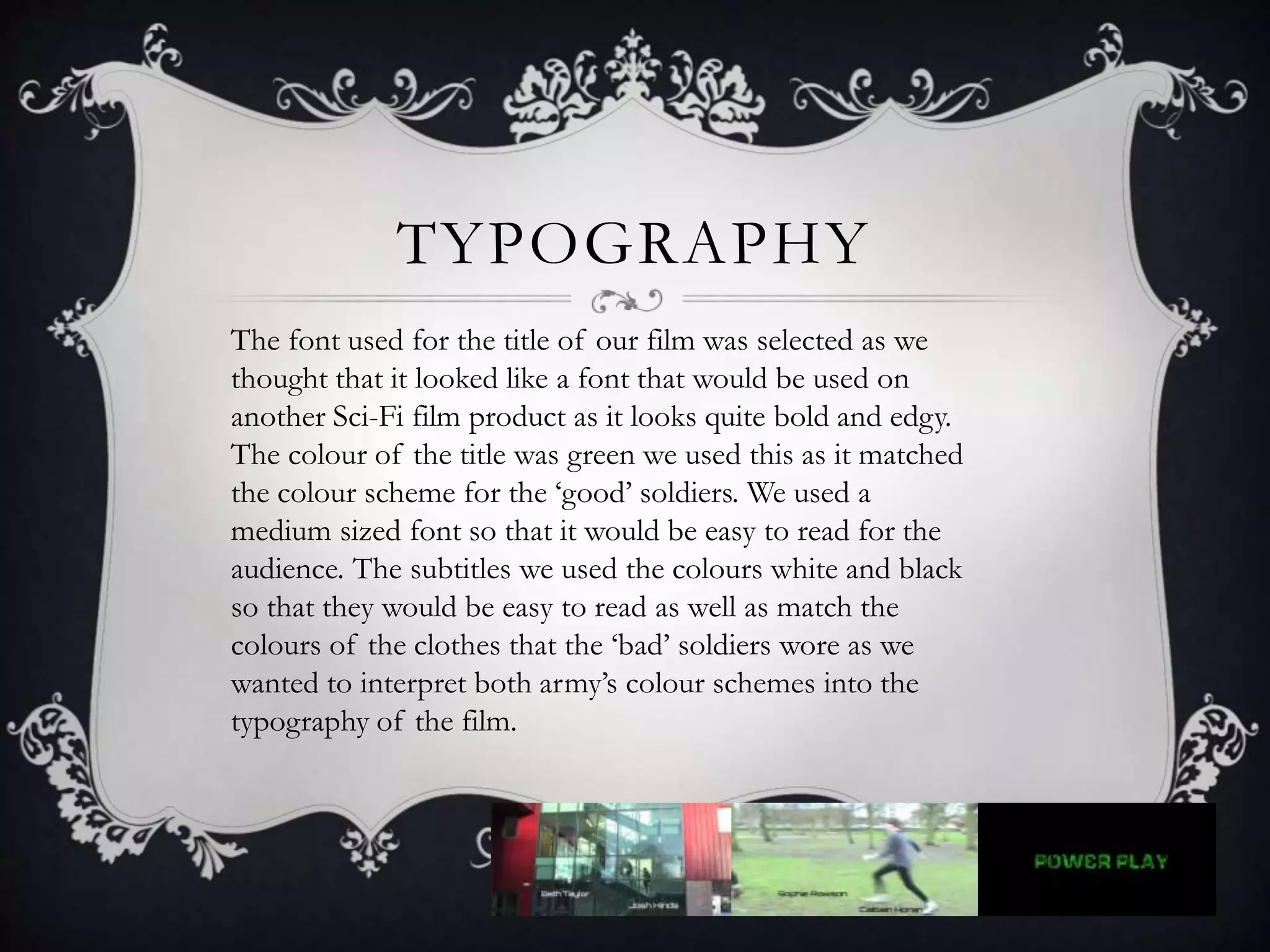
The font used for the title of our film was selected as we
thought that it looked like a font that would be used on
another Sci-Fi film product as it looks quite bold and edgy.
The colour of the title was green we used this as it matched
the colour scheme for the ‘good’ soldiers. We used a
medium sized font so that it would be easy to read for the
audience. The subtitles we used the colours white and black
so that they would be easy to read as well as match the
colours of the clothes that the ‘bad’ soldiers wore as we
wanted to interpret both army’s colour schemes into the
typography of the film.
ICONOGRAPHY
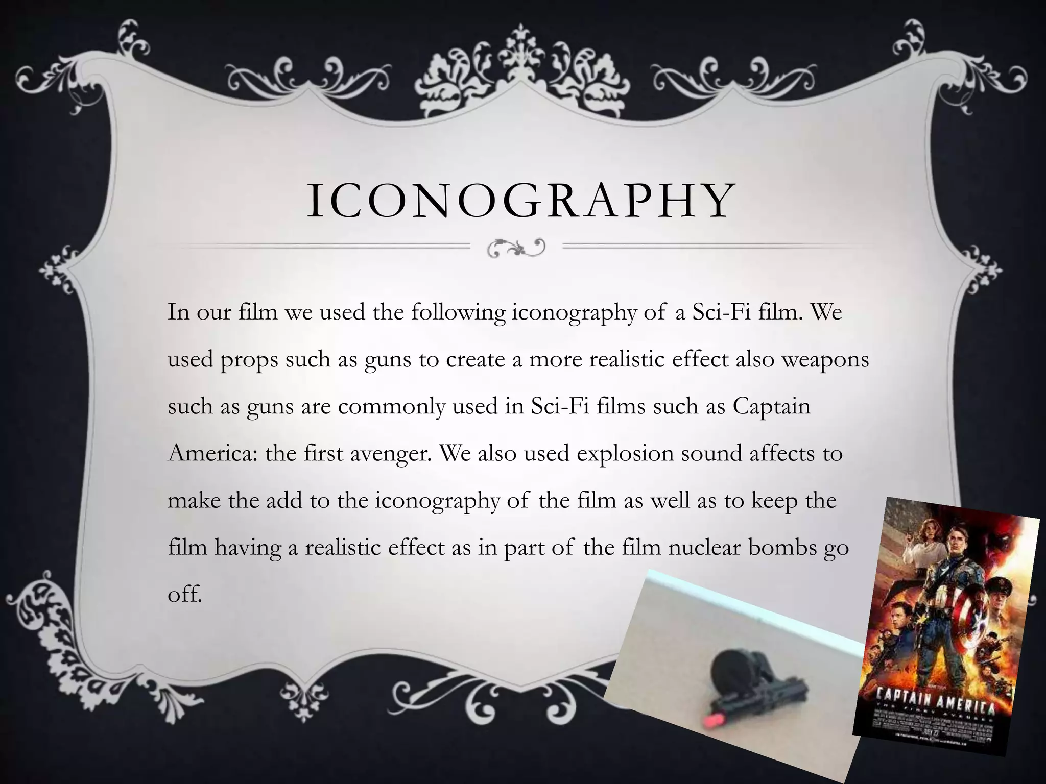
In our film we used the following iconography of a Sci-Fi film. We
used props such as guns to create a more realistic effect also weapons
such as guns are commonly used in Sci-Fi films such as Captain
America: the first avenger. We also used explosion sound affects to
make the add to the iconography of the film as well as to keep the
film having a realistic effect as in part of the film nuclear bombs go
off.

Evaluation question one: In what ways does your media product use, develop or challenge forms and conventions of real media products?

  • 1.
    EVALUATION Question one: In whichways does your media product use, develop or challenge forms and conventions of real media products
  • 2.
    SIMILAR FILMS (RESEARCH) Wewanted to create a 15 rated film that a Marvel/ DC comic vibe to it as that is where we received most of our inspiration for the film from.
  • 3.
    EXAMPLE OF HOWWE USED SIMILAR FILMS The idea of Yuri’s glowing hands came from Fantastic four as the Fantastic Four’s super powers are made clear by physical changes just like how Yuri’s hands changed from normal to glowing.
  • 4.
    NARRATIVE The start ofour film was a non-liner narrative as we information on the occurrences on which our film was based on. We did this by introducing our film with a news report. This idea is also used in Battle: Los Angeles. We wanted to use the news report so that we could explain the narrative to the audience effectively so that they were able to keep up with the storyline of our film. We also decided to do this so that the audience was automatically drawn in to the storyline so that they had some grasp of the vital storyline of which our film is based on. The rest of our film after the news report and the title of our film was shown was a linear narrative as the occurrences shown where happening at the present time in the film.
  • 5.
    GENRE The genre ofour film was firstly identified by the news report we had used to introduce our film as this has also been used in other Sci-Fi products such as Battle: Los Angeles. We also used other codes and conventions of a Sci-Fi film in our film as we used props such as guns to make both our ‘good’ soldiers and ‘bad’ soldiers look more realistic. We included characters such as soldier’s to show the fact there was a war going off. We also showed Yuri’s glowing hands to symbolize the fact that she had super-powers.
  • 6.
    CAMERA, ANGLE, SHOT, MOVEMENTAND POSITION In our film we used a variety of shots such as two shots which we used to show the two enemy soldiers talking to Yuri. We used close up’s to create emphasis on some points of our film e.g. when Laura Smith was receiving vital information about the war that had broken out, by using a close up on Laura at that point we showed the audience that she was receiving important information, therefore by using a close up we were able to make the audience pay more attention on what was happening at that point in time. We also used long shots to help the audience establish the location of the scene and to also see the action being taken place fully. We also used high and low shots to establish the characters authority and power at certain points e.g. when Yuri is first encountered by the enemy soldiers she is shown at a lower angle, this shows that at that point in time she is less powerful giving her a weaker appearance. We also used a cantered angle from a low position to give the audience the something strange was happening as this occurred after the explosions., by doing this we were able to show the sense of urgency and panic of the situation.
  • 7.
    CONTINUITY & EDITING Wemade sure that continuity was a key part of our film as we wanted to create a product that had a smooth consistency with no jarring effects. Because continuity was a key part of our film we made sure that all our shots linked together in some way e.g. we used two different shots to create a smooth effect as well as to increase the pace at which the film was going, we did this to create tension this was done in the scene where both the ‘bad’ army and the ‘good’ army were shown running. By editing these scenes together we were able to create an atmosphere for the audience so that they knew something important was about to happen, therefore by editing the scenes together we were able to make sure that the audience gave the film their full attention. Also by adding an upbeat song to the scene the shots were able to be linked together, by doing this the audience would also be paying more attention to the action that is happening in the scene.
  • 8.
    SOUND In our filmwe had diegetic sound as we added a fast pace song to build tension towards the end of the film as that was when the most action was happening. Therefore by adding a fast pace song the audience will be aware that there is more action coming up so will be able to prepare themselves for what they may be about to see. Even though we didn’t rhythmically edit the shots to the music but we believe the music itself brought emphasis on the action which is about to occur. The upbeat song also liked the shots in the scene together as I believe the song matched the actions taking place. E.g. because the song used in the film was upbeat it linked in nicely with the two rival armies running to battle.
  • 9.
    MISE-EN-SCENE When selecting wherewe were going to shoot we made sure that the environment so that we could create the right atmosphere e.g. we based part of our film in the Old Mill Lane Site at Barnsley College as we believed that it looked a lot like a science building also the building had stairs so that we were able to use it for the tilt scene where the ‘good’ army was running up the stairs. We also selected Holy Trinity High School for part of our news report as it looked like a convincing laboratory as well as looking professional. For the news report we managed to find a seating area in the Old Mill Lane site in Barnsley College that looked like a news room which is were we filmed the beginning of our news report. For the costumes we used in the film we used the following schemes: the ‘good’ soldiers were dressed in a matchy type of scheme as they wore a variety of greens and sandy colours as well as camouflage prints. By making the ‘good army’ wear matchy types of clothes it shows that they are professional and work together. The news reporters wore casual relaxed clothing as we wanted them to look relatable to the audience however the clothing they wore wasn’t overly casual e.g. Jessica wore quite a dressy, smart looking top. The ‘bad’ army wore dark colours as we thought that because they play the bad guys and dark colours are often associated with bad, evil things therefore we wanted the colour of what they wore to link in with the part they played. The clothes that the ‘bad’ army wore didn’t have a common theme other than the colour of their clothes, we wanted to do this to show that they were less organised and professional compared to the ‘good’ army.
  • 10.
    TYPOGRAPHY The font usedfor the title of our film was selected as we thought that it looked like a font that would be used on another Sci-Fi film product as it looks quite bold and edgy. The colour of the title was green we used this as it matched the colour scheme for the ‘good’ soldiers. We used a medium sized font so that it would be easy to read for the audience. The subtitles we used the colours white and black so that they would be easy to read as well as match the colours of the clothes that the ‘bad’ soldiers wore as we wanted to interpret both army’s colour schemes into the typography of the film.
  • 11.
    ICONOGRAPHY In our filmwe used the following iconography of a Sci-Fi film. We used props such as guns to create a more realistic effect also weapons such as guns are commonly used in Sci-Fi films such as Captain America: the first avenger. We also used explosion sound affects to make the add to the iconography of the film as well as to keep the film having a realistic effect as in part of the film nuclear bombs go off.