Downloaded 441 times


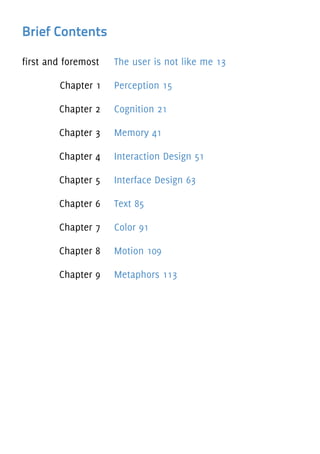


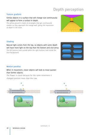
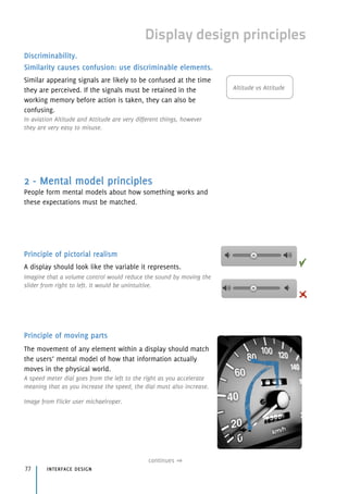
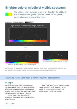
![Signal detection theory
Theory that describes how we respond the question:
“Did you perceive [or detect] that?”
Did you perceive (or detect) that? Sensitivity & Response bias
In depth
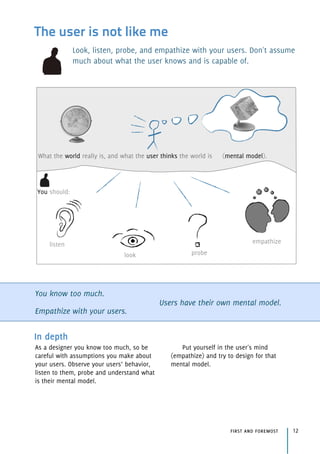
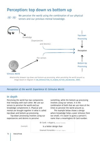
The perception of the world is a complex
process. Depends on our senses,
expectancies, previous knowledge,
restrictions in mental resources, etc. How
can we improve the decision making results
when we’re trying to detect something?
To the question “Did you perceive [or
detect] that?” two answers can arise: Yes or
No, and four results can arise: correct yes,
incorrect yes, correct no, incorrect no. These
four results can be summarized in two
characteristics of the process of detection:
sensitivity and response bias.
Sensitivity is how good we are at
discriminating between signal and noise.
Sensitivity is related to the “quality” of
our senses and strength of signals
relative to noise.
Response bias is our tendency to
respond more times yes or no. Bias is
related to expectancies and cost / benefits
of the answer.
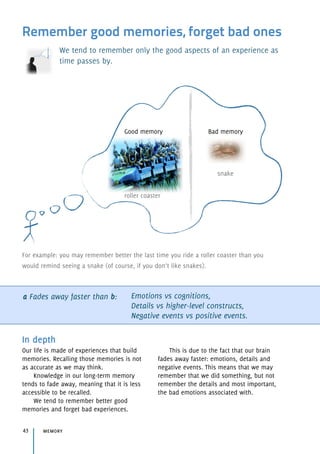
cognition33
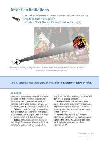
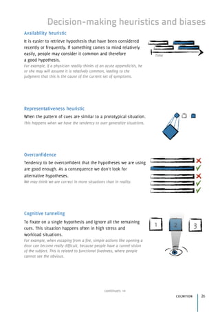
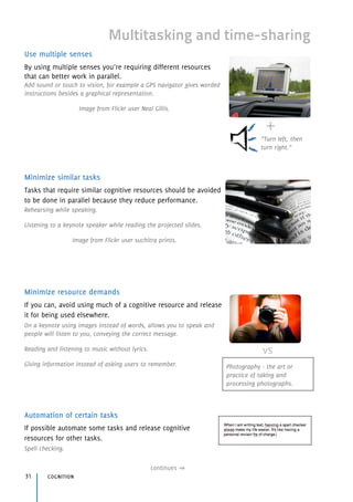
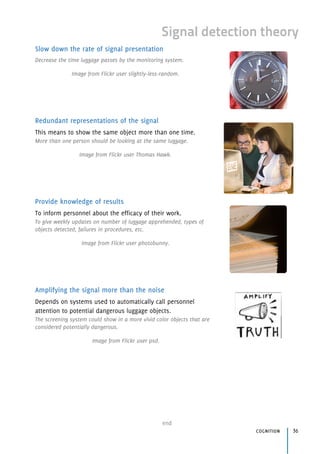
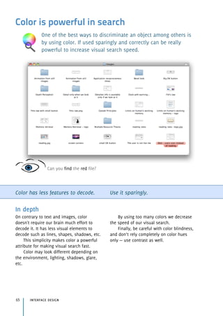
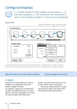
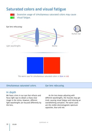
An airport security luggage monitoring system is an example where the signal detection theory
applies. While still being extremely important to detect dangerous objects (signal), they must
be efficient and deal with lots of objects (noise) that complicates the monitoring situation.
Is there a dangerous object in this bag?
signal
noise
continues](https://image.slidesharecdn.com/hciquickguide-100521060507-phpapp02/85/HCI-Quick-Guide-33-320.jpg)


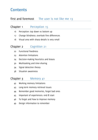
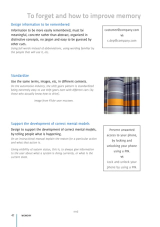
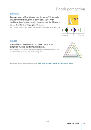
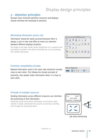
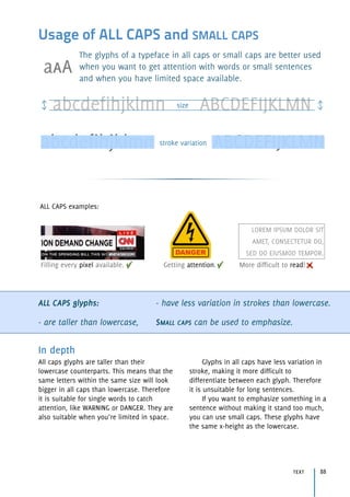
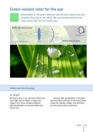
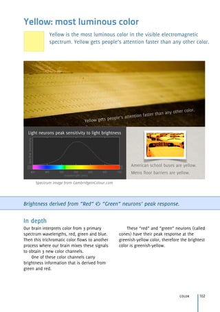
![Working memory limitations
Working memory is used to temporarily store chunks of
information used by our brain to think or act. We can’t work with
much information at once in our memory without additional aids.
Working memory capacity
(chunks of info):
3 [2,5 ~ 4,1] for pure capacity.
7 [5 ~ 9] augmented by long-term memory.
In depth
Humans have big restrictions on the amount
of information they can handle at the same
time.
Our working memory, used to
temporarily store information, is limited in
average to 3 chunks of unrelated information
and 7 chunks of information that is already
in our long term-memory.
For example, it is easier to remember a
phone number as “96 308 45 72”, instead of
“9 6 3 0 8 4 5 7 2”.
Another example: from the letters R P S C
I T V C N M V, we can remember only a few,
while with same letters but recognizable
chunks (stored in long-term memory) we can
remember many more, such as TV channels
RTP SIC TVI CNN MTV TV.
memory41
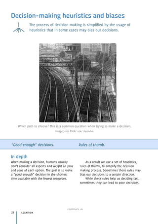
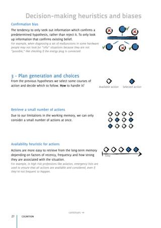
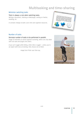
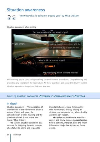
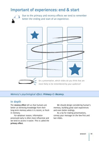
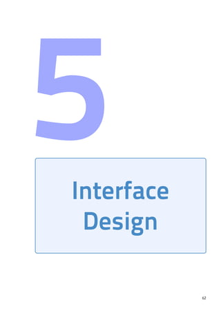
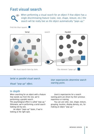
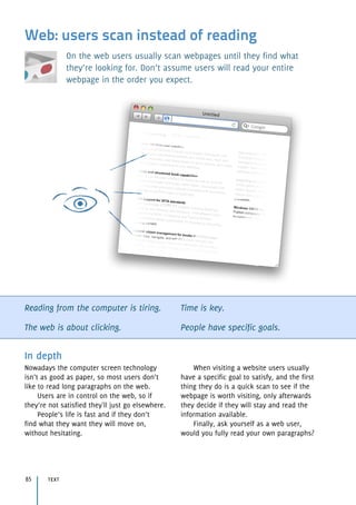
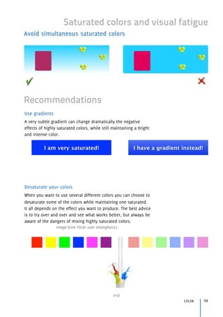
Which is better to remember?
9 6 3 0 8 4 5 7 2
or
96 308 45 72
Working memory capacity augmented with previous knowledge (TV channels): until 9 chunks.
Pure working memory capacity: until 4 chunks.](https://image.slidesharecdn.com/hciquickguide-100521060507-phpapp02/85/HCI-Quick-Guide-41-320.jpg)
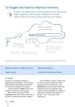

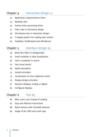
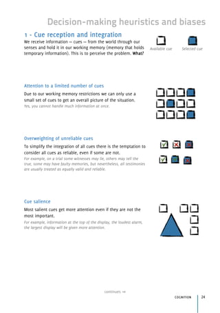
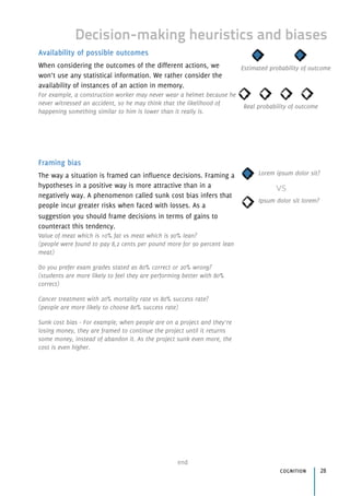
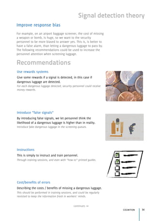
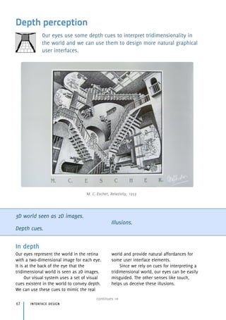
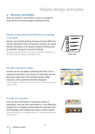
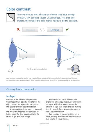
![Application responsiveness times
Upon which time should we respond to users's actions? How
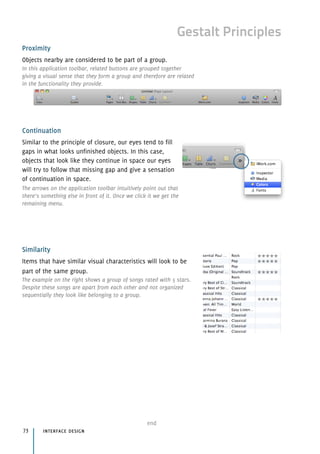
long can users wait for an operation to be completed before we
provide any means of feedback?
Human stimulus response time = 100 milliseconds
0.1 seconds = immediate response,
1 second = limit for feeling of control,
10 seconds = unresponsiveness detected.
In depth
Humans take on average 100 [50 ~ 200]
milliseconds to perceive a stimulus. Less
than this, there is the risk that the user
won’t perceive the effect of the action.
On the technology side, if we for
example have screens refreshing at a rate
of 50 HZ, it means that the image on the
screen changes every 20 milliseconds
(1/50), meaning that a fastest response
won’t be noticed by users.
Examples: According to Apple Human
Interface Guidelines, the spinning wait
cursor , is shown within 2 seconds after
an application becomes unresponsive.
interaction design51
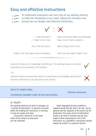
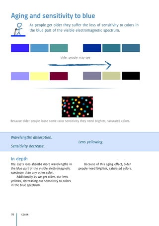
0,1 1 10
Time Seconds
instantaneously
some delay unresponsive
The user feels the Application like:](https://image.slidesharecdn.com/hciquickguide-100521060507-phpapp02/85/HCI-Quick-Guide-51-320.jpg)
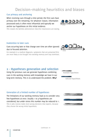
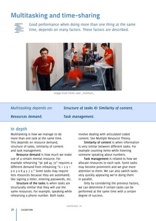
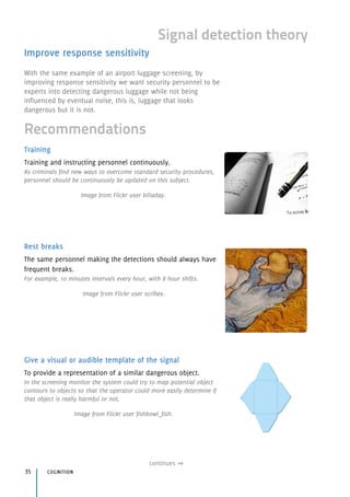
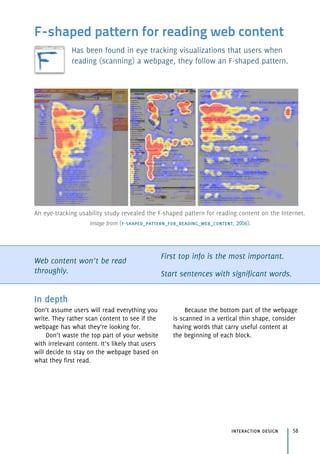
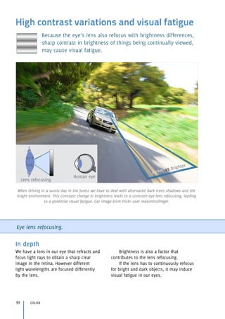
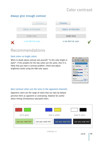
![Reading rates
The reading rate depends on the eye movements, the cognitive
effort required by the text and the amount of text read for each
eye movement we make.
These rates are approximations and you need to take that into account.
Use it as a baseline for your design.
Eye movements (saccades).
Amount of words read at each saccade.
Familiarity of content.
Cognitive processing.
interaction design 52
In depth
When reading, we make several eye
movements (saccades) for each block of
content we read. These saccades can take
230 [70 ~ 700] milliseconds.
For each saccade we must calculate the
amount of words or letters we can read. This
can be 4 to 5 letters or more depending on
our reading speed.
The type of content will influence the
time we take to understand it (more familiar
content is faster to read).
We can also read for memorization,
learning, comprehension and skimming. All
these types of reading require a different
cognitive processing.
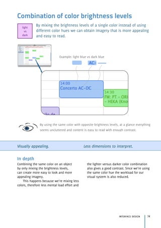
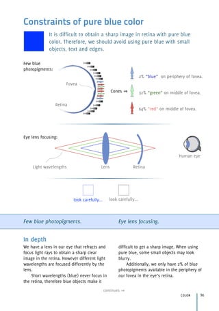
Type of reading Words per minute
Memorization < 100
Learning 100-200
Comprehension 200-400
Skimming 400-700
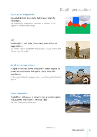
Lorem ipsum dolor sit amet, consectetur adipisicing elit, sed do eiusmod tempor incididunt.
Saccades - eye movements](https://image.slidesharecdn.com/hciquickguide-100521060507-phpapp02/85/HCI-Quick-Guide-52-320.jpg)
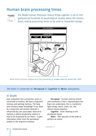
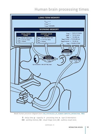
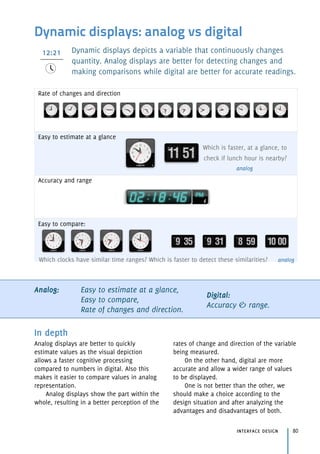
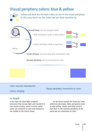
![Human brain processing times
interaction design55
end
Eyes Movement
230 [70 ~ 700]
To use these values you must specify which parts of the brain
will be in place for a specific task and then use the times
mentioned in the respective table.
Example: What delay time should we setup a TV remote
control to execute a task so that the user feels that the
remote is responding to his actions?
Answer: This problem requires the user to perceive a
stimulus. Understanding the stimulus is not important so we
only consider the perceptual processor. Looking at the
processing times of the perceptual processor, we can obtain
that 100 milliseconds is the time for the average person to
perceive that he pressed the remote and something occurred.
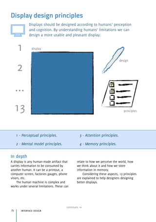
All measurements are as: average [slow ~ fast].
(in milliseconds) Perceptual Cognitive Motor
Processing Time 100 [50 ~ 200] 70 [25 ~ 170] 70 [30 ~100]
Minimum 50 25 30
Average 100 70 70
Maximum 200 170 100
Table with different processing times from the three brain subsystems.
Working memory Visual Image Auditory Image
Capacity 3 [2.5 ~ 4.1] chunks 17 [7 ~ 17] letters * 5 [4.4 ~ 6.2] letters*
Decay time 7 [5 ~ 226] sec 200 [70 ~ 1000] ms 1500 [900 ~ 3500] ms
Type of info Visual or acoustic Physical Physical
Table with capabilities of memory. Long term memory has infinity decay time and capacity.
* These numbers are difficult to fix, so they are approximations. Decay time is the half-life, which is the
time after which the probability of retrieval is less than 50%.
Capacity augmented
with long-term memory
Decay time for
1 chunk
Decay time for
3 chunks
Working
memory
7 [5 ~ 9] chunks 73 [73 ~ 226]
seconds
7 [5 ~ 34] seconds
Table with memory abilities in special situations.](https://image.slidesharecdn.com/hciquickguide-100521060507-phpapp02/85/HCI-Quick-Guide-55-320.jpg)


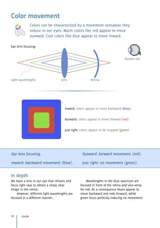


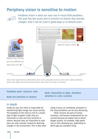
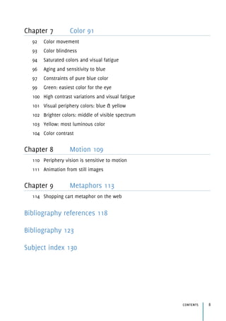
![Visual perceptual processor speed:
Fastest: 50 milliseconds
Average: 100 milliseconds
Slowest: 200 milliseconds
Animation from still images
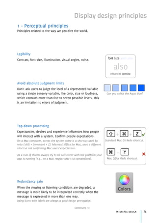
To create animation we can present still images continuously at a
rate that overcomes the time by which our visual system process
a stimulus.
Average visual perceptual processor speed = 100[50~200] milliseconds.
Motion sensation = 1000/50 = 20 images per second.
motion 110
In depth
By exploring the speed of our visual
perceptual processor we can induce a
sensation of motion in our brain.
If our brain takes between 50 to 200 ms
to process a stimulus and transform it into a
representation our mind understands,
something beneath that range will be
processed as a whole.
By passing 20 images per second, our
brain will see one single stimulus as motion
instead of 20 individual stimuli.
Motion video cameras usually take 24
frames per second, just to make sure motion
will be perceived at all times by all people.](https://image.slidesharecdn.com/hciquickguide-100521060507-phpapp02/85/HCI-Quick-Guide-110-320.jpg)


![Luke Wroblewski (2005). Small Multiples Within a User Interface. Retrieved August
2009, from UXmatters. Website
http://www.uxmatters.com/mt/archives/2005/12/small-multiples-within-a-user-interface.php
(small_multiples_within_a_user_interface, 2009)
Wilbert Galitz (2007). The essential guide to user interface design, Third edition.
Chapter 2 - The User Interface Design Process, step 12 - Choose the Proper Colors (pp.
701-702). Wiley Publishing, Inc.
(the_essential_guide_to_user_interface_design, 2007)
Donald Norman (1988). The psychology of everyday things. New York: Basic Books
[Reprinted MIT Press, 1998].
(the_psychology_of_everyday_things, 1988)
Stuart Card, Thomas Moran & Allen Newell, (1983). The Psychology of Human-
Computer Interaction. Lawrence Erlbaum Associates, Inc.
(the_psychology_of_human-computer_interaction, 1983)
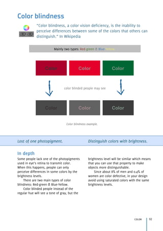
Small multiples in data visualization
Color movement
Saturated colors and visual fatigue
Aging and sensitivity to blue
Constraints of pure blue color
High contrast variations and visual fatigue
Brighter colors: middle of visible spectrum
Feedback, feedforward and affordances
Long-term memory retrieval issues 2 - The Human Information-Processor 39-40
Working memory limitations 2 - The Human Information-Processor 39
Reading rates 2 - The Human Information-Processor 50-51
Application responsiveness times 2 - The Human Information-Processor 31-34
Animation from still images 2 - The Human Information-Processor 31-32,
45-46
Human brain processing times 2 - The Human Information-Processor
category 126](https://image.slidesharecdn.com/hciquickguide-100521060507-phpapp02/85/HCI-Quick-Guide-126-320.jpg)

![133
W
W3C, 106
Wait cursor, 52
Warm colors, 92
Web
F-shaped pattern for reading, 59
scanning, 86
shopping cart metaphor, 114
Working memory, 42
change blindness, 17
decision-making, 24—29
discriminability (display), 78
display design principles, 80
instructions, 87
instructions, 87
model human processor, 54—56
Writing, 87
X
X-height, 89
Y, Z
Yellow (luminosity), 103
brightness, 102—103, 106
color blindness, 93
older people, 96
opponent colors, 105
visual periphery colors, 101
*
3D, 68, 69—71
7[5~9]. See Working memory.](https://image.slidesharecdn.com/hciquickguide-100521060507-phpapp02/85/HCI-Quick-Guide-133-320.jpg)


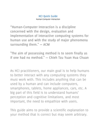
The HCI Quick Guide is designed to assist practitioners in the field of human-computer interaction by providing essential design principles and considerations for creating user-friendly interfaces. Focusing on human perception, cognition, and memory, the guide emphasizes the importance of empathizing with users and understanding their mental models. It serves as both a practical resource for designers and an introduction to the key concepts in HCI, though it does not encompass every principle within the field.