Download as PDF, PPTX

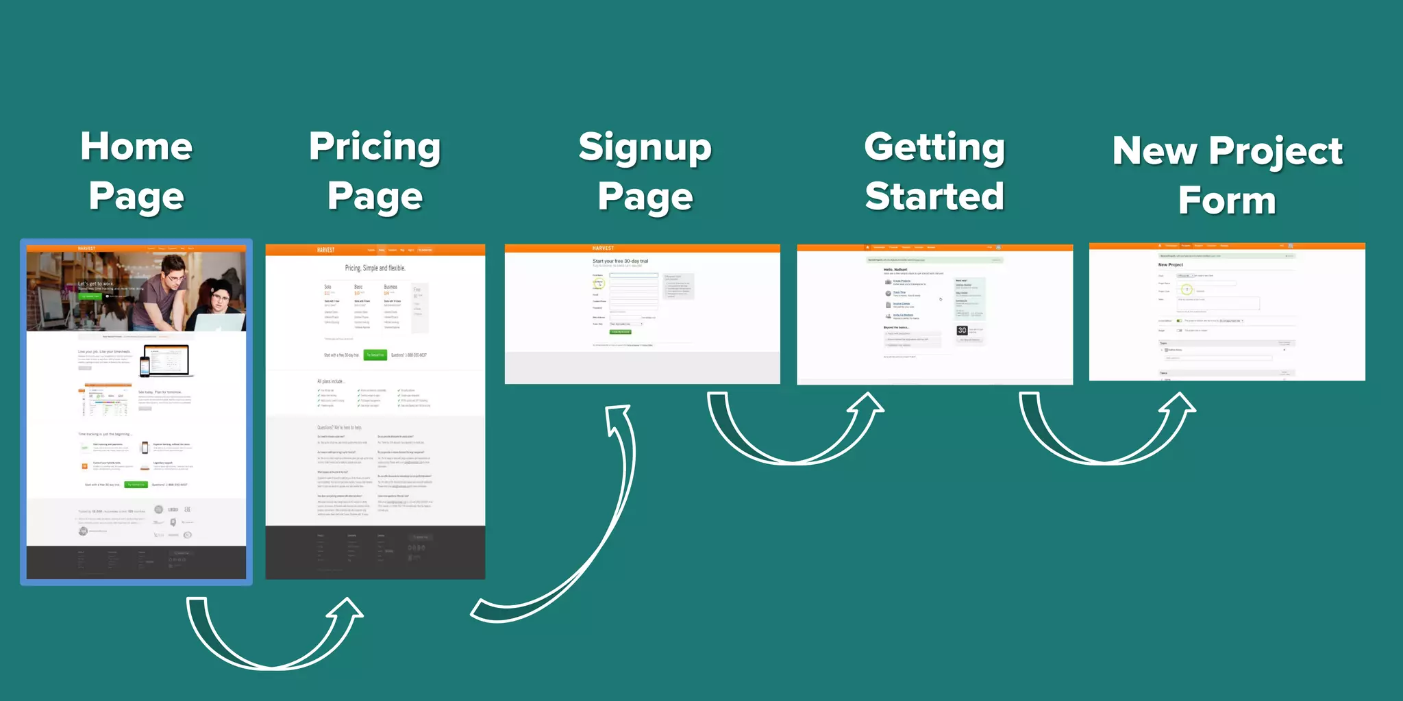
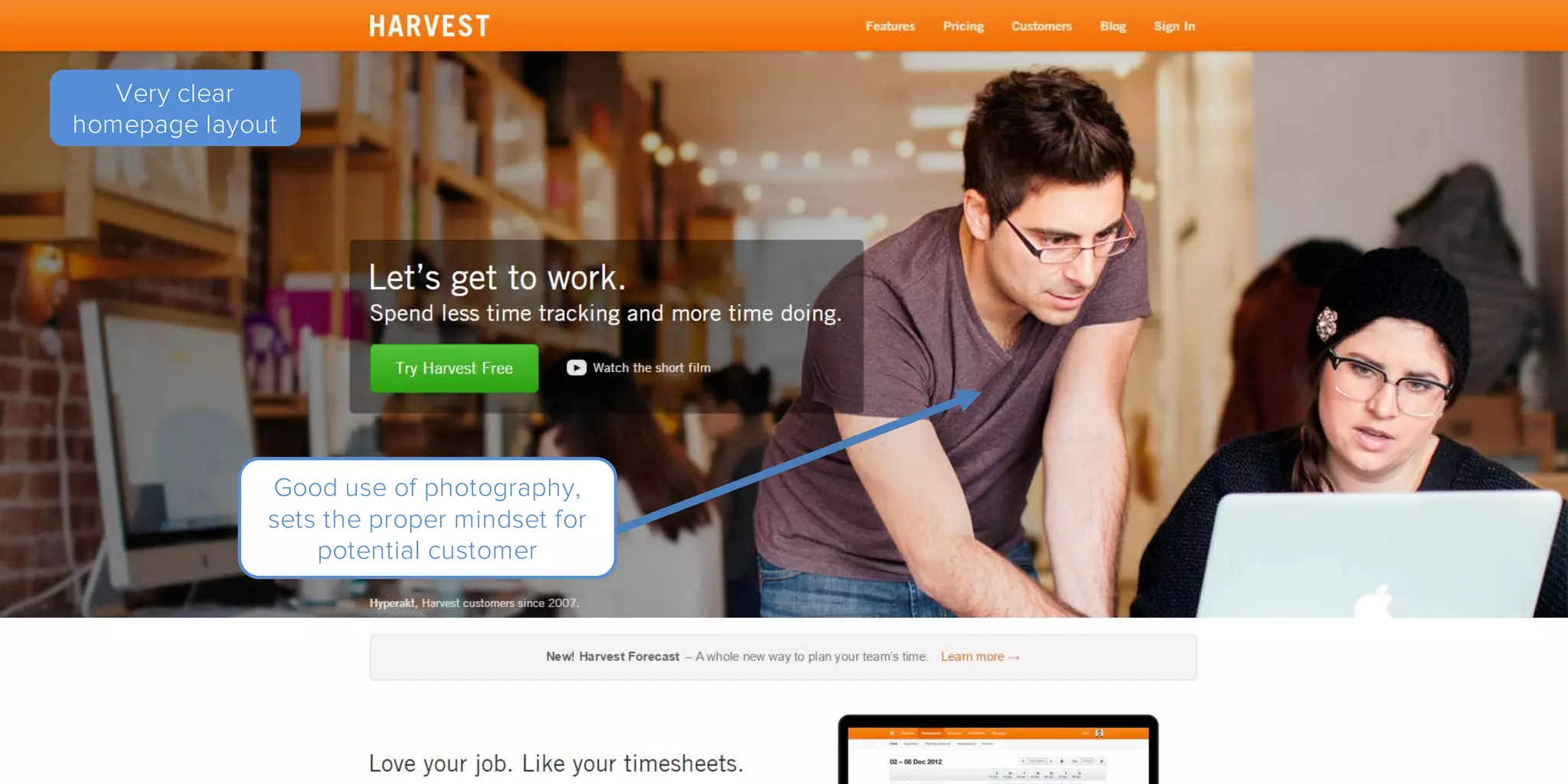
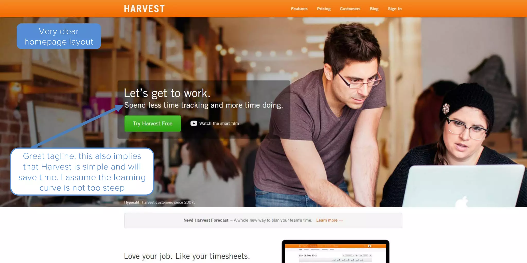
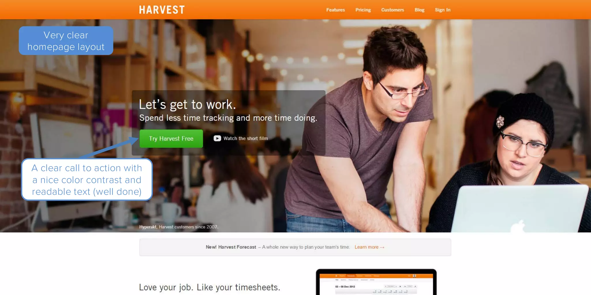
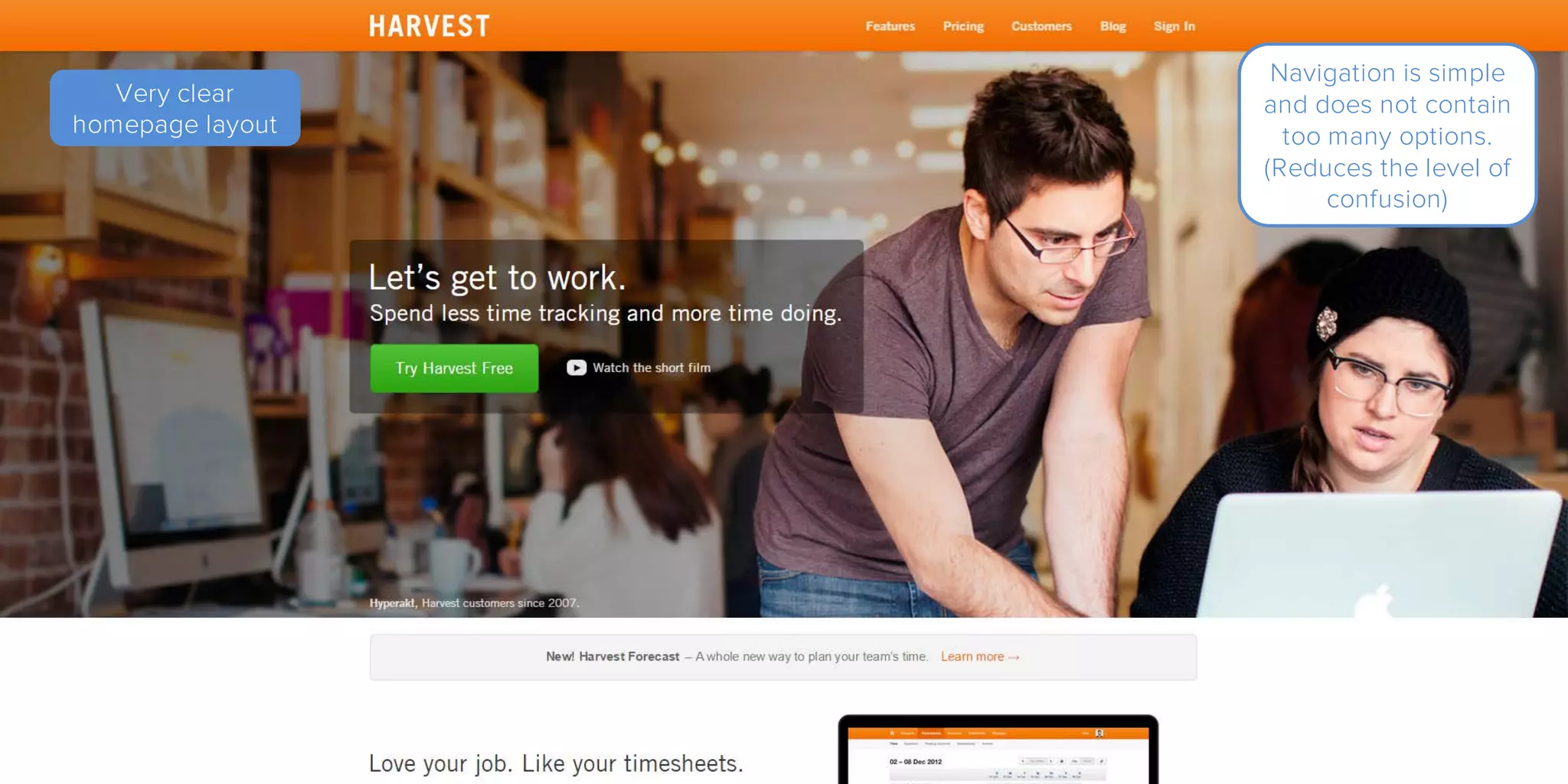
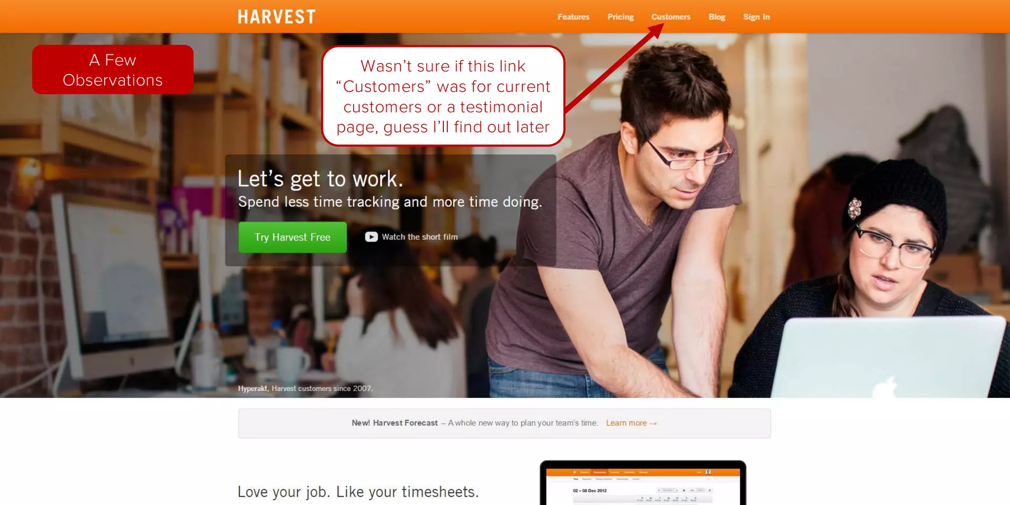
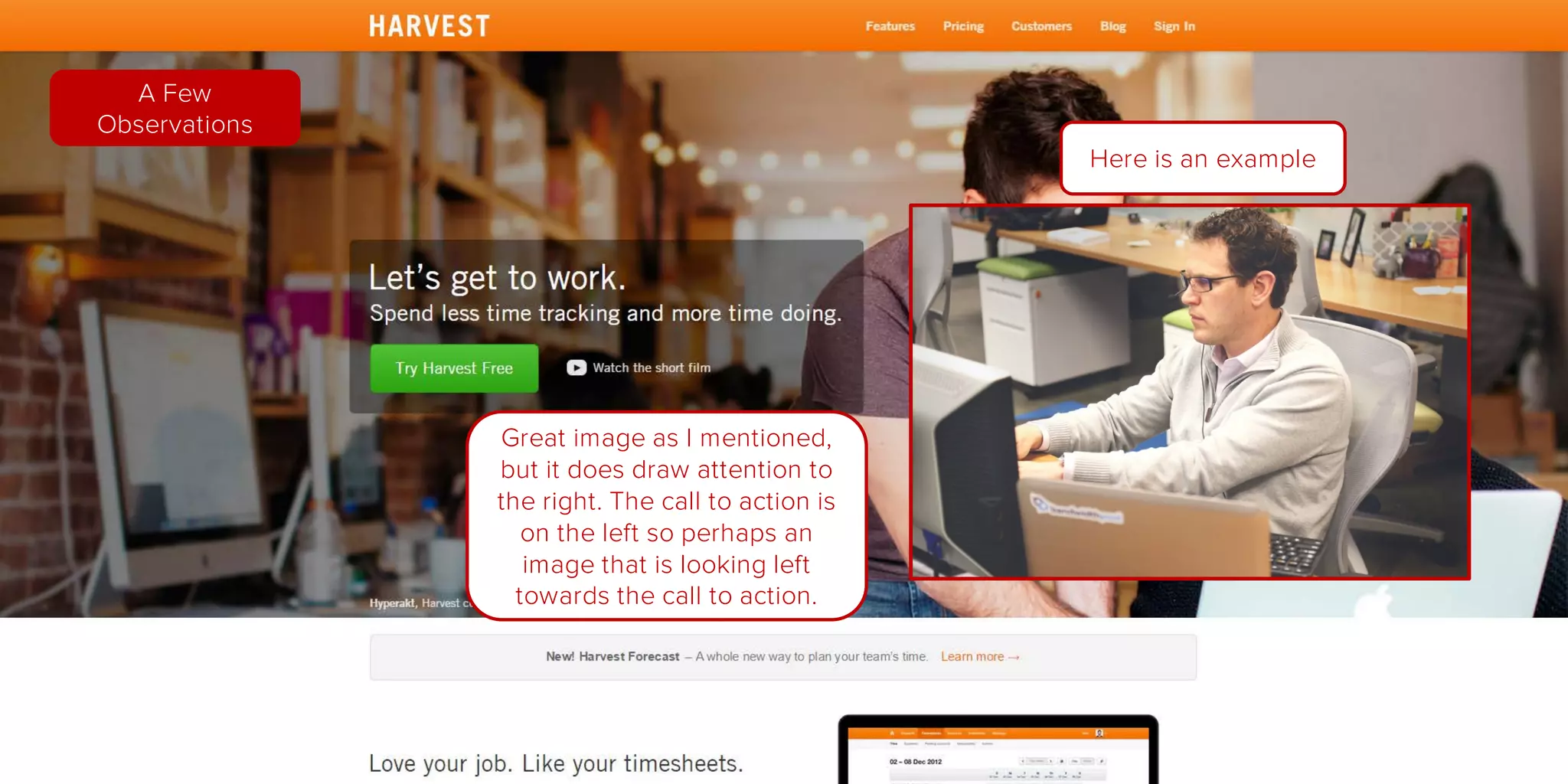
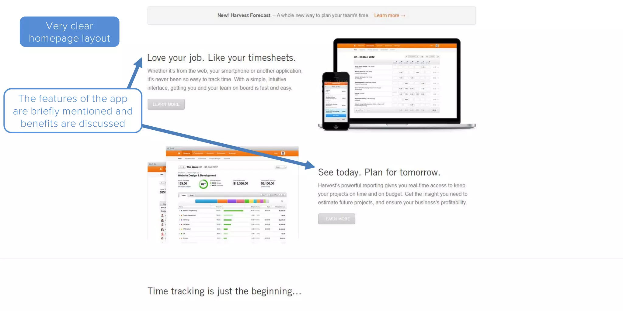
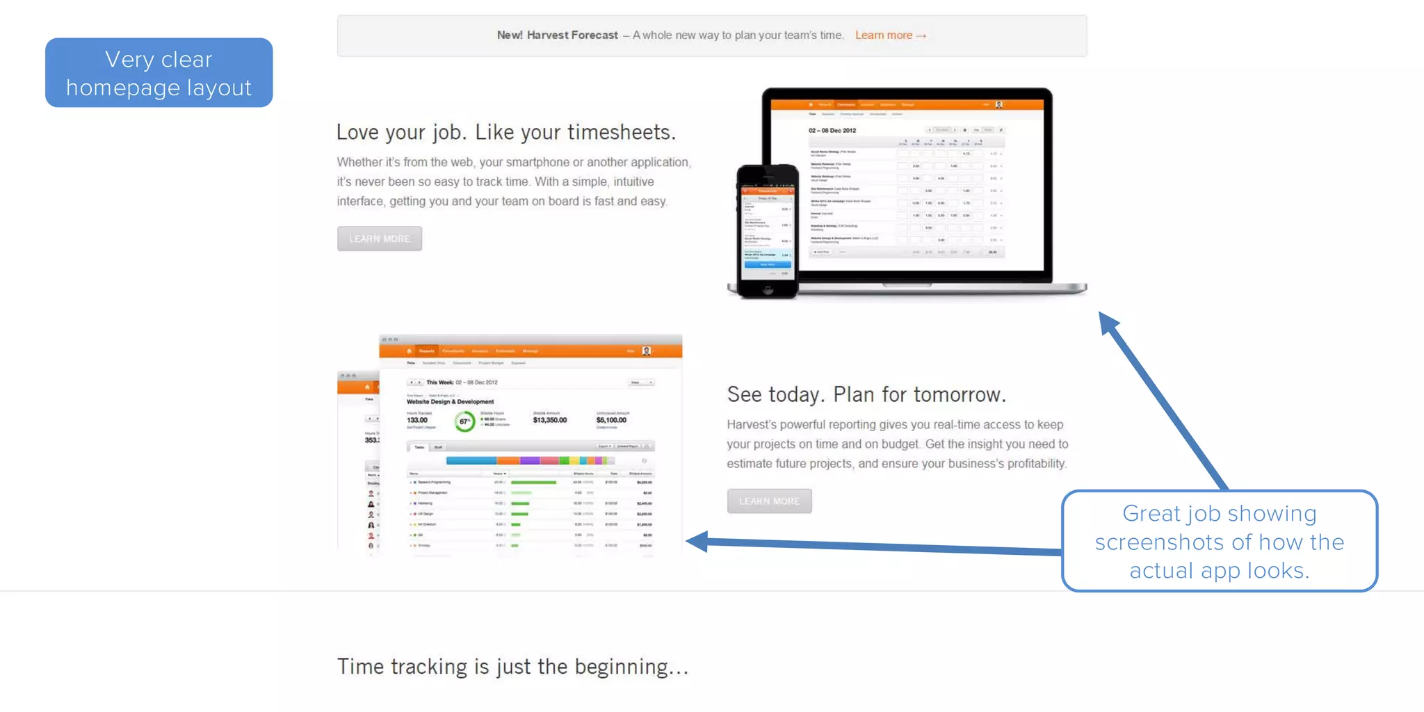
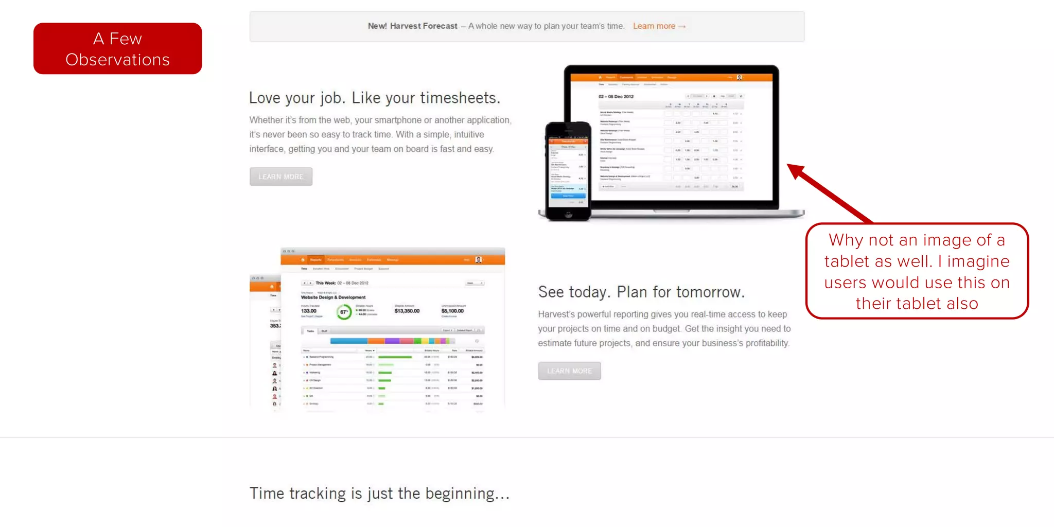
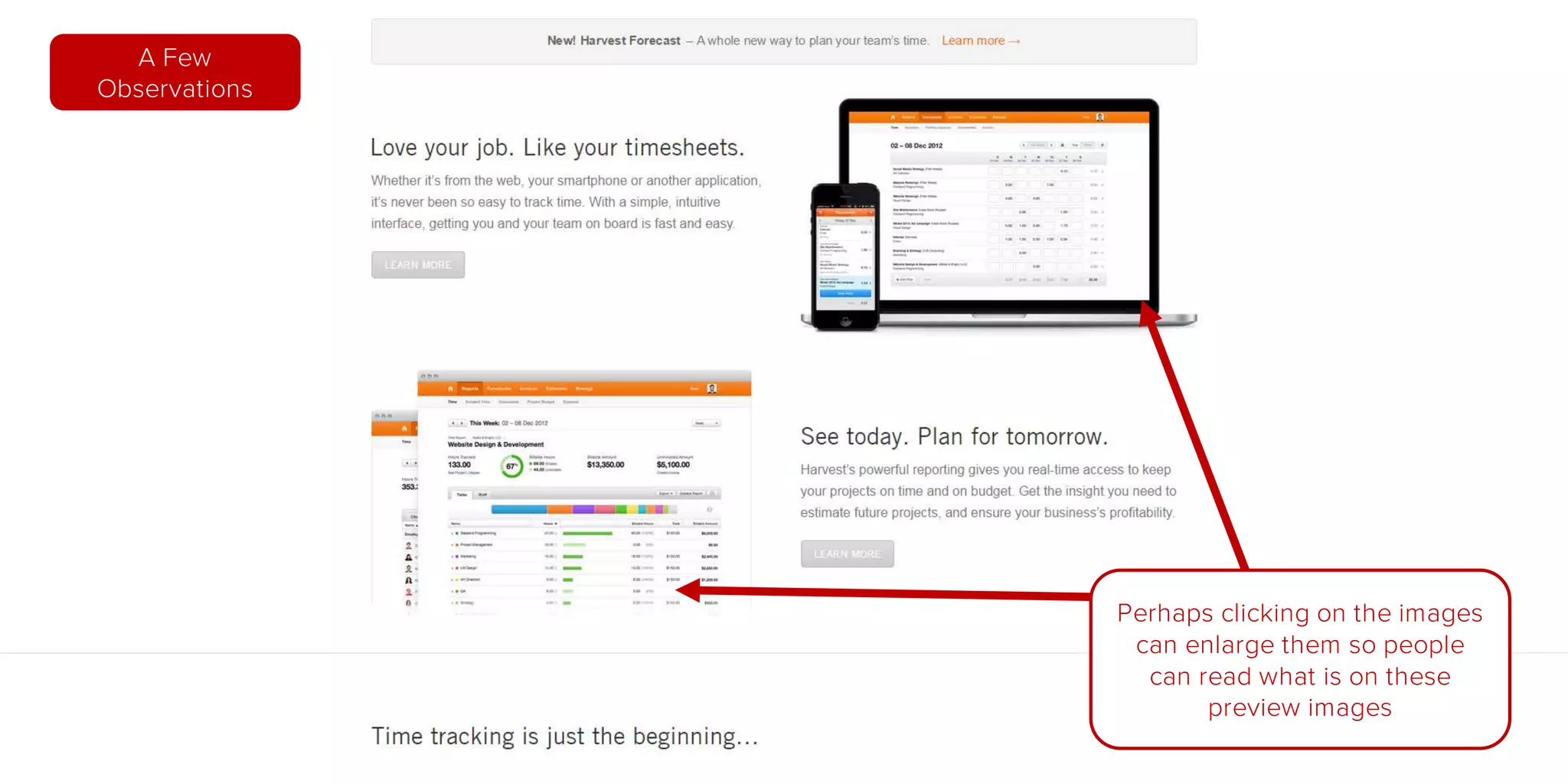
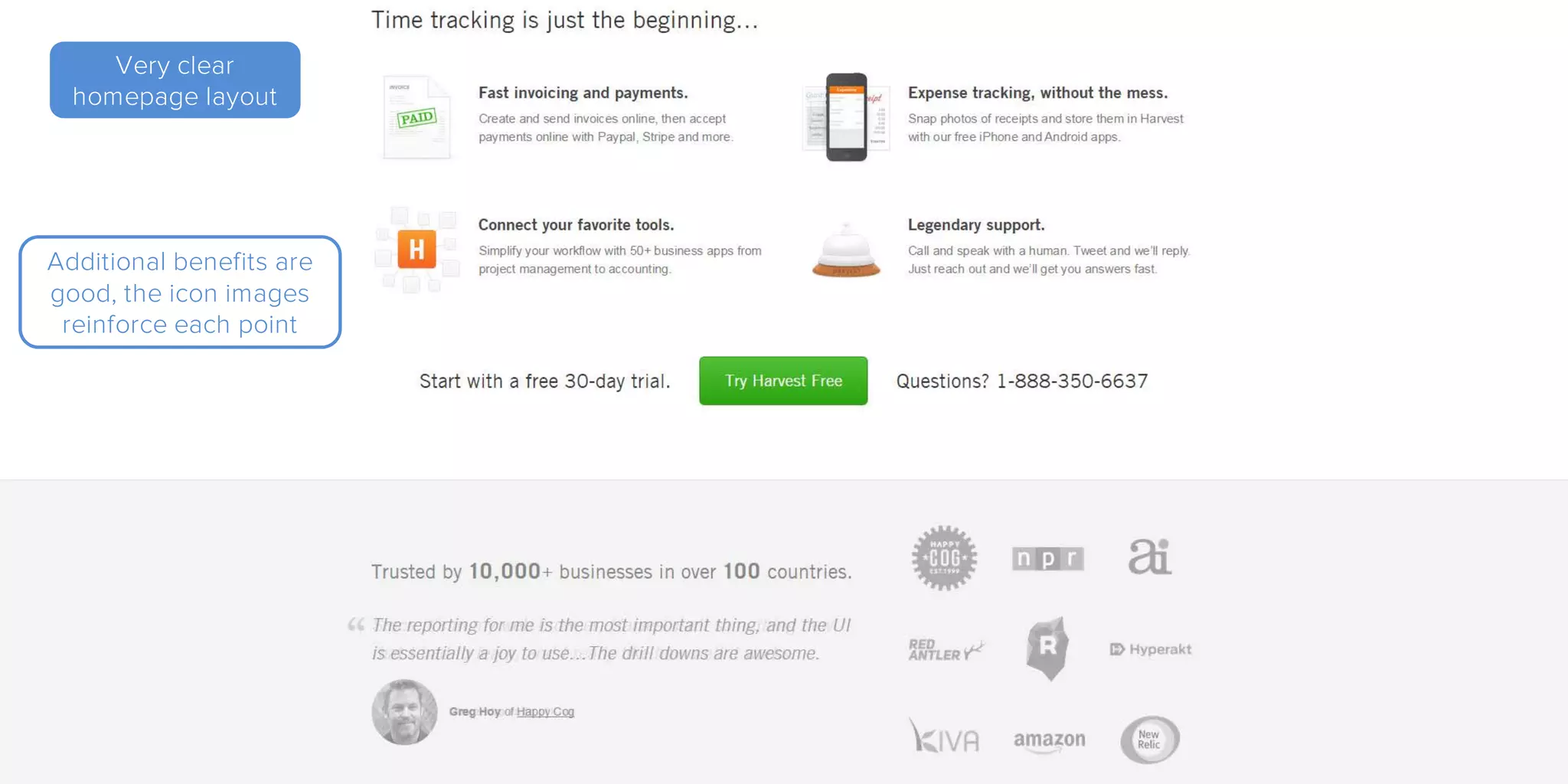
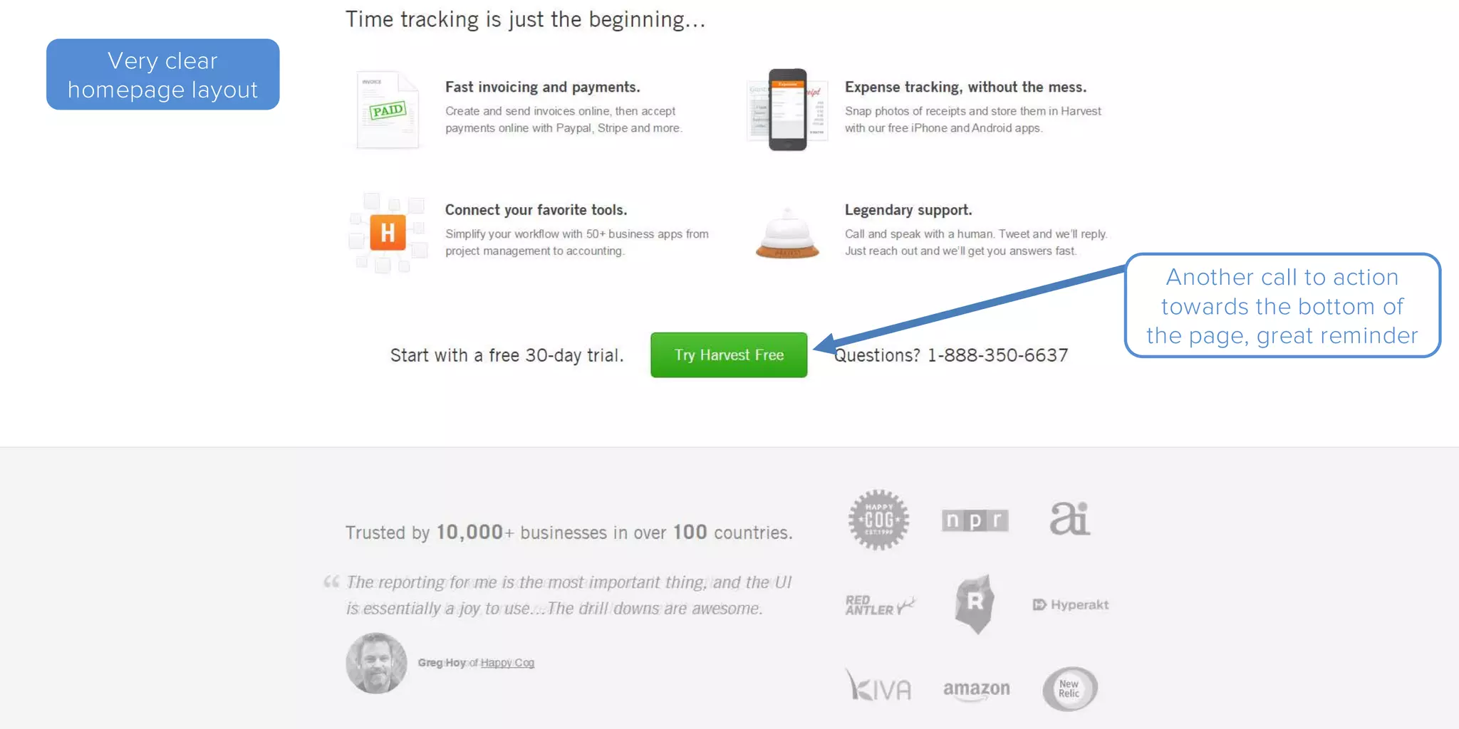
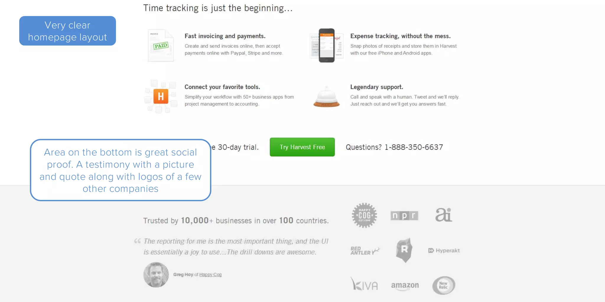
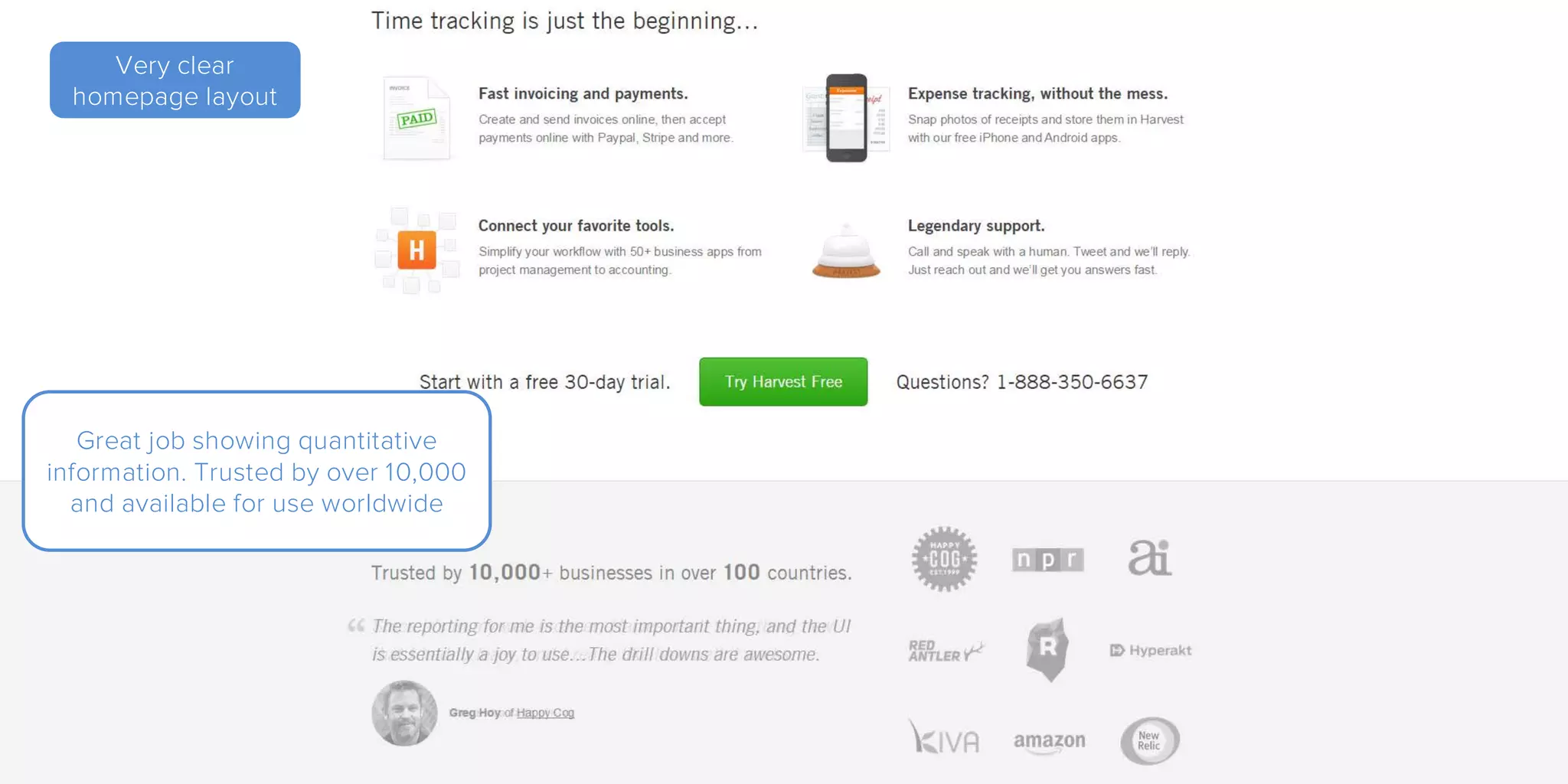
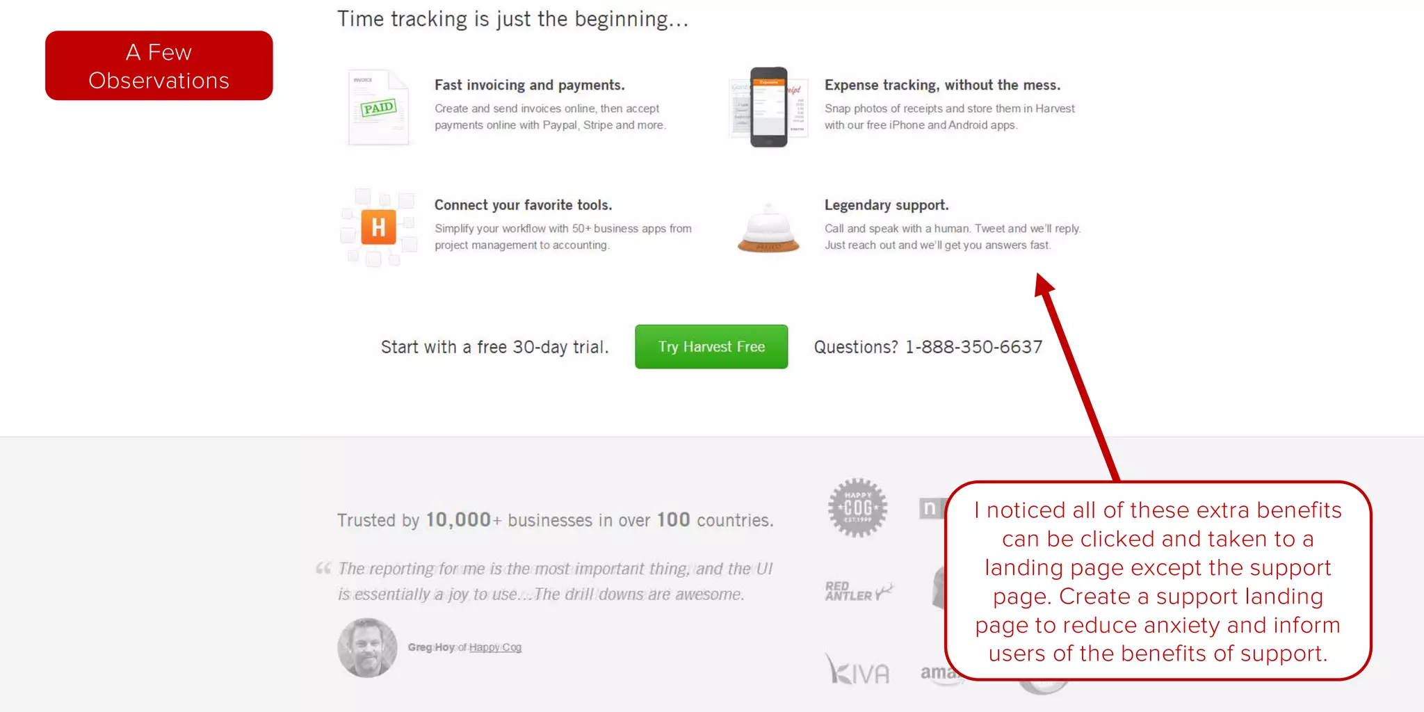
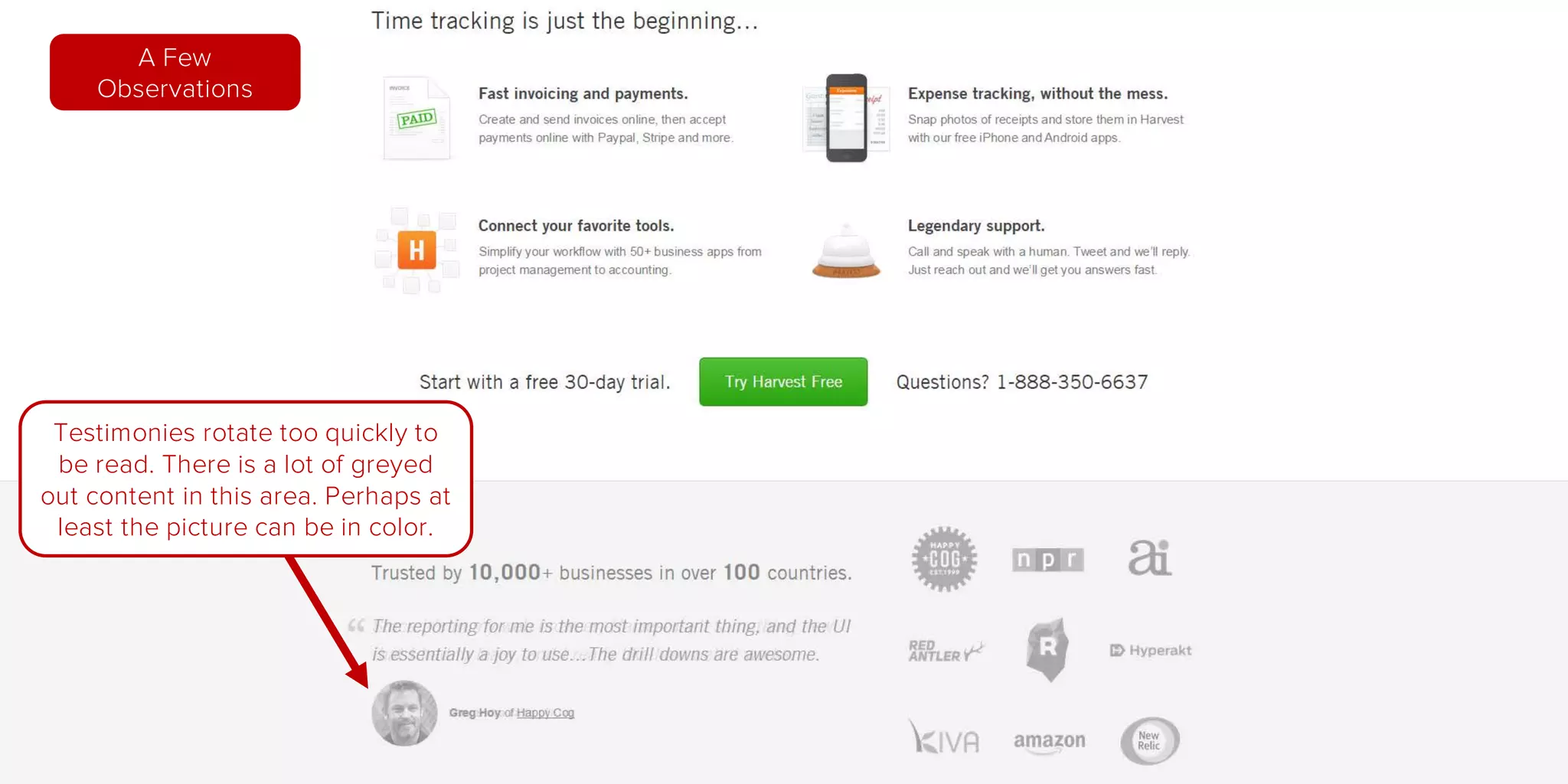
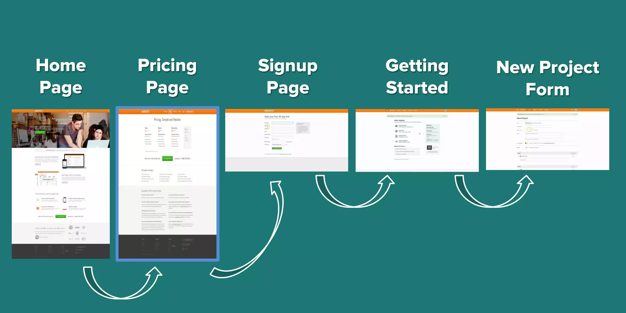
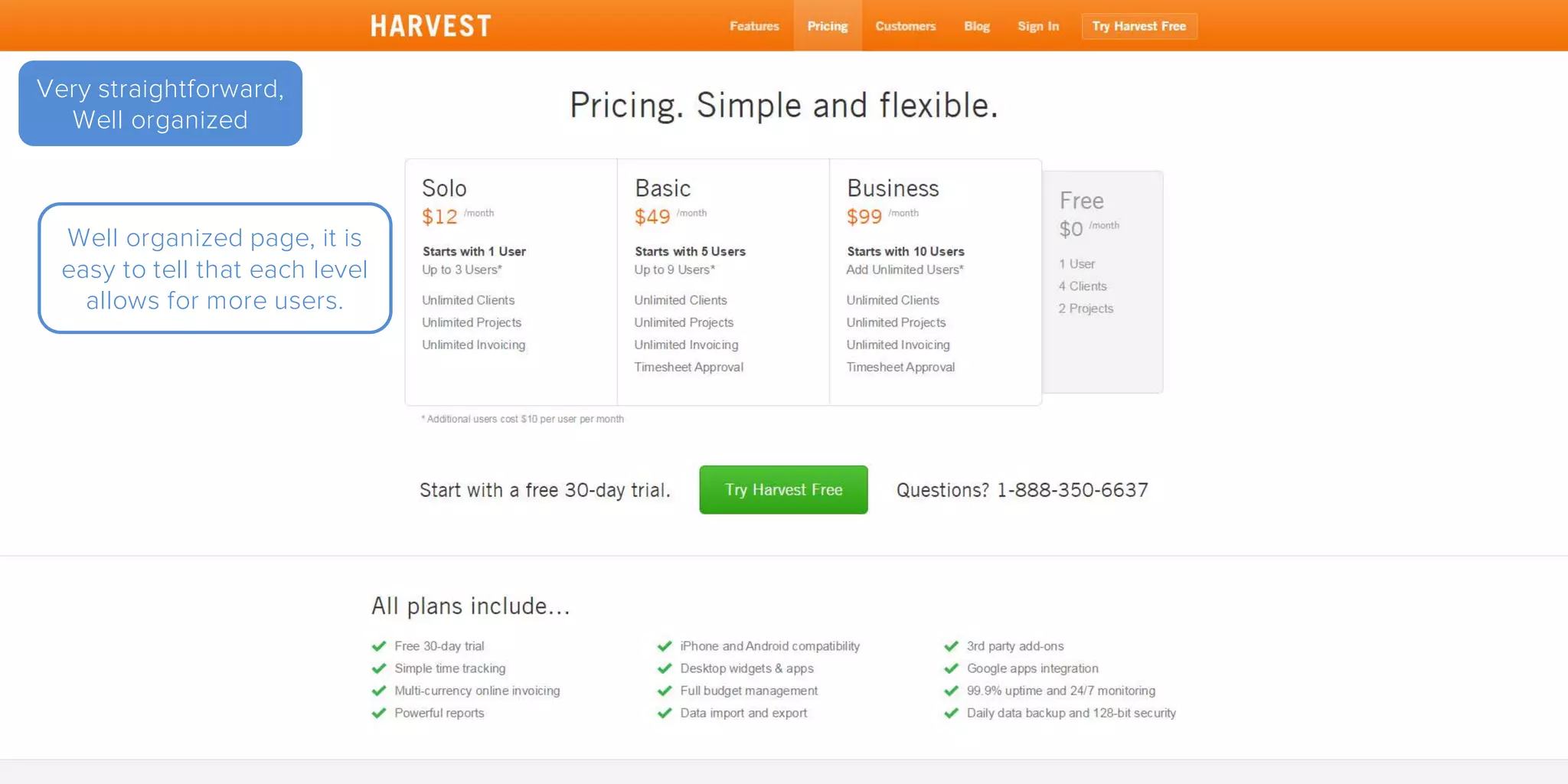
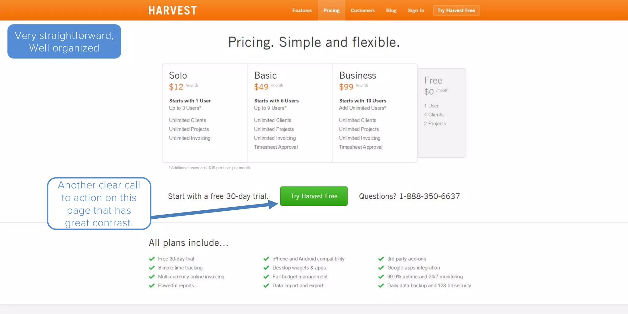
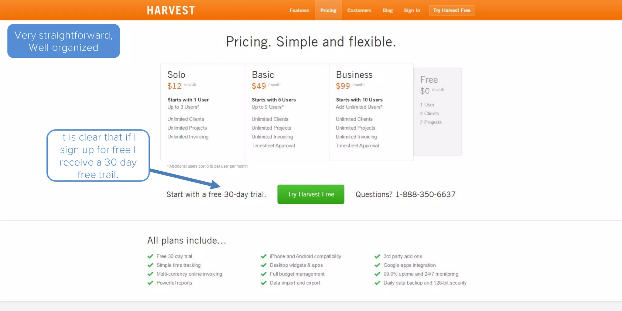
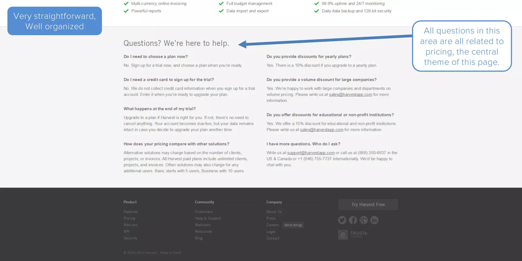
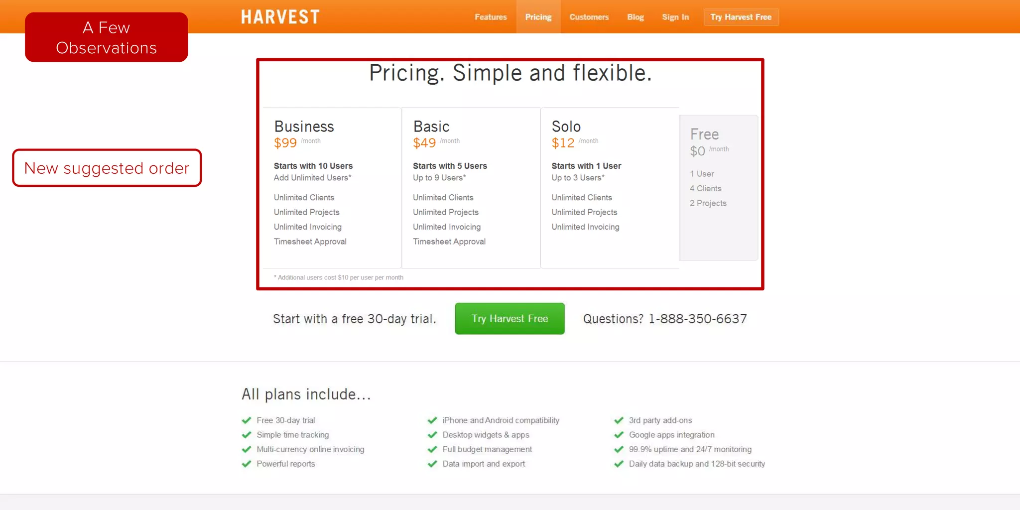
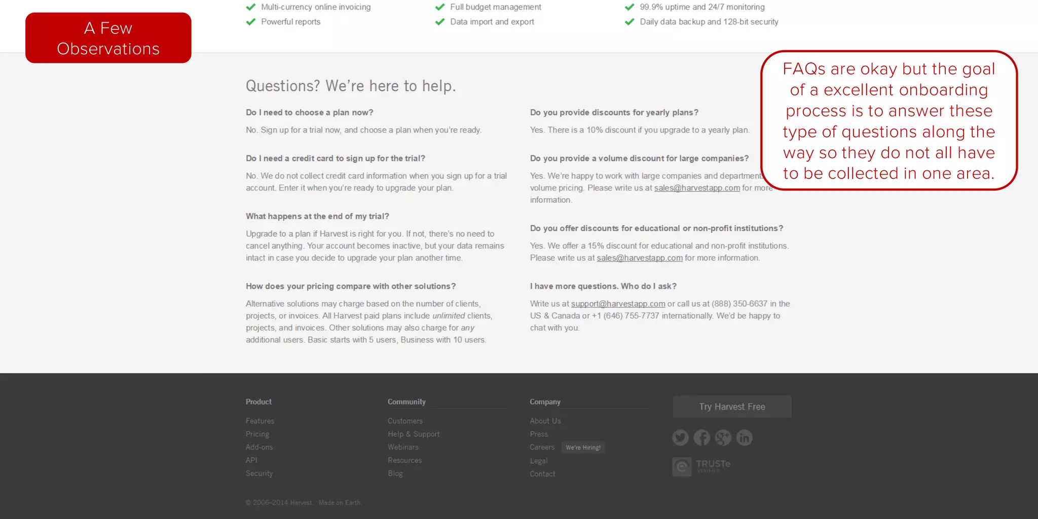
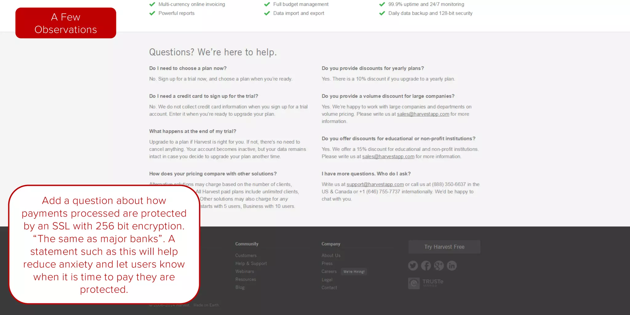

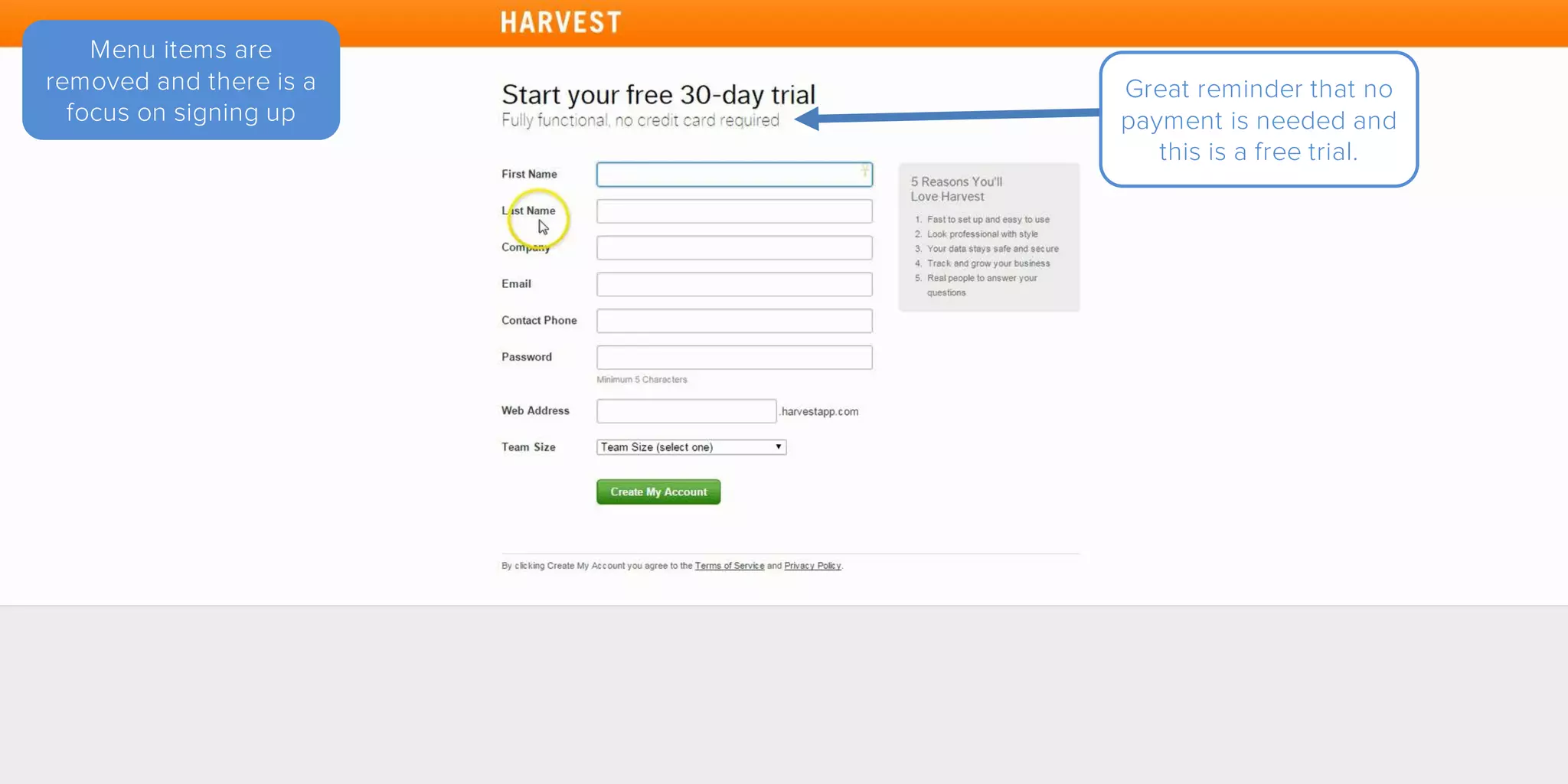
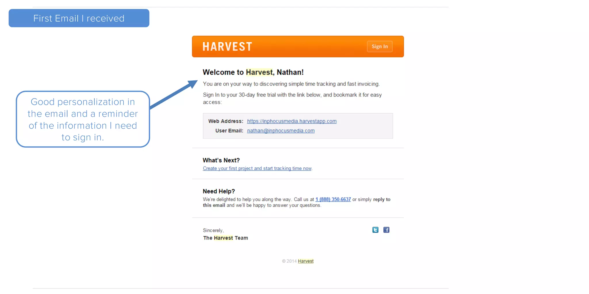
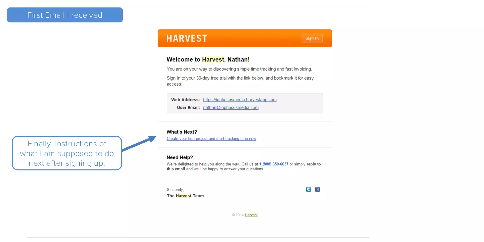
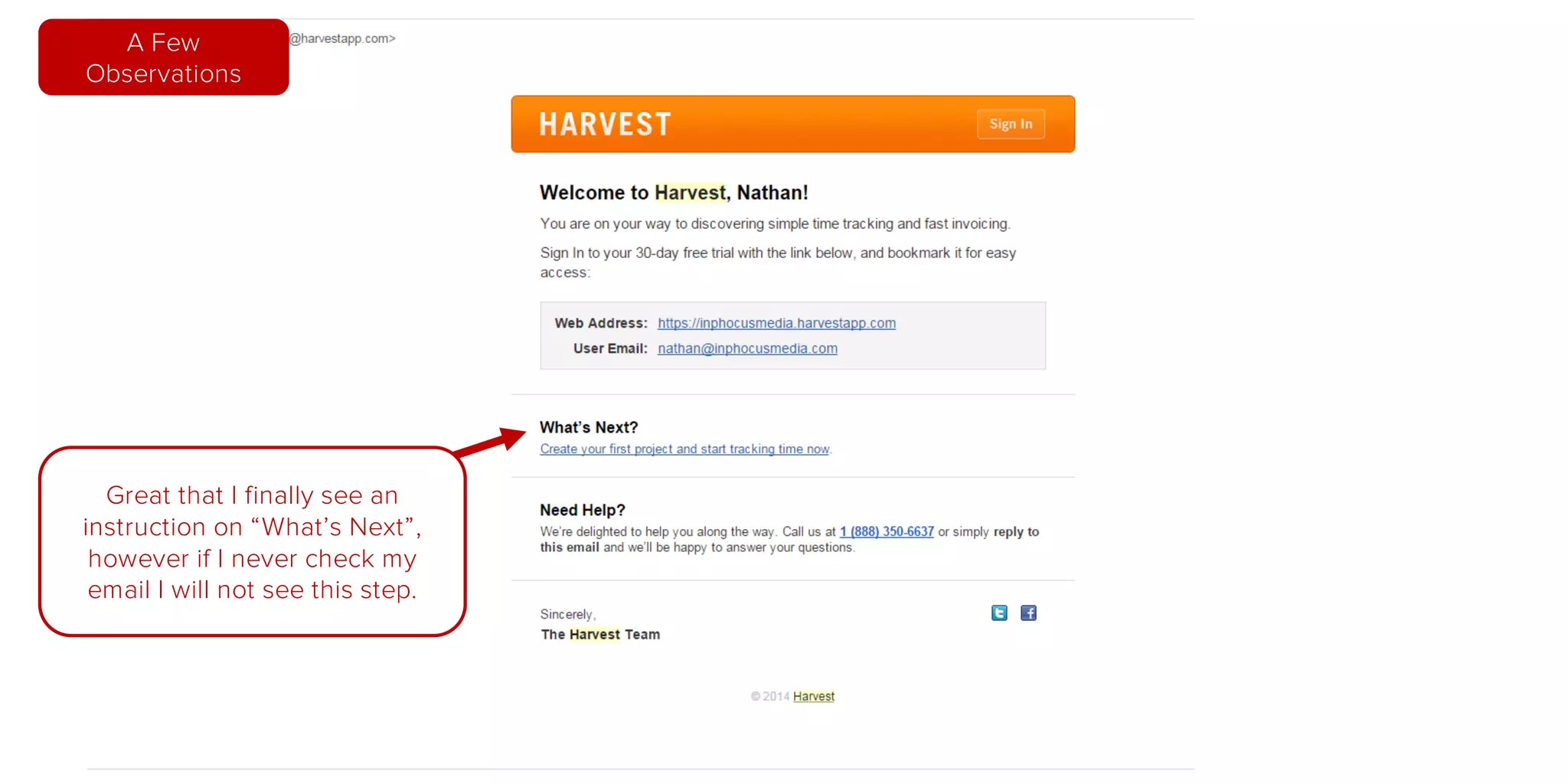
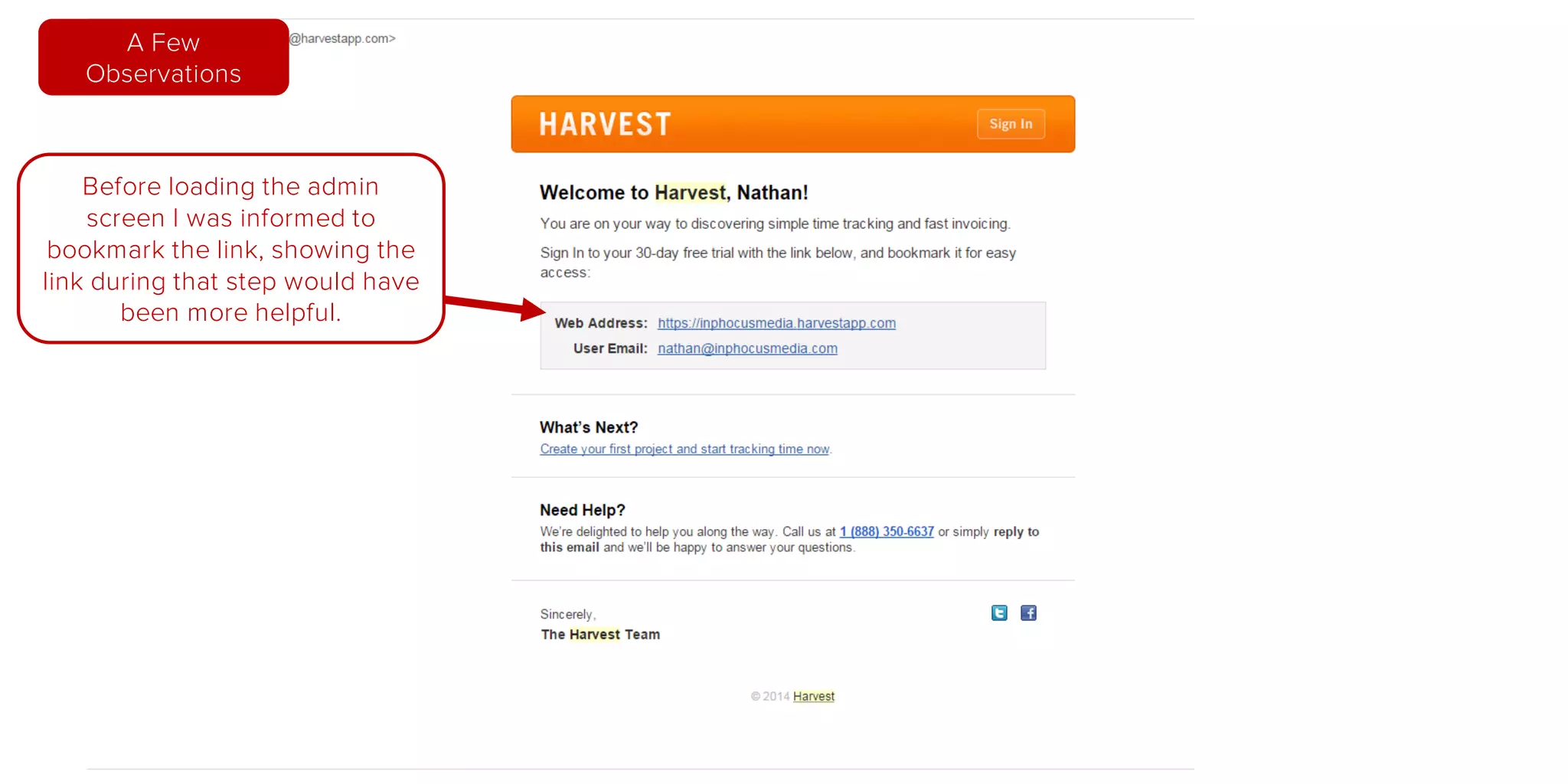

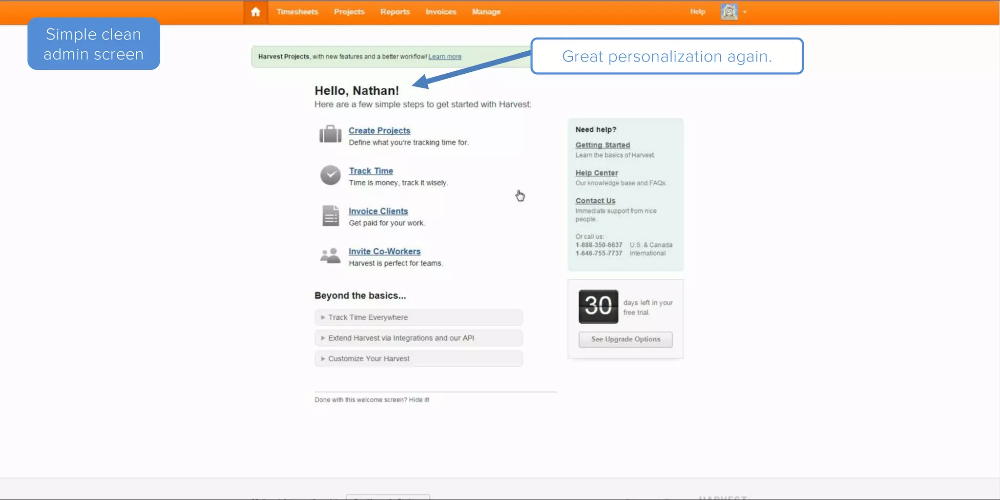
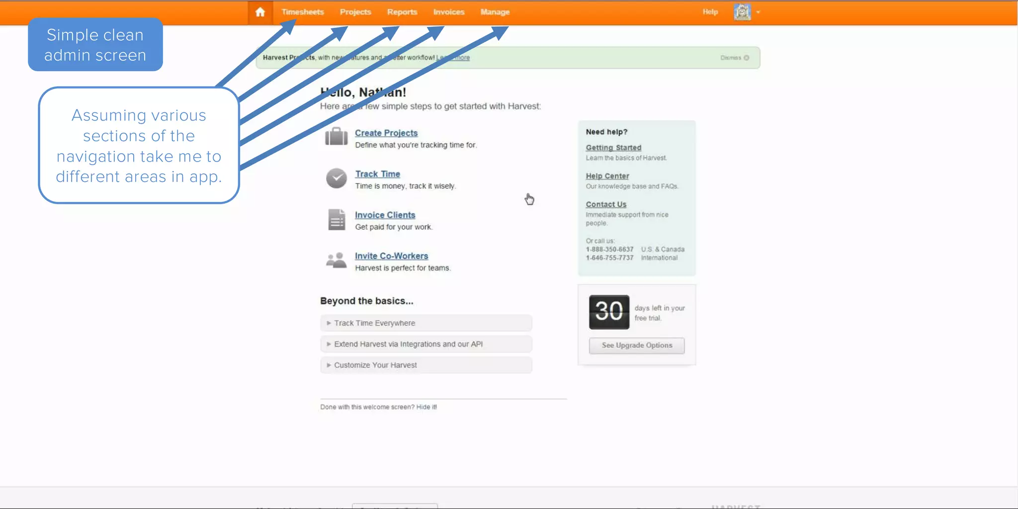
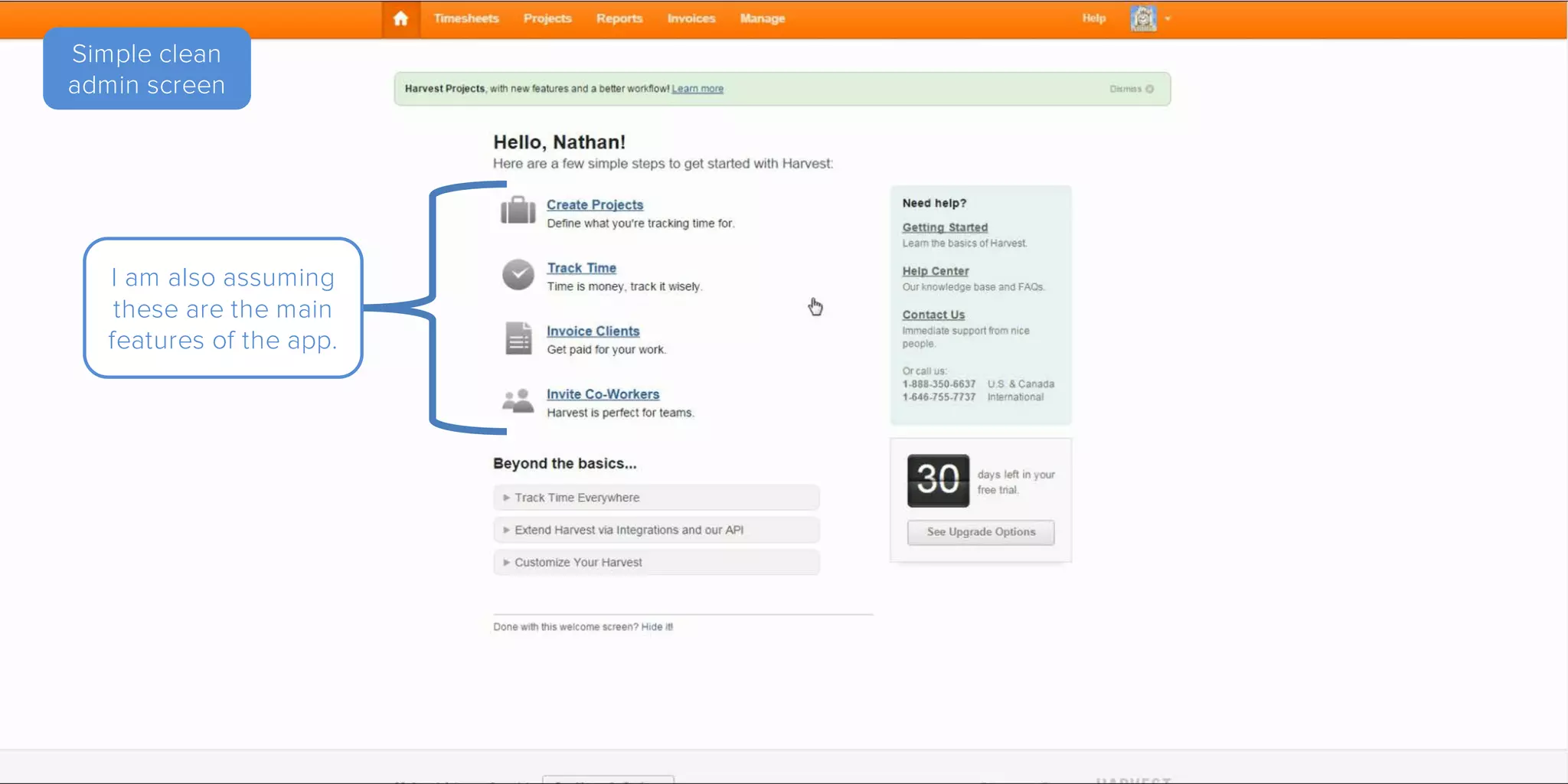
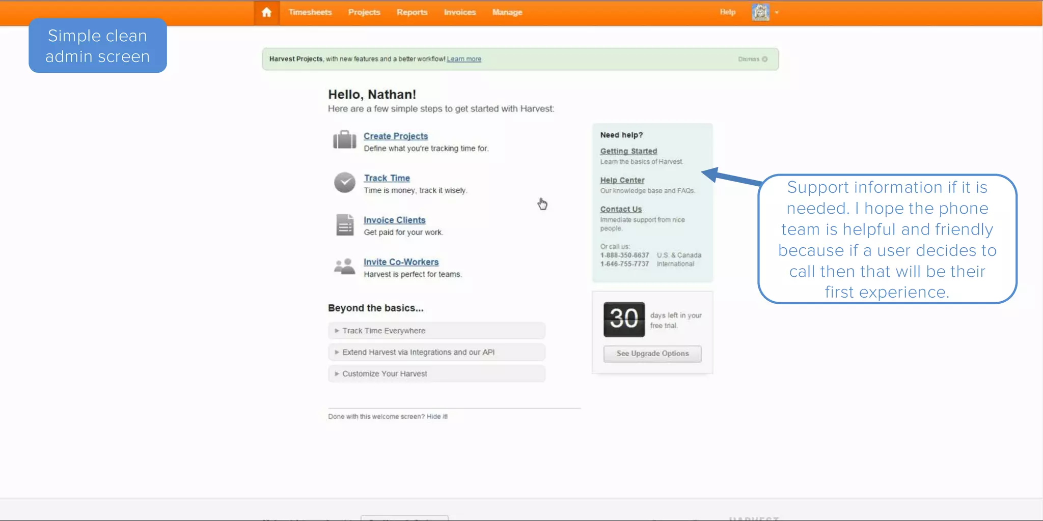
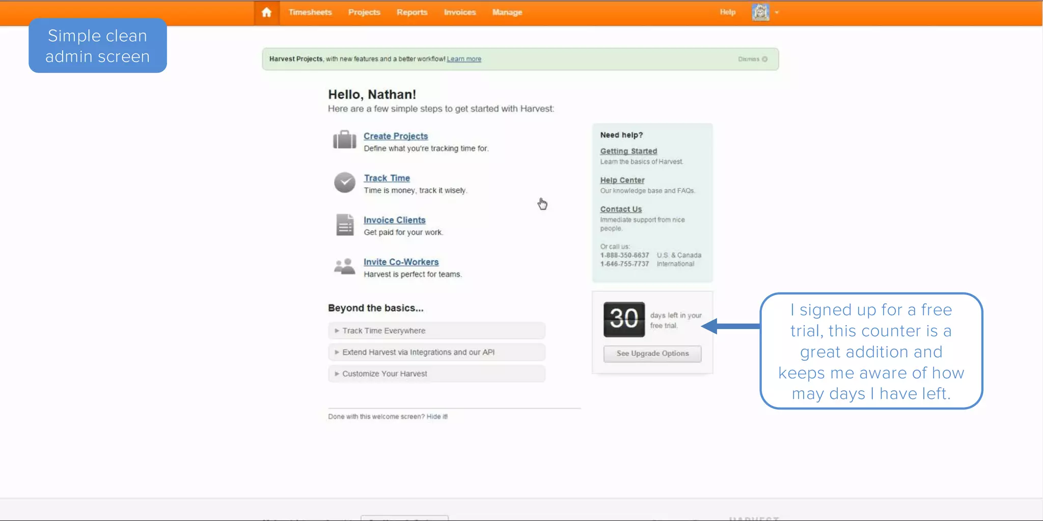
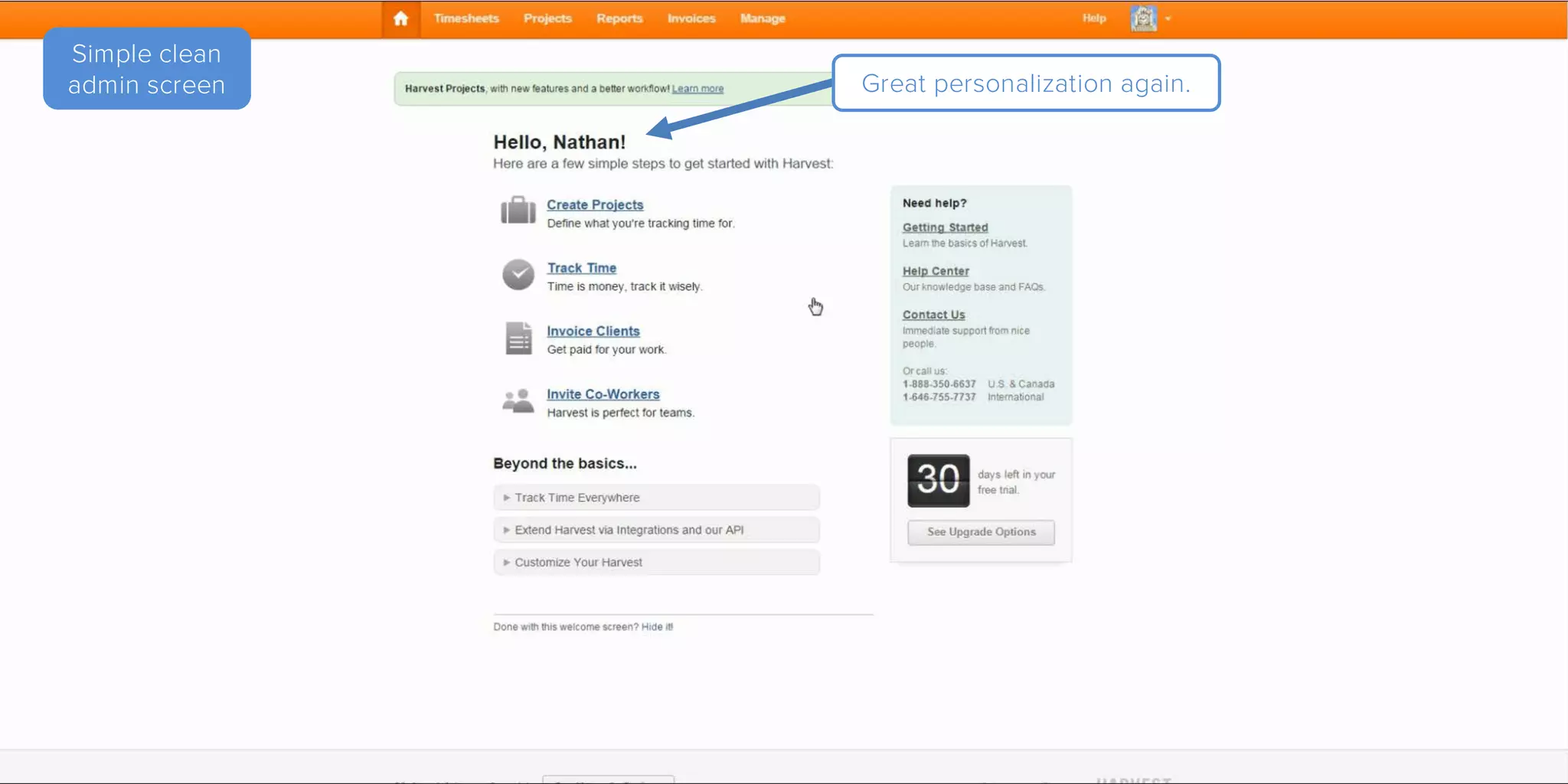
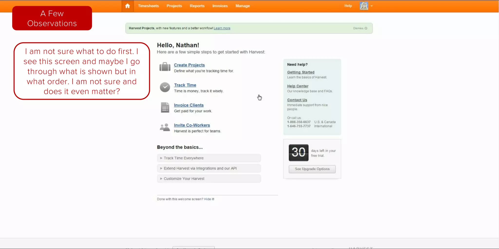
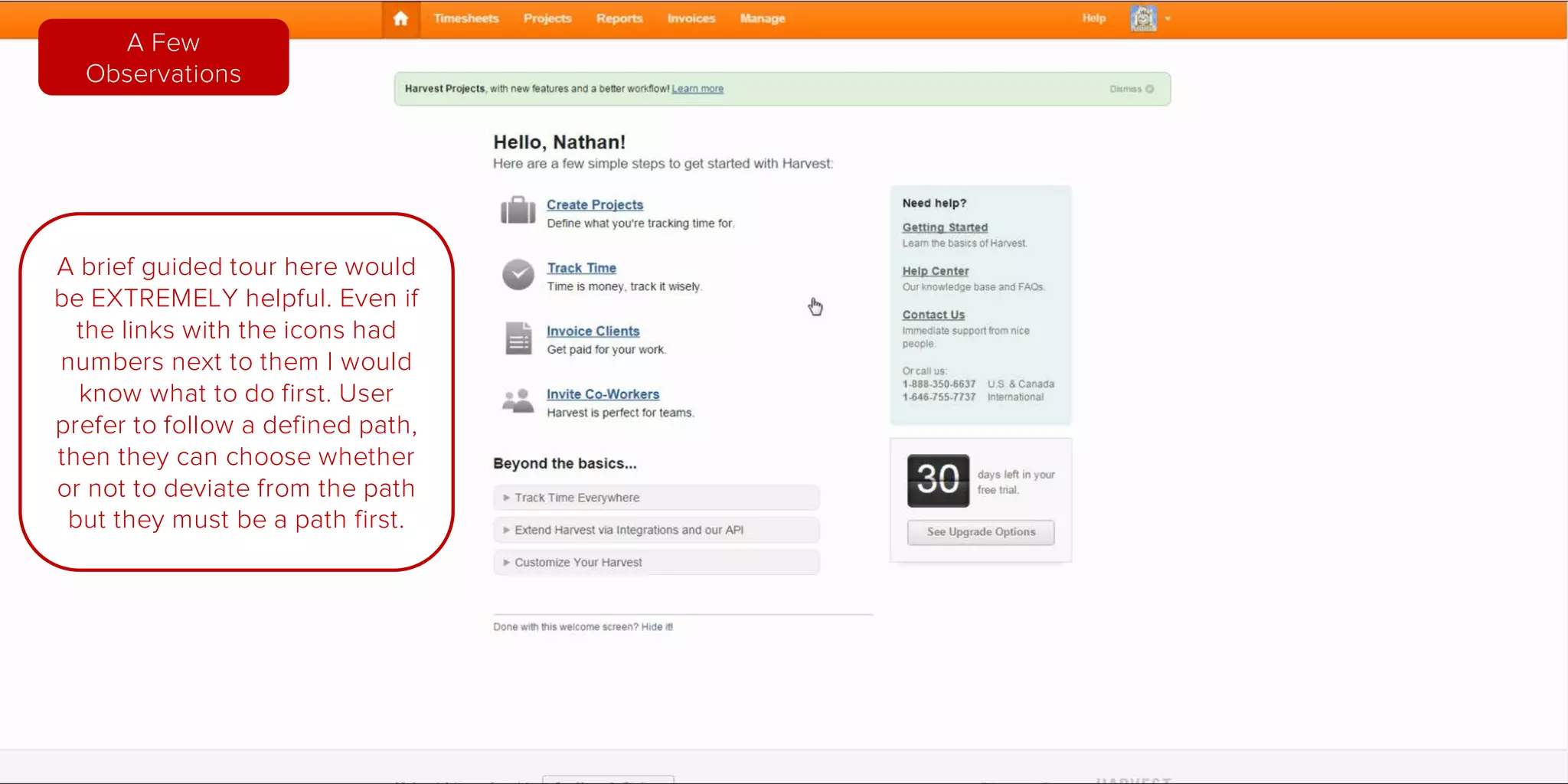
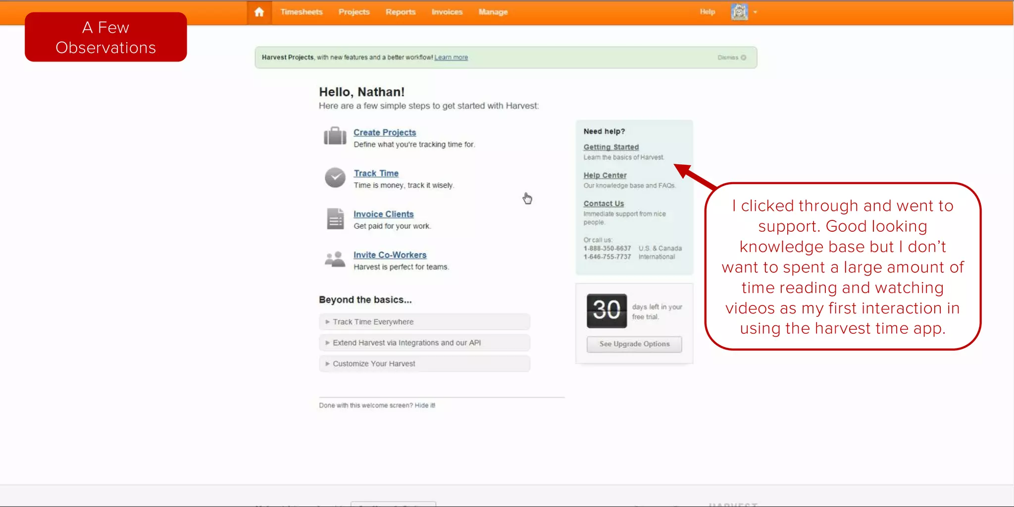
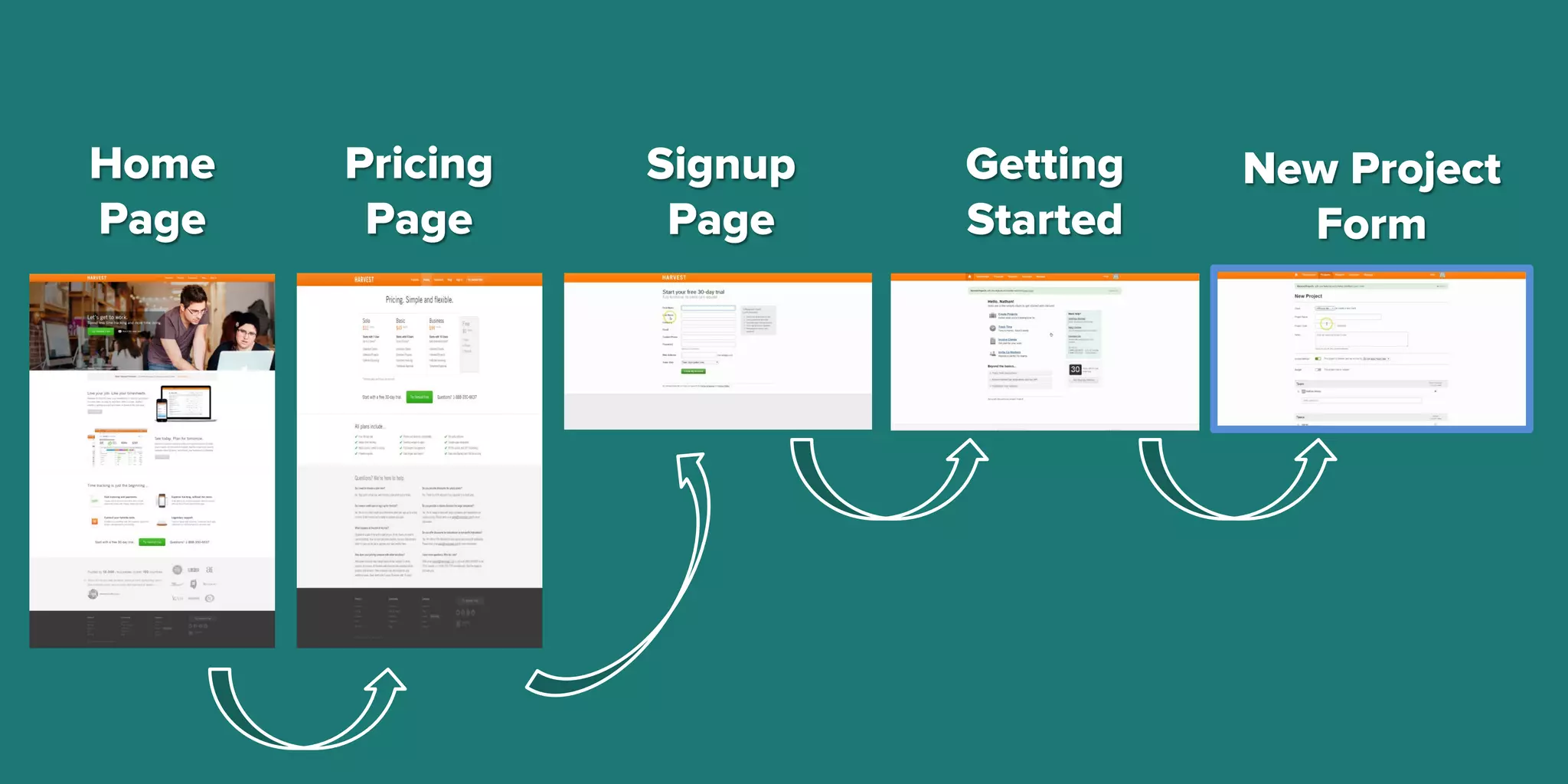
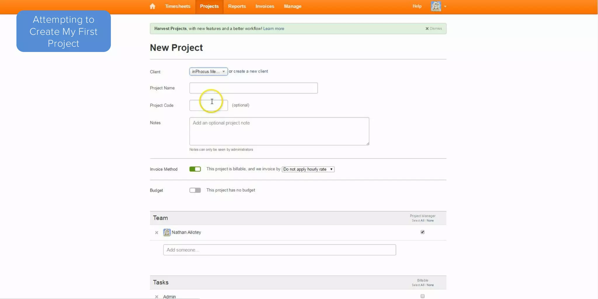
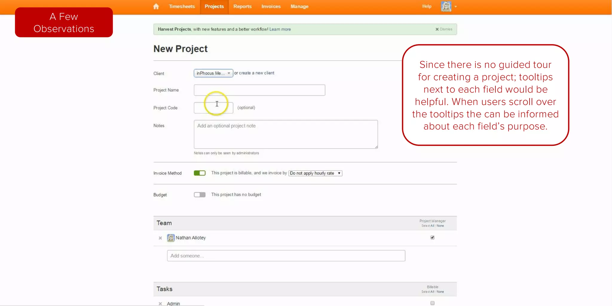
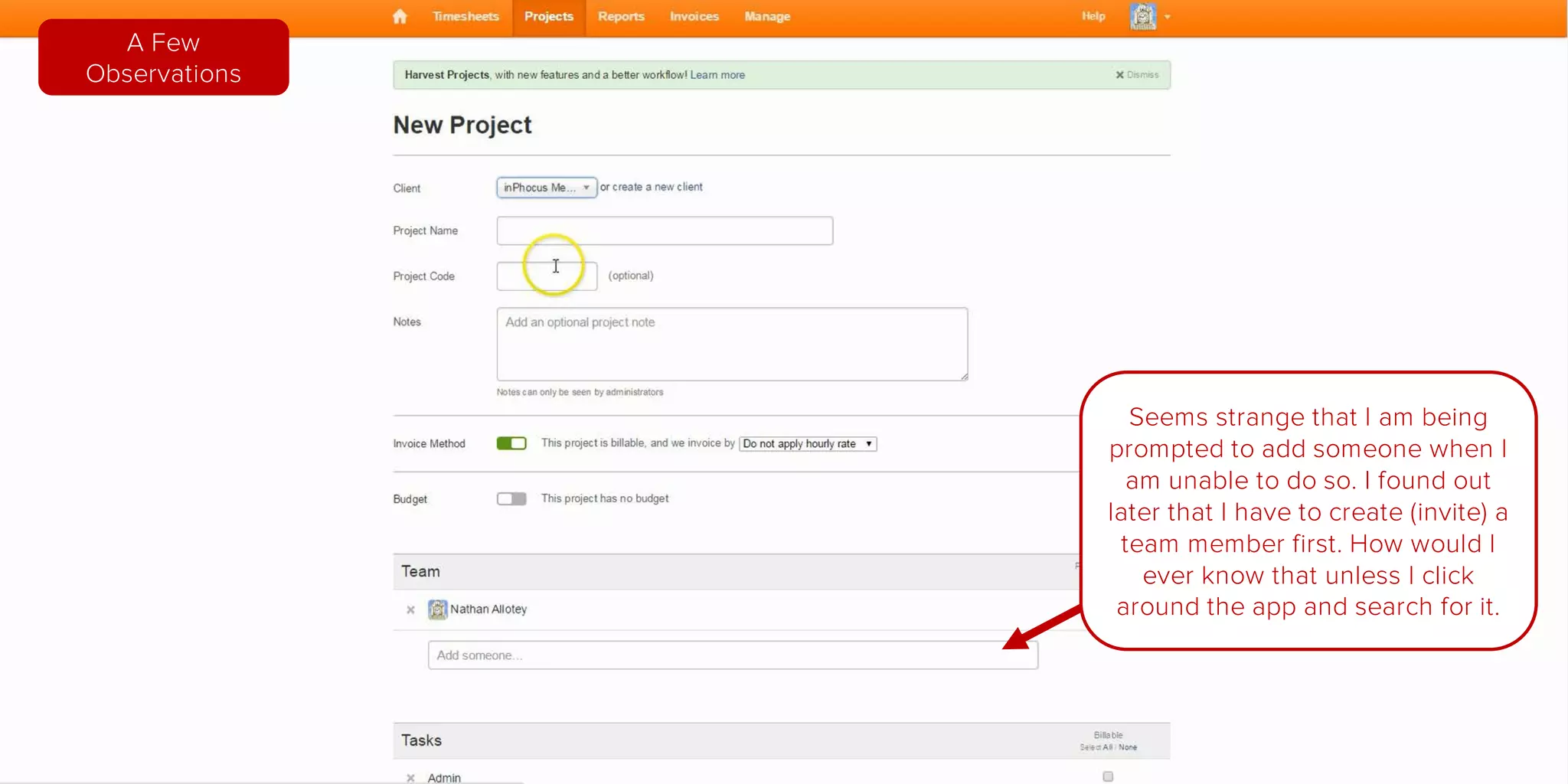

The document provides a detailed analysis of the onboarding process for Harvest, a time tracking application. It highlights strengths such as a clear homepage layout and effective calls to action, while also noting areas for improvement, such as the need for guided tours and better organization of content. Overall, it emphasizes the importance of user experience design in helping potential customers navigate the service efficiently.


![[BROCHURE] Italy Tour Project | @SlideON](https://cdn.slidesharecdn.com/ss_thumbnails/brochure8-251215152319-2805af68-thumbnail.jpg?width=640&height=640&fit=bounds)


