Download as PDF, PPTX
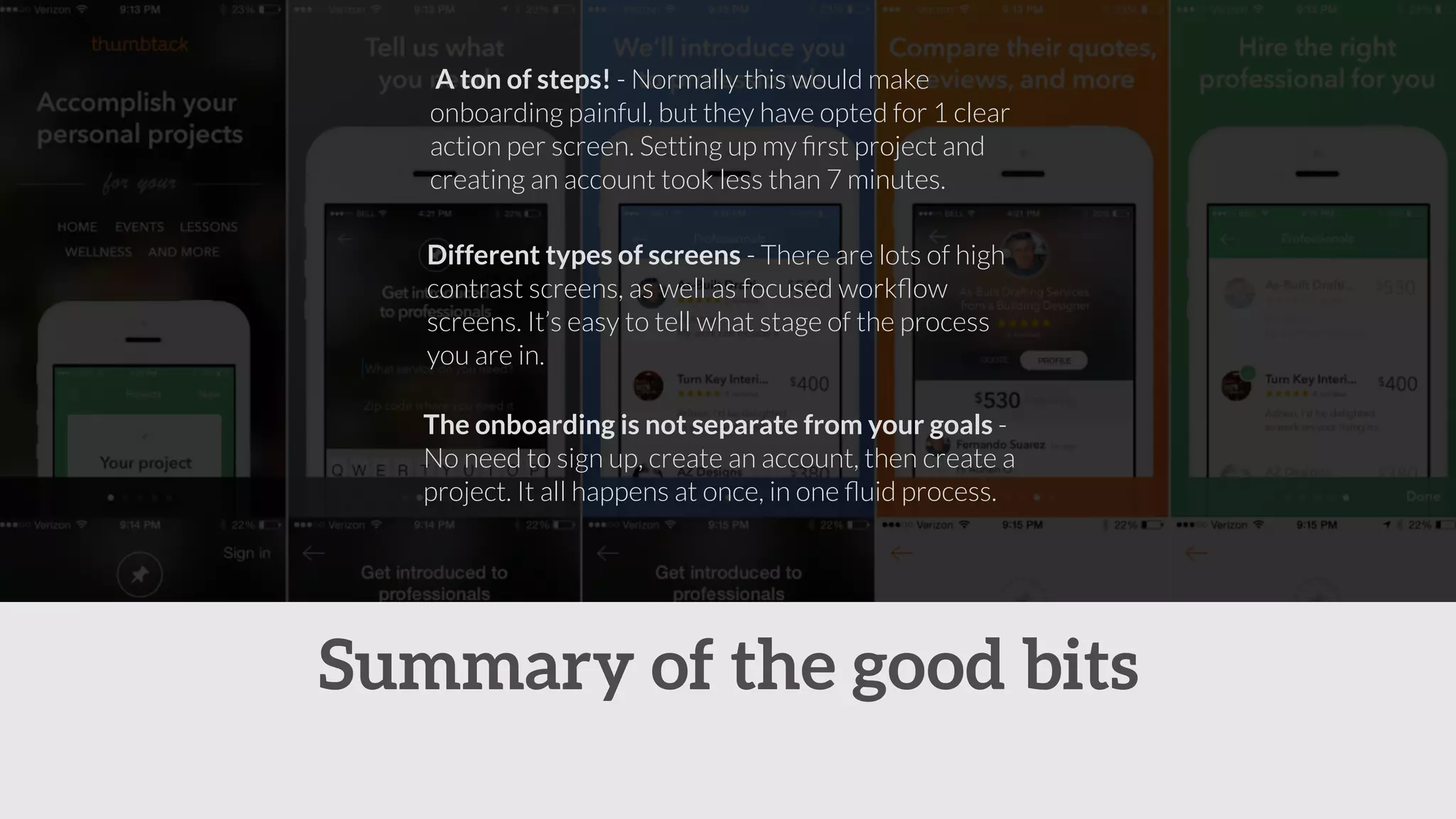
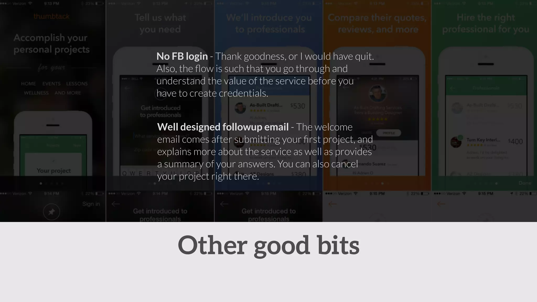
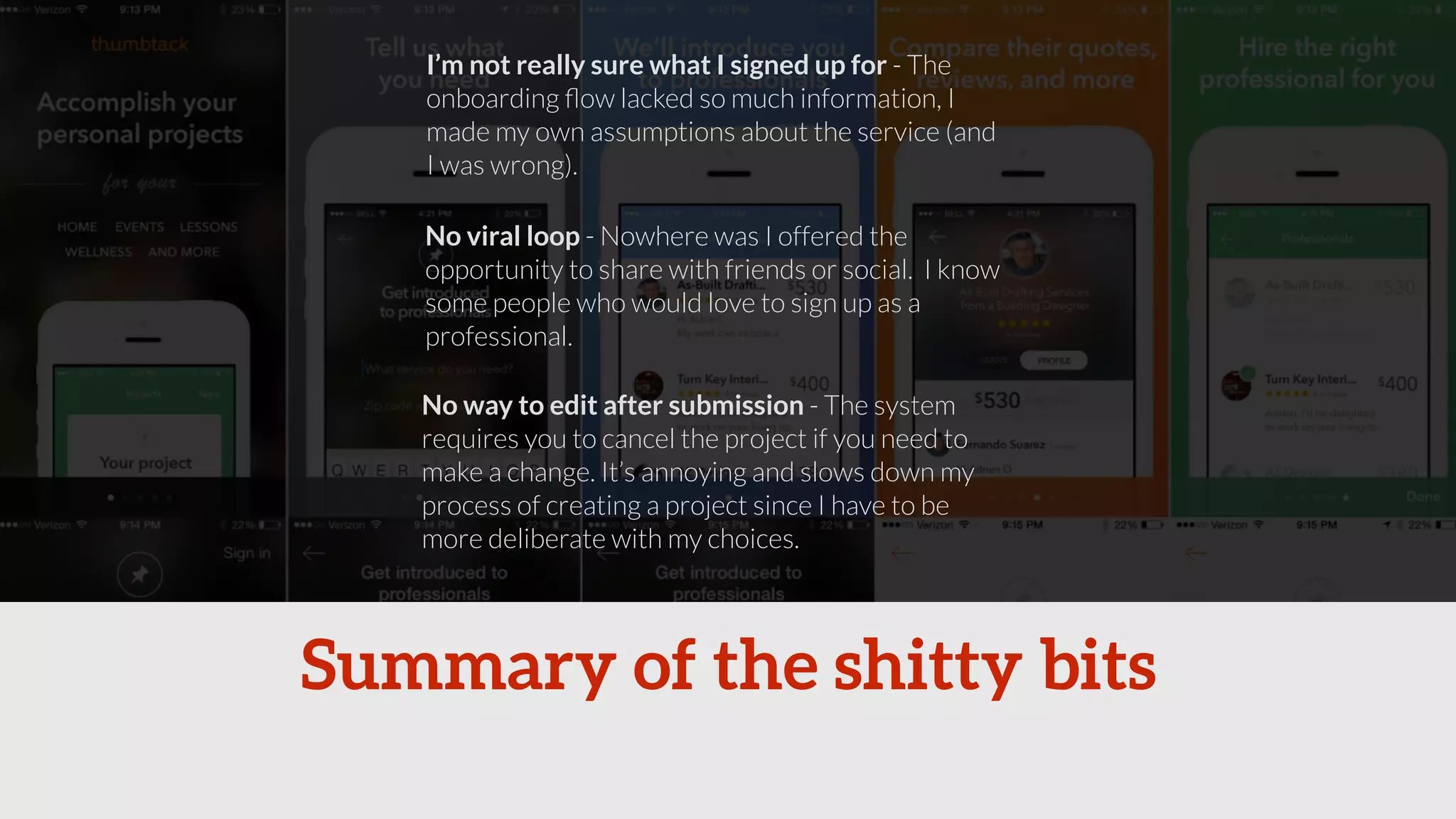
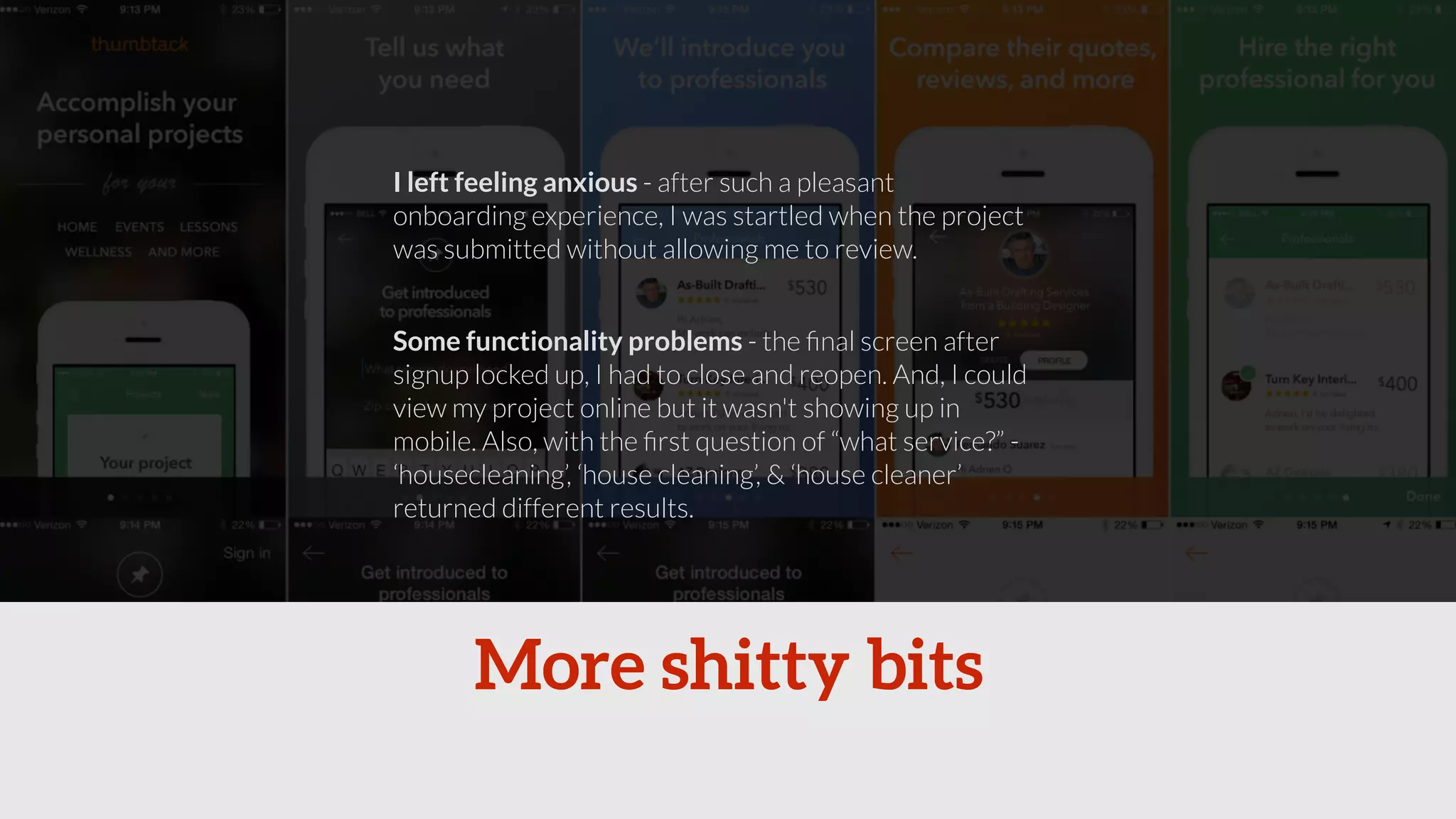
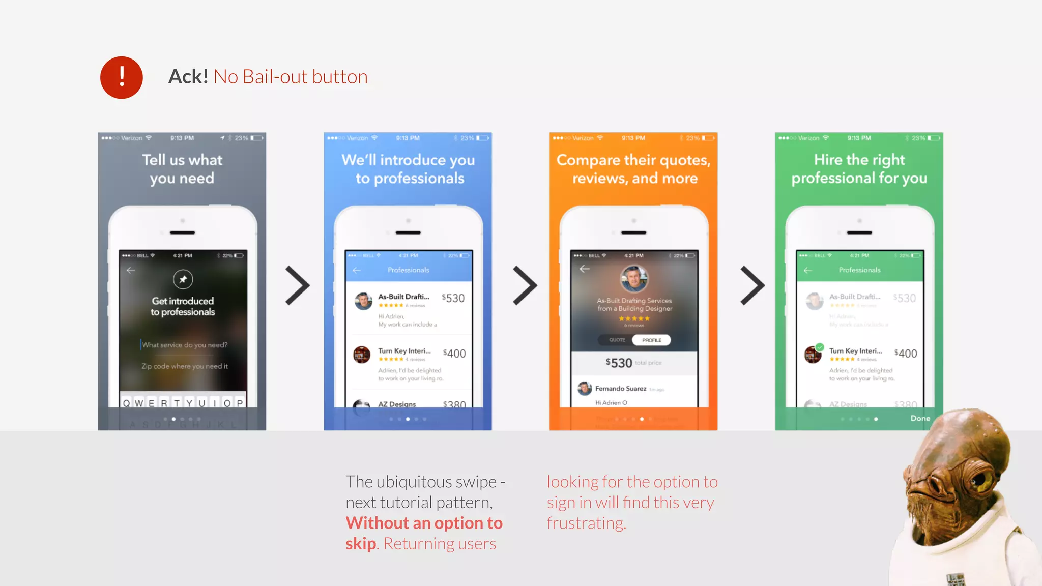
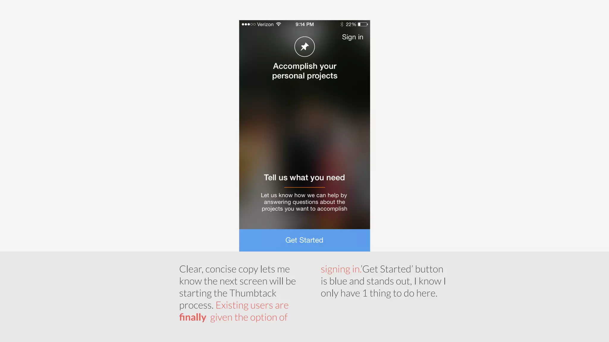
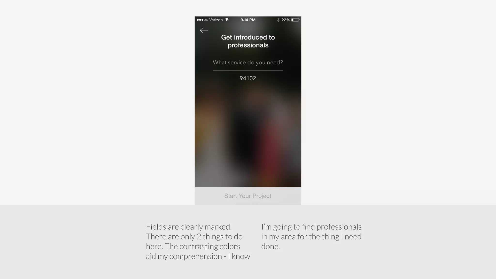
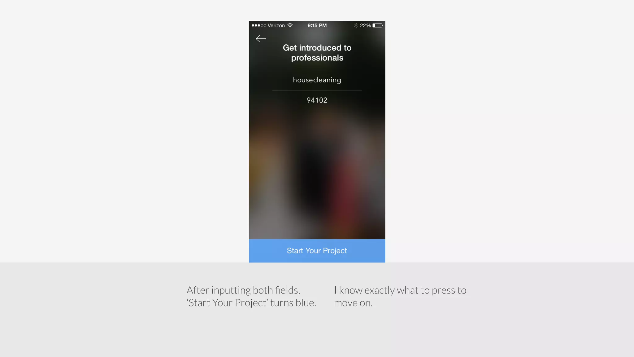
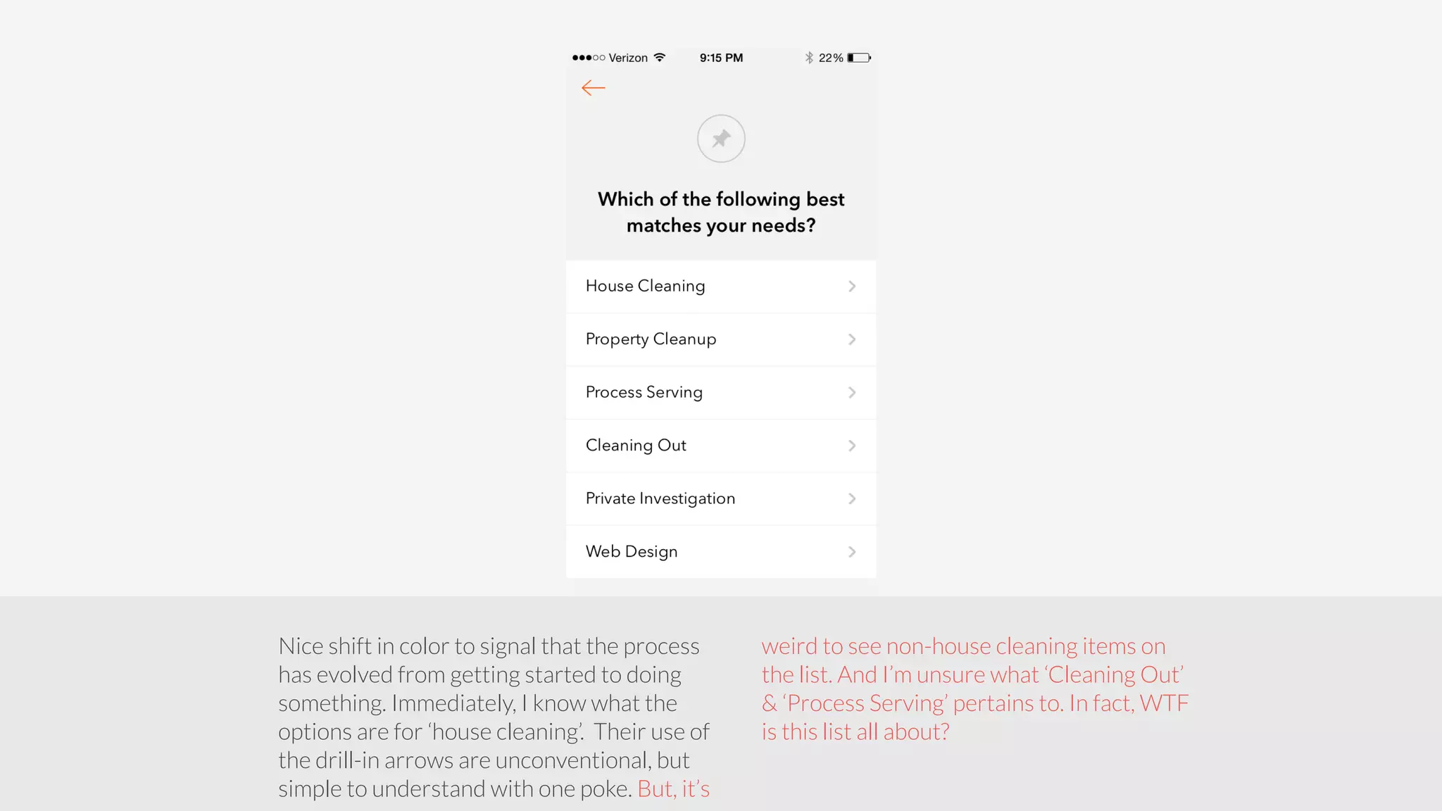
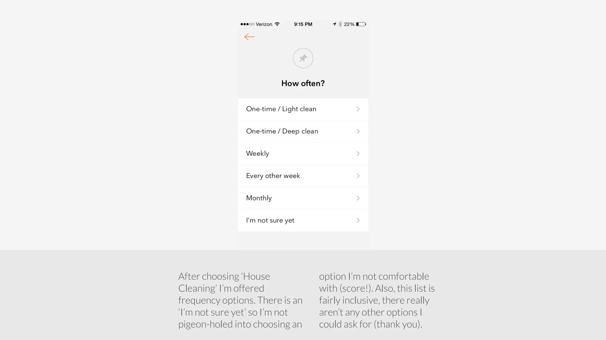
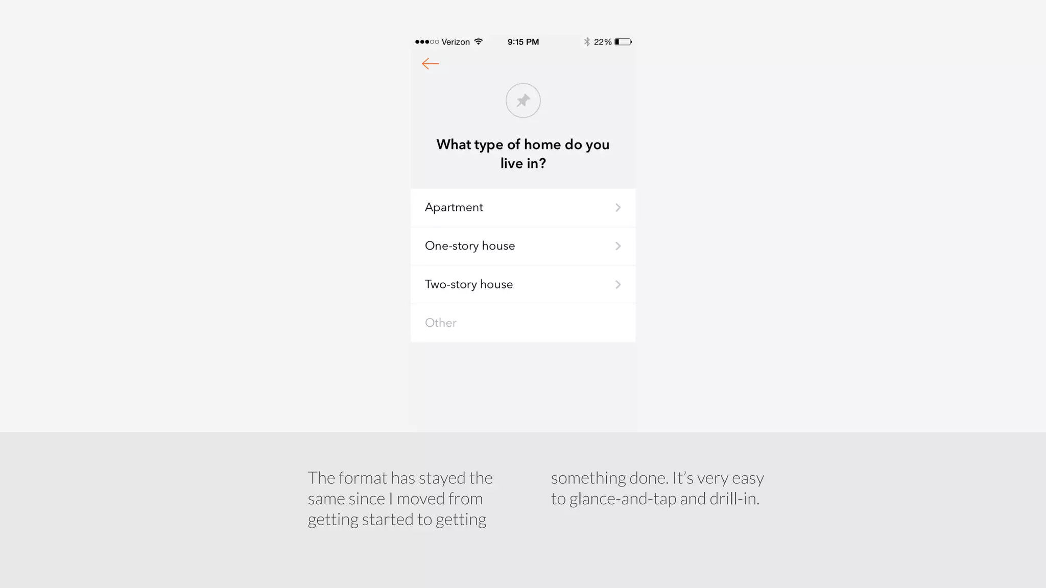
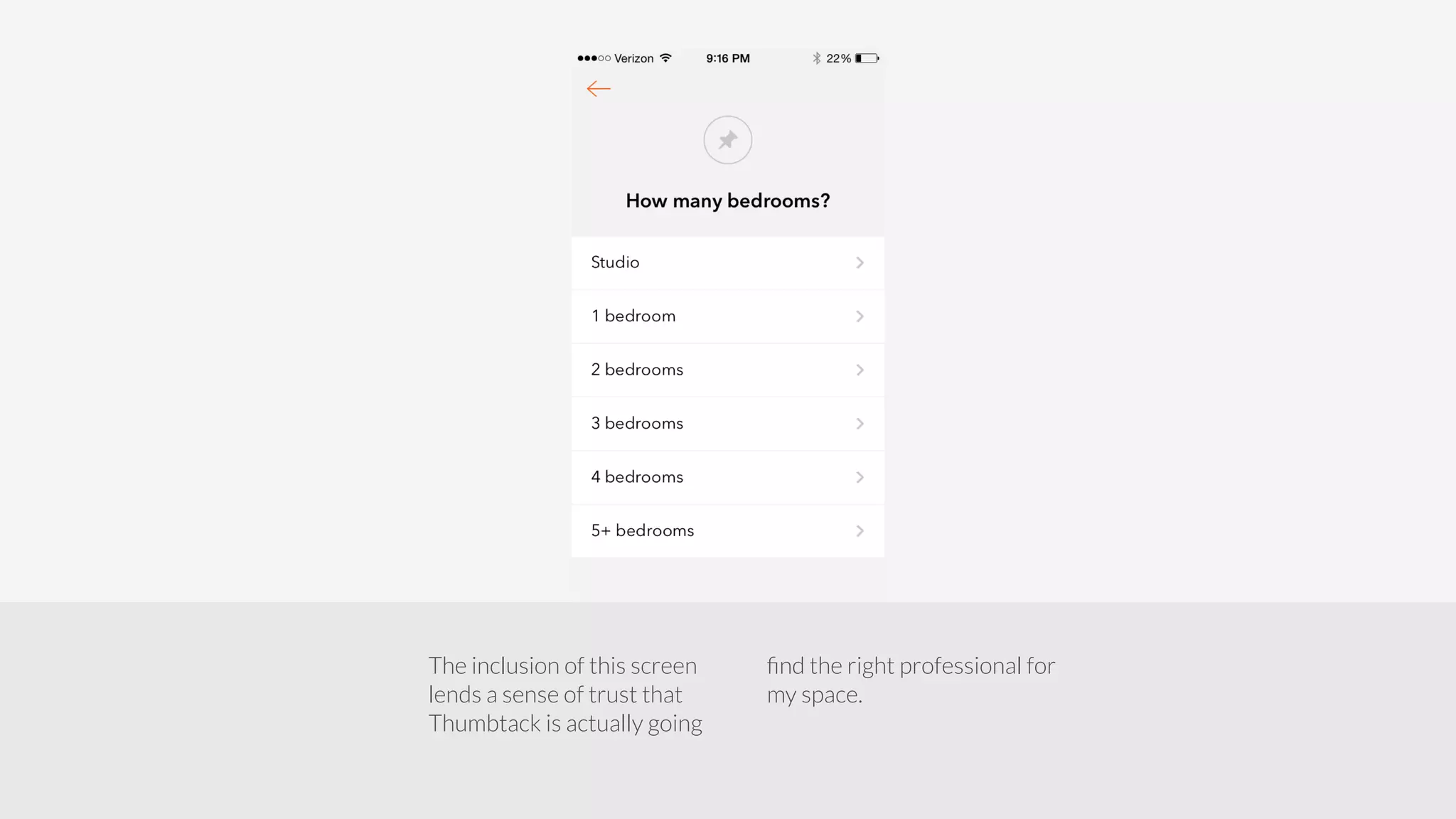
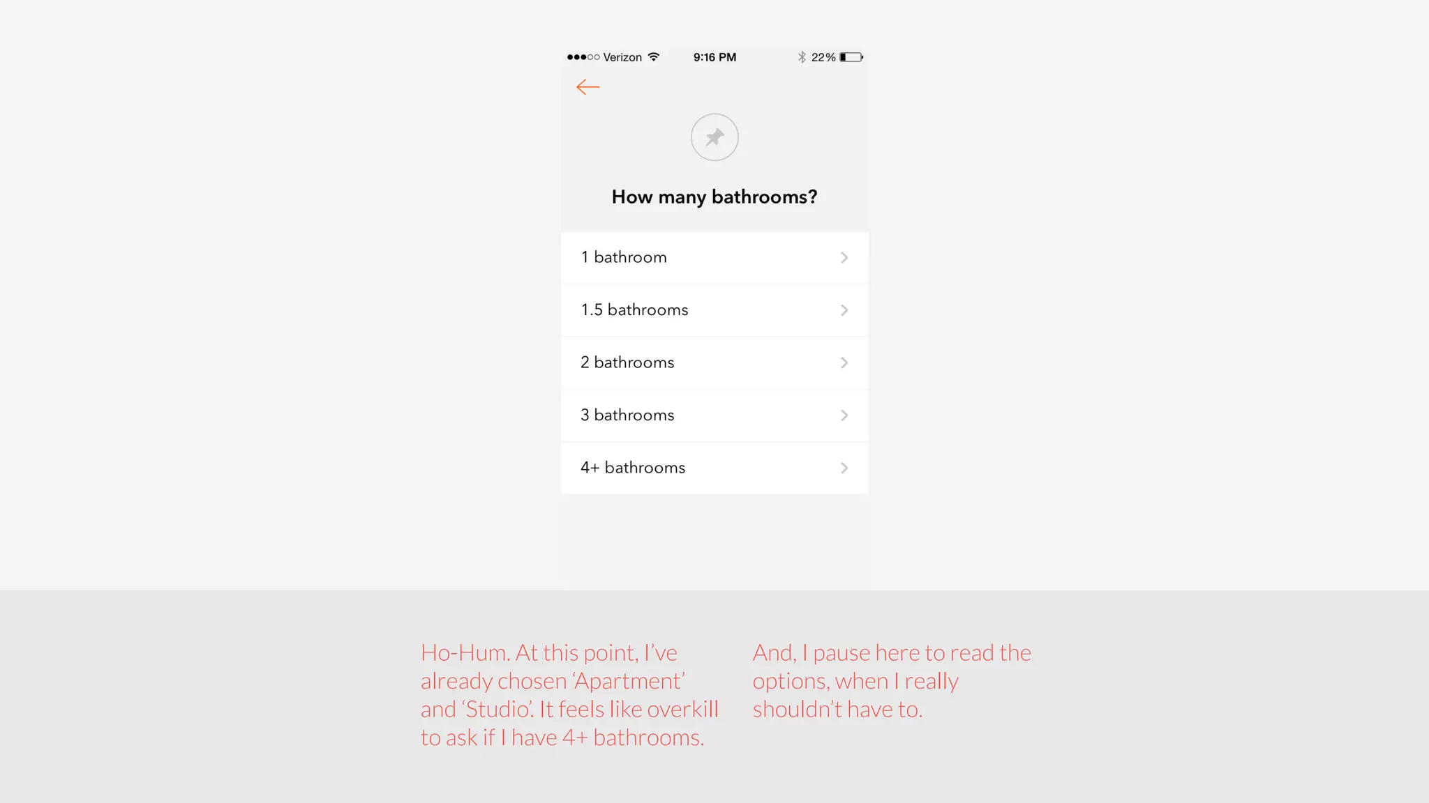
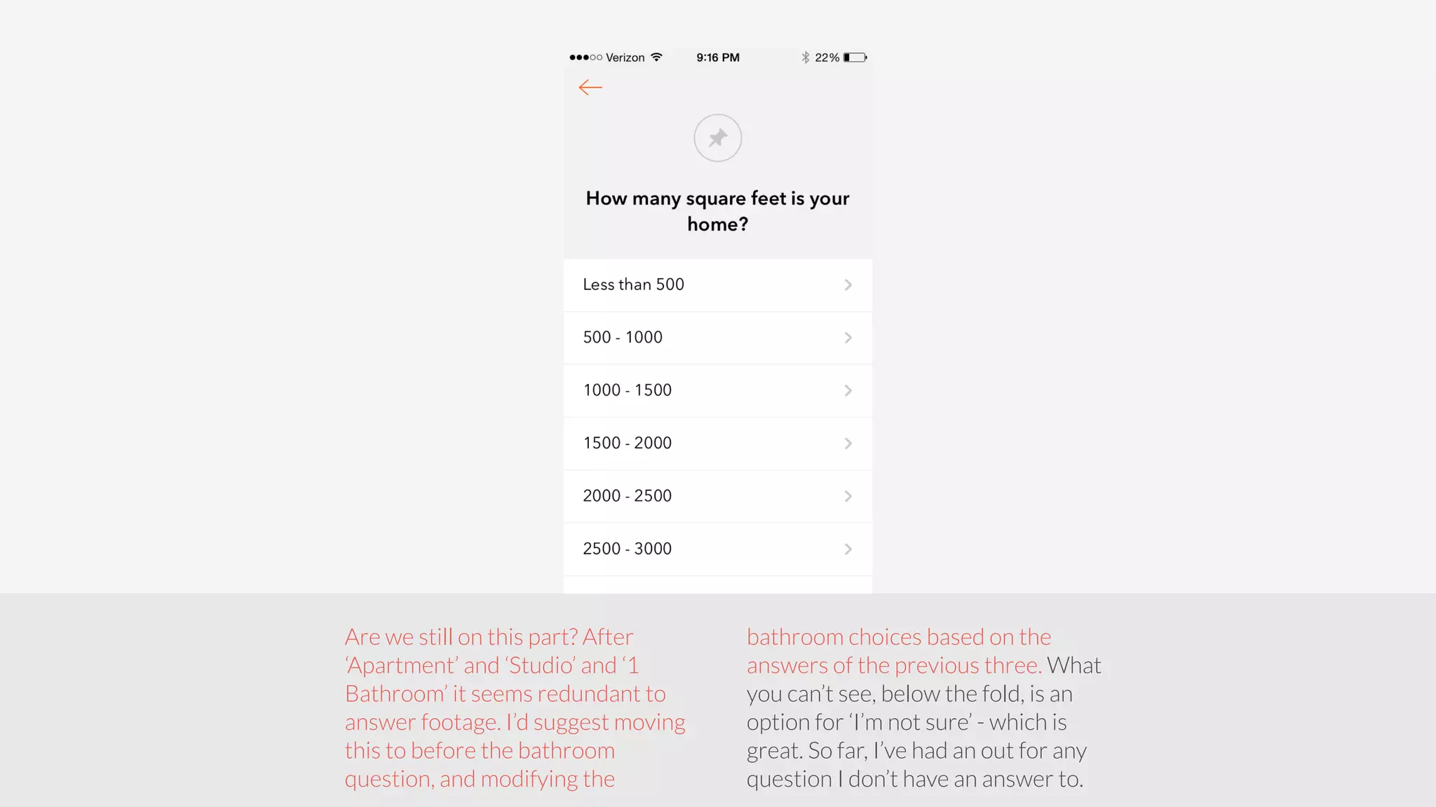
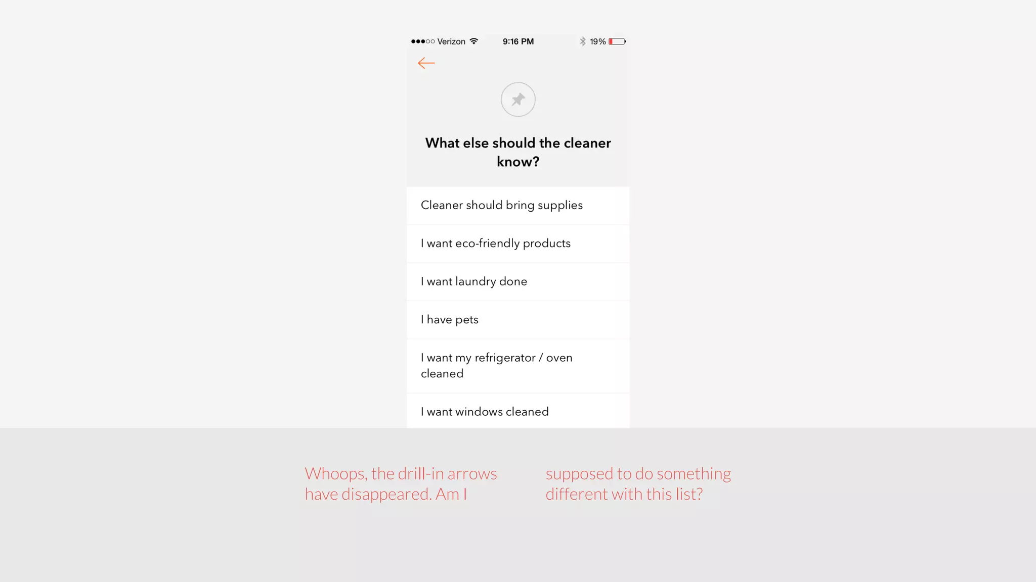
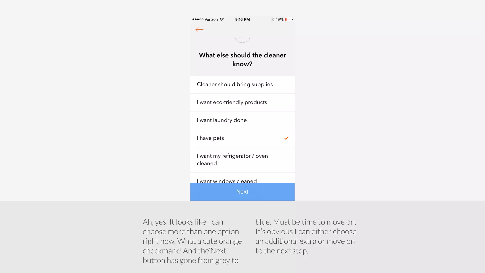
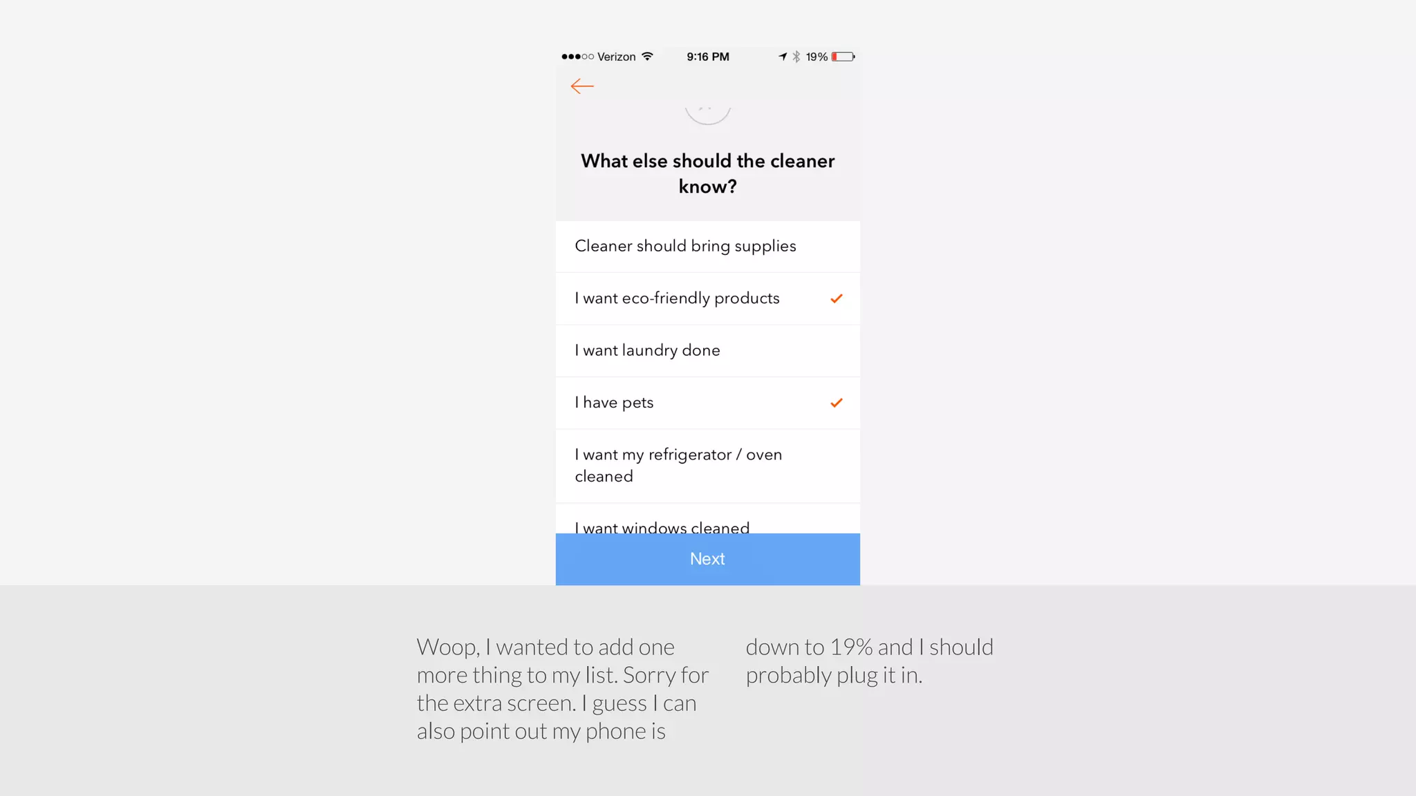
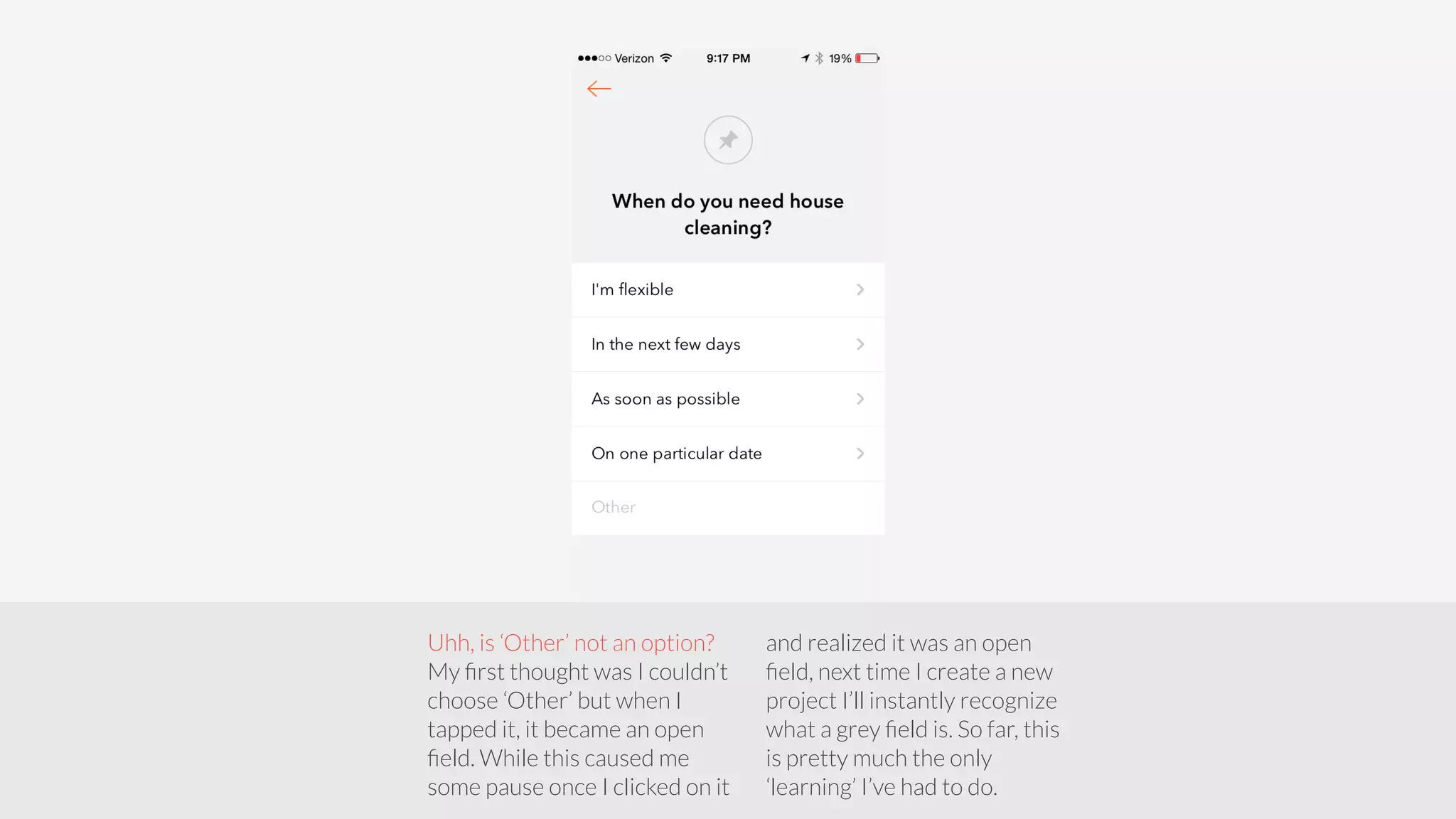
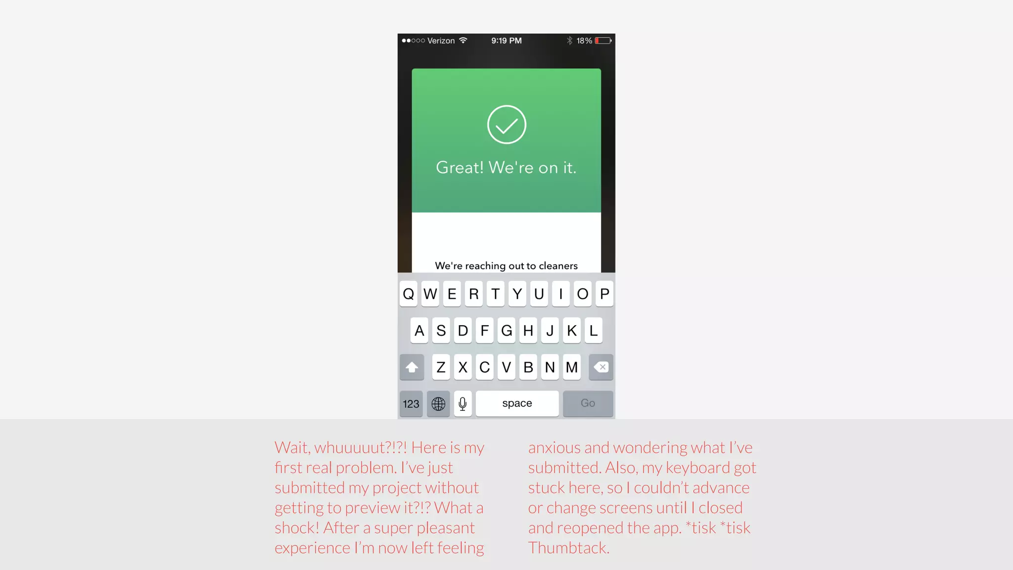

Thumbtack's mobile onboarding flow is streamlined, allowing users to create an account and initiate a project in under 7 minutes with clear actions on each screen. However, the process has some drawbacks, including a lack of information leading to user confusion, inability to edit submissions, and a significant anxiety from submitting a project without previewing it. Overall, the onboarding experience is intuitive with effective design, but it could benefit from improvements to reduce user anxiety and enhance functionality.

![[WMD 2015] Thumbtack >> Sander Daniels, "The Big Reveal: The Correlation Betw...](https://cdn.slidesharecdn.com/ss_thumbnails/09sanderdaniels-150430214726-conversion-gate02-thumbnail.jpg?width=640&height=640&fit=bounds)


