This document describes a group project analyzing customer purchasing patterns in different departments of a grocery store using multidimensional scaling. The group collected hourly sales data for 10 departments from a local grocery store. They normalized the data and calculated distances between departments using Minkowski distance formulas. They then used multidimensional scaling to plot the departments and show their similarities based on busy times. The results could provide insight for grocery store layout and planning.

![during this time, so on Tuesday morning around 10 am he went in to the local QFC in person to
observe the situation firsthand.
Upon speaking to the manager, she led Gerard into the backroom of the store and introduced
him to her bookkeeper. From this point, Gerard worked directly with the bookkeeper to obtain
data that he felt could be useful to our project. Gerard was able to obtain an hour by hour
breakdown of the activity (i.e. item count, sales amount, and customer count) of each of the 10
departments of the store (packaged produce, deli, bakery, dairy, meat, dry goods, fresh produce,
seafood, coffee, and sushi). Unfortunately, this was not the data that we had originally intended
on receiving for our grocery store checkout simulation, but that did not mean that it wasn’t useful.
We met up as a team and discussed how we wanted to move forward with this new information.
We brainstormed a proposal for a new project that we could formulate, based on the data that we
were provided. We settled on creating an MDS model comparing the different departments on an
hour by hour basis, based on their normalized distributions for each indicator. The details of the
model are explained below.
2.2 Similar Modelings
Multidimensional scaling (MDS) is a set of data analysis techniques that display the structure of
distance-like data as a geometrical picture. Evolving from the work of Richardson, [1] Torgerson
proposed the first MDS method and coined the term.[2]. MDS is now a general analysis technique
used in a wide variety of fields, such as marketing, sociology, economies etc. In 1984, Young and
Hamer published a book on the theory and applications of MDS, and they presented applications
of MDS in marketing. [3]
J.A. Tenreiro Machado and Maria Eugenia Mata from Portugal analyzed the world economic
variables using multidimensional scaling[4] that is similar as we do. Tenreiro and Mata analyze
the evolution of GDP per capita,[5] international trade openness, life expectancy and education
tertiary enrollment in 14 countries from 1977 up to 2012[6] using MDS method. In their study,
the objects are country economies characterized by means of a given set of variables evaluated
during a given time period. They calculated the distance between i-th and j-th objects by taking
difference of economic variables for them in several years period. They plot countries on the graph
and distinguish countries by multiple aspects like human welfare, quality of life and growth rate.
Tenreiro and Mata concluded from the graphs that the analysis on 14 countries over the last 36
years under MDS techniques proves that a large gap separates Asian partners from converging
to the North-American and Western-European developed countries, in terms of potential warfare,
economic development, and social welfare.
The modeling Tenreiro and Mata use is similar as we do. In our projects, the objects are
departments in grocery store. They studied the difference/similarity between country economies
through years, while we study the difference/similarity between different departments through
hours in a day. In Tenreiro and Mata’s research, the countries developed at the same time are
close on the graphs; in our study, the store departments that are busy at the same time are close
on the graphs. However, the database of our project is much smaller than theirs. We compared
departments from the data of the number of items sale, customers’ number and the total amount
sale at a given time period. Tenreiro and Mata’ s data is more dimensional, from GDP per capita,
economic openness, life expectancy, and tertiary education etc. And also our project studies
similarity of busyness from another side: percentage of each department sale at the given hour.
2.3 Similar Problems
The objective of our project is to help the grocery store owner to plan the layout of different blocks
of store and increase store’s sale by finding the interrelationships of busyness between products
from different departments.
The problem of how to layout a grocery store to maximize the purchases of the average customer
is discussed in many works, through both aspects of merchandising and mathematics. As mentioned
by one article, grab-and-go items such as bottled water and snacks should be placed near the
entrance; Deli and Coffee Bar should be placed in one of the front corners to attract hungry
customers; Cooking Ingredients, and Canned Goods should be placed in the center aisles to draw
customers to walk deeper and shop through nonessential items.[8] There are also many economists
and mathematicians working on similar problems. In the paper written by Boros, P., Fehér, O.,
Lakner, Z., traveling salesman problem (TSP) was used to maximize the shortest walking distance
3](https://image.slidesharecdn.com/math-381-project2-170127205549/85/Grocery-Store-Classification-Model-3-320.jpg)
![for each customer according to different arrangements of the departments in the store.[9] The results
showed that the total walking distances of customers increased in the proposed new layout.[9] Chen
Li from University of Pittsburgh modeled the department allocation design problem as a multiple
knapsack problem and optimized the adjacency preference of departments to get possible maximum
exposure of items in the store, and try to give out an effective layout.[10] Similar optimization was
used in the paper by Elif Ozgormus from Auburn University.[11] To access the revenue of the store
layout, she used stochastic simulation and classified departments in to groups where customers
often purchase items from them concurrently.[11] By limiting space, unit revenue production and
department adjacency in the store, she optimized the impulse purchase and customer satisfaction
to get a desired layout.[11]
All three papers have similar basic objectives to ours. The paper by Boros et al. was aiming to
maximize the total walking distance of each customer and thus promote sales of the store.[9] Li’s
paper also focused on profit maximization but with considerations of the exposure of the items and
adjacencies between departments.[10] He is the first person to incorporate aisle structure, depart-
ment allocation, and departmental layout together into a comprehensive research.[10] The paper by
Ozgormus took revenue and adjacency into consideration and worked on the model specifically for
grocery stores towards the objectives of maximizing revenue and adjacency satisfaction.[11] In our
paper, we simply focus on the busyness of different departments and use multidimensional scaling
to model the similarities between each department and thus provide solid evidence for designing
an efficient and profitable layout. Instead of having data on comprehensive customer behavior in
the store, we have data of sales from the register point of view.
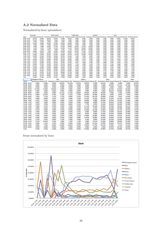
3 The Model
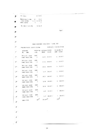
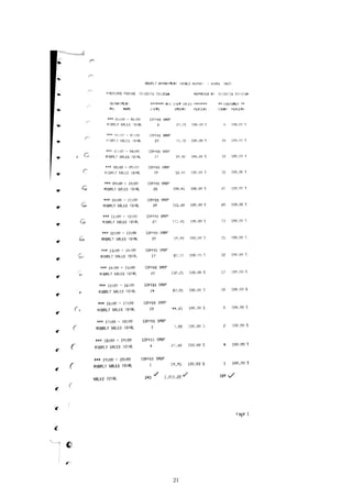
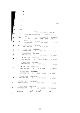
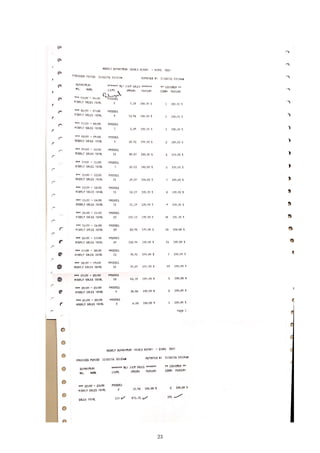
As a result of the data acquisition process described in the Background section, we were able to
obtain an hourly breakdown of the number of items, total sales, and number of customers that
purchase items from the local QFC that we collected from. The data presents a 24-hour snapshot
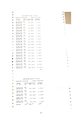
of a standard day within the grocery store. The data was presented in individual printouts of each
department’s activity for the day, therefore the first step was to transcribe all of the information
from physical paper form onto an Excel spreadsheet. The results are presented in the Appendix.
The next step was to separate and normalize each of the different activity indicators based
on their departmental, as well as hourly, totals. In this way, we transformed the raw data into
standardized distributions whose area under the curve summed to one. Specifically, we separated
the data into three different 24 × 10 matrices (i.e. items, sales, and customers), where the rows
of the matrix represent the hourly data for a 24-hour time period and the columns represent the
each of the 10 departments. For each of these matrices we normalized each entry by their daily
departmental totals, i.e. for each department (or column) we divided each entry in the column by
the summed total of the column:
MATLAB Code:
for i = 1:10
items_normD(:,i) = items_raw(:,i)/sum(items_raw(:,i));
sales_normD(:,i) = sales_raw(:,i)/sum(sales_raw(:,i));
cust_normD(:,i) = cust_raw(:,i)/sum(cust_raw(:,i));
end
Additionally, we normalized each of the 24 rows (hourly data) by the row sum of the activity for
that particular hour throughout all departments:
MATLAB Code:
for i = 1:24
items_normH(i,:) = items_raw(i,:)/sum(items_raw(i,:));
sales_normH(i,:) = sales_raw(i,:)/sum(sales_raw(i,:));
cust_normH(i,:) = cust_raw(i,:)/sum(cust_raw(i,:));
end
These calculations were performed on a mid-2010 Macbook Pro, running Windows 7 - SP1, in
MATLAB R2016b Student edition. The calculations were instantaneous. The result of this nor-
malization process resulted in 6 different datasets of customer activity, i.e. the number of items,
4](https://image.slidesharecdn.com/math-381-project2-170127205549/85/Grocery-Store-Classification-Model-4-320.jpg)
![sales, and the number of customers each normalized by their daily departmental totals and addition-
ally by their hourly store totals. We ran each of these data sets through the distance calculations,
described below, in order to generate different variations of the information, ultimately in search
of the best “goodness of fit.”
In order to create an MDS model of the above mentioned data sets, our next step was to run
each data sets through our distance algorithm in order to calculate a single dimensional distance
between different departments. In other words, we iterated through each of the departments, a,
and compared them to each of the other department’s, b, hourly customer activity. We utilized
the Minkowski distance formula for our distance calculations [7]:
distance =
24
i=1
|ra,i − rb,i|p
1
p
where, i represents the hourly time period (e.g. i = 1 represents 12 o’clock AM to 1 o’clock AM),
a and b represent each of the different departments, and p represents the power of the Minkowski
algorithm. The most common powers, p, that are considered are powers of 1, 2, and ∞. A power
of 1 is commonly referred to as the Manhattan distance, a power of 2 is commonly referred to as
the Euclidean distance, and power ∞ is commonly referred to as Supremum distance. We used R
version 3.3.2 on a Late 2013 MacBook Pro running macOS 10.12.1 to carry out our calculations,
which ran instantly. Specifically, we ran the following commands in R:
library ( readr )
library ( wordcloud )
items <− read . csv ( f i l e = "ItemsHourLabel . csv " , head = TRUE, sep = " , " )
d <− d i s t ( items , method = " e u c l i d i a n " )
l l <− cmdscale (d , k = 2)
textplot ( l l [ , 1 ] , l l [ , 2 ] , items [ , 1 ] , ann = FALSE)
Step-by-step, here is what the commands do:
library ( readr )
library ( wordcloud )
These commands import libraries that allow us to read the CSV file and create the plot.
items <− read . csv ( f i l e = "ItemsHourLabel . csv " , head = TRUE, sep = " , " )
This command reads in the formatted 24-dimensional vectors corresponding to each department
from the file “ItemsHourLabel.csv” into a table called “items”. The file “ItemsHourLabel.csv” con-
sists of rows that look like this:
Department,00:00 - 01:00,01:00 - 02:00,02:00 - 03:00,03:00 - 04:00,...
Packaged Produce,0,0,0,0.011299,0,0,0.022599,0.00565,0.022599,...
Deli,0.006135,0,0,0,0,0.02454,0.006135,0.02454,0.018405,0.02454,...
Bakery,0.001661,0,0,0,0,0.021595,0.019934,0.059801,0.043189,...
.
.
.
In this case, each row represents the number of items sold in each department in a given hour
divided by the total number of items sold in the department over the course of the day. The
department names at the beginning of each row are used for the graphic output.
d <− d i s t ( items , method = " e u c l i d i a n " )
This command takes the table “items” and creates a matrix of distances between every row of the
table. Here, the distance method is specified as “euclidian”, which means that the distance between
5](https://image.slidesharecdn.com/math-381-project2-170127205549/85/Grocery-Store-Classification-Model-5-320.jpg)
![row i and row j will be calculated as
dij =
24
i=1
|ra,i − rb,i|
2
.
l l <− cmdscale (d , k = 2)
Here, the k = 2 specifies a two-dimensional model. The output is a list of two-dimensional coor-
dinates, one for each object in the original set:
> head(ll, 10)
[,1] [,2]
[1,] -0.032088329 0.01770756
[2,] -0.027631806 0.02097795
[3,] -0.028511119 0.05441644
[4,] -0.013549396 -0.01713736
[5,] -0.086806729 -0.06648990
[6,] -0.007476898 -0.01173682
[7,] -0.010818238 -0.02144684
[8,] -0.001610913 0.18130208
[9,] -0.045186100 -0.12261632
[10,] 0.253679528 -0.03497679
textplot ( l l [ , 1 ] , l l [ , 2 ] , items [ , 1 ] , ann = FALSE)
This command plots the result with the names of the departments. ll[,1], ll[,2] specifies
that the first column of ll gives the x-coordinates and the second column gives the y-coordinates.
items[,1] specifies that the first column of the table “items” gives the labels for the data points.
ann = FALSE removes the x and y labels from the plot. The results of these commands are
presented in the following section.
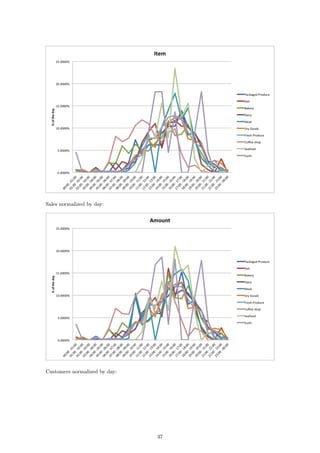
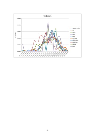
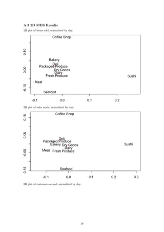
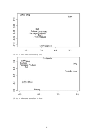
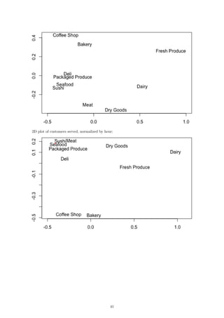
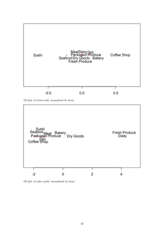
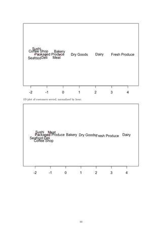
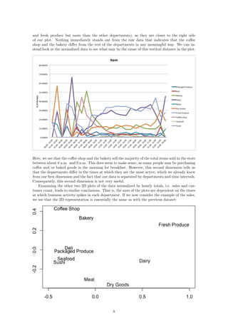
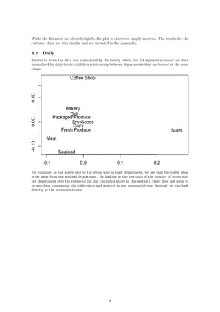
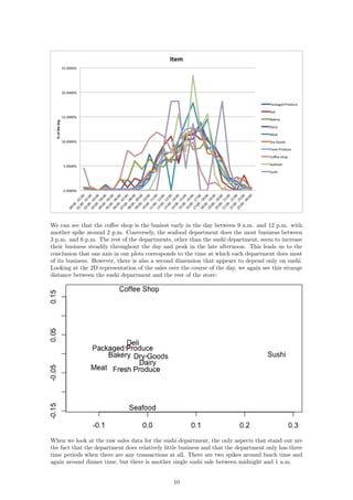
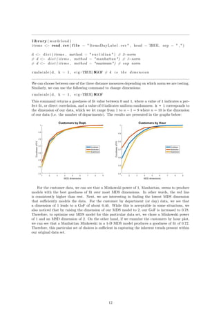
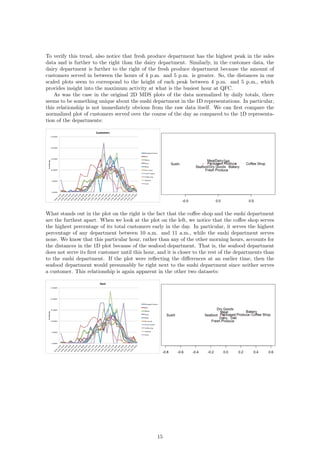
4 Results
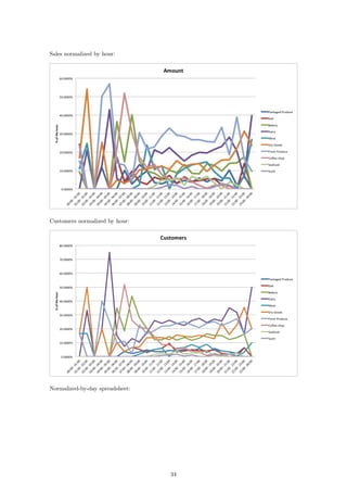
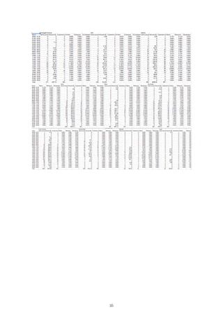
4.1 Hourly
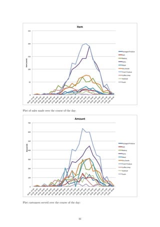
In order to draw conclusions about the two-dimensional representation of our data, we can compare
them to the original data after it has been normalized by the hourly store totals. The result of
these datasets is the 2D plot of the items per hour:
6](https://image.slidesharecdn.com/math-381-project2-170127205549/85/Grocery-Store-Classification-Model-6-320.jpg)
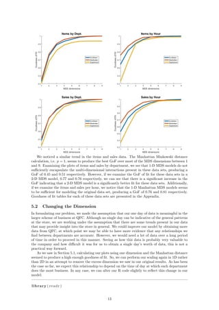
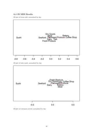
![library ( wordcloud )
items <− read . csv ( f i l e = " SalesHourLabel . csv " , head = TRUE, sep = " , " )
d <− d i s t ( items , method = "manhattan" )
l l <− cmdscale (d , k = 1)
# Column of zeros used to p l o t a l i n e in one dimension
textplot ( l l , c (0 ,0 ,0 ,0 ,0 ,0 ,0 ,0 ,0 ,0) , items [ , 1 ] , yaxt = ’n ’ , ann = FALSE)
If we now compare our raw data to our 1D representations, we see a stronger relationship between
the dimension and the data itself. Consider first the number of items sold over the course of each
hour:
The fresh produce department and the dairy department sell the most items at their peaks. This
is reflected in the plot as those two departments are the furthest away from the rest. In fact, if we
go through the lines from top to bottom in the plot on the left, we will see that this is exactly the
order in which the departments appear from right to left in the second plot. We can see the same
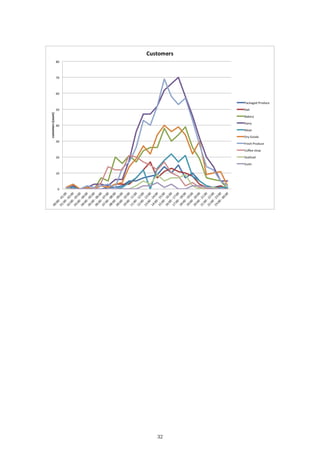
relationship reflected in the plots for sales per hour and customers per hour:
14](https://image.slidesharecdn.com/math-381-project2-170127205549/85/Grocery-Store-Classification-Model-14-320.jpg)

![References
[1] Richardson, M. W. (1938). Psychological Bulletin, 35, 659-660
[2] Torgerson. W. S. (1952). Psychometrika. 17. 401-419. (The first major MDS breakthrough.)
[3] Young. F. W. (1984). Research Methods for Multimode Data Analvsis in the Behavioral
Sciences. H. G. Law, C. W. Snyder, J. Hattie, and R. P. MacDonald, eds. (An advanced
treatment of the most general models in MDS. Geometrically oriented. Interesting political
science example of a wide range of MDS models applied to one set of data.)
[4] Machado JT, Mata ME (2015) Analysis of World Economic Variables Using Multidimensional
Scaling. PLOS ONE 10(3): e0121277
http://dx.doi.org/10.1371/journal.pone.0121277
[5] Anand S, Sen A. The Income Component of the Human Development Index. Journal of
Human Development. 2000;1
http://dx.doi.org/10.1371/journal.pone.0121277
[6] World Development Indicators, The World Bank,Time series,17-Nov-2016
http://data.worldbank.org/data-catalog/world-development-indicators
[7] Wikipedia contributors. "Minkowski distance." Wikipedia, The Free Encyclopedia. Wikipedia,
The Free Encyclopedia, 1 Nov. 2016. Web. 1 Nov. 2016.
https://en.wikipedia.org/w/index.php?title=Minkowski_distance&oldid=747257101
[8] Editor of Real Simple. "The Secrets Behind Your Grocery Store’s Layout." Real Simple. N.p.,
2012. Web. 29 Nov. 2016.
http://www.realsimple.com/food-recipes/shopping-storing/
more-shopping-storing/grocery-store-layout
[9] Boros, P., Fehér, O., Lakner, Z. et al. Ann Oper Res (2016) 238: 27. doi:10.1007/s10479-015-
1986-2.
http://link.springer.com/article/10.1007/s10479-015-1986-2
[10] Li, Chen. "A FACILITY LAYOUT DESIGN METHODOLOGY FOR RETAIL ENVIRON-
MENTS." D-Scholarship. N.p., 3 May 2010. Web. 29 Nov. 2016.
http://d-scholarship.pitt.edu/9670/1/Dissertation_ChenLi_2010.pdf
[11] Ozgormus, Elif. "Optimization of Block Layout for Grocery Stores." Auburn University. N.p.,
9 May 2015. Web. 29 Nov. 2016.
https://etd.auburn.edu/bitstream/handle/10415/4494/Eozgormusphd.pdf;sequence=2
18](https://image.slidesharecdn.com/math-381-project2-170127205549/85/Grocery-Store-Classification-Model-18-320.jpg)