Download to read offline

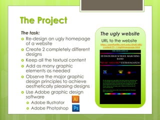
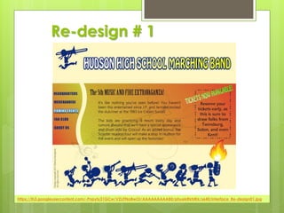
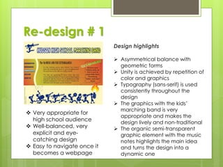
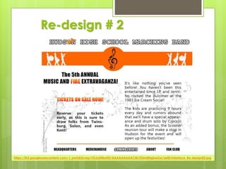

The document summarizes a graphic design project to redesign an ugly website homepage. The designer, Marina Georgieva, was tasked with creating two completely different design concepts while keeping all textual content. Both concepts observed graphic design principles and utilized Adobe software. The first design was very explicit and eye-catching with asymmetrical balance and repetition of color and graphics. It featured a marching band graphic. The second design had approximate horizontal symmetry and a more conservative grey-orange color scheme, but still included dynamic music note graphics. Both designs were intended to be easy to navigate once implemented as webpages.


