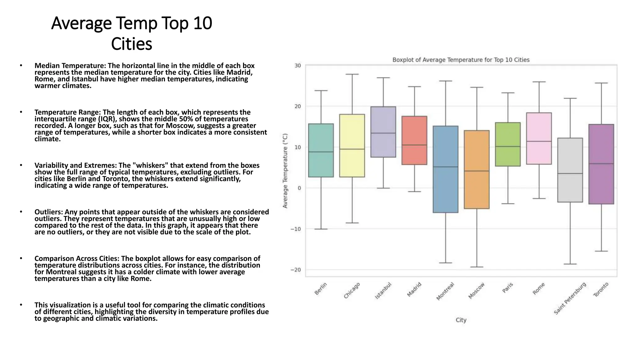
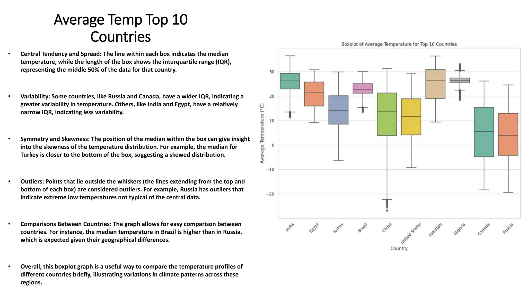
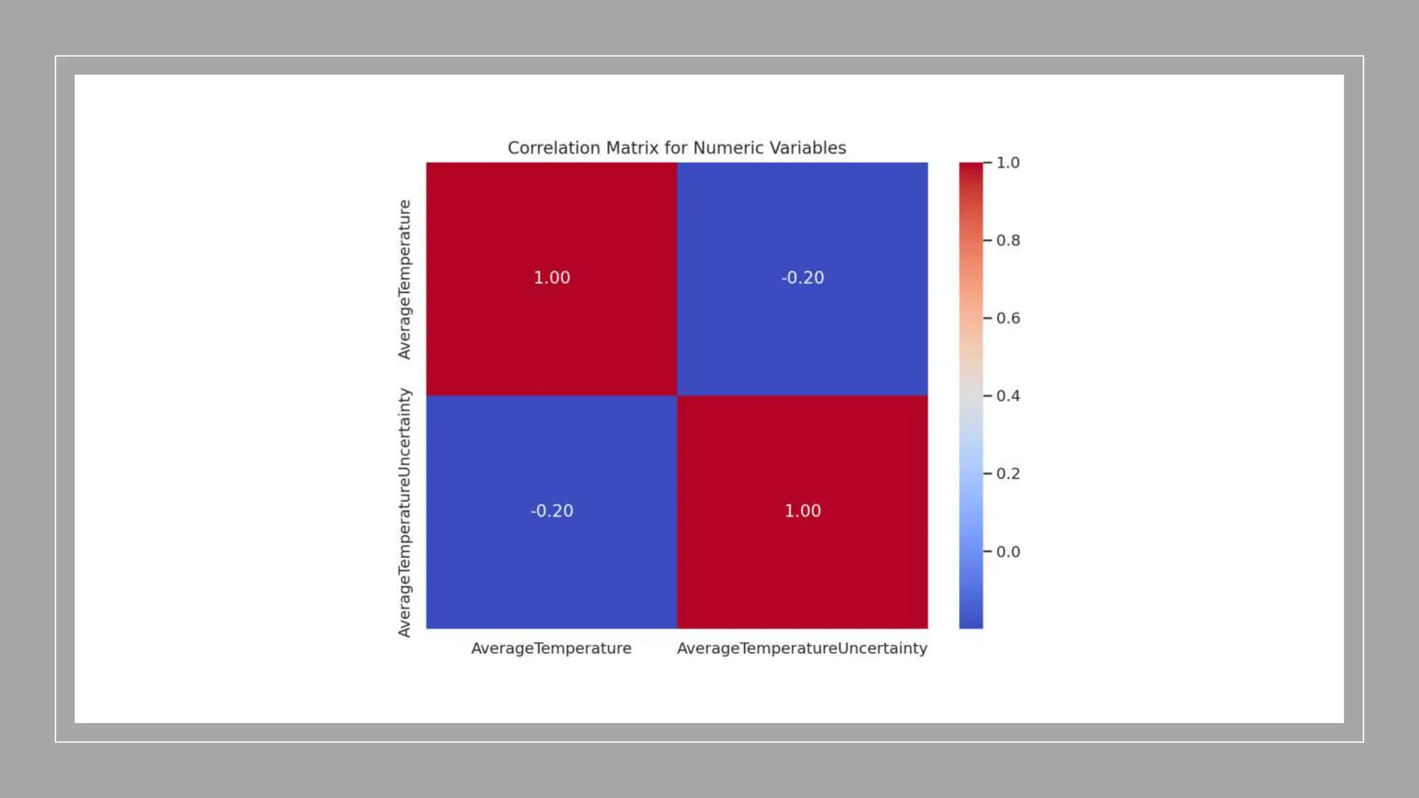
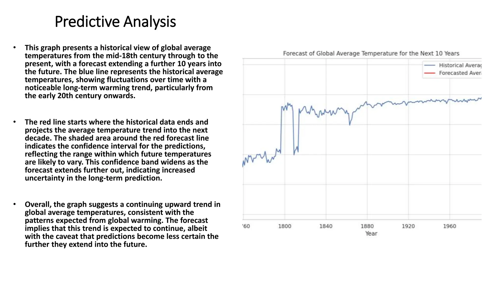
Tracing Thermal
Footprints: An In-
Depth Analysis of
Global Temperature
Trends (1850-2022)
Created by David Waynne
Introduction
• In this presentation, we will embark on an analytical expedition into the historical records of
global temperatures, covering an extensive period from 1850 to 2022. Our analysis paints a
picture of the Earth's changing climate, revealing trends and patterns that are critical to
understanding the trajectory of our global environment.
• We will unveil insights drawn from a meticulous exploration of temperature data, uncovering
the fluctuations and consistencies across different geographical landscapes. From the bustling
cities that have seen industrial revolutions to the diverse countries spanning our planet, we'll
explore how average temperatures have evolved and what they signify for our future.
• As we sift through the data, we will also delve into the nuances of temperature uncertainties,
providing a clear view of the precision and reliability of historical climate measurements. Our
journey will lead us to a forward-looking perspective, where we use the lessons of the past to
forecast potential scenarios that could unfold in the coming years.
• This presentation is not just about numbers and charts; it's a narrative about our planet's
climate history, the stories the data tells us, and the future we're steering towards. So, let us
begin our journey through time and temperature, to better understand the world we live in and
the changes we may expect.
Average Temperature
• The image shows a histogram that illustrates the distribution of
average temperatures recorded in a dataset. The x-axis indicates
the average temperature in degrees Celsius, and the y-axis
represents the frequency of temperature occurrences.
• Central Tendency: The distribution of temperatures is centered
around 20°C, as indicated by the tallest bar, suggesting that this
temperature is the most common in the dataset.
• Symmetry: The distribution appears to be fairly symmetrical
around the mode, with a slight right skew as there are bars
extending towards higher temperatures.
• Range of Temperatures: The temperatures range from below -20°C
to above 30°C, showing a wide variety of temperatures
represented in the dataset.
• Most Frequent Temperatures: Temperatures between
approximately 10°C to 30°C occur most frequently, as indicated by
the height of the bars in this range.
• Temperature Extremes: There are fewer occurrences of extremely
low and high temperatures, as seen by the shorter bars at the tails
of the distribution.
• Overall, the histogram provides a visual representation of how
average temperatures are distributed, indicating the most
common temperatures and the variability within the dataset. This
could be useful for understanding climate patterns or for making
decisions related to weather-dependent activities.
Average Temperature
Uncertainty
• The graph is a histogram that shows the distribution of average
temperature uncertainty in a dataset. The x-axis represents the
average temperature uncertainty, and the y-axis represents the
frequency of occurrence within the dataset.
• Concentration of Values: A large concentration of values is near the
origin, indicating that most of the temperature records have low
uncertainty. This suggests that most temperature measurements are
precise.
• Skewness: The distribution is right-skewed, with a tail extending
towards the higher values of temperature uncertainty. This indicates
that while most records are reliable, there are a few with significantly
higher uncertainty.
• Frequency Decline: The frequency of records decreases rapidly as the
uncertainty increases, which is typical in quality data where high
precision is maintained in most measurements.
• Range of Uncertainty: The uncertainty ranges from 0 to slightly over
14, with most records having an uncertainty below 2.
• Outliers: The presence of data points with high uncertainty (above 4)
is minimal compared to the rest, as evidenced by the long tail.
• This histogram is useful for understanding the reliability of the
temperature data, as it highlights the extent of measurement
uncertainty across all records.
Most Frequent Countries
• The graph is a horizontal bar chart that represents the top 10
most frequently recorded countries in a dataset, presumably
related to global temperature records. The length of each bar
corresponds to the frequency of records for each country.
• India has the highest frequency of records, with its bar
extending the furthest, indicating a significantly larger number
of temperature data points compared to the other countries in
the list.
• China follows as the second most frequent country in the
dataset, with a notably smaller frequency than India but still
substantial compared to the others.
• The rest of the countries, including Brazil, Turkey, the United
States, Egypt, Pakistan, Russia, Canada, and Nigeria, are also
represented, with decreasing frequencies from left to right.
• The frequency range varies widely across these countries,
suggesting that the dataset may have more comprehensive
coverage for some countries over others.
• This chart is valuable for understanding which countries have
the most robust temperature records in the dataset and could
reflect the data collection efforts or the size and diversity of the
climates within these countries.
Global Average
Temperature
• The graph displays a time series of global average
temperature from the year 1850 to 2022. The vertical
axis represents temperature in degrees Celsius, while
the horizontal axis represents time in years.
• A notable amount of variability in temperatures is
seen throughout the entire time span, with some
particularly sharp fluctuations in the earlier years.
• There appears to be an overall increasing trend in
average temperatures over time, especially noticeable
from the mid-20th century onward. This trend is
consistent with the global warming pattern that is
commonly reported in climate studies.
• The density of the data points increases over time,
which could be due to more frequent or reliable
temperature recordings in recent years compared to
the past.
• The latter part of the series, especially post-1980,
shows less extreme variation in temperatures,
suggesting a stabilization of temperature recordings
but at a higher average than in the earlier period.
• Overall, the graph could be used to illustrate the long-
term trend of rising average global temperatures,
potentially due to anthropogenic factors affecting the
climate. The data leading up to 2022 could serve as a
historical reference for climatic changes and
contribute to discussions on climate policies and
research.
Average Temp Top 10
Cities
• Median Temperature: The horizontal line in the middle of each box
represents the median temperature for the city. Cities like Madrid,
Rome, and Istanbul have higher median temperatures, indicating
warmer climates.
• Temperature Range: The length of each box, which represents the
interquartile range (IQR), shows the middle 50% of temperatures
recorded. A longer box, such as that for Moscow, suggests a greater
range of temperatures, while a shorter box indicates a more consistent
climate.
• Variability and Extremes: The "whiskers" that extend from the boxes
show the full range of typical temperatures, excluding outliers. For
cities like Berlin and Toronto, the whiskers extend significantly,
indicating a wide range of temperatures.
• Outliers: Any points that appear outside of the whiskers are considered
outliers. They represent temperatures that are unusually high or low
compared to the rest of the data. In this graph, it appears that there
are no outliers, or they are not visible due to the scale of the plot.
• Comparison Across Cities: The boxplot allows for easy comparison of
temperature distributions across cities. For instance, the distribution
for Montreal suggests it has a colder climate with lower average
temperatures than a city like Rome.
• This visualization is a useful tool for comparing the climatic conditions
of different cities, highlighting the diversity in temperature profiles due
to geographic and climatic variations.
Average Temp Top 10
Countries
• Central Tendency and Spread: The line within each box indicates the median
temperature, while the length of the box shows the interquartile range (IQR),
representing the middle 50% of the data for that country.
• Variability: Some countries, like Russia and Canada, have a wider IQR, indicating a
greater variability in temperature. Others, like India and Egypt, have a relatively
narrow IQR, indicating less variability.
• Symmetry and Skewness: The position of the median within the box can give insight
into the skewness of the temperature distribution. For example, the median for
Turkey is closer to the bottom of the box, suggesting a skewed distribution.
• Outliers: Points that lie outside the whiskers (the lines extending from the top and
bottom of each box) are considered outliers. For example, Russia has outliers that
indicate extreme low temperatures not typical of the central data.
• Comparisons Between Countries: The graph allows for easy comparison between
countries. For instance, the median temperature in Brazil is higher than in Russia,
which is expected given their geographical differences.
• Overall, this boxplot graph is a useful way to compare the temperature profiles of
different countries briefly, illustrating variations in climate patterns across these
regions.
Correlation Matrix
• The image depicts a heatmap visualizing the correlation
matrix for two numeric variables: 'Average Temperature'
and 'AverageTemperatureUncertainty'. The diagonal cells,
representing the correlation of each variable with itself,
are colored in deep red indicating a perfect positive
correlation value of 1.00, as expected.
• The off-diagonal cell shows the correlation between
'Average Temperature' and
'AverageTemperatureUncertainty', which is colored in
blue, indicating a negative correlation. The value in this
cell is -0.20, suggesting a slight inverse relationship
between the two variables. This means that as the
average temperature increases, the uncertainty in the
temperature measurement tends to decrease slightly, or
vice versa.
• The color intensity and the scale on the right convey the
strength of the correlation, with red denoting positive
correlation, blue indicating negative correlation, and the
color intensity denoting the strength of this relationship.
The scale ranges from -1 to 1, where 1 is a perfect positive
correlation, -1 is a perfect negative correlation, and 0
indicates no correlation.
• Overall, this heatmap provides a clear and immediate
visual summary of how these two variables relate to each
other across the dataset.
Predictive Analysis
• This graph presents a historical view of global average
temperatures from the mid-18th century through to the
present, with a forecast extending a further 10 years into
the future. The blue line represents the historical average
temperatures, showing fluctuations over time with a
noticeable long-term warming trend, particularly from
the early 20th century onwards.
• The red line starts where the historical data ends and
projects the average temperature trend into the next
decade. The shaded area around the red forecast line
indicates the confidence interval for the predictions,
reflecting the range within which future temperatures
are likely to vary. This confidence band widens as the
forecast extends further out, indicating increased
uncertainty in the long-term prediction.
• Overall, the graph suggests a continuing upward trend in
global average temperatures, consistent with the
patterns expected from global warming. The forecast
implies that this trend is expected to continue, albeit
with the caveat that predictions become less certain the
further they extend into the future.
IN CONCLUSION
• As we conclude our insightful journey through the canals of climatic history, it is crucial to reflect on the rigorous
process that brought these revelations to light. The data we scrutinized was meticulously gathered using
Python's Selenium library.
• The narrative woven by this data is both compelling and concerning. It tells us that our planet's temperature is
not just an abstract number fluctuating on a chart; it is a symptom of the profound changes occurring within our
environment. The upward trend in global temperatures, as evidenced by the historical records and predictive
models, underscores a stark reality: our planet is warming at an unprecedented pace.
• This warming, as our analysis indicates, is not a simple anomaly but a complex consequence of various factors,
including greenhouse gas emissions from relentless industrial expansion, deforestation, and a myriad of human
activities that have left an indelible imprint on the Earth's climate system.
• In closing, the data speaks volumes about the urgency of the situation. It beckons us to heed the warning signs,
to embrace sustainable practices, and to advocate for policies that prioritize the health of our planet. As
custodians of the Earth, the onus is on us to translate this data into action, to alter the trajectory of our
climate's future, and to ensure that the legacy we leave for generations to come is not one of neglect, but of
stewardship and respect for the delicate balance that sustains life on our blue planet.
• Thank you for your attention, your engagement, and your willingness to be part of the conversation that shapes
our world

Global Temp Report.

  • 1.
    Tracing Thermal Footprints: AnIn- Depth Analysis of Global Temperature Trends (1850-2022) Created by David Waynne
  • 2.
    Introduction • In thispresentation, we will embark on an analytical expedition into the historical records of global temperatures, covering an extensive period from 1850 to 2022. Our analysis paints a picture of the Earth's changing climate, revealing trends and patterns that are critical to understanding the trajectory of our global environment. • We will unveil insights drawn from a meticulous exploration of temperature data, uncovering the fluctuations and consistencies across different geographical landscapes. From the bustling cities that have seen industrial revolutions to the diverse countries spanning our planet, we'll explore how average temperatures have evolved and what they signify for our future. • As we sift through the data, we will also delve into the nuances of temperature uncertainties, providing a clear view of the precision and reliability of historical climate measurements. Our journey will lead us to a forward-looking perspective, where we use the lessons of the past to forecast potential scenarios that could unfold in the coming years. • This presentation is not just about numbers and charts; it's a narrative about our planet's climate history, the stories the data tells us, and the future we're steering towards. So, let us begin our journey through time and temperature, to better understand the world we live in and the changes we may expect.
  • 4.
    Average Temperature • Theimage shows a histogram that illustrates the distribution of average temperatures recorded in a dataset. The x-axis indicates the average temperature in degrees Celsius, and the y-axis represents the frequency of temperature occurrences. • Central Tendency: The distribution of temperatures is centered around 20°C, as indicated by the tallest bar, suggesting that this temperature is the most common in the dataset. • Symmetry: The distribution appears to be fairly symmetrical around the mode, with a slight right skew as there are bars extending towards higher temperatures. • Range of Temperatures: The temperatures range from below -20°C to above 30°C, showing a wide variety of temperatures represented in the dataset. • Most Frequent Temperatures: Temperatures between approximately 10°C to 30°C occur most frequently, as indicated by the height of the bars in this range. • Temperature Extremes: There are fewer occurrences of extremely low and high temperatures, as seen by the shorter bars at the tails of the distribution. • Overall, the histogram provides a visual representation of how average temperatures are distributed, indicating the most common temperatures and the variability within the dataset. This could be useful for understanding climate patterns or for making decisions related to weather-dependent activities.
  • 6.
    Average Temperature Uncertainty • Thegraph is a histogram that shows the distribution of average temperature uncertainty in a dataset. The x-axis represents the average temperature uncertainty, and the y-axis represents the frequency of occurrence within the dataset. • Concentration of Values: A large concentration of values is near the origin, indicating that most of the temperature records have low uncertainty. This suggests that most temperature measurements are precise. • Skewness: The distribution is right-skewed, with a tail extending towards the higher values of temperature uncertainty. This indicates that while most records are reliable, there are a few with significantly higher uncertainty. • Frequency Decline: The frequency of records decreases rapidly as the uncertainty increases, which is typical in quality data where high precision is maintained in most measurements. • Range of Uncertainty: The uncertainty ranges from 0 to slightly over 14, with most records having an uncertainty below 2. • Outliers: The presence of data points with high uncertainty (above 4) is minimal compared to the rest, as evidenced by the long tail. • This histogram is useful for understanding the reliability of the temperature data, as it highlights the extent of measurement uncertainty across all records.
  • 8.
    Most Frequent Countries •The graph is a horizontal bar chart that represents the top 10 most frequently recorded countries in a dataset, presumably related to global temperature records. The length of each bar corresponds to the frequency of records for each country. • India has the highest frequency of records, with its bar extending the furthest, indicating a significantly larger number of temperature data points compared to the other countries in the list. • China follows as the second most frequent country in the dataset, with a notably smaller frequency than India but still substantial compared to the others. • The rest of the countries, including Brazil, Turkey, the United States, Egypt, Pakistan, Russia, Canada, and Nigeria, are also represented, with decreasing frequencies from left to right. • The frequency range varies widely across these countries, suggesting that the dataset may have more comprehensive coverage for some countries over others. • This chart is valuable for understanding which countries have the most robust temperature records in the dataset and could reflect the data collection efforts or the size and diversity of the climates within these countries.
  • 10.
    Global Average Temperature • Thegraph displays a time series of global average temperature from the year 1850 to 2022. The vertical axis represents temperature in degrees Celsius, while the horizontal axis represents time in years. • A notable amount of variability in temperatures is seen throughout the entire time span, with some particularly sharp fluctuations in the earlier years. • There appears to be an overall increasing trend in average temperatures over time, especially noticeable from the mid-20th century onward. This trend is consistent with the global warming pattern that is commonly reported in climate studies. • The density of the data points increases over time, which could be due to more frequent or reliable temperature recordings in recent years compared to the past. • The latter part of the series, especially post-1980, shows less extreme variation in temperatures, suggesting a stabilization of temperature recordings but at a higher average than in the earlier period. • Overall, the graph could be used to illustrate the long- term trend of rising average global temperatures, potentially due to anthropogenic factors affecting the climate. The data leading up to 2022 could serve as a historical reference for climatic changes and contribute to discussions on climate policies and research.
  • 12.
    Average Temp Top10 Cities • Median Temperature: The horizontal line in the middle of each box represents the median temperature for the city. Cities like Madrid, Rome, and Istanbul have higher median temperatures, indicating warmer climates. • Temperature Range: The length of each box, which represents the interquartile range (IQR), shows the middle 50% of temperatures recorded. A longer box, such as that for Moscow, suggests a greater range of temperatures, while a shorter box indicates a more consistent climate. • Variability and Extremes: The "whiskers" that extend from the boxes show the full range of typical temperatures, excluding outliers. For cities like Berlin and Toronto, the whiskers extend significantly, indicating a wide range of temperatures. • Outliers: Any points that appear outside of the whiskers are considered outliers. They represent temperatures that are unusually high or low compared to the rest of the data. In this graph, it appears that there are no outliers, or they are not visible due to the scale of the plot. • Comparison Across Cities: The boxplot allows for easy comparison of temperature distributions across cities. For instance, the distribution for Montreal suggests it has a colder climate with lower average temperatures than a city like Rome. • This visualization is a useful tool for comparing the climatic conditions of different cities, highlighting the diversity in temperature profiles due to geographic and climatic variations.
  • 14.
    Average Temp Top10 Countries • Central Tendency and Spread: The line within each box indicates the median temperature, while the length of the box shows the interquartile range (IQR), representing the middle 50% of the data for that country. • Variability: Some countries, like Russia and Canada, have a wider IQR, indicating a greater variability in temperature. Others, like India and Egypt, have a relatively narrow IQR, indicating less variability. • Symmetry and Skewness: The position of the median within the box can give insight into the skewness of the temperature distribution. For example, the median for Turkey is closer to the bottom of the box, suggesting a skewed distribution. • Outliers: Points that lie outside the whiskers (the lines extending from the top and bottom of each box) are considered outliers. For example, Russia has outliers that indicate extreme low temperatures not typical of the central data. • Comparisons Between Countries: The graph allows for easy comparison between countries. For instance, the median temperature in Brazil is higher than in Russia, which is expected given their geographical differences. • Overall, this boxplot graph is a useful way to compare the temperature profiles of different countries briefly, illustrating variations in climate patterns across these regions.
  • 16.
    Correlation Matrix • Theimage depicts a heatmap visualizing the correlation matrix for two numeric variables: 'Average Temperature' and 'AverageTemperatureUncertainty'. The diagonal cells, representing the correlation of each variable with itself, are colored in deep red indicating a perfect positive correlation value of 1.00, as expected. • The off-diagonal cell shows the correlation between 'Average Temperature' and 'AverageTemperatureUncertainty', which is colored in blue, indicating a negative correlation. The value in this cell is -0.20, suggesting a slight inverse relationship between the two variables. This means that as the average temperature increases, the uncertainty in the temperature measurement tends to decrease slightly, or vice versa. • The color intensity and the scale on the right convey the strength of the correlation, with red denoting positive correlation, blue indicating negative correlation, and the color intensity denoting the strength of this relationship. The scale ranges from -1 to 1, where 1 is a perfect positive correlation, -1 is a perfect negative correlation, and 0 indicates no correlation. • Overall, this heatmap provides a clear and immediate visual summary of how these two variables relate to each other across the dataset.
  • 18.
    Predictive Analysis • Thisgraph presents a historical view of global average temperatures from the mid-18th century through to the present, with a forecast extending a further 10 years into the future. The blue line represents the historical average temperatures, showing fluctuations over time with a noticeable long-term warming trend, particularly from the early 20th century onwards. • The red line starts where the historical data ends and projects the average temperature trend into the next decade. The shaded area around the red forecast line indicates the confidence interval for the predictions, reflecting the range within which future temperatures are likely to vary. This confidence band widens as the forecast extends further out, indicating increased uncertainty in the long-term prediction. • Overall, the graph suggests a continuing upward trend in global average temperatures, consistent with the patterns expected from global warming. The forecast implies that this trend is expected to continue, albeit with the caveat that predictions become less certain the further they extend into the future.
  • 19.
    IN CONCLUSION • Aswe conclude our insightful journey through the canals of climatic history, it is crucial to reflect on the rigorous process that brought these revelations to light. The data we scrutinized was meticulously gathered using Python's Selenium library. • The narrative woven by this data is both compelling and concerning. It tells us that our planet's temperature is not just an abstract number fluctuating on a chart; it is a symptom of the profound changes occurring within our environment. The upward trend in global temperatures, as evidenced by the historical records and predictive models, underscores a stark reality: our planet is warming at an unprecedented pace. • This warming, as our analysis indicates, is not a simple anomaly but a complex consequence of various factors, including greenhouse gas emissions from relentless industrial expansion, deforestation, and a myriad of human activities that have left an indelible imprint on the Earth's climate system. • In closing, the data speaks volumes about the urgency of the situation. It beckons us to heed the warning signs, to embrace sustainable practices, and to advocate for policies that prioritize the health of our planet. As custodians of the Earth, the onus is on us to translate this data into action, to alter the trajectory of our climate's future, and to ensure that the legacy we leave for generations to come is not one of neglect, but of stewardship and respect for the delicate balance that sustains life on our blue planet. • Thank you for your attention, your engagement, and your willingness to be part of the conversation that shapes our world