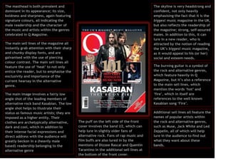
The masthead is both prevalent and
dominant in its appearance; its size,
boldness and sharpness, again featuring
signature colours, all indicating the
male readership and the character of
the music and artists within the genres
celebrated in Q Magazine.

The skyline is very headstrong and
confident, not only heavily
emphasising the fact that it is the
biggest music magazine in the UK,
but also reflects the readership of
the magazine; strong, self-assured
males. In addition to this, it can
lure in a new reader, who is
attracted by the notion of reading
the UK’s biggest music magazine,
as it would appeal to his (or her)
social and esteem needs.

The main sell lines of the magazine all
instantly grab attention with their sharp
and chunky display fonts, and are
galvanised with the use of piercing
colour contrast. The main sell lines all
feature the use of ‘heat’ to not only
entice the reader, but to emphasise the
exclusivity and importance of the
current hearsay in the alternative
genre.
The main image involves a fairly low
angle shot of the leading members of
alternative rock band Kasabian. The low
angle shot helps to illustrate their
status as famous music artists; they are
imposed as a higher entity. Their
clothes are archetypically alternative,
dark and cool, which in addition to
their intense facial expressions and
direct address with the audience will
greatly beckon in a (heavily male
based) readership belonging to the
alternative genre

The burning guitar is a symbol of
the rock and alternative genres,
which feature heavily in Q
Magazine, but it’s also a reference
to the main sell lines, which
mention the words ‘hot’ and
‘fire’, which in itself are
references to the well known
Kasabian song ‘Fire’.

The puff on the left side of the front
cover involves the band U2, which can
help lure in slightly older fans of
alternative rock. Fans of rap music and
film buffs are also lured in by the
mentions of Dizzee Rascal and Quentin
Tarantino in the additional sell lines at
the bottom of the front cover.

Additional sell lines all feature the
names of popular artists within
the rock and alternative genres,
such as Muse, Jack White and Led
Zeppelin, all of which will help
lure in the audience to find out
what they want about these
bands.
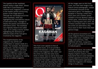
The typeface of the masthead,
despite being a single letter, almost
looks like it could belong in a
classical music magazine; a contrast
to the leather jackets and burning
guitars of the image below it,
although the red background of the
white masthead, while also
highlighting the contradictory nature
of alternative music, manages to
display the passion and boldness of
alternative artists. The masthead
was originally meant to be called
‘Cue’, as in cueing a record, further
highlighting the dominance of
different styles of the rock genre
involved by the magazine.
The strapline/skyline of the
magazine may aid the self
actualisation or esteem needs of a
reader. For example, the dominant
display font, and the emphasis on
the adjective ‘biggest’ will firmly
plant the magazine’s status and
excellence into the reader’s mind,
making them feel special for reading
such an accredited magazine.

All the images seen on this front
cover, be it the main image or the
feature article photographs, contain
conventional costumes of the
alternative genre; Tom Meighan of
Kasabian is wearing a white shirt,
black jeans and a leather jacket,
members of Arctic Monkeys adopt a
similar guise, while Damon Albarn of
Blur is wearing jeans and a shirt. All
of these costumes make it clear that
the artists are alternative; they
focus more on their music than their
general image.

This front cover appeals to fans of
alternative music, as it can provide a
mutual link between a reader and the
artists in the magazine; the reader and
the artists all enjoy the same music,
think in similar ways as well as dress and
compose themselves in a similar manner,
allowing for the reader’s esteem needs to
be aided, while also allowing them into a
world of escapism by having the reader
put him/herself into the artist’s shoes.

All the general conventions of a
music magazine feature prominently
on this front cover; masthead, main
image, main sell lines, FAPs,
additional sell lines, a pug and a
puff, as well as props and costume
to indicate genre.
Although in general, the audience
will be attracted by the clear
displays of genre (colours, artists
featured & mise en scene elements)
and the apparent exclusivity and
bubbling information captivated
within the magazine (101 Hottest
things in music now).

Front cover analysis 1

  • 1.
    The masthead isboth prevalent and dominant in its appearance; its size, boldness and sharpness, again featuring signature colours, all indicating the male readership and the character of the music and artists within the genres celebrated in Q Magazine. The skyline is very headstrong and confident, not only heavily emphasising the fact that it is the biggest music magazine in the UK, but also reflects the readership of the magazine; strong, self-assured males. In addition to this, it can lure in a new reader, who is attracted by the notion of reading the UK’s biggest music magazine, as it would appeal to his (or her) social and esteem needs. The main sell lines of the magazine all instantly grab attention with their sharp and chunky display fonts, and are galvanised with the use of piercing colour contrast. The main sell lines all feature the use of ‘heat’ to not only entice the reader, but to emphasise the exclusivity and importance of the current hearsay in the alternative genre. The main image involves a fairly low angle shot of the leading members of alternative rock band Kasabian. The low angle shot helps to illustrate their status as famous music artists; they are imposed as a higher entity. Their clothes are archetypically alternative, dark and cool, which in addition to their intense facial expressions and direct address with the audience will greatly beckon in a (heavily male based) readership belonging to the alternative genre The burning guitar is a symbol of the rock and alternative genres, which feature heavily in Q Magazine, but it’s also a reference to the main sell lines, which mention the words ‘hot’ and ‘fire’, which in itself are references to the well known Kasabian song ‘Fire’. The puff on the left side of the front cover involves the band U2, which can help lure in slightly older fans of alternative rock. Fans of rap music and film buffs are also lured in by the mentions of Dizzee Rascal and Quentin Tarantino in the additional sell lines at the bottom of the front cover. Additional sell lines all feature the names of popular artists within the rock and alternative genres, such as Muse, Jack White and Led Zeppelin, all of which will help lure in the audience to find out what they want about these bands.
  • 2.
    The typeface ofthe masthead, despite being a single letter, almost looks like it could belong in a classical music magazine; a contrast to the leather jackets and burning guitars of the image below it, although the red background of the white masthead, while also highlighting the contradictory nature of alternative music, manages to display the passion and boldness of alternative artists. The masthead was originally meant to be called ‘Cue’, as in cueing a record, further highlighting the dominance of different styles of the rock genre involved by the magazine. The strapline/skyline of the magazine may aid the self actualisation or esteem needs of a reader. For example, the dominant display font, and the emphasis on the adjective ‘biggest’ will firmly plant the magazine’s status and excellence into the reader’s mind, making them feel special for reading such an accredited magazine. All the images seen on this front cover, be it the main image or the feature article photographs, contain conventional costumes of the alternative genre; Tom Meighan of Kasabian is wearing a white shirt, black jeans and a leather jacket, members of Arctic Monkeys adopt a similar guise, while Damon Albarn of Blur is wearing jeans and a shirt. All of these costumes make it clear that the artists are alternative; they focus more on their music than their general image. This front cover appeals to fans of alternative music, as it can provide a mutual link between a reader and the artists in the magazine; the reader and the artists all enjoy the same music, think in similar ways as well as dress and compose themselves in a similar manner, allowing for the reader’s esteem needs to be aided, while also allowing them into a world of escapism by having the reader put him/herself into the artist’s shoes. All the general conventions of a music magazine feature prominently on this front cover; masthead, main image, main sell lines, FAPs, additional sell lines, a pug and a puff, as well as props and costume to indicate genre. Although in general, the audience will be attracted by the clear displays of genre (colours, artists featured & mise en scene elements) and the apparent exclusivity and bubbling information captivated within the magazine (101 Hottest things in music now).