From a questionnaire, the document's author learned that their target audience would prefer an informal magazine with bright colors and bold writing. They chose a bold fourth font that is "in your face", as well as the colors black, white, red, blue, and yellow. These design choices were informed by rock magazines that appealed to the author and they believe will also appeal to their target audience. The use of white provides contrast to make the magazine easier to read while not appearing overly bold.
In an evening surpassing expectations, the Colorado Symphony Ball: “From Bach…To Rock!: THE BATTLE OF THE BANDS,” raised over $1 million towards the mission and ongoing operations for the Colorado Symphony.
This year’s Colorado Symphony Ball raised money through table sales, individual and corporate contributions, sponsorship, silent and live auction, and real-time voting during “THE BATTLE OF THE BANDS” segment of the evening, where guests voted for their favorite band. This year’s bands were the Colorado Symphony, The DaVita Blues All Stars, and Tracksuit Wedding.
The Colorado Symphony welcomed Debbie and Jim Shpall as Event Chairs. Governor John Hickenlooper, Mayor Michael B. Hancock, and First Lady Mary Louise Lee served as Honorary Co-Chairs.
Biogas Division Of Atmospower is the leading biogas bottling plant with companies all over India. We have specialized bio gas to CNG plant with appropriate upgradation and enrichment system. We use LPSA, MPSA and VPSA system for purification process. Visit : http://www.biogaspurifier.com
Social Me - Doppler: Cómo conseguir mejores resultados en Email MarketingFromDoppler
Si alguna vez te has preguntando por qué razón los resultados de tus Campañas no son lo que esperabas, no te puedes perder esta capacitación. Aprende todo sobre Reportes y métricas, Segmentación, Formularios de Suscripción, cómo mejorar el Retorno de la Inversión y los mejores Tips para construir Asuntos que provoquen aperturas y contenidos que motiven a la conversión.
Community Engagement Principles & Best Practices - Grassroots Solutions is a consulting firm that focuses exclusively on engaging, organizing, and mobilizing people. As engagement experts, we have put together a presentation for various nonprofits,foundations, and other groups which is an overview of the best practices in Community Engagement and organizing.
The war on drugs has taken a massive cost in human lives, making the US the world’s largest prison population, but drugs remain widely available and treatment resources are insufficient. The US government spent trillions of dollars incarcerating non-violent drug offenders that pose barriers to employment and stability.
Book Formatting: Quality Control Checks for DesignersConfidence Ago
This presentation was made to help designers who work in publishing houses or format books for printing ensure quality.
Quality control is vital to every industry. This is why every department in a company need create a method they use in ensuring quality. This, perhaps, will not only improve the quality of products and bring errors to the barest minimum, but take it to a near perfect finish.
It is beyond a moot point that a good book will somewhat be judged by its cover, but the content of the book remains king. No matter how beautiful the cover, if the quality of writing or presentation is off, that will be a reason for readers not to come back to the book or recommend it.
So, this presentation points designers to some important things that may be missed by an editor that they could eventually discover and call the attention of the editor.
Unleash Your Inner Demon with the "Let's Summon Demons" T-Shirt. Calling all fans of dark humor and edgy fashion! The "Let's Summon Demons" t-shirt is a unique way to express yourself and turn heads.
https://dribbble.com/shots/24253051-Let-s-Summon-Demons-Shirt
Dive into the innovative world of smart garages with our insightful presentation, "Exploring the Future of Smart Garages." This comprehensive guide covers the latest advancements in garage technology, including automated systems, smart security features, energy efficiency solutions, and seamless integration with smart home ecosystems. Learn how these technologies are transforming traditional garages into high-tech, efficient spaces that enhance convenience, safety, and sustainability.
Ideal for homeowners, tech enthusiasts, and industry professionals, this presentation provides valuable insights into the trends, benefits, and future developments in smart garage technology. Stay ahead of the curve with our expert analysis and practical tips on implementing smart garage solutions.
Expert Accessory Dwelling Unit (ADU) Drafting ServicesResDraft
Whether you’re looking to create a guest house, a rental unit, or a private retreat, our experienced team will design a space that complements your existing home and maximizes your investment. We provide personalized, comprehensive expert accessory dwelling unit (ADU)drafting solutions tailored to your needs, ensuring a seamless process from concept to completion.
Between Filth and Fortune- Urban Cattle Foraging Realities by Devi S Nair, An...Mansi Shah
This study examines cattle rearing in urban and rural settings, focusing on milk production and consumption. By exploring a case in Ahmedabad, it highlights the challenges and processes in dairy farming across different environments, emphasising the need for sustainable practices and the essential role of milk in daily consumption.
You could be a professional graphic designer and still make mistakes. There is always the possibility of human error. On the other hand if you’re not a designer, the chances of making some common graphic design mistakes are even higher. Because you don’t know what you don’t know. That’s where this blog comes in. To make your job easier and help you create better designs, we have put together a list of common graphic design mistakes that you need to avoid.
Can AI do good? at 'offtheCanvas' India HCI preludeAlan Dix
Invited talk at 'offtheCanvas' IndiaHCI prelude, 29th June 2024.
https://www.alandix.com/academic/talks/offtheCanvas-IndiaHCI2024/
The world is being changed fundamentally by AI and we are constantly faced with newspaper headlines about its harmful effects. However, there is also the potential to both ameliorate theses harms and use the new abilities of AI to transform society for the good. Can you make the difference?
1. KDMO
KDMO
KDMO
KDMO
KDMO
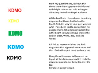
From my questionnaire, it shows that
they’d want the magazine to be informal
with bright colours and bold writing to
attract my immediate target audience.
All the bold fonts I have chosen do suit my
magazine but I have decided on the
fourth font. It’s very ‘in your face’ which is
what I have been told to pursue from my
questionnaire. What I do particularly like
is the bright colours so I have chosen the
colours Black, White, Red, Blue and
Yellow.
It’ll link to my research into the Rock
magazines that appealed to me more and
that I find will appeal to my audience too.
Using the white colour will contrast on
top of all the dark colours which cools the
magazine down to not being too over the
top.
It makes it easier to read.