More Related Content
![정찬명 - CSS Flex you must konw [WSConf.Seoul.2017. Vol.2]](https://cdn.slidesharecdn.com/ss_thumbnails/cssflexyoumustknow-170719071405-thumbnail.jpg?width=640&height=640&fit=bounds)
PDF
정찬명 - CSS Flex you must konw [WSConf.Seoul.2017. Vol.2] 
PPTX
![2011웹표준[04] 실전예제(네비게이션,버튼,박스,포지션)](https://cdn.slidesharecdn.com/ss_thumbnails/201104-111215014233-phpapp02-thumbnail.jpg?width=640&height=640&fit=bounds)
PDF
2011웹표준[04] 실전예제(네비게이션,버튼,박스,포지션) 
PDF
Grid Layout (Kitworks Team Study 장현정 발표자료) ![[WEB UI BASIC] CSS_2](https://cdn.slidesharecdn.com/ss_thumbnails/webuibasicweek3css-150419060046-conversion-gate02-thumbnail.jpg?width=640&height=640&fit=bounds)
PDF

PDF
ABCD Foundation_Codingstudy 
PDF
WebStandards-Basic 5.positioning 
PPTX
Similar to Flex design

PPTX
XECon+PHPFest2014 발표자료 - 효율적인 css 개발방법 - 최대영 
PDF

PDF

PPTX
![[D2 CAMPUS] 안드로이드 오픈소스 스터디자료 - HTML, Android Animation](https://cdn.slidesharecdn.com/ss_thumbnails/nexters4-htmlandroidanimation-160927091904-thumbnail.jpg?width=640&height=640&fit=bounds)
PDF
[D2 CAMPUS] 안드로이드 오픈소스 스터디자료 - HTML, Android Animation 
PPTX

PDF

PPTX

PPTX

PPTX

PDF

PPTX

PDF

PPTX

PPTX

PDF
Front-end Development Process - 어디까지 개선할 수 있나 More from HyungKuIm

PPTX

PPTX

PPTX

PPTX

PPTX

PPTX

PPTX

PPTX
PPTX
Flex design
- 1.
- 2.
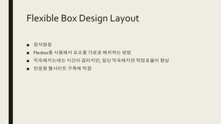
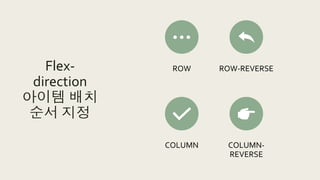
Flexible Box DesignLayout
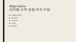
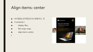
■ 정식명칭
■ Flexbox를 사용해서 요소를 가로로 배치하는 방법
■ 익숙해지는데는 시간이 걸리지만, 일단 익숙해지면 작업효율이 향상
■ 반응형 웹사이트 구축에 적합
- 3.
- 4.
- 5.
- 6.
- 7.
- 8.
- 9.
- 10.
- 11.
- 12.
- 13.
- 14.
- 15.
- 16.
- 17.
- 18.
- 19.
- 20.
- 21.
- 22.
- 23.
- 24.
- 25.
- 26.
- 27.
- 28.
- 29.
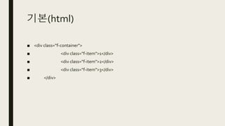
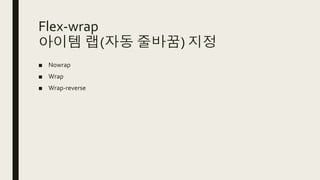
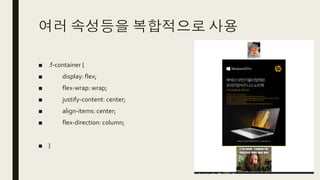
여러 속성등을 복합적으로사용
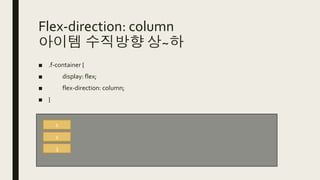
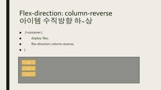
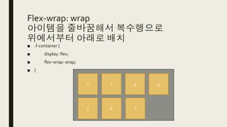
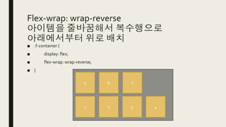
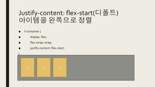
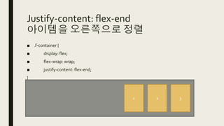
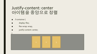
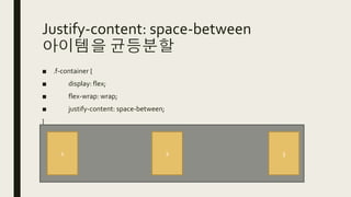
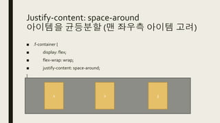
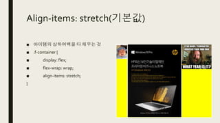
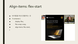
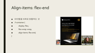
■ .f-container {
■ display: flex;
■ flex-wrap: wrap;
■ justify-content: center;
■ align-items: center;
■ flex-direction: column;
■ }
- 30.