Past
이미지 +
간단한 Style sheet 사용.
Ex) Font, Border, Background..
inLine
<table style="border:1px solid red">
<tr>
<td style="color:yellow;font-size:17px">나는 누구 여긴 어디..</td>
</tr>
</table>
6.
Present
이미지를 대체하는..
Ex) @fant-face, border-radius, gradient, text-shadow...
Javascript를 대체 하는..
Ex) media query, :nth-of-type(), a[href*=naver]…
동적 요소를 대체 하는..
Ex) trasition, animation...
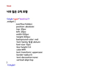
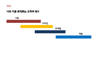
Issue
너무 이른최적화는 오히려 독?!
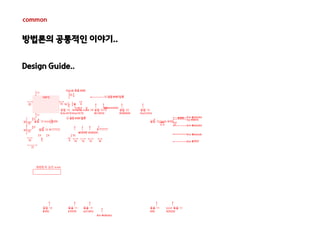
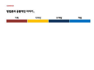
기획
디자인
UI개발
개발
정보는 부족하지만..
최적화 진행..
22.
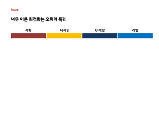
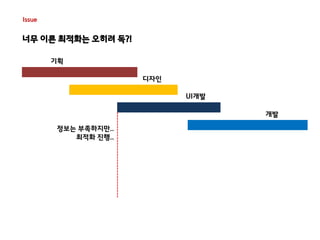
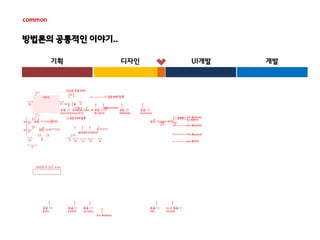
Issue
너무 이른최적화는 오히려 독?!
기획
디자인
UI개발
개발
정보는 부족하지만..
최적화 진행..
수정 . 수정 . 수정 . 수정
수정 . 수정 . 수정 . 수정
수정 . 수정 . 수정 . 수정
수정 . 수정 . 수정 . 수정
23.
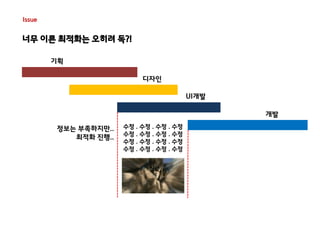
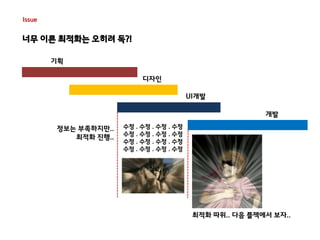
Issue
너무 이른최적화는 오히려 독?!
기획
디자인
UI개발
개발
최적화 따위.. 다음 플젝에서 보자..
정보는 부족하지만..
최적화 진행..
수정 . 수정 . 수정 . 수정
수정 . 수정 . 수정 . 수정
수정 . 수정 . 수정 . 수정
수정 . 수정 . 수정 . 수정
24.
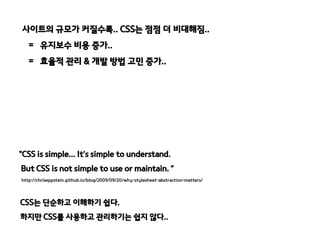
사이트의 규모가 커질수록..CSS는 점점 더 비대해짐..
= 유지보수 비용 증가..
= 효율적 관리 & 개발 방법 고민 증가..
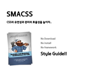
“CSS is simple... It’s simple to understand.
But CSS is not simple to use or maintain. ”
http://chriseppstein.github.io/blog/2009/09/20/why-stylesheet-abstraction-matters/
CSS는 단순하고 이해하기 쉽다.
하지만 CSS를 사용하고 관리하기는 쉽지 않다..
25.
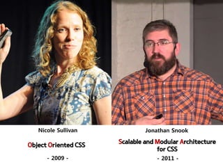
Nicole Sullivan JonathanSnook
Object Oriented CSS
- 2009 -
Scalable and Modular Architecture
for CSS
- 2011 -
26.
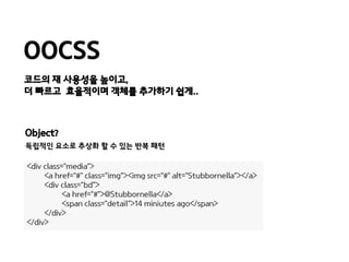
OOCSS
코드의 재사용성을 높이고,
더 빠르고 효율적이며 객체를 추가하기 쉽게..
Object?
독립적인 요소로 추상화 할 수 있는 반복 패턴
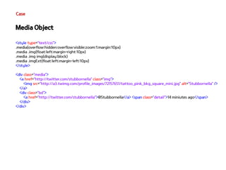
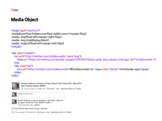
<div class="media">
<a href=“#" class="img“><img src=“#" alt="Stubbornella”></a>
<div class="bd">
<a href=“#">@Stubbornella</a>
<span class="detail">14 miniutes ago</span>
</div>
</div>
27.
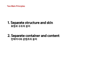
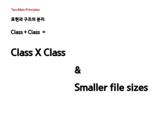
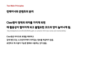
Two Main Principles
1. Separate structure and skin
표현과 구조의 분리
2. Separate container and content
컨테이너와 콘텐츠의 분리
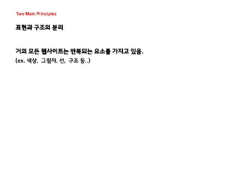
Two Main Principles
표현과 구조의 분리
거의 모든 웹사이트는 반복되는 요소를 가지고 있음.
(ex. 색상, 그림자, 선, 구조 등..)
30.
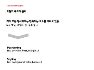
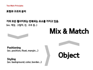
Two Main Principles
표현과 구조의 분리
거의 모든 웹사이트는 반복되는 요소를 가지고 있음.
(ex. 색상, 그림자, 선, 구조 등..)
Positioning
(ex. position, float, margin...)
Styling
(ex. background, color, border...)
31.
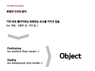
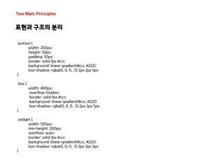
Two Main Principles
표현과 구조의 분리
거의 모든 웹사이트는 반복되는 요소를 가지고 있음.
(ex. 색상, 그림자, 선, 구조 등..)
Object
Positioning
(ex. position, float, margin...)
Styling
(ex. background, color, border...)
32.
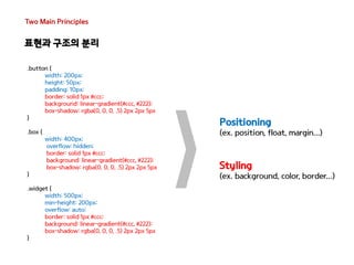
Two Main Principles
표현과 구조의 분리
거의 모든 웹사이트는 반복되는 요소를 가지고 있음.
(ex. 색상, 그림자, 선, 구조 등..)
Mix & Match
Positioning
(ex. position, float, margin...)
Styling
(ex. background, color, border...)
Object
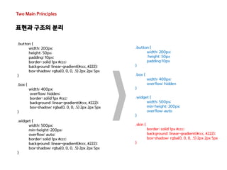
Two Main Principles
표현과 구조의 분리
<style type="text/css">
/* Positioning */
.mod{overflow:hidden}
.modImg{float:left;width:140px;margin-right:10px}
.modImg-title{display:block}
.mod>li{margin-bottom:7px}
.modB-desc{margin:5px 0 10px;display:block}
.modImg-img{display:block}
.ly-mod{width:250px}
.ly-modImg{position:relative;display:block}
.ly-modImg-title{position:absolute;bottom:0;left:0;padding:6px 7px 6px 9px}
.modlist-clear{clear:left;padding-top:5px}
.dualImg{margin-right:22px}
/* Styling */
.link{color:#000063;font-weight:bold;letter-spacing:-1px}
.slink{font-size:14px}
.blink{font-size:24px}
.blink-desc{color:#4F4F4F;font-size:12px;font-weight:normal;line-height:1.4}
.img-link{color:#4f4f4f}
.img-link-desc{color:#4f4f4f;line-height:1.4}
.ly-link-desc{color:#fff;background-color:#000;opacity:0.65}
</style>
42.
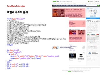
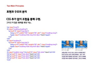
Two Main Principles
표현과 구조의 분리
CSS 추가 없이 조합을 통해 구현.
그리고 더 많은 형태를 표현 가능..
<ul class="mod">
<li class="modImg">
<a href="#" class="img-link">
<img src="#" width="140" height="85" alt="" class="modImg-img">
<span class="modImg-title img-link-desc">text</span>
</a>
</li>
<li><a href="#" class="link slink">text</a></li>
<li><a href="#" class="link slink">text</a></li>
<li><a href="#" class="link slink">text</a></li>
<li><a href="#" class="link slink">text</a></li>
<li><a href="#" class="link slink">text</a></li>
</ul>
43.
Two Main Principles
표현과 구조의 분리
CSS 추가 없이 조합을 통해 구현.
그리고 더 많은 형태를 표현 가능..
<ul class="mod">
<li class="modImg ly-mod">
<a href="#" class="img-link ly-modImg">
<img src="#" width="250" height="170" alt="" class="modImg-img">
<span class="modImg-title ly-modImg-title ly-link-desc">text</span>
</a>
</li>
<li class="modB">
<a href="#" class="link blink">
text
<span class="modB-desc blink-desc">text</span>
</a>
</li>
<li><a href="#" class="link slink">text</a></li>
<li><a href="#" class="link slink">text</a></li>
<li><a href="#" class="link slink">text</a></li>
<li><a href="#" class="link slink">text</a></li>
</ul>
44.
Two Main Principles
표현과 구조의 분리
CSS 추가 없이 조합을 통해 구현.
그리고 더 많은 형태를 표현 가능..
<ul class="mod">
<li class="modImg dualImg">
<a href="#" class="img-link">
<img src="#" width="140" height="85" alt="" class="modImg-img">
<span class="modImg-title img-link-desc">text</span>
</a>
</li>
<li class="modImg">
<a href="#" class="img-link">
<img src="#" width="140" height="85" alt="" class="modImg-img">
<span class="modImg-title img-link-desc">text</span>
</a>
</li>
<li class="modlist-clear"><a href="#" class="link slink">text</a></li>
<li><a href="#" class="link slink">text</a></li>
<li><a href="#" class="link slink">text</a></li>
<li><a href="#" class="link slink">text</a></li>
</ul>
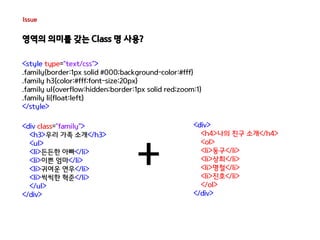
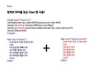
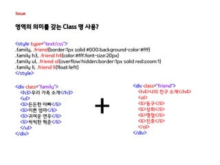
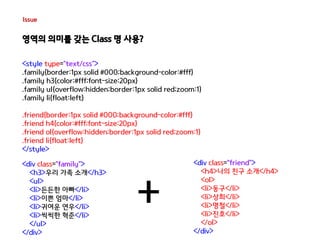
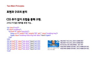
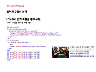
Two Main Principles
컨테이너와 콘텐츠의 분리
Dom의 위치에 상관 없이
객체의 재사용을 허용하기 위한 규칙
위치에 의존하지 않고 재사용이 가능한 클래스 기반 모듈 구축,
어떤 컨테이너에도 종속되지 않는…
48.
Two Main Principles
컨테이너와 콘텐츠의 분리
Class명이 영역의 의미를 가지게 되면
재 활용성이 떨어지게 되고 불필요한 코드의 양이 늘어나게 됨.
http://brettjankord.com/2013/02/09/thoughts-on-semantic-html-class-names-and-maintainability/
Class명은 마이크로 포맷을 제외하고
검색 엔진 또는 스크린리더에서 의미있는 정보를 제공하지 않음.
유연하고 재 사용이 가능한 형태로 사용하는 것이 좋음.
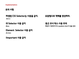
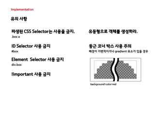
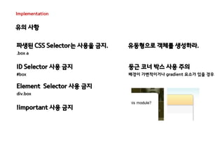
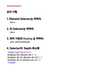
Implementation
유의 사항
파생된 CSS Selector는 사용을 금지.
.box a
ID Selector 사용 금지
#box
Element Selector 사용 금지
div.box
!important 사용 금지
유동형으로 객체를 생성하라.
둥근 코너 박스 사용 주의
배경이 가변적이거나 gradient 요소가 있을 경우
52.
Implementation
유의 사항
background-color:red
파생된 CSS Selector는 사용을 금지.
.box a
ID Selector 사용 금지
#box
!important 사용 금지
유동형으로 객체를 생성하라.
둥근 코너 박스 사용 주의
배경이 가변적이거나 gradient 요소가 있을 경우
Element Selector 사용 금지
div.box
53.
Implementation
유의 사항
파생된 CSS Selector는 사용을 금지.
.box a
ID Selector 사용 금지
#box
!important 사용 금지
유동형으로 객체를 생성하라.
둥근 코너 박스 사용 주의
배경이 가변적이거나 gradient 요소가 있을 경우
Element Selector 사용 금지
div.box
54.
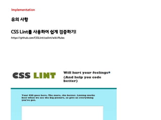
Implementation
유의 사항
CSS Lint를 사용하여 쉽게 검증하기!
https://github.com/CSSLint/csslint/wiki/Rules
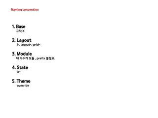
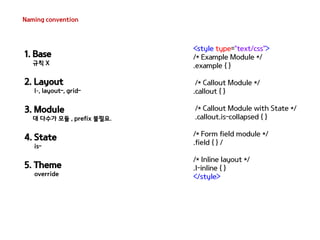
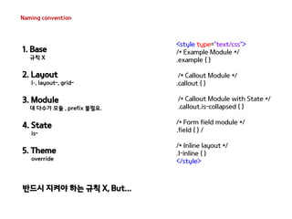
Core
Base
CSS의기본 요소를 정의, 모든 요소에 적용되는 기본 스타일.
- ID or Class 없음
- !important 사용 금지
- 단일 element selector 사용 가능
- attribute selectors, pseudo-class selectors, child selectors, sibling selectors
67.
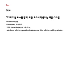
Core
Base
CSS의기본 요소를 정의, 모든 요소에 적용되는 기본 스타일.
- ID or Class 없음
- !important 사용 금지
- 단일 element selector 사용 가능
- attribute selectors, pseudo-class selectors, child selectors, sibling selectors
<style type="text/css">
html, body, form { margin: 0; padding: 0 }
input[type=text] { border: 1px solid #999}
a { color: #039}
a:hover { color: #03C }
</style>
Reset CSS !
크로스 브라우징을 위해 일관된 기준을 정의하는 목적으로 사용되는 CSS..
Core
Layout
페이지분할 요소, Layout 내 하나 이상의 모듈을 함께 구성하여 사용
- 유일하게 ID 사용! (재활용이 불가능한 Layout에만 사용 가능. 그 외..Class 사용)
- 사이트 내 레이아웃 변경이 필요한 경우 Class 추가하여 제어 Ex) .l-fippde #aside
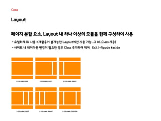
Core
Module
재사용을위한 요소 , 독립형 Component로 설계 필요
- ID Selector 사용 금지
- Element Selector 사용 금지
- 위치 기반의 Styling 금지
<style type="text/css">
.pod { width: 100% }
.pod input[type=text] {width: 50% }
.pod-constrained input[type=text] {width: 100% }
.pod-callout {width: 200px }
.pod-callout input[type=text] {width: 180px }
</style>
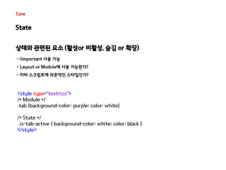
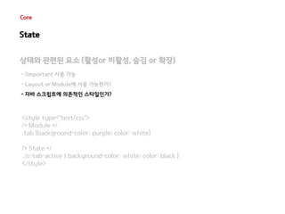
Core
State
상태와관련된 요소 (활성or 비활성, 숨김 or 확장)
- !important 사용 가능
- Layout or Module에 사용 가능한가?
- 자바 스크립트에 의존적인 스타일인가?
<style type="text/css">
/* Module */
.tab {background-color: purple; color: white}
/* State */
.is-tab-active { background-color: white; color: black }
</style>
74.
Core
State
상태와관련된 요소 (활성or 비활성, 숨김 or 확장)
- !important 사용 가능
- Layout or Module에 사용 가능한가?
- 자바 스크립트에 의존적인 스타일인가?
<style type="text/css">
/* Module */
.tab {background-color: purple; color: white}
/* State */
.is-tab-active { background-color: white; color: black }
</style>
75.
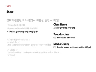
Core
State
상태와관련된 요소 (활성or 비활성, 숨김 or 확장)
- !important 사용 가능
- Layout or Module에 사용 가능한가?
- 자바 스크립트에 의존적인 스타일인가?
<style type="text/css">
/* Module */
.tab {background-color: purple; color: white}
Class Name
Javascript에 의존적인 방법
Pseudo-class
Ex) .btn:hover, .btn:focus
Media Query
Ex) @media screen and (max-width: 400px)
/* State */
.is-tab-active { background-color: white; color: black }
</style>
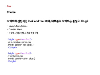
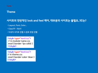
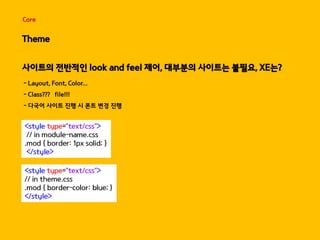
Core
Theme
사이트의전반적인 look and feel 제어, 대부분의 사이트는 불필요, XE는?
- Layout, Font, Color...
- Class??? file!!!
- 다국어 사이트 진행 시 폰트 변경 진행
<style type="text/css">
// in module-name.css
.mod { border: 1px solid; }
</style>
<style type="text/css">
// in theme.css
.mod { border-color: blue; }
</style>
78.
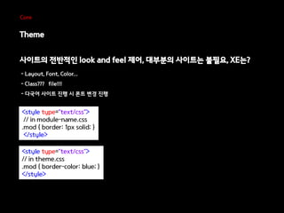
Core
Theme
사이트의전반적인 look and feel 제어, 대부분의 사이트는 불필요, XE는?
- Layout, Font, Color...
- Class??? file!!!
- 다국어 사이트 진행 시 폰트 변경 진행
<style type="text/css">
// in module-name.css
.mod { border: 1px solid; }
</style>
<style type="text/css">
// in theme.css
.mod { border-color: blue; }
</style>
79.
Core
Theme
사이트의전반적인 look and feel 제어, 대부분의 사이트는 불필요, XE는?
- Layout, Font, Color...
- Class??? file!!!
- 다국어 사이트 진행 시 폰트 변경 진행
<style type="text/css">
// in module-name.css
.mod { border: 1px solid; }
</style>
<style type="text/css">
// in theme.css
.mod { border-color: blue; }
</style>
80.
Core
Theme
사이트의전반적인 look and feel 제어, 대부분의 사이트는 불필요, XE는?
- Layout, Font, Color...
- Class??? file!!!
- 다국어 사이트 진행 시 폰트 변경 진행
<style type="text/css">
// in module-name.css
.mod { border: 1px solid; }
</style>
<style type="text/css">
// in theme.css
.mod { border-color: blue; }
</style>
81.
Core
Theme
사이트의전반적인 look and feel 제어, 대부분의 사이트는 불필요, XE는?
- Layout, Font, Color...
- Class??? file!!!
- 다국어 사이트 진행 시 폰트 변경 진행
<style type="text/css">
// in module-name.css
.mod { border: 1px solid; }
</style>
<style type="text/css">
// in theme.css
.mod { border-color: blue; }
</style>
82.
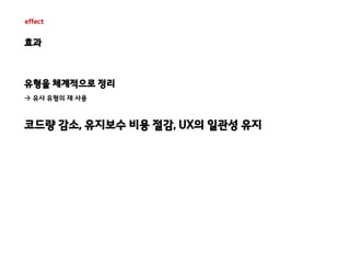
effect
효과
유형을체계적으로 정리
유사 유형의 재 사용
코드량 감소, 유지보수 비용 절감, UX의 일관성 유지
83.
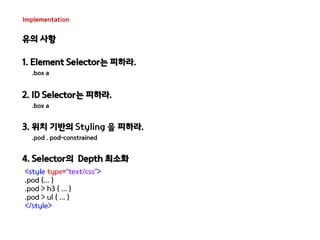
Implementation
유의 사항
1. Element Selector는 피하라.
.box a
2. ID Selector는 피하라.
.box a
3. 위치 기반의 Styling 을 피하라.
.pod . pod-constrained
4. Selector의 Depth 최소화
<style type="text/css">
#sidebar div, #footer div { …}
#sidebar div h3, #footer div h3 {… }
#sidebar div ul, #footer div ul {…}
</style>
84.
Implementation
유의 사항
1. Element Selector는 피하라.
.box a
2. ID Selector는 피하라.
.box a
3. 위치 기반의 Styling 을 피하라.
.pod . pod-constrained
4. Selector의 Depth 최소화
<style type="text/css">
.pod {... }
.pod > h3 { ... }
.pod > ul { ... }
</style>
85.
Implementation
유의 사항
1. Element Selector는 피하라.
.box a
2. ID Selector는 피하라.
.box a
3. 위치 기반의 Styling 을 피하라.
.pod . pod-constrained
4. Selector의 Depth 최소화
5. right Selector Class이름 사용
.pod . Ls-pod
common
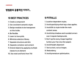
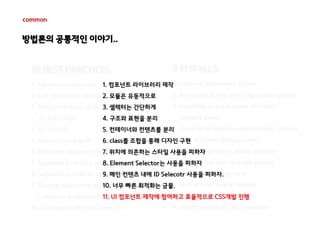
10 BESTPRACTICES
1. Create a component
2. Use consistent semantic styles
3. Design modules to be transparent
on the inside.
4. Be flexible.
5. Learn to love grids.
6. Minimize selectors library
7. Separate structure and skin
8. Separate container and content
9. Extend objects by applying multiple
classes to an element
10. Use reset and fonts from YUI
9 PITFALLS
1. Location dependent styles.
2. Avoid specifying what tag a class applies.
3. Avoid IDs to style inside the main
content areas.
4. Avoid drop shadows and rounded corners
over irregular backgrounds.
5. Don’t sprite every image together
(unless your has very few pages).
6. Avoid height alignment
7. Text as text, not as images.
8. Redundancy
9. Avoid premature optimization.
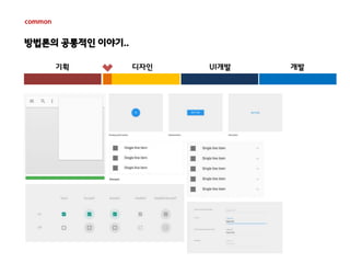
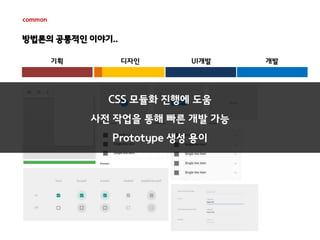
방법론의 공통적인 이야기..
92.
common
10 BESTPRACTICES
1. Create a component
2. Use consistent semantic styles
3. Design modules to be transparent
on the inside.
4. Be flexible.
5. Learn to love grids.
6. Minimize selectors library
7. Separate structure and skin
8. Separate container and content
9. Extend objects by applying multiple
classes to an element
10. Use reset and fonts from YUI
9 PITFALLS
1. Location dependent styles.
2. Avoid specifying what tag a class applies.
3. Avoid IDs to style inside the main
content areas.
4. Avoid drop shadows and rounded corners
over irregular backgrounds.
5. Don’t sprite every image together
(unless your has very few pages).
6. Avoid height alignment
7. Text as text, not as images.
8. Redundancy
9. Avoid premature optimization.
방법론의 공통적인 이야기..
1. 컴포넌트 라이브러리 제작
2. 모듈은 유동적으로
3. 셀렉터는 간단하게
4. 구조와 표현을 분리
5. 컨테이너와 컨텐츠를 분리
6. class를 조합을 통해 디자인 구현
7. 위치에 의존하는 스타일 사용을 피하자
8. Element Selector는 사용을 피하자
9. 메인 컨텐츠 내에 ID Selecotr 사용을 피하자.
10. 너무 빠른 최적화는 금물.
방법론의 공통적인 이야기..
기획 디자인 UI개발 개발
common
CSS 모듈화 진행에 도움
사전 작업을 통해 빠른 개발 가능
Prototype 생성 용이
99.
common
10 BESTPRACTICES
1. Create a component
2. Use consistent semantic styles
3. Design modules to be transparent
on the inside.
1. 컴포넌트 라이브러리 제작
2. 모듈은 유동적으로
3. 셀렉터는 간단하게
4. 구조와 표현을 분리
5. 컨테이너와 컨텐츠를 분리
6. class를 조합을 통해 디자인 구현
7. 위치에 의존하는 스타일 사용을 피하자
8. Element Selector는 사용을 피하자
9. 메인 컨텐츠 내에 ID Selecotr 사용을 피하자.
10. 너무 빠른 최적화는 금물.
11. UI 컴포넌트 제작에 참여하고 효율적으로 CSS개발 진행
4. Be flexible.
5. Learn to love grids.
6. Minimize selectors library
7. Separate structure and skin
8. Separate container and content
9. Extend objects by applying multiple
classes to an element
10. Use reset and fonts from YUI
9 PITFALLS
1. Location dependent styles.
2. Avoid specifying what tag a class applies.
3. Avoid IDs to style inside the main
content areas.
4. Avoid drop shadows and rounded corners
over irregular backgrounds.
5. Don’t sprite every image together
(unless your has very few pages).
6. Avoid height alignment
7. Text as text, not as images.
8. Redundancy
9. Avoid premature optimization.
방법론의 공통적인 이야기..
#46 이렇듯 표현과 구조의 분리로 인해 CSS의 용량은 감소 시키고 더 다양한 디자인을 조합을 통해 표현할 수 있었습니다.
#48 앞서 이야기한 CSS의 규칙을 추가해야하는 나쁜 습관 중 하나로 의미있는 class명을 사용하는 방식을 이야기 햇는데요 그와 동일하게 의미있는 class명을 사용하거나 element selector를 사용한경우 모듈의 의미가 변경되거나 Tag가 변경 되었을때 재사용이 어렵게 됩니다. 컨테이너 종속이란? 상위 CSS Selector에 국한되어 Style을 지정하지 않고 독립적인 요소를 사용해야한다는 이야기 입니다. 상위 CSS Selector에 국한되게 되면 컨테이너간 재사용은 어렵게 되기 때문입니다.
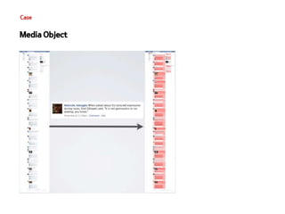
#59 미디어 오브젝트 사용 시 페이스 북의 수백줄의 코드를 감소 시킬 수 있고 이 내용을 페이스 북 UI메니저에게 메일로안내를 햇고 긍정적인 피드백을 받았음. 그로인해 약 CSS는 19% 정도 감소 HTML은 45% 정도 감소
OOCSS를 사용하면 전체적인 코드 감소와 함께 중복 코드 사용으로 인해 개발을 더욱 효율적으로 할 수 있을것으로 생각됩.
#61 우리는 보통 한 개의 CSS 파일의 생성, 그리고 하단에 새로운 CSS계속 쌓게 되면 향후 유지보수도 어렵고 담당자 변경시에도 문제가 발생
그래서 SMACSS는 CSS를 규칙에 맞게 분류함. CSS를 규칙에 맞게 분류하면서 새로운 패턴이 생기고 그 패턴들을 활용하여 도 나은 방법으로 개발이 가능하다.
#88 SMACSS는 여전히 바전중 15불 결제를 통해 효율적인 개발을 할수 있다면 투자가 아깝지 않을듯 합니다.^^
#94 이 디자인 가이드는 UI개발자라면 누구든지 한번쯤은 본 화면일듯..
이 디자인 가이드는 디자이너는 UI개발자의 편의성을 위하여 UI개발자는 정확한 디자인을 요하는 디자이너를 위한 가이드라고 생각하는듯..
실제 앞서 이야기 한것들을 토데로 본다면 보다 좋은 CSS개발을 위해 우리에게 필요로 하는 것은 이런 디자인 가이드가 아님..
#95 사이트의 전반적인 내용을 이해할 수 있고 모듈화 하기 좋은 구성요소들을 정리해 둔 가이드가 CSS개발에는 훨씬 도움이 됨.
#96 사이트의 전반적인 내용을 이해할 수 있고 모듈화 하기 좋은 구성요소들을 정리해 둔 가이드가 CSS개발에는 훨씬 도움이 됨.
#98 사이트의 전반적인 내용을 이해할 수 있고 모듈화 하기 좋은 구성요소들을 정리해 둔 가이드가 CSS개발에는 훨씬 도움이 됨.
#99 사이트의 전반적인 내용을 이해할 수 있고 모듈화 하기 좋은 구성요소들을 정리해 둔 가이드가 CSS개발에는 훨씬 도움이 됨.
![Present
이미지를 대체 하는..
Ex) @fant-face, border-radius, gradient, text-shadow...
Javascript를 대체 하는..
Ex) media query, :nth-of-type(), a[href*=naver]…
동적 요소를 대체 하는..
Ex) trasition, animation...](https://image.slidesharecdn.com/xecon-phpfest2014-css-141110202859-conversion-gate01/85/XECon-PHPFest2014-css-6-320.jpg)


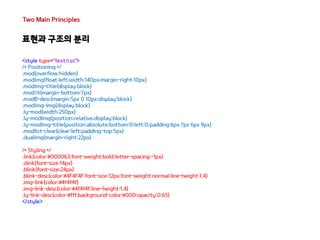
![Issue
CSS Selector ..
CSS Specificity
Selector n * 100 n * 10 n * 1 specificity
* 0 0 0 0
LI 0 0 1 1
UL LI 0 0 2 2
UL OL+LI 0 0 3 3
H1 + *[REL=up] 0 1 1 11
UL OL LI.red 0 1 3 13
LI.red.level 0 2 1 21
#x34y 1 0 0 100
#s12:not(FOO) 1 0 1 101
불필요한 CSS Selector 사용
a.family , #a.family ...
지나치게 복잡한 선택자
#content .home .family a
<div id="content">
<div>
<div>
<a href="#">집으로..</a>
</div>
</div>
</div>
CSS 우선 순위 조정 or !important 사용](https://image.slidesharecdn.com/xecon-phpfest2014-css-141110202859-conversion-gate01/85/XECon-PHPFest2014-css-9-320.jpg)
![Two Main Principles
컨테이너와 콘텐츠의 분리
[As-is]
<style type="text/css">
.family{border:1px solid #000;background-color:#fff}
.family h3{color:#fff;font-size:20px}
.family ul{overflow:hidden;border:1px solid red;zoom:1}
.family li{float:left}
.friend{border:1px solid #000;background-color:#fff}
.friend h4{color:#fff;font-size:20px}
.friend ol{overflow:hidden;border:1px solid red;zoom:1}
.friend li{float:left}
</style>
<div class="family">
<h3>우리 가족 소개</h3>
<ul>
<li>든든한 아빠</li>
<li>이쁜 엄마</li>
<li>귀여운 연우</li>
<li>씩씩한 혁준</li>
</ul>
</div>
<div class="friend">
<h4>나의 친구 소개</h4>
<ol>
<li>동구</li>
<li>상희</li>
<li>명철</li>
<li>진호</li>
<li>희철</li>
</ol>
</div>](https://image.slidesharecdn.com/xecon-phpfest2014-css-141110202859-conversion-gate01/85/XECon-PHPFest2014-css-49-320.jpg)
![Two Main Principles
컨테이너와 콘텐츠의 분리
<div class=“mod">
<h3 class=“hd">우리 가족 소개</h3>
<ul class=“ls">
<li>든든한 아빠</li>
<li>이쁜 엄마</li>
<li>귀여운 연우</li>
<li>씩씩한 혁준</li>
</ul>
</div>
<style type="text/css">
.mod{border:1px solid #000;background-color:#fff}
.hd{color:#fff;font-size:20px}
.ls{overflow:hidden;border:1px solid red;zoom:1}
.ls>li{float:left}
</style>
<div class=“mod">
<h4 class=“hd">우리 가족 소개</h4>
<ol class=“ls">
<li>동구</li>
<li>상희</li>
<li>명철</li>
<li>진호</li>
<li>희철</li>
</ol>
</div>
[To-be]](https://image.slidesharecdn.com/xecon-phpfest2014-css-141110202859-conversion-gate01/85/XECon-PHPFest2014-css-50-320.jpg)
![Core
Base
CSS의 기본 요소를 정의, 모든 요소에 적용되는 기본 스타일.
- ID or Class 없음
- !important 사용 금지
- 단일 element selector 사용 가능
- attribute selectors, pseudo-class selectors, child selectors, sibling selectors
<style type="text/css">
html, body, form { margin: 0; padding: 0 }
input[type=text] { border: 1px solid #999}
a { color: #039}
a:hover { color: #03C }
</style>
Reset CSS !
크로스 브라우징을 위해 일관된 기준을 정의하는 목적으로 사용되는 CSS..](https://image.slidesharecdn.com/xecon-phpfest2014-css-141110202859-conversion-gate01/85/XECon-PHPFest2014-css-67-320.jpg)


![Core
Module
재사용을 위한 요소 , 독립형 Component로 설계 필요
- ID Selector 사용 금지
- Element Selector 사용 금지
- 위치 기반의 Styling 금지
<style type="text/css">
.pod { width: 100% }
.pod input[type=text] {width: 50% }
.pod-constrained input[type=text] {width: 100% }
.pod-callout {width: 200px }
.pod-callout input[type=text] {width: 180px }
</style>](https://image.slidesharecdn.com/xecon-phpfest2014-css-141110202859-conversion-gate01/85/XECon-PHPFest2014-css-71-320.jpg)


![[2014널리세미나] 시맨틱한 HTML5 마크업 구조 설계, 어떻게 할까?](https://cdn.slidesharecdn.com/ss_thumbnails/08-140827030216-phpapp02-thumbnail.jpg?width=640&height=640&fit=bounds)


![[Basic HTML/CSS] 5. css - selector, units](https://cdn.slidesharecdn.com/ss_thumbnails/5-170304052513-thumbnail.jpg?width=640&height=640&fit=bounds)


![[HCI2010]UI패턴기반 UI설계/개발자동화사례발표](https://cdn.slidesharecdn.com/ss_thumbnails/uiui20100129hci2010-1285739738-phpapp02-thumbnail.jpg?width=640&height=640&fit=bounds)


![[HCI2011]모바일웹 UI패턴 및 UI플랫폼_김창겸,문승현_배포용](https://cdn.slidesharecdn.com/ss_thumbnails/hci2011uiui-110412085125-phpapp01-thumbnail.jpg?width=640&height=640&fit=bounds)
![[오픈소스컨설팅]Java Performance Tuning](https://cdn.slidesharecdn.com/ss_thumbnails/javaperformanetuning-150408192031-conversion-gate01-thumbnail.jpg?width=640&height=640&fit=bounds)

![[D2]java 성능에 대한 오해와 편견](https://cdn.slidesharecdn.com/ss_thumbnails/d2java-150522063126-lva1-app6891-thumbnail.jpg?width=640&height=640&fit=bounds)


![[전파교육] css day 2014](https://cdn.slidesharecdn.com/ss_thumbnails/cssday2014-140806031358-phpapp01-thumbnail.jpg?width=640&height=640&fit=bounds)


![2011웹표준[04] 실전예제(네비게이션,버튼,박스,포지션)](https://cdn.slidesharecdn.com/ss_thumbnails/201104-111215014233-phpapp02-thumbnail.jpg?width=640&height=640&fit=bounds)
![[D2 CAMPUS] 안드로이드 오픈소스 스터디자료 - HTML, Android Animation](https://cdn.slidesharecdn.com/ss_thumbnails/nexters4-htmlandroidanimation-160927091904-thumbnail.jpg?width=640&height=640&fit=bounds)


![[20160115] 작심 10시간 - CSS](https://cdn.slidesharecdn.com/ss_thumbnails/10css-220118152205-thumbnail.jpg?width=640&height=640&fit=bounds)


![[XECon2016] B-1 안정수 라라벨 Scout을 활용한 검색 기능 둘러보기](https://cdn.slidesharecdn.com/ss_thumbnails/b-1-scout000001-161201043032-thumbnail.jpg?width=640&height=640&fit=bounds)
![[XECon2016] A-1 정규창 [React] Immutable한 양방향 데이터 바인딩](https://cdn.slidesharecdn.com/ss_thumbnails/react-formagic-final1000001-161201042245-thumbnail.jpg?width=640&height=640&fit=bounds)
![[XECon2016] C-4 한성민 AngularJS 1, 2 그리고 실무환경 적용 이야기](https://cdn.slidesharecdn.com/ss_thumbnails/c4-000001-161128073401-thumbnail.jpg?width=640&height=640&fit=bounds)
![[XECon2016] C-3 이현석 팀장들이 꼽은 신입 PHP 개발자가 가급적 빨리 알았으면 하는 것들](https://cdn.slidesharecdn.com/ss_thumbnails/c3-000001-161128073354-thumbnail.jpg?width=640&height=640&fit=bounds)
![[XECon2016] C-2 홍성범 XE3 Theme 제작 - 자유롭게, 그리고 편하게](https://cdn.slidesharecdn.com/ss_thumbnails/c2-000001-161128073350-thumbnail.jpg?width=640&height=640&fit=bounds)
![[XECon2016] C-1 오승훈 XE3로 웹사이트 만들기](https://cdn.slidesharecdn.com/ss_thumbnails/c1-000001-161128073347-thumbnail.jpg?width=640&height=640&fit=bounds)
![[XECon2016] B-4 변종원 CodeIgniter와 PHP7](https://cdn.slidesharecdn.com/ss_thumbnails/b4-000001-161128073343-thumbnail.jpg?width=640&height=640&fit=bounds)
![[XECon2016] B-3 성기진 XE1 가지치기와 오픈소스 생태계의 미래](https://cdn.slidesharecdn.com/ss_thumbnails/b3-000001-161128073342-thumbnail.jpg?width=640&height=640&fit=bounds)
![[XECon2016] B-2 정광섭 Laravel로 스타트업 기술 스택 구성하기](https://cdn.slidesharecdn.com/ss_thumbnails/b2-000001-161128073340-thumbnail.jpg?width=640&height=640&fit=bounds)
![[XECon2016] A-3 박형식 Frontend stack의 변화 : jQuery, BackboneJS, ReactJS 중심으로](https://cdn.slidesharecdn.com/ss_thumbnails/a3-000001-161128073338-thumbnail.jpg?width=640&height=640&fit=bounds)
![[XECon2016] A-2 임형주 Webpack 실무 적용전략](https://cdn.slidesharecdn.com/ss_thumbnails/a2-000001-161128073335-thumbnail.jpg?width=640&height=640&fit=bounds)
![[XECon2016] A-4 조정현 GitHub + Jenkins + Docker로 자동배포 시스템 구축하기](https://cdn.slidesharecdn.com/ss_thumbnails/a4-000001-161128073332-thumbnail.jpg?width=640&height=640&fit=bounds)
![XECon2015 :: [1-3] 김덕홍 - Git Workflow with GitHub](https://cdn.slidesharecdn.com/ss_thumbnails/xecon-160404022500-thumbnail.jpg?width=640&height=640&fit=bounds)
![XECon2015 :: [2-2] 박상현 - React로 개발하는 SPA 실무 이야기](https://cdn.slidesharecdn.com/ss_thumbnails/react1-160404022032-thumbnail.jpg?width=640&height=640&fit=bounds)
![XECon2015 :: [2-1] 정광섭 - 처음 시작하는 laravel](https://cdn.slidesharecdn.com/ss_thumbnails/random-151116001443-lva1-app6892-2-160323043830-thumbnail.jpg?width=640&height=640&fit=bounds)
![XECon2015 :: [1-2] 이현석 - Learning Laravel](https://cdn.slidesharecdn.com/ss_thumbnails/learninglaravel-151115013004-lva1-app6892-160323043508-thumbnail.jpg?width=640&height=640&fit=bounds)