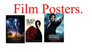
2. The main name is bold and
black. Font is big and divided
in places. The name is on top
and the main masthead is
being divided.
I liked this design more as it
provides the idea of using
art, on posters. The use of props
links to the storyline. Also, the
idea of dark on one side and
light on the other describes the
two characteristics of the main
character.
3. A tag line is really vital
as it gives the viewers
the message about
the inside of the
movie.
The front image very creative, it
also represents the film itself.
However the creativity looks a bit
unprofessional and easy. The use
of colour is a pallet with a
mixture of cold to hot
colours, this emphasises the
viewers to be connect to the idea
of science fiction movies.
The name of the film
has being put bold and
stands out, with the use
of white colour.
4. Two film posters in different countries. Some of the industries tend to copy the exact same thing as
different magazine (copy right). This for me, I think it’s not an idea of being creative as there’s
nothing that could distinguish them. The following are two magazines but with the same idea of
being creative:
Same ideas on 2
different magazines.
But based on different
audiences of countries.
Featuring the two sides
of the character.
Mast head under and the names of the
cast on top, with the idea of bold and
different font used.