Download to read offline


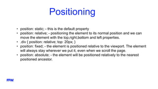
![CSS Attribute Selectors
In CSS – we can style HTML elements using their attributes and/or attribute
values.
That way – we select every a element with target attribute and value = “_blank”
HTML
<a href=”#” target=”_blank”>
CSS
a[target=”_blank”] {
background-color: blue;
}](https://image.slidesharecdn.com/ffwgabrovopmg-css-160628111304/85/FFW-Gabrovo-PMG-CSS-21-320.jpg)


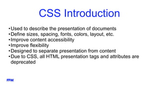
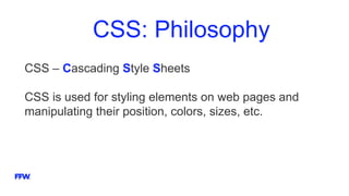
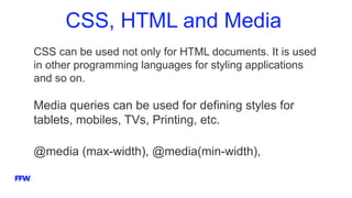
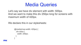
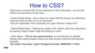
CSS is used to style and lay out web pages. It separates the presentation of HTML elements from the content. CSS rules consist of selectors that point to HTML elements and declarations that apply styles like colors, fonts, sizes etc. CSS rules cascade from broad to specific. More specific selectors override broader ones. CSS can be applied via external stylesheets, internal stylesheets or inline styles. Pseudo-classes can style elements in special states like hover. Media queries allow responsive designs for different screen sizes.