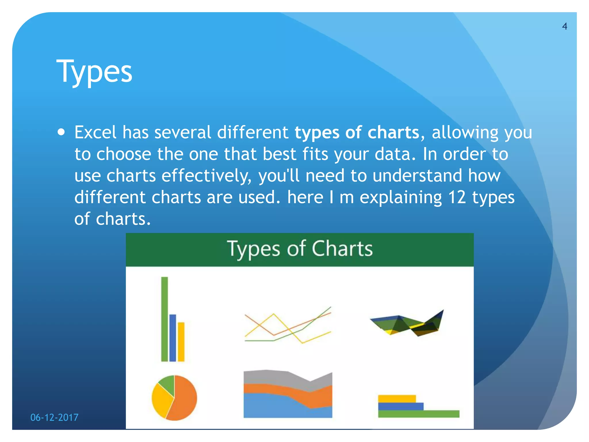
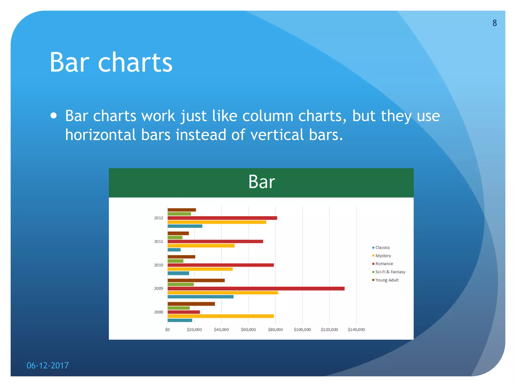
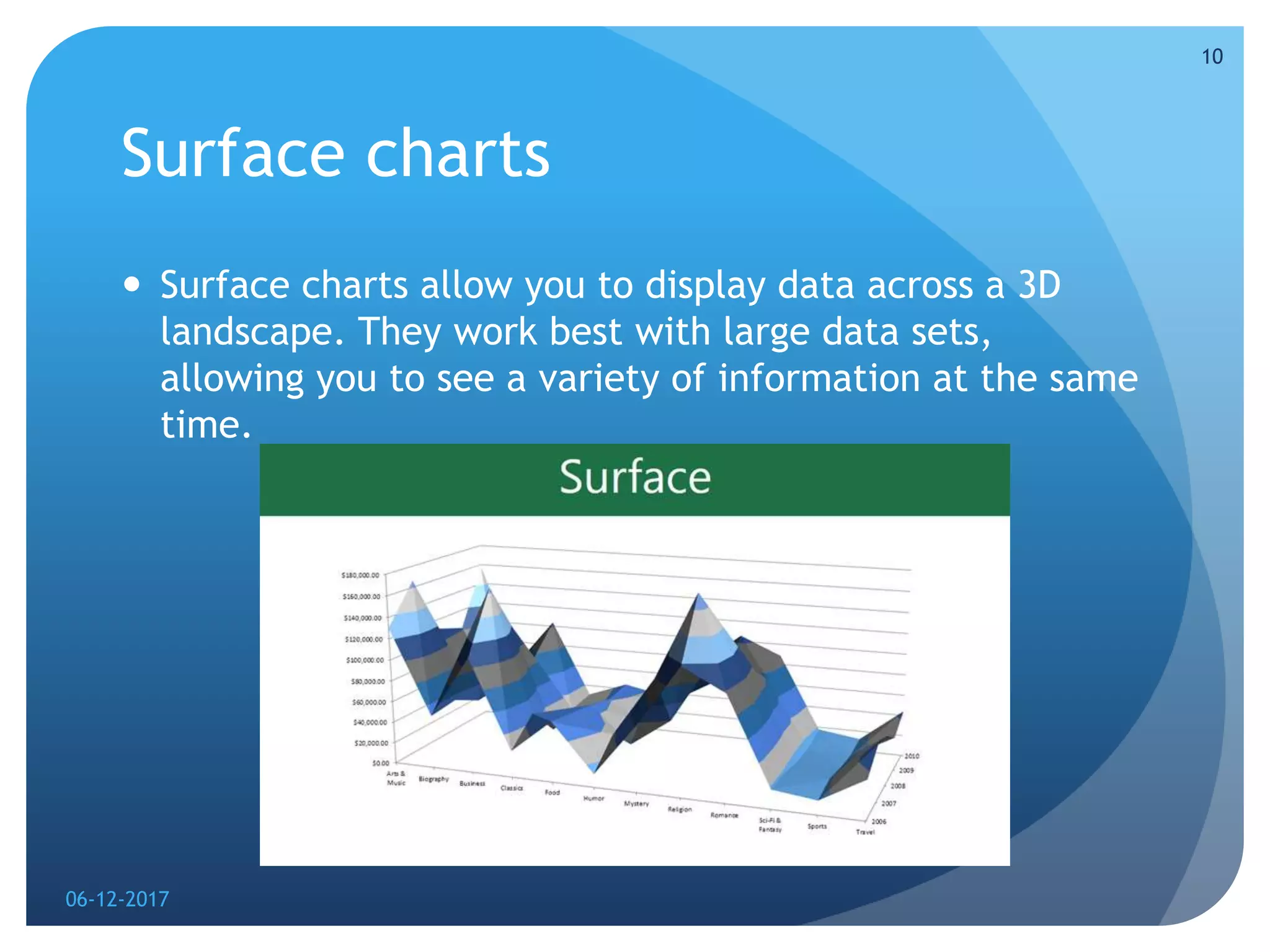
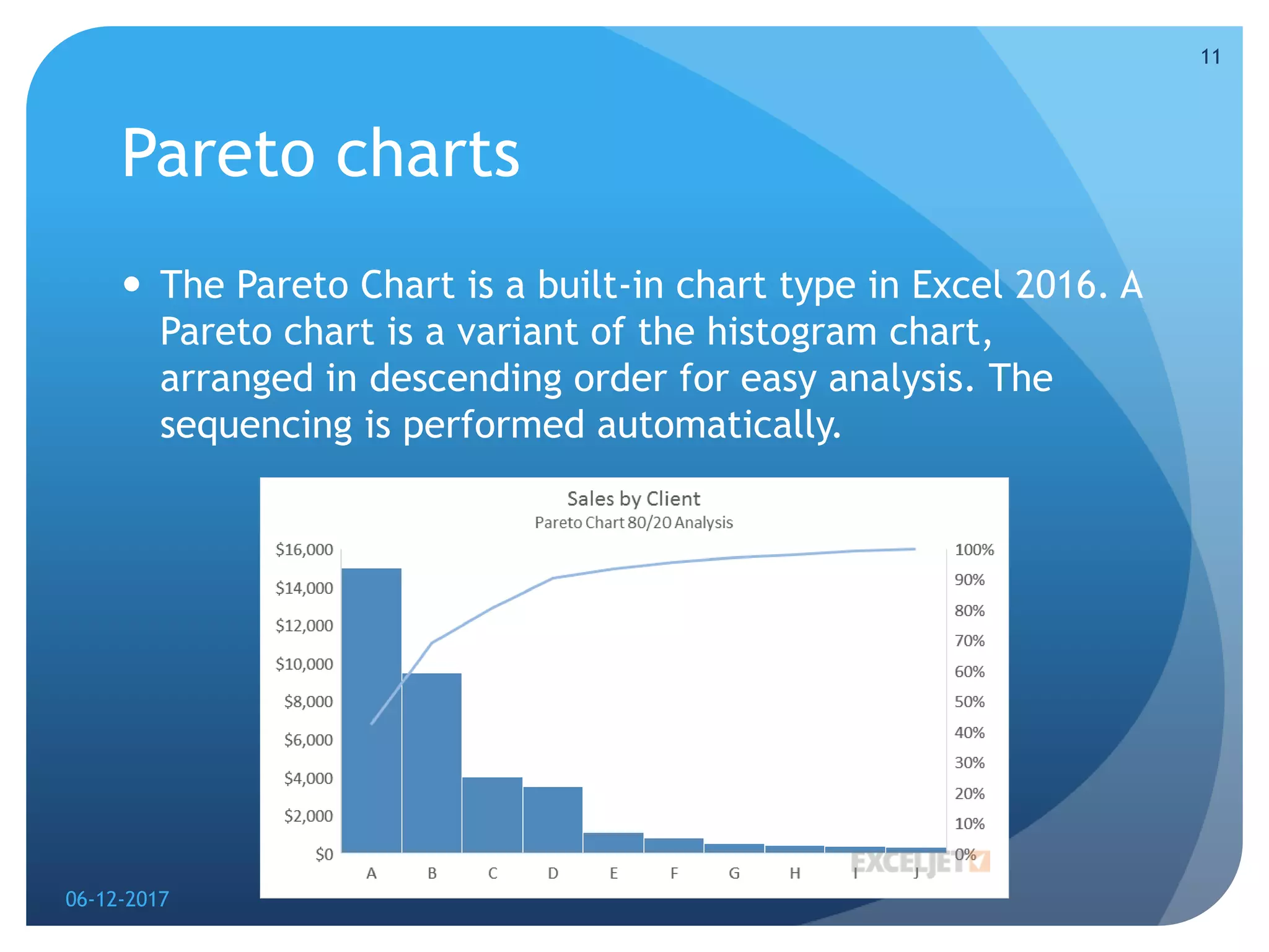
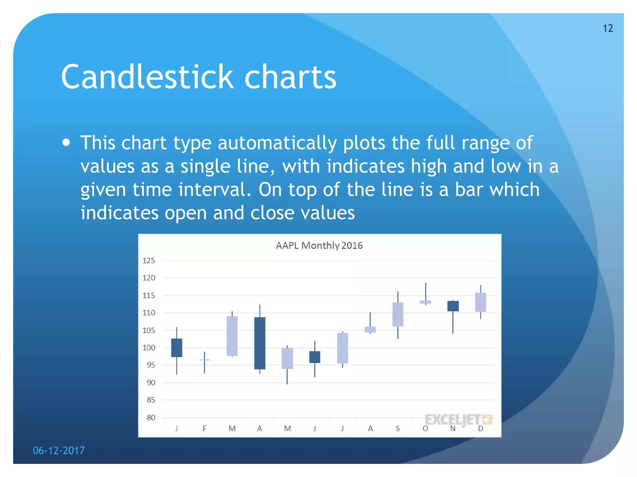
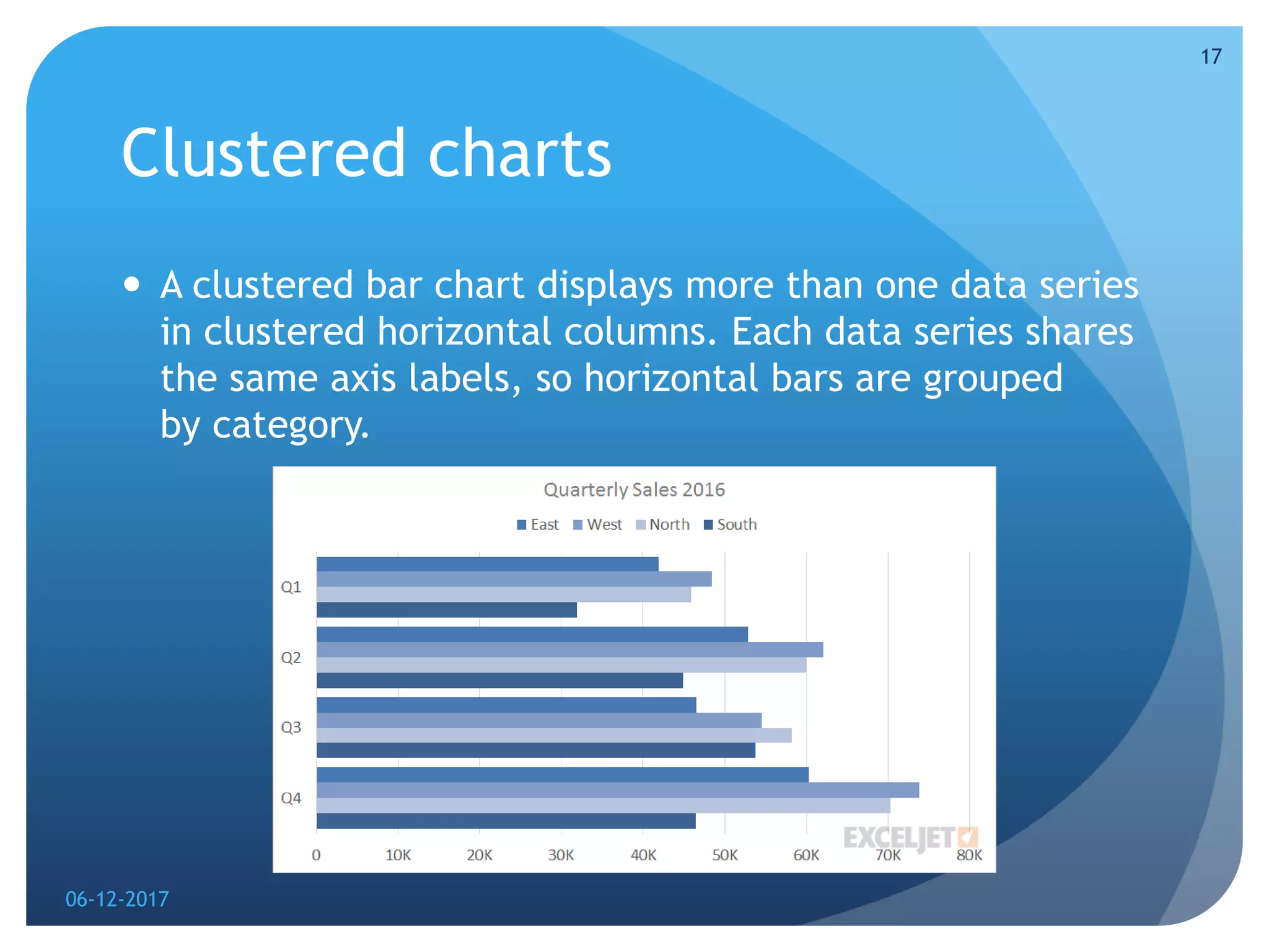
Microsoft excel charts
Presentation by-Aayushi Jain
06-12-2017
1
Introduction
 It can often be difficult to interpret Excel workbooks
that contain a lot of data. Charts allow you to illustrate
your workbook data graphically, which makes it easy to
visualize comparisons and trends.
06-12-2017
2
To insert a chart
 Select the cells you want to chart, including the column
titles and row labels. These cells will be the source data for
the chart.
 From the Insert tab, click the desired Chart command. In
our example, we'll select Column.
 Choose the desired chart type from the drop-down menu.
 The selected chart will be inserted in the worksheet.
 If you're not sure which type of chart to use, the
Recommended Charts command will suggest several
different charts based on the source data.
06-12-2017
3
Types
 Excel has several different types of charts, allowing you
to choose the one that best fits your data. In order to
use charts effectively, you'll need to understand how
different charts are used. here I m explaining 12 types
of charts.
06-12-2017
4
Column charts
 Column charts use vertical bars to represent data. They
can work with many different types of data, but they're
most frequently used for comparing information.
06-12-2017
5
Line charts
 Line charts are ideal for showing trends. The data points
are connected with lines, making it easy to see whether
values are increasing or decreasing over time.
06-12-2017
6
Pie charts
 Pie charts make it easy to compare proportions. Each
value is shown as a slice of the pie, so it's easy to see
which values make up the percentage of a whole.
06-12-2017
7
Bar charts
 Bar charts work just like column charts, but they use
horizontal bars instead of vertical bars.
06-12-2017
8
Area charts
 Area charts are similar to line charts, except the areas
under the lines are filled in.
06-12-2017
9
Surface charts
 Surface charts allow you to display data across a 3D
landscape. They work best with large data sets,
allowing you to see a variety of information at the same
time.
06-12-2017
10
Pareto charts
 The Pareto Chart is a built-in chart type in Excel 2016. A
Pareto chart is a variant of the histogram chart,
arranged in descending order for easy analysis. The
sequencing is performed automatically.
06-12-2017
11
Candlestick charts
 This chart type automatically plots the full range of
values as a single line, with indicates high and low in a
given time interval. On top of the line is a bar which
indicates open and close values
06-12-2017
12
 A Candlestick chart is a built-in chart type in Excel
normally used to show stock price activity. You'll find
this chart under the Stock category of chart types, with
the name Open-High-Low-Close, sometimes abbreviated
OHLC. Dark bars indicate close price is less than open
price (a loss), light bars indicate a close price greater
than open price (a gain).
06-12-2017
13
Bubble charts
 The Bubble Chart is a built-in chart type in Excel.
Bubble charts are a special kind of XY chart that can
display another data series which is used to scale the
bubble (marker) plotted at X and Y values.
06-12-2017
14
Radar charts
 The Radar Chart is a built-in chart type in Excel. Radar
charts, sometimes called spider charts, have one axis
per category which all use the same scale.
06-12-2017
15
 The axes of a radar chart radiate out from the center of
the chart and data points are plotted on each axis using
a common scale. The result is a geometric shape that
shows "at-a-glance" performance across all categories.
 Radar charts can be used to plot the performance of
employees, athletes, products, and companies in
various categories. They can be used for performance
evaluations and satisfaction surveys.
06-12-2017
16
Clustered charts
 A clustered bar chart displays more than one data series
in clustered horizontal columns. Each data series shares
the same axis labels, so horizontal bars are grouped
by category.
06-12-2017
17
Doughnut charts
 Doughnut charts are meant to express a "part-to-whole"
relationship, where all pieces together represent 100%.
Doughnut charts work best to display data with a small
number of categories (2-5).
06-12-2017
18
06-12-2017
19

excel charts

  • 1.
    Microsoft excel charts Presentationby-Aayushi Jain 06-12-2017 1
  • 2.
    Introduction  It canoften be difficult to interpret Excel workbooks that contain a lot of data. Charts allow you to illustrate your workbook data graphically, which makes it easy to visualize comparisons and trends. 06-12-2017 2
  • 3.
    To insert achart  Select the cells you want to chart, including the column titles and row labels. These cells will be the source data for the chart.  From the Insert tab, click the desired Chart command. In our example, we'll select Column.  Choose the desired chart type from the drop-down menu.  The selected chart will be inserted in the worksheet.  If you're not sure which type of chart to use, the Recommended Charts command will suggest several different charts based on the source data. 06-12-2017 3
  • 4.
    Types  Excel hasseveral different types of charts, allowing you to choose the one that best fits your data. In order to use charts effectively, you'll need to understand how different charts are used. here I m explaining 12 types of charts. 06-12-2017 4
  • 5.
    Column charts  Columncharts use vertical bars to represent data. They can work with many different types of data, but they're most frequently used for comparing information. 06-12-2017 5
  • 6.
    Line charts  Linecharts are ideal for showing trends. The data points are connected with lines, making it easy to see whether values are increasing or decreasing over time. 06-12-2017 6
  • 7.
    Pie charts  Piecharts make it easy to compare proportions. Each value is shown as a slice of the pie, so it's easy to see which values make up the percentage of a whole. 06-12-2017 7
  • 8.
    Bar charts  Barcharts work just like column charts, but they use horizontal bars instead of vertical bars. 06-12-2017 8
  • 9.
    Area charts  Areacharts are similar to line charts, except the areas under the lines are filled in. 06-12-2017 9
  • 10.
    Surface charts  Surfacecharts allow you to display data across a 3D landscape. They work best with large data sets, allowing you to see a variety of information at the same time. 06-12-2017 10
  • 11.
    Pareto charts  ThePareto Chart is a built-in chart type in Excel 2016. A Pareto chart is a variant of the histogram chart, arranged in descending order for easy analysis. The sequencing is performed automatically. 06-12-2017 11
  • 12.
    Candlestick charts  Thischart type automatically plots the full range of values as a single line, with indicates high and low in a given time interval. On top of the line is a bar which indicates open and close values 06-12-2017 12
  • 13.
     A Candlestickchart is a built-in chart type in Excel normally used to show stock price activity. You'll find this chart under the Stock category of chart types, with the name Open-High-Low-Close, sometimes abbreviated OHLC. Dark bars indicate close price is less than open price (a loss), light bars indicate a close price greater than open price (a gain). 06-12-2017 13
  • 14.
    Bubble charts  TheBubble Chart is a built-in chart type in Excel. Bubble charts are a special kind of XY chart that can display another data series which is used to scale the bubble (marker) plotted at X and Y values. 06-12-2017 14
  • 15.
    Radar charts  TheRadar Chart is a built-in chart type in Excel. Radar charts, sometimes called spider charts, have one axis per category which all use the same scale. 06-12-2017 15
  • 16.
     The axesof a radar chart radiate out from the center of the chart and data points are plotted on each axis using a common scale. The result is a geometric shape that shows "at-a-glance" performance across all categories.  Radar charts can be used to plot the performance of employees, athletes, products, and companies in various categories. They can be used for performance evaluations and satisfaction surveys. 06-12-2017 16
  • 17.
    Clustered charts  Aclustered bar chart displays more than one data series in clustered horizontal columns. Each data series shares the same axis labels, so horizontal bars are grouped by category. 06-12-2017 17
  • 18.
    Doughnut charts  Doughnutcharts are meant to express a "part-to-whole" relationship, where all pieces together represent 100%. Doughnut charts work best to display data with a small number of categories (2-5). 06-12-2017 18
  • 19.