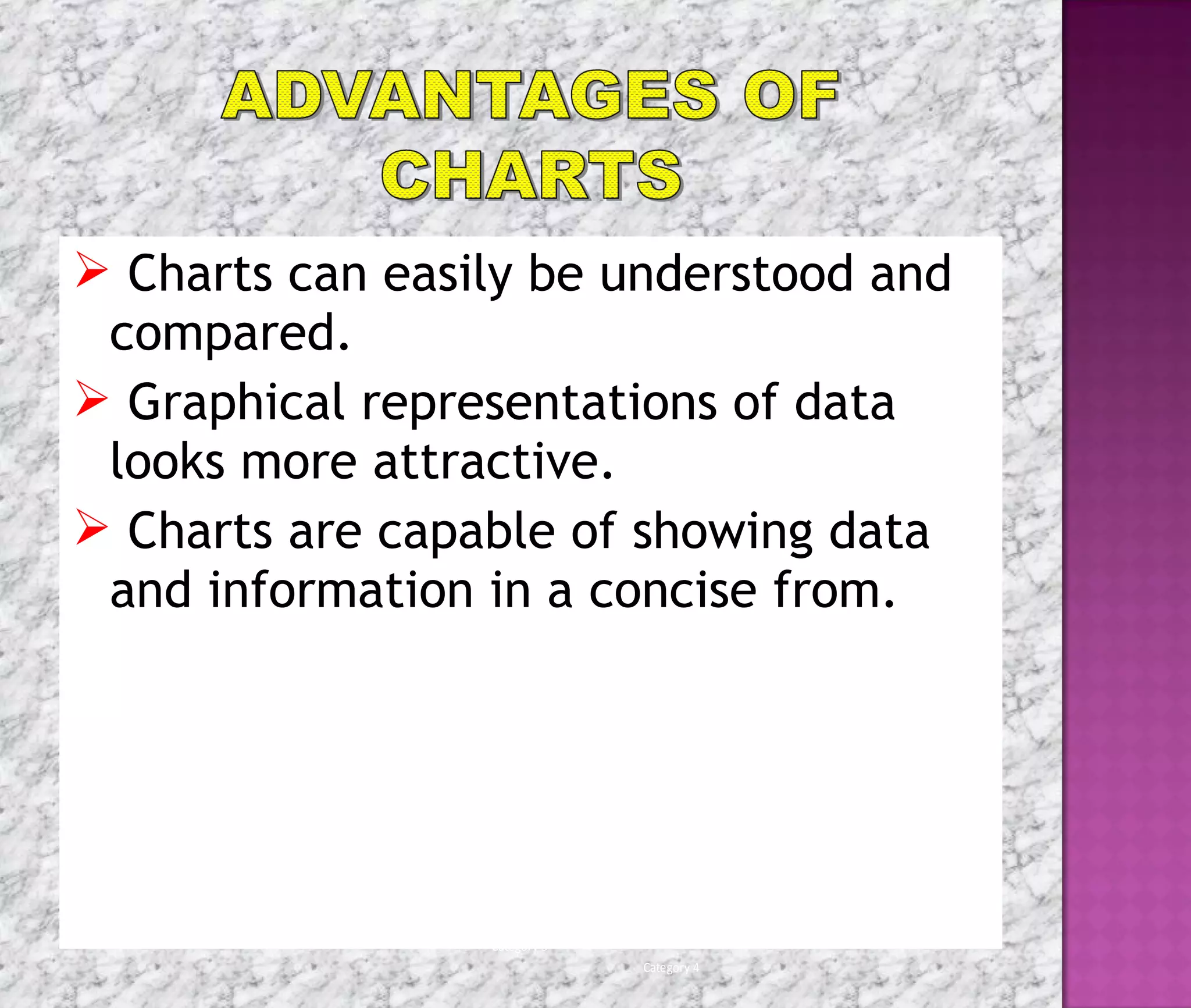
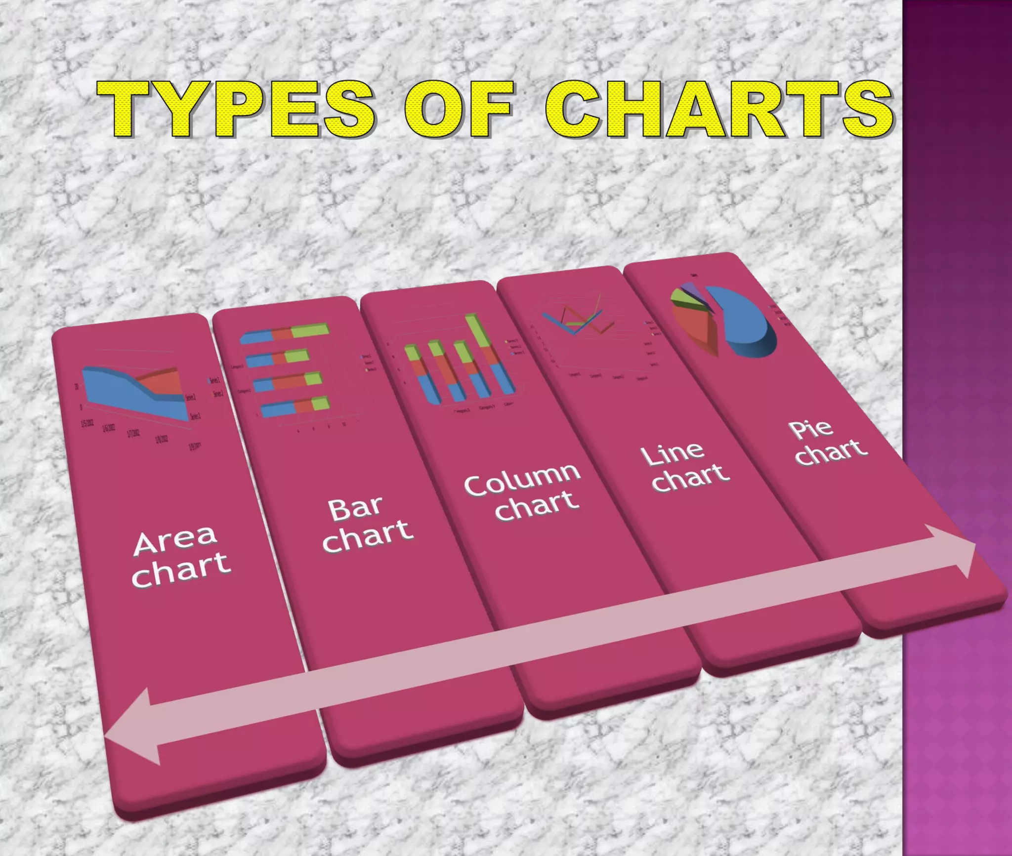
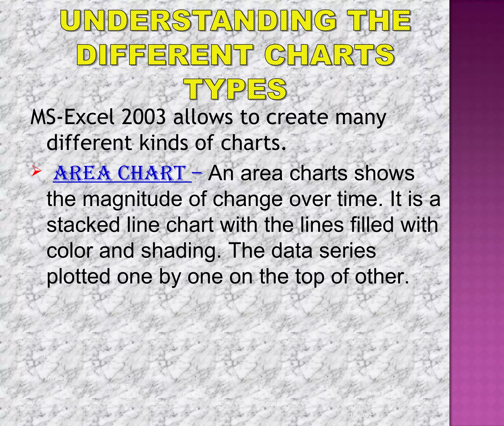
Microsoft Excel is the most popular
spreadsheet software available for
desktop computer. It is a
component of the very popular
Microsoft office application suite
and is fully integrated to effectively
interact with any of the other
Microsoft Office modules.
Charts provide an effective way of
presenting data and information.
Charts enhance the look of the
worksheet and present a large volume
of data in easy format.
Generating charts can help in making
comparisons, taking decisions and
forecasting weather reports.
 Charts can easily be understood and
compared.
 Graphical representations of data
looks more attractive.
 Charts are capable of showing data
and information in a concise from.
0%
10%
20%
30%
40%
50%
60%
70%
80%
90%
100%
Category 1
Category 2
Category 3
Category 4
Series3
Series2
Series1
MS-Excel 2003 allows to create many
different kinds of charts.
 area chart – An area charts shows
the magnitude of change over time. It is a
stacked line chart with the lines filled with
color and shading. The data series
plotted one by one on the top of other.
Series 1
Series 2
0
10
20
30
40
1/5/2002
1/6/2002
1/7/2002
1/8/2002
1/9/2002
Series1
Series2
 bar chart - Bar chart display comparisons
among individual items. Bar charts organize
the categories vertically and values
horizontally. They are column charts drawn
sideways.
0 2 4 6 8 10 12 14
Category 1
Category 2
Category 3
Category 4
Series1
Series2
Series3
column chart – A column chart uses
vertical bar to display values over different
categories. They are excellent at showing
variations in value over time.
0
2
4
6
8
10
12
14
Category 1 Category 2 Category 3 Category 4
Series3
Series2
Series1
 lIne chart- Line charts are useful for
showing change in a value over a
period of time. Each of the data series
is plotted as a line of different color and
shade.
Series1
Series2
Series3
0
0.5
1
1.5
2
2.5
3
3.5
4
4.5
5
Category 1
Category 2
Category 3
Category 4
Series1
Series2
Series3
 pIe chart – A pie chart displays
the contribution of each value to total.
It highlights the relationship in terms
of percentage of each value in a data
series. A pie chart represents only
one data series.
Sales
1stQtr
2nd Qtr
3rd Qtr
4th Qtr
Other charts tat can also be created in MS-
Excel 2003 includes:
radar chart doughnut chart
Sales
1stQtr
2nd Qtr
3rd Qtr
4th Qtr
0
5
10
15
20
25
30
35
1/5/
2002
1/6/
2002
1/7/
2002
1/8/
2002
1/9/
2002
Series1
Series2
XY chart bubble chart
0
0.5
1
1.5
2
2.5
3
3.5
0 0.5 1 1.5 2 2.5 3
Y-Values
Y-Values
0
0.5
1
1.5
2
2.5
3
3.5
4
0 0.5 1 1.5 2 2.5 3 3.5
Y-Values
Y-Values
Charts are a visual representation of
data in the worksheet. Charts make it
easy to see comparisons, patterns and
trends in the data.
MS Excel creates an embedded chart by
default. An embedded chart is placed on
the same worksheet as the source data
used to create it.
To embed a chart in a worksheet, perform
the steps given below
 Click on the view menu and point the toolbar.
 Click on chart option & Select the range of cells.
 Click chart type, pull down arrow & select chart.
 Open the chart options dialog box to add a title
to your chart.
 Select the titles tab & type the title of the
chart in the Chart title text box.
 Click on chart menu.
 Select location option.
 The Chart location dialog box will appears.
 Select as new sheet option.
 Click the OK button.
Sometimes you may want to create a chart and
place it on a separate sheet in the workbook.
This is called a chart sheet.
To move an embedded chart to a chart sheet,
perform the following steps.
 Create an embedded chart.
 Select the chart to be moved to a chart sheet.
To delete a chart, perform the
following steps.
 Click anywhere on the white space of
the chart area to select the chart.
 Press the delete key on your keyboard.
Any embedded chart or chart sheet
can be deleted from a worksheet. A
chart sheet is deleted in the same
manner a worksheet is deleted.
THANK
YOU

Karan Goyal

  • 2.
    Microsoft Excel isthe most popular spreadsheet software available for desktop computer. It is a component of the very popular Microsoft office application suite and is fully integrated to effectively interact with any of the other Microsoft Office modules.
  • 3.
    Charts provide aneffective way of presenting data and information. Charts enhance the look of the worksheet and present a large volume of data in easy format. Generating charts can help in making comparisons, taking decisions and forecasting weather reports.
  • 4.
     Charts caneasily be understood and compared.  Graphical representations of data looks more attractive.  Charts are capable of showing data and information in a concise from. 0% 10% 20% 30% 40% 50% 60% 70% 80% 90% 100% Category 1 Category 2 Category 3 Category 4 Series3 Series2 Series1
  • 6.
    MS-Excel 2003 allowsto create many different kinds of charts.  area chart – An area charts shows the magnitude of change over time. It is a stacked line chart with the lines filled with color and shading. The data series plotted one by one on the top of other. Series 1 Series 2 0 10 20 30 40 1/5/2002 1/6/2002 1/7/2002 1/8/2002 1/9/2002 Series1 Series2
  • 7.
     bar chart- Bar chart display comparisons among individual items. Bar charts organize the categories vertically and values horizontally. They are column charts drawn sideways. 0 2 4 6 8 10 12 14 Category 1 Category 2 Category 3 Category 4 Series1 Series2 Series3
  • 8.
    column chart –A column chart uses vertical bar to display values over different categories. They are excellent at showing variations in value over time. 0 2 4 6 8 10 12 14 Category 1 Category 2 Category 3 Category 4 Series3 Series2 Series1
  • 9.
     lIne chart-Line charts are useful for showing change in a value over a period of time. Each of the data series is plotted as a line of different color and shade. Series1 Series2 Series3 0 0.5 1 1.5 2 2.5 3 3.5 4 4.5 5 Category 1 Category 2 Category 3 Category 4 Series1 Series2 Series3
  • 10.
     pIe chart– A pie chart displays the contribution of each value to total. It highlights the relationship in terms of percentage of each value in a data series. A pie chart represents only one data series. Sales 1stQtr 2nd Qtr 3rd Qtr 4th Qtr
  • 11.
    Other charts tatcan also be created in MS- Excel 2003 includes: radar chart doughnut chart Sales 1stQtr 2nd Qtr 3rd Qtr 4th Qtr 0 5 10 15 20 25 30 35 1/5/ 2002 1/6/ 2002 1/7/ 2002 1/8/ 2002 1/9/ 2002 Series1 Series2
  • 12.
    XY chart bubblechart 0 0.5 1 1.5 2 2.5 3 3.5 0 0.5 1 1.5 2 2.5 3 Y-Values Y-Values 0 0.5 1 1.5 2 2.5 3 3.5 4 0 0.5 1 1.5 2 2.5 3 3.5 Y-Values Y-Values
  • 13.
    Charts are avisual representation of data in the worksheet. Charts make it easy to see comparisons, patterns and trends in the data.
  • 15.
    MS Excel createsan embedded chart by default. An embedded chart is placed on the same worksheet as the source data used to create it. To embed a chart in a worksheet, perform the steps given below  Click on the view menu and point the toolbar.  Click on chart option & Select the range of cells.  Click chart type, pull down arrow & select chart.  Open the chart options dialog box to add a title to your chart.  Select the titles tab & type the title of the chart in the Chart title text box.
  • 16.
     Click onchart menu.  Select location option.  The Chart location dialog box will appears.  Select as new sheet option.  Click the OK button. Sometimes you may want to create a chart and place it on a separate sheet in the workbook. This is called a chart sheet. To move an embedded chart to a chart sheet, perform the following steps.  Create an embedded chart.  Select the chart to be moved to a chart sheet.
  • 17.
    To delete achart, perform the following steps.  Click anywhere on the white space of the chart area to select the chart.  Press the delete key on your keyboard. Any embedded chart or chart sheet can be deleted from a worksheet. A chart sheet is deleted in the same manner a worksheet is deleted.
  • 18.

Editor's Notes

  • #19 Writer’s Choice Text p. 452-453