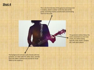
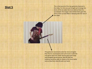
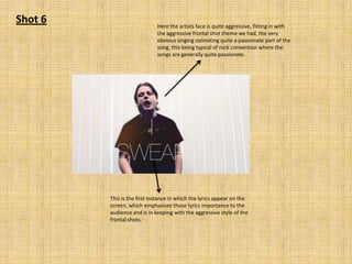
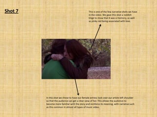
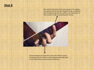
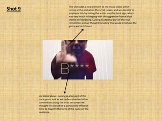
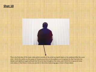
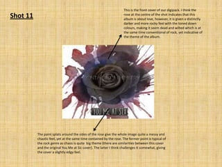
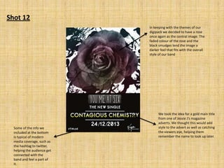
Evaluation Question 1
Shot 1

The red lights were created by using a disco ball
type contraption and reflecting the lasers of the
wall, followed by overlaying the shot over the top.
This gave the music video a slightly surreal effect
which I think was effective

I think the shadows
in this shot are
particularly effective
as they connote a
darker, grungy feel to
the video which is
typical of the rock
genre

Starting the video with a guitar shot I think was very effective
opener as it immediately lets the audience know what genre
of music video they are watching. The shot also has an
unusual angle to it, looking from the base up, which is unique
to our video
Shot 2
In this shot the artist is wearing
clothes that are quite fitting with the
rock genre (dark colours) and has
longer hair which is also conventional
of rock artists.

The artists also has
his finger pointed
upwards, which I
think connotes a bit
of attitude and
emphasises that he
wants to make his
point known to the
audience
Shot 3

The artists face has quite a sceptical, falsely pitying
expression in this shot which I think really captures
the essence of the video, which is about a broken
heart. This is the typical attitude of rock stars on
matters like this, who’s songs normally portray
them as the victim and their bitterness about this
fact.

The high angle of this shot provides some variety to the
video, with the parts of the song in these shots being more
docile and the full frontal shots being the parts were the
artist is more aggressive verbally and physically.
Shot 4
This is the first full shot of the guitarist and shows him
in shadow, which is similar to the first shot of the
guitar, connoting mystery and the dark and brooding
nature of the song.

The guitarists clothes follow the
same conventions as the main
artists, his clothes being
typically rocky (skulls, zombies
etc.) with dark colours.

The background contrasts quite sharply with the
guitarist, as it does with the other shots, and this
gives the video a quite brutal and full on visual
effect to the audience.
Shot 5

This is the second of the two guitarists featured in
the video. For this one we thought we’d change the
shots of him to make him more distinct from his
counterpart. His image is kind of blurred to give the
shot a more surreal effect in keeping with the rest of
the video

The guitarists movements were far more energetic
than the his counterparts and so fit more in with the
rock genre were the artists tend to give quite lively
and energetic performances. We felt that the
audience would be able to relate to this more easily
and so help them identify with our band.
Shot 6

Here the artists face is quite aggressive, fitting in with
the aggressive frontal shot theme we had, the very
obvious singing connoting quite a passionate part of the
song, this being typical of rock convention where the
songs are generally quite passionate.

This is the first instance in which the lyrics appear on the
screen, which emphasises those lyrics importance to the
audience and is in keeping with the aggressive style of the
frontal shots.
Shot 7

This is one of the few narrative shots we have
in the video. We gave this shot a reddish
tinge to show that it was a memory, as well
as pinky red being associated with love.

In this shot we chose to have our female actress look over our artists left shoulder
so that the audience can get a clear view of her. This allows the audience to
become more familiar with the story and reinforce its meaning, with narrative such
as this common in almost all types of music video.
Shot 8
We used this shot when there was a pause in the singing
and a guitar solo started. We thought this was an effective
way of emphasising what the audience was listening to at
that moment as well as providing some variety.

Guitarists fingers are quite dirty in this shot which is typical
of rock genre as the artists in rock bands generally take pride
in not conforming to normal social conventions.
Shot 9

This shot adds a new element to the music video which
comes at the end when the artist curses, and we decided to
emphasis this by having the artists use the hand sign, which
was very much in keeping with the aggressive frontal shot
theme we had going. Cursing is a typical part of the rock
convention and we thought including this would emphasis the
genre we had chosen

As stated above, cursing is a big part of the
rock genre, and as we had emphasised other
conventions using the lyrics on screen we
thought this would be a particularly effective
time to magnify the force of the curse on the
audience.
Shot 10

This is the final shot of the music video which consists of the artist turning his back on the audience after the curse
shot. I think this reinforces the power of the previous shot on the audience as it emphasis for the final time the
disdain and slightly arrogant attitude that the artist has throughout the video, and I think this is typical of many
rock videos in that there is rarely any warmth in the artists body language or tone in these videos.
Shot 11

This is the front cover of our digipack. I think the
rose at the centre of the shot indicates that this
album is about love, however, it is given a distinctly
darker and more rocky feel with the toned down
colours, making it seem dead and wilted which is at
the same time conventional of rock, yet indicative of
the theme of the album.

The paint splats around the sides of the rose give the whole image quite a messy and
chaotic feel, yet at the same time contained by the rose. The former point is typical of
the rock genre as chaos is quite big theme (there are similarities between this cover
and the original You Me at Sic cover). The latter I think challenges it somewhat, giving
the cover a slightly edgy feel.
Shot 12
In keeping with the themes of our
digipack we decided to have a rose
once again as the central image. The
faded colour of the rose and the
black smudges lend the image a
darker feel that fits with the overall
style of our band

Some of the info we
included at the bottom
is typical of modern
media coverage, such as
the hashtag to twitter,
helping the audience get
connected with the
band and feel a part of
it.

We took the idea for a gold main title
from one of Jessie J’s magazine
adverts. We thought this would add
style to the advert as well as catching
the viewers eye, helping them
remember the name to look up later.

Evaluation question 1 (2)

  • 1.
  • 2.
    Shot 1 The redlights were created by using a disco ball type contraption and reflecting the lasers of the wall, followed by overlaying the shot over the top. This gave the music video a slightly surreal effect which I think was effective I think the shadows in this shot are particularly effective as they connote a darker, grungy feel to the video which is typical of the rock genre Starting the video with a guitar shot I think was very effective opener as it immediately lets the audience know what genre of music video they are watching. The shot also has an unusual angle to it, looking from the base up, which is unique to our video
  • 3.
    Shot 2 In thisshot the artist is wearing clothes that are quite fitting with the rock genre (dark colours) and has longer hair which is also conventional of rock artists. The artists also has his finger pointed upwards, which I think connotes a bit of attitude and emphasises that he wants to make his point known to the audience
  • 4.
    Shot 3 The artistsface has quite a sceptical, falsely pitying expression in this shot which I think really captures the essence of the video, which is about a broken heart. This is the typical attitude of rock stars on matters like this, who’s songs normally portray them as the victim and their bitterness about this fact. The high angle of this shot provides some variety to the video, with the parts of the song in these shots being more docile and the full frontal shots being the parts were the artist is more aggressive verbally and physically.
  • 5.
    Shot 4 This isthe first full shot of the guitarist and shows him in shadow, which is similar to the first shot of the guitar, connoting mystery and the dark and brooding nature of the song. The guitarists clothes follow the same conventions as the main artists, his clothes being typically rocky (skulls, zombies etc.) with dark colours. The background contrasts quite sharply with the guitarist, as it does with the other shots, and this gives the video a quite brutal and full on visual effect to the audience.
  • 6.
    Shot 5 This isthe second of the two guitarists featured in the video. For this one we thought we’d change the shots of him to make him more distinct from his counterpart. His image is kind of blurred to give the shot a more surreal effect in keeping with the rest of the video The guitarists movements were far more energetic than the his counterparts and so fit more in with the rock genre were the artists tend to give quite lively and energetic performances. We felt that the audience would be able to relate to this more easily and so help them identify with our band.
  • 7.
    Shot 6 Here theartists face is quite aggressive, fitting in with the aggressive frontal shot theme we had, the very obvious singing connoting quite a passionate part of the song, this being typical of rock convention where the songs are generally quite passionate. This is the first instance in which the lyrics appear on the screen, which emphasises those lyrics importance to the audience and is in keeping with the aggressive style of the frontal shots.
  • 8.
    Shot 7 This isone of the few narrative shots we have in the video. We gave this shot a reddish tinge to show that it was a memory, as well as pinky red being associated with love. In this shot we chose to have our female actress look over our artists left shoulder so that the audience can get a clear view of her. This allows the audience to become more familiar with the story and reinforce its meaning, with narrative such as this common in almost all types of music video.
  • 9.
    Shot 8 We usedthis shot when there was a pause in the singing and a guitar solo started. We thought this was an effective way of emphasising what the audience was listening to at that moment as well as providing some variety. Guitarists fingers are quite dirty in this shot which is typical of rock genre as the artists in rock bands generally take pride in not conforming to normal social conventions.
  • 10.
    Shot 9 This shotadds a new element to the music video which comes at the end when the artist curses, and we decided to emphasis this by having the artists use the hand sign, which was very much in keeping with the aggressive frontal shot theme we had going. Cursing is a typical part of the rock convention and we thought including this would emphasis the genre we had chosen As stated above, cursing is a big part of the rock genre, and as we had emphasised other conventions using the lyrics on screen we thought this would be a particularly effective time to magnify the force of the curse on the audience.
  • 11.
    Shot 10 This isthe final shot of the music video which consists of the artist turning his back on the audience after the curse shot. I think this reinforces the power of the previous shot on the audience as it emphasis for the final time the disdain and slightly arrogant attitude that the artist has throughout the video, and I think this is typical of many rock videos in that there is rarely any warmth in the artists body language or tone in these videos.
  • 12.
    Shot 11 This isthe front cover of our digipack. I think the rose at the centre of the shot indicates that this album is about love, however, it is given a distinctly darker and more rocky feel with the toned down colours, making it seem dead and wilted which is at the same time conventional of rock, yet indicative of the theme of the album. The paint splats around the sides of the rose give the whole image quite a messy and chaotic feel, yet at the same time contained by the rose. The former point is typical of the rock genre as chaos is quite big theme (there are similarities between this cover and the original You Me at Sic cover). The latter I think challenges it somewhat, giving the cover a slightly edgy feel.
  • 13.
    Shot 12 In keepingwith the themes of our digipack we decided to have a rose once again as the central image. The faded colour of the rose and the black smudges lend the image a darker feel that fits with the overall style of our band Some of the info we included at the bottom is typical of modern media coverage, such as the hashtag to twitter, helping the audience get connected with the band and feel a part of it. We took the idea for a gold main title from one of Jessie J’s magazine adverts. We thought this would add style to the advert as well as catching the viewers eye, helping them remember the name to look up later.