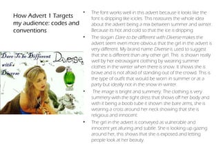
Jemima Selwood 9139
Claremont Fan Court School 64680

          OCR Media Studies J526
   Individual Media Studies Portfolio B321
   Planning and Evaluation: Commentary
•   My advertisement targets young women aged 18 to 25: it
                                  promises being happily single to someone who enjoys going
Fragrance Advert 1:               out with friends but likes city life and its buzz.
Target audience for Diverse   •   My target audience is likely to be energetic : she spends a
is young teenagers                good proportion of her income on makeup, luxurious clothes,
                                  designer shoes and many cosmetics. But the other side of her
                                  is very committed, a woman who is looking for a male
                                  companion yet is quite rebellious.
                              •    Her leisure activities are likely to include shopping and
                                  spending vast amounts of money on clothes; her ideal
                                  weekends are spent with friends and going to for lavish
                                  dinners, spending time with members of both sexes.
                              •   She would be likely to go out for dinner in the evening at
                                  high profile restaurants like Nobu. She works in the city with
                                  very high income.
                              •   Her dream holiday would be a extravagant trip somewhere
                                  really hot like Miami, a very exotic location, and most her time
                                  will be spent on the beach.
                              •   My target audience reads magazines such as Vogue and Elle
                                  and her favourite films are the classics like Love Actually.
                              •   I would place my advert on billboards in huge shopping
                                  centres and I would launch this as a television campaign the
                                  month before Christmas as she is sitting on snow.
•   The font works well in this advert because it looks like the
How Advert 1 Targets         font is dripping like icicles. This reassures the whole idea
my audience: codes and       about the advert being a mix between summer and winter.
conventions                  Because its hot and cold so that the ice is dripping.
                         •   The slogan Dare to be different with Diverse makes the
                             advert seem even more obvious that the girl in the advert is
                             very different. My brand name Diverse is used to suggest
                             that she is different than any other girl. This is shown really
                             well by her extravagant clothing by wearing summer
                             clothes in the winter when there is snow. It shows she is
                             brave and is not afraid of standing out of the crowd. This is
                             the type of outfit that would be worn in summer or at a
                             party but ideally not in the snow in winter.
                         •    The image is bright and summery. The clothing is very
                             summery with the tight dress that shows off her body and
                             with it being a boob tube it shown she bare arms, she is
                             wearing a cross around her neck showing that she is
                             religious and innocent.
                         •   The girl in the advert is conveyed as vulnerable and
                             innocent yet alluring and subtle. She is looking up gazing
                             around her, this shows that she is exposed and letting
                             people look at her beauty.
Fragrance Advert 2: The •   The Target market is young children ages 8-15 who aspire to
Target audience for my      be something great when they grow up.
second advert is young •     They have great child lives and have just got to the stage in
children                    their lives where they hope to be something amazing when
                            they are older. And that they will have many adventures
                            when there older. Because they have big imaginations
                        •    They are interested in a variety of things whether its for girls
                            that age playing with toys or boys that age playing with
                            friends and enjoying their childhood.
                        •   The slogan You to can be wonderful without visiting
                            wonderland, shows that little children don't have to be
                            perfect and that they don't have to follow crowds to be
                            wonderful in other peoples eyes.
                        •    I would place my campaign on billboards or in child care
                            places, because its showing that the children can aspire to be
                            whatever they want, also it is about Alice And Wonderland
                            which is a children's book/film that all children love. I would
                            also put it in children's magazines as they would like to look
                            at all the vibrant colours. Magazines profile readers and make
                            claims about the importance of the magazines in the readers
                            life. They categorize readers into groups relating to interest,
                            income and social status.
•   My chosen font AR CHRISTY Has connotations
How advert 2 targets my       of making the words look fun and good for
                              children
audience: codes &         •   My brand name Little Alice Connotes that she is
conventions                   very little and that she has huge expectations
                              ahead of her in life as she is a bright girl.
                          •   The image is of a little girl who is looking up at
                              the perfume bottle, my main idea came form
                              the film Alice and wonder land which was a
                              huge hit in the box office last year starring stars
                              such as Johnny Depp.
                          •   The background is patterned tiles which fits in
                              really well with the whole idea of an imaginary
                              world, also the film contained patterned
                              flooring in different scenes.
                          •    The clothing is a blue dress, she is wearing this
                              because in the film Alice and wonderland, Alice
                              is wearing a bright blue dress so I made the girl
                              in my advert wear a similar dress this is so that
                              when an onlooker sees my advert they will
                              know instantly where my inspiration came
                              from.
                          •   The is an adventurous little girl who likes to
                              have an adventure. I choose to do this advert
                              to do because I think that it will entertain and
                              enlighten all children's lives.
Research into the magazine
industry as a vehicle for my •   I would place my advert for diverse in a variety of magazines mainly
advertisements                   the glossy magazines for example Vogue and Elle, but also in
                                 Celebrity magazines for example OK or Hello. Where the readers will
Institution- the magazine        seek to be like the cover girl in the magazines. They will wish to have
Industry- my research            the key aspects that the cover girl has. They will identify with the
                                 messages and values about fashion. I would place it here because it
                                 fits in the right place with all the glossy girls on the covers of
                                 magazines such as Vogue.
                             •   I would place my advert for children and mid teenagers in a
                                 magazine that they will relate to. I chose Bliss because loads of
                                 young children read Bliss. I would also be the type of advert that will
                                 fit into magazines such as (cosmos and sugar) With a celebrity on
                                 the front covers young children would read this because they aspire
                                 to be like important celebrities such as Rihanna who is featured in
                                 the Bliss magazine. They might admire female celebrities such as
                                 Rihanna, Beyonce, Lady Gaga and Jessie J. The magazine caters for
                                 children who want to read about fashion and get the inside into
                                 local celebrities lifestyles. Bliss ‘
                             •   The audience profile for the magazine that relates to my adverts:
                                 achievers and aspirers, confident over achievers hoping to be
                                 wealthy and have successful jobs when their older. Interested in
                                 socialising with friends, going shopping, buying clothes, going to
                                 school, music, celebrities and meeting new friends.
                             •    Over a third of magazines revenue comes from advertising like
                                 mine.
•   Firstly I studied soft drink advertisement. I
Research into the                               studied Coca Cola and Lucozade adverts from
advertising industry: use                       the 1950’s through to 2010 and looked at the
                                                differences and how the adverts have
own examples                                    changed in that period. I studied the
Institution: the advertising industry: my       different representations of men, women and
research                                        young people and how the brand conveyed
                                                their messages and how a different message
                                                came across for the different types of groups
                                                of people/ target audience.
                                            •    I analysed television adverts:
                                            •   D&G ‘The One’ 2010 (Gisele Bundchen)
                                            •   ‘Intimately Beckham’ 2010
                                            •    Nina Ricci ‘Ricci Ricci’ 2010
                                            •    Hugo Boss ‘ Hugo’ 2006 (Jonathan Rees
                                                Myers)
                                                Looking at these advert I think made making
                                                my own advert easier as I researched in big
                                                detail and looked at loads of different adverts
                                                to give me ideas. They also gave me
                                                inspiration of how I could portray my girl in
                                                advert 1 making her look alluring yet she
                                                looks innocent but seductive. I also looked
                                                and analysed the 3 adverts from different
                                                time periods, this helped me as I knew what
                                                had changed since the 1920’s to 2010, I then
                                                knew how to make my advert fresh and up to
                                                date.
•   On my advert I decided to make the lighting
Advert 1: my original         lighter and more crisp. I did this on Photoshop
photograph, my                making the outline of the girl more defined against
decisions and revisions       the snow in the background. I also added colour to
                              the girl to make the snow contrast with the skin.
                              This made the advert instantly look brighter. I
                              added blue to the eyes of the girl, I did this to really
                              emphasis the deep blue that you cant really see in
                              this picture.
                          •    I added a personally drawn image of the title
                              Diverse which has icicles dropping from letters. I
                              added this to the right top hand corner and I had
                              to change the colour from grey to white to fit in
                              with the background of the snow. The picture at
                              the bottom left was my first attempt at editing the
                              main photo. I decided not to use this because I
                              made a new one which was crisper and had more
                              shadows.
                          •    I decided to add a green perfume bottle into the
                              advert because it stands out of the advert and it is
                              placed right where the girls gaze is.
Advert 2: My original     •    On my advert 2 I decided I wanted to make something
                              different from the normal advert which consists of a
photograph, my                beautiful girl which is what I did for my first advert.
decisions and revisions       Alice in Wonderland strangely came to mind when I
                              thought of doing a perfume advert for children. I
                              decide that I would use a girl and make her really small
                              and put a giant perfume bottle in next to her. I made
                              two drafts where they where both with different
                              scenes behind them and one had an antique table in it
                              to try and recreate the scene in Alice In Wonderland
                              where Alice is trying to reach for something on the top
                              of the table.
                          •   I eventually used the bottom left photo. I think that it
                              made the advert look more unreal as in the film its all
                              patterns. I decided to add a red perfume bottle into the
                              advert to contrast with the background. I chose a
                              perfume bottle that was bright red and also I thought it
                              looked like the red queen that is in the film Alice in
                              Wonderland. The title Little Alice I used because I feel it
                              went with the advert and it has a nice sound to it. It
                              also portrays that Alice is little which she is in my
                              advert. I changed the background on Photoshop so
                              that the advert seemed more fun and also I changed
                              the girl who is meant to be Alice smaller and the bottle
                              bigger.
•    I think that I had a few strengths whilst being set this task.
                                  One of them I feel is that I think I was quite good at getting
Evaluation of the strengths       a variety of different photos for my advert one, as I needed
and weaknesses of my              to find the right one and ended up with a huge variety to
advertising campaign              choose from.
                              •    My second strength for my first advert I think was being
                                  able to hand draw the title for the advert and having to
                                  scan it into the computer and then having to make it the
                                  same background as the snow. This I found considerably
                                  challenging and difficult but I believe I tested myself and
                                  set myself goals.
                              •   My weaknesses that I had with my first advert I found was
                                  moving one image over onto another image with making
                                  sure that I don't ruin the image as I transferred them over.
                              •    My strengths on my second advert I think where
                                  completely different from my strengths in my first advert. I
                                  only had to take around two photos till I had the one I
                                  wanted. I think my biggest strength was being able to
                                  produce a product which was completely different to any
                                  perfume product I've seen, I had a few moments where I
                                  thought I was going to change my idea but eventually I
                                  pulled through.
                              •   My biggest weakness for my second advert I think was that
                                  I hadn't used some aspects of Photoshop that I needed so I
                                  had to experiment with things I hadn't use before like for
                                  example trying to make it all seem like a fun advert.
This is my first unedited advert that I    This was my first attempt at making the
In decided to use a hand drawn image     didn't use this because I thought the       picture look lighter and more crisp. I
on my advert because I didn't like any           lighting was too dark.            didn't use this because I felt I still needed
of the fonts                                                                                    to make it lighter


                                                                                   When I made the image before
                                         I made the image the                       lighter to get this image I felt
                                         same lighting but I made                  that I lost the crispness of the
                                         this one more crisp. I                                 image
                                         also added a perfume
                                         bottle .
Evaluation Perfume

Evaluation Perfume

  • 1.
    Jemima Selwood 9139 ClaremontFan Court School 64680 OCR Media Studies J526 Individual Media Studies Portfolio B321 Planning and Evaluation: Commentary
  • 2.
    My advertisement targets young women aged 18 to 25: it promises being happily single to someone who enjoys going Fragrance Advert 1: out with friends but likes city life and its buzz. Target audience for Diverse • My target audience is likely to be energetic : she spends a is young teenagers good proportion of her income on makeup, luxurious clothes, designer shoes and many cosmetics. But the other side of her is very committed, a woman who is looking for a male companion yet is quite rebellious. • Her leisure activities are likely to include shopping and spending vast amounts of money on clothes; her ideal weekends are spent with friends and going to for lavish dinners, spending time with members of both sexes. • She would be likely to go out for dinner in the evening at high profile restaurants like Nobu. She works in the city with very high income. • Her dream holiday would be a extravagant trip somewhere really hot like Miami, a very exotic location, and most her time will be spent on the beach. • My target audience reads magazines such as Vogue and Elle and her favourite films are the classics like Love Actually. • I would place my advert on billboards in huge shopping centres and I would launch this as a television campaign the month before Christmas as she is sitting on snow.
  • 3.
    The font works well in this advert because it looks like the How Advert 1 Targets font is dripping like icicles. This reassures the whole idea my audience: codes and about the advert being a mix between summer and winter. conventions Because its hot and cold so that the ice is dripping. • The slogan Dare to be different with Diverse makes the advert seem even more obvious that the girl in the advert is very different. My brand name Diverse is used to suggest that she is different than any other girl. This is shown really well by her extravagant clothing by wearing summer clothes in the winter when there is snow. It shows she is brave and is not afraid of standing out of the crowd. This is the type of outfit that would be worn in summer or at a party but ideally not in the snow in winter. • The image is bright and summery. The clothing is very summery with the tight dress that shows off her body and with it being a boob tube it shown she bare arms, she is wearing a cross around her neck showing that she is religious and innocent. • The girl in the advert is conveyed as vulnerable and innocent yet alluring and subtle. She is looking up gazing around her, this shows that she is exposed and letting people look at her beauty.
  • 4.
    Fragrance Advert 2:The • The Target market is young children ages 8-15 who aspire to Target audience for my be something great when they grow up. second advert is young • They have great child lives and have just got to the stage in children their lives where they hope to be something amazing when they are older. And that they will have many adventures when there older. Because they have big imaginations • They are interested in a variety of things whether its for girls that age playing with toys or boys that age playing with friends and enjoying their childhood. • The slogan You to can be wonderful without visiting wonderland, shows that little children don't have to be perfect and that they don't have to follow crowds to be wonderful in other peoples eyes. • I would place my campaign on billboards or in child care places, because its showing that the children can aspire to be whatever they want, also it is about Alice And Wonderland which is a children's book/film that all children love. I would also put it in children's magazines as they would like to look at all the vibrant colours. Magazines profile readers and make claims about the importance of the magazines in the readers life. They categorize readers into groups relating to interest, income and social status.
  • 5.
    My chosen font AR CHRISTY Has connotations How advert 2 targets my of making the words look fun and good for children audience: codes & • My brand name Little Alice Connotes that she is conventions very little and that she has huge expectations ahead of her in life as she is a bright girl. • The image is of a little girl who is looking up at the perfume bottle, my main idea came form the film Alice and wonder land which was a huge hit in the box office last year starring stars such as Johnny Depp. • The background is patterned tiles which fits in really well with the whole idea of an imaginary world, also the film contained patterned flooring in different scenes. • The clothing is a blue dress, she is wearing this because in the film Alice and wonderland, Alice is wearing a bright blue dress so I made the girl in my advert wear a similar dress this is so that when an onlooker sees my advert they will know instantly where my inspiration came from. • The is an adventurous little girl who likes to have an adventure. I choose to do this advert to do because I think that it will entertain and enlighten all children's lives.
  • 6.
    Research into themagazine industry as a vehicle for my • I would place my advert for diverse in a variety of magazines mainly advertisements the glossy magazines for example Vogue and Elle, but also in Celebrity magazines for example OK or Hello. Where the readers will Institution- the magazine seek to be like the cover girl in the magazines. They will wish to have Industry- my research the key aspects that the cover girl has. They will identify with the messages and values about fashion. I would place it here because it fits in the right place with all the glossy girls on the covers of magazines such as Vogue. • I would place my advert for children and mid teenagers in a magazine that they will relate to. I chose Bliss because loads of young children read Bliss. I would also be the type of advert that will fit into magazines such as (cosmos and sugar) With a celebrity on the front covers young children would read this because they aspire to be like important celebrities such as Rihanna who is featured in the Bliss magazine. They might admire female celebrities such as Rihanna, Beyonce, Lady Gaga and Jessie J. The magazine caters for children who want to read about fashion and get the inside into local celebrities lifestyles. Bliss ‘ • The audience profile for the magazine that relates to my adverts: achievers and aspirers, confident over achievers hoping to be wealthy and have successful jobs when their older. Interested in socialising with friends, going shopping, buying clothes, going to school, music, celebrities and meeting new friends. • Over a third of magazines revenue comes from advertising like mine.
  • 7.
    Firstly I studied soft drink advertisement. I Research into the studied Coca Cola and Lucozade adverts from advertising industry: use the 1950’s through to 2010 and looked at the differences and how the adverts have own examples changed in that period. I studied the Institution: the advertising industry: my different representations of men, women and research young people and how the brand conveyed their messages and how a different message came across for the different types of groups of people/ target audience. • I analysed television adverts: • D&G ‘The One’ 2010 (Gisele Bundchen) • ‘Intimately Beckham’ 2010 • Nina Ricci ‘Ricci Ricci’ 2010 • Hugo Boss ‘ Hugo’ 2006 (Jonathan Rees Myers) Looking at these advert I think made making my own advert easier as I researched in big detail and looked at loads of different adverts to give me ideas. They also gave me inspiration of how I could portray my girl in advert 1 making her look alluring yet she looks innocent but seductive. I also looked and analysed the 3 adverts from different time periods, this helped me as I knew what had changed since the 1920’s to 2010, I then knew how to make my advert fresh and up to date.
  • 8.
    On my advert I decided to make the lighting Advert 1: my original lighter and more crisp. I did this on Photoshop photograph, my making the outline of the girl more defined against decisions and revisions the snow in the background. I also added colour to the girl to make the snow contrast with the skin. This made the advert instantly look brighter. I added blue to the eyes of the girl, I did this to really emphasis the deep blue that you cant really see in this picture. • I added a personally drawn image of the title Diverse which has icicles dropping from letters. I added this to the right top hand corner and I had to change the colour from grey to white to fit in with the background of the snow. The picture at the bottom left was my first attempt at editing the main photo. I decided not to use this because I made a new one which was crisper and had more shadows. • I decided to add a green perfume bottle into the advert because it stands out of the advert and it is placed right where the girls gaze is.
  • 9.
    Advert 2: Myoriginal • On my advert 2 I decided I wanted to make something different from the normal advert which consists of a photograph, my beautiful girl which is what I did for my first advert. decisions and revisions Alice in Wonderland strangely came to mind when I thought of doing a perfume advert for children. I decide that I would use a girl and make her really small and put a giant perfume bottle in next to her. I made two drafts where they where both with different scenes behind them and one had an antique table in it to try and recreate the scene in Alice In Wonderland where Alice is trying to reach for something on the top of the table. • I eventually used the bottom left photo. I think that it made the advert look more unreal as in the film its all patterns. I decided to add a red perfume bottle into the advert to contrast with the background. I chose a perfume bottle that was bright red and also I thought it looked like the red queen that is in the film Alice in Wonderland. The title Little Alice I used because I feel it went with the advert and it has a nice sound to it. It also portrays that Alice is little which she is in my advert. I changed the background on Photoshop so that the advert seemed more fun and also I changed the girl who is meant to be Alice smaller and the bottle bigger.
  • 10.
    I think that I had a few strengths whilst being set this task. One of them I feel is that I think I was quite good at getting Evaluation of the strengths a variety of different photos for my advert one, as I needed and weaknesses of my to find the right one and ended up with a huge variety to advertising campaign choose from. • My second strength for my first advert I think was being able to hand draw the title for the advert and having to scan it into the computer and then having to make it the same background as the snow. This I found considerably challenging and difficult but I believe I tested myself and set myself goals. • My weaknesses that I had with my first advert I found was moving one image over onto another image with making sure that I don't ruin the image as I transferred them over. • My strengths on my second advert I think where completely different from my strengths in my first advert. I only had to take around two photos till I had the one I wanted. I think my biggest strength was being able to produce a product which was completely different to any perfume product I've seen, I had a few moments where I thought I was going to change my idea but eventually I pulled through. • My biggest weakness for my second advert I think was that I hadn't used some aspects of Photoshop that I needed so I had to experiment with things I hadn't use before like for example trying to make it all seem like a fun advert.
  • 12.
    This is myfirst unedited advert that I This was my first attempt at making the In decided to use a hand drawn image didn't use this because I thought the picture look lighter and more crisp. I on my advert because I didn't like any lighting was too dark. didn't use this because I felt I still needed of the fonts to make it lighter When I made the image before I made the image the lighter to get this image I felt same lighting but I made that I lost the crispness of the this one more crisp. I image also added a perfume bottle .