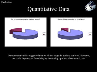
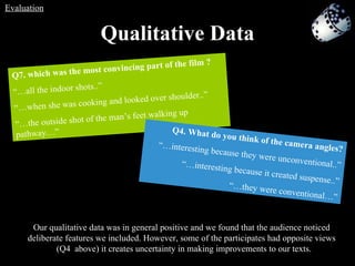
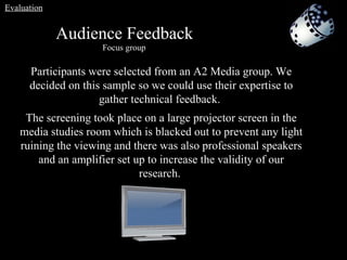
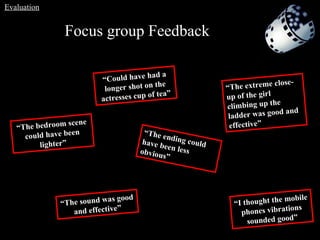
The document discusses how the media product uses, develops or challenges conventions of the thriller genre in its mise-en-scene, characters, narrative, themes, camera work, editing, sound, setting, props and characters. It evaluates how the media product approaches these conventions based on research of other similar products.
The document discusses the conventions of thriller films and how the student's media product adheres to or challenges these conventions. It addresses conventions in areas like mise-en-scene, characters, narrative, camera work, editing, sound, setting, props, and characters. The poster and film review also follow typical conventions like layout, colors, title placement, credits, images, columns, and ratings. In some cases the student's product challenges conventions by using unfamiliar settings, multiple victim characters, and unusual credit positioning.
The document discusses the conventions of film magazines, film posters, and thriller film trailers. It describes how the student's media products utilized some of these conventions, such as using establishing shots, fog/mist effects, and tripod camera shots. It also discusses some ways the student's products challenged conventions, such as using an atypical park setting and more realistic shots. The document focuses on how the student linked their film trailer, poster, and magazine cover through consistent visual elements like characters, location, and font to effectively promote their film.
The document discusses the conventions of film magazines and horror/thriller film posters and how the student's media products apply or challenge these conventions. It analyzes how the film trailer, film poster, and magazine cover work together through consistent imagery, characters, fonts, and mood. Audience feedback is important as it provides insight into what is successful or needs improvement in communicating the intended genre and story.
The student summarizes the opening sequence created by their group for a film evaluation assignment. Their group consisted of three members who each took on different roles in creating the 2-3 minute opening sequence in the psychological thriller genre. The sequence introduces the main character James, who is from a wealthy family, and establishes he has been kidnapped. It aims to attract audiences and keep them interested by using common thriller conventions while also adding some unique plot twists.
This document discusses how the media product uses and develops conventions of real film trailers, posters, and magazines. It analyzes the conventions used in a teaser trailer, film poster, and magazine cover for the film Warm Bodies. It then explains how the conventions from Warm Bodies and other zombie films were used and developed for the teaser trailer, poster, and magazine cover created for the media product T.O.D. Settings, lighting, props, costumes, and makeup are discussed in developing the realistic elements of a zombie horror genre.
Our media product uses and develops conventions of the crime/gangster genre. We filmed in urban settings like alleyways and subways at nighttime. The narrative involves gambling debts and consequences. Main characters include an intimidating boss and a young, cocky protagonist who challenges higher-ups. Feedback helped improve realism and address offensiveness. Media technologies like blogs, cameras, editing software, and Photoshop supported planning, production, and evaluation.
The document discusses conventions of the crime/gangster genre that the media product uses, including settings in urban areas, themes of gambling and debt, and character types like a young but overconfident protagonist. Feedback was gathered through focus groups and questionnaires to evaluate the effectiveness of combining the film trailer with other marketing texts and identify ways to improve the media product. Key lessons included the importance of audience feedback in meeting expectations and preferences.
The document provides guidance on writing an effective film review. It explains that a review should inform readers about the film's details, describe the story and characters, analyze whether the film is good and why, and advise readers whether to see it. It also offers tips on structuring a review with an introduction, plot description, analysis, and conclusion. Font formatting and appropriate images are also discussed. The target audience for most film reviews is generally people aged 25 and older.
The document discusses the codes and conventions of film posters. It explains that film posters are meant to attract the target audience and establish the genre and narrative. Posters typically feature the main image showing the narrative or protagonist, the central title at the top, and information about directors, producers and actors at the bottom. Posters also commonly include mottos or quotes from the film and ratings. The document proposes ideas for a film poster including featuring the protagonist in a character shot to introduce her, using lighting and composition techniques, and designing the title with a gradient and the words "lost in the" inside each letter of the protagonist's name.
My partner and I created a teaser trailer and poster for a psychological thriller film. We drew inspiration from films like "Split" and "Inception" that target a youthful audience. The trailer incorporates elements of both the horror and thriller genres to create a hybrid product. It includes scary and violent scenes like a horror film but also psychological suspense like a thriller. We used conventions like a dark color palette, possessed object as the central image, and ominous soundtrack. However, we also challenged some conventions by not including the main character's face or a specific release date to generate mystery. The goal was to attract audiences with a unique product that fits in the psychological thriller genre.
The document summarizes the findings of a focus group conducted to gather feedback on horror film trailers, posters, and magazine covers from the target audience of 17-18 year old girls. The focus group provided insights that will help the creators design an effective trailer, poster, and magazine cover for their psychological horror film that will appeal to the target demographic. They learned that elements like an intriguing protagonist, ambiguity, tension-building music and quick cuts are preferred for the trailer. Posters should feature the antagonist with mystery and a tagline. Magazine covers worked best when the main image drew readers in with eye contact.
How effective is the combination of your main product and ancillary texts ?Christinadaniella
The document discusses how combining a film trailer with ancillary texts like a poster and magazine cover can increase effectiveness. It analyzes the poster and magazine cover created for a student film project. For the poster, key elements like the central image, actors' names, and tagline were used to attract attention and link to the trailer. The magazine cover also featured the central image and tagline to create synergy across products and intrigue audiences about the film's thriller genre. Analyzing real examples helped understand how to craft attractive and related ancillary texts to better promote the film.
We used various media technologies throughout the construction, research, planning and evaluation stages of our project. During construction, we used filming equipment, professional cameras, lighting and a Mac for editing. For research and planning, we utilized our group blog, slideshare and the internet. We also filmed a focus group and uploaded our film to gain audience feedback via YouTube, the blog and websites. This feedback helped us evaluate and improve our film.
The document provides guidance on how to create an effective storyboard. It explains that storyboards are a series of illustrations displayed in sequence to help filmmakers visualize shots and plan their film. It then discusses key elements of an effective storyboard like including camera instructions, shot types, sound details and duration for each shot. The document also provides tips for drawing people in a proportionate "sausage" style and colors the finished storyboard in Photoshop for a polished look. The storyboard is numbered and includes all relevant details to plan shots according to the script.
This document discusses the marketing campaign for the film Inception, including teasers, trailers, websites, posters and magazine features promoting the film. It also provides analysis of the teaser trailers for Inception and Fast Five, discussing conventions such as logos, images and taglines used. Examples of posters and magazine covers are presented and evaluated for their effectiveness.
The document discusses the creation of ancillary texts, including a poster and radio trailer, to promote a psychological thriller film called "The Employer".
It describes the process of researching conventions for thriller posters and radio trailers, then designing the poster with subtle ominous elements and the radio trailer as a monologue spoken by the film's antagonist that directly addresses the audience.
Feedback on the ancillary texts was positive, noting they effectively represented the eerie and dangerous atmosphere of the film and complemented each other in promotion.
This document discusses how the filmmaker used, developed, and challenged conventions of short films in their media product. They began by researching conventions around narrative, genre, characters, and structure. Their 13 minute film followed some conventions like a slow pace and small cast to keep the audience engaged. They also challenged some conventions, like not fully resolving the narrative to fit the psychological thriller genre. Overall, the filmmaker aimed to create a professional product by following many short film conventions but also took some risks that challenged norms to serve their original story.
The document discusses the conventions used in horror film trailers, posters, and magazine covers. It analyzes several existing examples from each media type to understand typical conventions like dark color schemes, dramatic scenes, and positioning of key information. The response then discusses how the conventions were used or challenged in the teaser trailer, poster, and magazine cover created for a horror film project.
The document summarizes the results of a survey conducted with the target audience of a film poster for a short psychological thriller film. 25 people ages 19-25 answered questions about the poster. The majority liked the layout, felt it fit the genre, and were reminded of similar films. They were drawn to the poster by the image and felt the main character Eve looked innocent and vulnerable. Most rated the poster as looking professional and said it made them want to watch the film. In conclusion, the poster testing was very successful in conveying the intended message to the target demographic.
The document analyzes the conventions used in horror film trailers, posters, and magazine covers. It discusses how the creator researched existing examples to understand conventions and then applied them to their own horror media products. Key conventions included dark color schemes, isolated locations, dramatic scenes, and revealing the film title at the end for trailers. Posters featured taglines, images of characters, and credits at the bottom. Magazine covers had the magazine title at the top in large font and featured a character image related to the genre.
The document analyzes the conventions used in horror film trailers, posters, and magazine covers. It discusses how the creator researched existing examples to understand conventions and then applied them to their own horror media products. Key conventions included dark color schemes, isolated locations, dramatic scenes, and revealing the film title at the end for trailers. Common poster elements were taglines, images of characters, and credits at the bottom. Magazine covers usually featured people, contrasting colors, and previews of content inside. The creator incorporated these standard horror media conventions across their teaser trailer, poster, and magazine cover design.
The document discusses the production of a short film called "The Unknown Variable" and the ways it uses and challenges conventions of real media. Some key points:
- The film incorporates the Barthes theory of narratives to build tension and mystery. It follows conventions like other short films but also challenges forms to convey its message.
- Research was done on cinematography, narrative and other films to make the short film look professional. Shots like long shots and medium shots were used effectively.
- The poster challenges conventions by using an image related to the plot rather than the main characters. This leaves the audience wondering about the events in the film.
- The combination of the film, poster and other materials
The filmmakers created a radio trailer and poster to promote their short film about a drug deal gone wrong. The radio trailer uses audio clips and music from the film to create familiarity and intrigue about the characters and plot. The poster depicts the main actor's face in an aggressive pose with critical quotes to seem intriguing and make viewers want to learn more by visiting the film's website and listening to the radio trailer. The filmmakers believe these ancillary materials will successfully advertise and sell their film.
How effective is the combination of your main product and the ancillary texts?ConnorOB
The document discusses the effectiveness of ancillary texts, including a film poster and radio trailer, in promoting a short film called "7 Minutes".
The poster uses horror-style fonts, mysterious images and a quote to foreshadow death and danger, reflecting the film's thriller genre. It effectively attracts the target 15-24 age group.
The radio trailer uses sound effects, persuasive quotes and dialogue to give the audience insights into the film's plot while also conveying it is exciting and of high quality. Both ancillary texts directly relate to and promote the key elements of the film.
The document discusses how the media product uses conventions of the crime/gangster genre. It follows conventions in its mise-en-scene by filming in urban areas, narrative by including themes of gambling and debt, and characters like a powerful boss and reckless young protagonist. Feedback was gathered through focus groups, questionnaires, and online to help evaluate and improve the product. Various media technologies like blogs, cameras, editing software, and Photoshop were used at different stages of production.
The document provides feedback from audiences on a short film and accompanying media products created by the author. Questionnaires given to 40 and 50 people found that drama was the most popular genre. For the film poster, most audience members were attracted to the main image but some thought it was a crime film rather than thriller. The author learned they should have included a billing block. Overall, audience research is beneficial but results may not be accurate and limited feedback was received. The author used online research, Photoshop, and InDesign in creating the film and ancillary texts.
The document provides feedback from an evaluation of a short film project. It discusses how the film incorporated conventions like mystery and tension to engage audiences. Research was done on existing films to understand conventions. Feedback was collected through questionnaires which found drama to be the most popular genre. Further feedback on the film found the main image attracted attention, while some thought it was a crime or horror film based on colors. Lessons were learned about including more images and a billing block to improve promotion. Media technologies like Photoshop, InDesign and online research were used in the project's production, planning and evaluation.
The student created a short film and ancillary texts including a poster and magazine article to promote the film. They researched codes and conventions from real media products to make their work look professional. Feedback from audiences was positive and showed the film successfully engaged viewers. The student learned the importance of audience feedback to improve their skills. Media technologies including cameras, editing software, and websites were used at all stages of production, research, and distribution to construct high quality media products and receive global feedback.
The document summarizes the ways in which the media product, a thriller film titled "The Face of a Killer", uses and develops conventions of the thriller genre. It discusses how the film uses red colors, dim lighting, quick cuts, and ominous music to build tension. It also challenges conventions by subverting expectations about the identity of the victim and killer. Audience feedback found these techniques generally effective at creating suspense, though some were confused by the twist in expectations.
The document discusses a student's media product project in the thriller genre of film. It includes sections that analyze the use of forms and conventions in different elements of the project like camera work, editing, sound, special effects, and narrative. Feedback from target audiences is also discussed. The student learned various filming and editing techniques in creating the project and improved their skills from their preliminary task. They were able to apply feedback to strengthen areas like transitions, continuity, and use of sound.
The student created a short film, poster, and magazine article to promote their film. They researched codes and conventions from real media products to make their work look professional. Feedback from audiences was positive and showed the acting, editing, color scheme, and genre representation were effective. Throughout the process, the student used various media technologies for construction, research, planning, and evaluation. They leveraged websites and social media to distribute their work globally and improve their digital skills.
This document summarizes Priyanka Chawla's reflections on creating a media title sequence for a psychological thriller as part of a group project. Some key points:
- Priyanka researched conventions of psychological thriller titles and incorporated some (simple text on black background) while avoiding others (black and white filter) for their project.
- Close-ups, quick editing, and suspenseful sound were used to follow thriller conventions. Male characters were given more screen time and dominance to represent typical gender stereotypes.
- Warner Bros. would be a good distributor since they have distributed similar thrillers in the past. The intended audience is males ages 15 and over who would relate to the male dominance
This document summarizes Priyanka Chawla's reflections on creating a media title sequence for a psychological thriller as part of a group project. Some key points:
- Priyanka researched conventions of psychological thriller titles and incorporated some (simple text on black background) while avoiding others (black and white filter) for their project.
- Close-ups, quick editing, and suspenseful sound were used to represent conventions of the genre.
- Stereotypes of male dominance and women in subservient roles were represented through camerawork, editing, sound, and mise-en-scene.
- Warner Bros. was identified as a suitable distributor because of its experience with similar
The document discusses a student's media studies coursework evaluating a teaser trailer they created for a horror film project. It covers the typical conventions used in horror trailers and how the student incorporated these into their teaser trailer. It also discusses how they developed ancillary tasks including a magazine cover and film posters to create a consistent brand identity and reinforce the film's image. The student analyzes how effective the combination of these materials was at constructing a strong brand. Finally, it discusses how the student gathered audience feedback on the project through various methods.
The document discusses the student's media studies coursework, including a teaser trailer for a horror film and accompanying ancillary tasks like posters and a magazine cover.
The student used typical conventions for a horror genre teaser trailer, including brief glimpses of actors, blood, and an ominous setting. Feedback was gathered from peers via a survey. The trailer and ancillary tasks were designed to have consistent branding elements like the use of a main character, colors, font, and taglines related to the film's woods setting and childlike elements. Media technologies like YouTube, blogs, and editing software were used for research, production, and gathering audience feedback evaluations.
The document discusses the student's media studies coursework, including a teaser trailer for a horror film and accompanying ancillary tasks like posters and a magazine cover.
The student used typical conventions for a horror genre teaser trailer, including quick shots, blood, and an ominous setting. Feedback was positive, though some felt the trailer could have shown the killer (a little girl) more.
Accompanying tasks like posters and magazines also featured these conventions to create a consistent brand identity. Feedback noted the clear brand image across tasks but felt one poster could include more.
Media technologies helped at all stages, from research/planning using YouTube, blogs and Google to production using editing software and cameras to evaluation by gathering
The document discusses how new media technologies were used at various stages of creating a horror film marketing package, including a teaser trailer, poster, and magazine cover. Research was conducted online using Google. Photoshop was used to design the magazine cover and edit photos. A digital camera was used to take production stills. Final Cut Pro was used to edit the teaser trailer. Blogger was used to share work online. SlideShare was used to publish a presentation. Throughout the process, technologies helped with construction, research, planning, and sharing of the project.
The document discusses conventions for the structure and elements of short drama films. It notes that short films typically begin with title cards and opening credits to identify the film and production companies. It also summarizes that short dramas commonly use low-key lighting to set a mood, tell stories in a way that leaves questions for the audience, are set in real rather than fantastical worlds, and feature character archetypes like heroes, villains and helpers. The document concludes that short films conventionally end by resolving the main conflict and showing closing credits with production company and staff names.
The document discusses the forms and conventions used in the opening of thriller films. It analyzes how the student media project both conformed to and challenged these conventions through elements like narrative, mise-en-scene, camera work, editing, sound, and titles. Key ways the project developed conventions included subverting expectations by revealing the apparent victim was actually the killer. Audience feedback found this twist to be an interesting surprise, though some felt confused.
The student created a short horror film and ancillary texts including a poster and magazine article to promote the film. They researched codes and conventions of real media to make their products look professional. Feedback from audiences was positive and indicated the acting, editing, color scheme, and genre representation were effective. Various media technologies were used at different stages, including cameras, editing software, music programs, and websites to film, edit, distribute, and get feedback on the projects. The student's skills improved through converging technologies to construct their media products.
The document provides an evaluation of a 2 minute media film opening. It discusses how the opening uses conventions from real media products such as sound and camera shots to build tension. It challenges one convention by not including dialogue. The document also discusses how the opening represents social groups through the main characters and why a horror institution would be suited to distribute the product. The intended audience is described as well as how the opening aims to attract them through relatable characters and tension-building techniques. The document reflects on the technologies used such as editing software and what was learned from creating the preliminary task and developing the full opening.
The document provides an evaluation of a 2-minute media film opening. It discusses several ways the opening uses and develops conventions of real media products. It discusses the use of soundtracks to build tension, as well as challenging conventions by not including dialogue. It also discusses the use of various camera shots and movements that both conform to and challenge conventions. The editing and costumes/props are also described as conforming to horror film conventions. The document evaluates how the characters represent social groups such as gender, age and race. It discusses what type of media institution would be suitable for distributing the product. Finally, it discusses the intended audience and how they were attracted and addressed.
The document provides an evaluation of a 2-minute media film opening. It discusses several ways the opening uses and develops conventions of real media products. It examines how the characters represent various social groups in terms of gender, age, race, class, and sexuality. Finally, it considers what type of media institution might distribute the product and who the target audience would be. The opening challenges conventions by not including dialogue to emphasize mood, and uses camera shots and editing techniques typical of horror films to attract audiences.
The document discusses the codes and conventions the author followed when creating their short film media product. They researched narrative structure, genre, and film techniques to make their short film as professional as possible. They chose a psychological thriller genre and aimed it at teenagers/young adults. When filming and editing, they carefully considered mise-en-scene, cinematography, sound, and narrative flow. They also created promotional materials like a poster and magazine article that adhered to standard conventions to effectively advertise their film. Audience feedback was positive and confirmed they successfully engaged their target demographic.
At Digidev, we are working to be the leader in interactive streaming platforms of choice by smart device users worldwide.
Our goal is to become the ultimate distribution service of entertainment content. The Digidev application will offer the next generation television highway for users to discover and engage in a variety of content. While also providing a fresh and
innovative approach towards advertainment with vast revenue opportunities. Designed and developed by Joe Q. Bretz
The Evolution of the Leonardo DiCaprio Haircut: A Journey Through Style and C...greendigital
Leonardo DiCaprio, a name synonymous with Hollywood stardom and acting excellence. has captivated audiences for decades with his talent and charisma. But, the Leonardo DiCaprio haircut is one aspect of his public persona that has garnered attention. From his early days as a teenage heartthrob to his current status as a seasoned actor and environmental activist. DiCaprio's hairstyles have evolved. reflecting both his personal growth and the changing trends in fashion. This article delves into the many phases of the Leonardo DiCaprio haircut. exploring its significance and impact on pop culture.
Modern Radio Frequency Access Control Systems: The Key to Efficiency and SafetyAITIX LLC
Today's fast-paced environment worries companies of all sizes about efficiency and security. Businesses are constantly looking for new and better solutions to solve their problems, whether it's data security or facility access. RFID for access control technologies have revolutionized this.
Everything You Need to Know About IPTV Ireland.pdfXtreame HDTV
The way we consume television has evolved dramatically over the past decade. Internet Protocol Television (IPTV) has emerged as a popular alternative to traditional cable and satellite TV, offering a wide range of channels and on-demand content via the internet. In Ireland, IPTV is rapidly gaining traction, with Xtreame HDTV being one of the prominent providers in the market. This comprehensive guide will delve into everything you need to know about IPTV Ireland, focusing on Xtreame HDTV, its features, benefits, and how it is revolutionizing TV viewing for Irish audiences.
Leonardo DiCaprio House: A Journey Through His Extravagant Real Estate Portfoliogreendigital
Introduction
Leonardo DiCaprio, A name synonymous with Hollywood excellence. is not only known for his stellar acting career but also for his impressive real estate investments. The "Leonardo DiCaprio house" is a topic that piques the interest of many. as the Oscar-winning actor has amassed a diverse portfolio of luxurious properties. DiCaprio's homes reflect his varied tastes and commitment to sustainability. from retreats to historic mansions. This article will delve into the fascinating world of Leonardo DiCaprio's real estate. Exploring the details of his most notable residences. and the unique aspects that make them stand out.
Follow us on: Pinterest
Leonardo DiCaprio House: Malibu Beachfront Retreat
A Prime Location
His Malibu beachfront house is one of the most famous properties in Leonardo DiCaprio's real estate portfolio. Situated in the exclusive Carbon Beach. also known as "Billionaire's Beach," this property boasts stunning ocean views and private beach access. The "Leonardo DiCaprio house" in Malibu is a testament to the actor's love for the sea and his penchant for luxurious living.
Architectural Highlights
The Malibu house features a modern design with clean lines, large windows. and open spaces blending indoor and outdoor living. The expansive deck and patio areas provide ample space for entertaining guests or enjoying a quiet sunset. The house has state-of-the-art amenities. including a gourmet kitchen, a home theatre, and many guest suites.
Sustainable Features
Leonardo DiCaprio is a well-known environmental activist. whose Malibu house reflects his commitment to sustainability. The property incorporates solar panels, energy-efficient appliances, and sustainable building materials. The landscaping around the house is also designed to be water-efficient. featuring drought-resistant plants and intelligent irrigation systems.
Leonardo DiCaprio House: Hollywood Hills Hideaway
Privacy and Seclusion
Another remarkable property in Leonardo DiCaprio's collection is his Hollywood Hills house. This secluded retreat offers privacy and tranquility. making it an ideal escape from the hustle and bustle of Los Angeles. The "Leonardo DiCaprio house" in Hollywood Hills nestled among lush greenery. and offers panoramic views of the city and surrounding landscapes.
Design and Amenities
The Hollywood Hills house is a mid-century modern gem characterized by its sleek design and floor-to-ceiling windows. The open-concept living space is perfect for entertaining. while the cozy bedrooms provide a comfortable retreat. The property also features a swimming pool, and outdoor dining area. and a spacious deck that overlooks the cityscape.
Environmental Initiatives
The Hollywood Hills house incorporates several green features that are in line with DiCaprio's environmental values. The home has solar panels, energy-efficient lighting, and a rainwater harvesting system. Additionally, the landscaping designed to support local wildlife and promote
From Teacher to OnlyFans: Brianna Coppage's Story at 28get joys
At 28, Brianna Coppage left her teaching career to become an OnlyFans content creator. This bold move into digital entrepreneurship allowed her to harness her creativity and build a new identity. Brianna's experience highlights the intersection of technology and personal branding in today's economy.
The Unbelievable Tale of Dwayne Johnson Kidnapping: A Riveting Sagagreendigital
Introduction
The notion of Dwayne Johnson kidnapping seems straight out of a Hollywood thriller. Dwayne "The Rock" Johnson, known for his larger-than-life persona, immense popularity. and action-packed filmography, is the last person anyone would envision being a victim of kidnapping. Yet, the bizarre and riveting tale of such an incident, filled with twists and turns. has captured the imagination of many. In this article, we delve into the intricate details of this astonishing event. exploring every aspect, from the dramatic rescue operation to the aftermath and the lessons learned.
Follow us on: Pinterest
The Origins of the Dwayne Johnson Kidnapping Saga
Dwayne Johnson: A Brief Background
Before discussing the specifics of the kidnapping. it is crucial to understand who Dwayne Johnson is and why his kidnapping would be so significant. Born May 2, 1972, Dwayne Douglas Johnson is an American actor, producer, businessman. and former professional wrestler. Known by his ring name, "The Rock," he gained fame in the World Wrestling Federation (WWF, now WWE) before transitioning to a successful career in Hollywood.
Johnson's filmography includes blockbuster hits such as "The Fast and the Furious" series, "Jumanji," "Moana," and "San Andreas." His charismatic personality, impressive physique. and action-star status have made him a beloved figure worldwide. Thus, the news of his kidnapping would send shockwaves across the globe.
Setting the Scene: The Day of the Kidnapping
The incident of Dwayne Johnson's kidnapping began on an ordinary day. Johnson was filming his latest high-octane action film set to break box office records. The location was a remote yet scenic area. chosen for its rugged terrain and breathtaking vistas. perfect for the film's climactic scenes.
But, beneath the veneer of normalcy, a sinister plot was unfolding. Unbeknownst to Johnson and his team, a group of criminals had planned his abduction. hoping to leverage his celebrity status for a hefty ransom. The stage was set for an event that would soon dominate worldwide headlines and social media feeds.
The Abduction: Unfolding the Dwayne Johnson Kidnapping
The Moment of Capture
On the day of the kidnapping, everything seemed to be proceeding as usual on set. Johnson and his co-stars and crew were engrossed in shooting a particularly demanding scene. As the day wore on, the production team took a short break. providing the kidnappers with the perfect opportunity to strike.
The abduction was executed with military precision. A group of masked men, armed and organized, infiltrated the set. They created chaos, taking advantage of the confusion to isolate Johnson. Johnson was outnumbered and caught off guard despite his formidable strength and fighting skills. The kidnappers overpowered him, bundled him into a waiting vehicle. and sped away, leaving everyone on set in a state of shock and disbelief.
The Immediate Aftermath
The immediate aftermath of the Dwayne Johnson kidnappin
Christian Louboutin: Innovating with Red Solesget joys
Christian Louboutin is celebrated for his innovative approach to footwear design, marked by his trademark red soles. This in-depth look at his life and career explores the origins of his creativity, the milestones in his journey, and the impact of his work on the fashion industry. Learn how Louboutin's bold vision and dedication to excellence have made his brand synonymous with luxury and style.
Barbie Movie Review - The Astras.pdffffftheastras43
Barbie Movie Review has gotten brilliant surveys for its fun and creative story. Coordinated by Greta Gerwig, it stars Margot Robbie as Barbie and Ryan Gosling as Insight. Critics adore its perky humor, dynamic visuals, and intelligent take on the notorious doll's world. It's lauded for being engaging for both kids and grown-ups. The Astras profoundly prescribes observing the Barbie Review for a delightful and colorful cinematic involvement.https://theastras.com/hca-member-gradebooks/hca-gradebook-barbie/
Authenticity in Motion Pictures: How Steve Greisen Retains Real Stories
Evaluation 1
1. In what ways does your media product use, develop or challenge forms, conventions of real media products?
2. In what ways does your media product use, develop or challenge forms, conventions of real media products? When evaluating our film we considered the forms and conventions of the thriller genre: Mise-en-scene – dark/night time, domestic setting of house, domestic items e.g.. Phone, TV, kitchen facilities. Characters – hero, villain, victim. Narrative – battle between good and evil, rescue Themes – Supernatural, death, violence Camera work – close up to show facial expression in moments of tension, long/ establishing shots to show setting, low angles to make villain appear powerful and high angles to show vulnerability of victim . Editing – straight cuts, some continuity - some jump cuts, flashes, fades … Sound – diegetic: screams, creaking door, heartbeat, footsteps, non-diegetic sound track may be fast to match action in the scene Evaluation
3. In what ways does your media product use, develop or challenge forms, conventions of real media products? The conventions of a short thriller should promote these ideas: Intense excitement, suspense, high level of anticipation, ultra-heightened expectations, uncertainty, anxiety and nerve wrecking tension. Setting: The setting of most existing short thriller products is fairly simple but it creates the impact of tension for the viewer. The simplicity gives away nothing to the viewer. The settings are normally set within a single room or a domestic setting. The idea of pathetic fallacy usually enhances a plot by adding tension. When researching other types of film for example feature films we found that the settings they used were too elaborate for the thriller we wanted to make. Feature films had settings such as; forests/woods. We actually decided to use a more domestic setting for our thriller to try to relate to our audience. We thought that the viewer would be able to visualise and become more involved with the film if they could relate to a setting they are used to. Evaluation
4. In what ways does your media product use, develop or challenge forms, conventions of real media products? Props: The props that are usually used are everyday objects. Objects such as; telephones, computers and picture frames. They are usually stereotypical objects for wherever the film is located. The props within short films aren’t as revealing as the plot of the story (enigma coding) however; the props can act as hints throughout the film. In our film we try to limit our props and we used props that could be related to our setting because we thought that this convention was key to a short film. This convention was one that we felt we need to follow because most all the short films we looked followed this convention and made the films very successful in terms of realism . Evaluation
5. In what ways does your media product use, develop or challenge forms, conventions of real media products? Characters: When looking at characters and specific characters we have to consider the stereotypical characters that can be found in short films. Characters can be split into groups or types, types such as; hero, helper, villain, monster, victim . We included in our product a villain and victim. A stereotypical Villain is normally male, or a large stature and a shady character whom is not to be trusted. In trying to create our villain we enigma coded these aspects and our preferred meaning of this is the element of the unknown about the character. Throughout the film you never see the face or the identity of the stalker until the very end when only; parts of the face are revealed. We constructed an element of mystery to the villainous character. We also took the idea of having a victim but in our film the victim is a mother and a child. Most stereotypical victim is vulnerable women. We choose to use a mother as she would be more likely to protect the child who could be seen as the typical vulnerable character but in our film the mother almost acts as the protector from the vulnerability . We can say that we kind of broke the conventions because we had the two characters. Evaluation
6. In what ways does your media product use, develop or challenge forms, conventions of real media products? These things can be analysed when looking at conventions of a thriller poster: Film title: a thriller film title has to be suspicious and add mystery/ reflect the film content/ plot. With our film title we considered similar titles and then decided on things like ‘The Uninvited’ ‘The Unidentified’ ‘The Unknown’ but these have all been used before and normally with a new film it is called something that people haven’t heard off and not another films title. Anonymity is different and has not been used before. It also means anonymous and adds suspicion and freight to our film. You can tell from this title that this is going to be a thriller film and that something bad is going to happen in it. This may make the viewer want to see it. On our poster, the title is in the middle for various reasons. This is because it has to be easily identified and easily remembered, allowing the viewer to have it in there head and go and see it. An image (either from the film or of main actors/ actresses): the picture on our poster was carefully selected. Our ‘door’ picture adds an element of freight, the door being open and having leaves on the floor may suggest that something bad is going to happen/has already happened. This image had been taken from our film and is the same front door as featured in our clips. This shows continuity and also may make the viewer watch it more. Evaluation
7. In what ways does your media product use, develop or challenge forms, conventions of real media products? Name of directors and actors (usually at the top of the film poster): we went against the conventions when choosing where to put the production credits. We put them at the bottom, allowing the image to be seen clearly and not to block any major features. The actor’s names are in slightly bigger writing than the rest of the credits, allowing the reader to see clearly and easily who’s in the film. The production companies logos were made by ourselves, allowing us to make up names and symbols for them, adding to the realness of the poster. A film tag (usually under the title): Our film tag ‘There’s much you don’t know in this world…’ makes the reader think about the possibilities of what might happen in the film, this could be the main part for example, the stranger coming into the house and not knowing who he is. It hints at the plot and adds suspicion again to the film. The reader may then feel worried for the characters or want to know what happens to them Evaluation
8. In what ways does your media product use, develop or challenge forms, conventions of real media products? Evaluation Colours : In the conventions, the colours of red, black and white. These may suggest white for innocence, black for mystery and red for death. The colours of the poster are mainly dark, suggesting eeriness and suspense . They are quite dull and bland and may connote that it is a normal domestic setting and not a glorified sci-fi setting. Layout (usually the image takes up the majority of the film poster ) We followed conventions and picked one major still image to represent our film. It makes a bold statement and draws the reader to the picture. The fact the title is in the middle is also conventional of other posters, allowing the reader to see clearly what the name of the film is.
9. FILM In what ways does your media product use, develop or challenge forms, conventions of real media products? Evaluation Columns - The text within a film review is set out in columns, this organises the writing into a structure, making it look a lot more presentable to the reader. Image - An image from the film in action is usually taken and printed on to a film review. This makes it look more eye catching and is the element of the review that attracts the reader to the film; making them want to see it. Headline - The main heading of a review immediately alerts the reader of what it is about. It makes them aware of the name of the film and usually, by the name of the film, people decide whether they would like to see it. We used columns which structured our review and made it look neat and presentable. The headline we used for the review stood out and made the name of the film very apparent. Our Review
10.
11. How effective is the combination of your main product and ancillary texts?
12. Both texts use: Low key chiaroscuro lighting (we chose to do this because it reflects the thriller genre and it creates a sense of mystery) Production company logo we included this as a continuity device Images for example the iconic image of the front door is used in both texts. The door is iconic because it represents a barrier between the unknown against the innocence of the house and all it encapsulates inside. Copy we used the same font/colour/effects in both texts to anchor the continuity of our release campaign How we made the poster and film consistent Evaluation
13. How we made the poster and film consistent Logo – production company logo Lighting Copy – location/size Main image- iconic important image Evaluation
14. How we constructed the media pack It was hard to keep consistency throughout all three products because the review page, would not be written by the production company, JBH Productions . However, the production company would release a media pack containing essential details (synopsis, credits, release date, quotes from director and main actors) along with stills from the film. This would then be used by the reviewer to write an article that the production company has controlled to some extent. Evaluation
15.
16. It was hard to keep consistency throughout all three products because the review page, like existing reviews in magazines, are not written by the production company. The production company release a media pack containing key details and stills from the film. This is then used by the reviewer to write an article. Unfortunately we were unable to send information packs off to the reviewers, but we did conduct viewings of our product from which we were able to include real quotations and comments in our own review. How effective is the combination of your main product and ancillary texts? Evaluation
17. Within the short film and the poster we have included the production logo. We did this because is brought more audience awareness to the production company and increased the publicity for the production company. Overall, we feel that all three products that we have made would be part of a successful release campaign. Each represent our product positively. They would guarantee a profitable release. How effective is the combination of your main product and ancillary texts? Evaluation
19. Audience Feedback Audience feedback allows us to edit and adjust our text to gain the best possible outcome. We have used a variety of different methods of research including; focus groups, questionnaires and screenings. We also considered whether we wanted to generate Qualitative or Quantitative data… Evaluation
20.
21.
22. Audience Feedback The Questionnaire The questions consisted of media language as we wanted technical feedback. We used open and closed questions in the hope of gathering qualitative and quantitative data. Evaluation
25. Quantitative Data Our quantitative data suggested that we hit our target in achieve our brief. However, we could improve on the editing by sharpening up some of our match cuts. Evaluation
26. Qualitative Data Our qualitative data was in general positive and we found that the audience noticed deliberate features we included. However, some of the participates had opposite views (Q4 above) it creates uncertainty in making improvements to our texts. Q7. which was the most convincing part of the film ? “… all the indoor shots..” “… when she was cooking and looked over shoulder..” “… the outside shot of the man’s feet walking up pathway…” Q4. What do you think of the camera angles? “… interesting because they were unconventional..” “… interesting because it created suspense..” “… they were conventional…” Evaluation
27. Audience Feedback Participants were selected from an A2 Media group. We decided on this sample so we could use their expertise to gather technical feedback. The screening took place on a large projector screen in the media studies room which is blacked out to prevent any light ruining the viewing and there was also professional speakers and an amplifier set up to increase the validity of our research. Focus group Evaluation
28. Focus group Feedback “ The bedroom scene could have been lighter” “ The ending could have been less obvious” “ The sound was good and effective” “ Could have had a longer shot on the actresses cup of tea” “ I thought the mobile phones vibrations sounded good” “ The extreme close-up of the girl climbing up the ladder was good and effective” Evaluation
29.
30. How did you use new media technologies in the construction and research, planning and evaluation stages?
31. Image editing -Photoshop In our poster we used the paint brush tool to refine edges of text and make them stand out. We used the picture cropping tool to adjust the size of the picture to how we wanted it. The shape tools enabled us to create production company logos. We used the blur tool to blend in images. Evaluation
32. Video Editing Transition button This allows us to add effects from one shot to another Audio button This allowed us to crop and trim audio clips Time line This was used to organise our visual footage Time line This was used to organise our audio footage Import button This was used to transfer footage from the camera to the Mac The filming footage This was used as an organisation for a footage Audio button This was used to add in audio to our film Font button This was used to add in credit to our film Evaluation
33. Blog Slide share Slideshare is a programme that enables you to upload and share your PowerPoint presentations, word documents and PDF portfolios. We used this to upload our presentations onto our blog, for others to see. It’s easy and efficient to update and helped us to consistently evaluate our work. Our blog allowed all three members of our group to access our work online with the need of only a password and username. Our blog allows feedback, for example the poll feature at the top of our blog. This enables people to rate our production. Evaluation