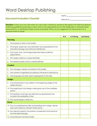
Word Desktop Publishing
Document Evaluation Checklist
Directions: Check your own document or a document created by someone else against the following desktop
publishing guidelines by placing a check mark on the appropriate box for Not Applicable, In Training (needs
improvement), or Job Ready (meets industry standards). Write out any suggestions for improvement on a
separate sheet of paper.
N/A In Training Job Ready
Planning
1. The purpose is clear to the reader.
2. The paper, paper size, and orientation are appropriate for the
intended message and method of distribution.
3. The mood, tone, and image projected meets audience
expectations.
4. The target audience is easily identified.
5. The desired reader action is clearly defined.
Content
6. The message is clearly conveyed to the reader.
7. The content is organized according to the level of importance.
8. The language and style used is appropriate to the task.
Design
9. A thumbnail sketch was utilized in the beginning stages of the
design process.
10. The page layout and design make good use of the available
space.
11. The typeface and type size selected are appropriate and
increase the readability of text.
12. The overall design is effective.
Focus
13. Focus is established by titles and headings set in larger, denser
type surrounded by sufficient white space.
14. Any relevant graphic focal points complement and enhance
the intended message.
15. Focal elements are kept simple.
Name
Exercise #
N/A In Training JobReady
Balance
16. The weight of elements is equally distributed on the page either
in a symmetrical or asymmetrical design.
17. If the publication can be viewed as a two-page spread,
balance is achieved among the elements on both pages.
Proportion
18. Visual elements are sized in proportion to their level of
importance.
19. The type sizes used in headings, subheads, and body text are in
proportion to one another.
20. The amount of white space allotted in margins, before and after
headings, and between columns is in proportion to the content.
21. Graphic images are in proportion to their importance in relation
to the content.
Contrast
22. Contrast is established by headings, subheadings, and/or
important information set in larger and denser type.
23. A graphic image(s) is used to create visual contrast on the
page.
24. Colors used provide a pleasing contrast on the page and
increase the legibility of text.
Directional Flow
25. Focal points lead the reader’s eye in a logical progression
throughout the document.
26. Related information is grouped close together.
27. A strong, consistent alignment was used throughout the
document.
Consistency
28. Page layout, whether symmetrical or asymmetrical, is used
consistently throughout the document.
29. The underlying grid structure, such as two-column, three-
column, etc., is consistent from page to page in the document.
30. Margins are consistent throughout the document.
31. Font selection for headings and subheadings is consistent
throughout the document.
32. Header and footer information is consistent throughout the
document.
33. Caption format is consistent throughout the document.
34. Color choice and application is consistent throughout the
document.

Document evaluationchecklist

  • 1.
    Word Desktop Publishing DocumentEvaluation Checklist Directions: Check your own document or a document created by someone else against the following desktop publishing guidelines by placing a check mark on the appropriate box for Not Applicable, In Training (needs improvement), or Job Ready (meets industry standards). Write out any suggestions for improvement on a separate sheet of paper. N/A In Training Job Ready Planning 1. The purpose is clear to the reader. 2. The paper, paper size, and orientation are appropriate for the intended message and method of distribution. 3. The mood, tone, and image projected meets audience expectations. 4. The target audience is easily identified. 5. The desired reader action is clearly defined. Content 6. The message is clearly conveyed to the reader. 7. The content is organized according to the level of importance. 8. The language and style used is appropriate to the task. Design 9. A thumbnail sketch was utilized in the beginning stages of the design process. 10. The page layout and design make good use of the available space. 11. The typeface and type size selected are appropriate and increase the readability of text. 12. The overall design is effective. Focus 13. Focus is established by titles and headings set in larger, denser type surrounded by sufficient white space. 14. Any relevant graphic focal points complement and enhance the intended message. 15. Focal elements are kept simple. Name Exercise #
  • 2.
    N/A In TrainingJobReady Balance 16. The weight of elements is equally distributed on the page either in a symmetrical or asymmetrical design. 17. If the publication can be viewed as a two-page spread, balance is achieved among the elements on both pages. Proportion 18. Visual elements are sized in proportion to their level of importance. 19. The type sizes used in headings, subheads, and body text are in proportion to one another. 20. The amount of white space allotted in margins, before and after headings, and between columns is in proportion to the content. 21. Graphic images are in proportion to their importance in relation to the content. Contrast 22. Contrast is established by headings, subheadings, and/or important information set in larger and denser type. 23. A graphic image(s) is used to create visual contrast on the page. 24. Colors used provide a pleasing contrast on the page and increase the legibility of text. Directional Flow 25. Focal points lead the reader’s eye in a logical progression throughout the document. 26. Related information is grouped close together. 27. A strong, consistent alignment was used throughout the document. Consistency 28. Page layout, whether symmetrical or asymmetrical, is used consistently throughout the document. 29. The underlying grid structure, such as two-column, three- column, etc., is consistent from page to page in the document. 30. Margins are consistent throughout the document. 31. Font selection for headings and subheadings is consistent throughout the document. 32. Header and footer information is consistent throughout the document. 33. Caption format is consistent throughout the document. 34. Color choice and application is consistent throughout the document.