
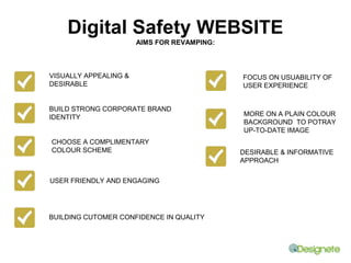
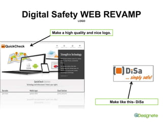
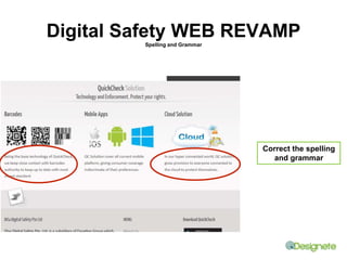
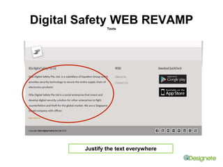
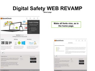
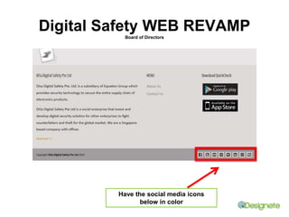

The document discusses a review of a website for a digital safety app. It notes some areas that could be improved, including making the app store buttons more prominent, fixing spelling and grammar errors, justifying text, improving the logo quality, and coloring social media icons. The review recommends revamping the website to make it more visually appealing, focus on usability, and build confidence in quality through a consistent complementary color scheme and up-to-date design.


