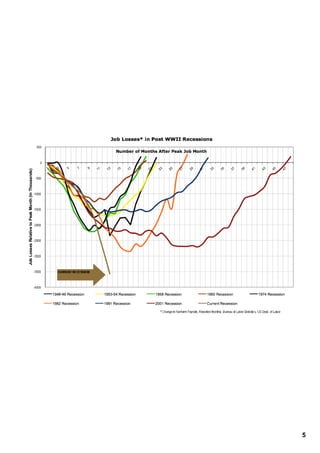
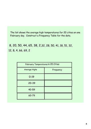
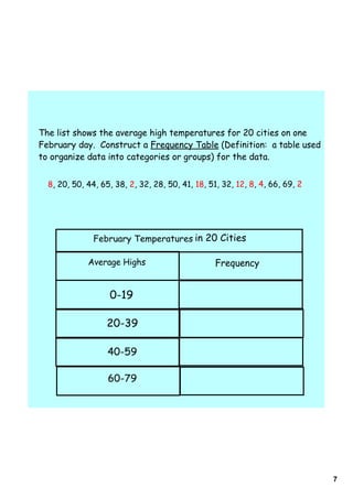
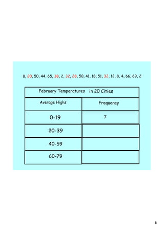
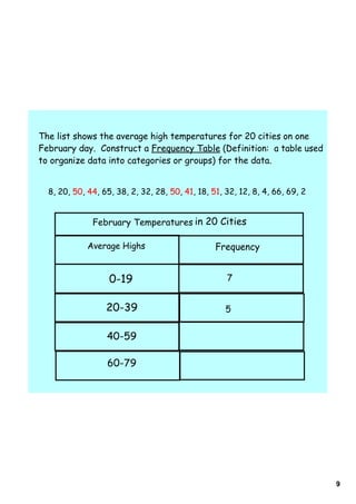
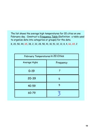
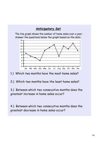
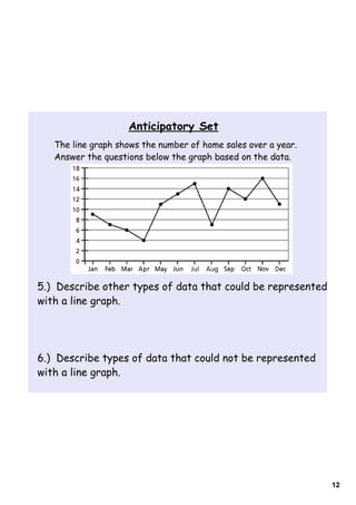
The document provides instructions for students on how to construct and interpret bar and line graphs. It includes examples of frequency tables used to organize data into categories for a bar graph showing average high temperatures in 20 cities on a February day. It also has sample line graphs showing home sales over a year and questions students should answer based on the data in the graph. Finally, it poses multiple choice questions testing students' abilities to interpret data from bar and line graphs.