Download as PDF, PPTX


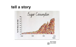
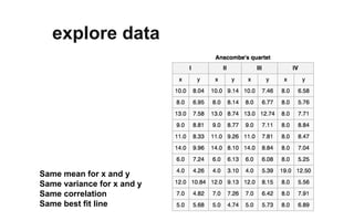
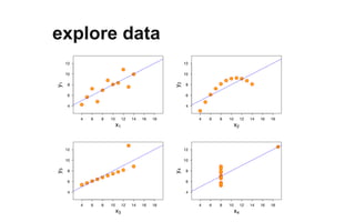
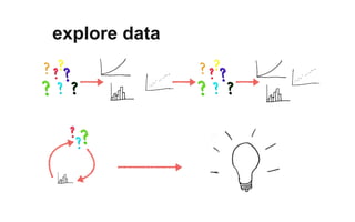


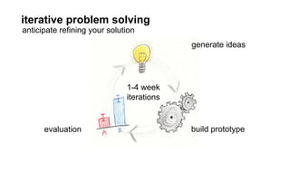
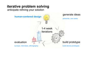
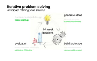
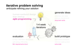
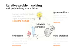

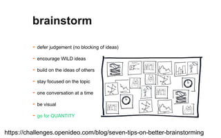

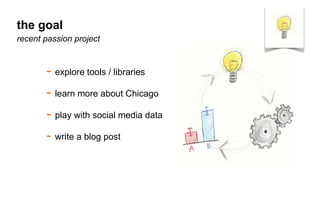
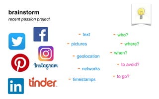
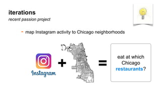

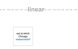
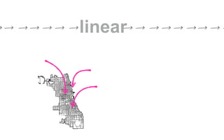
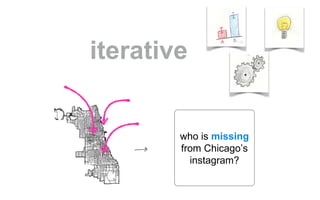
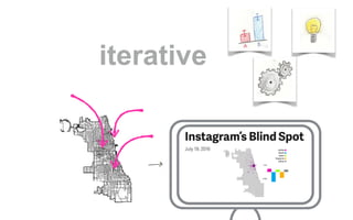


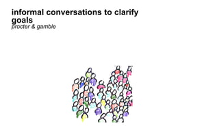

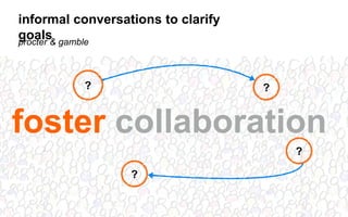
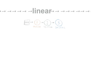
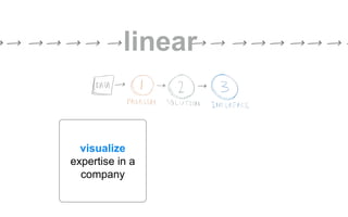
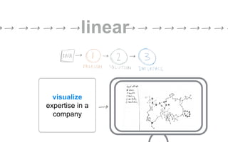

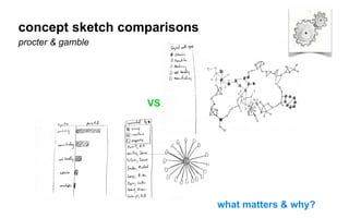
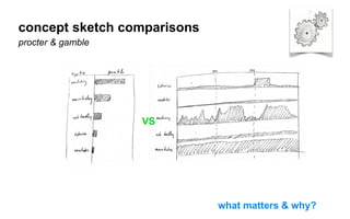
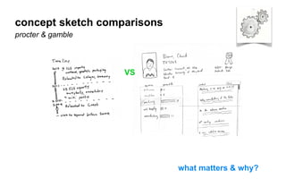
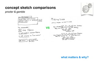
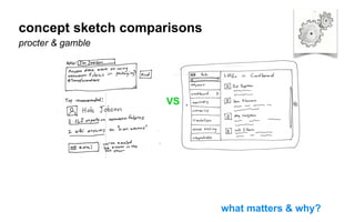
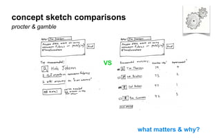
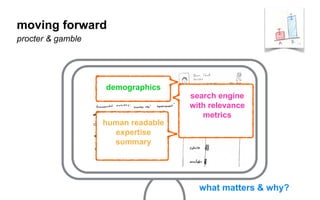
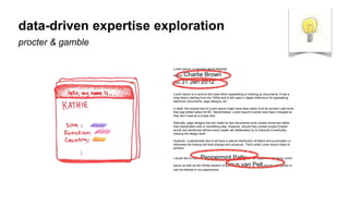
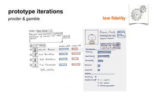
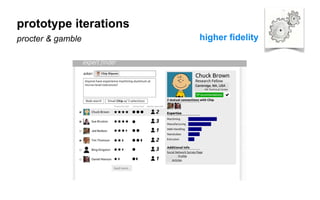
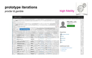
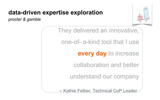


The document outlines a course on data visualization led by Mollie Pettit, emphasizing the importance of storytelling with data. It discusses iterative approaches to problem-solving, brainstorming techniques, and includes case studies like Procter & Gamble's data-driven explorations. The course promotes the integration of human-centered design and agile programming methodologies to enhance data visualization processes.


