This document provides an overview of various tools and concepts related to data quality management models. It discusses key aspects of data quality including accuracy, accessibility, comprehensiveness, consistency, currency, definition, granularity, precision, relevancy, and timeliness. Specific quality management tools are also outlined, such as check sheets, control charts, Pareto charts, and scatter plots. Examples are given for how these data quality principles and tools apply across different domains like healthcare records and data warehousing.
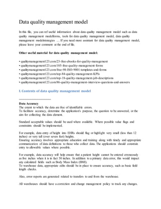


![the sheet.
Check sheets typically employ a heading that answers the
Five Ws:
Who filled out the check sheet
What was collected (what each check represents,
an identifying batch or lot number)
Where the collection took place (facility, room,
apparatus)
When the collection took place (hour, shift, day
of the week)
Why the data were collected
2. Control chart
Control charts, also known as Shewhart charts
(after Walter A. Shewhart) or process-behavior
charts, in statistical process control are tools used
to determine if a manufacturing or business
process is in a state of statistical control.
If analysis of the control chart indicates that the
process is currently under control (i.e., is stable,
with variation only coming from sources common
to the process), then no corrections or changes to
process control parameters are needed or desired.
In addition, data from the process can be used to
predict the future performance of the process. If
the chart indicates that the monitored process is
not in control, analysis of the chart can help
determine the sources of variation, as this will
result in degraded process performance.[1] A
process that is stable but operating outside of
desired (specification) limits (e.g., scrap rates
may be in statistical control but above desired
limits) needs to be improved through a deliberate
effort to understand the causes of current
performance and fundamentally improve the
process.
The control chart is one of the seven basic tools of
quality control.[3] Typically control charts are](https://image.slidesharecdn.com/dataqualitymanagementmodel-150208180141-conversion-gate02/85/Data-quality-management-model-7-320.jpg)
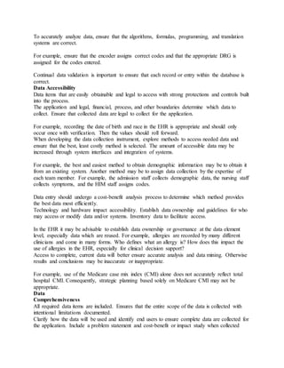
![A scatter plot, scatterplot, or scattergraph is a type of
mathematical diagram using Cartesian coordinates to
display values for two variables for a set of data.
The data is displayed as a collection of points, each
having the value of one variable determining the position
on the horizontal axis and the value of the other variable
determining the position on the vertical axis.[2] This kind
of plot is also called a scatter chart, scattergram, scatter
diagram,[3] or scatter graph.
A scatter plot is used when a variable exists that is under
the control of the experimenter. If a parameter exists that
is systematically incremented and/or decremented by the
other, it is called the control parameter or independent
variable and is customarily plotted along the horizontal
axis. The measured or dependent variable is customarily
plotted along the vertical axis. If no dependent variable
exists, either type of variable can be plotted on either axis
and a scatter plot will illustrate only the degree of
correlation (not causation) between two variables.
A scatter plot can suggest various kinds of correlations
between variables with a certain confidence interval. For
example, weight and height, weight would be on x axis
and height would be on the y axis. Correlations may be
positive (rising), negative (falling), or null (uncorrelated).
If the pattern of dots slopes from lower left to upper right,
it suggests a positive correlation between the variables
being studied. If the pattern of dots slopes from upper left
to lower right, it suggests a negative correlation. A line of
best fit (alternatively called 'trendline') can be drawn in
order to study the correlation between the variables. An
equation for the correlation between the variables can be
determined by established best-fit procedures. For a linear
correlation, the best-fit procedure is known as linear
regression and is guaranteed to generate a correct solution
in a finite time. No universal best-fit procedure is
guaranteed to generate a correct solution for arbitrary
relationships. A scatter plot is also very useful when we
wish to see how two comparable data sets agree with each
other. In this case, an identity line, i.e., a y=x line, or an
1:1 line, is often drawn as a reference. The more the two
data sets agree, the more the scatters tend to concentrate in
the vicinity of the identity line; if the two data sets are
numerically identical, the scatters fall on the identity line](https://image.slidesharecdn.com/dataqualitymanagementmodel-150208180141-conversion-gate02/85/Data-quality-management-model-9-320.jpg)
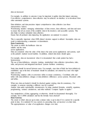
![exactly.
5.Ishikawa diagram
Ishikawa diagrams (also called fishbone diagrams,
herringbone diagrams, cause-and-effect diagrams, or
Fishikawa) are causal diagrams created by Kaoru
Ishikawa (1968) that show the causes of a specific
event.[1][2] Common uses of the Ishikawa diagram are
product design and quality defect prevention, to identify
potential factors causing an overall effect. Each cause or
reason for imperfection is a source of variation. Causes
are usually grouped into major categories to identify these
sources of variation. The categories typically include
People: Anyone involved with the process
Methods: How the process is performed and the
specific requirements for doing it, such as policies,
procedures, rules, regulations and laws
Machines: Any equipment, computers, tools, etc.
required to accomplish the job
Materials: Raw materials, parts, pens, paper, etc.
used to produce the final product
Measurements: Data generated from the process
that are used to evaluate its quality
Environment: The conditions, such as location,
time, temperature, and culture in which the process
operates
6. Histogram method](https://image.slidesharecdn.com/dataqualitymanagementmodel-150208180141-conversion-gate02/85/Data-quality-management-model-10-320.jpg)
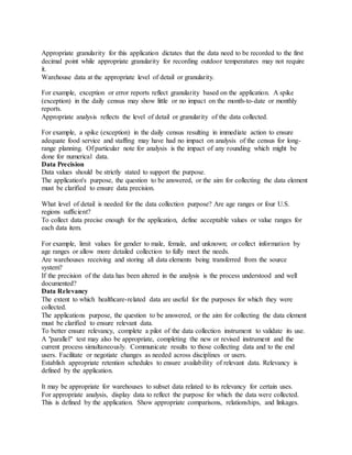
![A histogram is a graphical representation of the
distribution of data. It is an estimate of the probability
distribution of a continuous variable (quantitative
variable) and was first introduced by Karl Pearson.[1] To
construct a histogram, the first step is to "bin" the range of
values -- that is, divide the entire range of values into a
series of small intervals -- and then count how many
values fall into each interval. A rectangle is drawn with
height proportional to the count and width equal to the bin
size, so that rectangles abut each other. A histogram may
also be normalized displaying relative frequencies. It then
shows the proportion of cases that fall into each of several
categories, with the sum of the heights equaling 1. The
bins are usually specified as consecutive, non-overlapping
intervals of a variable. The bins (intervals) must be
adjacent, and usually equal size.[2] The rectangles of a
histogram are drawn so that they touch each other to
indicate that the original variable is continuous.[3]
III. Other topics related to Data quality management model (pdf download)
quality management systems
quality management courses
quality management tools
iso 9001 quality management system
quality management process
quality management system example
quality system management
quality management techniques
quality management standards
quality management policy
quality management strategy
quality management books](https://image.slidesharecdn.com/dataqualitymanagementmodel-150208180141-conversion-gate02/85/Data-quality-management-model-11-320.jpg)