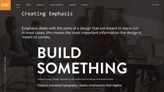
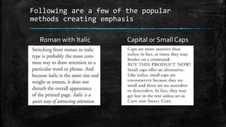
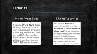
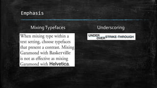
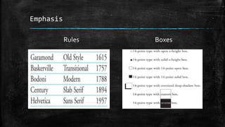
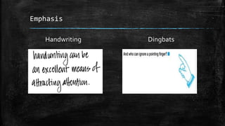
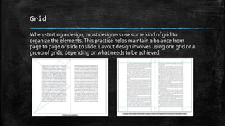
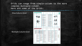
Creating Emphasis
and Grids Text
By: Cian Wenkzoid
Creating Emphasis
Emphasis deals with the parts of a design that are meant to stand out.
In most cases, this means the most important information the design is
meant to convey.
Clique's oversized typography clearly emphasizes their tagline.
Following are a few of the popular
methods creating emphasis
Roman with Italic Capital or Small Caps
MixingTypes Sizes MixingTypestyles
Emphasis
Emphasis
MixingTypefaces Underscoring
Rules Boxes
Emphasis
Emphasis
Bullets Position
Emphasis
Handwriting Dingbats
Grid
When starting a design, most designers use some kind of grid to
organize the elements.This practice helps maintain a balance from
page to page or slide to slide. Layout design involves using one grid or a
group of grids, depending on what needs to be achieved.
Grids can range from simple-column to the more
complex multiple-column.
Here are some of the Grids:
One ColumnGrid
Multiple Column Grid
Grids
Working without a Grid
Parts of a Page
Grids are the backbone of all
layouts, infographics and
presentations. When you are
designing on an online
editor, you are using grids
without even knowing it.
End

Creating emphasis

Editor's Notes

  • #3 Emphasis can also be used to reduce the impact of certain information. This is most apparent in instances where “fine print” is used for ancillary information in a design. Tiny typography tucked away at the bottom of a page carries much less weight than almost anything else in a design, and is therefore deemphasized.
  • #8 Positioning is one of the simplest methods of attracting attention because of its manner is unexpected. Maybe its distracting but the important part is it attract attention.
  • #9 In typography, a dingbat is an ornament, character, or spacer used in typesetting, often employed for the creation of box frames. The term continues to be used in the computer industry to describe fonts that have symbols and shapes in the positions designated for alphabetical or numeric characters.
  • #10 Grids are the backbone of all layouts, infographics and presentations. When you are designing on an online editor like Visme, you are using grids without even knowing it.
  • #11 One column grid has a single column for both text and illustrations. Multiple column grid, like the one used for this book, allow for more flexibility and creative use of space. Most magazines as well as illustrated books are design around multiple-column grid.
  • #12 Perphaps the most challenging approach of all is to work without a grid. In this case, layouts are basically free-form, each spread designed according to its own rules. Parts of a Page There are a number of terms used by editors and designers to refer to all the elements that make up a printed page.