Creating an Excel Chart
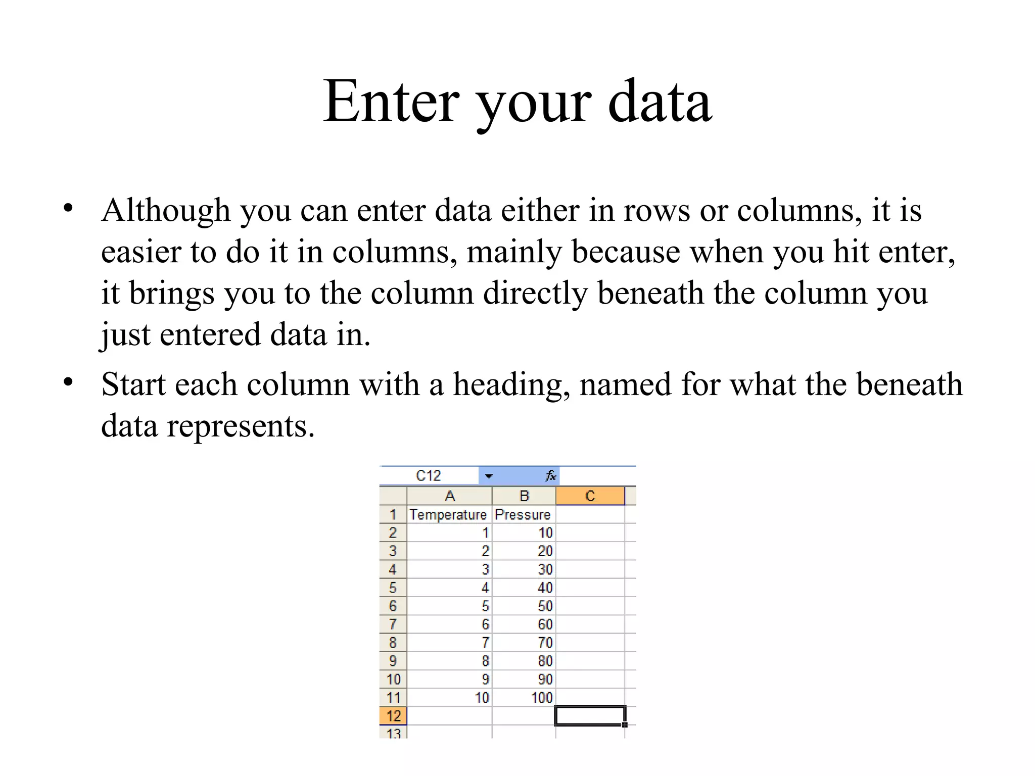
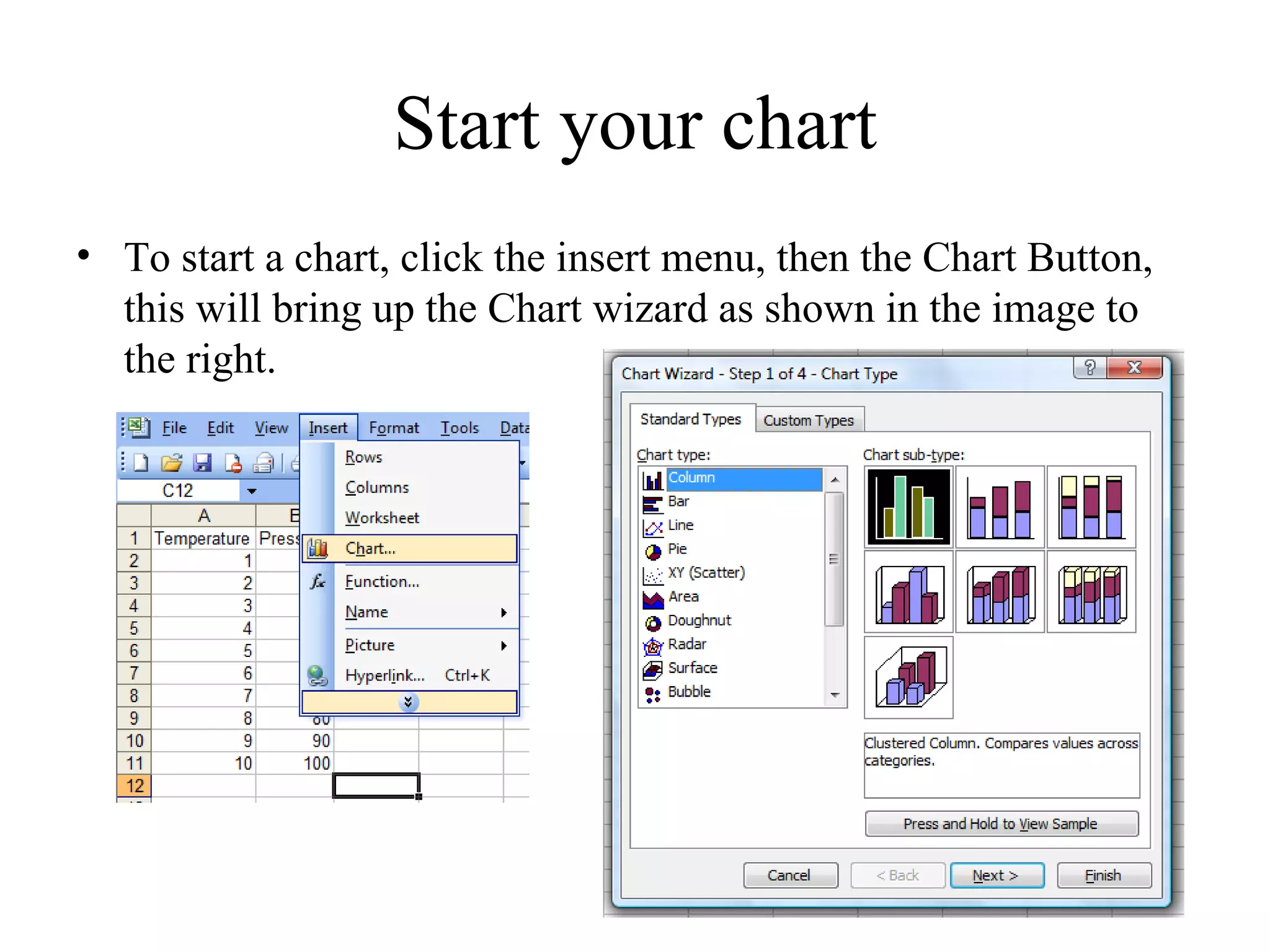
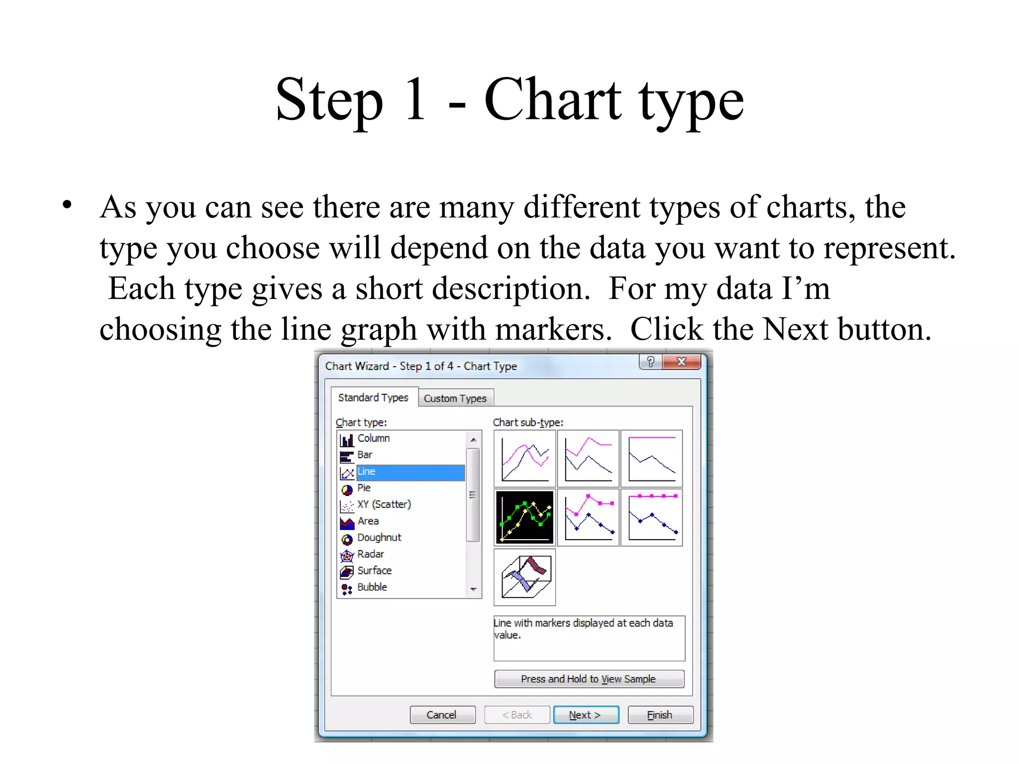
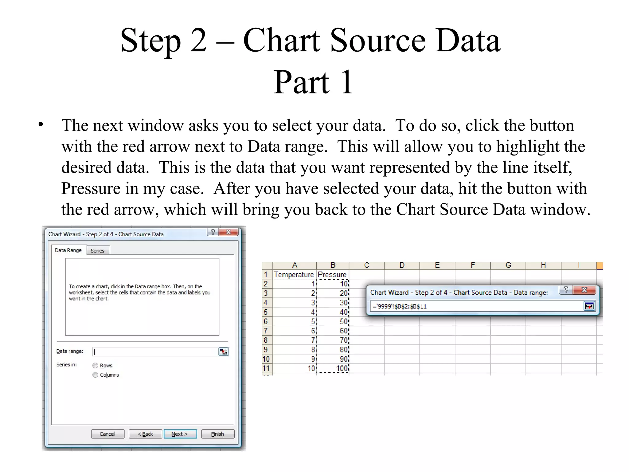
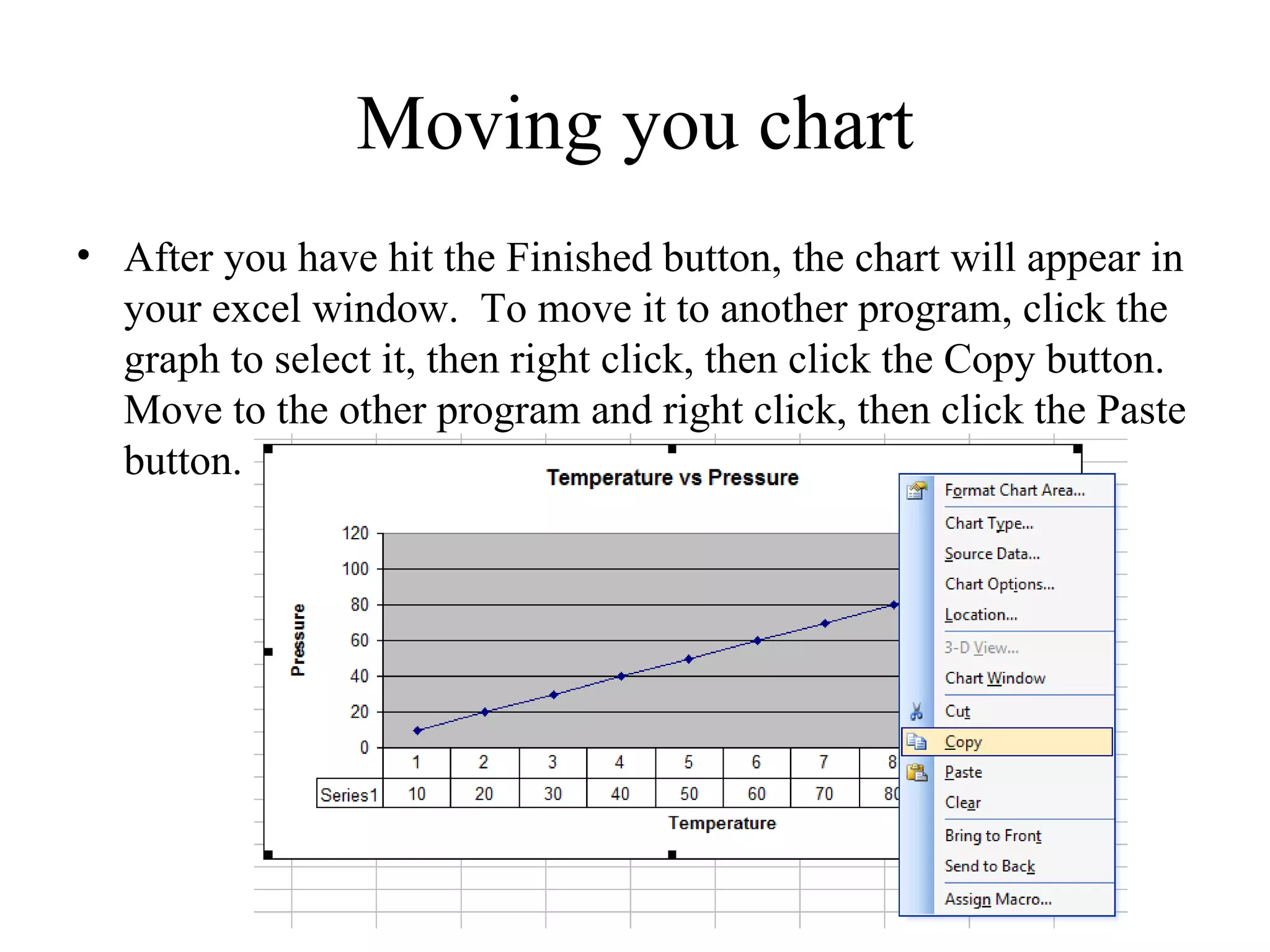
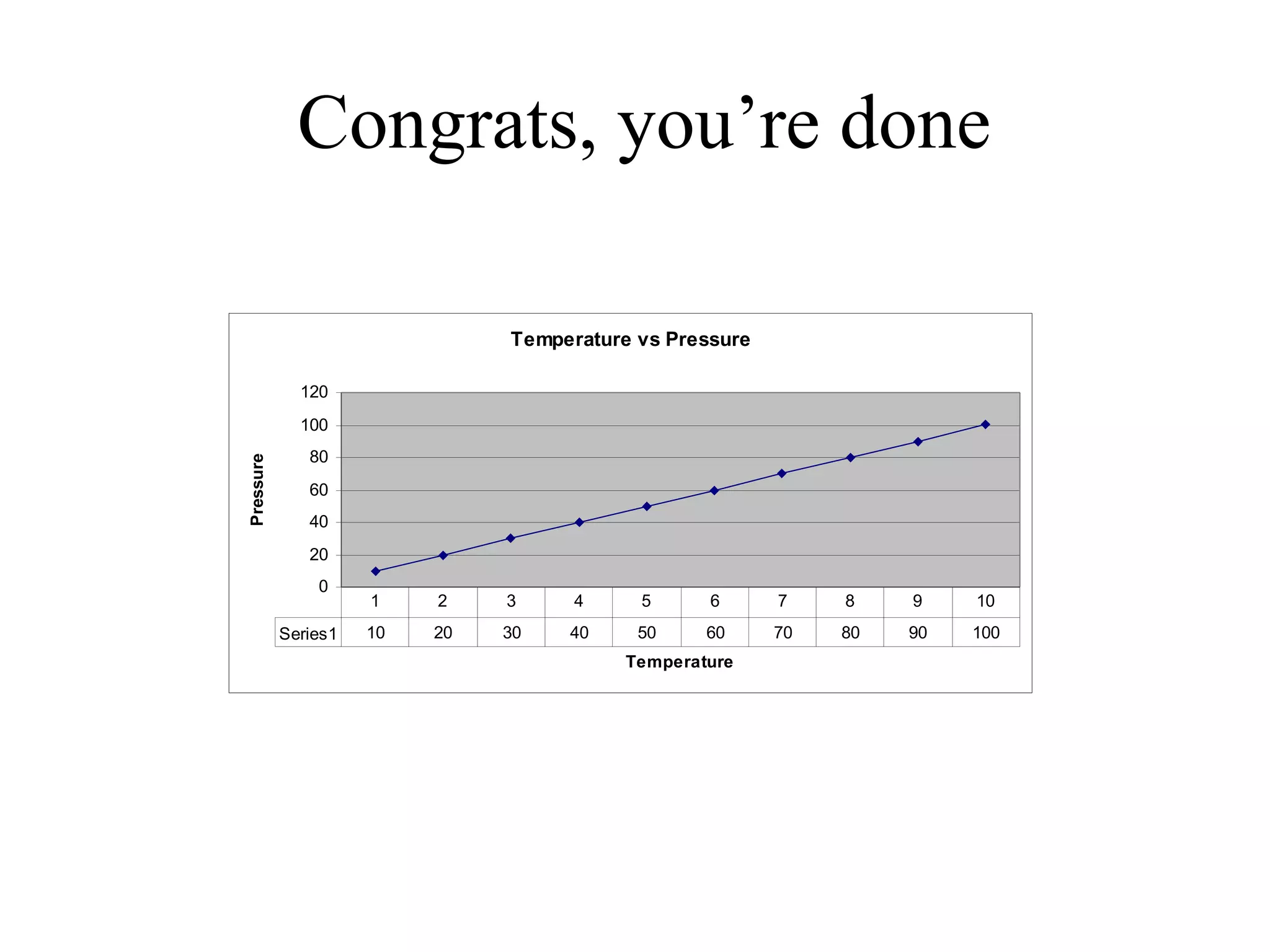
        Excel 2003

       By: Trevor Majors
Excel


Excel is a very powerful tool that can be used
to help interpret data and create charts to help
convey the data’s meaning visually.
*The provided images are an example, I recommend entering the data as
displayed in the images while going through the slideshow to help
reinforce the information provided.
**Play around at each step to see how it affects the chart.
Enter your data
• Although you can enter data either in rows or columns, it is
  easier to do it in columns, mainly because when you hit enter,
  it brings you to the column directly beneath the column you
  just entered data in.
• Start each column with a heading, named for what the beneath
  data represents.
Start your chart
• To start a chart, click the insert menu, then the Chart Button,
  this will bring up the Chart wizard as shown in the image to
  the right.
Step 1 - Chart type
• As you can see there are many different types of charts, the
  type you choose will depend on the data you want to represent.
   Each type gives a short description. For my data I’m
  choosing the line graph with markers. Click the Next button.
Step 2 – Chart Source Data
                     Part 1
• The next window asks you to select your data. To do so, click the button
  with the red arrow next to Data range. This will allow you to highlight the
  desired data. This is the data that you want represented by the line itself,
  Pressure in my case. After you have selected your data, hit the button with
  the red arrow, which will bring you back to the Chart Source Data window.
Step 2 – Chart Source Data
                     Part 2
• You may want to change the name of each Series (the item each line of the
  graph represents) when you are graphing multiple sets of data. To do so,
  click the Series tab, click the desired series, then click the button with the
  red arrow next to Name. Then select the cell with the correct name,
  Pressure in this case. Finally, click the button with the red button, which
  will return you to the Chart Source Data window.
Step 2 – Chart Source Data
                   Part 3
• The next step is to select your x-value data. Click the button
  with red arrow next to Category (X) axis labels. Select the
  data you wish to represent the x-axis, then click the button
  with the red arrow to return to the Chart Source Data window
Step 3 – Chart Options
                      Titles
• The next window is the Chart Options Window. The first tab
  is Titles, allowing you to name your chart, x-axis, and y-axis.
  This is highly recommended.
Step 3 – Chart Options
                      Axes
• The next tab in the Chart Options window is Axes. This
  allows you to determine if you want your axes to have a value
  shown. Generally, you can skip this tab when creating chart.
Step 3 – Chart Options
                    Gridlines
• The next tab in the Chart Options window is Gridlines. This
  allows you to add or remove gridlines. Minor gridlines are
  rarely used as they add clutter, Major gridlines are much more
  common. X-axis gridlines are not necessary when using
  markers like my example uses
Step 3 – Chart Options
                     Legend
• The next tab in the Chart Options window is Legend. The
  legend is used when you chart multiple data sets on the same
  graph to show what each line represents, you can move the
  legend to different parts of your chart. Because I only have
  one line, I removed the legend from my chart.
Step 3 – Chart Options
                  Data Labels
• The next tab in the Chart Options window is Data labels. Data
  labels lets you label the markers on your chart with
  information. This is really unnecessary and adds clutter to
  your chart. I would recommend against it.
Step 3 – Chart Options
                   Data Table
• The last tab in the Chart Options window is Data Table. Data
  table lets you add a table under the x-axis that contains the
  values. It also lets you add the legend keys to the table,
  eliminating the need for a separate legend. After you’ve
  finished this section, click the Next button.
Step 4 – Chart Location
• This step asks you where you want to place the chart. Because
  people usually create charts to carry over to other programs
  (mostly Word and PowerPoint) this step is unnecessary and
  can be skipped at step 3 by clicking Finish instead of Next.
Moving you chart
• After you have hit the Finished button, the chart will appear in
  your excel window. To move it to another program, click the
  graph to select it, then right click, then click the Copy button.
  Move to the other program and right click, then click the Paste
  button.
Congrats, you’re done

                               Temperature vs Pressure

             120
             100
              80
Pressure


              60
              40
              20
               0
                     1    2    3     4     5      6      7    8    9    10
           Series1   10   20   30   40     50     60     70   80   90   100
                                          Temperature

Creating an excel chart

  • 1.
    Creating an ExcelChart Excel 2003 By: Trevor Majors
  • 2.
    Excel Excel is avery powerful tool that can be used to help interpret data and create charts to help convey the data’s meaning visually. *The provided images are an example, I recommend entering the data as displayed in the images while going through the slideshow to help reinforce the information provided. **Play around at each step to see how it affects the chart.
  • 3.
    Enter your data •Although you can enter data either in rows or columns, it is easier to do it in columns, mainly because when you hit enter, it brings you to the column directly beneath the column you just entered data in. • Start each column with a heading, named for what the beneath data represents.
  • 4.
    Start your chart •To start a chart, click the insert menu, then the Chart Button, this will bring up the Chart wizard as shown in the image to the right.
  • 5.
    Step 1 -Chart type • As you can see there are many different types of charts, the type you choose will depend on the data you want to represent. Each type gives a short description. For my data I’m choosing the line graph with markers. Click the Next button.
  • 6.
    Step 2 –Chart Source Data Part 1 • The next window asks you to select your data. To do so, click the button with the red arrow next to Data range. This will allow you to highlight the desired data. This is the data that you want represented by the line itself, Pressure in my case. After you have selected your data, hit the button with the red arrow, which will bring you back to the Chart Source Data window.
  • 7.
    Step 2 –Chart Source Data Part 2 • You may want to change the name of each Series (the item each line of the graph represents) when you are graphing multiple sets of data. To do so, click the Series tab, click the desired series, then click the button with the red arrow next to Name. Then select the cell with the correct name, Pressure in this case. Finally, click the button with the red button, which will return you to the Chart Source Data window.
  • 8.
    Step 2 –Chart Source Data Part 3 • The next step is to select your x-value data. Click the button with red arrow next to Category (X) axis labels. Select the data you wish to represent the x-axis, then click the button with the red arrow to return to the Chart Source Data window
  • 9.
    Step 3 –Chart Options Titles • The next window is the Chart Options Window. The first tab is Titles, allowing you to name your chart, x-axis, and y-axis. This is highly recommended.
  • 10.
    Step 3 –Chart Options Axes • The next tab in the Chart Options window is Axes. This allows you to determine if you want your axes to have a value shown. Generally, you can skip this tab when creating chart.
  • 11.
    Step 3 –Chart Options Gridlines • The next tab in the Chart Options window is Gridlines. This allows you to add or remove gridlines. Minor gridlines are rarely used as they add clutter, Major gridlines are much more common. X-axis gridlines are not necessary when using markers like my example uses
  • 12.
    Step 3 –Chart Options Legend • The next tab in the Chart Options window is Legend. The legend is used when you chart multiple data sets on the same graph to show what each line represents, you can move the legend to different parts of your chart. Because I only have one line, I removed the legend from my chart.
  • 13.
    Step 3 –Chart Options Data Labels • The next tab in the Chart Options window is Data labels. Data labels lets you label the markers on your chart with information. This is really unnecessary and adds clutter to your chart. I would recommend against it.
  • 14.
    Step 3 –Chart Options Data Table • The last tab in the Chart Options window is Data Table. Data table lets you add a table under the x-axis that contains the values. It also lets you add the legend keys to the table, eliminating the need for a separate legend. After you’ve finished this section, click the Next button.
  • 15.
    Step 4 –Chart Location • This step asks you where you want to place the chart. Because people usually create charts to carry over to other programs (mostly Word and PowerPoint) this step is unnecessary and can be skipped at step 3 by clicking Finish instead of Next.
  • 16.
    Moving you chart •After you have hit the Finished button, the chart will appear in your excel window. To move it to another program, click the graph to select it, then right click, then click the Copy button. Move to the other program and right click, then click the Paste button.
  • 17.
    Congrats, you’re done Temperature vs Pressure 120 100 80 Pressure 60 40 20 0 1 2 3 4 5 6 7 8 9 10 Series1 10 20 30 40 50 60 70 80 90 100 Temperature