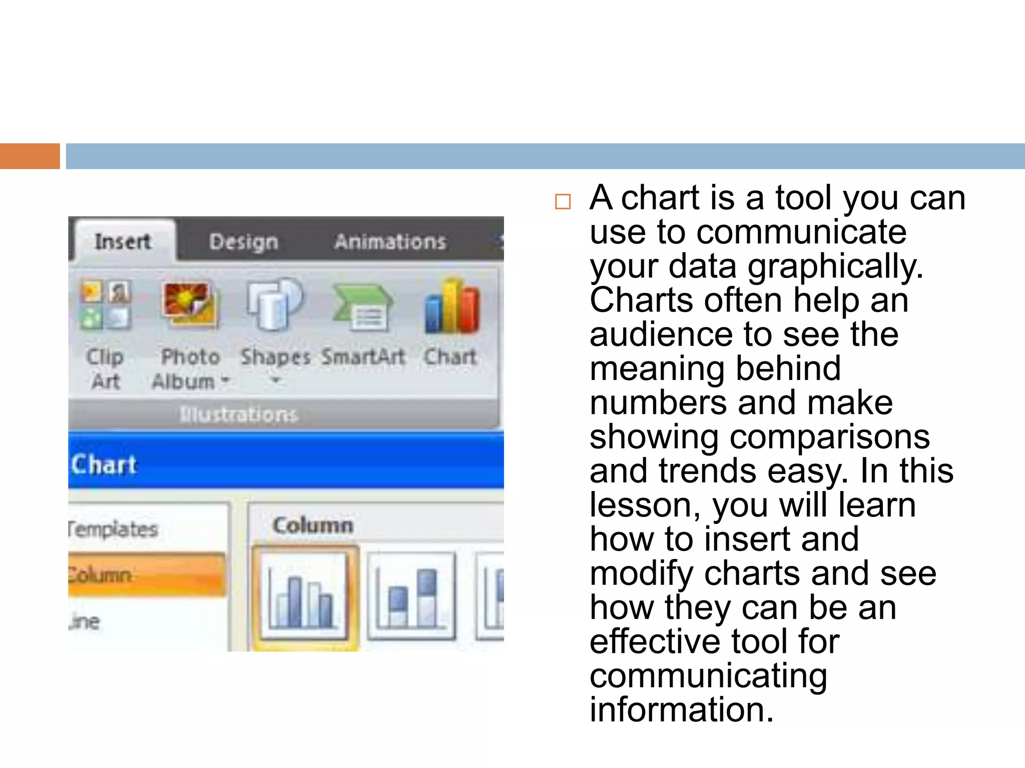
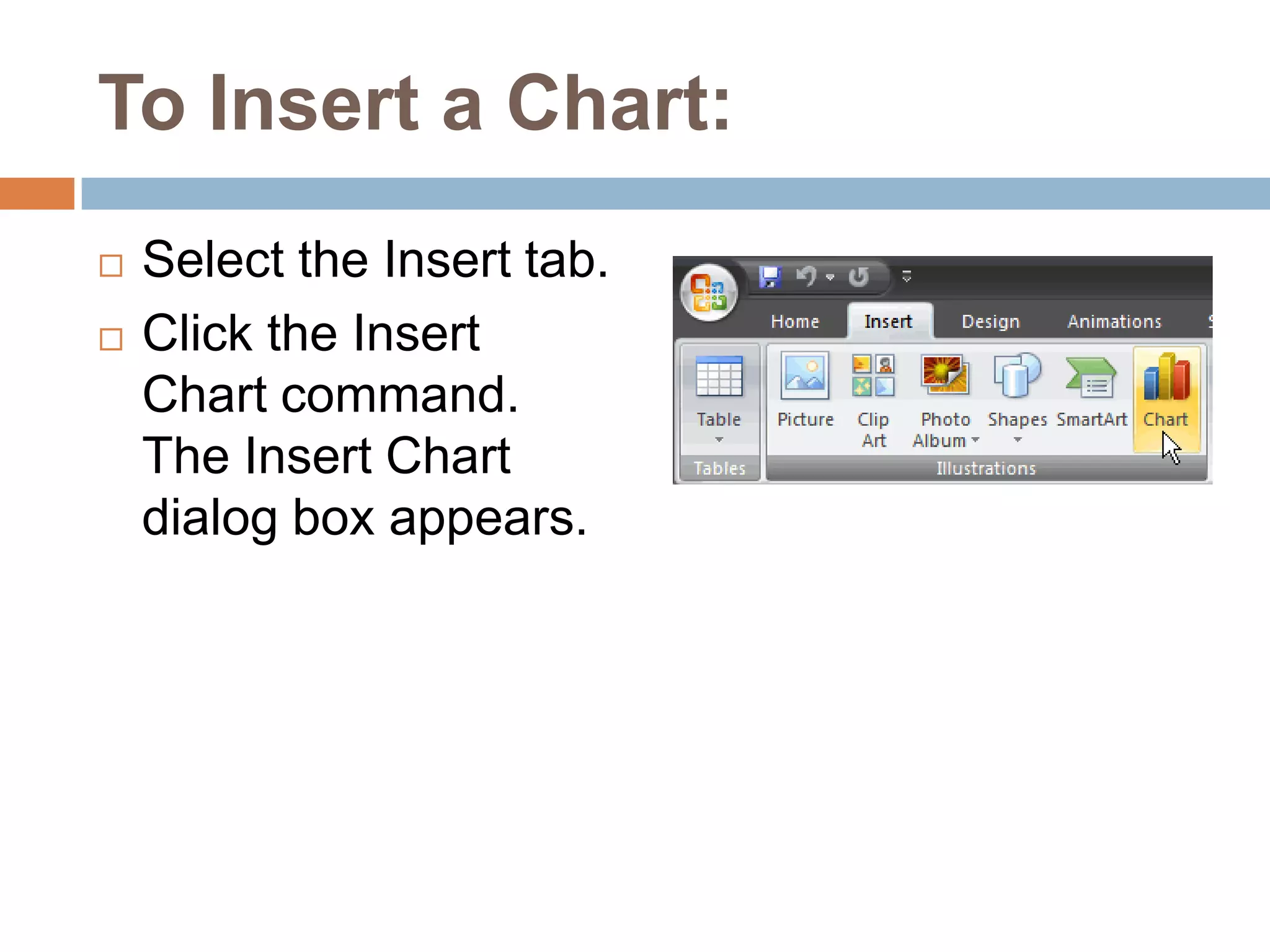
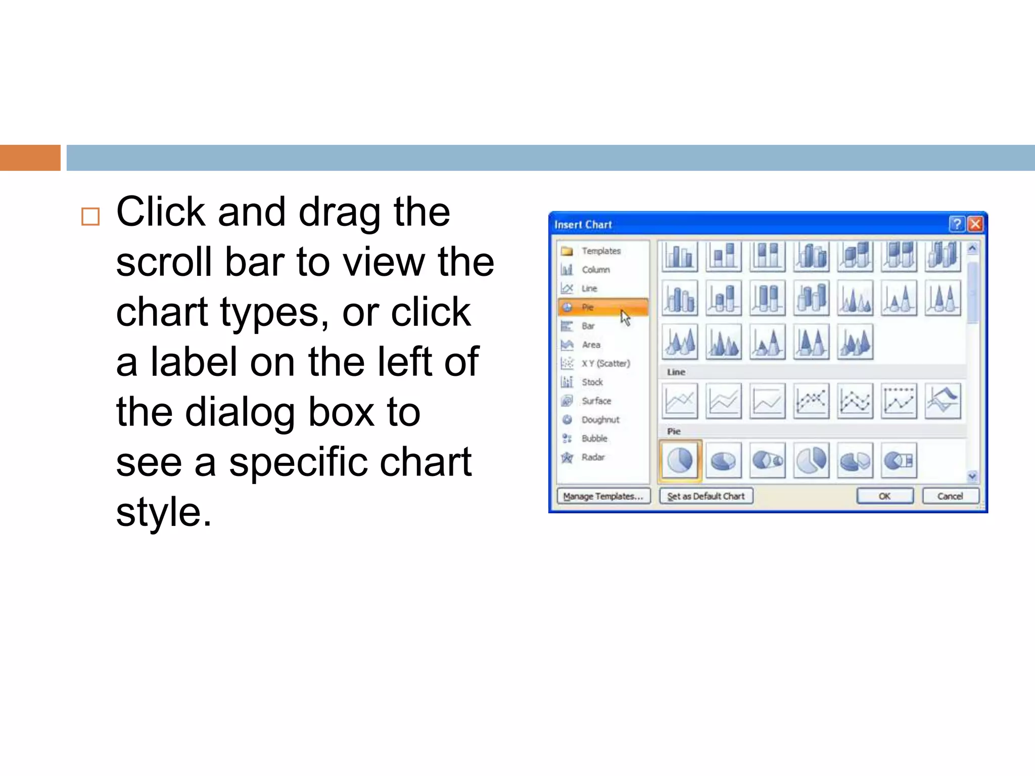
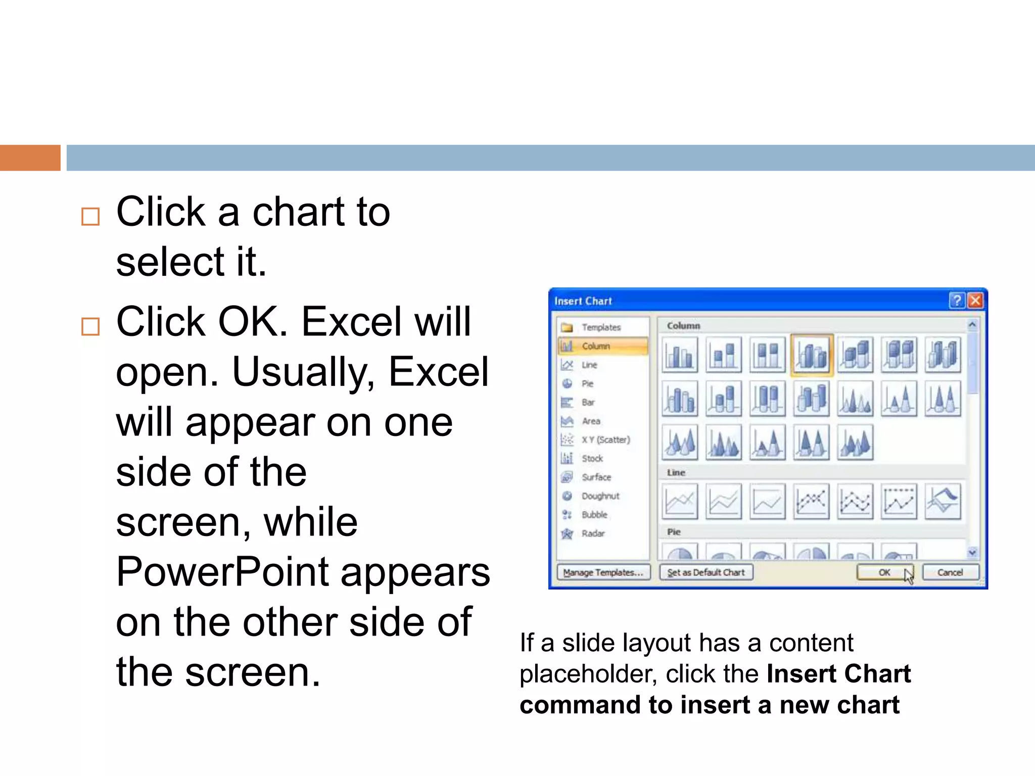
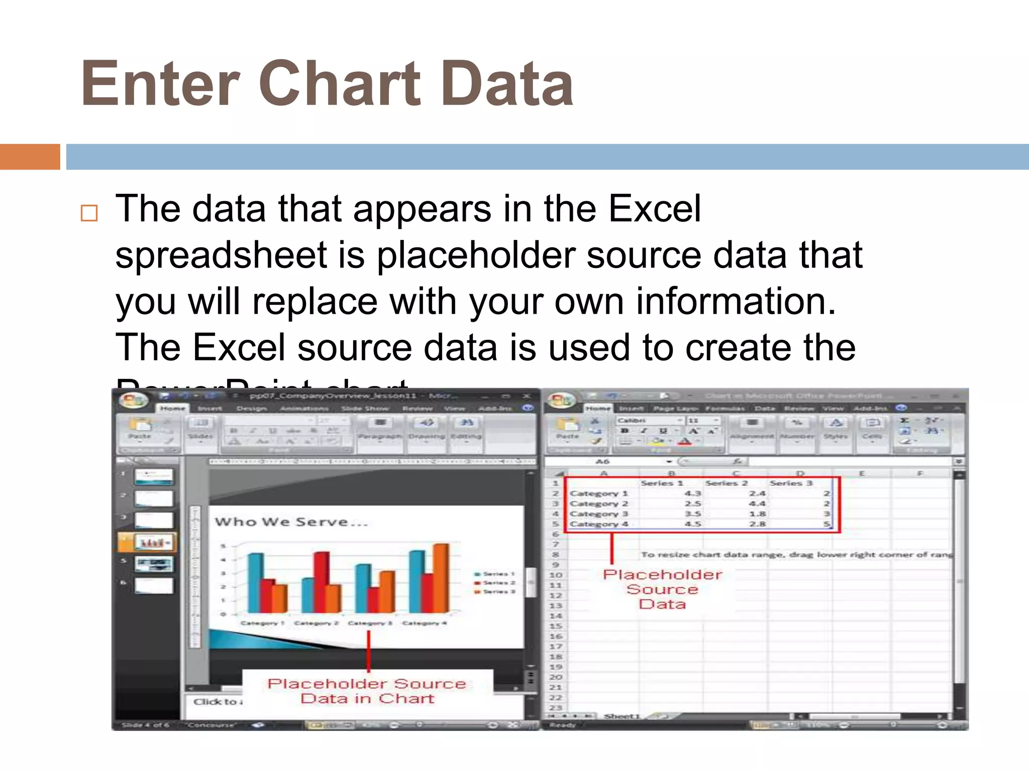
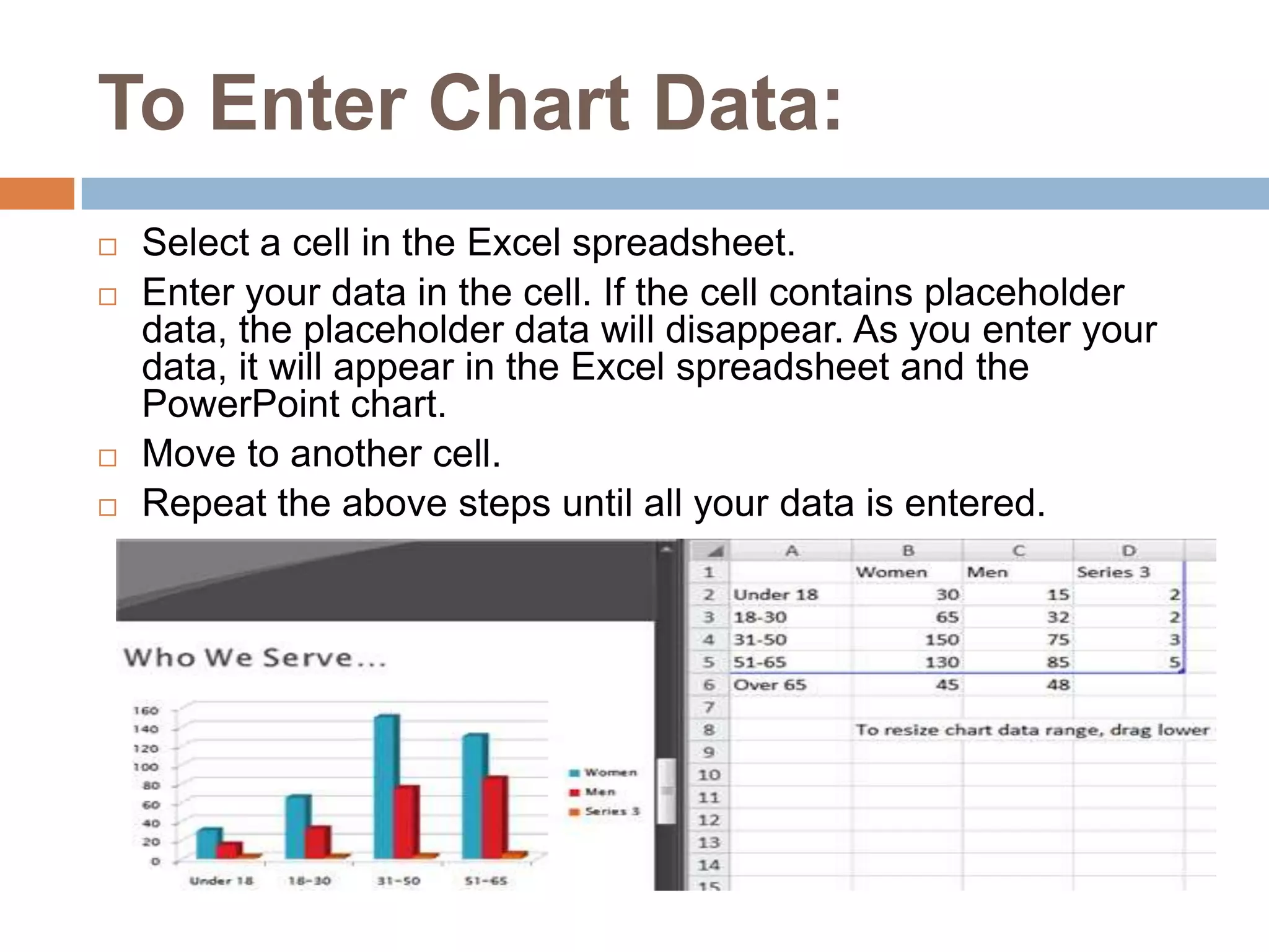
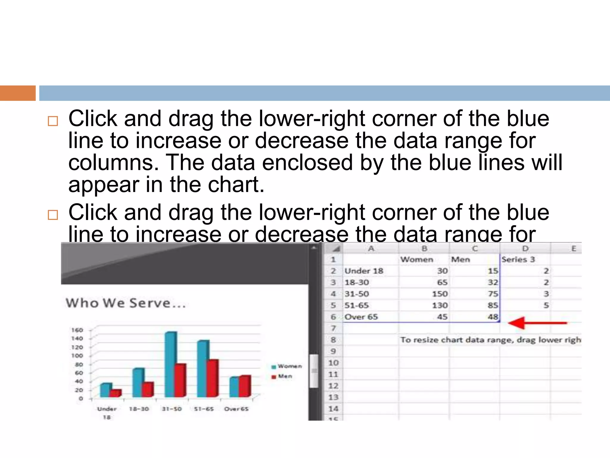
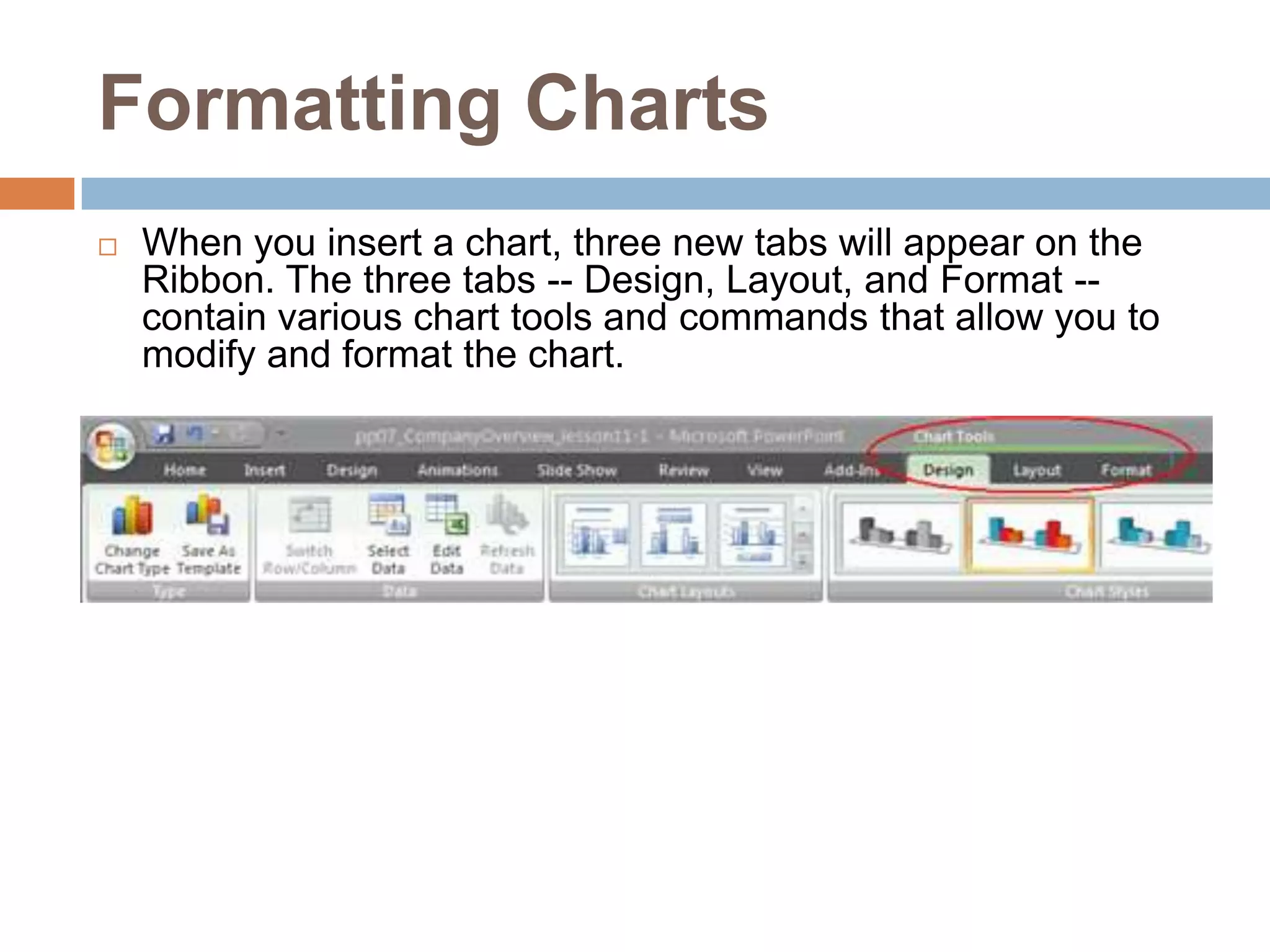
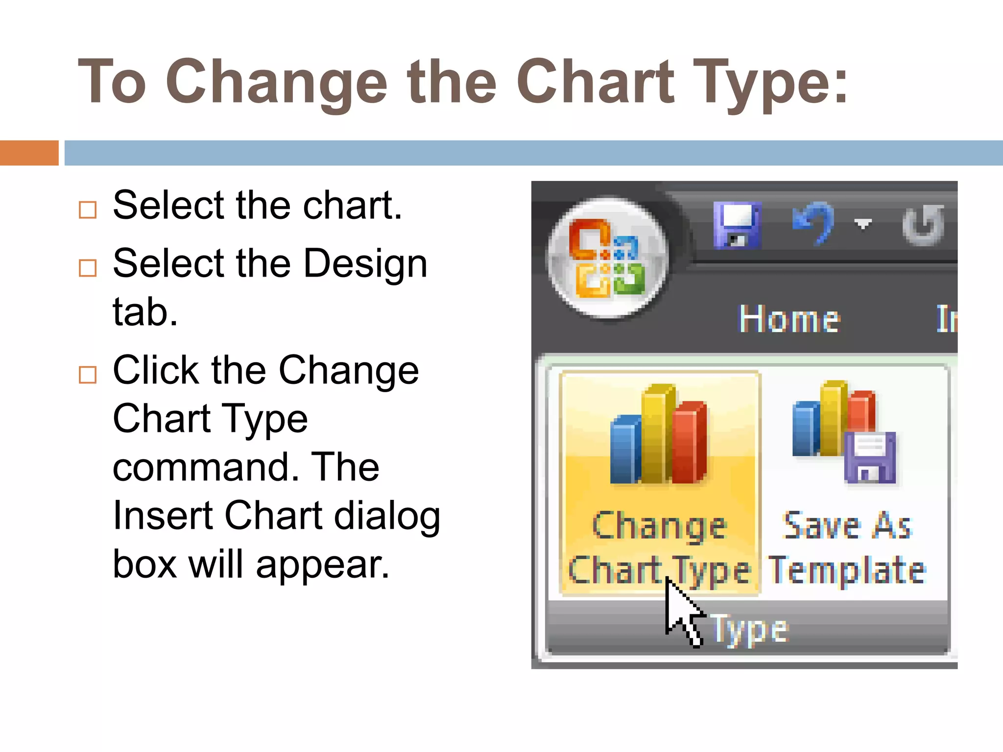
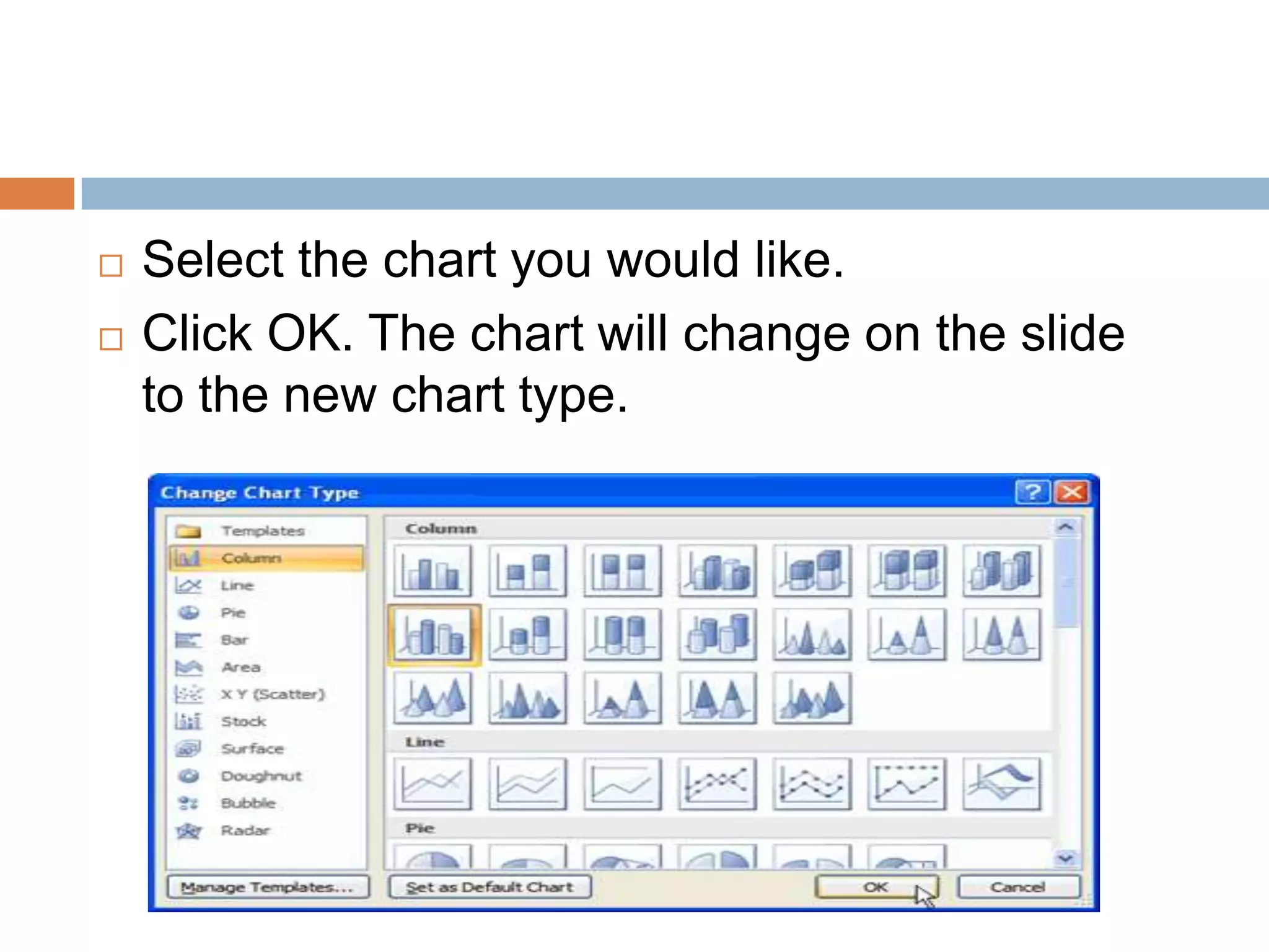
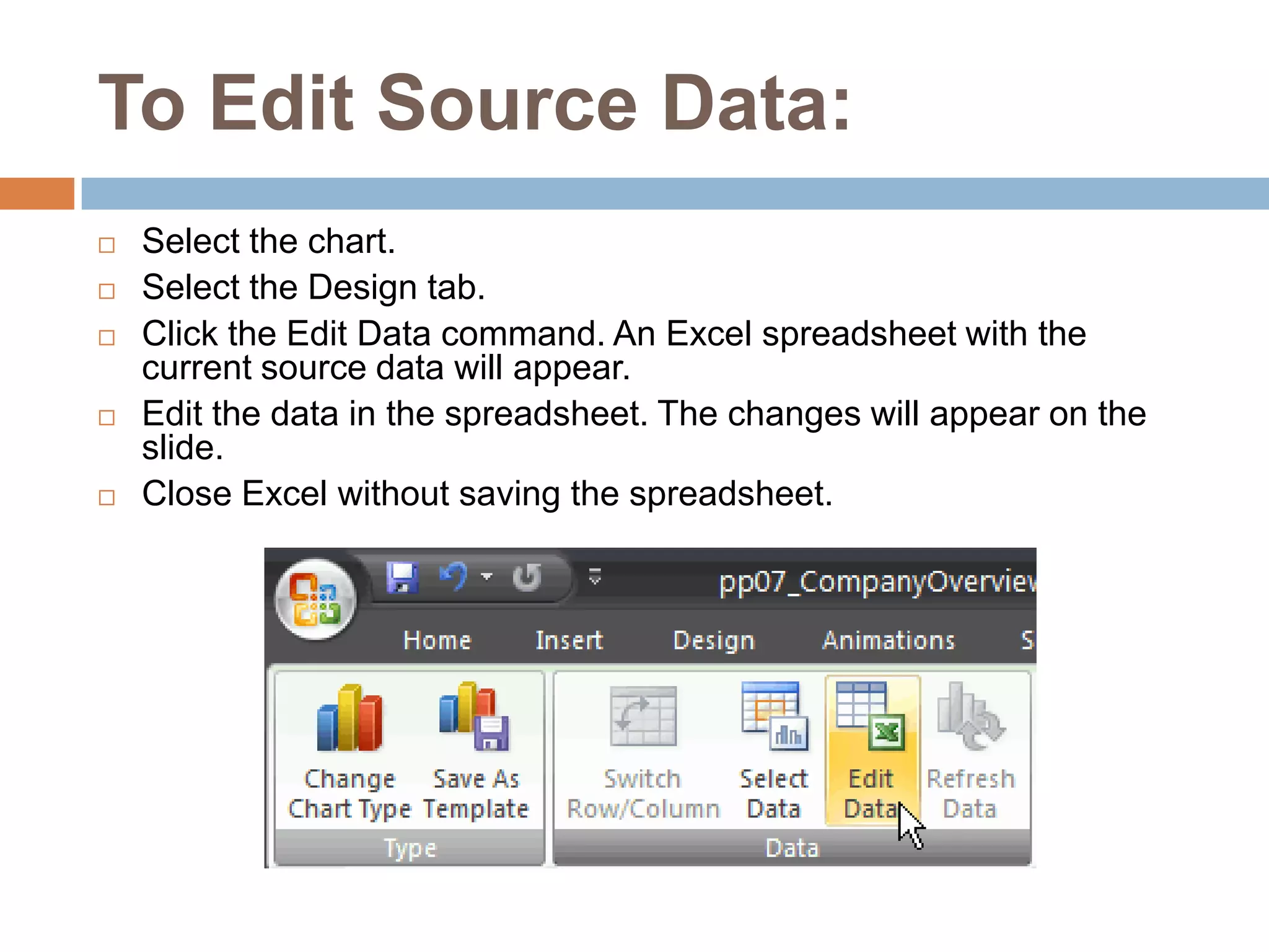
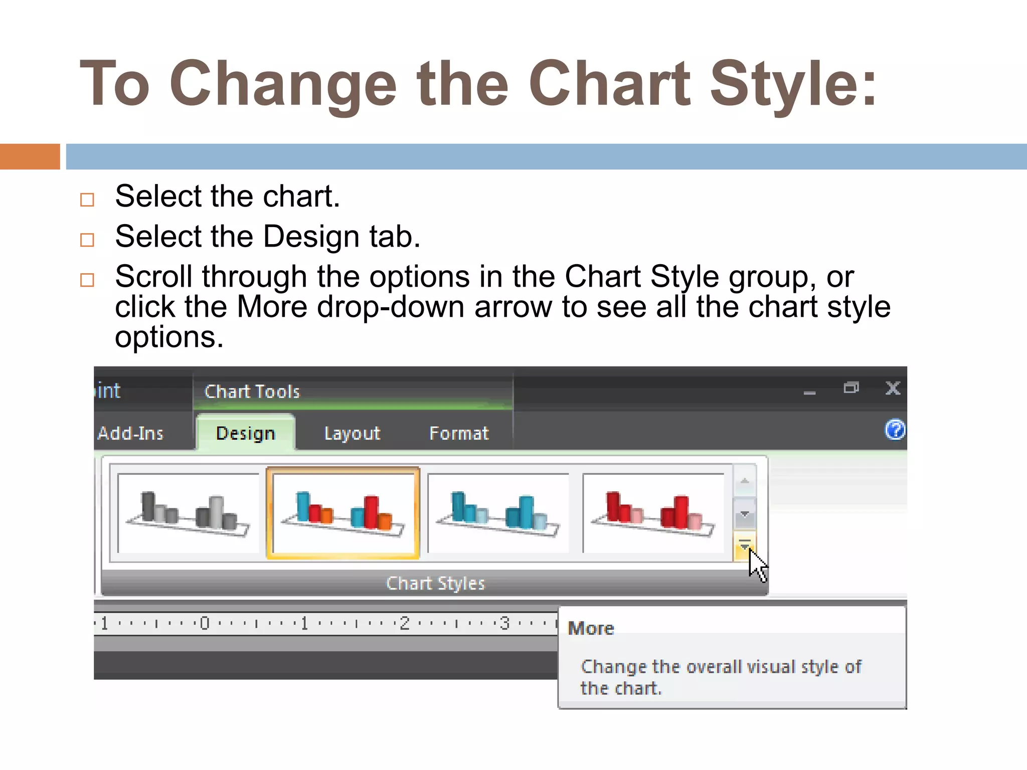
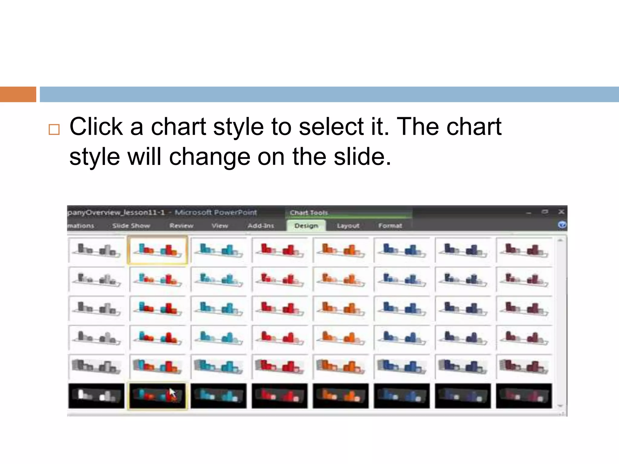
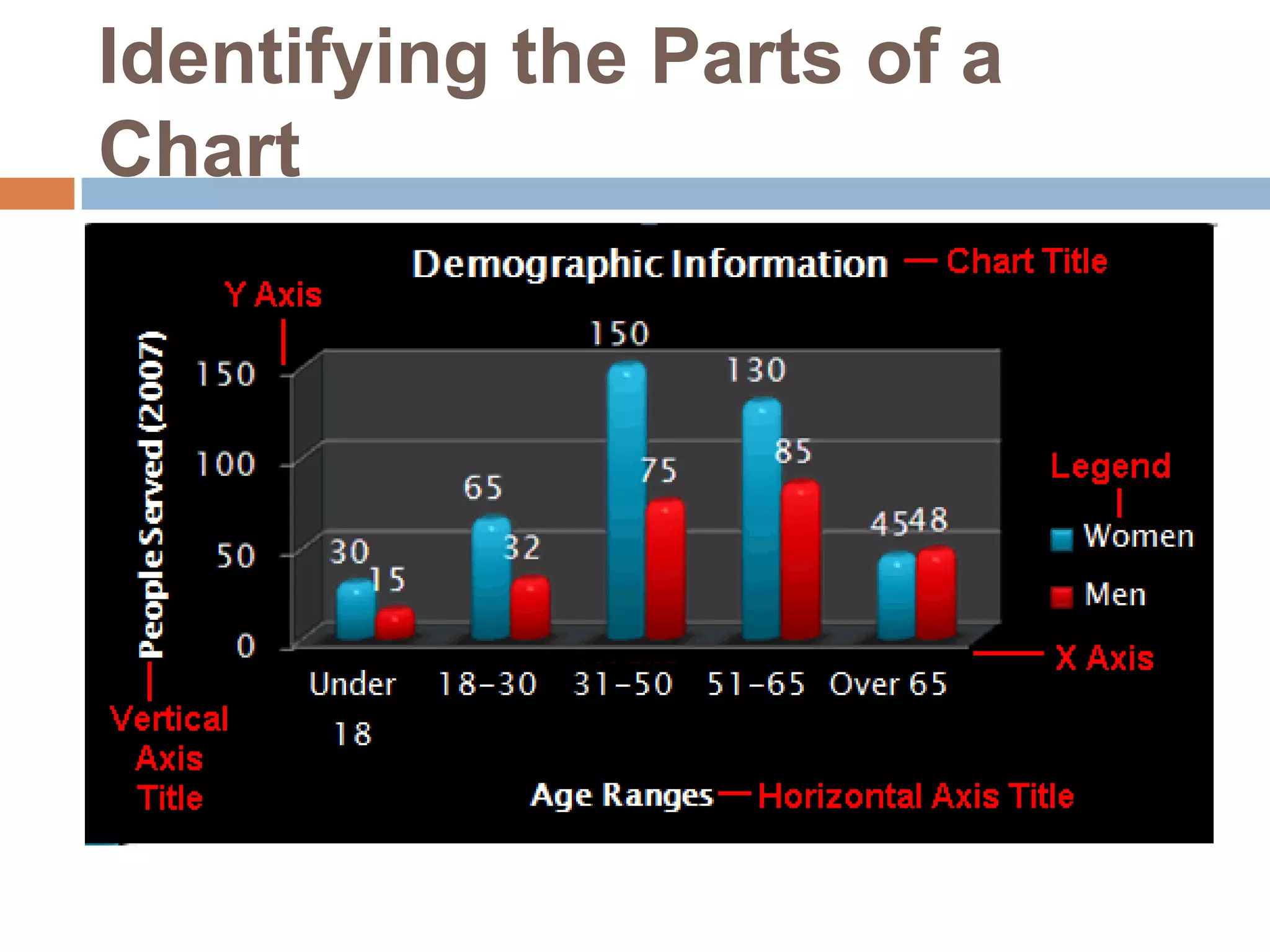
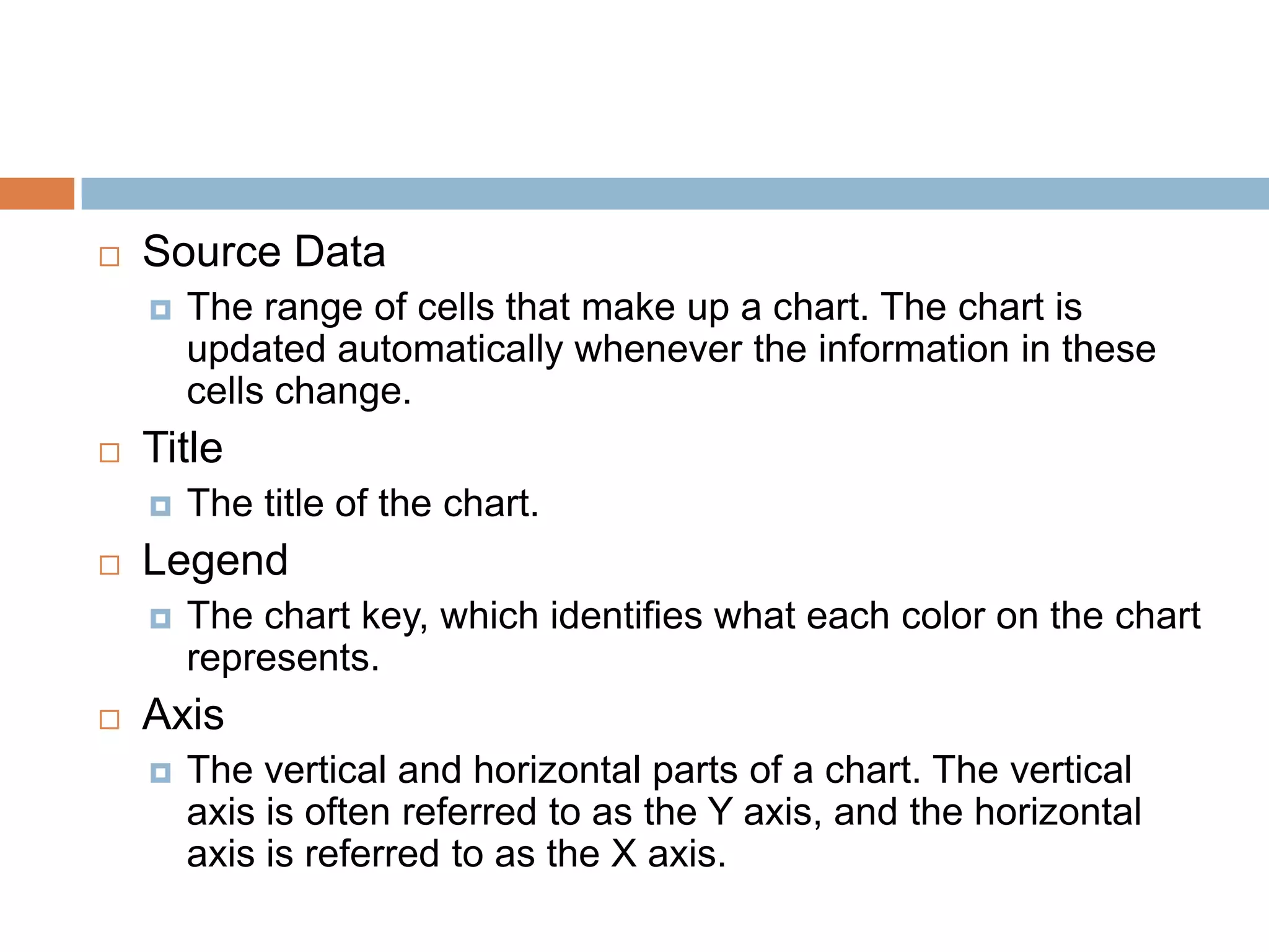
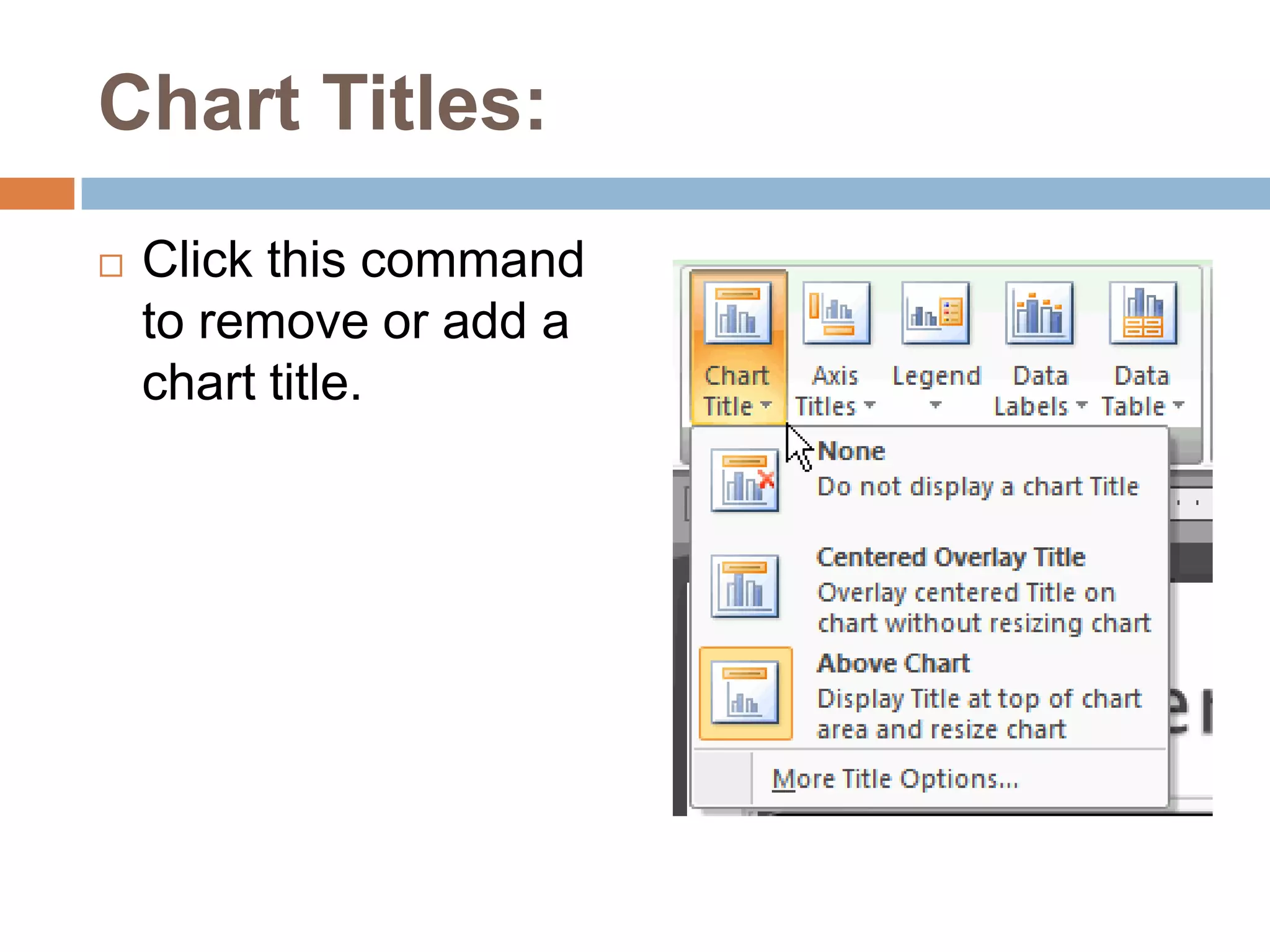
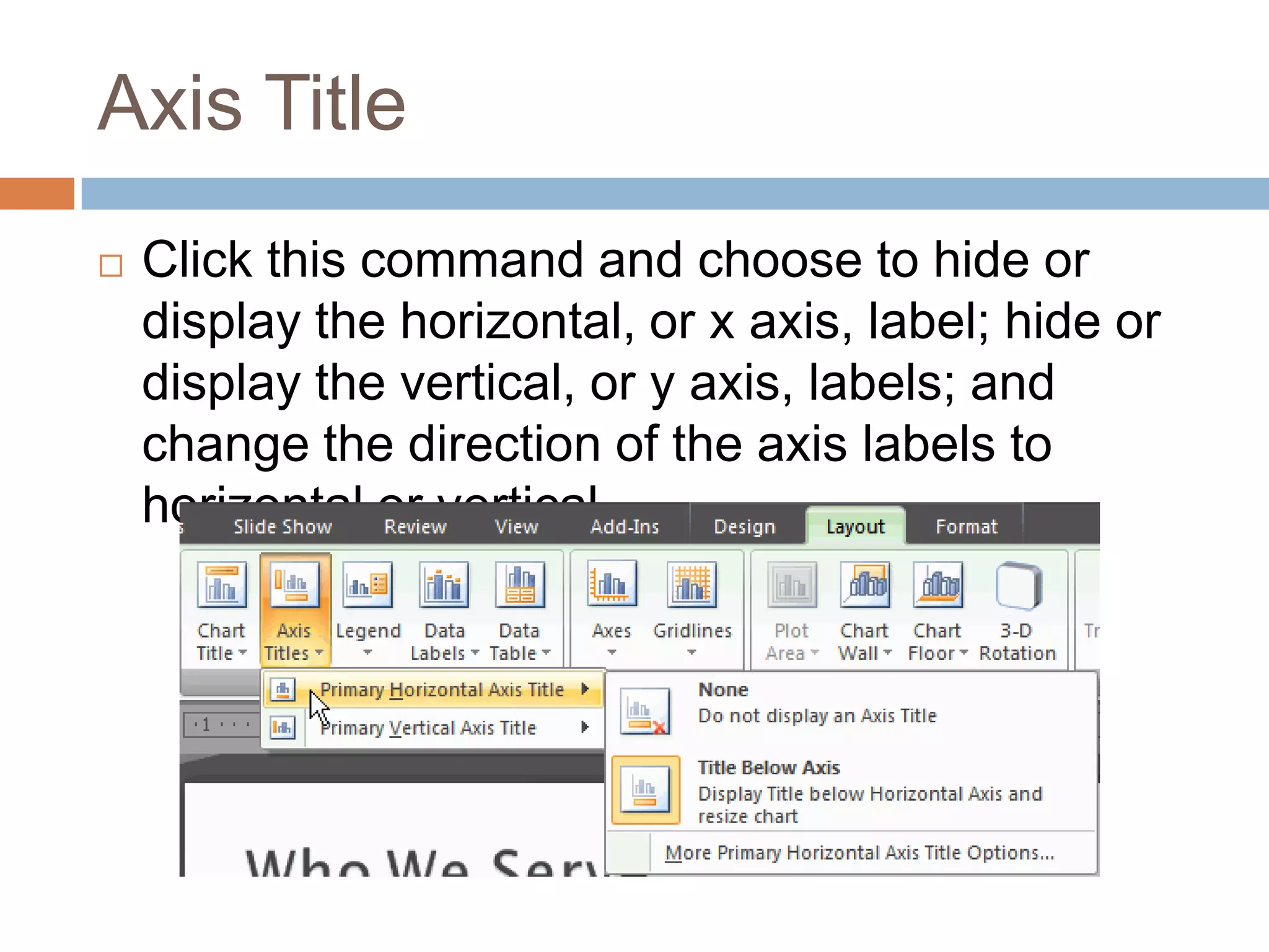
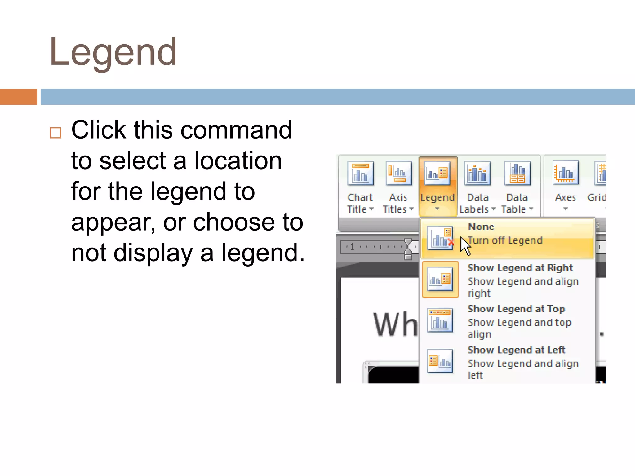
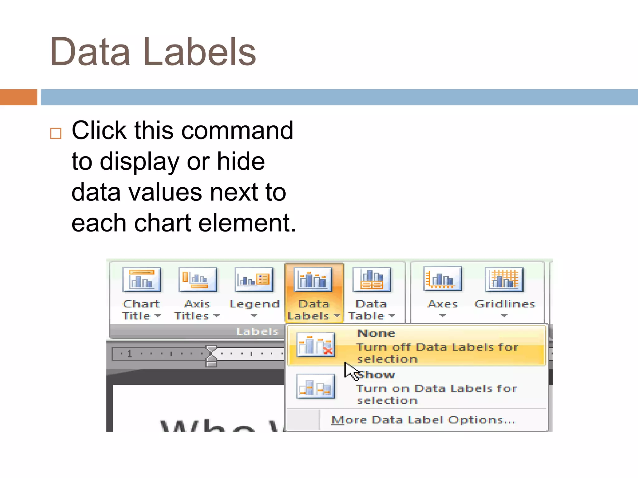
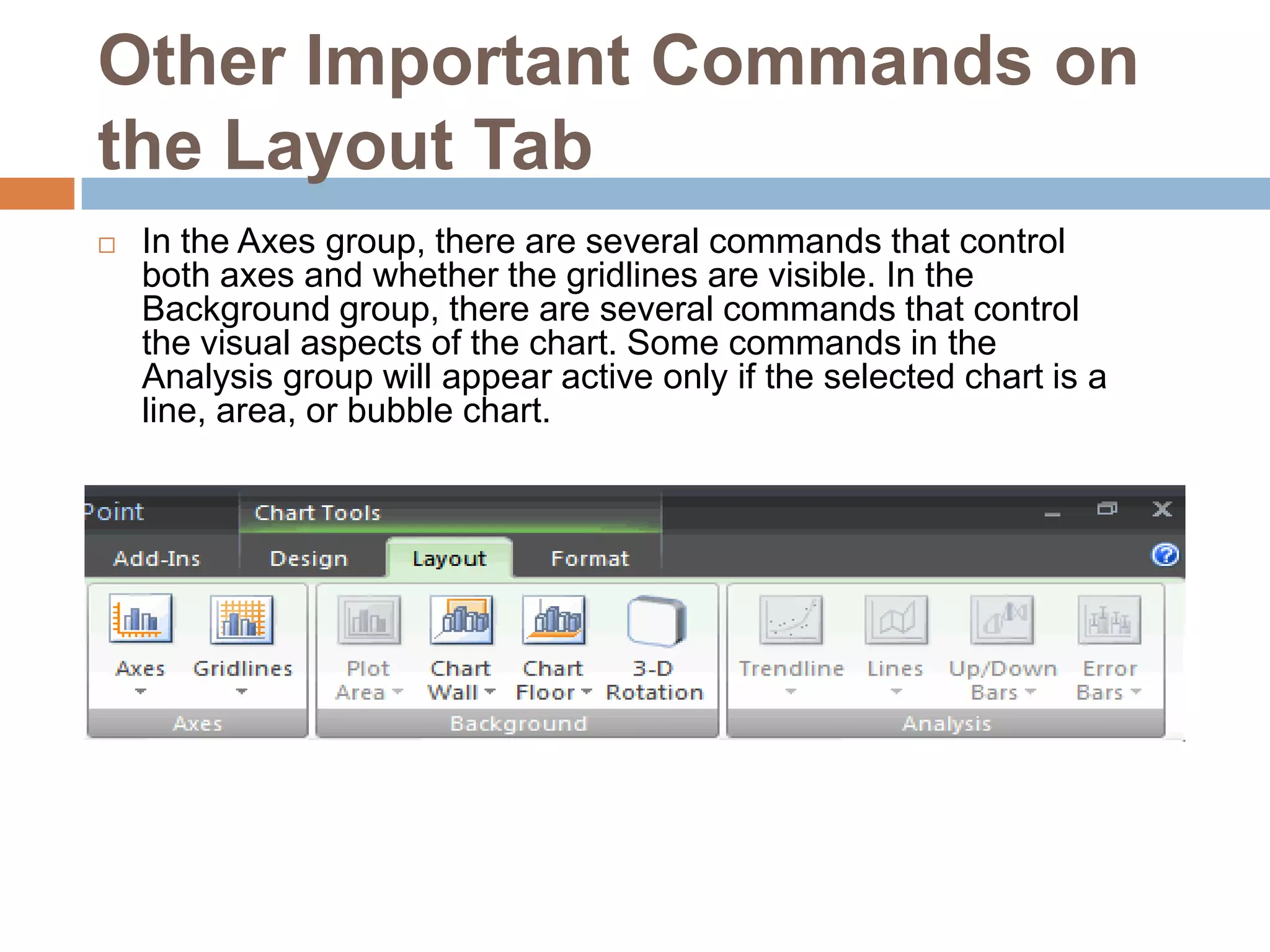
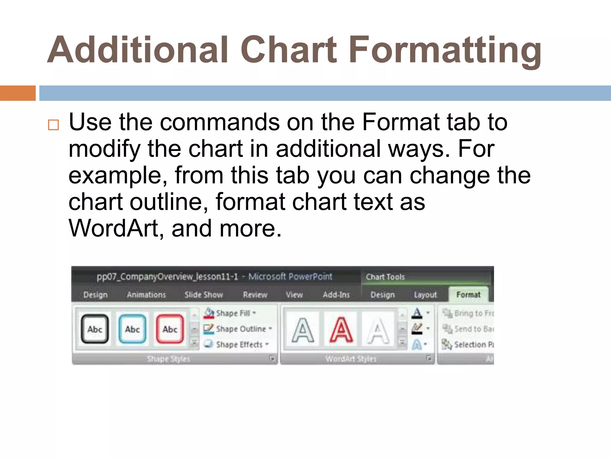
Working with chartsLESSON 11
A chart is a tool you can use to communicate your data graphically. Charts often help an audience to see the meaning behind numbers and make showing comparisons and trends easy. In this lesson, you will learn how to insert and modify charts and see how they can be an effective tool for communicating information.
To Insert a Chart:Select the Insert tab.Click the Insert Chart command. The Insert Chart dialog box appears.
Click and drag the scroll bar to view the chart types, or click a label on the left of the dialog box to see a specific chart style.
Click a chart to select it.Click OK. Excel will open. Usually, Excel will appear on one side of the screen, while PowerPoint appears on the other side of the screen.If a slide layout has a content placeholder, click the Insert Chart command to insert a new chart
Enter Chart DataThe data that appears in the Excel spreadsheet is placeholder source data that you will replace with your own information. The Excel source data is used to create the PowerPoint chart.
To Enter Chart Data:Select a cell in the Excel spreadsheet.Enter your data in the cell. If the cell contains placeholder data, the placeholder data will disappear. As you enter your data, it will appear in the Excel spreadsheet and the PowerPoint chart.Move to another cell.Repeat the above steps until all your data is entered.
Click and drag the lower-right corner of the blue line to increase or decrease the data range for columns. The data enclosed by the blue lines will appear in the chart.Click and drag the lower-right corner of the blue line to increase or decrease the data range for rows
Select any cells with placeholder data remaining. In the example, the column with Series 3 data was not needed.
Press the Delete key to delete the remaining placeholder data.Close Excel. You do not need to save the spreadsheet. The new Excel source data appears in the PowerPoint chart.
Formatting ChartsWhen you insert a chart, three new tabs will appear on the Ribbon. The three tabs -- Design, Layout, and Format -- contain various chart tools and commands that allow you to modify and format the chart.
To Change the Chart Type:Select the chart.Select the Design tab.Click the Change Chart Type command. The Insert Chart dialog box will appear.
Select the chart you would like.Click OK. The chart will change on the slide to the new chart type.
To Edit Source Data:Select the chart.Select the Design tab.Click the Edit Data command. An Excel spreadsheet with the current source data will appear.Edit the data in the spreadsheet. The changes will appear on the slide.Close Excel without saving the spreadsheet.
To Change the Chart Style:Select the chart.Select the Design tab.Scroll through the options in the Chart Style group, or click the More drop-down arrow to see all the chart style options.
Click a chart style to select it. The chart style will change on the slide.
Identifying the Parts of a Chart
Source DataThe range of cells that make up a chart. The chart is updated automatically whenever the information in these cells change.TitleThe title of the chart.LegendThe chart key, which identifies what each color on the chart represents.AxisThe vertical and horizontal parts of a chart. The vertical axis is often referred to as the Y axis, and the horizontal axis is referred to as the X axis.
To Change the Chart Layout:Select the chart.Select the Design tab.Scroll through the options in the Chart Layout group, or click the More drop-down arrow to see all the chart layout options.Click a chart layout to select it. The chart layout will change on the slide.The chart layout determines how specific chart information will appear. For example, some layouts include chart titles, legends, and axis labelsTo Modify Specific Areas of the Chart LayoutSelect the chart.Select the Layout tab.Locate the Labels group.
Chart Titles:Click this command to remove or add a chart title.
Axis TitleClick this command and choose to hide or display the horizontal, or x axis, label; hide or display the vertical, or y axis, labels; and change the direction of the axis labels to horizontal or vertical.
LegendClick this command to select a location for the legend to appear, or choose to not display a legend.
Data LabelsClick this command to display or hide data values next to each chart element.
Other Important Commands on the Layout TabIn the Axes group, there are several commands that control both axes and whether the gridlines are visible. In the Background group, there are several commands that control the visual aspects of the chart. Some commands in the Analysis group will appear active only if the selected chart is a line, area, or bubble chart.
Additional Chart FormattingUse the commands on the Format tab to modify the chart in additional ways. For example, from this tab you can change the chart outline, format chart text as WordArt, and more.
ChallengeUse the Company Overview presentation or any other PowerPoint presentation you choose to complete this challenge.Open a presentation.Insert a bar chart.Change the chart to a line chart.Change the chart layout.Apply a different chart style.Add axis labels if they are not included on the layout you chose.
Lesson 10   working with charts

Lesson 10 working with charts

  • 1.
  • 2.
    A chart isa tool you can use to communicate your data graphically. Charts often help an audience to see the meaning behind numbers and make showing comparisons and trends easy. In this lesson, you will learn how to insert and modify charts and see how they can be an effective tool for communicating information.
  • 3.
    To Insert aChart:Select the Insert tab.Click the Insert Chart command. The Insert Chart dialog box appears.
  • 4.
    Click and dragthe scroll bar to view the chart types, or click a label on the left of the dialog box to see a specific chart style.
  • 5.
    Click a chartto select it.Click OK. Excel will open. Usually, Excel will appear on one side of the screen, while PowerPoint appears on the other side of the screen.If a slide layout has a content placeholder, click the Insert Chart command to insert a new chart
  • 6.
    Enter Chart DataThedata that appears in the Excel spreadsheet is placeholder source data that you will replace with your own information. The Excel source data is used to create the PowerPoint chart.
  • 7.
    To Enter ChartData:Select a cell in the Excel spreadsheet.Enter your data in the cell. If the cell contains placeholder data, the placeholder data will disappear. As you enter your data, it will appear in the Excel spreadsheet and the PowerPoint chart.Move to another cell.Repeat the above steps until all your data is entered.
  • 8.
    Click and dragthe lower-right corner of the blue line to increase or decrease the data range for columns. The data enclosed by the blue lines will appear in the chart.Click and drag the lower-right corner of the blue line to increase or decrease the data range for rows
  • 9.
    Select any cellswith placeholder data remaining. In the example, the column with Series 3 data was not needed.
  • 10.
    Press the Deletekey to delete the remaining placeholder data.Close Excel. You do not need to save the spreadsheet. The new Excel source data appears in the PowerPoint chart.
  • 11.
    Formatting ChartsWhen youinsert a chart, three new tabs will appear on the Ribbon. The three tabs -- Design, Layout, and Format -- contain various chart tools and commands that allow you to modify and format the chart.
  • 12.
    To Change theChart Type:Select the chart.Select the Design tab.Click the Change Chart Type command. The Insert Chart dialog box will appear.
  • 13.
    Select the chartyou would like.Click OK. The chart will change on the slide to the new chart type.
  • 14.
    To Edit SourceData:Select the chart.Select the Design tab.Click the Edit Data command. An Excel spreadsheet with the current source data will appear.Edit the data in the spreadsheet. The changes will appear on the slide.Close Excel without saving the spreadsheet.
  • 15.
    To Change theChart Style:Select the chart.Select the Design tab.Scroll through the options in the Chart Style group, or click the More drop-down arrow to see all the chart style options.
  • 16.
    Click a chartstyle to select it. The chart style will change on the slide.
  • 17.
  • 18.
    Source DataThe rangeof cells that make up a chart. The chart is updated automatically whenever the information in these cells change.TitleThe title of the chart.LegendThe chart key, which identifies what each color on the chart represents.AxisThe vertical and horizontal parts of a chart. The vertical axis is often referred to as the Y axis, and the horizontal axis is referred to as the X axis.
  • 19.
    To Change theChart Layout:Select the chart.Select the Design tab.Scroll through the options in the Chart Layout group, or click the More drop-down arrow to see all the chart layout options.Click a chart layout to select it. The chart layout will change on the slide.The chart layout determines how specific chart information will appear. For example, some layouts include chart titles, legends, and axis labelsTo Modify Specific Areas of the Chart LayoutSelect the chart.Select the Layout tab.Locate the Labels group.
  • 20.
    Chart Titles:Click thiscommand to remove or add a chart title.
  • 21.
    Axis TitleClick thiscommand and choose to hide or display the horizontal, or x axis, label; hide or display the vertical, or y axis, labels; and change the direction of the axis labels to horizontal or vertical.
  • 22.
    LegendClick this commandto select a location for the legend to appear, or choose to not display a legend.
  • 23.
    Data LabelsClick thiscommand to display or hide data values next to each chart element.
  • 24.
    Other Important Commandson the Layout TabIn the Axes group, there are several commands that control both axes and whether the gridlines are visible. In the Background group, there are several commands that control the visual aspects of the chart. Some commands in the Analysis group will appear active only if the selected chart is a line, area, or bubble chart.
  • 25.
    Additional Chart FormattingUsethe commands on the Format tab to modify the chart in additional ways. For example, from this tab you can change the chart outline, format chart text as WordArt, and more.
  • 26.
    ChallengeUse the CompanyOverview presentation or any other PowerPoint presentation you choose to complete this challenge.Open a presentation.Insert a bar chart.Change the chart to a line chart.Change the chart layout.Apply a different chart style.Add axis labels if they are not included on the layout you chose.