The document discusses the magazine "Cornwall Life" and its effective use of regional identity and imagery from Cornwall to appeal to both residents and tourists. It analyzes design elements like the cover featuring surfers and coastal scenes, varied colored cover lines, and inclusion of contributor profiles. While praising some aspects, it notes the large text of "Newquay" overshadowing the masthead and images clustered at the top of the contents page leaving blank space below. Overall, the magazine's layout and use of regional imagery effectively communicates its lifestyle focus.
Kampanye Earth Hour dan Ramah Lingkungan (studi eksplanatif pengaruh tingkat ...Kurniawan Bramanta
Kampanye Earth Hour dan Ramah Lingkungan
(studi eksplanatif pengaruh tingkat kognitif pada program kampanye di twitter terhadap opini tentang gaya hidup yang lebih ramah lingkungan)
A 2 hours workshop about selling for BNI chapter of Lucca and some guest.
Un workshop di due ore sulla vendita, per i membri del capitolo BNI Puccini di Lucca e alcuni ospiti.
VIETATO L'UTILIZZO SENZA PERMESSO.
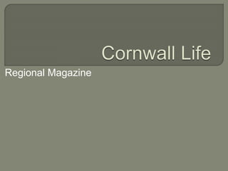
2. Cornwall Life
magazine uses the
regional identity of
its location to
appeal not only to
residents of
Cornwall, but to a
wider population
e.g. Tourists.
The image itself has
many connotations
Cornwall, with the
coastal scene and
surfers, thereby
enhancing the identity
of the magazine.
I particularly like the
use of layers, with
the surfers at the
bottom of the page
and the circular cover
line in the top corner.
An effective feature of
the cover is the
variation of cover
lines, printed in
different colours.
However, the
substantial size of
‘Newquay’
overshadows the
masthead somewhat.
3. Spread over two
pages, the
contents page
for Cornwall Life
boasts an array
of images, all of
which connote
the British
coastline.
Whilst the font
sizes are well-varied,
the text
itself is a little
overwhelming at
first glance.
The positioning of
the images is an
issue; they are
clustered at the
top of the pages,
leaving much
blank space
below.
At the bottom, the
magazine includes
the individual
profiles of
Contributors. I feel
that this adds a
personal touch.
4. The images in
this double page
spread prove to
be rather effective
in communicating
the lifestyle of the
magazine’s
demographic.
The Surf Style
heading thereby
emphasises this
theme.
The layout of
text is also
rather pleasing
to the reader as
it carefully
intertwines itself
with the images.
Moreover, it is
not too dense.