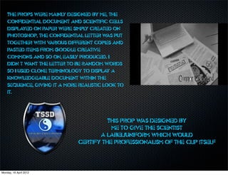
Download to read offline


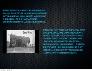
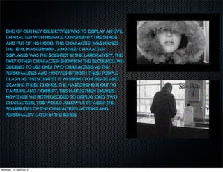
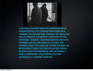


Connor Crawford created a title sequence for a sci-fi/fantasy television series called "Dead Ringer" as a school project. The sequence establishes that the story involves cloning and features shots of a scientist working in a lab and an evil mastermind. Effects were used to make the modern footage appear old. While location footage was limited, the credits and some effects did not turn out as planned due to time constraints. Overall, the sequence accomplishes the goal of hinting at the storyline and characters without revealing too much to intrigue viewers.


![Collaga medaiii[1]](https://cdn.slidesharecdn.com/ss_thumbnails/collagamedaiii1-130122110515-phpapp02-thumbnail.jpg?width=640&height=640&fit=bounds)


