The document provides information about the Snapple beverage brand and its origins in the 1970s when it was created by three friends using natural ingredients. It discusses how Snapple grew its market share with little competition by taking a quirky, fun, and humorous approach to branding. However, over time market pressures increased and this approach was eroded, so the brief aimed to re-establish Snapple's original ethos and rule-breaking alternative attitude through new branding and marketing.
Beginners Guide to TikTok for Search - Rachel Pearson - We are Tilt __ Bright...
Charlene portfolio tester
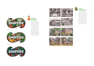
1. SNAPPLE
STORY BOARD
A woman is on a noisy, busy
street, with shopping bags and a
bad reception on her phone. She’s
generally stressed. Eventually she
slumps down in a bus stop, tired and
irritable until she takes out a bottle
of Snapple, which brings colour to
the scene. The very next moment
the woman is lying down, relaxing
SNAPPLE and enjoying her drink, when a hippy
style plant sprouts up from the
BRANDING ground and quickly grows over the
dreary bus stop. Although surprised,
In 1972 three hippy friends
she embraces her new found comfy
created a still fruit drink with natural
haven, until she gets carried away by
ingredients, from which a whole
dancing fruit, to a place of weird and
range of innovative fruit combinations
wonderful bliss.
emerged. Snapple, with little direct
competition, very much owned it’s
market positioning as well as its
quirky, fun, unusual and humorous
attitude. However, through an
increase in market pressure, over
time this has been eroded, so the
Strawberry and kiwi aim of the brief was to take back
ownership of the original ethos
behind the product. Through brand
creation the optimistic, cheerful and
unpretentious values of the brand
needed to be re-established, and
Snapple’s rule breaking alternative
attitude to urban life promoted.
Diet orange and carrot
Cherry ice tea
2. A FAIR TRADE CAMPAIGN
Across the world millions of people are exploited and oppressed by the unfair
power balance in world trade, however this can be a difficult issue to relate to,
especially as fair trade products often cost the consumer more. This poster
is part of a campaign aimed at students to raise awareness and support for
Oxfam’s Make Trade Fair campaign. By placing objects that students would
relate to, in an obvious unfair swap, this campaign hopes to spark a more
personal understanding of what fair trade is about, encouraging students to
find out more.
3. RESTAURANT
WEB SITE
A web site created for ‘The White
Horse’ in Harpenden. The first
restaurant from the brand ‘A touch
of Novelli’ which revolves around
the personality and expertise of
the French celebrity chef Jean-
Christophe Novelli. This site was
designed and built whilst working
at Aubergine 262.
4. KENNETH TURNER
Kenneth Turner is a floral decorator who has many home fragrances and
collections in glass, pewter and crystal. Below is a new packaging range
created for the Blue Tangerine home fragrance set. On the right is a brochure
for Kenneth Turner’s 2006 collection. All work for the Kenneth Turner brand,
also including adverts and web banners, was carried out within the design
team at Aubergine 262, following the Kenneth Turner corporate guidelines.
5. KENNETH TURNER
Please feel free to take out the brochure for a look inside.
The real
Kturner
brochure
will be here
6. WATFORD
COLOSSEUM
Brand creation and brochure design
for the Watford Colosseum, an
internationally renowned concert
hall. The hall is owned and operated
by Watford Borough Council, so the
brochure needed to sit comfortably
alongside the Watford Council
brand colours. It was important to
the client that the brochure clearly
showed the versatility of the hall and
it’s services, and also was relevant
across the diverse communities living
in and around Watford. This was
and designed and developed whilst
working at Aubergine 262.
7. SERVICE CARDS
Each service provided by Watford
Colosseum has a card. Please feel
free to take out the folder opposite
to look at any of the other cards.
The real
Colosseum
brochure
will be here
8. The
SNAIL
The desert snail takes the term
‘lazy bones’ to the extreme, by
being able to sleep for three
years at a time.
THE SEVEN WONDERS
Sample pages for a lavish and highly illustrated coffee
table book taking a new perspective on the seven
wonders of the world. This book looks into the surprising
and unexpected wonder of living creatures. It finishes
with a human posing as the butler of the home, charged
with the responsibility of caring for it’s occupants. To
create a lavish feel, the illustrations take inspiration
from the maximalist movement in their excessive use
of pattern. The style of Baroque is also used for this
purpose, primarily in the animal pattern wallpaper. This
style is particularly relevant to be used within a showcase
of wonders, as the Aristocracy traditionally saw it as a
means to flaunt and express grandeur and exuberance.
9. A QUICK REFERENCE GUIDE
These cards are from a quick-reference marketing categories guide for
the creative industries. They aim to make socioeconomic groupings more
accessible and fun to engage with. Using the childish format of a make-your-
own cut out scene, enables a potentially complex subject to be presented
in a relatively simple way, breaking down the information into two levels of
reference. The first, taken from the objects within the scene, and the second,
from the details within these objects.
1 wealthy
achiever a wealthy
executives b affluent
greys c flourishing
families
2 urban
prosperity d
prosperous
professionals e educated
urbanites f aspiring
singles
CONSUMER CLASSIFICATION
More details of each category’s sub-groupings are provided on the back
of each card. The back is also colour coded, so that when the objects are
cut out, the user can tell which category the piece comes from. Mixing
and matching the individual pieces allows the user to accommodate for
the complexity and overlapping sub-group elements that cross the main
categories. Finally, copies of the category cards without details are also
provided so that the categories can be kept up to date, tailored to a
specific subgroup, or simply coloured in and randomly customised.
4 moderate
means k asian
communities l post-industrial
families m blue-collar
roots
3 comfortably
off
g starting
out h secure
families i settled
suburbia J prudent
pensioners
10. VEER MAGAZINE
This is a sample concept for a lifestyle magazine with
an ethical edge. This magazine is aimed at young
professionals who are new to the world of ethical living,
but are sympathetic to the cause. It covers the normal
areas of a lifestyle magazine such as fashion, travel,
arts and entertainment, but also highlights ethical issues
within these topics in a non-confrontational way. The
heart of the magazine is to raise awareness of how we
effect the world around us, and have the power through
consumption to have positive influence.
The cover of this magasine picks up on the theme of
changing perceptions, by having two versions. The first
looks like a standard mainstream lifestyle magasine, with
a close up of a man standing in an urban environment,
however this can be ripped off and the magasine turned
upside down to reveal the cover shown to the right. This
cover presents the same man, but from a distance. This
man is placed in the centre of images representing people
and places in the world that we are connected to through
our purchasing decisions. The first cover has a poster on
the back, so it is re-useable.
On the left, is the sleeve that fits over the first cover
version, keeping it in place, and hinting there is
something different about this magazine.
11. DOVE SELF ESTEEM FUND
RECEIVED D&AD IN BOOK AWARD
The brief was to communicate how the Dove brand could
help turn the negative, body-related self-esteem of 13-
16 year old girls, into a desire to discover more about
self-acceptance through the Dove Self Esteem Fund. The
campaign also needed to broaden stereotypical views of
beauty and incorporate a positive portrayal of disability,
following the ethos of the Images of disability campaign.
The Images of Disability campaign is not about making
disability the focus of adverts, but simply raising the profile
of disability within advertising, by presenting it in a normal
everyday manner. Portraying disabled individuals not as
‘heroes’ or ‘victims’ but simply people within society.
12. RECEIVED D&AD
IN BOOK AWARD
DOVE SELF ESTEEM FUND
Through research it was clear that female teenage insecurities are often based on not fitting into a prescribed
ideal, usually depicted in the media. Whether it is the size of your clothes, your weight, your shape or your height,
a common denominator was the act of measuring up or down to these ‘beauty’ targets. Even though teenage
girls generally saw beauty as something far beyond these external fixed dimensions, appearing to have the wrong
measurement in any of these areas, often became a stumbling block in accepting their own beauty. This sparked the
campaign focus of ‘beauty beyond measure’, which aims to encourage girls to see beauty without these restrictions.
Questioning whether beauty can be defined by a measurement, will hopefully help them to realise that beauty can
not and should not be judged by fixed and perceived ideals, enabling them to start seeing and accepting how beautiful
they really are.
13. LIVINGBREAD BRAND DEVELOPMENT NEW LIVINGBREAD LOGO
Food for the Hungry, known as FH, is a Christian international charity working in 45 developing The livingbread logo uses the elements from the FH
countries. It provides disaster and emergency relief and implements sustainable development logo, but brings them together within the concept of
programs to transform communities physically and spiritually. However, a new focus of FH a partnership. It shows how the UK are still working
within the UK is partnering UK churches with African communities, it is about developing mutually towards the overall aim of the charity, to meet physical
respectful relationships, and inviting churches to be personally involved in the plight of the poor. and spiritual hungers, but within the context of creating
The aim of the brief was to create a brand for the UK partnership scheme, and a brochure which partnerships. The figures show equality, joy and hope
could introduce the charity and this initiative to churches. through their posture, and that they are working together
ORIGINAL LOGO to bring the abundant life that Jesus offers, through them
To engage with UK churches effectively the new brand should express the core values and Above is the logo that was used for lifting up the wheat- a symbol of food and Jesus as the
purpose of the charity, it was therefore important that African life and culture was celebrated FH internationally, the new logo for bread of life. It also shows that Jesus is at the centre
throughout. This is because the charity aims to embrace the hope and potential in African the partnership scheme needed to of the relationship, through the Ichthus fish symbol.
communities, empowering them to reach their own vision for their future. It was also important to fit under this. This logo consists of The colours were chosen to represent renewal, hope,
promote equality between the UK and African communities, as the partnership vision was for both the Ichthus symbol, which is based endurance and strength.
communities to fight poverty together, rather than finance and ideas just being imposed by the on the Greek acronym of the word
western church. Finally, it was essential to communicate the charity’s desire to follow the teaching ‘fish’, which stands for ‘Jesus Christ,
and example of Jesus Christ, and therefore work holistically, by meeting physical, spiritual, mental Son of God, Saviour’. The stem of
and social needs. To encapsulate the heart and values of this scheme, the brand needed to move wheat is also a symbol of Jesus, and
away from the more corporate approach of the international charity brand, and appear personal, also references the account of him
approachable, simplistic, authentic, natural, living and vibrant. feeding the 5000.
LOGO CORPORATE
DEVELOPMENT GUIDELINES
The first two logo concepts are Please feel free to take out these
based on the Borromean rings, a Corporate guidelines and read
symbol founded on three intersecting more about the livingbread brand.
circles. In a Christian context this
Real
can refer to the Holy Trinity, which
is relevant to the charity, as it
emphasises the relational aspect of
God. In this case the three stands
can represent the UK church, the
African community and Jesus in the
centre, symbolised by the cross in
corporate
the left logo, and the white band in
the right.
On the second row, the first
concept continues to look into
using intersecting shapes to
show relationship. This also uses
guidelines
the symbol of wheat from the
international logo, providing continuity
and representing Jesus again, as in
the centre of the partnership. The
concept on the right presents this
idea through a more literal illustration
style. Although this is more dynamic,
in here
it could be interpreted as blocking
the figure depicted a Jesus out.
The third row shows Jesus,
represented through symbols, being
lifted or raised up. The figures on
the left actually lifting up the symbol
themselves looks more active, which
is more suitable, as the charity
empowers people to act themselves.
However, the symbol of the wheat is
more relevant to the charity than the
cross, as it refers to food / feeding
of the 5000, and also the name for
the scheme, livingbread partnerships.
14. LIVINGBREAD GUIDE
The ‘partners against poverty’ guide is given to interested through the illustration style, and the use of African
churches, and shares the values and vision of the charity pattern and nature based symbolism. Symbolism,
and it’s partnership scheme. Photographic images used particularly through nature, is also meaningful within the
within this guide are mainly unposed reflections of African Christian Bible, so is particularly relevant to the recipients
life and culture, focusing on the hope and potential within of this guide. Craft based illustration and texture is also
these communities, rather than the poverty. Images used to emphasise the natural, simple and personal
focusing on poverty are used sparingly and treated aspects of the brand, and create warm and individual feel.
differently within the livingbread brand, as they do not Finally, all photographs showing interaction between UK
reflect the charity’s vision of hope and restoration for and African communities aim to portray the partnership
these communities. African culture is also celebrated as a positive, mutually respectful and equal relationship.