w w w . C h a n g o D e s i g n . c o m
W W W . C H A N G O D E S I G N . C O M
F
or centuries story telling has been instigating laughter,
evoking empathy or explaining the power of love and the fury
of wars. Compelling stories make personal connections, remove
barriers and create emotional bonds.
Successful brands resonate with the consumer. They have a story,
an account of their roots, their passion and their struggles. Here
we share a handful of our client’s stories and the unique journey of
how they came to be, what they believe, and the work they inspired
us to produce.
C H A N G O D E S I G N
T E X A S
T H E A R T O F
S T O R Y T E L L I N G
TEQUILA
Alfonzo’s farm in Jalisco, Mexico was passed down
to him by his father, Jesus Maria. A place once full
of life, now a barren parcel. In 2004, he began to
cultivate agave. After years of hard work, Alfonzo
came to us ready to develop a premium line of tequilas.
We discussed business goals, brand strategy and naming
architecture since he was new to the process.
1 S T R O U N D C O N C E P T S
Originally, he wanted Blue Mosquito and Rayo Azul
(Blue Lighting) as names. We felt Blue Mosquito
evoked novelty and Rayo Azul didn’t sound or feel
premium. We suggested Alfonzo’s Tequila Company
as the umbrella brand and focused on letter “A”
logotypes. We also referenced iconography from
Mexico’s rich culture.
But something was missing... the real story behind
the farm he cherished so.
M I S F O R T U N E B E C O M E S L E G A C Y
W W W . C H A N G O D E S I G N . C O M
A L E G A C Y H O N O R E D
In our next meeting, the black and white photos of
Jesus Maria are just as you see them, faded and
tattered. Defiance filled tales began. We sat captivated
as he talked about his “Viejo”, an unapologetic man
with uncompromising principles.
In a quick turn, tears fell freely as he recalled
the untimely accident that took his father’s life
Christmas day. A sentimental silence followed.
“Revelde” (Rebel) Tequila was born right then and
there. A shot of Revelde Silver soothed the lump in
our throats.
The hand lettered typography was influenced
by 11th Century Blackletter. With deep ties to
Catholicism, Mexican Blackletter has become part
of the cultural identity of Mexico.
Revelde Silver
Our triple distilled silver delivers fresh and ready for action
Jesus Maria at 15 with his first pistola
Revelde Reposado
A mischievously refined experience
Jesus Maria at 23 and compadres
Revelde AÑejo
Matured to bold and unapologetic perfection
Jesus Maria at 42
W W W . C H A N G O D E S I G N . C O M
S E R V I C E S P R O V I D E D
Brand Positioning, Naming, Logotype,
Label Design & Copywriting
W W W . C H A N G O D E S I G N . C O M
M E X I C O C I T Y D . F. ( W )
Our client wanted a delightful, sensory “experience”.
A distinct attitude reminiscent of the culture and
street cuisine found in Mexico City.
We promptly imagined cruising through “D. F.”, on a
rumbling Harley, bustling city sounds, colorful imag-
es and street vendors all around us. Soon, the tempt-
ing aromas of sizzling carnitas, grilled onions and
smoky poblano peppers draw us in. Our mouths water
as we order. Handed to us is a thick, toasted torta
stuffed with lip smackin’ Mexican mojo. One bite, and
we feel a little less “gringo”.
The creative brief from our client read like this:
“Think Harley riding, Mexician luchador chef, who hap-
pens to be everyone’s favorite ‘tio’ (uncle).”
And that is exactly what we did.
W W W . C H A N G O D E S I G N . C O M
S E R V I C E S P R O V I D E D
Logo Design, Internal & External Signage,
Package Design & Illustration
Larry Srubas fondest memories involved the family’s
humble kitchen table. As a fitness trainer, his own
experience with food and the challenges of “meals
on the run” inspired him to develop a food bar that
offered more. In his free time, he began to experiment.
Using friends and clients as taste testers and after
many attempts, the recipes flourished into yummy
“Larry Bars”.
Larry’s excitement took center stage when describing
the natural products he envisioned. The meticulous
manner in which he selected ingredients, the nutritional
research, historic origins and cultural roots all mattered
greatly to him.
Srubas Global Foods felt natural as a name and
would allow for future growth. The package artwork
reflects the cultural inspiration behind each flavor
and was designed to appeal, persuade and create a
connection that would last.
N O U R I S H E D B O D Y, N U R T U R E D S P I R I T
W W W . C H A N G O D E S I G N . C O M
S E R V I C E S P R O V I D E D
Positioning, Logo, Naming, Packaging & Structural Design
W W W . C H A N G O D E S I G N . C O M
A S O N A N D H I S M O T H E R
Patrick Timpone founded Mom’s Spaghetti Sauce
in 1986 using the Sicilian family recipe which was
handed down for years. His mother Nenfa, hand-
picked each herb in just the right amount from her
garden, she never measured anything. Something
delicious was always simmering on the stove, he
recalled.
Still known for using premium Roma tomatoes, the
finest Sicilian olive oil and fresh basil, the secret lies
in their unique approach to bottling their sauce.
One fresh bay leaf is dropped into each jar, seconds
before sealing. This allows the distinct flavor of the
herb to infuse into the chunky sauce as it cools.
The custom illustration depicts winged cherubs
in serenade. A radiant sun symbolizes the sweet
warmth of Mom’s brand. Momma Nenfa’s portrait
was rendered in an Italian Master Style with classic
typography as a finishing element.
S E R V I C E S P R O V I D E D
Label Design, Typography & Illustration
W W W . C H A N G O D E S I G N . C O M
S E R V I C E S P R O V I D E D
Label Design, Typography & Illustration
W W W . C H A N G O D E S I G N . C O M
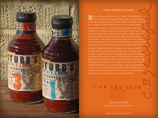
Born in Texas, C. B. “Stubb” Stubblefield. He was a
respected staff sergeant and recipient of two purple
hearts in the US. Army. His generosity brought
people together. Rumor has it, he’d use any hot surface
(in the trench) to grill for his troops. While blues
blared over field radios, he’d hand out the goods
and holler, “made with love”. After being injured, he
worked the mess hall and was known to shout,
“I AM the cook!”
“Stubb’s Bar-B-Q” opened in 1968. Sunday Night
Jams were ground zero for many famous musicians
delighted to play for their dinner. Stevie Ray Vaughn,
Willie Nelson, Johnny Cash and B.B King to name
a few. Stubb’s Legendary Kitchen was established in
1990 to distributes his sauces, rubs and marinades.
While Stubb left us in 1995, his legend lives on in Austin.
The packaging depicts Stubb’s larger than life perso-
na and smile, which came from doing what he loved.
The typography we chose is bold, gritty and inviting.
Stubb poured a little soul into every bottle he shared.
T E X A S B A R B E C U E L E G E N D
A S TA R T- U P I N 1 8 8 9
S E R V I C E S P R O V I D E D
Package Design, Typography & Illustration
W W W . C H A N G O D E S I G N . C O M
W.R. Case & Sons is an American manufacturer of
premium, hand-crafted knives. The company’s rich
history began in 1889 when four brothers began
selling their handcrafted knives along a wagon trail
in upstate New York. Their humble beginnings
evolved into a publicly traded company that has
never lost its artisan approach.
The exquisite knife handles are crafted using select
natural and exotic elements like ancient mammoth
ivory, mother of pearl and precious stones. Each knife
no matter how lavish or utilitarian, is meticulously
shaped, polished by hand and finished with a unique
tang stamp dating system developed by Case.
The package graphics and typography were inspired
by original company documents dating back to the
early 1900’s. We incorporated those authentic graphic
elements into the design to portray the timeless quality
of each Case knife.
w w w . C h a n g o D e s i g n . c o m
Great brands don’t just happen.
w w w . C h a n g o D e s i g n . c o m
Dan Birlew
Principal Designer, Founder
d.birlew@changodesign.com
Cynthia Herrera-Birlew
Managing Partner, Founder
c.birlew@changodesign.com
W W W. C H A N G O D E S I G N . C O M
214 763 9067
STRATEGIC SERVICES
Brand Strategy & Positioning
Marketing & Advertising Strategy
New Product Development
CREATIVE SERVICES
Visual Identity | Brand Style Guides
Product Naming & Extensions
Packaging Design | Private Label Branding
Custom Illustration & Typography
Structural Design | 2D/3D Mock ups
Exterior & Interior Signage
PRODUCTION RESOURCES
Video | 3D Animation
Web & Social Media Development
Photography & Art Direction
Print Management & Sourcing

Chango Design - The Art of Story Telling

  • 1.
    w w w. C h a n g o D e s i g n . c o m
  • 2.
    W W W. C H A N G O D E S I G N . C O M F or centuries story telling has been instigating laughter, evoking empathy or explaining the power of love and the fury of wars. Compelling stories make personal connections, remove barriers and create emotional bonds. Successful brands resonate with the consumer. They have a story, an account of their roots, their passion and their struggles. Here we share a handful of our client’s stories and the unique journey of how they came to be, what they believe, and the work they inspired us to produce. C H A N G O D E S I G N T E X A S T H E A R T O F S T O R Y T E L L I N G
  • 3.
    TEQUILA Alfonzo’s farm inJalisco, Mexico was passed down to him by his father, Jesus Maria. A place once full of life, now a barren parcel. In 2004, he began to cultivate agave. After years of hard work, Alfonzo came to us ready to develop a premium line of tequilas. We discussed business goals, brand strategy and naming architecture since he was new to the process. 1 S T R O U N D C O N C E P T S Originally, he wanted Blue Mosquito and Rayo Azul (Blue Lighting) as names. We felt Blue Mosquito evoked novelty and Rayo Azul didn’t sound or feel premium. We suggested Alfonzo’s Tequila Company as the umbrella brand and focused on letter “A” logotypes. We also referenced iconography from Mexico’s rich culture. But something was missing... the real story behind the farm he cherished so. M I S F O R T U N E B E C O M E S L E G A C Y W W W . C H A N G O D E S I G N . C O M
  • 4.
    A L EG A C Y H O N O R E D In our next meeting, the black and white photos of Jesus Maria are just as you see them, faded and tattered. Defiance filled tales began. We sat captivated as he talked about his “Viejo”, an unapologetic man with uncompromising principles. In a quick turn, tears fell freely as he recalled the untimely accident that took his father’s life Christmas day. A sentimental silence followed. “Revelde” (Rebel) Tequila was born right then and there. A shot of Revelde Silver soothed the lump in our throats. The hand lettered typography was influenced by 11th Century Blackletter. With deep ties to Catholicism, Mexican Blackletter has become part of the cultural identity of Mexico. Revelde Silver Our triple distilled silver delivers fresh and ready for action Jesus Maria at 15 with his first pistola Revelde Reposado A mischievously refined experience Jesus Maria at 23 and compadres Revelde AÑejo Matured to bold and unapologetic perfection Jesus Maria at 42 W W W . C H A N G O D E S I G N . C O M S E R V I C E S P R O V I D E D Brand Positioning, Naming, Logotype, Label Design & Copywriting
  • 5.
    W W W. C H A N G O D E S I G N . C O M M E X I C O C I T Y D . F. ( W ) Our client wanted a delightful, sensory “experience”. A distinct attitude reminiscent of the culture and street cuisine found in Mexico City. We promptly imagined cruising through “D. F.”, on a rumbling Harley, bustling city sounds, colorful imag- es and street vendors all around us. Soon, the tempt- ing aromas of sizzling carnitas, grilled onions and smoky poblano peppers draw us in. Our mouths water as we order. Handed to us is a thick, toasted torta stuffed with lip smackin’ Mexican mojo. One bite, and we feel a little less “gringo”. The creative brief from our client read like this: “Think Harley riding, Mexician luchador chef, who hap- pens to be everyone’s favorite ‘tio’ (uncle).” And that is exactly what we did. W W W . C H A N G O D E S I G N . C O M S E R V I C E S P R O V I D E D Logo Design, Internal & External Signage, Package Design & Illustration
  • 6.
    Larry Srubas fondestmemories involved the family’s humble kitchen table. As a fitness trainer, his own experience with food and the challenges of “meals on the run” inspired him to develop a food bar that offered more. In his free time, he began to experiment. Using friends and clients as taste testers and after many attempts, the recipes flourished into yummy “Larry Bars”. Larry’s excitement took center stage when describing the natural products he envisioned. The meticulous manner in which he selected ingredients, the nutritional research, historic origins and cultural roots all mattered greatly to him. Srubas Global Foods felt natural as a name and would allow for future growth. The package artwork reflects the cultural inspiration behind each flavor and was designed to appeal, persuade and create a connection that would last. N O U R I S H E D B O D Y, N U R T U R E D S P I R I T W W W . C H A N G O D E S I G N . C O M S E R V I C E S P R O V I D E D Positioning, Logo, Naming, Packaging & Structural Design
  • 7.
    W W W. C H A N G O D E S I G N . C O M A S O N A N D H I S M O T H E R Patrick Timpone founded Mom’s Spaghetti Sauce in 1986 using the Sicilian family recipe which was handed down for years. His mother Nenfa, hand- picked each herb in just the right amount from her garden, she never measured anything. Something delicious was always simmering on the stove, he recalled. Still known for using premium Roma tomatoes, the finest Sicilian olive oil and fresh basil, the secret lies in their unique approach to bottling their sauce. One fresh bay leaf is dropped into each jar, seconds before sealing. This allows the distinct flavor of the herb to infuse into the chunky sauce as it cools. The custom illustration depicts winged cherubs in serenade. A radiant sun symbolizes the sweet warmth of Mom’s brand. Momma Nenfa’s portrait was rendered in an Italian Master Style with classic typography as a finishing element. S E R V I C E S P R O V I D E D Label Design, Typography & Illustration W W W . C H A N G O D E S I G N . C O M
  • 8.
    S E RV I C E S P R O V I D E D Label Design, Typography & Illustration W W W . C H A N G O D E S I G N . C O M Born in Texas, C. B. “Stubb” Stubblefield. He was a respected staff sergeant and recipient of two purple hearts in the US. Army. His generosity brought people together. Rumor has it, he’d use any hot surface (in the trench) to grill for his troops. While blues blared over field radios, he’d hand out the goods and holler, “made with love”. After being injured, he worked the mess hall and was known to shout, “I AM the cook!” “Stubb’s Bar-B-Q” opened in 1968. Sunday Night Jams were ground zero for many famous musicians delighted to play for their dinner. Stevie Ray Vaughn, Willie Nelson, Johnny Cash and B.B King to name a few. Stubb’s Legendary Kitchen was established in 1990 to distributes his sauces, rubs and marinades. While Stubb left us in 1995, his legend lives on in Austin. The packaging depicts Stubb’s larger than life perso- na and smile, which came from doing what he loved. The typography we chose is bold, gritty and inviting. Stubb poured a little soul into every bottle he shared. T E X A S B A R B E C U E L E G E N D
  • 9.
    A S TAR T- U P I N 1 8 8 9 S E R V I C E S P R O V I D E D Package Design, Typography & Illustration W W W . C H A N G O D E S I G N . C O M W.R. Case & Sons is an American manufacturer of premium, hand-crafted knives. The company’s rich history began in 1889 when four brothers began selling their handcrafted knives along a wagon trail in upstate New York. Their humble beginnings evolved into a publicly traded company that has never lost its artisan approach. The exquisite knife handles are crafted using select natural and exotic elements like ancient mammoth ivory, mother of pearl and precious stones. Each knife no matter how lavish or utilitarian, is meticulously shaped, polished by hand and finished with a unique tang stamp dating system developed by Case. The package graphics and typography were inspired by original company documents dating back to the early 1900’s. We incorporated those authentic graphic elements into the design to portray the timeless quality of each Case knife.
  • 10.
    w w w. C h a n g o D e s i g n . c o m Great brands don’t just happen.
  • 11.
    w w w. C h a n g o D e s i g n . c o m Dan Birlew Principal Designer, Founder d.birlew@changodesign.com Cynthia Herrera-Birlew Managing Partner, Founder c.birlew@changodesign.com W W W. C H A N G O D E S I G N . C O M 214 763 9067 STRATEGIC SERVICES Brand Strategy & Positioning Marketing & Advertising Strategy New Product Development CREATIVE SERVICES Visual Identity | Brand Style Guides Product Naming & Extensions Packaging Design | Private Label Branding Custom Illustration & Typography Structural Design | 2D/3D Mock ups Exterior & Interior Signage PRODUCTION RESOURCES Video | 3D Animation Web & Social Media Development Photography & Art Direction Print Management & Sourcing