More Related Content
PPTX
Python chart plotting using Matplotlib.pptx 
PPTX
Data Visualization using Matplotlib to understand Graphs 
PPTX
Visualization and Matplotlib using Python.pptx 
PPTX
UNIT-5-II IT-DATA VISUALIZATION TECHNIQUES 
PPTX

PPTX
Matplotlib_Presentation jk jdjklskncncsjkk 
PPTX

PPTX
Introduction to Pylab and Matploitlib. Similar to CBSEMOSTIMPORMatplotlib_Class12_PPT.pptx

PPTX
Matplotlib yayyyyyyyyyyyyyin Python.pptx 
PPTX
PPTX
Introduction_to_Matplotlibpresenatration.pptx 
PPTX
Matplot Lib Practicals artificial intelligence.pptx 
PPTX
Introduction to matplotlib 
PDF

PPTX
matplotlib.pptxdsfdsfdsfdsdsfdsdfdsfsdf cvvf 
PDF
PPTX
PYTHON-Chapter 4-Plotting and Data Science PyLab - MAULIK BORSANIYA 
PPTX
Python_Matplotlib_13_Slides_With_Diagrams.pptx 
PPTX
Python_Matplotlib_13. _Slides.pptx 
PPTX
Matplotlib.pptx for data analysis and visualization 
PPTX
Introduction to Matplotlib Library in Python.pptx 
PDF
Data visualization pyplot 
PPTX
Matplotlib - Python Plotting Library Description 
PDF
711118749-FDS-UNIT-5-PPT.pdf is used to the engineering students 
DOCX
Data visualization using py plot part i 
PPTX

PDF
matplotlib fully explained in detail with examples 
PDF
S4-Matplotlib_Computational_Physics_.pdf Recently uploaded

PDF
The Drift Principle: When Information Accelerates Faster Than Minds Can Compress 
PDF
FAMILY ASSESSMENT FORMAT - CHN practical 
PPTX
The Art Pastor's Guide to the Liturgical Calendar 
PPTX
15 December 2025 Education for human flourishing Michael Stevenson .pptx 
PPTX
Pain. definition, causes, factor influencing pain & pain assessment.pptx 
PPTX
How to use search_read method in Odoo 18 
PDF
Models of Teaching - TNTEU - B.Ed I Semester - Teaching and Learning - BD1TL ... 
PPTX
Semester 6 unit 2 Atopic dermatitis.pptx 
PDF
1ST APPLICATION FOR ANNULMENT (4)8787666.pdf 
PDF
Digital Wellness in University Communities: Libraries as Guardians of Healthy... 
PDF
UKSG Forum 2025 - They asked for everything - The Case of the Systematic Revi... 
PPTX
Cost of Capital - Cost of Equity, Cost of debenture, Cost of Preference share... 
PPTX
Accounting Skills Paper-II (Registers of PACs and Credit Co-operative Societies) 
PPTX
2025-2026 History in your Hands Class 4 December 2025 January 2026 .pptx 
PDF
Projecte de la porta d'i5B: Els animals marins 
PPTX
Unit I — Introduction to Anatomical Terms and Organization of the Human Body 
PDF
DHA/HAAD/MOH/DOH OPTOMETRY MCQ PYQ. .pdf 
PPTX
How to Manage Line Discounts in Odoo 18 POS 
PPTX
ICH Harmonization A Global Pathway to Unified Drug Regulation.pptx 
PPTX
Semester 6 UNIT 2 Dislocation of hip.pptx CBSEMOSTIMPORMatplotlib_Class12_PPT.pptx
- 1.
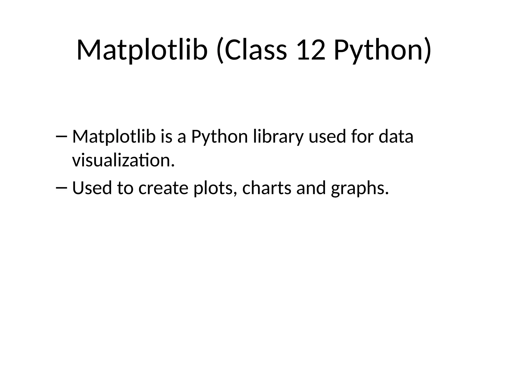
Matplotlib (Class 12Python)
– Matplotlib is a Python library used for data
visualization.
– Used to create plots, charts and graphs.
- 2.
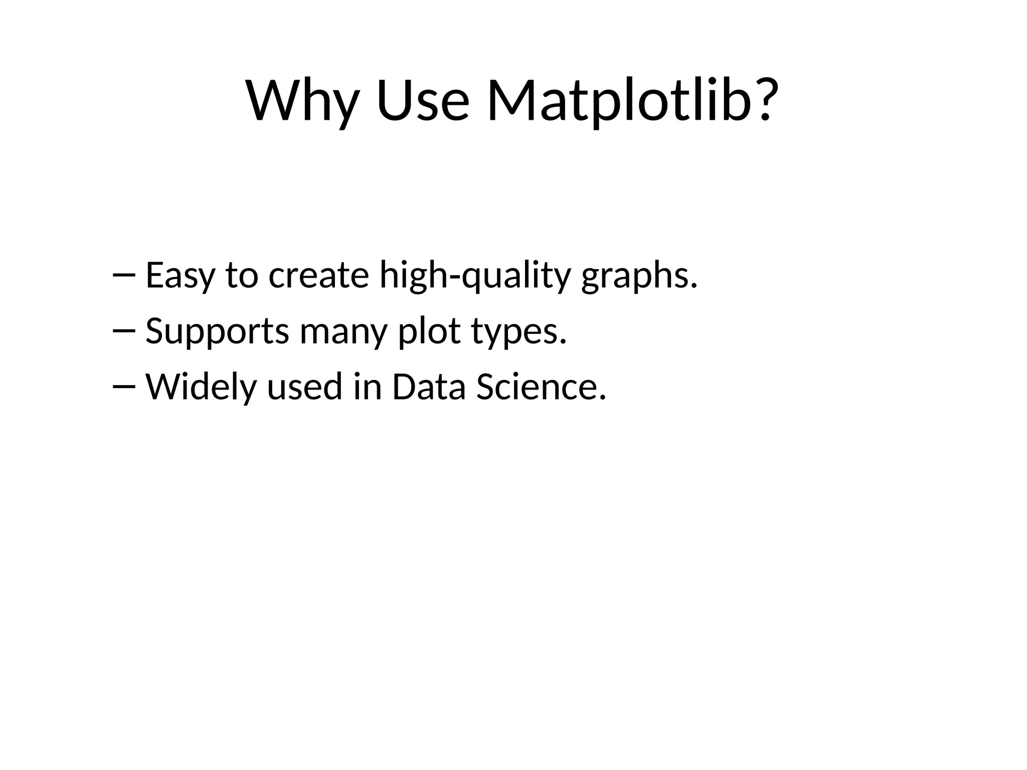
Why Use Matplotlib?
–Easy to create high quality graphs.
‑
– Supports many plot types.
– Widely used in Data Science.
- 3.
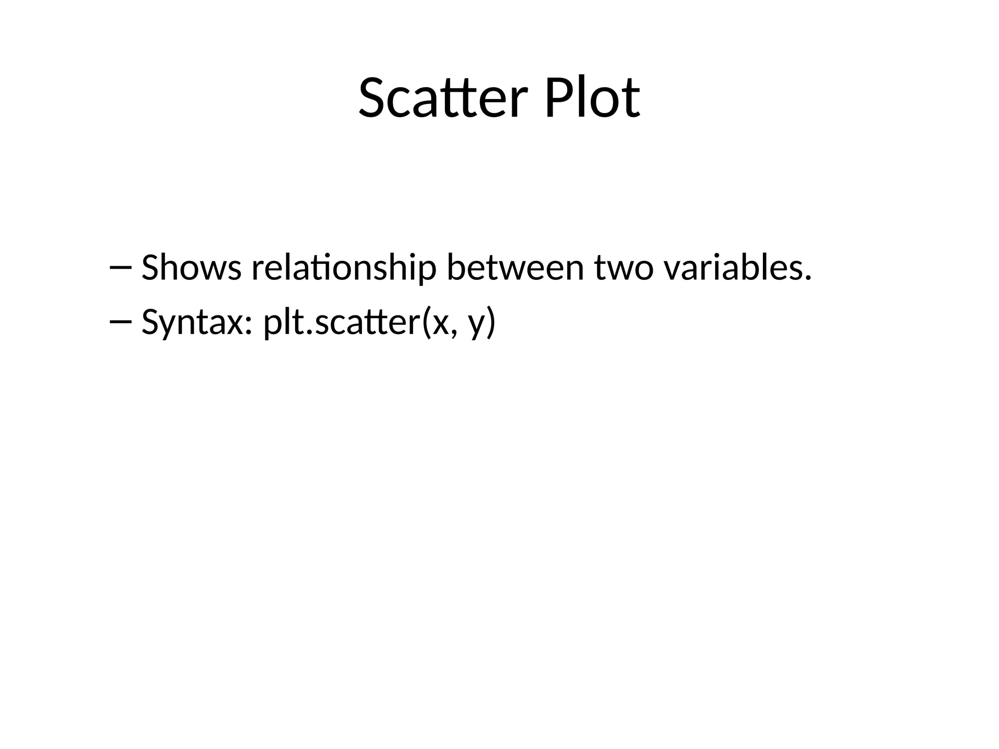
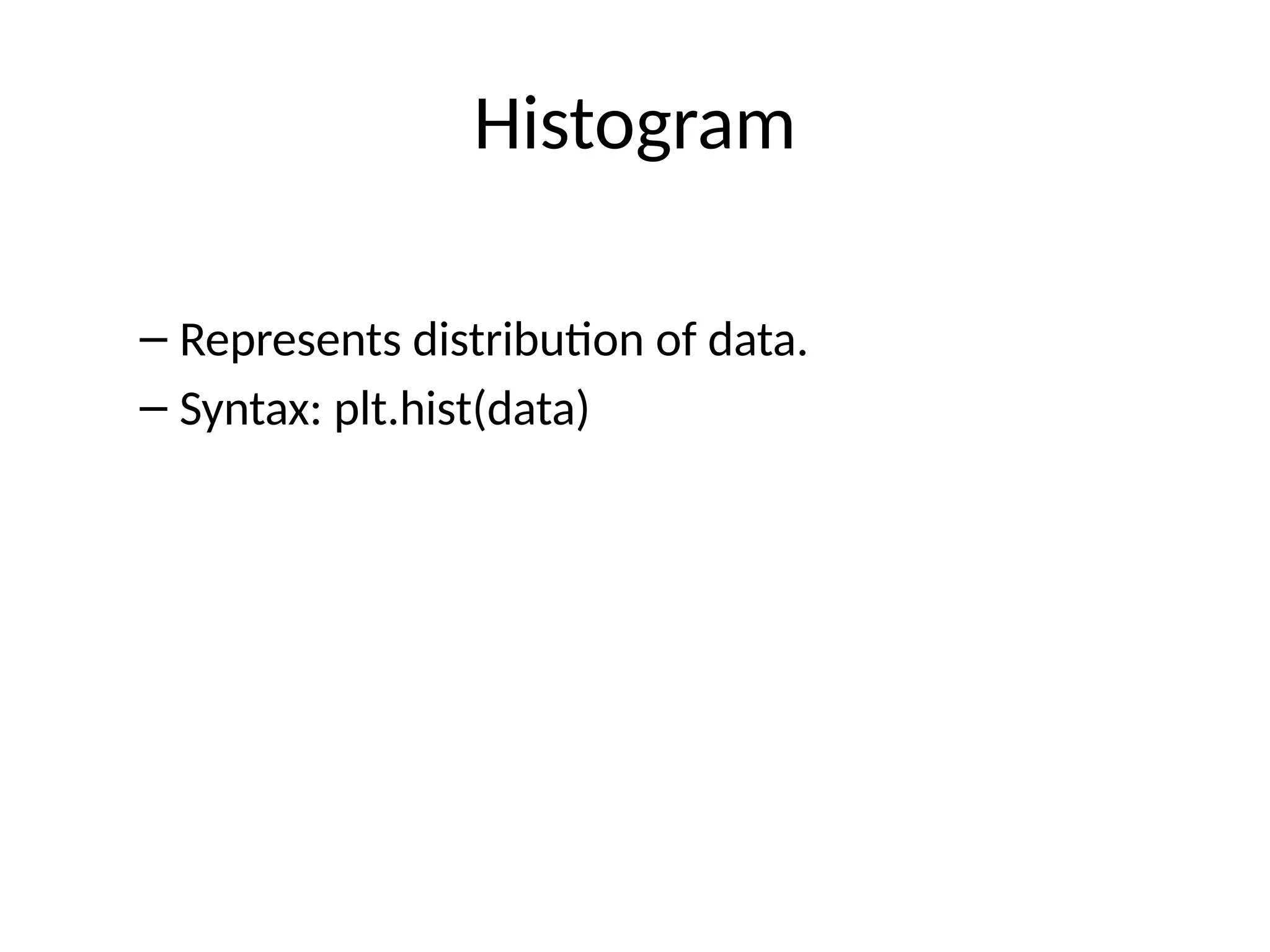
- 4.
- 5.
- 6.
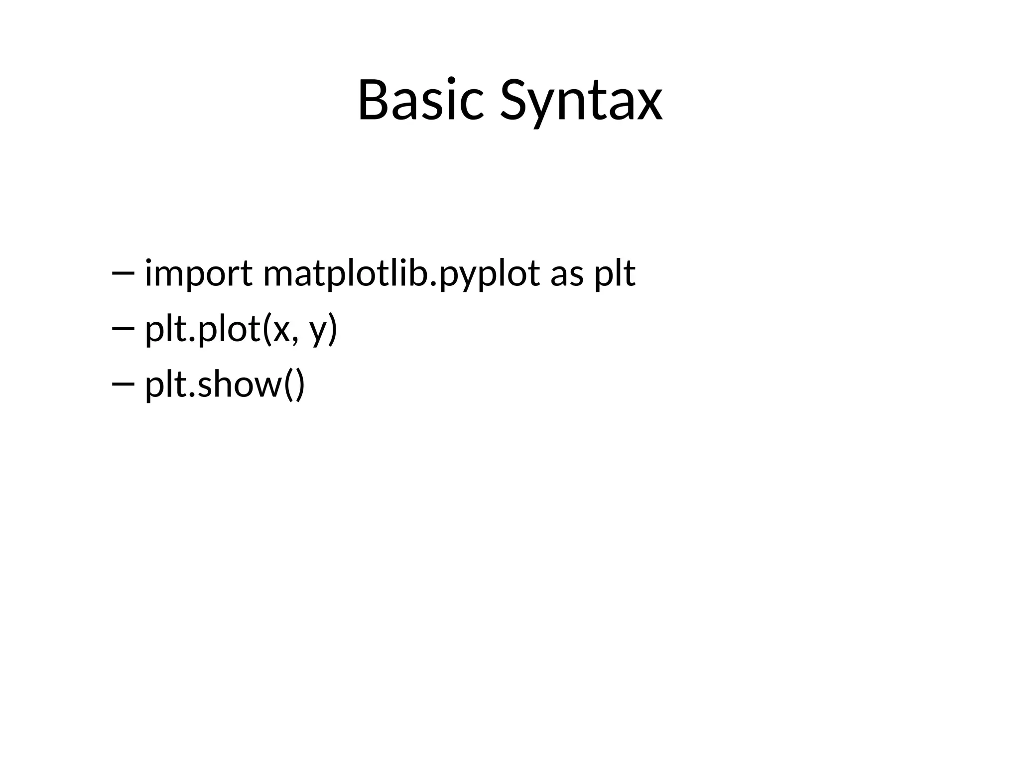
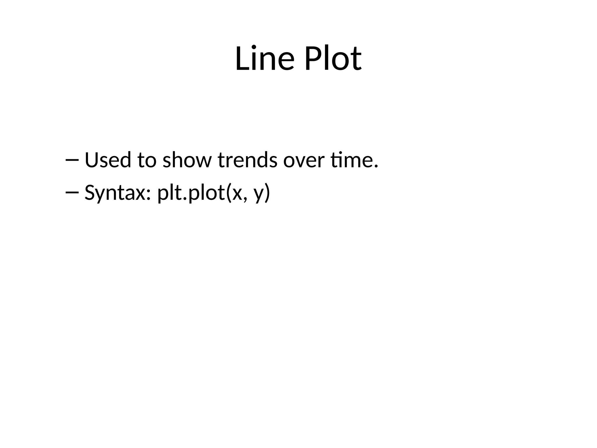
Example: Line Plot
–import matplotlib.pyplot as plt
– x=[1,2,3,4]
– y=[10,20,15,30]
– plt.plot(x,y)
– plt.show()
- 7.
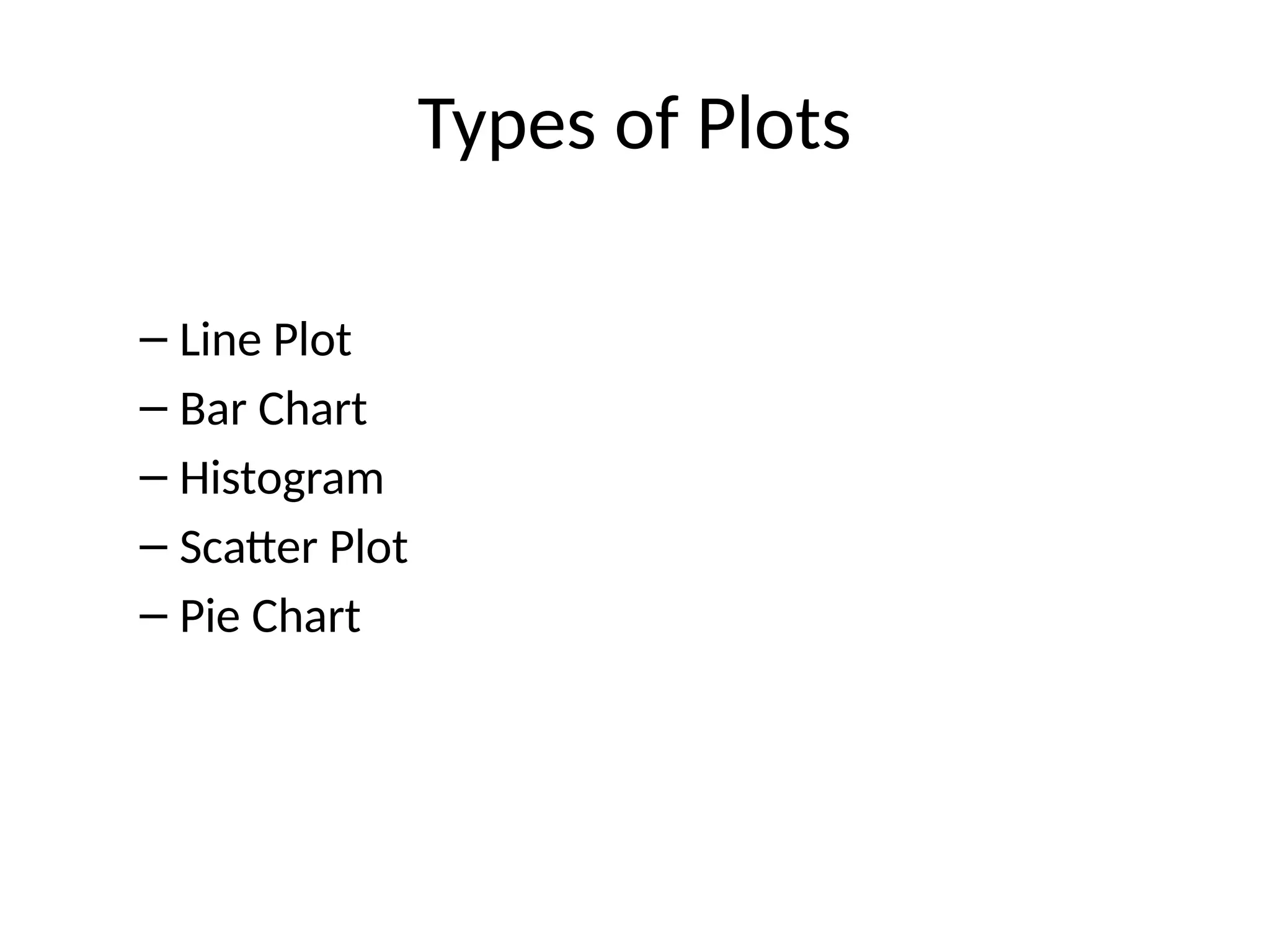
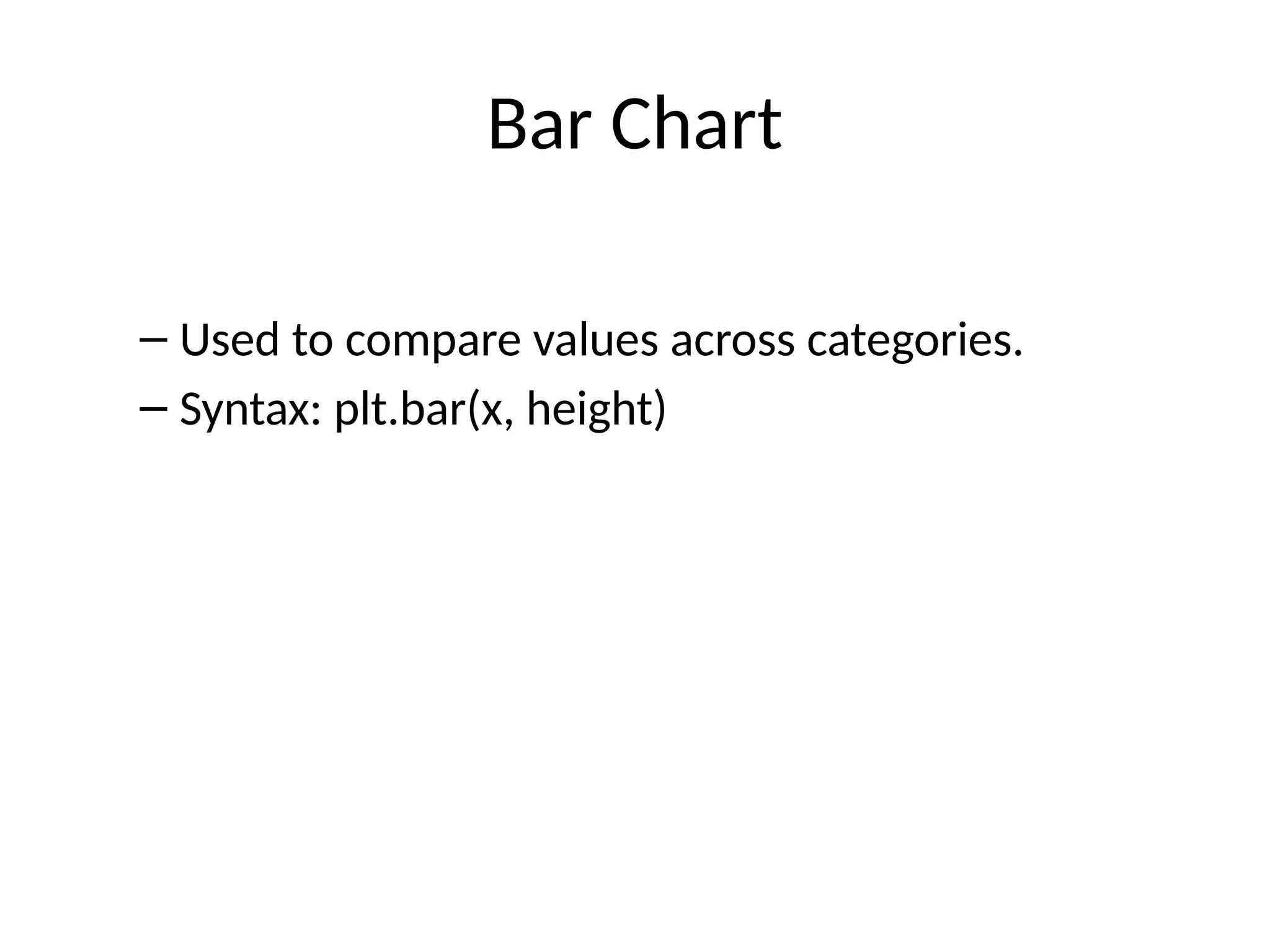
Bar Chart
– Usedto compare values across categories.
– Syntax: plt.bar(x, height)
- 8.
- 9.
- 10.
- 11.
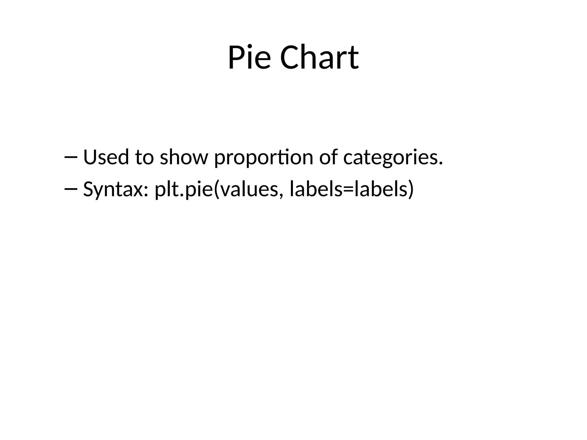
Pie Chart
– Usedto show proportion of categories.
– Syntax: plt.pie(values, labels=labels)
- 12.
- 13.
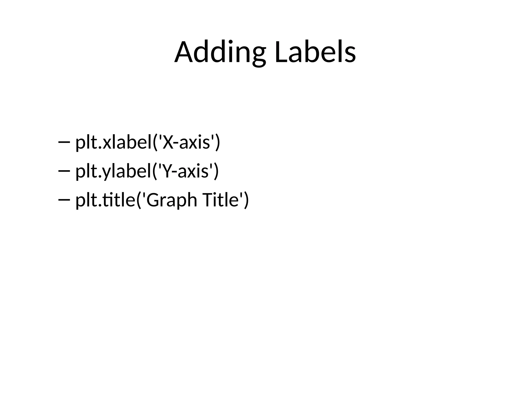
- 14.
- 15.
- 16.
- 17.
- 18.
- 19.
- 20.
![Example: Line Plot
– import matplotlib.pyplot as plt
– x=[1,2,3,4]
– y=[10,20,15,30]
– plt.plot(x,y)
– plt.show()](https://image.slidesharecdn.com/matplotlibclass12ppt-251210151143-1330e7ae/75/CBSEMOSTIMPORMatplotlib_Class12_PPT-pptx-6-2048.jpg)
![Example: Bar Chart
– x=['A','B','C']
– y=[10,25,15]
– plt.bar(x,y)](https://image.slidesharecdn.com/matplotlibclass12ppt-251210151143-1330e7ae/75/CBSEMOSTIMPORMatplotlib_Class12_PPT-pptx-8-2048.jpg)