
Recommended
More Related Content
Similar to Categorical DataCategorical data represents characteristics..docx
Similar to Categorical DataCategorical data represents characteristics..docx (20)
More from keturahhazelhurst
More from keturahhazelhurst (20)
Recently uploaded
Recently uploaded (20)
Categorical DataCategorical data represents characteristics..docx
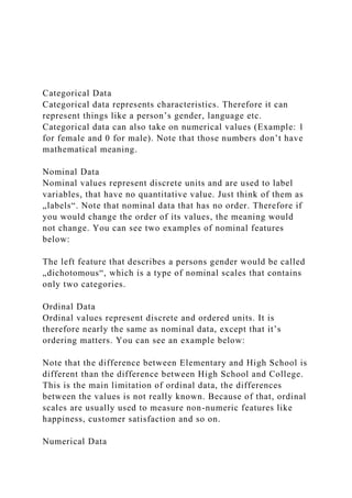
- 1. Categorical Data Categorical data represents characteristics. Therefore it can represent things like a person’s gender, language etc. Categorical data can also take on numerical values (Example: 1 for female and 0 for male). Note that those numbers don’t have mathematical meaning. Nominal Data Nominal values represent discrete units and are used to label variables, that have no quantitative value. Just think of them as „labels“. Note that nominal data that has no order. Therefore if you would change the order of its values, the meaning would not change. You can see two examples of nominal features below: The left feature that describes a persons gender would be called „dichotomous“, which is a type of nominal scales that contains only two categories. Ordinal Data Ordinal values represent discrete and ordered units. It is therefore nearly the same as nominal data, except that it’s ordering matters. You can see an example below: Note that the difference between Elementary and High School is different than the difference between High School and College. This is the main limitation of ordinal data, the differences between the values is not really known. Because of that, ordinal scales are usually used to measure non-numeric features like happiness, customer satisfaction and so on. Numerical Data
- 2. 1. Discrete Data We speak of discrete data if its values are distinct and separate. In other words: We speak of discrete data if the data can only take on certain values. This type of data can’t be measured but it can be counted. It basically represents information that can be categorized into a classification. An example is the number of heads in 100 coin flips. You can check by asking the following two questions whether you are dealing with discrete data or not: Can you count it and can it be divided up into smaller and smaller parts? 2. Continuous Data Continuous Data represents measurements and therefore their values can’t be counted but they can be measured. An example would be the height of a person, which you can describe by using intervals on the real number line. Interval Data Interval values represent ordered units that have the same difference. Therefore we speak of interval data when we have a variable that contains numeric values that are ordered and where we know the exact differences between the values. An example would be a feature that contains temperature of a given place like you can see below: The problem with interval values data is that they don’t have a „true zero“. That means in regards to our example, that there is no such thing as no temperature. With interval data, we can add and subtract, but we cannot multiply, divide or calculate ratios. Because there is no true zero, a lot of descriptive and inferential statistics can’t be applied. Ratio Data Ratio values are also ordered units that have the same difference. Ratio values are the same as interval values, with
- 3. the difference that they do have an absolute zero. Good examples are height, weight, length etc. Why Data Types are important? Datatypes are an important concept because statistical methods can only be used with certain data types. You have to analyze continuous data differently than categorical data otherwise it would result in a wrong analysis. Therefore knowing the types of data you are dealing with, enables you to choose the correct method of analysis. We will now go over every data type again but this time in regards to what statistical methods can be applied. To understand properly what we will now discuss, you have to understand the basics of descriptive statistics. If you don’t know them, you can read my blog post (9min read) about it: https://towardsdatascience.com/intro-to-descriptive- statistics-252e9c464ac9. Statistical Methods Nominal Data When you are dealing with nominal data, you collect information through: Frequencies: The Frequency is the rate at which something occurs over a period of time or within a dataset. Proportion: You can easily calculate the proportion by dividing the frequency by the total number of events. (e.g how often something happened divided by how often it could happen) Percentage. Visualization Methods: To visualize nominal data you can use a pie chart or a bar chart. In Data Science, you can use one hot encoding, to transform nominal data into a numeric feature.
- 4. Ordinal Data When you are dealing with ordinal data, you can use the same methods like with nominal data, but you also have access to some additional tools. Therefore you can summarize your ordinal data with frequencies, proportions, percentages. And you can visualize it with pie and bar charts. Additionally, you can use percentiles, median, mode and the interquartile range to summarize your data. In Data Science, you can use one label encoding, to transform ordinal data into a numeric feature. Continuous Data When you are dealing with continuous data, you can use the most methods to describe your data. You can summarize your data using percentiles, median, interquartile range, mean, mode, standard deviation, and range. Visualization Methods: To visualize continuous data, you can use a histogram or a box- plot. With a histogram, you can check the central tendency, variability, modality, and kurtosis of a distribution. Note that a histogram can’t show you if you have any outliers. This is why we also use box-plots. Sheet1Q4Q8Student 1219Student 2320Student 3118Student 4117Student 5219Student 6221Student 7324Student 8220Student 9117Student 10322Student 1117Student 2218Student 3221Student 4118Student 5219Student 6218Student 7118Student 8331Student 9119Student 10119Student 1218Student 2117Student 3320Student 4219Student 5318Student 6118Student 7219Student 8121Student 9320Student 10220Student 1126Student 2125Student 3120Student 4427Student 5120Student 6219Student 7219
- 5. Categorical and Numerical I want you to write a two-page report about the Survey you have been working on the past two weeks. Essay is on the question you chose to investigate and how the other two questions relate to the topic (main question). 1. I want you to discuss the major question you’re investigating. Have you changed your major? 2. I want you to give a description of the two questions that you are discussing one categorical and one numerical. (Categorical) What classification were you when you first changed your major? 1. Freshman 2. Sophomore 3. Junior 4. Senior (Numerical) How old were you when you first changed your major? 3. I want you to give me a table of the responses I’m thinking this is Analyzing the two questions. 4. You should have at least two different displays for your data, at least one different way for each question. I did complete both graphs for the 2 questions. 5. Give me a recommendation (response) to your question. (students who are younger tend to change their degree plan more than older students, they are more likely to change it in the first two years) 6. I then want you to explain how these results inform your opinion of the investigation. Example: As a result, using my data, I think I could answer the question we are trying to investigate ( Have you changed your major?) I have attached the graphs. The bar graph is to the Categorial question and the Boxplot graph is to Numerical. I also attached the survey Q4 is the Categorical question and Q8 is the Numerical question. I forgot to note on the boxplot graph A1- A37 is the Categorical question and B1-B37 is Numerical.