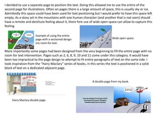
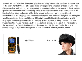
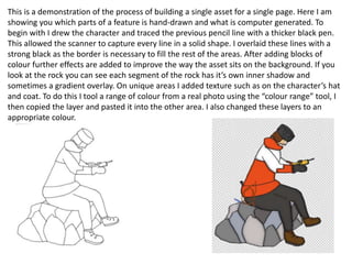
Graphic Narrative
Evaluation
Jamie Mellors
Use this template to help you evaluate your project.
You should give specific details about your work.
You should provide both written and visual examples to explain your project.
You should find areas to praise in your work. Be specific about why you think they are
good or why you are proud of them.
You should also find areas that could be improved. Look for areas that you could make
better if you went back to them. Be specific about what you would improve.
Add additional slides as you need to. Don’t be restricted by what is here.
Any blank slides should be deleted before submission.
Does your final product reflect your
original intentions?
• Compare your planning/digital flat plans/
storyboards to your final product
I have stuck very close to my original planning. I really liked the idea I had to begin with and therefore wanted to
create exactly that. Most of the development occurred in the story itself. I added two extra pages to give the
feeling of repetition that is often used in children’s stories and also the original “The Boy Who Cried Who” story.
However at the same time I didn’t want the story to drag on further up to 15 pages or more, so I decided to cut
suitable pages in half, for example pages 2 and 6. This also worked as it created a style mirrors how comic books
present stories. The initial mistake I made in early planning was that the goat was not present in the story until the
encounter, this was change as to match up with the classic story. Small changes have also been made in the script
although this is less noteworthy as the changes are so minor.
I am very proud of the way the visuals have turned out at the end of production as to find a recognisable look. I
presented how I hoped that might turn out in my mood boards. I made these very detailed with a page for each
significant asset of the book. Looking back at these I notice how I had planned the environments to look. I my mind
at the time I imagined they would look majorly rugged to capture a real mountaineering experience. Everything
was planned to be more dramatic and harsh looking. In reality I have ended up with a highly stylised and childish
look, which considering the target audience is a good thing. This change only came about during the beginning of
production when I realised I was going to struggle to fill these large environments, I worked on focusing on a
smaller scale would allow me to sufficiently animate each page.
Example of using the
entire page with a
sectioned design
Less detailed but a more stylised
environment.
Despite saying this I have stuck very closely to my mood boards. The main
character “Lucus” really does look like a mountain climber as shown in these mood
boards, I included a rope and pick axe in every shot he is in to fit this persona. The goat is
very similar to the goats featured in mood boards. The helicopter is stylaised like a Swiss
mountain rescue, with a toned down appearance excluding accessories and the complex
paint job of the real thing, I thing it also fits with the theme in the rest of the book.
The aspect of the book where the littlest change has occurred since planning in
the story boards themselves. Every page has been created shot for shot, excluding pages
4, 5 and 10. These pages were changed due to a better idea that came up at the time, or
it was simply more time efficient to reuse resources that I had already made. Page 5 is
essentially the same as page 1 only from a different angle.
Swiss mountain
rescue helicopter
(from mood board).
The
helicopter
I made for
my work.
Original
story
board.
Final page in the
book.
How well have you constructed your
images?
• How well have you constructed your images?
You could talk about the overall visual
appearance and well as the use of texture and
colour.
Throughout production I had stuck to a style that incorporates a hand-drawn image that has been coloured and further
worked on to achieve the final look. The key part of this process that allows me to develop my own style is after
initially adding a block of colour. From here I will add a gradient overlay and an inner shadow. I do not always use both,
looking at the page as a whole the gradient overlay will go from light to dark, or from a strong colour to a less washed
out one. Doing this creates real light passing over the image from one side to the other. The sky will have a colour
pattern like this on it to emphsise the light. I use a bright blue colour that fades to white often as this is gives the cold
feel and look to every page, I have tried to be as realistic as possible while retaining a comic style that appeals to
children. The white and blue colours feature on virtually every page is to amplify the icy cold look. Most objects will
have a hint of blue. To better illustrate my example if I was to have set the story in the desert I would use the same
technique with a warm orange and sometimes red colour.
I believe what I have done effectively is to make each shot unique and interesting. I have decided to position the
viewing point of the image in places that might be used in a film. For example on pages where the SOS phone is viewed
I have drawn the page as a close up that than another wide shot. On one page I feel I took this too far. On page 7 I
chose to position the point of view on ground level looking at Lucas’s feet from behind, this failed to work in reality as I
had hoped. The shot is just a little uninteresting as there is no view to admire that I may have tried to include on other
Cold colour scheme.
Close up shot.
Overly stylised shot.
pages. The shot is just a little uninteresting as there is no view to admire that I may have tried to
include on other pages. Instead you see a gravel track and grass using a premade stencil on
photoshop, I drew a crack in the pavement as an attempt to give variety. It is also worth mentioning
at the pen used the trace the image was of low quality and too broad for the fine detail. I feel it was
worth the attempt and if viewed less critically may even be appreciated. On other pages I tried to
mimic the effect of a camera that has been set to a low f/. On page 5 I heavily blurred the backdrop
while keeping Lucas in focus, I quite like this page as which out this effect the page would have been
skipable. To assist with the illusion of distance I coloured the different rows of trees slightly darker
the further towards the horizon they were placed.
There were some problems that became apparent after opening a hand-drawn image into
Photoshop. If you take a look at the main mountain featured in the story, each time it has been used
is the same one. Small cracks of white show through next to pen stokes, on the specific feature I had
used a very broad pen that was difficult to use and resulted in this kind of small construction defect. I
hope that it can be forgiven has the art style of the hand-drawn images are not designed to be
immaculate.
Low depth of field effect, only Lucas is in focus. The
degree of the Gaussian Blur amplifies the further
back in the environment you look. This gives a
great sense of perspective and distance. Also
notice the high level of detail inbertween the gaps
in the trees.
How well have you used text to anchor
your images
• You should talk about the combination of
words, images and text.
I decided to use a separate page to position the text. Doing this allowed me to use the entire of the
second page for illustrations. Often on pages there is a large amount of space, this is usually sky or ice.
Admittedly this space could have been used for text positioning but I would prefer to have this space left
empty. As a story set in the mountains with one human character (and another that is not seen) should
have a remote and destitute feeling about it, there fore use of wide open space can allow to capture this
feeling.
More importantly some pages had been designed from the very beginning to fill the entire page with no
room for text intervention. Pages such as 2, 6, 8, 9, 10 and 11 come under this category. It would have
been too impractical to the page design to attempt to fit entire paragraphs of text on the same side. I
took inspiration from the “Hairy Maclary” series of books, in this series the text is positioned in a solid
block of text on a dedicated adjacent page.
Example of using the entire
page with a sectioned design
(no room for text.
Wide open space.
Hairy Maclary double page.
A double page from my book.
However I have made use of speech bubbles on the illustrative page. These speech bubbles can
some times mirror what has already been said on the text page. This is in the interest of how
children might prefer to take in dialogue. This is the case with most of the speech bubbles, they
rewrite what has already been said, for example page 10 (now that I am referring to pages very
frequently I am realising I have forgotten to add page numbers to the book). However on other page
the speech bubbles have been use to drive the story forward. For example on page 3 Lucas only lies
about the goat running off in the speech bubble and not in the paragraph of text.
This page is the same as every other text page. The
page uses the same colours as the the illustrations. A
very similar gradient overlay has been used to the ice
formations. From the top blue, white, blue. I decided
to use white in the middle as it highlights the text, like
a light shining from behind. I also got a texture from a
real photo of an ice pattern, using the colour range
tool I selected the pattern, pasted it onto this page
and lowered the opacity to below 20% so that it was
barely visible.
Blue and white gradient
overlay on ice.
Is your product suitable for your
audience?
• Reference your proposal
• Give an audience profile and describe
suitability in reference to content
I my proposal I stated that “The audience is a younger audience of Under 8 years old. The age will range from 3-8
years” I think I have achieved my target audiences ideals for a book. I make use of vibrant colours, interesting
transitions and easily understandable text. Speech bubbles appear in most books for children of this age. The structure
of the story is easy to follow and the language used is at a standard suitable to the older spectrum of this age range.
Readers below the age of 6 should have the book read to them by a parent. I did not want the text be simplified to
such an extent that younger children can read it themselves, it was important to range the complexity of sentences to
the older children in my market. I included words that might be considered more of an intermediate level of reading,
for example “unpredictable” and “approached” were two of the words in included in the hope children will learn a few
new words. Also rather than using the word “said” after each line of dialogue I chose to used “lied”. I would say the
book is unsuitable for the youngest ages I have aimed for in hindsight, a 3 year old would certainly struggle to read the
book. However it was never my intention for them to read it, I imagined that they would look at the illustrations and
listen to the book being read. “I intend the book to be read by parents to children and in the later years of the age
range read I themselves”- an extract from my proposal. One page however is questionable, I think I have made page 11
quite unclear as to what is actually going on (this is the page where Lucas is stuck on the ledge in which the different
stages of the night pass and on the final segment the goat in not seen). The idea behind this was good I though
however in practice it is probably too subtle for children to understand, maybe it is even quite unclear to anyone
reading. Which leads me onto another point about age, I have used some angles that as I said earlier imitate a camera
angle that might be used in a film. These kind of pages (5 and 7) might not interest a child that much pages like 6 and
12 which pack more into a single frame might be more stimulating to children.
A book targeted at
boys, notice the red,
white and blue colours.
A book aimed at
girls, noticle the
colour scheme
and Princess
theme.
Girls might usually prefer a more traditional fairy tale story, featuring princesses and prince
etc.. Having said that the original “Boy Who Cried Wolf” story is a multi-gender audience, the
main intention of the story is to teach children the morality of not lying. My story has
retained the same message and the story is also very multi-gender. Admittedly I expect the
book will appeal to boys more due to the male protagonist and a colour scheme that is
predominately blue, red and white. These colours are just how I chose to represent the
environments although it would have been very hard to stylise the mountain setting using
more female orientated colours, this would have also radically change my target market.
Which reinforces my thoughts that I have achieved my target market as the blue, red and
white combination is a fairly neutral colour scheme.
What do you like/dislike about the
techniques you have used?
• Reference specific tools you used with images
The technique I chose to create my characters involved drawing them by hand. The main character,
Lucas, appears on every page. This meant that there had to be an image of Lucas that fits the
positioning for every page. I ended up with 5 different versions, walking sideways, a back view while
standing still, climbing, sitting and the slide where Lucas is stuck on the ledge. I drew him 4 different
times in total it was very different to retain a consistent look. The original drawing of the side-on view
of Lucas was draw with an overweight looking Lucas by mistake using the transform tool I corrected it
to appear the same physique as in the previous slide. There was a a lot of trial and error with this
hand drawn process, a human character with the extra details I have tried to retain is difficult to
replicate time after time. To add to the difficulty of this technique it is very time consuming. Given a
far larger amount of time I would have aimed to draw Lucas in a unique way for every page.
I have used techniques to stylise the pages. This consisted of inner shadows, stroke and gradient
overlays. The environments were all hand drawn with no base for the idea, each environment is
unique to my book with is a definitive advantage of the hand draw technique. Other aspects of the
hand draw technique means that to create a highly detailed environment would involved a significant
amount of time to draw and colour each aspect. I have used computer made aspects as well such as
the penguins, the sun and moon symbols and the tufts of grass.
Stretched ( amended
version used in final
version).
Upstretched
Hand drawn children’s book seam to be more popular. Especially those that demonstrate skill
for example water colour painted book are very popular. The books “The Friendly Giant” and
“Hairy Maclary” have a strong positive colour style. By using a gradient overlay I hoped I could
create colours that are as interesting to look at as this. Alternatively I could have gone down
the route of solid blocks of colour, an example of this would be The Simposns. Very often in
children’ a wider array of colouring is used, which is why I have chosen this look.
Water colours used in
“The Selfish Giant”
Unlike other children’s book I have looked through no others really seam to use a depth of
field effect. This is one aspect of my book I think I really like. The layers further in the
distance received a strong Gaussian Blur effect. Here is an example:
The more distant mountains are blurred to a higher
degree.
At various points in the book I multiplied a single layer extensively. I did this to create
the forests, the wooden logs on Lucas’ house. The positive outlook of this technique
allowed me to create exactly what I wanted in quantities that I could never have done if
drawing and colouring individually. The large areas of wood land work very well
practically on page 5. The technique comes across problems when the layers are made
too big an used as an immediate background, for example on page 6 on the left side.
Page 5:
Example of this duplication
method working well.
Notice the trees
( all duplicated from an individual
drawing of 1 tree).
Page 6:
Example of how duplicated layers can look
lazy. The trucks of the trees have the exact
same knots and defining lines.
What do you like/dislike about how
your final product looks?
I am impressed with the book as a whole. It is only when the images are broken down
that cracks begin to show. The gradient overlays and backgrounds are the highlight for
me. The ugliness begins to show when a single layer has been used overly. I have used
the same scan of a tree that I initially drew for page one repeatedly over the course of
the book. Trees and forests help to fill in areas of space that would otherwise appear
desolate. I learned this on my first attempted page. This happened to be page one.
This is the original flat plan for first page. The
idea was to have the mountain in the distance
and tree parting the way either side.
I did exactly as I planned. This is how the page
turned out. The problem that I came across was that
it is very difficult to fill the gap between the trees
and it therefore appears baron. It would not be
worth the time to create very small details
individually, this is because they would be so small
that would not be noticed. To help with this I added
very small premade stencils of blades of grass to pad
out the setting. This is the only page in the book that
I did this as I though it reduced the overall appeal of
the book.
I later discovered the best way to do this was to cover the as much of the view with trees. Therefore I only had to fill
very small gaps with the grass stencil, resulting in a much better page. Using different shades and minor Gaussian blurs
I was able to make a page that would have been dull quite interesting to look at. However it would have been better
not to reuse the same tree so many times, I think it gets very repetitive. Tis was the best way to mask it and avoid the
ugly open space.
Site of
page 1
Why did you include the content you
used?
• Images, fonts, effects, colours
When choosing a font I knew with little thought that I wanted a font that was printed rather
than in a joined up style. The story is rock, icy, natural it is not an elaborated or smart
setting. The font needed to be rough and blunt looking. Although having said this I didn’t
want to end up with a over-the-top cave man stylised font. The font is easy to read, as
children are going to be attempting the read the book I didn’t want to over complicate the
process by choosing an undecipherable font. Another children’s book I have analysed,
“Shark’s Big Surprise” uses a combination of different fonts to provide variety to the reader.
On the occations that a different font is used it is to amplify the onomatopoeia effect for
example a character that is an octopus is described as “Splish-splashing” along.
I thought this writing style was not appropriate to the
book I had designed. The font I chose looks rugged an
mountainous. I could have attempted this
onomatopoeia effect although the consistency in the
story would be different throughout, which is
something I didn’t want to do.
My story is very blue and white heavy. I was inspired by what colours are displayed in a really
snowy mountain setting. The ground is overpoweringly bright, with white, and the sky (on a
good day) is blue. The clear blue sky when combined with the white and very reflective ground
surface result in a merge of colours between areas. The mountians, especially icy areas, appear
in an off blue tone. Whereas the sky often has a white glow, I have included both of these
effects in my work.
Snow covered areas of the
mountain in an off blue tone.
Cold glow above
mountain range.
Slightly blue ice shown in
my book.
Cold glow above
mountains in my
book
What signs, symbols or codes have
your used in your work?
• Choices of colour, style, locations, character
design and tone all give additional meaning to
your work.
Guided by the mountain setting the rest of the illustrations have fallen into place within this
setting. The type of tree I chose to feature in the illustration is a pine/fir tree which is often
associated with cold climates and mountainous areas. It is a commonly known tree children
recognise from Christmas and other forms of media. For example the forest in “The Gruffalo”
is a pine forest.
A mountain climber’s look is very recognisable culturally. In this case it is not the appearance
of the character but the tools he uses. Rope, an ice pick and a Russian stylised hat. The hat
gives a possible indication as to the county the story takes place in. Despite this there was no
specific location in mind for the setting. Various cultural indications exist. Firstly there is the
Russian hat, another indication is the Swizz rescue helicopter.
Pine trees shown on
the Gruffalo front
cover.
A mountain climber’s look is very recognisable culturally. In this case it is not the appearance
of the character but the tools he uses. Rope, an ice pick and a Russian stylised hat. The hat
gives a possible indication as to the county the story takes place in. Despite this there was no
specific location in mind for the setting. Various cultural indications exist. Firstly there is the
Russian hat, another indication is the Swizz rescue helicopter. However the biggest
contradiction is the language that the characters speak. The book was designed for an English
speaking audience, there would be no difficulty in republishing the book in other world
languages. The helicopter featured in the story was directly inspired by the look of these
Swizz mountain rescue helicopters. Of all the cultural aspects of the book the helicopter is
the most obvious. The design in reality is designed to draw the eye. Finally the bright
yellow/orange SOS phone is recognised as this and not an ordinary mobile phone.
SOS phone Russian hat
What representations can be found in
your work?
• How are men, women or children shown in
your work? Does your work feature different
ages, races, social groups or religions? Does a
lack of any variety of character types create its
own representation?
There are very few featured characters in the book. The main character, Lucas, is the only one
who has any information revealed about the character. The other human character featured is
the helicopter pilot. The goat can also be considered a character. The character of the
helicopter pilot is undefined. It is possible for the character to be male or female of any age. I
designed the main character with little thought as to any interpretations and representations
that may be found. Following in the original stories’ footsteps I made the character a young
male character. The story that I have made follows an outgoing adventures type of person
who is male which may reinforce this representation in children’s book. The main character is
quite generic as a male cast character, a female character would be more unusual. Although
this does happen more often in forms of media for older children. For example Lara croft in
the Tomb Raider video games series feature a female adventurer character as the main
protagonist. Although at this older age, the character is highly sexualised and the series has
been the subject of controversy. In my story the main character is not one to be idolised. The
moral of the story is what continuous lying can result in. The character is arragent in thinking
that he can safely go up a dangerous mountain alone, he also thinks he is clever by phoning in
the reliable mountain rescue. This is more of a representation of male characteristics. The
other character in the story is the helicopter pilot. The pilot as I said is an undefined character,
although a character with a personality is still apparent. The pilot’s role in Lucas’ character
development is to present a safety net that will not always be there. The pilot is a mentor like
character that Lucas can look to for safety and guidance.
What style have you employed in your
products?
• Discuss influences/ existing products
• What visual style does your work have and
why did you choose it?
Computer generated colouring
Compare elements of drawn and computer generated books with examples
Talk about both sides of the spectrum
As children’s books have evolved over time they have become more and more computer
generated. Older book were entirely drawn and coloured by hand, for example the original
book of charlotte’s web (that has now become a film) was created in this style. At the other
side of the spectrum books can be created entirely virtually. The book shown on the right is
called “Terrible Trolls” and has been made on a computer with no hand drawn assets. These
are two very obvious examples, although it can be difficult to tell as sometimes as designers
try to replicate the hard drawn style on a computer. My book however is half and half. I drew
the majority of the books assets and coloured and pieced the pages together with Photoshop.
From the book “Terrible Trolls” From the original book of “charlotte’s web”
This is a demonstration of the process of building a single asset for a single page. Here I am
showing you which parts of a feature is hand-drawn and what is computer generated. To
begin with I drew the character and traced the previous pencil line with a thicker black pen.
This allowed the scanner to capture every line in a solid shape. I overlaid these lines with a
strong black as the border is necessary to fill the rest of the areas. After adding blocks of
colour further effects are added to improve the way the asset sits on the background. If you
look at the rock you can see each segment of the rock has it’s own inner shadow and
sometimes a gradient overlay. On unique areas I added texture such as on the character’s hat
and coat. To do this I tool a range of colour from a real photo using the “colour range” tool, I
then copied the layer and pasted it into the other area. I also changed these layers to an
appropriate colour.
Example of how hand drawn aspects of the book come together to make a complete page.
What were the strengths and weaknesses
of the pre-production and planning
• How did the planning and research help
• How well did you manage your time
• Reference specific examples
My pre-production was strong in some areas and weak in others. The design work I created in pre-
production was enough to know exactly what I was doing on every page. The detail level was high with
specific assets and layout already thought out and written down. This is in the form of my flat plans,
script and mood boards. Every part of the aesthetics of the book was ready and clear. My biggest fault in
my planning work was a terrible time schedule. It was very unstructured and loosely followed. This
resulted in far more time being taken to complete each individual page and aspect of the book. Which in
turn delayed completion of the book. My research into how real scenery looks assisted me greatly in the
product of the environments. The is heavily based around to scenery taking the setting into account. I
had a very clear idea throughout of what I wanted to make based on the extensive research looking up
children’s book illustrations and narrative structure. The story needed to have several reoccurrences
throughout and several lines of dialogue repeated as there is in every children’s book. Knowing the page
layout before beginning production allowed me to draw up the assets knowing exactly how they are
going to piece together onto the page. Therefore I didn’t waste time drawing an element of the story
more times than I needed to. Foe example on the page when Lucas climbs up the rock that is the same
drawing on Lucas on page 2. Although the same drawing I knew I could manipulate the positioning of his
limbs to put him into a climbing position. I also knew I would only need to draw the goat once, I have
used the same tree on multiple occasions. The only time I drew a new tree was on the final page as I
wanted it to be a unique send off to the book.
Single drawing
transformed into a
different use.
Historical and cultural context
• How does your work compare to what has
come before? What other similar products
have existed in the past? What current
products exist?
The story I have made is a modern adaptation of “The Boy Who Cried Wolf”. The original story
has a message that is relevant to everyone, even today. Although the original story may have
had direct relevance to how people lived at the time, the story is very old. The origin of the
story is believed to be attributed to Greek fabulist, Aesop. Aesop was born in 620BC making
the the story over 2,500 years old. Children might have been liable to cause trouble while
tending to sheep or cattle. This reference is long outdated, in British culture anyway, as wolves
no longer live in this part of the world. The story I have made is in no direct relation to
mountain climbers and hikers. I chose to do this story as it has great use of repetition that
appeals to children. The structure of the story is an easy one to adapt. The danger is teased
twice and then the danger that is teased actually occurs. The story I have made is highly
modernised. Technology is present in my version of the story in contrast to the old fashioned
setting of the original.
The message behind the story is that lying can cause problems and land yourself in
trouble. This story is present in different cultures all over the world, often ending in the
character who lied being killed. In some versions of “The boy who cried wolf” story the boy is
killed and eaten by the wolf. This has been changes as the book has been adapted into
friendlier children’s books.
Book for small children
Other counties and regions of the world have their own version of the fable. The boy who
cried wolf in the western version. For example in China they children are told the story of
“King You of Zhou”. This tells the story of a Chinese king who to entertain himself and his lover
would like warning beacons signaling an attack, causing his nobles to come to his aid. He does
this twice before on the third time a real attack threatens the city none of his allies come to
his aid and he is killed and his lover captured.
An artists impression of the story.
The scene shows his nobles coming to aid him
as his lover claps and laughs. Warning beacons
are also seen blazing in the background.

Book evaluation

  • 1.
  • 2.
    Use this templateto help you evaluate your project. You should give specific details about your work. You should provide both written and visual examples to explain your project. You should find areas to praise in your work. Be specific about why you think they are good or why you are proud of them. You should also find areas that could be improved. Look for areas that you could make better if you went back to them. Be specific about what you would improve. Add additional slides as you need to. Don’t be restricted by what is here. Any blank slides should be deleted before submission.
  • 3.
    Does your finalproduct reflect your original intentions? • Compare your planning/digital flat plans/ storyboards to your final product
  • 4.
    I have stuckvery close to my original planning. I really liked the idea I had to begin with and therefore wanted to create exactly that. Most of the development occurred in the story itself. I added two extra pages to give the feeling of repetition that is often used in children’s stories and also the original “The Boy Who Cried Who” story. However at the same time I didn’t want the story to drag on further up to 15 pages or more, so I decided to cut suitable pages in half, for example pages 2 and 6. This also worked as it created a style mirrors how comic books present stories. The initial mistake I made in early planning was that the goat was not present in the story until the encounter, this was change as to match up with the classic story. Small changes have also been made in the script although this is less noteworthy as the changes are so minor. I am very proud of the way the visuals have turned out at the end of production as to find a recognisable look. I presented how I hoped that might turn out in my mood boards. I made these very detailed with a page for each significant asset of the book. Looking back at these I notice how I had planned the environments to look. I my mind at the time I imagined they would look majorly rugged to capture a real mountaineering experience. Everything was planned to be more dramatic and harsh looking. In reality I have ended up with a highly stylised and childish look, which considering the target audience is a good thing. This change only came about during the beginning of production when I realised I was going to struggle to fill these large environments, I worked on focusing on a smaller scale would allow me to sufficiently animate each page. Example of using the entire page with a sectioned design Less detailed but a more stylised environment.
  • 5.
    Despite saying thisI have stuck very closely to my mood boards. The main character “Lucus” really does look like a mountain climber as shown in these mood boards, I included a rope and pick axe in every shot he is in to fit this persona. The goat is very similar to the goats featured in mood boards. The helicopter is stylaised like a Swiss mountain rescue, with a toned down appearance excluding accessories and the complex paint job of the real thing, I thing it also fits with the theme in the rest of the book. The aspect of the book where the littlest change has occurred since planning in the story boards themselves. Every page has been created shot for shot, excluding pages 4, 5 and 10. These pages were changed due to a better idea that came up at the time, or it was simply more time efficient to reuse resources that I had already made. Page 5 is essentially the same as page 1 only from a different angle. Swiss mountain rescue helicopter (from mood board). The helicopter I made for my work. Original story board. Final page in the book.
  • 6.
    How well haveyou constructed your images? • How well have you constructed your images? You could talk about the overall visual appearance and well as the use of texture and colour.
  • 7.
    Throughout production Ihad stuck to a style that incorporates a hand-drawn image that has been coloured and further worked on to achieve the final look. The key part of this process that allows me to develop my own style is after initially adding a block of colour. From here I will add a gradient overlay and an inner shadow. I do not always use both, looking at the page as a whole the gradient overlay will go from light to dark, or from a strong colour to a less washed out one. Doing this creates real light passing over the image from one side to the other. The sky will have a colour pattern like this on it to emphsise the light. I use a bright blue colour that fades to white often as this is gives the cold feel and look to every page, I have tried to be as realistic as possible while retaining a comic style that appeals to children. The white and blue colours feature on virtually every page is to amplify the icy cold look. Most objects will have a hint of blue. To better illustrate my example if I was to have set the story in the desert I would use the same technique with a warm orange and sometimes red colour. I believe what I have done effectively is to make each shot unique and interesting. I have decided to position the viewing point of the image in places that might be used in a film. For example on pages where the SOS phone is viewed I have drawn the page as a close up that than another wide shot. On one page I feel I took this too far. On page 7 I chose to position the point of view on ground level looking at Lucas’s feet from behind, this failed to work in reality as I had hoped. The shot is just a little uninteresting as there is no view to admire that I may have tried to include on other Cold colour scheme. Close up shot. Overly stylised shot.
  • 8.
    pages. The shotis just a little uninteresting as there is no view to admire that I may have tried to include on other pages. Instead you see a gravel track and grass using a premade stencil on photoshop, I drew a crack in the pavement as an attempt to give variety. It is also worth mentioning at the pen used the trace the image was of low quality and too broad for the fine detail. I feel it was worth the attempt and if viewed less critically may even be appreciated. On other pages I tried to mimic the effect of a camera that has been set to a low f/. On page 5 I heavily blurred the backdrop while keeping Lucas in focus, I quite like this page as which out this effect the page would have been skipable. To assist with the illusion of distance I coloured the different rows of trees slightly darker the further towards the horizon they were placed. There were some problems that became apparent after opening a hand-drawn image into Photoshop. If you take a look at the main mountain featured in the story, each time it has been used is the same one. Small cracks of white show through next to pen stokes, on the specific feature I had used a very broad pen that was difficult to use and resulted in this kind of small construction defect. I hope that it can be forgiven has the art style of the hand-drawn images are not designed to be immaculate. Low depth of field effect, only Lucas is in focus. The degree of the Gaussian Blur amplifies the further back in the environment you look. This gives a great sense of perspective and distance. Also notice the high level of detail inbertween the gaps in the trees.
  • 9.
    How well haveyou used text to anchor your images • You should talk about the combination of words, images and text.
  • 10.
    I decided touse a separate page to position the text. Doing this allowed me to use the entire of the second page for illustrations. Often on pages there is a large amount of space, this is usually sky or ice. Admittedly this space could have been used for text positioning but I would prefer to have this space left empty. As a story set in the mountains with one human character (and another that is not seen) should have a remote and destitute feeling about it, there fore use of wide open space can allow to capture this feeling. More importantly some pages had been designed from the very beginning to fill the entire page with no room for text intervention. Pages such as 2, 6, 8, 9, 10 and 11 come under this category. It would have been too impractical to the page design to attempt to fit entire paragraphs of text on the same side. I took inspiration from the “Hairy Maclary” series of books, in this series the text is positioned in a solid block of text on a dedicated adjacent page. Example of using the entire page with a sectioned design (no room for text. Wide open space. Hairy Maclary double page. A double page from my book.
  • 11.
    However I havemade use of speech bubbles on the illustrative page. These speech bubbles can some times mirror what has already been said on the text page. This is in the interest of how children might prefer to take in dialogue. This is the case with most of the speech bubbles, they rewrite what has already been said, for example page 10 (now that I am referring to pages very frequently I am realising I have forgotten to add page numbers to the book). However on other page the speech bubbles have been use to drive the story forward. For example on page 3 Lucas only lies about the goat running off in the speech bubble and not in the paragraph of text. This page is the same as every other text page. The page uses the same colours as the the illustrations. A very similar gradient overlay has been used to the ice formations. From the top blue, white, blue. I decided to use white in the middle as it highlights the text, like a light shining from behind. I also got a texture from a real photo of an ice pattern, using the colour range tool I selected the pattern, pasted it onto this page and lowered the opacity to below 20% so that it was barely visible. Blue and white gradient overlay on ice.
  • 12.
    Is your productsuitable for your audience? • Reference your proposal • Give an audience profile and describe suitability in reference to content
  • 13.
    I my proposalI stated that “The audience is a younger audience of Under 8 years old. The age will range from 3-8 years” I think I have achieved my target audiences ideals for a book. I make use of vibrant colours, interesting transitions and easily understandable text. Speech bubbles appear in most books for children of this age. The structure of the story is easy to follow and the language used is at a standard suitable to the older spectrum of this age range. Readers below the age of 6 should have the book read to them by a parent. I did not want the text be simplified to such an extent that younger children can read it themselves, it was important to range the complexity of sentences to the older children in my market. I included words that might be considered more of an intermediate level of reading, for example “unpredictable” and “approached” were two of the words in included in the hope children will learn a few new words. Also rather than using the word “said” after each line of dialogue I chose to used “lied”. I would say the book is unsuitable for the youngest ages I have aimed for in hindsight, a 3 year old would certainly struggle to read the book. However it was never my intention for them to read it, I imagined that they would look at the illustrations and listen to the book being read. “I intend the book to be read by parents to children and in the later years of the age range read I themselves”- an extract from my proposal. One page however is questionable, I think I have made page 11 quite unclear as to what is actually going on (this is the page where Lucas is stuck on the ledge in which the different stages of the night pass and on the final segment the goat in not seen). The idea behind this was good I though however in practice it is probably too subtle for children to understand, maybe it is even quite unclear to anyone reading. Which leads me onto another point about age, I have used some angles that as I said earlier imitate a camera angle that might be used in a film. These kind of pages (5 and 7) might not interest a child that much pages like 6 and 12 which pack more into a single frame might be more stimulating to children. A book targeted at boys, notice the red, white and blue colours. A book aimed at girls, noticle the colour scheme and Princess theme.
  • 14.
    Girls might usuallyprefer a more traditional fairy tale story, featuring princesses and prince etc.. Having said that the original “Boy Who Cried Wolf” story is a multi-gender audience, the main intention of the story is to teach children the morality of not lying. My story has retained the same message and the story is also very multi-gender. Admittedly I expect the book will appeal to boys more due to the male protagonist and a colour scheme that is predominately blue, red and white. These colours are just how I chose to represent the environments although it would have been very hard to stylise the mountain setting using more female orientated colours, this would have also radically change my target market. Which reinforces my thoughts that I have achieved my target market as the blue, red and white combination is a fairly neutral colour scheme.
  • 15.
    What do youlike/dislike about the techniques you have used? • Reference specific tools you used with images
  • 16.
    The technique Ichose to create my characters involved drawing them by hand. The main character, Lucas, appears on every page. This meant that there had to be an image of Lucas that fits the positioning for every page. I ended up with 5 different versions, walking sideways, a back view while standing still, climbing, sitting and the slide where Lucas is stuck on the ledge. I drew him 4 different times in total it was very different to retain a consistent look. The original drawing of the side-on view of Lucas was draw with an overweight looking Lucas by mistake using the transform tool I corrected it to appear the same physique as in the previous slide. There was a a lot of trial and error with this hand drawn process, a human character with the extra details I have tried to retain is difficult to replicate time after time. To add to the difficulty of this technique it is very time consuming. Given a far larger amount of time I would have aimed to draw Lucas in a unique way for every page. I have used techniques to stylise the pages. This consisted of inner shadows, stroke and gradient overlays. The environments were all hand drawn with no base for the idea, each environment is unique to my book with is a definitive advantage of the hand draw technique. Other aspects of the hand draw technique means that to create a highly detailed environment would involved a significant amount of time to draw and colour each aspect. I have used computer made aspects as well such as the penguins, the sun and moon symbols and the tufts of grass. Stretched ( amended version used in final version). Upstretched
  • 17.
    Hand drawn children’sbook seam to be more popular. Especially those that demonstrate skill for example water colour painted book are very popular. The books “The Friendly Giant” and “Hairy Maclary” have a strong positive colour style. By using a gradient overlay I hoped I could create colours that are as interesting to look at as this. Alternatively I could have gone down the route of solid blocks of colour, an example of this would be The Simposns. Very often in children’ a wider array of colouring is used, which is why I have chosen this look. Water colours used in “The Selfish Giant” Unlike other children’s book I have looked through no others really seam to use a depth of field effect. This is one aspect of my book I think I really like. The layers further in the distance received a strong Gaussian Blur effect. Here is an example: The more distant mountains are blurred to a higher degree.
  • 18.
    At various pointsin the book I multiplied a single layer extensively. I did this to create the forests, the wooden logs on Lucas’ house. The positive outlook of this technique allowed me to create exactly what I wanted in quantities that I could never have done if drawing and colouring individually. The large areas of wood land work very well practically on page 5. The technique comes across problems when the layers are made too big an used as an immediate background, for example on page 6 on the left side. Page 5: Example of this duplication method working well. Notice the trees ( all duplicated from an individual drawing of 1 tree). Page 6: Example of how duplicated layers can look lazy. The trucks of the trees have the exact same knots and defining lines.
  • 19.
    What do youlike/dislike about how your final product looks?
  • 20.
    I am impressedwith the book as a whole. It is only when the images are broken down that cracks begin to show. The gradient overlays and backgrounds are the highlight for me. The ugliness begins to show when a single layer has been used overly. I have used the same scan of a tree that I initially drew for page one repeatedly over the course of the book. Trees and forests help to fill in areas of space that would otherwise appear desolate. I learned this on my first attempted page. This happened to be page one. This is the original flat plan for first page. The idea was to have the mountain in the distance and tree parting the way either side. I did exactly as I planned. This is how the page turned out. The problem that I came across was that it is very difficult to fill the gap between the trees and it therefore appears baron. It would not be worth the time to create very small details individually, this is because they would be so small that would not be noticed. To help with this I added very small premade stencils of blades of grass to pad out the setting. This is the only page in the book that I did this as I though it reduced the overall appeal of the book.
  • 21.
    I later discoveredthe best way to do this was to cover the as much of the view with trees. Therefore I only had to fill very small gaps with the grass stencil, resulting in a much better page. Using different shades and minor Gaussian blurs I was able to make a page that would have been dull quite interesting to look at. However it would have been better not to reuse the same tree so many times, I think it gets very repetitive. Tis was the best way to mask it and avoid the ugly open space. Site of page 1
  • 22.
    Why did youinclude the content you used? • Images, fonts, effects, colours
  • 23.
    When choosing afont I knew with little thought that I wanted a font that was printed rather than in a joined up style. The story is rock, icy, natural it is not an elaborated or smart setting. The font needed to be rough and blunt looking. Although having said this I didn’t want to end up with a over-the-top cave man stylised font. The font is easy to read, as children are going to be attempting the read the book I didn’t want to over complicate the process by choosing an undecipherable font. Another children’s book I have analysed, “Shark’s Big Surprise” uses a combination of different fonts to provide variety to the reader. On the occations that a different font is used it is to amplify the onomatopoeia effect for example a character that is an octopus is described as “Splish-splashing” along. I thought this writing style was not appropriate to the book I had designed. The font I chose looks rugged an mountainous. I could have attempted this onomatopoeia effect although the consistency in the story would be different throughout, which is something I didn’t want to do.
  • 24.
    My story isvery blue and white heavy. I was inspired by what colours are displayed in a really snowy mountain setting. The ground is overpoweringly bright, with white, and the sky (on a good day) is blue. The clear blue sky when combined with the white and very reflective ground surface result in a merge of colours between areas. The mountians, especially icy areas, appear in an off blue tone. Whereas the sky often has a white glow, I have included both of these effects in my work. Snow covered areas of the mountain in an off blue tone. Cold glow above mountain range. Slightly blue ice shown in my book. Cold glow above mountains in my book
  • 25.
    What signs, symbolsor codes have your used in your work? • Choices of colour, style, locations, character design and tone all give additional meaning to your work.
  • 26.
    Guided by themountain setting the rest of the illustrations have fallen into place within this setting. The type of tree I chose to feature in the illustration is a pine/fir tree which is often associated with cold climates and mountainous areas. It is a commonly known tree children recognise from Christmas and other forms of media. For example the forest in “The Gruffalo” is a pine forest. A mountain climber’s look is very recognisable culturally. In this case it is not the appearance of the character but the tools he uses. Rope, an ice pick and a Russian stylised hat. The hat gives a possible indication as to the county the story takes place in. Despite this there was no specific location in mind for the setting. Various cultural indications exist. Firstly there is the Russian hat, another indication is the Swizz rescue helicopter. Pine trees shown on the Gruffalo front cover.
  • 27.
    A mountain climber’slook is very recognisable culturally. In this case it is not the appearance of the character but the tools he uses. Rope, an ice pick and a Russian stylised hat. The hat gives a possible indication as to the county the story takes place in. Despite this there was no specific location in mind for the setting. Various cultural indications exist. Firstly there is the Russian hat, another indication is the Swizz rescue helicopter. However the biggest contradiction is the language that the characters speak. The book was designed for an English speaking audience, there would be no difficulty in republishing the book in other world languages. The helicopter featured in the story was directly inspired by the look of these Swizz mountain rescue helicopters. Of all the cultural aspects of the book the helicopter is the most obvious. The design in reality is designed to draw the eye. Finally the bright yellow/orange SOS phone is recognised as this and not an ordinary mobile phone. SOS phone Russian hat
  • 28.
    What representations canbe found in your work? • How are men, women or children shown in your work? Does your work feature different ages, races, social groups or religions? Does a lack of any variety of character types create its own representation?
  • 29.
    There are veryfew featured characters in the book. The main character, Lucas, is the only one who has any information revealed about the character. The other human character featured is the helicopter pilot. The goat can also be considered a character. The character of the helicopter pilot is undefined. It is possible for the character to be male or female of any age. I designed the main character with little thought as to any interpretations and representations that may be found. Following in the original stories’ footsteps I made the character a young male character. The story that I have made follows an outgoing adventures type of person who is male which may reinforce this representation in children’s book. The main character is quite generic as a male cast character, a female character would be more unusual. Although this does happen more often in forms of media for older children. For example Lara croft in the Tomb Raider video games series feature a female adventurer character as the main protagonist. Although at this older age, the character is highly sexualised and the series has been the subject of controversy. In my story the main character is not one to be idolised. The moral of the story is what continuous lying can result in. The character is arragent in thinking that he can safely go up a dangerous mountain alone, he also thinks he is clever by phoning in the reliable mountain rescue. This is more of a representation of male characteristics. The other character in the story is the helicopter pilot. The pilot as I said is an undefined character, although a character with a personality is still apparent. The pilot’s role in Lucas’ character development is to present a safety net that will not always be there. The pilot is a mentor like character that Lucas can look to for safety and guidance.
  • 30.
    What style haveyou employed in your products? • Discuss influences/ existing products • What visual style does your work have and why did you choose it?
  • 31.
    Computer generated colouring Compareelements of drawn and computer generated books with examples Talk about both sides of the spectrum As children’s books have evolved over time they have become more and more computer generated. Older book were entirely drawn and coloured by hand, for example the original book of charlotte’s web (that has now become a film) was created in this style. At the other side of the spectrum books can be created entirely virtually. The book shown on the right is called “Terrible Trolls” and has been made on a computer with no hand drawn assets. These are two very obvious examples, although it can be difficult to tell as sometimes as designers try to replicate the hard drawn style on a computer. My book however is half and half. I drew the majority of the books assets and coloured and pieced the pages together with Photoshop. From the book “Terrible Trolls” From the original book of “charlotte’s web”
  • 32.
    This is ademonstration of the process of building a single asset for a single page. Here I am showing you which parts of a feature is hand-drawn and what is computer generated. To begin with I drew the character and traced the previous pencil line with a thicker black pen. This allowed the scanner to capture every line in a solid shape. I overlaid these lines with a strong black as the border is necessary to fill the rest of the areas. After adding blocks of colour further effects are added to improve the way the asset sits on the background. If you look at the rock you can see each segment of the rock has it’s own inner shadow and sometimes a gradient overlay. On unique areas I added texture such as on the character’s hat and coat. To do this I tool a range of colour from a real photo using the “colour range” tool, I then copied the layer and pasted it into the other area. I also changed these layers to an appropriate colour.
  • 33.
    Example of howhand drawn aspects of the book come together to make a complete page.
  • 34.
    What were thestrengths and weaknesses of the pre-production and planning • How did the planning and research help • How well did you manage your time • Reference specific examples
  • 35.
    My pre-production wasstrong in some areas and weak in others. The design work I created in pre- production was enough to know exactly what I was doing on every page. The detail level was high with specific assets and layout already thought out and written down. This is in the form of my flat plans, script and mood boards. Every part of the aesthetics of the book was ready and clear. My biggest fault in my planning work was a terrible time schedule. It was very unstructured and loosely followed. This resulted in far more time being taken to complete each individual page and aspect of the book. Which in turn delayed completion of the book. My research into how real scenery looks assisted me greatly in the product of the environments. The is heavily based around to scenery taking the setting into account. I had a very clear idea throughout of what I wanted to make based on the extensive research looking up children’s book illustrations and narrative structure. The story needed to have several reoccurrences throughout and several lines of dialogue repeated as there is in every children’s book. Knowing the page layout before beginning production allowed me to draw up the assets knowing exactly how they are going to piece together onto the page. Therefore I didn’t waste time drawing an element of the story more times than I needed to. Foe example on the page when Lucas climbs up the rock that is the same drawing on Lucas on page 2. Although the same drawing I knew I could manipulate the positioning of his limbs to put him into a climbing position. I also knew I would only need to draw the goat once, I have used the same tree on multiple occasions. The only time I drew a new tree was on the final page as I wanted it to be a unique send off to the book. Single drawing transformed into a different use.
  • 36.
    Historical and culturalcontext • How does your work compare to what has come before? What other similar products have existed in the past? What current products exist?
  • 37.
    The story Ihave made is a modern adaptation of “The Boy Who Cried Wolf”. The original story has a message that is relevant to everyone, even today. Although the original story may have had direct relevance to how people lived at the time, the story is very old. The origin of the story is believed to be attributed to Greek fabulist, Aesop. Aesop was born in 620BC making the the story over 2,500 years old. Children might have been liable to cause trouble while tending to sheep or cattle. This reference is long outdated, in British culture anyway, as wolves no longer live in this part of the world. The story I have made is in no direct relation to mountain climbers and hikers. I chose to do this story as it has great use of repetition that appeals to children. The structure of the story is an easy one to adapt. The danger is teased twice and then the danger that is teased actually occurs. The story I have made is highly modernised. Technology is present in my version of the story in contrast to the old fashioned setting of the original. The message behind the story is that lying can cause problems and land yourself in trouble. This story is present in different cultures all over the world, often ending in the character who lied being killed. In some versions of “The boy who cried wolf” story the boy is killed and eaten by the wolf. This has been changes as the book has been adapted into friendlier children’s books. Book for small children
  • 38.
    Other counties andregions of the world have their own version of the fable. The boy who cried wolf in the western version. For example in China they children are told the story of “King You of Zhou”. This tells the story of a Chinese king who to entertain himself and his lover would like warning beacons signaling an attack, causing his nobles to come to his aid. He does this twice before on the third time a real attack threatens the city none of his allies come to his aid and he is killed and his lover captured. An artists impression of the story. The scene shows his nobles coming to aid him as his lover claps and laughs. Warning beacons are also seen blazing in the background.