This document provides information about ComponentOne GridView for ASP.NET AJAX, including:
- What's new in recent versions from 2010 to 2009.
- How to install, set up, and deploy the GridView control in ASP.NET applications.
- An overview of key features like editing, grouping, paging and more.
- Instructions for a quick start on binding data and customizing the GridView.
- Details on the design-time support and property builder.
- How to change visual styles, customize appearance, and use keyboard navigation.


![The licenses.licx file is a simple text file that contains strong names and version information for each of the
licensed components used in the application. Whenever Visual Studio is called upon to rebuild the application
resources, this file is read and used as a list of components to query for run-time licenses to be embedded in the
appropriate assembly resource. Note that editing or adding an appropriate line to this file can force Visual Studio
to add run-time licenses of other controls as well.
Note that the licenses.licx file is usually not shown in the Solution Explorer; it appears if you press the Show All
Files button in the Solution Explorer's Toolbox, or from Visual Studio's main menu, select Show All Files on the
Project menu.
Later, when the component is created at run time, it obtains the run-time license from the appropriate assembly
resource that was created at design time and can decide whether to simply accept the run-time license, to throw an
exception and fail altogether, or to display some information reminding the user that the software has not been
licensed.
All ComponentOne products are designed to display licensing information if the product is not licensed. None will
throw licensing exceptions and prevent applications from running.
Common Scenarios
The following topics describe some of the licensing scenarios you may encounter.
Creating components at design time
This is the most common scenario and also the simplest: the user adds one or more controls to the form, the
licensing information is stored in the licenses.licx file, and the component works.
Note that the mechanism is exactly the same for Windows Forms and Web Forms (ASP.NET) projects.
Creating components at run time
This is also a fairly common scenario. You do not need an instance of the component on the form, but would like
to create one or more instances at run time.
In this case, the project will not contain a licenses.licx file (or the file will not contain an appropriate run-time
license for the component) and therefore licensing will fail.
To fix this problem, add an instance of the component to a form in the project. This will create the licenses.licx file
and things will then work as expected. (The component can be removed from the form after the licenses.licx file
has been created).
Adding an instance of the component to a form, then removing that component, is just a simple way of adding a
line with the component strong name to the licenses.licx file. If desired, you can do this manually using notepad or
Visual Studio itself by opening the file and adding the text. When Visual Studio recreates the application resources,
the component will be queried and its run-time license added to the appropriate assembly resource.
Inheriting from licensed components
If a component that inherits from a licensed component is created, the licensing information to be stored in the
form is still needed. This can be done in two ways:
Add a LicenseProvider attribute to the component.
This will mark the derived component class as licensed. When the component is added to a form, Visual
Studio will create and manage the licenses.licx file, and the base class will handle the licensing process as
usual. No additional work is needed. For example:
[LicenseProvider(typeof(LicenseProvider))]
class MyGrid: C1.Win.C1FlexGrid.C1FlexGrid
{
// ...
}
12](https://image.slidesharecdn.com/aspnet-gridview-100916072955-phpapp01/85/Aspnet-grid-view-18-320.jpg)
![ Add an instance of the base component to the form.
This will embed the licensing information into the licenses.licx file as in the previous scenario, and the
base component will find it and use it. As before, the extra instance can be deleted after the licenses.licx
file has been created.
Please note, that C1 licensing will not accept a run-time license for a derived control if the run-time license is
embedded in the same assembly as the derived class definition, and the assembly is a DLL. This restriction is
necessary to prevent a derived control class assembly from being used in other applications without a design time
license. If you create such an assembly, you will need to take one of the actions previously described create a
component at run time.
Using licensed components in console applications
When building console applications, there are no forms to add components to, and therefore Visual Studio won't
create a licenses.licx file.
In these cases, create a temporary Windows Forms application and add all the desired licensed components to a
form. Then close the Windows Forms application and copy the licenses.licx file into the console application
project.
Make sure the licenses.licx file is configured as an embedded resource. To do this, right-click the licenses.licx file in
the Solution Explorer window and select Properties. In the Properties window, set the Build Action property to
Embedded Resource.
Using licensed components in Visual C++ applications
There is an issue in VC++ 2003 where the licenses.licx is ignored during the build process; therefore, the licensing
information is not included in VC++ applications.
To fix this problem, extra steps must be taken to compile the licensing resources and link them to the project. Note
the following:
1. Build the C++ project as usual. This should create an .exe file and also a licenses.licx file with licensing
information in it.
2. Copy the licenses.licx file from the application directory to the target folder (Debug or Release).
3. Copy the C1Lc.exe utility and the licensed DLLs to the target folder. (Don't use the standard lc.exe, it has
bugs.)
4. Use C1Lc.exe to compile the licenses.licx file. The command line should look like this:
c1lc /target:MyApp.exe /complist:licenses.licx /i:C1.Win.C1FlexGrid.dll
5. Link the licenses into the project. To do this, go back to Visual Studio, right-click the project, select
Properties, and go to the Linker/Command Line option. Enter the following:
/ASSEMBLYRESOURCE:DebugMyApp.exe.licenses
6. Rebuild the executable to include the licensing information in the application.
Using licensed components with automated testing products
Automated testing products that load assemblies dynamically may cause them to display a license dialog box. This
is the expected behavior since the test application typically does not contain the necessary licensing information,
and there is no easy way to add it.
This can be avoided by adding the string "C1CheckForDesignLicenseAtRuntime" to the AssemblyConfiguration
attribute of the assembly that contains or derives from ComponentOne controls. This attribute value directs the
ComponentOne controls to use design-time licenses at run time.
For example:
#if AUTOMATED_TESTING
[AssemblyConfiguration("C1CheckForDesignLicenseAtRuntime")]
13](https://image.slidesharecdn.com/aspnet-gridview-100916072955-phpapp01/85/Aspnet-grid-view-19-320.jpg)
![#endif
public class MyDerivedControl : C1LicensedControl
{
// ...
}
Note that the AssemblyConfiguration string may contain additional text before or after the given string, so the
AssemblyConfiguration attribute can be used for other purposes as well. For example:
[AssemblyConfiguration("C1CheckForDesignLicenseAtRuntime,BetaVersion")]
THIS METHOD SHOULD ONLY BE USED UNDER THE SCENARIO DESCRIBED. It requires a design
time license to be installed on the testing machine. Distributing or installing the license on other computers is a
violation of the EULA.
Troubleshooting
We try very hard to make the licensing mechanism as unobtrusive as possible, but problems may occur for a
number of reasons.
Below is a description of the most common problems and their solutions.
I have a licensed version of a ComponentOne product but I still get the splash screen when I run my
project.
If this happens, there may be a problem with the licenses.licx file in the project. It either doesn't exist, contains
wrong information, or is not configured correctly.
First, try a full rebuild (Rebuild All from the Visual Studio Build menu). This will usually rebuild the correct
licensing resources.
If that fails follow these steps:
1. Open the project and go to the Solution Explorer window.
2. Click the Show All Files button on the top of the window.
3. Find the licenses.licx file and open it. If prompted, continue to open the file.
4. Change the version number of each component to the appropriate value. If the component does not
appear in the file, obtain the appropriate data from another licenses.licx file or follow the alternate
procedure following.
5. Save the file, then close the licenses.licx tab.
6. Rebuild the project using the Rebuild All option (not just Rebuild).
Alternatively, follow these steps:
1. Open the project and go to the Solution Explorer window.
2. Click the Show All Files button on the top of the window.
3. Find the licenses.licx file and delete it.
4. Close the project and reopen it.
5. Open the main form and add an instance of each licensed control.
6. Check the Solution Explorer window, there should be a licenses.licx file there.
7. Rebuild the project using the Rebuild All option (not just Rebuild).
For ASP.NET 2.x applications, follow these steps:
1. Open the project and go to the Solution Explorer window.
2. Find the licenses.licx file and right-click it.
14](https://image.slidesharecdn.com/aspnet-gridview-100916072955-phpapp01/85/Aspnet-grid-view-20-320.jpg)


![End Sub
C#
private void _rblView_SelectedIndexChanged(object sender, System.EventArgs
e)
{
// set up grouping/merging
C1.Web.UI.Controls.C1GridView.C1Field col = C1GridView1.Columns[0];
switch (_rblView.SelectedItem.Text)
{
// Traditional Mode: no grouping or merging
case "Traditional":
col.Visible = true;
col.RowMerge = C1.Web.UI.Controls.C1GridView.RowMerge.None;
col.GroupInfo.Position =
C1.Web.UI.Controls.C1GridView.GroupPosition.None;
break;
// Merged: no grouping, similar values merged down the columns
case "Merged":
col.Visible = true;
col.RowMerge = C1.Web.UI.Controls.C1GridView.RowMerge.None;
col.GroupInfo.Position =
C1.Web.UI.Controls.C1GridView.GroupPosition.None;
break;
// Grouped: grouped with collapsible headers, grouped values
merged.
case "Grouped":
col.Visible = true;
col.RowMerge = C1.Web.UI.Controls.C1GridView.RowMerge.None;
col.GroupInfo.Position =
C1.Web.UI.Controls.C1GridView.GroupPosition.Header;
break;
// Summary: grouped with collapsible headers, grouped values
hidden.
case "Summary":
col.Visible = false;
col.RowMerge = C1.Web.UI.Controls.C1GridView.RowMerge.None;
col.GroupInfo.Position =
C1.Web.UI.Controls.C1GridView.GroupPosition.Header;
break;
}
}
Sample Project Available
For the complete sample, see the Grouping sample located on the ComponentOne HelpCentral Sample page.
Collapsing and Expanding Groups
GridView for ASP.NET AJAX generates client-side script that allows users to collapse and expand the groups
without round trips to the server.
53](https://image.slidesharecdn.com/aspnet-gridview-100916072955-phpapp01/85/Aspnet-grid-view-59-320.jpg)


![It will appear similar to the following:
<cc1:C1GridView ID="C1GridView1" runat="server"
AutoGenerateColumns="False" ShowFooter="True" DataKeyNames="ProductID"
DataSourceID="AccessDataSource1"
VisualStylePath="~/C1WebControls/VisualStyles">
2. Set the footer text for individual columns using the FooterText property by adding the following
<GroupInfo> tag within a <cc1:C1BoundField> tag, so it appears similar to the following:
<cc1:C1BoundField DataField="ProductName" HeaderText="Product"
SortExpression="ProductName" DataFormatString="{0:c}">
<GroupInfo FooterText="Footer">
</GroupInfo>
</cc1:C1BoundField>
This will set the FooterText property.
In Code
Open the Code Editor and set the following properties in code:
Set the AutoGenerateColumns property to False.
Set the ShowFooter property to True.
Set the footer text for individual columns using the FooterText property. This property must be set before
the DataBind method is called.
For example, add the following code to the Page_Load event:
Visual Basic
C1GridView1.AutoGenerateColumns = False
C1GridView1.ShowFooter = True
C1GridView1.Columns(0).FooterText = "Footer"
C#
C1GridView1.AutoGenerateColumns = false;
C1GridView1.ShowFooter = true;
C1GridView1.Columns[0].FooterText = "Footer";
What You've Accomplished
This example sets the footer text for the first column to "Footer":
Note: The footer text can only be set for columns that are not automatically generated.
Creating Column Header Bands
This topic demonstrates how to create multi-column headers using C1Band at design time and programmatically.
69](https://image.slidesharecdn.com/aspnet-gridview-100916072955-phpapp01/85/Aspnet-grid-view-75-320.jpg)


![3. Click the C1GridView Smart Tag and select Column[0] – Supplier # from the Display drop-down list.
The template editor appears:
4. From the Standard tab in the Toolbox, drag a Label control into the Item Template section.
5. If the Label Tasks menu does not appear, click the Label1 Smart Tag, and then click Edit DataBindings.
The Label1 DataBindings window appears.
6. Select Text in the Bindable properties list, and then select the SupplierID field from the Bound to box.
7. Click OK.
8. Click the C1GridView Smart Tag, and select End Template Editing from the C1GridView Tasks menu.
75](https://image.slidesharecdn.com/aspnet-gridview-100916072955-phpapp01/85/Aspnet-grid-view-81-320.jpg)
![Binding editable template columns
To bind editable template columns Contact name, Company name, and Address to a data source, complete the
following steps:
1. Click C1GridView's smart tag and select Edit Templates.
2. Select Column[1] – Contact name from the Display drop-down list.
3. From the Standard tab in the Toolbox, drag a Label control into the Item Template section.
4. If the Label Tasks menu does not appear, click the Label2 Smart Tag, and then click Edit DataBindings.
The Label2 DataBindings window appears.
5. Select Text in the Bindable properties list, and then select the ContactName field from the Bound to combo
box.
6. Click OK.
7. From the Standard tab in the Toolbox, drag a TextBox control into the EditItem Template section.
8. If the TextBox Tasks menu does not appear, click the TextBox1 Smart Tag, and then click Edit
DataBindings.
9. Select Text in the Bindable properties list, and then select the ContactName field from the Bound to check
box.
10. Make sure that the Two-way databinding check box is checked and click OK.
11. Click the C1GridView Smart Tag and select End Template Editing from the C1GridView Tasks menu.
12. Repeat the steps above for the Company name and Address columns. Bind them to the CompanyName and
Address fields accordingly.
What You've Accomplished
Run the project. When you click the Edit button in the first row, an editable text box appears for each column.
You can edit the information, and click Update to update the database or click Cancel to ignore any edits you
made.
Adding CheckBox or ListBox Controls to a Column
To use the standard ASP.NET CheckBox and ListBox controls to display data for a column, complete the
following steps:
1. Right-click C1GridView and select Show Smart Tag from the context menu. From the C1GridView
Tasks menu, select Property builder. The C1GridView Properties dialog box appears.
2. Click the Columns tab in the left pane.
3. Under Column List, select Template Column from the list of Available columns.
4. Click the arrow button between the column lists to copy the Template Column to the list of Selected
columns.
5. Select the new Template Column and set the desired properties under Column properties. This might
include adding a header or footer to the column, fixing the column's size or position, and so on.
6. Click OK to return to the form.
7. Click the C1GridView Smart Tag and select Edit Templates from the C1GridView Tasks menu.
8. Click the Display drop-down arrow and choose the new Template Column you created.
The template editor Document appears.
76](https://image.slidesharecdn.com/aspnet-gridview-100916072955-phpapp01/85/Aspnet-grid-view-82-320.jpg)

![9. Click the C1GridView Smart Tag and select Edit Templates from the C1GridView Tasks menu.
10. Add the C1CurrencyInput control to the Price column:
1. In the C1GridView Tasks menu, click the Display drop-down arrow and under Column[2] – Price,
choose Item Template.
2. The Item Template editor appears.
3. Click in the body area of the template, navigate to the Visual Studio Toolbox, and double-click the
C1CurrencyInput control to add it to the ItemTemplate.
4. Click the C1CurrencyInput control's smart tag, and select Edit DataBindings from the
C1CurrencyInput Tasks menu. This will open the C1CurrencyInput DataBindings dialog box.
5. In the C1CurrencyInput DataBindings dialog box, select Value in the list of Bindable properties,
choose the Field binding radio button, and in the Bound to drop-down list, select UnitPrice.
6. Click OK to save your settings and close the C1CurrencyInput DataBindings dialog box.
7. Click once on the C1CurrencyInput control to select it and in the Properties window set the Width
property to "60px".
11. Add the C1NumericInput control to the Stock column:
1. Click the C1GridView Smart Tag, click the Display drop-down arrow, and under Column[3] – Stock,
choose Item Template.
2. Click in the body area of the template, navigate to the Visual Studio Toolbox, and double-click the
C1NumericInput control to add it to the ItemTemplate.
3. Click the C1NumericInput control's smart tag, and select Edit DataBindings from the C1NumericInput
Tasks menu. This will open the C1NumericInput DataBindings dialog box.
4. In the C1NumericInput DataBindings dialog box, select Value in the list of Bindable properties, choose
the Field binding radio button, and in the Bound to drop-down list, select UnitsInStock.
5. Click OK to save your settings and close the C1NumericInput DataBindings dialog box.
6. Click once on the C1NumericInput control to select it and in the Properties window set the Width
property to "60px".
7. Click the C1NumericInput control's smart tag and, in the C1NumericInput Tasks menu, enter "0" in the
DecimalPlaces text box.
12. Add the C1NumericInput control to the Ordered column:
78](https://image.slidesharecdn.com/aspnet-gridview-100916072955-phpapp01/85/Aspnet-grid-view-84-320.jpg)
![1. Click the C1GridView Smart Tag, click the Display drop-down arrow, and under Column[4] – Ordered,
choose Item Template.
2. Click in the body area of the template, navigate to the Visual Studio Toolbox, and double-click the
C1NumericInput control to add it to the ItemTemplate.
3. Click the C1NumericInput control's smart tag, and select Edit DataBindings from the C1NumericInput
Tasks menu. This will open the C1NumericInput DataBindings dialog box.
4. In the C1NumericInput DataBindings dialog box, select Value in the list of Bindable properties, choose
the Field binding radio button, and in the Bound to drop-down list, select UnitsOnOrder.
5. Click once on the C1NumericInput control to select it and in the Properties window set the Width
property to "60px".
6. Click OK to save your settings and close the C1NumericInput DataBindings dialog box.
7. Click the C1NumericInput control's smart tag and, in the C1NumericInput Tasks menu, enter "200" in
the MaxValue text box.
13. Click the C1GridView Smart Tag and select End Template Editing from the C1GridView Tasks menu.
What You've Accomplished
Run your application and observe that the grid now uses ComponentOne Input for ASP.NET AJAX controls in
the Price, Stock, and Ordered columns:
Customizing the Grid's Appearance
The following task-based help topics explain how to customize the appearance of your grid, including adding
borders, changing row and font colors, and setting styles.
Adding Borders and Gridlines to the Grid
This topic demonstrates how to add borders and spacing to C1GridView programmatically, using the following
properties:
Property Data Type
BorderColor System.Drawing.Color
BorderStyle BorderStyle (enum)
BorderWidth System.Web.UI.WebControls.Unit
79](https://image.slidesharecdn.com/aspnet-gridview-100916072955-phpapp01/85/Aspnet-grid-view-85-320.jpg)

![Setting Column Width
This topic demonstrates how to set the width of a column in C1GridView.
A column's width can be specified in code if the column is not automatically generated. To set the column width:
1. Set the AutoGenerateColumns property of C1GridView to False.
2. Specify the columns to appear in C1GridView. See Hiding Specified Columns (page 68) for more
information.
3. Set the width of the third column, for example, via the Code Editor or at design time:
Add the following code after the DataBind method is called:
Visual Basic
C1GridView1.Columns(2).ItemStyle.Width = New Unit(500)
C#
C1GridView1.Columns[2].ItemStyle.Width = new Unit(500);
OR
From the Property builder, select Format tab in the left pane and select a column from the list of
Columns on the right. Change the Width property to 500 Pixels, and click OK.
What You've Accomplished
In this topic you learned how to change the width of a column. In this example, the third column is 500 pixels:
Formatting Rows and Cells Meeting Specific Criteria
While changing styles will change the general appearance of the grid, you may want to change the grid's
appearance based on conditions. You can change the appearance of grid rows and cells matching specific criteria
using the RowDataBound event.
To change the color of a specific row or a cell's font using the RowDataBound event, complete the following steps:
1. Specify the number of the row you want to change using the RowIndex property.
2. Set the desired color of the C1GridViewRow.BackColor property.
For example, add the following code to the RowDataBound event:
Visual Basic
Protected Sub C1GridView1_RowDataBound(ByVal sender As Object, ByVal e
As C1.Web.UI.Controls.C1GridView.C1GridViewRowEventArgs) Handles
C1GridView1.RowDataBound
81](https://image.slidesharecdn.com/aspnet-gridview-100916072955-phpapp01/85/Aspnet-grid-view-87-320.jpg)
![If (e.Row.RowIndex = 2) Then
e.Row.BackColor = System.Drawing.Color.Red
End If
End Sub
C#
private void C1GridView1_RowDataBound(object sender,
C1.Web.UI.Controls.C1GridView.C1GridViewRowEventArgs e)
{
if ((e.Row.RowIndex == 2)) {
e.Row.BackColor = System.Drawing.Color.Red;
}
}
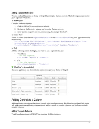
This code changes the background color of the third row to red.
You can change the color of the font used in a specific cell by specifying the text in the cell and the desired
color.
For example, add the following code to the RowDataBound event:
Visual Basic
Protected Sub C1GridView1_RowDataBound(ByVal sender As Object, ByVal e
As C1.Web.UI.Controls.C1GridView.C1GridViewRowEventArgs) Handles
C1GridView1.RowDataBound
If (e.Row.Cells(0).Text = "Chang") Then
e.Row.Cells(0).ForeColor = System.Drawing.Color.Green
End If
End Sub
C#
private void C1GridView1_RowDataBound(object sender,
C1.Web.UI.Controls.C1GridView.C1GridViewRowEventArgs e)
{
if ((e.Row.Cells[0].Text == "Chang")) {
e.Row.Cells[0].ForeColor = System.Drawing.Color.Green;
}
}
Note that you may need to change the column index in the above code. This code changes the font color
of the cell consisting of the text "Chang" to green.
82](https://image.slidesharecdn.com/aspnet-gridview-100916072955-phpapp01/85/Aspnet-grid-view-88-320.jpg)

![Use the RowMerge property of the C1GridView class to determine if and how rows are merged:
Visual Basic
CType(C1GridView1.Columns(1),
C1.Web.UI.Controls.C1GridView.C1Field).RowMerge =
C1.Web.UI.Controls.C1GridView.RowMerge.Free
C#
((C1.Web.UI.Controls.C1GridView.C1Field)C1GridView1.Columns[0]).RowMerge =
C1.Web.UI.Controls.C1GridView.RowMerge.Free;
The RowMerge property can also be accessed in the Property Builder. Simply select a column from the list of
Selected columns, click the drop-down arrow next to the RowMerge property and choose Free or Restricted. The
default is None.
Sample Project Available
For the complete sample, see the Merging sample located on the ComponentOne HelpCentral Sample page.
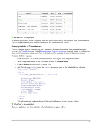
Grouping Properties
The example below shows a typical grid and how you would set the GroupInfo and Aggregate properties for the
columns.
Note: This example uses the Grouping sample and an Access database, WebGridDemo.MDB, provided with
C1GridView.
To group orders by year and show the sales totals, set the following properties:
1. The DataSource should be sorted by OrderYear (for example, 'SELECT OrderDate, YEAR(OrderDate)
AS OrderYear, Country, Salesperson, OrderID, ExtendedPrice FROM Invoices ORDER BY
YEAR(OrderDate) DESC, Country, Salesperson, OrderID, ExtendedPrice DESC').
2. The GroupInfo property of the OrderYear column should be set as follows (these properties can be set at
design time by choosing Grouping from the Property builder):
Set the Position property to Header (group rows will appear before the data).
Set the HeaderText property to "Orders in <i>{0}</i>". (This is the text on group header rows; {0} is
replaced with the value being grouped on).
Expand the HeaderStyle property and set it. (This is the style for the group header rows; you will
usually set at least the HeaderStyle.BackColor).
3. The Aggregate property of the ExtendedPrice column should be set to Sum. This will cause the grid to add
the sales for each group and display the aggregate value in the group header (and footer) rows. To set this
property:
Select Columns from the Property builder.
Choose ExtendedPrice from the list of Selected columns.
Set the Aggregate property to Sum.
4. To make the grid appear neatly and organized, you can use the GroupIndent property to indent each
group a specific number of points or pixels. To set this property:
Click the C1GridView control once to select it.
85](https://image.slidesharecdn.com/aspnet-gridview-100916072955-phpapp01/85/Aspnet-grid-view-91-320.jpg)


![ C#
C1GridView1.Columns[0].Fixed = true;
What You've Accomplished
Run your application and scroll the grid. Note that the column does not scroll to the right with the other columns.
Sample Project Available
For the complete sample, see the Scrollable sample located on the ComponentOne HelpCentral Sample page.
Creating a Non-Scrollable Row
To fix a row in the grid so that it will not scroll, complete the following steps:
1. Add the following code to the Page_Load event to allow scrolling and fixed rows:
Visual Basic
' Set the grid's height and width.
C1GridView1.Height = 250
C1GridView1.Width = 450
' Turn scrolling on.
C1GridView1.ScrollSettings.ScrollMode =
C1.Web.UI.DOMScrollMode.ScrollBar
' Set both horizontal and vertical scrolling.
C1GridView1.ScrollSettings.ScrollOrientation =
C1.Web.UI.DOMScrollOrientation.Both
C#
// Set the grid's height and width.
C1GridView1.Height = 250;
C1GridView1.Width = 450;
// Turn scrolling on.
C1GridView1.ScrollSettings.ScrollMode =
C1.Web.UI.DOMScrollMode.ScrollBar;
// Set both horizontal and vertical scrolling.
C1GridView1.ScrollSettings.ScrollOrientation =
C1.Web.UI.DOMScrollOrientation.Both;
2. Add the following code to the C1GridView's RowDataBound event which contains the information for
the rows to be fixed:
Visual Basic
Protected Sub C1GridView1_RowDataBound(ByVal sender As Object, ByVal e
As C1.Web.UI.Controls.C1GridView.C1GridViewRowEventArgs) Handles
C1GridView1.RowDataBound
' Fix the top three rows of the grid when scrolling horizontally.
If e.Item.ItemIndex <= 2 Then
e.Item.Fixed = True
End If
End Sub
C#
private void C1GridView1_RowDataBound(object sender,
C1.Web.UI.Controls.C1GridView.C1GridViewRowEventArgs e)
{
// Fix the top three rows of the grid when scrolling
horizontally.
91](https://image.slidesharecdn.com/aspnet-gridview-100916072955-phpapp01/85/Aspnet-grid-view-97-320.jpg)


![Wp br v7_a_vmware_architects_favorite_features[1]](https://cdn.slidesharecdn.com/ss_thumbnails/wpbrv7avmwarearchitectsfavoritefeatures1-131003071359-phpapp01-thumbnail.jpg?width=640&height=640&fit=bounds)


![Erpi admin 11123510[1] by иссам неязын issam hejazin](https://cdn.slidesharecdn.com/ss_thumbnails/erpiadmin111235101-140814022227-phpapp01-thumbnail.jpg?width=640&height=640&fit=bounds)