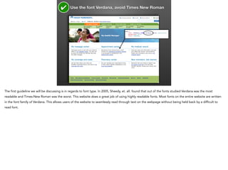
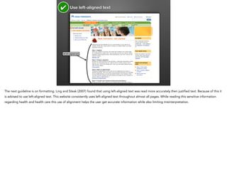
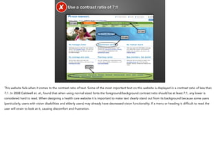
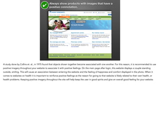
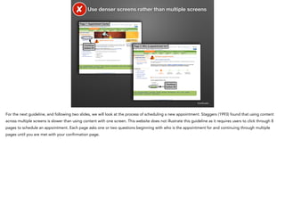
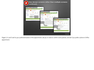
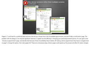
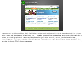
The document evaluates kp.org based on research guidelines for website design. It finds that kp.org follows many guidelines such as using the readable font Verdana, left-aligned text, consistent menu locations, and positive imagery. However, it also finds some areas for improvement. Specifically, it notes that the contrast ratio of some text is below recommended levels, the scheduling process takes users through too many screens, and the main navigation has too few items. Overall, the evaluation finds kp.org meets many standards but could improve in areas of text readability, efficient workflows, and navigation.