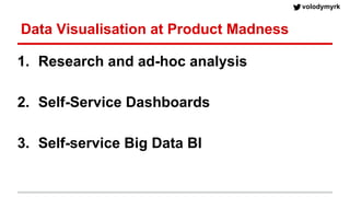
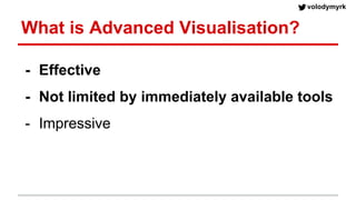
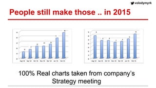
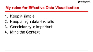
Agile Data Visualisation
Volodymyr (Vlad) Kazantsev
Head of Data Science at Product Madness
volodymyrk
About myself
MS Math,
Probability Theory
Kiev, 1999-2004
Graphics
Programming,
Video Games
Kiev, 2002-2005
Visual Effect
Programming
Berlin, Sydney, London
2005-2010
MBA
London Business
School
2010-2012
Product Manager
(King, Splash Damage)
2012-2013
Head of Data Science
2013-present
volodymyrk
Product Madness
● Social Casino Games - not gambling
● 60 people in London, 30 in San Fran, 25 in Minsk
volodymyrk
Product Madness in Rankings
iPad rankings, US iPad rankings, Australia
volodymyrk
Data Science at Product Madness
● Team of 6
● Analyse product releases, A/B tests, etc.
● Audit Marketing activities
● Dev/support of DWH (AWS Redshift)
● analysis: ipynb, pandas, matplotlib, scipy..
● products: Flask, AWS, D3.js
● .. and SQL
volodymyrk
Data Visualisation at Product Madness
1. Research and ad-hoc analysis
2. Self-Service Dashboards
3. Self-service Big Data BI
volodymyrk
What is Advanced Visualisation?
- Effective
- Not limited by immediately available tools
- Impressive
volodymyrk
People still make those .. in 2015
100% Real charts taken from company’s
Strategy meeting
volodymyrk
My rules for Effective Data Visualisation
1. Keep it simple
2. Keep a high data-ink ratio
3. Consistency is important
4. Mind the Context
Effective Data
Visualisation in
IPython
This does not look great
by default.
(but defaults are much
improved, especially
with seaborn)
publish()
1. formats the chart
2. create chart label (large font)
3. saves “Random Data.png”
into “Images” folder with high
DPI
volodymyrk
Python Visualisations for reports
compared to Matplotlib:
1. no borders
2. double width lines
3. markers
4. Cynthia Brewer colors
5. borderless legend
6. light-grey grid lines
7. slightly darker grey on
x-axis
8. ticks outside, x-axis
only
volodymyrk
Python Visualisations for reports
● White background for presentations
● Avoid vector formats (.svg, .swf). Use high DPI .png
● Consistent style, colors and fonts make reports look professional
Web-based
Dashboards
volodymyrk
Dashboards, V1
volodymyrk
Dashboards, V2 - Tableau
volodymyrk
Dashboards, V2 - The Style Guide
❑ Charts should be 800px wide, the dashboard no wider than 1000px. Charts height: 200-300px
❑ Charts BG RGB: 238 243 250
❑ Dates should be formatted “d mmm” e.g. “7 Jan”. Only include the year if absolutely necessary
❑ Don’t show unnecessary precision: 0.50% is the same as 0.5%
❑ Bar charts always start their axis at 0
❑ A line graphs’ axis should start wherever makes the average slope 45º
❑ Add titles for Chart (centered, bold), axis too (if not obvious)
❑ Add “Updated at … UTC” in the bottom of the first chart in Dashboard
❑ Still looking for a perfect Date selector.. Use Default Tableau one, not minimalistic one.
❑ Filters should apply to all charts in a dashboard
❑ No scrolling anywhere on the dashboard. Browser has a scrolling bar already. Huge legends/filters are useless.
volodymyrk
❑ Charts should be 800px wide, the dashboard no wider than 1000px. Charts height: 200-300px
❑ Charts BG RGB: 238 243 250
❑ Dates should be formatted “d mmm” e.g. “7 Jan”. Only include the year if absolutely necessary
❑ Don’t show unnecessary precision: 0.50% is the same as 0.5%
❑ Bar charts always start their axis at 0
❑ A line graphs’ axis should start wherever makes the average slope 45º
❑ Add titles for Chart (centered, bold), axis too (if not obvious)
❑ Add “Updated at … UTC” in the bottom of the first chart in Dashboard
❑ Still looking for a perfect Date selector.. Use Default Tableau one, not minimalistic one.
❑ Filters should apply to all charts in a dashboard
❑ No scrolling anywhere on the dashboard. Browser has a scrolling bar already. Huge legends/filters are useless.
Dashboards, V2 - The Style Guide
No Version Control
Maintenance takes time
..and still no good Date Selector
Self-service
Big Data BI
volodymyrk
BI Tools Triangle
Easy to setup
for IT & Data teams
Easy to use
for end users
Powerful
for end users
volodymyrk
Scale
● Code naturally promote
reuse-ability
● Code have version-control
● You never really “develop
from scratch”
volodymyrk
Dashboards, V3 - Flask+JS
Front End:
- dc.js
- bootstrap.js
- colorbrewer.js
Back End:
- Flask
- pandas
- Redshift (data cubes)
- S3: csv cache
volodymyrk
Tech Stack
● Redshift Back-End (ELT+Cubes)
● Python, Flask, Pandas
● DC.js, scrossfilter.js, D3.js
volodymyrk
Self-Serve Big Data BI
● Tableau client
● Looker
● ElasticSearch + Kibana
● Bokeh
volodymyrk
Summary
● Good looking visualisation is better than an ugly one
● Interactivity leads to more insights
● Consistency matters; Code allows to style once
● You never really “develop from scratch”, or “just use
off-the-shelf” tool
● Mind your team capabilities and aspirations
● Don’t be limited by your existing tool(s)
volodymyrk
Questions?
W
e are hiring

Agile data visualisation

  • 1.
    Agile Data Visualisation Volodymyr(Vlad) Kazantsev Head of Data Science at Product Madness
  • 2.
    volodymyrk About myself MS Math, ProbabilityTheory Kiev, 1999-2004 Graphics Programming, Video Games Kiev, 2002-2005 Visual Effect Programming Berlin, Sydney, London 2005-2010 MBA London Business School 2010-2012 Product Manager (King, Splash Damage) 2012-2013 Head of Data Science 2013-present
  • 3.
    volodymyrk Product Madness ● SocialCasino Games - not gambling ● 60 people in London, 30 in San Fran, 25 in Minsk
  • 4.
    volodymyrk Product Madness inRankings iPad rankings, US iPad rankings, Australia
  • 5.
    volodymyrk Data Science atProduct Madness ● Team of 6 ● Analyse product releases, A/B tests, etc. ● Audit Marketing activities ● Dev/support of DWH (AWS Redshift) ● analysis: ipynb, pandas, matplotlib, scipy.. ● products: Flask, AWS, D3.js ● .. and SQL
  • 6.
    volodymyrk Data Visualisation atProduct Madness 1. Research and ad-hoc analysis 2. Self-Service Dashboards 3. Self-service Big Data BI
  • 7.
    volodymyrk What is AdvancedVisualisation? - Effective - Not limited by immediately available tools - Impressive
  • 8.
    volodymyrk People still makethose .. in 2015 100% Real charts taken from company’s Strategy meeting
  • 9.
    volodymyrk My rules forEffective Data Visualisation 1. Keep it simple 2. Keep a high data-ink ratio 3. Consistency is important 4. Mind the Context
  • 10.
  • 11.
    This does notlook great by default. (but defaults are much improved, especially with seaborn)
  • 12.
    publish() 1. formats thechart 2. create chart label (large font) 3. saves “Random Data.png” into “Images” folder with high DPI
  • 13.
    volodymyrk Python Visualisations forreports compared to Matplotlib: 1. no borders 2. double width lines 3. markers 4. Cynthia Brewer colors 5. borderless legend 6. light-grey grid lines 7. slightly darker grey on x-axis 8. ticks outside, x-axis only
  • 14.
    volodymyrk Python Visualisations forreports ● White background for presentations ● Avoid vector formats (.svg, .swf). Use high DPI .png ● Consistent style, colors and fonts make reports look professional
  • 15.
  • 16.
  • 17.
  • 18.
    volodymyrk Dashboards, V2 -The Style Guide ❑ Charts should be 800px wide, the dashboard no wider than 1000px. Charts height: 200-300px ❑ Charts BG RGB: 238 243 250 ❑ Dates should be formatted “d mmm” e.g. “7 Jan”. Only include the year if absolutely necessary ❑ Don’t show unnecessary precision: 0.50% is the same as 0.5% ❑ Bar charts always start their axis at 0 ❑ A line graphs’ axis should start wherever makes the average slope 45º ❑ Add titles for Chart (centered, bold), axis too (if not obvious) ❑ Add “Updated at … UTC” in the bottom of the first chart in Dashboard ❑ Still looking for a perfect Date selector.. Use Default Tableau one, not minimalistic one. ❑ Filters should apply to all charts in a dashboard ❑ No scrolling anywhere on the dashboard. Browser has a scrolling bar already. Huge legends/filters are useless.
  • 19.
    volodymyrk ❑ Charts shouldbe 800px wide, the dashboard no wider than 1000px. Charts height: 200-300px ❑ Charts BG RGB: 238 243 250 ❑ Dates should be formatted “d mmm” e.g. “7 Jan”. Only include the year if absolutely necessary ❑ Don’t show unnecessary precision: 0.50% is the same as 0.5% ❑ Bar charts always start their axis at 0 ❑ A line graphs’ axis should start wherever makes the average slope 45º ❑ Add titles for Chart (centered, bold), axis too (if not obvious) ❑ Add “Updated at … UTC” in the bottom of the first chart in Dashboard ❑ Still looking for a perfect Date selector.. Use Default Tableau one, not minimalistic one. ❑ Filters should apply to all charts in a dashboard ❑ No scrolling anywhere on the dashboard. Browser has a scrolling bar already. Huge legends/filters are useless. Dashboards, V2 - The Style Guide No Version Control Maintenance takes time ..and still no good Date Selector
  • 20.
  • 21.
    volodymyrk BI Tools Triangle Easyto setup for IT & Data teams Easy to use for end users Powerful for end users
  • 22.
    volodymyrk Scale ● Code naturallypromote reuse-ability ● Code have version-control ● You never really “develop from scratch”
  • 23.
    volodymyrk Dashboards, V3 -Flask+JS Front End: - dc.js - bootstrap.js - colorbrewer.js Back End: - Flask - pandas - Redshift (data cubes) - S3: csv cache
  • 24.
    volodymyrk Tech Stack ● RedshiftBack-End (ELT+Cubes) ● Python, Flask, Pandas ● DC.js, scrossfilter.js, D3.js
  • 25.
    volodymyrk Self-Serve Big DataBI ● Tableau client ● Looker ● ElasticSearch + Kibana ● Bokeh
  • 26.
    volodymyrk Summary ● Good lookingvisualisation is better than an ugly one ● Interactivity leads to more insights ● Consistency matters; Code allows to style once ● You never really “develop from scratch”, or “just use off-the-shelf” tool ● Mind your team capabilities and aspirations ● Don’t be limited by your existing tool(s)
  • 27.