Dreamweaver CS5.5 includes new tools to help web designers build sites that adapt to different screen sizes and devices using HTML5, CSS3, and mobile development techniques. The book guides readers through the tools with case studies that redesign a site for multiple screens using responsive design, build a dedicated mobile site with jQuery Mobile, and create a native mobile app with PhoneGap. As mobile usage grows, these skills are important for web designers to serve users on all devices.


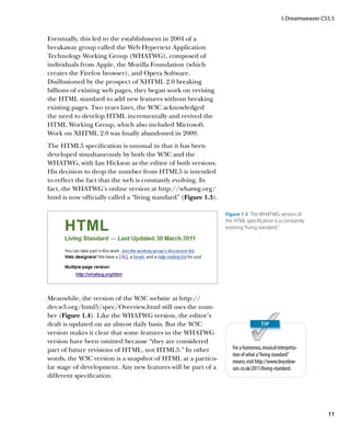
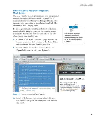
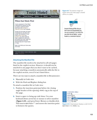
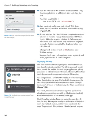
![I: Dreamweaver CS5.5
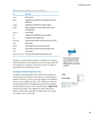
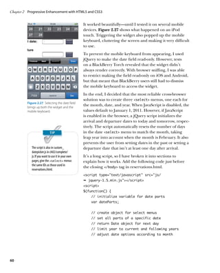
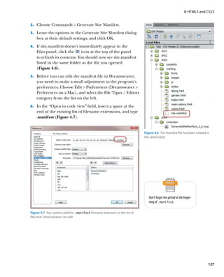
Unfortunately, IE 8 and earlier require an extra jolt of
encouragement to recognize the new HTML5 tags. You
need to use JavaScript to create a dummy element for each
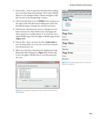
type of semantic tag you want to use. For example, if you
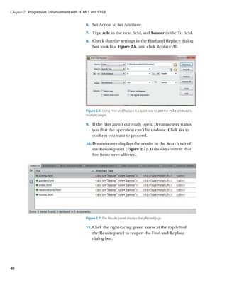
want to use the header, footer, and nav tags, you In HTML5, you no longer need to add
need to add the following in the head of each page: type=”text/javascript”
in the opening script tag.
script JavaScript is the default.
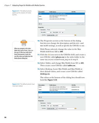
document.createElement(‘header’);
document.createElement(‘footer’);
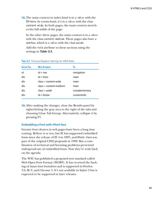
document.createElement(‘nav’);
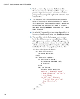
/script
Alternatively, you can load a tiny script from the Google
content distribution network (CDN) by adding the follow-
ing just before the closing /head tag:
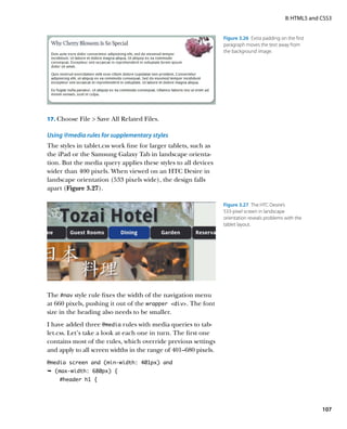
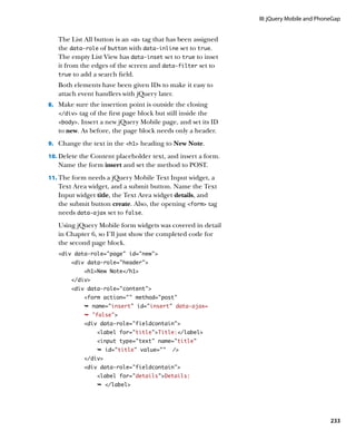
!--[if lt IE 9]
script src=”http://html5shiv.googlecode.com/svn/
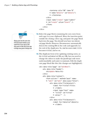
Ê trunk/html5.js/script
![endif]--
This is a 2 KB file that contains a little bit of JavaScript
wizardry devised by Remy Sharp that forces earlier versions
of IE to recognize the new HTML5 tags and apply CSS to
them. It creates dummy elements for all semantic tags,
saving you the bother of using createElement() for each
one. Although the file is small enough to host on your own Remy Sharp and Bruce Lawson are
authors of Introducing HTML5 (New
site, the advantage of using Google’s CDN is that the file Riders, 2010), a practical guide to
might already be in the user’s browser cache after visiting using HTML5 in websites today.
other sites, so it doesn’t need to be downloaded again.
The predefined HTML5 CSS layouts in Dreamweaver
CS5.5 (File New Blank Document) use Remy Sharp’s
script in combination with a style rule to display the seman-
tic tags as block-level elements, ensuring almost universal
support for them.
Therein lies the problem: It’s not 100 percent foolproof.
If JavaScript is disabled in the browser, IE leaves the
HTML5 tags completely unstyled. This wouldn’t be such
a problem if the whole page was unstyled, but you end up
with a horrendous mix of styled and unstyled elements.
9](https://image.slidesharecdn.com/adobedreamweavercs55studiotechniquespdf2108-121120034104-phpapp02/85/Adobe_Dreamweaver_CS5-5_Studio_Techniques-pdf-18-320.jpg)

![I: Dreamweaver CS5.5
Using embedded fonts
For years, web designers have been frustrated by the nar-
row range of “web safe” fonts at their disposal, because
Live view currently supports the
browsers use the fonts installed on the visitor’s computer. W3C border-radius and
CSS2 sought to solve this problem through @font-face, but text-shadow properties, but
browser support was lacking, so it was dropped. However, not box-shadow. To apply a drop
@font-face now has widespread browser support and is shadow on an element, you must
choose -webkit-box-shadow
part of CSS3. from the Categories view of the
Unfortunately, the situation is complicated by licensing Properties pane.
issues and the font formats supported by different browsers.
Chapter 2 discusses these problems and potential solutions.
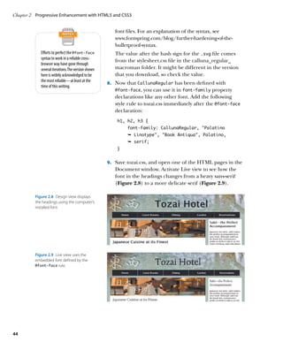
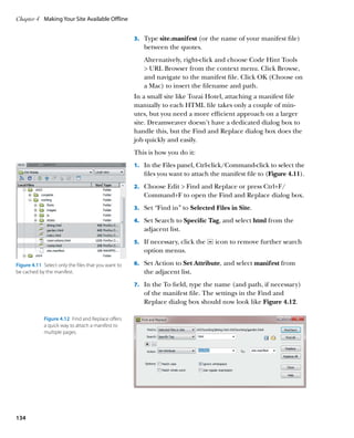
The good news is that Dreamweaver CS5.5 supports
@font-face in Live view (Figure 1.8), making it easier to
visualize how your page will look in a browser.
Figure 1.8 Live view displays embedded fonts as they will appear in a browser.
Expanded support for CSS3 selectors
Previous versions of Dreamweaver had support for only
a limited range of CSS selectors. A notable omission was
support for attribute selectors, such as input[type=submit]
(to select submit buttons). These have been part of CSS
ever since 1998, but have been of limited use because of
IE 6’s lack of support. However, IE 7 caught up with all
other browsers by adding support not only for CSS2.1
attribute selectors, but also three new ones from CSS3.
Dreamweaver CS5.5 now supports all attribute selectors,
which are listed in Table 1.1.
17](https://image.slidesharecdn.com/adobedreamweavercs55studiotechniquespdf2108-121120034104-phpapp02/85/Adobe_Dreamweaver_CS5-5_Studio_Techniques-pdf-26-320.jpg)
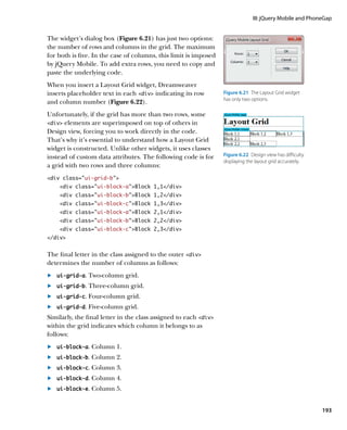
![Chapter 1 Dreamweaver Goes Mobile
Table 1.1 CSS Attribute Selectors
Selector Description Example
e[attr] Matches an e element with the attr attribute regardless img[title]
of the attribute’s value.
e[attr=val] Matches an e element with the attr attribute whose input[type=submit]
value is exactly equal to val.
e[attr~=val] Matches an e element with the attr attribute whose p[class~=aside]
value is a space-separated list of words; one of
which is exactly val.
e[attr|=val] Matches an e element with the attr attribute whose span[lang|=fr]
value is exactly val or val followed by a hyphen.
Used mainly to match language codes and subcodes.
e[attr^=val] Matches an e element with the attr attribute whose a[href^=http]
value begins with val.
e[attr$=val] Matches an e element with the attr attribute whose a[href$=.pdf]
value ends with val.
e[attr*=val] Matches an e element with the attr attribute whose div[class*=wide]
value contains the substring val.
CSS3 gives designers a much finer degree of control over the
selection of elements. With the exception of IE, browsers
have been quick to adopt the new selectors, many of which
will be familiar to you if you use jQuery. IE 9 has done a lot
Peter-Paul Koch has published a use- of catching up, so Dreamweaver CS5.5 now supports all the
ful set of CSS compatibility charts at
www.quirksmode.org/css/contents. structural pseudo-classes listed in Table 1.2.
html. According to his tests, all selec-
The :nth-child() and related pseudo-classes all take an
tors in Table 1.2 are supported by IE
9, Firefox 3.5, Safari 4, Chrome 4, argument that indicates the position of the element you
and later versions. Opera 10 also want to select. The possible values are the following:
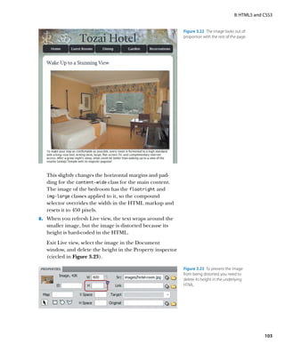
supports them but has bugs with
:nth-child() and :nth-of- The keywords odd or even. To select every even-numbered
.
type(). According to my own tests, matching element, use :nth-child(even).
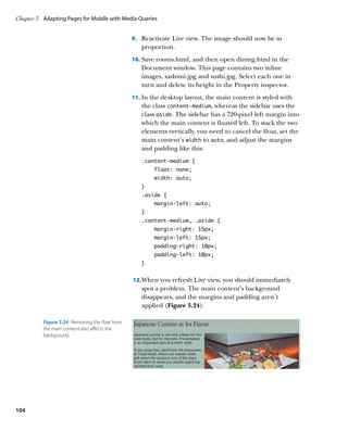
these bugs were fixed in Opera 11.
A single number counting from 1. Using :nth-child(5)
.
picks the fifth matching element.
The formula an+b or an-b. The letters a and b represent
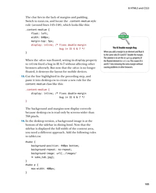
.
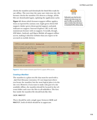
numbers, and n is the literal character. This divides the
child elements into groups, each composed of the
number specified by a; and within that group, it selects
the element specified by b. For example, tr:nth-child
(5n+2) selects the second, seventh, twelfth, and so on
18](https://image.slidesharecdn.com/adobedreamweavercs55studiotechniquespdf2108-121120034104-phpapp02/85/Adobe_Dreamweaver_CS5-5_Studio_Techniques-pdf-27-320.jpg)


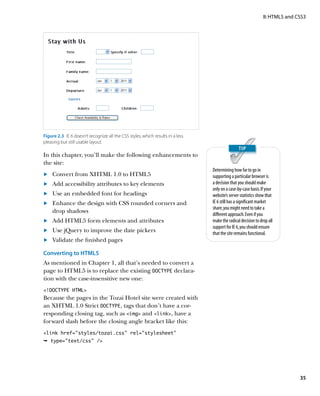
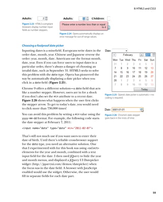
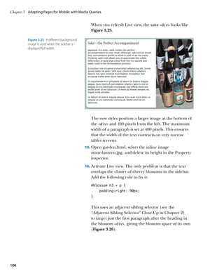
![Chapter 2 Progressive Enhancement with HTML5 and CSS3
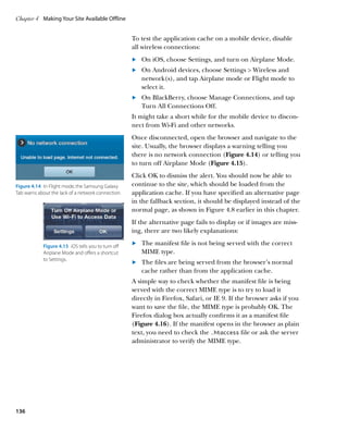
There’s just one minor exception. The styles for the inquiry
form in reservations.html include the following rules:
select + label, input + label {
padding-left: 10px;
}
input[type=submit] {
margin-left: 135px;
}
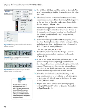
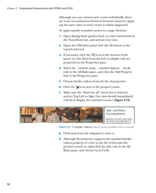
The first rule uses the adjacent sibling selector to add 10 pixels
of padding to the left of label tags that immediately fol-
low a select or input element. The second rule uses
an attribute selector (see Table 1.1) to add a 135-pixel mar-
gin to the left of the submit button. The result is a neatly
aligned form in all modern browsers (Figure 2.2).
Adjacent Sibling Selector
Sometimes it’s convenient to apply a style rule to
an element only if it immediately follows another
element at the same level of the document
hierarchy (a sibling). For example, you might want
to apply a different style to each first paragraph
that follows a heading. The adjacent sibling selector,
which consists of two selectors separated by a plus
sign (+), is designed precisely for this purpose.
The selector on the left of the plus sign identifies
the element that must precede the element that
matches the selector on the right. In other words,
h1 + p tells the browser to apply the rule only to
p elements that immediately follow an h1
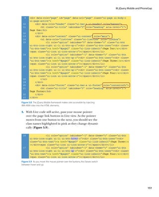
heading. If any other element comes between them,
the rule doesn’t apply.
Figure 2.2 In modern browsers, the form elements are neatly aligned.
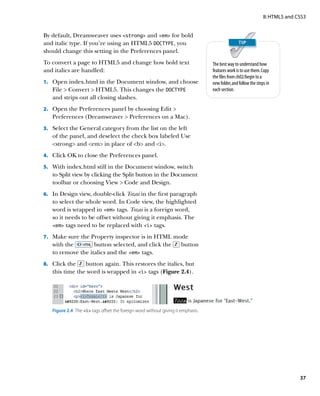
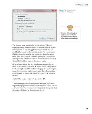
Using selectors to target elements based on their
relationship to their immediate siblings avoids IE didn’t support adjacent sibling or attribute selectors
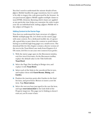
the need to pepper your code with classes. The
until IE 7. As a result, the form is not so neatly aligned in
downside is that changes to the page structure
might destroy the relationship, resulting in the style IE 6 (Figure 2.3). Also, the word Guests appears in a differ-
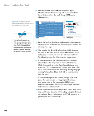
rule no longer being applied. The CSS3 Selectors ent color, because it’s the legend element of a fieldset
module refers to the adjacent sibling selector as the surrounding the input fields for adults and children. These
adjacent sibling combinator, but it’s simply a change
minor differences don’t affect the usability of the form and
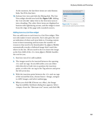
of name. The syntax and functionality remain
unchanged. can be ignored for a browser with a small and declining
market share.
34](https://image.slidesharecdn.com/adobedreamweavercs55studiotechniquespdf2108-121120034104-phpapp02/85/Adobe_Dreamweaver_CS5-5_Studio_Techniques-pdf-43-320.jpg)

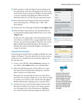
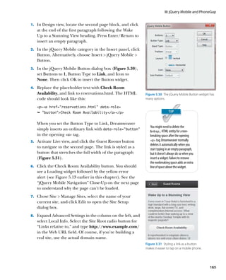
![Chapter 2 Progressive Enhancement with HTML5 and CSS3
The next part of the script is a function that sets all parts of
a specific date. It looks like this:
// set all parts of a specific date
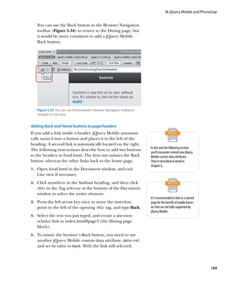
function setValues(dateParts, menu, theDate) {
// advance date by one day for departure menu
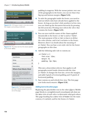
if (menu == ‘dep’) {
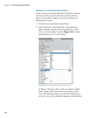
theDate = getNextDay(theDate);
}
// get the individual date parts
var m = theDate.getMonth() + 1,
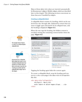
d = theDate.getDate(),
y = theDate.getFullYear(),
today = new Date();
JavaScript Dates // adjust options for date and year menus
JavaScript stores dates and times as the number populateDate(dateParts, menu, m, y);
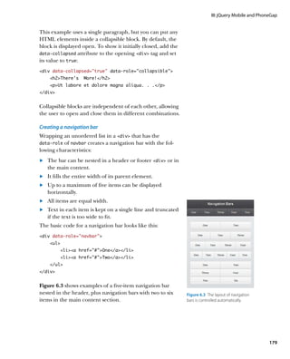
of milliseconds before or after midnight UTC populateYear(dateParts, menu,
(Coordinated Universal Time) on January 1, 1970. Ê today.getFullYear());
The valid range is plus or minus 100 million days
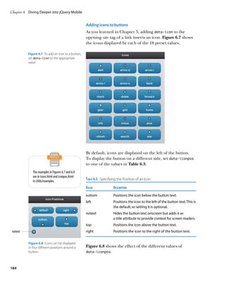
// set the values for each select menu
(273,785 years) from this date.
dateParts[menu + '_month'].val(m);
If no arguments are passed to the Date constructor,
an object representing the current date and time dateParts[menu + '_date'].val(d);
(to the nearest millisecond) is created. Alternatively, dateParts[menu + '_year'].val(y);
you can create a Date object for a specific date and }
time using any of the following:
. An integer representing the number of mil- The setValues() function takes three arguments:
liseconds since January 1, 1970
. A date string, such as ‘05 May 2011’ . The dateParts object containing references to the
. A comma-separated list of integers, represent- select menus
ing date parts in the order year, month, date,
hour, minutes, seconds, milliseconds
. A string (‘arr’ or ‘dep’) identifying whether to set the
arrival or departure date
Care needs to be taken when using a date string,
because the syntax can be difficult to get right. . A JavaScript Date object representing the date to be set
When using a comma-separated list of date parts,
the last four values are optional. JavaScript counts
When the page first loads, the arrival date is set to the cur-
months from zero, so 4 represents May, not April. rent date, and the departure is set to the following day. So,
See https://developer.mozilla.org/en/JavaScript/ if the value of menu is ‘dep’, the Date object in theDate
Reference/Global_Objects/Date. is advanced by one day by a function called getNextDay(),
which is defined shortly.
62](https://image.slidesharecdn.com/adobedreamweavercs55studiotechniquespdf2108-121120034104-phpapp02/85/Adobe_Dreamweaver_CS5-5_Studio_Techniques-pdf-71-320.jpg)
![II: HTML5 and CSS3
The function then uses standard JavaScript Date methods
to assign the date part values to local variables. JavaScript
counts months from zero, so 1 is added to the value
assigned to m.
To prevent incorrect dates from being selected, the
function calls two other functions, populateDate() and
populateYear(), to adjust the values displayed by the
date and year select menus. These functions are
described later.
Finally, setValues() uses the jQuery val() method to set
the values of the select menus, using square bracket
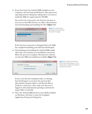
notation to access the appropriate properties of the date-
Parts object. For example, if ‘arr’ is passed as the second
argument to setValues(), the last three lines of the func-
tion equate to this:
dateParts[‘arr_month’].val(m);
dateParts[‘arr_date’].val(d);
dateParts[‘arr_year’].val(y); Using square bracket notation to
access object properties makes it
possible to build the property name
This is the equivalent of using the following dot notation from a combination of a variable
to access the object’s properties: and a string literal. You can’t build
property names dynamically with
dateParts.arr_month.val(m); dot notation.
dateParts.arr_date.val(d);
dateParts.arr_year.val(y);
The getNextDay() function is defined next. It takes a Date
object as its sole argument, and returns a new Date object
for the following day by adding the number of milliseconds
in 24 hours to the current value. The code looks like this:
// return Date object for next day
function getNextDay(date) {
return new Date(date.getTime() +
Ê (1000*60*60*24));
}
63](https://image.slidesharecdn.com/adobedreamweavercs55studiotechniquespdf2108-121120034104-phpapp02/85/Adobe_Dreamweaver_CS5-5_Studio_Techniques-pdf-72-320.jpg)
![Chapter 2 Progressive Enhancement with HTML5 and CSS3
The next two functions adjust the values in the year and
date select menus, taking into account the number of
days in a month and whether it’s a leap year. The code
looks like this:
// limit year to current and following years
function populateYear(dateParts, menu, yr) {
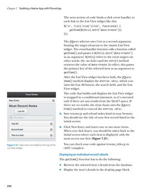
dateParts[menu + ‘_year’].html(‘option’ + yr
Ê + '/option' +
'option' + (yr + 1) + '/option');
}
// adjust date options according to month
function populateDate(dateParts, menu, mon, yr) {
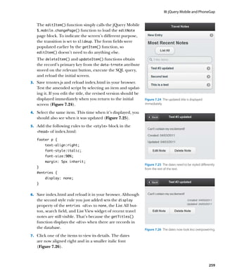
var len = getNumDays(mon, yr);
var html = ‘’;
for (var i = 1; i = len; i+=1) {
html += ‘option’ + i + ‘/option’;
}
dateParts[menu + ‘_date’].html(html);
}
Both functions use the jQuery html() method to generate
a new set of option elements to replace the existing ones.
The populateYear() function limits the years displayed to
the current and following years. The populateDate() func-
tion takes both the year and month among its arguments,
because February has 28 or 29 days depending on whether
it’s a leap year. The calculation regarding the number of
days to display is carried out by getNumDays(), which is
defined next.
// return number of days in selected month
function getNumDays(mon, yr) {
var num_days = 31;
if (mon == 4 || mon == 6 || mon == 9 ||
Ê mon == 11) {
num_days = 30;
} else if (mon == 2) {
// if leap year, Feb has 29 days
64](https://image.slidesharecdn.com/adobedreamweavercs55studiotechniquespdf2108-121120034104-phpapp02/85/Adobe_Dreamweaver_CS5-5_Studio_Techniques-pdf-73-320.jpg)
![II: HTML5 and CSS3
if (yr % 400 == 0 ||
Ê(yr % 4 == 0 yr % 100 != 0)) {
num_days = 29;
} else {
num_days = 28;
}
}
return num_days;
}
The getNumDays() function takes two arguments: a month
and a year. Most months have 31 days, so that’s set as the
default value of the local variable num_days. If the month is
Although JavaScript counts months
April, June, September, or November, the value of num_days from zero, this script adds 1 to the
is changed to 30. The else if clause checks if the month is month values to bring them in line
February and calculates the correct number of days. with normal dates.
The nested conditional statement uses modulo division to
calculate whether it’s a leap year. Leap years occur every
four years on years wholly divisible by 4. The exception is
that years divisible by 100 are not leap years unless they are
also divisible by 400.
The main part of this script is the change handler function Modulo Division
bound to all six select menus. It looks like this: Modulo division uses the percentage sign (%) as
its operator and produces the remainder left over
// change handler for select menus after a division. If a number is wholly divisible by
function resetDates(e) { another, the remainder is zero. For example, 2000 is
// find out whether arrival or departure
wholly divisible by 400, so 2000 % 400 produces 0
as its result.
// was changed, and get its value
Modulo division by 2 is frequently used to find
var dateParts = e.data.dateParts,
whether a number is odd or even. If the result is 0,
menu = e.data.menu, the number is even.
m = dateParts[menu + ‘_month’].val(),
d = dateParts[menu + ‘_date’].val(),
y = dateParts[menu + ‘_year’].val(),
num_days = getNumDays(m, y),
today = new Date(),
selected, arrival, departure;
// make sure date menu displays
// correct number of days
populateDate(dateParts, menu, m, y);
// if the month contains fewer days than
65](https://image.slidesharecdn.com/adobedreamweavercs55studiotechniquespdf2108-121120034104-phpapp02/85/Adobe_Dreamweaver_CS5-5_Studio_Techniques-pdf-74-320.jpg)
![Chapter 2 Progressive Enhancement with HTML5 and CSS3
// currently selected value, reset date
// menu to last day of month
d = (d = num_days) ? d : num_days;
dateParts[menu + ‘_date’].val(d);
// create Date objects for selected dates
selected = new Date(y, m-1, d);
arrival = new Date(dateParts.arr_year.val(),
dateParts.arr_month.val()-1,
dateParts.arr_date.val());
departure = new Date(dateParts.dep_year.val(),
dateParts.dep_month.val()-1,
dateParts.dep_date.val());
// if changes were made to arrival date
if (menu == ‘arr’) {
// if the arrival earlier than today,
// reset to today’s date
if (selected today) {
setValues(dateParts, ‘arr’, today);
setValues(dateParts, ‘dep’, today);
}
if (departure = selected) {
// set departure date to following day
setValues(dateParts, ‘dep’, arrival);
}
} else {
// if selected departure is today or
// earlier, reset both dates to default
if (selected = today) {
setValues(dateParts, ‘arr’, today);
setValues(dateParts, ‘dep’, today);
} else if (selected = arrival) {
// if selected departure date is same
// as arrival date or earlier, reset
// departure to one day after arrival
setValues(dateParts, ‘dep’, arrival);
}
}
}
66](https://image.slidesharecdn.com/adobedreamweavercs55studiotechniquespdf2108-121120034104-phpapp02/85/Adobe_Dreamweaver_CS5-5_Studio_Techniques-pdf-75-320.jpg)

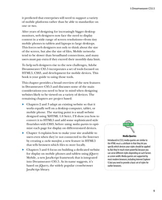
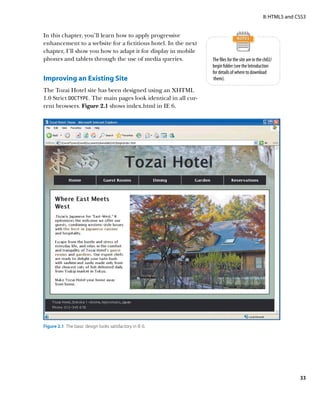
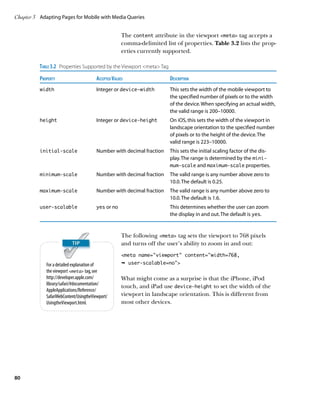
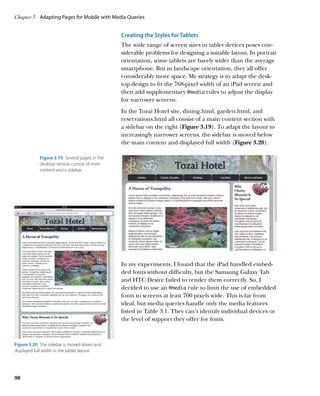
![Chapter 3 Adapting Pages for Mobile with Media Queries
The great source of pleasure is variety. Uniformity
must tire at last, though it be uniformity of excellence.
—Samuel Johnson
Adapting Pages for Mobile with
Media Queries
The need for dedicated style sheets for mobile devices was
recognized as far back as 1997, when the HTML and CSS
specifications included handheld among the permitted
values for the media attribute. However, the specifications
describe handheld devices as “small screen, monochrome,
[and] limited bandwidth.” Apart from screen size, modern
smartphones and tablets frequently have capabilities that
rival and even surpass desktops. Fortunately, the W3C had
the foresight to establish rules for the way browsers should
handle the media attribute, paving the way for future exten-
sions. The result is the CSS3 Media Queries module, which
allows you to specify rules for different devices through
simple queries about the device’s features, such as screen
width, device width, color depth, and orientation.
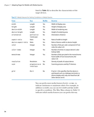
The W3C began work on media queries in 2001, and the
specification has reached a high level of maturity and stabil-
ity. According to http://caniuse.com, all modern browsers,
including Internet Explorer (IE) 9, support media queries
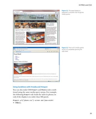
(Figure 3.1). Perhaps most important of all, media queries
are well supported by iOS and Android. As a result, they’re
ideal for delivering different styles to smartphones and
tablets. The problem, as usual, is lack of support by IE 6–8,
but you can overcome this with a little planning.
In this chapter, you’ll learn how to use media queries to adapt
the styles for the Tozai Hotel website from Chapter 2 for
display on smartphones and tablets. Although Dreamweaver
provides the tools that assist in the process of designing
for devices with different screen resolutions, the success
72](https://image.slidesharecdn.com/adobedreamweavercs55studiotechniquespdf2108-121120034104-phpapp02/85/Adobe_Dreamweaver_CS5-5_Studio_Techniques-pdf-81-320.jpg)
![Chapter 3 Adapting Pages for Mobile with Media Queries
There is no only media type, so the style rules are completely
ignored by earlier browsers.
IE Conditional Comments Unfortunately, IE 6–8 failed to implement the specification
IE conditional comments are extremely useful for correctly. If you have access to any of these versions of IE,
hiding from other browsers code that you want try the following experiment to see what happens when
to be seen only by IE. For example, you can wrap a they encounter a media query.
link to an external style sheet in an IE conditional
comment to serve a special set of styles to specific 1. Open dining.html from your work folder in the
versions of IE. Although IE conditional comments previous chapter (or use the file in the ch02/complete
use proprietary Microsoft code, they’re wrapped in
folder) and switch to Code view or Split view.
standard HTML comment tags, so your code remains
valid and other browsers ignore them. 2. In the link tag that attaches the style sheet, add a
The basic structure of an IE conditional comment media query like this (on line 6):
looks like this:
link href=”styles/tozai.css” rel=”stylesheet”
!--[if condition]
Content seen only by IE Ê type=text/css media=”screen and
![endif]-- Ê (min-width:768px)
The condition is built using an optional
comparison operator followed by IE and an 3. Save dining.html and view it in one of the browsers
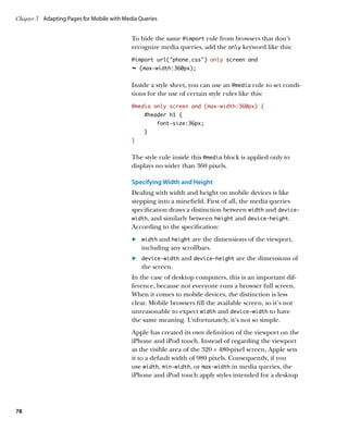
optional version number. The main comparison listed in Figure 3.1 as supporting media queries. As
operators are long as the viewport is at least 768 pixels wide, the page
. lt (less than) remains fully styled. Figure 3.2 shows what it looks like
. lte (less than or equal to) in Chrome.
. gt (greater than)
. gte (greater than or equal to) 4. Now view the same page in IE 6, IE 7, or IE 8. Although
For example, the following IE conditional comment browsers that don’t recognize media queries should
applies to IE 8 and earlier: truncate the media attribute to media=”screen” and
!--[if lte IE 8]
apply the styles, the page is completely unstyled. Figure
Content seen by IE 6–8 3.3 shows the page in IE 7.
![endif]--
To ensure that your pages are styled in IE 6–8, you need to
All other browsers—including IE 9—ignore the
content inside the conditional comment.
create a basic style sheet that is processed by all browsers
and use media queries to override the styles for tablets and
mobile phones. Alternatively, use an IE conditional comment
to add a special style sheet for IE 6–8. Sometimes, a combi-
nation of both approaches is needed, as you’ll see later in
this chapter.
76](https://image.slidesharecdn.com/adobedreamweavercs55studiotechniquespdf2108-121120034104-phpapp02/85/Adobe_Dreamweaver_CS5-5_Studio_Techniques-pdf-85-320.jpg)

![Chapter 3 Adapting Pages for Mobile with Media Queries
3. Select the Link radio button (it’s the default), and
click OK.
4. Open Split view. You should see the new link
immediately before the closing /head tag:
link href=”styles/tozai_mq.css”
Ê rel=stylesheet type=text/css
link href=”styles/desktop.css”
Ê rel=stylesheet type=text/css
/head
5. Open the Snippets panel by choosing Window
Snippets. On Windows, you can also press Shift+F9, but
there is no keyboard shortcut on a Mac.
6. Expand the Comments folder in the Snippets panel,
and select If Less Than IE 8 Conditional Comment
(Figure 3.17).
Figure 3.17 The Snippets panel contains
commonly used IE conditional comments. 7. Click the icon at the bottom right of the panel to
open the snippet for editing.
8. Amend the text in the Name field to Less Than or
Equal to IE 8 Conditional Comment.
9. (Optional) Update the Description field to indicate
that the browser version is less than or equal to Internet
Explorer 8.
10. Amend the code in the “Insert before” block like this:
!--[if lte IE 8]
The settings in the Snippet dialog box should look like
Even though you no longer have a
snippet for less than IE 8, the Less Figure 3.18.
Than or Equal to IE 7 Conditional 11. Click OK to save the changes.
Comment snippet serves exactly the
same purpose. 12. In Code view, select the link to desktop.css. Make
sure the entire tag is selected.
96](https://image.slidesharecdn.com/adobedreamweavercs55studiotechniquespdf2108-121120034104-phpapp02/85/Adobe_Dreamweaver_CS5-5_Studio_Techniques-pdf-105-320.jpg)
![II: HTML5 and CSS3
Figure 3.18 Editing the snippet.
13. The edited snippet should still be selected in the
Snippets panel. If not, select it before clicking the
Insert button at the bottom left of the panel.
The link should now be wrapped in an IE
conditional comment like this:
Because IE conditional comments
!--[if lte IE 8] are wrapped in standard HTML
link href=”styles/desktop.css” comment tags, they are grayed out
in Code view, and any content is
Ê rel=stylesheet type=text/css
ignored by Design view and Live view.
![endif]--
14. Copy and paste the IE conditional comment and link
into the other pages in the same location. Then save
all files.
It’s a nuisance having to attach desktop.css twice like this,
but it’s essential to prevent files from being downloaded
unnecessarily by mobile devices. Although desktop.css is
attached twice, browsers download it only once. Those
browsers that recognize media queries import desktop.css
through the site-wide media queries file. Only IE 6–8 use
the link you just wrapped in a conditional comment.
97](https://image.slidesharecdn.com/adobedreamweavercs55studiotechniquespdf2108-121120034104-phpapp02/85/Adobe_Dreamweaver_CS5-5_Studio_Techniques-pdf-106-320.jpg)
![Chapter 3 Adapting Pages for Mobile with Media Queries
The next @media rule fixes some problems with the align-
ment of form elements on screens narrower than 480
pixels.
:last-of-type @media screen and (max-width: 480px) {
The :last-of-type pseudo-class selects an select:last-of-type {
element that is the last of its type in the list of display:block;
children of its parent element. It’s fully supported by margin-left:135px;
iOS, Android, and BlackBerry. The three select
margin-top:5px;
menus used for each date picker are wrapped in a
paragraph. So, this rule selects the last select }
element within each paragraph. #adults {
margin-right:80px;
}
input + label {
padding-left:50px;
}
input[type=submit] {
margin-left:50px;
}
}
The first style rule uses the CSS3 :last-of-type pseudo-class
(see Table 1.2 in Chapter 1) to select the last select
menu in each of the date pickers. Without this rule, the
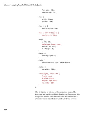
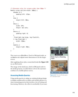
Figure 3.29 On a narrow screen the year menus are likely to drop to the next line and sit flush
year menus are sometimes pushed
onto the next line.
with the label on the left (Figure 3.29).
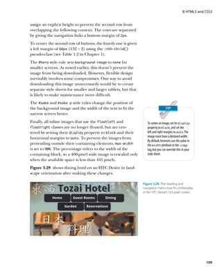
By setting the display property to block and setting margins,
you can align the year menus with the months (Figure 3.30).
The other rules align the Adults and Children text input
fields and the submit button.
The final @media rule simply assigns a bigger font size to
Figure 3.30 The date picker menus the main heading when the screen width is in the range of
are now neatly aligned. 500–680 pixels.
@media screen and (min-width: 500px) and
Ê (max-width: 680px) {
#header h1 {
font-size: 48px;
}
}
110](https://image.slidesharecdn.com/adobedreamweavercs55studiotechniquespdf2108-121120034104-phpapp02/85/Adobe_Dreamweaver_CS5-5_Studio_Techniques-pdf-119-320.jpg)
![Chapter 3 Adapting Pages for Mobile with Media Queries
/* Content containers on other pages */
.content-wide, .content-medium, .aside {
margin: 0 5px 5px 5px;
padding: 10px;
width: auto;
float: none;
}
/* Form elements */
form {
margin-left: 10px;
}
label {
width: 100px;
}
label[for=title] {
float: left;
}
datalist {
float: left;
}
datalist span {
display: block;
margin: 5px;
}
input[name=title] {
display: block;
clear: left;
margin-left: 105px;
}
select:last-of-type {
display: block;
margin-left: 105px;
margin-top: 5px;
}
input[type=submit] {
margin-left: 50px;
}
fieldset label {
width: 80px;
padding-left: 30px;
}
114](https://image.slidesharecdn.com/adobedreamweavercs55studiotechniquespdf2108-121120034104-phpapp02/85/Adobe_Dreamweaver_CS5-5_Studio_Techniques-pdf-123-320.jpg)


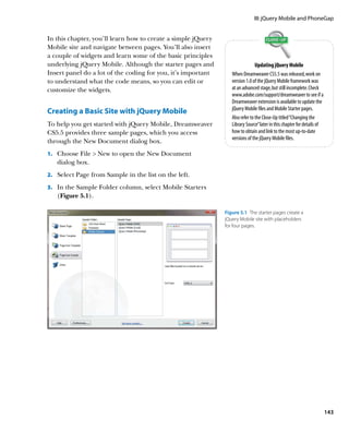
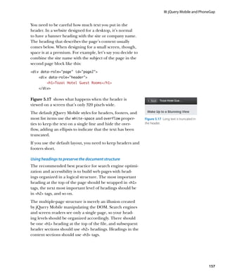


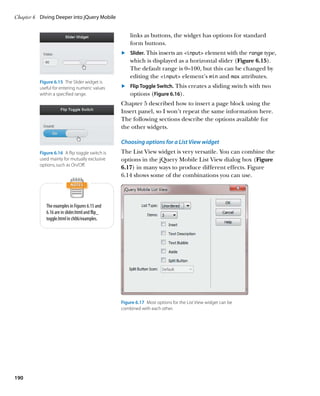
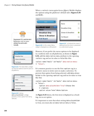
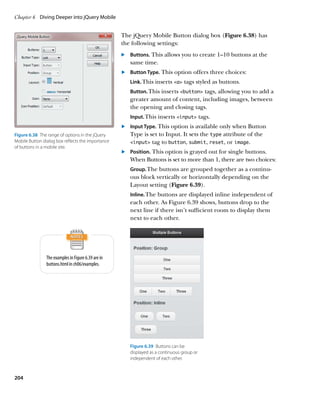
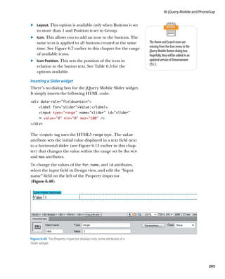
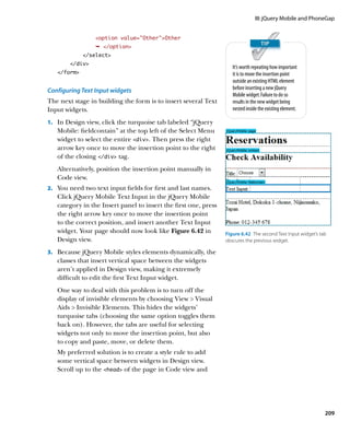
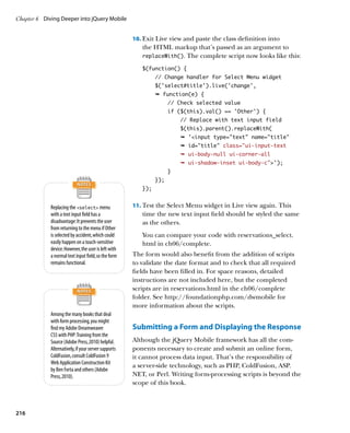
![III: jQuery Mobile and PhoneGap
The default style for select menus leaves the first
option selectable.
Offering multiple choices with a Checkbox widget
To insert a Checkbox widget, click Checkbox in the jQuery
Mobile category in the Insert panel, or choose Insert
jQuery Mobile Checkbox. This opens the jQuery Mobile
Checkbox dialog box (Figure 6.34).
The dialog box has the following options: Figure 6.34 The Checkbox widget has options for
vertical and horizontal layout.
. Name. This sets the name attribute that is shared by all
check boxes in the same group. Dreamweaver also
uses this value to assign a unique ID to each input
element. For example, if you enter meals in this field,
the check boxes are assigned the IDs meals_0, meals_1,
and so on. If the form-processing script uses
PHP, you need to append an empty
. Checkboxes. Select the number of check boxes you want pair of square brackets to the name,
in the group. The dialog box permits a maximum of for example meals[ ]. This tells
ten. If you want more, you need to add them manually the processing script to treat the
selected values as an array. Because
to the HTML code later. brackets are illegal characters in IDs,
. Layout. In a vertical layout, the check boxes are Dreamweaver ignores them when
stacked on top of each other with labels on the right. assigning the IDs to each check box,
keeping your code valid.
The horizontal layout presents only the labels as a
horizontal bar (Figure 6.35).
The examples in Figure 6.35 are in
checkbox.html in ch06/examples.
Figure 6.35 The Checkbox widget
has options for vertical and
horizontal layout.
201](https://image.slidesharecdn.com/adobedreamweavercs55studiotechniquespdf2108-121120034104-phpapp02/85/Adobe_Dreamweaver_CS5-5_Studio_Techniques-pdf-210-320.jpg)
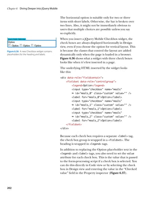
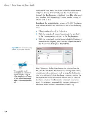
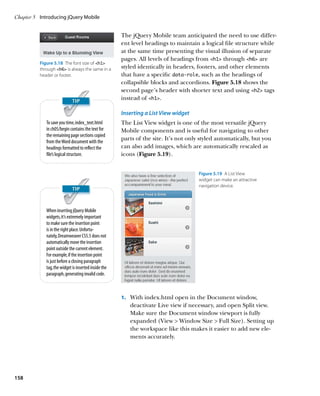
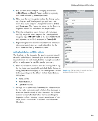
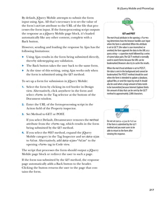
![Chapter 6 Diving Deeper into jQuery Mobile
add the following style block just before the closing
/head tag:
style
div[data-role=fieldcontain] {
margin: 1em inherit;
}
/style
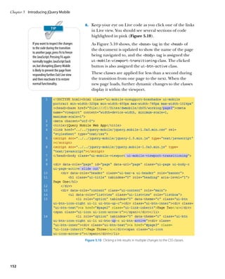
This uses an attribute selector (see Table 1.1 in Chapter
1) to select all div elements that have a data‑role of
fieldcontain—in other words, all form widgets. The
style rule applies top and bottom margins of one em
but leaves the horizontal margins untouched. Adding
this rule has the effect of pushing the form widgets one
Figure 6.43 The style rule makes it easier to edit line apart (Figure 6.43).
the form widgets.
An added bonus of this style rule is that it doesn’t
increase the vertical margins between form widgets when
viewed in a browser, so it doesn’t matter if you forget
to delete it when you have finished editing the form.
Select the style block created
in step 3, right-click, and choose
Create New Snippet. Give the snippet
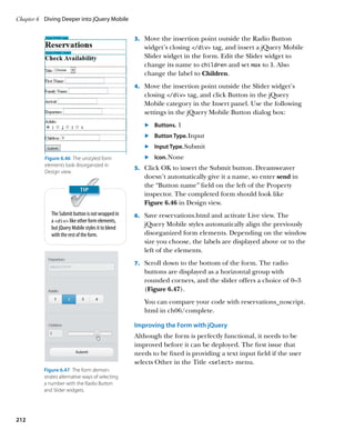
a name, such as jQuery Mobile The placeholder and data‑placeholder Attributes
Widget Separator, and click
OK to save it in the Snippets panel HTML5 and jQuery Mobile have similarly named attributes—placeholder
ready for reuse in other pages. and data‑placeholder—that are also similar in purpose but work very
differently. In browsers that support the HTML5 placeholder attribute, the
attribute’s value is displayed as a text hint inside a text input field. The text hint is
usually dimmed, and it disappears as soon as the input field has focus (Figure 6.44).
On the other hand, the jQuery Mobile data‑placeholder attribute turns an
option element in a select menu into a heading that can’t be selected,
normally prompting the user to select one of the other options. See Figure 6.33 in
“Choosing options for a Select Menu widget” earlier in this chapter for an example.
Figure 6.44 The placeholder
attribute reminds users what to
enter in a form field.
210](https://image.slidesharecdn.com/adobedreamweavercs55studiotechniquespdf2108-121120034104-phpapp02/85/Adobe_Dreamweaver_CS5-5_Studio_Techniques-pdf-219-320.jpg)


![III: jQuery Mobile and PhoneGap
} catch (e) {
alert(msg);
}
};
If the getCurrentPosition() method fails, it returns an
object containing details of the error, which is auto-
matically passed as the first argument to the failure
callback. If the code property of the error object is
PERMISSION_DENIED, it indicates that the user or the
system refused access to the GPS sensor, so this infor-
mation is added to the message stored in msg.
The try/catch blocks attempt to display the message
using the PhoneGap notification object, which uses
the mobile device’s native alert panel. The first argu-
ment passed to the alert() method is the text of the
message. The second is a callback function to be exe-
cuted when the user dismisses the alert. In this case, it
has been set to null because no callback is needed. The
third argument is used as the title of the panel. You can
also pass a fourth argument to set the text of the button
(the default is “OK”).
Desktop browsers don’t support PhoneGap, so the
catch block displays the default browser alert.
6. Define the insertEntry() function by adding the fol-
lowing code at the bottom of trnotes.js:
function insertEntry(e) {
var title = $(‘#title’).val(),
details = $(‘#details’).val();
$.mobile.notesdb.transaction(function(t) {
t.executeSql(‘INSERT into notes (title,
Ê details, entered, latitude,
Ê longitude) VALUES
Ê (?,?,date(now),?,?);',
[title, details, trNotes.lat,
Ê trNotes.lng],
function() {
$.mobile.changePage('#page',
Ê 'slide', false, true);
$('#title').val('');
247](https://image.slidesharecdn.com/adobedreamweavercs55studiotechniquespdf2108-121120034104-phpapp02/85/Adobe_Dreamweaver_CS5-5_Studio_Techniques-pdf-256-320.jpg)
![Chapter 7 Building a Native App with PhoneGap
$('#details').val('');
},
null
);
});
e.preventDefault();
};
The function begins by storing the values entered in
the title and details fields of the form. These values
are passed to the SQL query together with the latitude
and longitude stored in trNotes.lat and trNotes.lng.
Let’s take a quick look at how the values are passed into
the query. To make it easier to understand, the SQL
query is formatted with line breaks:
INSERT into notes
(title, details, entered, latitude, longitude)
VALUES (?,?,date(“now”),?,?);
The comma-separated list in the first set of parentheses
specifies the names of the columns into which the data
is to be inserted. The second set of parentheses speci-
fies the values for each column in the same order as
the first list. With the exception of entered, each value
is a question mark placeholder. The value for entered
is date(“now”), which is SQLite’s way of inserting the
current date.
The values represented by the placeholders are in the
following argument, which is a JavaScript array:
[title, details, trNotes.lat, trNotes.lng]
When using question mark
placeholders in SQL queries, there In other words, the value held in the title variable
must be the same number of is inserted in the title column, the value held in the
elements in the array of values as
details variable is inserted in the details column, and
placeholders—and they must be in
the same order. the values in trNotes.lat and trNotes.lng are inserted
in the latitude and longitude columns, respectively.
248](https://image.slidesharecdn.com/adobedreamweavercs55studiotechniquespdf2108-121120034104-phpapp02/85/Adobe_Dreamweaver_CS5-5_Studio_Techniques-pdf-257-320.jpg)
![III: jQuery Mobile and PhoneGap
. Bind a click event handler to each button to pass the
primary key to a function that retrieves the selected
record and loads its details in the display and editNote
page blocks.
. Display the entries div in the initial screen.
. If no records are found, hide the entries div in the
initial screen.
The following steps describe the code in detail and show
you how to handle the result of a SQL query.
1. Amend the document-ready event handler at the top of
trnotes.js to bind a new function called getTitles() to
the pagebeforeshow event of the home page block
like this:
$(function() {
$(‘#home’).live(‘pagebeforeshow’,
Ê getTitles);
$(‘#new’).live(‘pageshow’, getLocation);
$(‘#insert’).live(‘submit’, insertEntry);
});
I’ve added it as the first item because it needs to run
immediately when the app is first launched. Using the
pagebeforeshow event also means that the getTitles()
function is executed each time you return to the
first screen.
2. Add the code for the getTitles() function. It’s not
really important where you locate it in trnotes.js. The constraints of the printed page
However, your code is easier to maintain if you organize result in many lines being broken up,
functions in the order they’re used. In the download so you might find it easier to study
the code for the getTitles()
files, I have put it after the definition of the trNotes
function in trnotes_titles.js in ch07/
object and before the getLocation() function. The complete.
code looks like this:
function getTitles() {
var list = $(‘#recent’),
items = [];
$.mobile.notesdb.transaction(function(t) {
t.executeSql(‘SELECT id, title FROM
Ê notes ORDER BY id DESC LIMIT ?',
251](https://image.slidesharecdn.com/adobedreamweavercs55studiotechniquespdf2108-121120034104-phpapp02/85/Adobe_Dreamweaver_CS5-5_Studio_Techniques-pdf-260-320.jpg)
![Chapter 7 Building a Native App with PhoneGap
[trNotes.limit],
function(t, result) {
var i,
len = result.rows.length,
row;
if (len 0 ) {
for (i = 0; i len; i += 1) {
row = result.rows.item(i);
items.push('lia href=
Ê #display data-trnote='
Ê + row.id + '' + row.
Ê title + '/a/li');
}
list.html(items.join());
list.listview('refresh');
$('a', list).live('click',
Ê function(e) {
getItem(($(this).attr(
Ê 'data-trnote')));
});
$('#entries').show();
} else {
$('#entries').hide();
}
})
});
}
The function begins by creating two variables: list
holds a reference to the empty unordered list in the
home page block, and items is an empty array that will
be used to populate the list with the results of the
SQL query.
The SELECT query retrieves the id and title columns
from the notes table in descending (reverse) order, so
the most recent appears first. The query uses a LIMIT
clause to restrict the number of results. The number is
Even when there’s only one place-
holder in a SQL query, the second
represented by a question mark placeholder, and the
argument to executeSql() still specified value (trNotes.limit) is passed to the query
needs to be an array. as a single-element array in the second argument to
executeSql().
252](https://image.slidesharecdn.com/adobedreamweavercs55studiotechniquespdf2108-121120034104-phpapp02/85/Adobe_Dreamweaver_CS5-5_Studio_Techniques-pdf-261-320.jpg)
![III: jQuery Mobile and PhoneGap
. Control the button to display a map of the specified
location.
. Bind event handlers to the Edit Note and Delete Note
buttons.
. Populate the form in the editNote page block, so the
item is ready for updating.
Here’s the full listing:
function getItem(id) {
$.mobile.notesdb.transaction(function(t) {
t.executeSql(‘SELECT * FROM notes
Ê WHERE id = ?',
[id],
function(t, result) {
var row = result.rows.item(0),
entered = convertToMDY(
Ê row.entered),
updated = row.updated;
$('#display h1').text(row.title);
$('#display article').text(
Ê row.details);
if (row.latitude == null) {
$('#showmap').parent('p').hide();
} else {
$('#showmap').parent('p').show();
$('#showmap').unbind('click');
$('#showmap').click(displayMap);
}
$('#display footer').html('p
Ê Created: ' + entered + '/p');
if (updated != null) {
updated = convertToMDY(updated);
$('#display footer').append('p
Ê Updated: ' + updated + '/p');
}
$('#delete, #update').attr(
Ê 'data-trnote', id);
$('#title2').val(row.title);
$('#details2').val(row.details);
})
});
}
255](https://image.slidesharecdn.com/adobedreamweavercs55studiotechniquespdf2108-121120034104-phpapp02/85/Adobe_Dreamweaver_CS5-5_Studio_Techniques-pdf-264-320.jpg)
![Chapter 7 Building a Native App with PhoneGap
The getItem() function takes as its argument the ID of the
selected item and uses it in the WHERE clause of the SELECT
query to retrieve the item’s details from the database.
The callback function that handles the result of the query
assigns the result to row and then uses it to populate the
display page block. The value of the entered column is
passed to a utility function called convertToMDY(), which
converts it to an American date format.
The value of the title column replaces the text in the
h1 heading, and the value of details populates the
article element.
If the value of latitude is null, there’s no map to show,
so the paragraph that contains the Show Map button is
hidden. Otherwise, the paragraph is displayed and a func-
tion called displayMap() is bound to the button as a click
event handler. However, to prevent multiple click events
from being bound to the Show Map button each time
the getItem() function runs, the unbind() method first
removes any previous event handler.
The reformatted date is displayed in the footer element,
and if updated is not null, it’s reformatted and appended
to the HTML in the footer.
Finally, the item’s primary key is stored as data‑trnote in
the Delete and Update buttons, and the title and details
fields of the update form are prepopulated with the rel-
evant values. Even if the user doesn’t intend to update the
item, prepopulating the update form avoids the need to
query the database again.
Because getItem() calls two functions that haven’t yet been
created, you can’t test it yet.
1. Add the getItem() function definition to trnotes.js.
2. Add the following definition for the convertToMDY()
function:
function convertToMDY(date) {
var d = date.split(‘-’);
return d[1] + ‘/’ + d[2] + ‘/’ + d[0];
}
256](https://image.slidesharecdn.com/adobedreamweavercs55studiotechniquespdf2108-121120034104-phpapp02/85/Adobe_Dreamweaver_CS5-5_Studio_Techniques-pdf-265-320.jpg)
![III: jQuery Mobile and PhoneGap
This uses basic JavaScript to split the date, which
SQLite stores in the YYYY-MM-DD format, into an array
using the hyphens as a separator. So, the first element
of the array contains the year, the second contains the
To convert the date to the European
month, and the third contains the date. The array ele-
DD/MM/YYYY format, just swap the
ments are returned reordered with slashes in between positions of d[1] and d[2] in the
as MM/DD/YYYY. last line of the convertToMDY()
function.
3. You’ll define the displayMap() function later, but you
need to create a dummy function to prevent the script
from generating an error. Add this to trnotes.js:
function displayMap() {
}
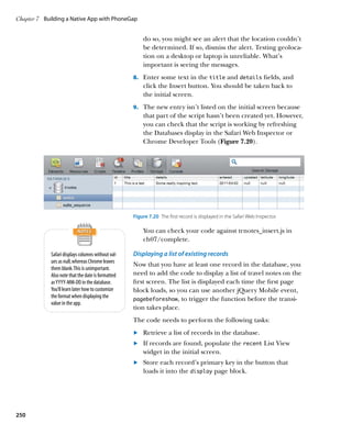
4. Save trnotes.js and refresh index.html in your browser.
Click one of the items in the list in the initial screen.
A new screen should load and display the details of the
item you selected (Figure 7.22).
Figure 7.22 The date is reformatted American style
If your network connection permits geolocation data to when the selected item’s details are shown.
be accessed, you should also see the Show Map button
(Figure 7.23).
The Show Map, Edit Note, and Delete Note buttons
don’t do anything yet.
You can check your code with trnotes_item.js in
ch07/complete.
Updating and deleting items
The functions for updating and deleting items follow the
same pattern as the other functions that you already cre-
Figure 7.23 The Show Map button is displayed
ated, so you can add them to the script at the same time. only if the latitude has been detected.
In addition to defining the functions, you also need to
bind them as event handlers to the relevant buttons, as
described in the following steps.
1. Amend the document-ready event handler at the top
of trnotes.js to bind the new functions to the Edit Note,
Delete Note, and Update buttons:
$(function() {
$(‘#home’).live(‘pagebeforeshow’,
Ê getTitles);
257](https://image.slidesharecdn.com/adobedreamweavercs55studiotechniquespdf2108-121120034104-phpapp02/85/Adobe_Dreamweaver_CS5-5_Studio_Techniques-pdf-266-320.jpg)
![Chapter 7 Building a Native App with PhoneGap
$('#new').live('pageshow', getLocation);
$('#insert').live('submit', insertEntry);
$(‘#editItem’).live(‘click’, editItem);
$(‘#delete’).live(‘click’, deleteItem);
$(‘#update’).live(‘click’, updateItem);
});
2. Add the function definitions related to the three buttons.
The code looks like this:
function editItem() {
$.mobile.changePage(‘#editNote’,
Ê 'slideup', false, true);
}
function deleteItem(e) {
var id = $(this).attr('data-trnote');
$.mobile.notesdb.transaction(function(t) {
t.executeSql('DELETE FROM notes WHERE
Ê id = ?',
[id],
$.mobile.changePage('#home', 'slide',
Ê false, true),
null);
});
e.preventDefault();
}
function updateItem(e) {
var title = $('#title2').val(),
details = $('#details2').val(),
id = $(this).attr('data-trnote');
$.mobile.notesdb.transaction(function(t) {
t.executeSql('UPDATE notes SET title =
Ê ?, details = ?, updated = date(now)
Ê WHERE id = ?',
[title, details, id],
$.mobile.changePage('#home', 'flip',
Ê false, true),
null);
});
e.preventDefault();
}
258](https://image.slidesharecdn.com/adobedreamweavercs55studiotechniquespdf2108-121120034104-phpapp02/85/Adobe_Dreamweaver_CS5-5_Studio_Techniques-pdf-267-320.jpg)
![III: jQuery Mobile and PhoneGap
an image in the map page block. It’s not interactive, but at
least you can continue using the Travel Notes app after
viewing the map by clicking the Back button generated by
jQuery Mobile.
The script uses the PhoneGap device object to detect
which operating system the app is running on.
The following steps describe how the script works.
1. The displayMap() function needs access to some of the
information retrieved from the database by getItem().
To pass data to an event handler in jQuery, you need to
create an object that’s attached to the Event instance.
Amend the getItem() function by adding the high-
lighted code:
function getItem(id) {
$.mobile.notesdb.transaction(function(t) {
t.executeSql(‘SELECT * FROM notes
Ê WHERE id = ?',
[id],
function(t, result) {
var row = result.rows.item(0),
entered = convertToMDY(
Ê row.entered),
updated = row.updated,
opts = {};
$(‘#display h1’).text(row.title);
$(‘#display article’).text(
Ê row.details);
if (row.latitude == null) {
$('#showmap').parent('p').
Ê hide();
} else {
$('#showmap').parent('p').
Ê show();
opts.title = row.title;
opts.lat = row.latitude;
opts.lng = row.longitude;
$(‘#showmap’).unbind(‘click’);
$(‘#showmap’).click(opts,
ÊdisplayMap);
}
263](https://image.slidesharecdn.com/adobedreamweavercs55studiotechniquespdf2108-121120034104-phpapp02/85/Adobe_Dreamweaver_CS5-5_Studio_Techniques-pdf-272-320.jpg)
![III: jQuery Mobile and PhoneGap
} else {
$('#map h1').text(title);
$('#map div[data-role=content]').html(
Ê 'img src=http://maps.google.com/
Ê maps/api/staticmap?center=' + latlng
Ê + ' zoom=16size=320x420markers='
Ê + latlng + 'sensor=false');
$.mobile.changePage('#map', 'fade',
Ê false, true);
}
}
When you pass a data object to an event handler, its
properties are assigned to the event’s data property. The
event is passed to displayMap() as e, so displayMap()
receives the value of opts.title as e.data.title, opts.
lat as e.data.lat, and opts.lng as e.data.lng.
The displayMap() function begins by storing the item’s
title as title and by combining its latitude and longi-
tude as a comma-separated value in latlng.
The rest of the function consists of a conditional
statement that determines how to display the map
depending on the platform. The condition uses the
platform property of PhoneGap’s device object to
detect if the app is running on Android. Because the
object isn’t supported by all devices, you need to test
for its existence like this:
if (typeof device !=’undefined’ . . .)
The rest of the condition uses toLowerCase() to convert
the value of device.platform to lowercase and compare
it with “android.” If the app is running on Android,
the script calls window.location and points it to Google
Maps. The else clause loads a Google static map as an
For details of the Google Maps
image into the map page block and then calls $.mobile.
and Google Static Maps APIs, see
changePage() to load the map page block. In both http://code.google.com/apis/maps/
cases, the latitude and longitude are incorporated in index.html.
the URL to display the map of the selected location.
265](https://image.slidesharecdn.com/adobedreamweavercs55studiotechniquespdf2108-121120034104-phpapp02/85/Adobe_Dreamweaver_CS5-5_Studio_Techniques-pdf-274-320.jpg)
![Chapter 7 Building a Native App with PhoneGap
3. To test the script, you need to use a computer that
can access geolocation information. Save the files and
reload index.html in your browser. Then access an
item and click the Show Map button. This loads the map
page block because desktop browsers don’t support the
PhoneGap device object. As Figure 7.32 shows, there’s
an unsightly gap on the top and left of the map.
4. Add the following rule to the style block in the
head of index.html:
#map div[data-role=content] {
padding:0;
}
This eliminates the 15-pixel padding surrounding the
content div in the map page block and moves the map
into the correct position.
That completes the code for the Travel Notes app. You
can compare your code with index.html and trnotes.js
Figure 7.32 The map needs to be moved up and
to the left. in ch07/complete.
Building and Testing the Native App
After you have created the HTML, CSS, and JavaScript
for an app, it needs to be packaged in a format that the
No, I don’t actually live at 10 Downing target platforms understand. As long as you set up the
Street. It’s already occupied by Native Application Settings as described in “Setting up a
someone else. Dreamweaver Site for a Native App” earlier in this chapter,
you’re just a couple of clicks away.
The following steps describe how to test the Travel Notes app.
1. Choose Site Mobile Applications Build and Emulate.
On Windows and Mac OS X 10.5, you have only one
The Build option on the submenu
packages the app without launching
option: Android.
a simulator. If you installed Xcode and the iOS SDK on Mac OS X
10.6, you have the choice of iPhone, iPad, and Android.
2. Select the target device from the submenu.
Dreamweaver displays a progress bar that keeps you
informed of what’s happening.
If you selected Android, be prepared to wait a couple of
minutes. The Android emulator takes a long time to
start up. The iOS simulator is much quicker off the mark.
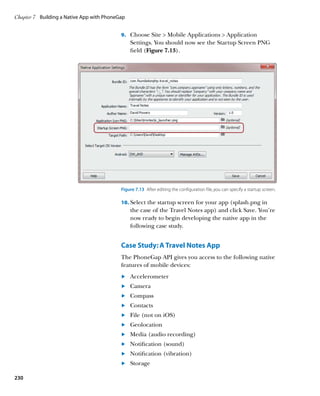
266](https://image.slidesharecdn.com/adobedreamweavercs55studiotechniquespdf2108-121120034104-phpapp02/85/Adobe_Dreamweaver_CS5-5_Studio_Techniques-pdf-275-320.jpg)


![Bonus Material
Validating the date format
There are plans to adapt the jQuery UI Datepicker widget
for use in a jQuery Mobile site. At the time of this writing,
the widget was still highly experimental. When a stable
version becomes available, you might prefer to use it Regular Expressions
instead of the following solution, which checks only the A regular expression—or regex for short—is
a pattern for matching text. Regexes use a
date format, not the validity of the date.
combination of literal text and characters with
This solution uses a complex regular expression. Copying special meanings. For example, w matches
any alphanumeric character or an underscore.
regular expressions from printed books often leads to
Learning how to build regexes isn’t easy, but it’s a
mistakes, so I suggest that you copy the code for the regex skill worth acquiring if you use a lot of JavaScript
from reservations_date.html in ch06/complete. or other programming languages. You’ll also find
regexes extremely useful in the Dreamweaver Find
1. Insert the following code inside the jQuery document- and Replace dialog box. For a basic introduction
ready function that you created in the previous section to regexes, see my tutorial at www.adobe.
(the change-handler script for the Select Menu widget com/devnet/dreamweaver/articles/regular_
expressions_pt1.html.
has been omitted for brevity):
$(function() {
// Change handler for Select Menu widget
. . .
// Check date format
$(‘#arrival, #departure’).live(‘blur’,
Ê function(e) {
});
});
This creates a jQuery selector for the arrival and
departure text input fields, and binds an onblur event
handler to both of them.
2. Inside the new event-handler function, define a variable
to hold the regex. Because of the limitations of the
printed page, it’s split over two lines, but it must be on
a single, unbroken line in your code:
var pattern = /^(1[0-2]|0[1-9])/(3[01]|
Ê [12][0-9]|0[1-9])/201[1-9]$/;
This matches a date in the MM/DD/YYYY format in the
years 2011–2019. The date must include leading zeros.
A-1](https://image.slidesharecdn.com/adobedreamweavercs55studiotechniquespdf2108-121120034104-phpapp02/85/Adobe_Dreamweaver_CS5-5_Studio_Techniques-pdf-290-320.jpg)
![Chapter 6 Diving Deeper into jQuery Mobile
To match a date in the European DD/MM/YYYY
format, use the following pattern instead:
var pattern = /^(3[01]|[12][0-9]|0[1-9])/
Ê (1[0-2]|0[1-9])/201[1-9]$/;
To match a date in the YYYY/MM/DD format
commonly used in East Asia, use this:
var pattern = /^201[1-9]/(1[0-2]|0[1-9])/
Ê (3[01]|[12][0-9]|0[1-9])$/;
3. You need to obtain the value entered by the user
using $(this).val() and pass it as an argument to
the JavaScript test() method, which returns true or
false depending on whether the value matches the
regex. If the input doesn’t match, display an alert. The
completed code looks like this:
$(function() {
// Change handler for Select Menu widget
. . .
// Check date format
$(‘#arrival, #departure’).live(‘blur’,
function(e) {
var pattern = /^(1[0-2]|0[1-9])/(3
Ê [01]|[12][0-9]|0[1-9])/201[1-9]$/;
if (!pattern.test($(this).val())) {
alert(‘Date must be in MM/DD/YYYY
Ê format with leading zeros');
}
});
});
The exclamation mark after the opening parenthesis
of the condition is the logical NOT operator, which
negates the meaning of the following expression. In
other words, the condition means “if the value doesn’t
match the pattern.”
Checking that all required fields have been filled in
Because you can’t be sure that all browsers recognize the
HTML5 required attribute, it’s a good idea to check that
required fields aren’t blank before submitting the form.
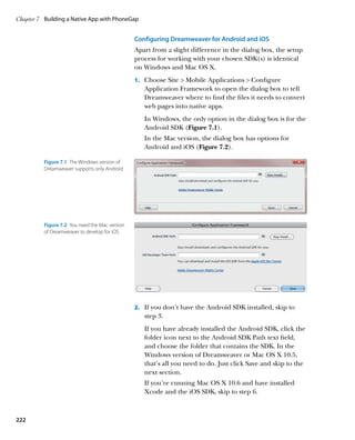
A-2](https://image.slidesharecdn.com/adobedreamweavercs55studiotechniquespdf2108-121120034104-phpapp02/85/Adobe_Dreamweaver_CS5-5_Studio_Techniques-pdf-291-320.jpg)
![Bonus Material
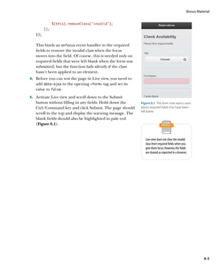
If any fields are missing, you can dynamically add a warn-
ing message to the form, highlight the affected fields, and
prevent the form from being submitted.
1. Add the following style rule to the style block in the
head of reservations.html:
.invalid {
background-color: rgba(255,0,0,0.1);
}
This uses the rgba() color format to set the background
color to red with 10% alpha transparency—in effect,
pale pink.
2. Add the following code inside the jQuery document-
ready function at the bottom of the page:
$(function() {
// Change handler for Select Menu widget
. . .
// Check date format
. . .
// Check required fields
$(‘form’).live(‘submit’, function(e) {
// Initialize Boolean variable
var OK = true;
// Test each required field
$(‘input[required]’).each(function() {
if ($.trim($(this).val()) == ‘’) {
// If blank, set OK to false
OK = false;
// Style current element
$(this).addClass(‘invalid’);
}
});
if (!OK) {
// Add warning if field(s) blank
$(‘form’).before(‘p id=”errors”
Ê Please fill in required fields.
Ê /p');
// Scroll to top of page
window.scrollTo(0,0);
A-3](https://image.slidesharecdn.com/adobedreamweavercs55studiotechniquespdf2108-121120034104-phpapp02/85/Adobe_Dreamweaver_CS5-5_Studio_Techniques-pdf-292-320.jpg)
![Chapter 6 Diving Deeper into jQuery Mobile
} else {
// Remove warning if OK
$('#errors').remove();
}
return OK;
});
});
This binds an onsubmit event handler to the form.
It must be bound to the form instead of the submit
button because of the way that jQuery Mobile handles
form submission. The script begins by initializing a
Boolean variable OK, which the event handler ultimately
returns. If any required fields are blank, OK is reset to
false, which prevents the form from being submitted.
The each() method is applied to the attribute selector
$(‘input[required]’). This executes the same function
on each required field. The condition inside the
function uses the jQuery $.trim() utility method to
strip leading and trailing spaces from the user input,
and compares the value with an empty string. If the
field is blank, OK is reset to false, and the invalid class
is applied to the current element.
If OK is false, the before() method prepends a warning
paragraph to the form, and the page is scrolled to the
top to bring the warning into view. The paragraph is
given an ID so that it can be removed later if the form
is submitted without errors.
3. There’s just one final refinement: Add the following
code inside the jQuery document-ready handler:
$(function() {
// Change handler for Select Menu widget
. . .
// Check date format
. . .
// Check required fields
. . .
// Clear invalid class on focus
$(‘input[required]’).live(‘focus’,
Ê function(e) {
A-4](https://image.slidesharecdn.com/adobedreamweavercs55studiotechniquespdf2108-121120034104-phpapp02/85/Adobe_Dreamweaver_CS5-5_Studio_Techniques-pdf-293-320.jpg)