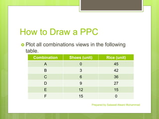
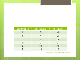
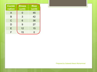
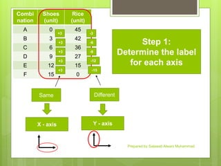
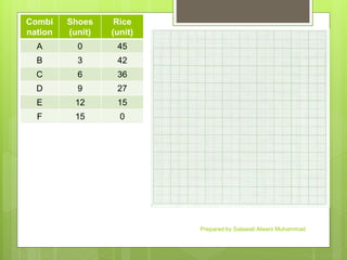
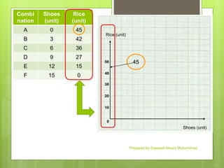
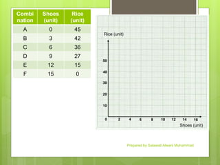
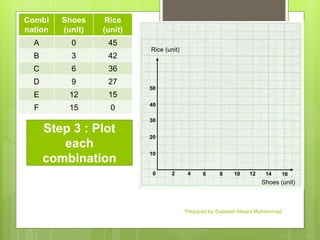
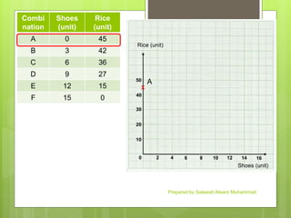
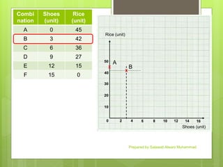
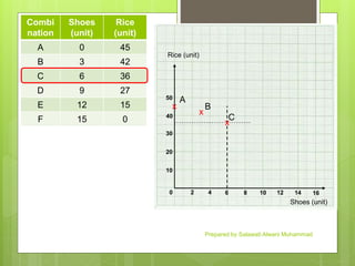
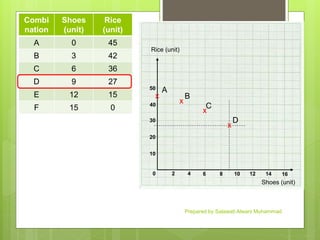
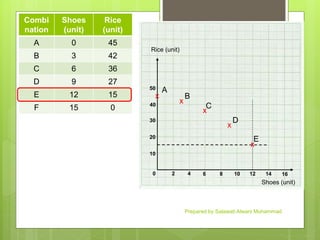
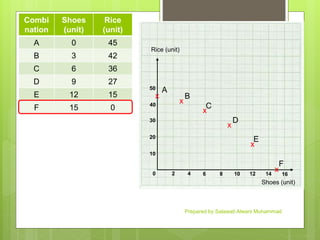
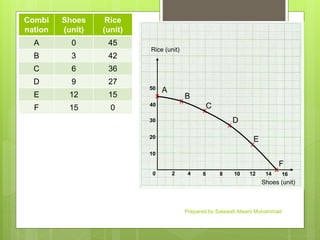
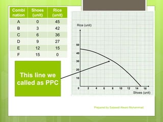
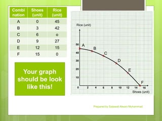
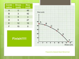
This document provides instructions for drawing a production possibilities curve (PPC) graph using data from a table listing the combinations of shoes and rice an economy can produce. It involves:
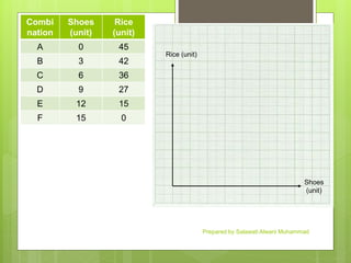
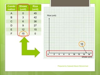
1) Plotting the combinations from the table on a graph with shoes on the x-axis and rice on the y-axis.
2) Connecting the points to show the curve representing the maximum possible combinations of goods an economy can produce while fully utilizing its resources.
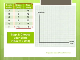
3) Labeling the graph with a title, axis labels, and scale to clearly show the relationship between the two goods and the production trade-offs involved.