5 Elements to Radical 

Brand Recognition
Learn How to Open the Eyes of Your Target Audience
1.
2.
3.
4.
5.
There are five essential elements that
help your company get recognized…
1.
2.
3.
4.
5.
…and really stand out.
5What is the definition of incognito?
If you don’t apply the five elements,

you may find your company incognito.
In•cog•ni•to
with one’s identity concealed
abc
5Let’s explore the five elements that
help your company get recognized
by starting out with number one.
Color
1.
Color
1.
Color is more important than any other
factor in increasing brand recognition,
and making your brand memorable.
Color
1.
(Source: Color Professor Jill Morton; Why Color Matters)
80%Studies show that color boosts brand
recognition up to 80 percent.
Color
1.
Successful companies choose a single
dominant color — one that best
conveys a unique association with their
company — and use it everywhere.
Color
1.
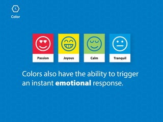
Joyous CalmPassion
Colors also have the ability to trigger
an instant emotional response.
Tranquil
Let’s explore six common colors,
and the attributes we associate
with each of them.
Color
1.
Color
1.
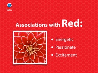
Associations with Red:
Energetic
Passionate
Excitement
Color
1.
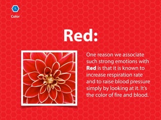
One reason we associate
such strong emotions with
Red is that it is known to
increase respiration rate
and to raise blood pressure
simply by looking at it. It’s
the color of fire and blood.
Red:
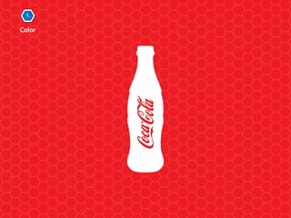
Can you guess which company chose
red as their dominant brand color?
Color
1.
Mini Quiz
(Answer on following page, no cheating)
Color
1.
Color
1.
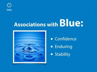
Confidence
Enduring
Stability
Associations with Blue:
Color
1.
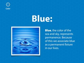
Blue:
Blue, the color of the 

sea and sky, represents
permanence. Because 

of this we associate blue 

as a permanent fixture 

in our lives.
Can you guess which company chose
blue as their dominant brand color?
Color
1.
Mini Quiz
Color
1.
Color
1.
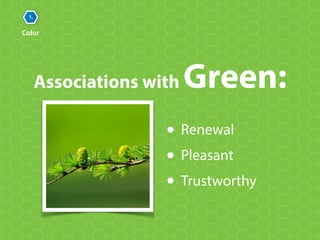
Associations with Green:
Renewal
Pleasant
Trustworthy
Color
1.
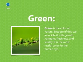
Green is the color of
nature. Because of this, we
associate it with growth,
harmony, freshness, and
vitality. It is the most
restful color for the
human eye.
Green:
Can you guess which company chose
green as their dominant brand color?
Color
1.
Mini Quiz
Color
1.
Color
1.
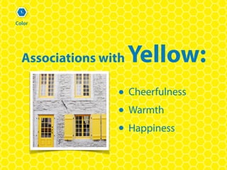
Associations with Yellow:
Cheerfulness
Warmth
Happiness
Color
1.
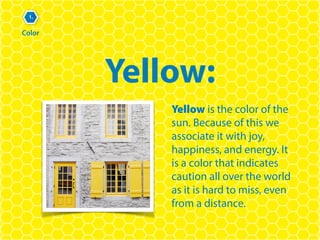
Yellow:
Yellow is the color of the
sun. Because of this we
associate it with joy,
happiness, and energy. It 

is a color that indicates
caution all over the world
as it is hard to miss, even
from a distance.
Color
1.
Can you guess which company chose
yellow as their dominant brand color?
Mini Quiz
Color
1.
Color
1.
Associations with Orange:
Determination
Stimulation
Enthusiasm
Color
1.
Orange:
The color orange radiates
warmth. It also has the
ability to stimulate
appetite. It can also tend
to convey playfulness, so 

it is not always a good
choice for conveying a
serious message.
Can you guess which company chose
orange as their dominant brand color?
Color
1.
Mini Quiz
Color
1.
Color
1.
Associations with Purple:
Royalty
Luxury
Creativity
Color
1.
Purple:
Purple is often associated
with royalty. It was the
most expensive color to
produce in fabric during
ancient times. It was so
rare and expensive that
only kings and rulers 

could afford it.
Can you guess which company chose
purple as their dominant brand color?
Color
1.
Mini Quiz
Color
1.
Did you notice the crown in their logo?
1.
Color Review
Successful companies choose 

a single dominant color
Colors trigger emotional responses
Color boosts brand recognition
up to 80 percent
The second element in increasing
radical brand recognition, one that
is often overlooked and misused,

is choosing the right fonts.
Fonts
2.
Fonts
2.
…Ok, now it’s time to get serious.
Before we get serious, here is a joke. Two
fonts walk into a bar and the bartender
says,“We don’t serve your type.”
Fonts
2.
One of the mistakes companies 

make when creating marketing
materials is to randomly choose 

a font simply because they like it.
And then a choose a different font the next day.
Fonts
2.
Successful companies use only a select 

few dominant fonts, ones that best
reflect the organization’s tone — 

and use them everywhere.
Fonts
2.
Using the same font in all aspects 

of its marketing—consistently and
repeatedly—will help your company
stand out and get recognized. Think
radical recognition.
Fonts
2.
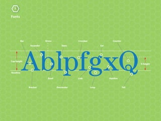
There are many things which can affect letterform…
Did you know there are over 20,000
fonts? Each one has its own personality
and expresses its own unique attributes.
Fonts
2.
Baseline
Bowl
StressBar
Bracket Descender
Ascender
Loop
HairlineLink
Tail
Ear
CounterCrossbar
X-height
Cap height
Stem
Fonts
2.
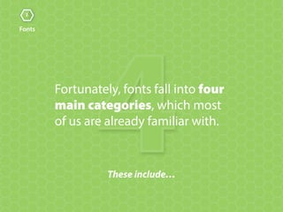
4These include…
Fortunately, fonts fall into four 

main categories, which most 

of us are already familiar with.
Fonts
2.
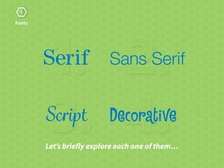
2.1.
3. 4.Let’s briefly explore each one of them…
Fonts
2.
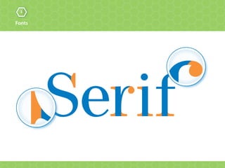
Let’s magnify and make them stand out in orange…
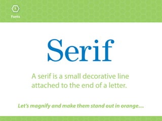
A serif is a small decorative line
attached to the end of a letter.
Fonts
2.
Fonts
2.
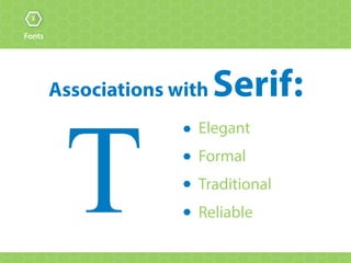
Elegant
Formal
Traditional
Reliable
Associations with Serif:
T
Fonts
2.
Let’s magnify and make them stand out in orange…
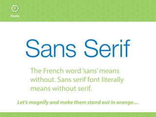
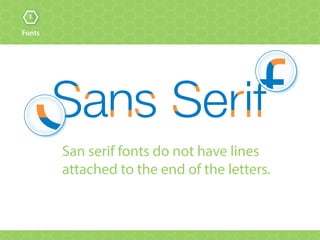
The French word‘sans’means
without. Sans serif font literally
means without serif.
Fonts
2.
San serif fonts do not have lines
attached to the end of the letters.
Fonts
2.
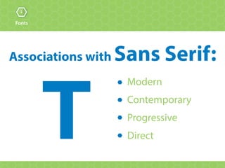
Modern
Contemporary
Progressive
DirectT
Associations with Sans Serif:
Fonts
2.
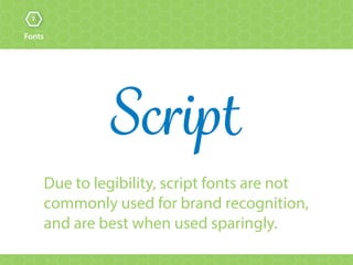
Due to legibility, script fonts are not
commonly used for brand recognition,
and are best when used sparingly.
Fonts
2.
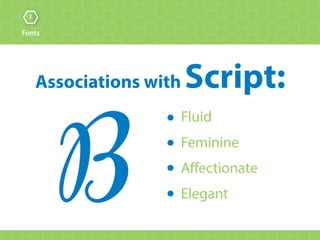
Fluid
Feminine
Affectionate
Elegant
Associations with Script:
B
Fonts
2.
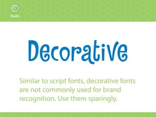
Similar to script fonts, decorative fonts
are not commonly used for brand
recognition. Use them sparingly.
Fonts
2.
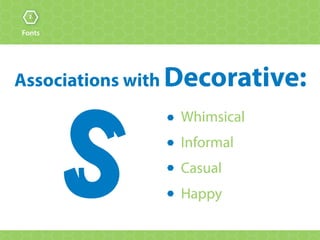
Whimsical
Informal
Casual
HappyS
Associations with Decorative:
Fonts
2.
Let’s take a look at three well-known
organizations that chose a dominant 

font for the purpose of consistency 

and radical brand recognition.
© 2015 Lippincott
Fonts
2.
I personally want to hug the font!
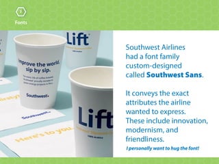
Southwest Airlines 

had a font family 

custom-designed 

called Southwest Sans.


It conveys the exact
attributes the airline
wanted to express. 

These include innovation,
modernism, and
friendliness.
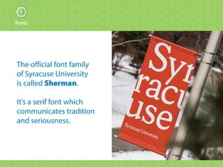
The official font family 

of Syracuse University 

is called Sherman.
It’s a serif font which
communicates tradition
and seriousness.
Fonts
2.
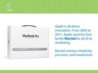
Apple is all about
innovation. From 2003 to
2017, Apple used the font
family Myriad for all of its
marketing.
Myriad conveys simplicity,
precision, and modernism.
Fonts
2.
2.
Fonts Review
Successful companies select just a few 

fonts and use them everywhere
Fonts express unique attributes
The four main categories are serif,
sans serif, script, and decorative
The third element in increasing radical
brand recognition is the logo.
Logos
3.
3.
Logos
The purpose of a logo is to
visually identify a company.
The logo is the most ubiquitous
of the five elements.
U•biq•ui•ty
the state of being widespread or 

seeming to be everywhere at once
3.
Logos
abc
3.
Logos
7.Let’s Explore…
There are seven key characteristics 

that make up a successful logo and 

help it really stand out.
3.
Logos
1. Identifiable
Just as every fingerprint is unique, 

your logo should be one-of-a-kind 

and convey some unique aspect.
3.
Logos
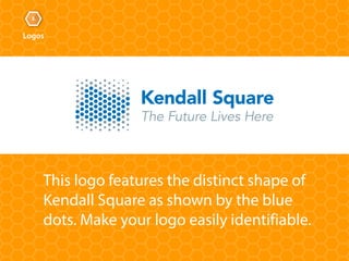
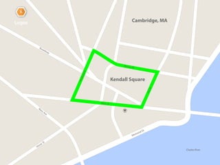
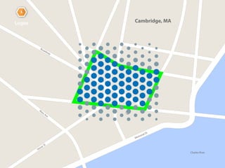
This logo features the distinct shape of
Kendall Square as shown by the blue
dots. Make your logo easily identifiable.
Charles River
Memorial Dr
M
ass Ave
Vassar St
Broadway
Main St
Binney St
PortlandSt
3rdSt
3.
Logos
Kendall Square
Cambridge, MA
Charles River
Memorial Dr
M
ass Ave
Vassar St
Broadway
Main St
Binney St
PortlandSt
3rdSt
3.
Logos Cambridge, MA
3.
Logos
2. Simplicity
All too often, logos are overdone 

and overcomplicated. Successful 

logos are very simple.
3.
Logos
MeetingMakers is all about connecting
people. By keeping it simple, the logo
will be remembered and retained.
3.
Logos
3. Memorable
A logo design must contain unique 

and recognizable elements that 

are connected to the brand.
3.
Logos
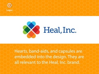
Hearts, band-aids, and capsules are
embedded into the design. They are 

all relevant to the Heal, Inc. brand.
3.
Logos
4. Differentiated
Assess what the competition is doing
and design an entirely different logo.
Remember all of the “swoosh” logos in 2000?
3.
Logos
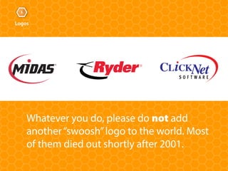
Whatever you do, please do not add
another“swoosh”logo to the world. Most
of them died out shortly after 2001.
3.
Logos
5. Sustainable
A properly designed logo will stand
the test of time and will not fall
victim to having a dated look.
3.
Logos
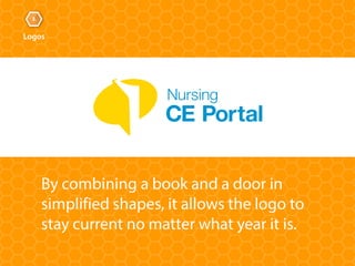
By combining a book and a door in
simplified shapes, it allows the logo to
stay current no matter what year it is.
3.
Logos
6. Emotional or
Engaging
Successful logos are able to evoke
feelings and thoughts in the mind 

of the prospective client.
3.
Logos
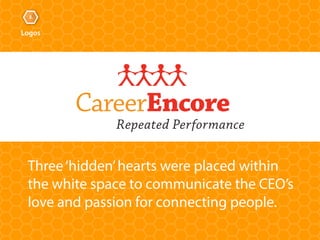
Three‘hidden’hearts were placed within 

the white space to communicate the CEO’s

love and passion for connecting people.
CareerEncore
Repeated Performance
3.
Logos
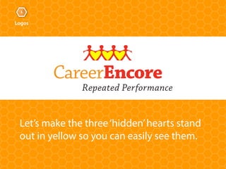
Let’s make the three‘hidden’hearts stand
out in yellow so you can easily see them.
CareerEncore
Repeated Performance
3.
Logos
7. Flexible
A logo must be adaptable so it can
accommodate any medium and size.
This includes print, the web, and
multimedia.
3.
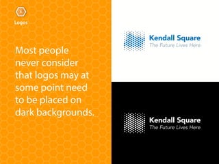
Logos
Most people
never consider
that logos may at
some point need
to be placed on
dark backgrounds.
3.
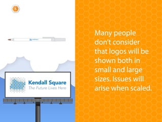
Logos
Many people
don’t consider
that logos will be
shown both in
small and large
sizes. Issues will
arise when scaled.
3.
Logo Review
Logos are the most ubiquitous 

brand element of any company
When designed correctly, logos will 

be recognized and remembered
There are seven key characteristics
that make up a successful logo
The fourth element in increasing 

radical brand recognition is images.
Images
4.
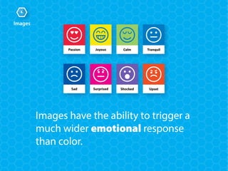
Joyous CalmPassion Tranquil
Sad Surprised Shocked Upset
Images
4.
Images have the ability to trigger a
much wider emotional response
than color.
Are you recognizing a pattern?
Images
4.
Successful companies choose a single
theme of related images — ones that
attract the audience, are recognizable,
and allow viewers to see themselves 

in the image.
Images
4.
What can be done about this?
All too often images are randomly
chosen without much thought, 

focus, or know-how.
Images
4.
IMAGE USAGE GUIDE
Guidelines:
Target Audience:
Description:
An ‘Image Usage Guide’
could be the answer!
An image usage guide specifies the
exact type of images that will be used
in order to achieve consistency and
radical brand recognition.
Images
4.
A good example of an organization that
effectively uses an image usage guide is the
public speaking organization Toastmasters.
Images
4.
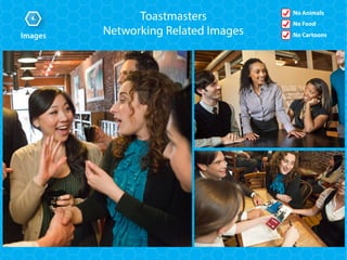
Not only does Toastmasters specify which
type of images to use, they even specify
which type of images not to use!
Images
4.
This can even be done on a single sheet of paper…
Images
4.
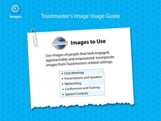
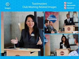
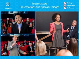
Use images of people that look engaged,
approachable and empowered. Incorporate
images from Toastmasters related settings:
Images to Use
• Club Meetings
• Presentations and Speakers
• Networking
• Conferences and Training
• Speech Contests
Toastmaster’s Image Usage Guide
Images
4.
Toastmaster’s Image Usage Guide
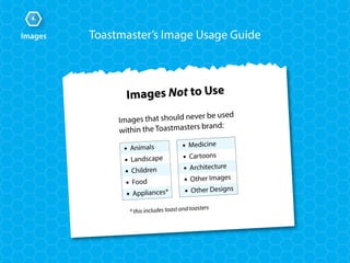
Images that should never be used
within the Toastmasters brand:
Images Not to Use
• Animals
• Landscape
• Children
• Food
• Appliances*
• Medicine
• Cartoons
• Architecture
• Other Images
• Other Designs
* this includes toast and toasters
Let’s take a glance at several images
that Toastmasters use throughout
their marketing materials.
Images
4.
Images
4. Toastmasters
Club Meeting Related Images
Engaged
Approachable
Empowered
Images
4.
Meetings
Presentations
Conferences
Toastmasters
Presentations and Speaker Images
Images
4.
No Animals
No Food
No Cartoons
Toastmasters
Networking Related Images