491 Visual Language Trend Report
•
6 likes•1,306 views

This document summarizes major visual language trends in brand identity observed over the past year. It identifies two key trends: [1] "Global Blanding", which refers to the homogenization of brand visuals through shared elements like spheres, shapes, and color blends, compromising uniqueness; and [2] "Authenticity", seen in brands emphasizing traditions, craft, and visual storytelling to convey trustworthiness. The report provides examples of sub-trends reflecting these larger trends, such as the use of signatures, ribbons, and vintage design elements to communicate authenticity.

More Related Content
Similar to 491 Visual Language Trend Report
Similar to 491 Visual Language Trend Report (20)
More from AxiomConsultingAustralia
491 Visual Language Trend Report
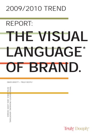
- 1. 2009/2010 TREND REPORT: THE VISUAL LANGUAGE * OF BRAND. DAVID ANSETT + TRULY DEEPLY *BRAND IDENTITY, PACKAGING, ADVERTISING, RETAIL SPACE, WEB, LIVERY, SIGNAGE
- 3. Truly Deeply 1 2009/2010 Trend Report; Dedicated to all businesses who © 2010 Truly Deeply. The Visual Language of Brand. actively leverage their brands and This work is licensed under a their brand visual language. Creative Commons License. We’re delighted for you to share, blog or publish extracts of our articles, on the condition that Truly Deeply is properly credited (and linked to) as the source, and that you include our URL: trulydeeply.com.au
- 4. 2009/2010 Trend Report: The Visual language of Brand A REPORT IN MAJOR VISUA LANGUAGE TRENDS IN BRAND IDENT Trends in the visual language of brand identity are driven by many factors from the ‘me-too-ism’ of designers and their clients mimicking the visual language of market leaders, to new and emerging trends such as ‘sustainability’ that draw a similar and en-mass visual response from designers all over the world
- 5. Truly Deeply 3 TO AL TITY.
- 6. 2009/2010 Trend Report: The Visual language of Brand When it comes to brands, the thing When the design of visual language HOWEVER THE about visual language is that it not only appears consistently and repeatedly BIG QUESTION communicates the essence of a brand and its (hopefully) unique proposition across a number of brands we identify that as a trend. When a trend is ON TRENDS IN to market, but also provides its audience leveraged positively it offers brands with cues relative to the other brands the opportunity to communicate an BRAND VISUAL in the marketplace. The more a brand existing set of cues or meanings within is a leader in its market, the greater a market to their advantage - whether LANGUAGE IS meaning it’s visual language has and that be a local business wishing to ‘WHAT EXACTLY the more influence it commands. look global, or a global business The brand visual language of the wishing to look local. Yet, when DO WE DO WITH Tiffany’s blue - especially when misunderstood or misused, trends combined with their iconic ribbon can create inappropriate or confusing THEM?’ and box - is a powerful identifier. It visual messaging to the detriment of clearly communicates a series of the brand. well understood cues such as quality, When the most popular trends become elegance, sophistication, femininity, widely misused the original brand cues design and premium to a broad cross become meaningless. The last decade section of its markets in every country saw the popularity of the ‘all lowercase they do business. logotype’. Using all lowercase letters was seen as a way for brands to show their ‘friendly’, ‘down to earth’ and ‘approachable’ side. As this aspect of brand personality became increasingly popular, more and more brands adopted the trend for their visual language, culminating in the re-branding of the National Australia Bank to ‘nab’. In terms of trend relevance, when a big bank - any big bank - adopts the visual language of ‘friendly’, ‘down to earth’ and ‘approachable’ the cues of the trend have become compromised.
- 7. Truly Deeply 5 The brand expressions we tracked What is the value of a Trend Report into OVER THE PAST included existing, new and refined the code of brand visual language? 12 MONTHS brand identities, product packaging, newspaper, magazine and billboard All brands project an image through their visual language. It is up to each WE HAVE ads. The scale and breadth of these brand to make conscious and informed brand expressions allowed us to decisions about exactly what they wish COLLECTED identify the major brand visual their visual language to communicate language trends of a broad range of relative to the competition and MORE THAN market leaders for the last year. to their market’s perceptions. An FIVE THOUSAND Whilst the majority of the examples understanding and mastery of the presented in this report are recent, trends in brand visual language will DIFFERENT many trends are not in themselves allow business to ‘tune’ their brand’s new. It is our interpretation of the image to ensure they’re consistently BRAND groundswell of take-up of a trend communicating the right messages to EXPRESSIONS and the influence exerted within their market by the brands involved, that the right people. For every organisation seeking to best SPANNING leads us to define the most compelling manage their brand identity, these and influential trends. trends must be part of the consideration ALMOST EVERY process. For each brand there will be advantages and disadvantages MAJOR INDUSTRY to leveraging the cues and meaning AND CATEGORY inherent in these trends. The big question you should be considering OF THE WESTERN is this; ‘does the trend provide an opportunity to leverage a set of visual WORLD. cues to communicate the perfect brand messages to your market, or has the trend become so widely adopted as to compromise the uniqueness of the brands who follow it?’
- 8. 2009/2010 Trend Report: The Visual language of Brand MAJOR TREND: GLOBAL BLANDING Global ‘Blanding’ is the single greatest trend we’ve seen in brand identity over the past two years, and in the last 12 months we’ve seen nothing to suggest the trend is losing steam.
- 9. Truly Deeply 7 Global ‘Blanding’ is the homogeniz- Global ‘Blanding’ describes the ation of brand visual language that we trading-in of unique and usually GLOBAL have seen occurring in brand identity design. Like many trends, it was meaningful symbolism for a shared and meaningless visual language BLANDING started by re-branding of some of the of spheres, colour blends and DESCRIBES largest global brands including; Xerox, transparencies, and three dimensional British Telecom, Barack Obama’s shapes. Whilst the visual style THE TRADING- Presidential Campaign, AT&T, Apple, achieved by combining these elements Barclaycard, HP & Mastercard, provides a sense of ‘international IN OF UNIQUE before being picked-up by the second or globalization’ often combined AND USUALLY and third tiers of medium and small with a suggestion of ‘cutting-edge enterprises. This visual language trend technology’, this is typically achieved MEANINGFUL cuts across almost every conceivable at the expense of individuality, brand category from telecommunications differentiation and brand messaging. SYMBOLISM FOR to airlines to petroleum, to sporting teams and fast food. There are so many examples of brand marks that fit this category, we can show A SHARED AND you only a small selection. This is not MEANINGLESS only the strongest trend identified, but also the one we believe to contain the VISUAL greatest risk of compromise to brand differentiation and uniqueness. Due to LANGUAGE over-use and mass misuse this trend has the potential for inappropriate or confusing visual messaging.
- 10. 2009/2010 Trend Report: The Visual language of Brand The last few years has seen almost As we’ve observed the trend of three- THE AUTO BADGE every auto manufacturer refine their dimensionality sweep across the HERITAGE brand mark to make it a shiny, three- dimensional representation of their brand identity in so-many categories we wonder whether these auto brands badge. This trend has been enabled can be held responsible for starting by the evolution of graphic rendering the trend, or at least giving it the software and print technology momentum of credibility. which now allows complex brand mark rendering such as these to be reproduced faithfully.
- 11. Truly Deeply 9
- 12. 2009/2010 Trend Report: The Visual language of Brand The strongest of the global ‘blanding’ this trend to communicate a global THE SPHERE OF sub-trends is the Sphere of Influence. positioning - which for many brands INFLUENCE With clear global symbolism, many brands with international reach or is a legitimate play. Some brands however seem to have ‘gone along aspirations have been attracted to a for the ride’ and through lack of sphere-based brand mark. relevance, or poor execution don’t This category includes the many fit in with the big boys. Brands brands from a wide range of categories attracted to the gravitational pull of and geographical markets who have the Sphere of Influence span property, evolved, refined or re-designed their telecommunications, travel, finance, brand identity to include a sphere hardware, retail, software. petroleum, element. Most brands have adopted gaming, politics and fast food.
- 13. Truly Deeply 11
- 14. 2009/2010 Trend Report: The Visual language of Brand
- 15. Truly Deeply 13
- 16. 2009/2010 Trend Report: The Visual language of Brand Whilst consciously or inadvertently marks look similar to each other. EVERY MAN following a trend in brand visual Some brand that follow this trend AND HIS DOG’S language does not on its own diminish the effectiveness or value do so whilst maintaining relevance and a uniqueness in their visual BREAKFAST of an organisation’s brand identity, a language relative to their market. The trend that groups together a mass of Woolworths brand identity below unrelated businesses and markets, is a good example. However, other painting them with the same brush brands such as UPS, Packard Bell, should be carefully considered before Microsoft’s Silverlight, Kraft Foods, being adopted. A key requirement and the Corowa RSL Club seem intent of an effective brand identity is to on following the leader rather than provide the business with unique striking-out in their own unique and and own-able visual properties. relevant direction. The Global Blanding trend applies a templated approach of three dimensional shape and graduating colour to every imaginable brand and market. Whilst providing brand with a sense of currency, there can be no doubt this approach increases the extent to which brand
- 17. Truly Deeply 15
- 18. 2009/2010 Trend Report: The Visual language of Brand
- 19. Truly Deeply 17
- 20. 2009/2010 Trend Report: The Visual language of Brand Another sub-trend gaining popularity SHARING SHARDS is the translucent shard. First spotted in the IT space, this style of visual language has moved across the finance industry and business consulting to place branding for the City of Melbourne in Australia.
- 21. Truly Deeply 19 As sporting clubs around the world aren’t immune from the trend either. THE NEW FACE clamor for the latest update to their Here are three competitive sporting OF WHICH brand’s visual language, many are turning to three dimensional versions organisations from Australia who’s brand identities follow this trend. SPORT? of their existing symbols and mascots. New sporting clubs and organisations
- 22. 2009/2010 Trend Report: The Visual language of Brand Key-lines have been used to create effect. These examples span brand THE FLYING GRID a three dimensional form in brand identities from markets including marks for decades. Recent times insurance, travel, telecommunications has seen this form of rendering gain and a place brand for a city in Victoria, new momentum with the addition Australia. of blended colour to accentuate the
- 23. Truly Deeply 21 Was it Einstein who said “There is representing businesses in the medical SAME-SAME BUT nothing that is a more certain sign equipment, electromechanical and DIFFERENT of insanity than to do the same thing over and over and expect the result to new media markets. be different.” It turns out Einstein’s theory of relativity seems also to hold for these three brand marks
- 24. 2009/2010 Trend Report: The Visual language of Brand Ribbons have long been a symbol of elegant flight of British Airways), THE RIBBON life and celebration. The current trend and sometimes with little apparent OF LIFE of Global Blanding has seen the use of the ribbon element on brand identity relevance (the stiff ribbon ‘V’ of Vic Roads). increase noticeably - sometimes to good effect (the celebration of fresh food for Woolworths and the
- 25. Truly Deeply 23
- 26. 2009/2010 Trend Report: The Visual language of Brand MAJOR TREND: AUTH- ENTICITY With markets flooded by abundant choice of similar products, and with a GFC induced return to more traditional values, consumers are being drawn towards brands they believe to be trustworthy and dependable.
- 27. Truly Deeply 25 A key driver of brand equity has Over the past year we have seen always been authenticity. The word a prevalence of authentic cues in “AUTHENTICITY “Authentic” derives from the Greek authentikós, which means “original.” advertising, packaging and brand identity of many brands. These IS THE As consumers in most of the western authentic cues have come in the form BENCHMARK world renew their affection for brands of story-telling, product development that provide a sense of safety and and of course, visual language. AGAINST WHICH reliability, authenticity has become the new brand value of choice. Attributes ALL BRANDS ARE such as genuine and true are the proof NOW JUDGED,” points for these brands. Authenticity is all about practising what you preach; NOTES JOHN being totally clear about who you are, what you stand for and how you must GRANT IN THE behave to demonstrate that. NEW MARKETING Brands such as Levis and Harley MANIFESTO. Davidson have long been regarded as brands steeped in authenticity. The visual language of their brand images are rich with cues of their heritage. Many brands are seeking to re-tell their stories, digging back into their past to unearth their own authentic visual language.
- 28. 2009/2010 Trend Report: The Visual language of Brand Brands with tradition and craft at their Application of this visual language has THE VISUAL heart have long communicated to the been applied liberally to packaging, LANGUAGE OF market with visual language rich in authentic and traditional cues. The last retail, advertising and on-line for brands in a range of markets including AUTHENTICITY twelve months have seen all manner travel, food, beverage, health, and of brands rediscover an authentic fashion. brand story and seek the relevant visual language to communicate their old/new proposition.
- 29. Truly Deeply 27
- 30. 2009/2010 Trend Report: The Visual language of Brand
- 31. Truly Deeply 29
- 32. 2009/2010 Trend Report: The Visual language of Brand
- 33. Truly Deeply 31
- 34. 2009/2010 Trend Report: The Visual language of Brand A sub-set of the wider trend of This visual language trend is well THE SIGNATURE authenticity the trend towards the use suited to brands with claim to an artisan of a signature in brand visual language or craftsman proposition, brands has regained popularity. Growing wishing to take a boutique positioning from a base of established signature relative to their competition, or brands brand marks, over the past twelve wishing to link their current values to months we’ve seen an acceleration in a historical or founding figurehead. this trend, possibly as a response to the GFC, which has seen consumers turn back to brands with trustworthy and traditional values.
- 35. Truly Deeply 33
- 36. 2009/2010 Trend Report: The Visual language of Brand One of the traits we often see in We’ve spotted a trend that embraces BACK TO THE authentic brands is a link to the past. the style, aesthetic and many of the FUTURE The thing about the past is we often associate it with a sense of trust, we visual cues of the past. From NBA team the 76ers, who recently ‘updated’ feel safe choosing the fabric softener their brand mark to look exactly like our grandma and our mother used on their old one, through to ice cream our woolly jumpers when we were brand Good Humour who have growing-up. cashed-in their heart symbol for an old ice cream truck, the examples are too numerous to count. We’re seeing this trend across markets including retail, travel, fashion, consumer electronics, and motor cycles, but with a particularly strong presence in food and beverage.
- 37. Truly Deeply 35
- 38. 2009/2010 Trend Report: The Visual language of Brand
- 39. Truly Deeply 37
- 40. 2009/2010 Trend Report: The Visual language of Brand ‘Greenwashing’ and ‘Farmwashing’ The Greenwashing trend is part of a GREENWASHING are two new terms coined to describe larger trend which has seen brands the recent trend of brands creating a overtly leveraging their pure, green, sense of environmental or farm-fresh farm, fresh, and fair-trade credentials credibility to products with no rightful - rightfully or otherwise. claim to those credentials.
- 41. Truly Deeply 39
- 42. 2009/2010 Trend Report: The Visual language of Brand
- 43. Truly Deeply 41
- 44. 2009/2010 Trend Report: The Visual language of Brand
- 45. Truly Deeply 43
- 46. 2009/2010 Trend Report: The Visual language of Brand
- 47. Truly Deeply 45
- 48. 2009/2010 Trend Report: The Visual language of Brand
- 49. Truly Deeply 47
- 50. 2009/2010 Trend Report: The Visual language of Brand Another variation on the ‘authentic’ The ‘Made with Love’ trend has been MADE WITH LOVE brand theme is one we’ve called; adopted by brands wishing to associate ‘Made with Love.’ These are brands themselves with qualities of care and who have consciously adopted the trust, community spirit, authentic visual language of hand-made, from artisan, and hand-made goodness the heart messaging. through the use of hand made or hand drawn elements, often combined with photography or other visual cues of human comfort.
- 51. Truly Deeply 49
- 52. 2009/2010 Trend Report: The Visual language of Brand
- 53. Truly Deeply 51
- 54. 2009/2010 Trend Report: The Visual language of Brand
- 55. Truly Deeply 53
- 56. 2009/2010 Trend Report: The Visual language of Brand
- 57. Truly Deeply 55
- 58. 2009/2010 Trend Report: The Visual language of Brand
- 59. Truly Deeply 57
- 60. 2009/2010 Trend Report: The Visual language of Brand When it comes to authenticity, generated hand writing. The thing FAKING IT brands who are faking it stand a about real hand writing is it’s written good chance of creating negative by hand, and no matter how clever brand associations. In an attempt to your typeface, there’s absolutely no look friendly, human and accessible, substitute for the real McCoy. many brands have jumped onto the This trend has spread like a visual trend of faking it with hand-written cancer of lazy brand language across fonts. These are computer generated many markets. typefaces intended to look like human
- 61. Truly Deeply 59
- 62. 2009/2010 Trend Report: The Visual language of Brand
- 63. Truly Deeply 61
- 64. 2009/2010 Trend Report: The Visual language of Brand OTHER TRENDS: AFFORDABLE LUXURY, CULT PERSONALITY URBAN ATTIT Beyond the major trends covered in the first two sections of the report there are many other smaller trends that remain equally as significant to the markets where they play out.
- 65. Truly Deeply 63 T OF Y& TUDE
- 66. 2009/2010 Trend Report: The Visual language of Brand The broader trend we are seeing of Fewer people are going out and buying AFFORDABLE consumers toning-down their major a $3000 Plasma, preferring to invest LUXURY purchases due to the weakening economy while staying at-home to in a tub of gourmet ice cream, a nice bottle of wine and a Saturday night re-connect and enjoy the finer things with the ‘missus’ in a five-star hotel. in life is fueling the popularity of As a result, many brands, especially affordable luxury items. These in retail, FMCG and hospitality, are luxuries are often a seen as a pamper, seeking to repackage themselves as or reward that wont break the bank. affordable luxuries.
- 67. Truly Deeply 65
- 68. 2009/2010 Trend Report: The Visual language of Brand
- 69. Truly Deeply 67
- 70. 2009/2010 Trend Report: The Visual language of Brand
- 71. Truly Deeply 69
- 72. 2009/2010 Trend Report: The Visual language of Brand
- 73. Truly Deeply 71
- 74. 2009/2010 Trend Report: The Visual language of Brand
- 75. Truly Deeply 73
- 76. 2009/2010 Trend Report: The Visual language of Brand
- 77. Truly Deeply 75
- 78. 2009/2010 Trend Report: The Visual language of Brand
- 79. Truly Deeply 77
- 80. 2009/2010 Trend Report: The Visual language of Brand As businesses evolve the way they take Often when we think of brands CULT OF their brand to market, increasingly with a distinctive personality we PERSONALITY we are seeing clearly defined brand personalities being leveraged as picture larger brands like Apple or Coke. But businesses of all sizes a powerful dimension to creating and in all markets can leverage the distinctive brand experiences. differentiating advantages and create Brand personality is usually associated brand charisma with a strategically with brands projecting a happy or considered brand personality. zany persona, but within any market, As well as the right visual language, relative to competitive brands, your brand voice - the words the brand persona can be anything - stylish chooses when it speaks - is a strong elegant, technically nerdy, quirky driver of brand personality. and artistic, or obsessively driven - as long as it has relevance, appeal and authenticity to your market.
- 81. Truly Deeply 79
- 82. 2009/2010 Trend Report: The Visual language of Brand
- 83. Truly Deeply 81
- 84. 2009/2010 Trend Report: The Visual language of Brand
- 85. Truly Deeply 83
- 86. 2009/2010 Trend Report: The Visual language of Brand
- 87. Truly Deeply 85
- 88. 2009/2010 Trend Report: The Visual language of Brand
- 89. Truly Deeply 87
- 90. 2009/2010 Trend Report: The Visual language of Brand
- 91. Truly Deeply 89
- 92. 2009/2010 Trend Report: The Visual language of Brand
- 93. Truly Deeply 91
- 94. 2009/2010 Trend Report: The Visual language of Brand
- 95. Truly Deeply 93
- 96. 2009/2010 Trend Report: The Visual language of Brand In the last decade we’ve seen an As a result, there’s great motivation URBAN ATTITUDE increased splintering of market for many brands to claim a stake in demographics. One of the trends the inner urban, but this kind of cred has been the growth of the ‘urban’ is not easy to claim. Where a brand’s audience, typically made-up of people visual language reflects an urban in the before kids and after kids (or status, authenticity resonates. When the no kids at all) stages of life. These a brand has no urban credentials, the twenty / thirty / fifty year olds who visual language will come-across as chooses to live in inner urban ares try-hard, alienating the very market are driven by a different values and they wish to connect with. mind-set to their contemporaries in The visual language of ‘Urban the suburbs. Attitude’ has a edge that combines The brands that appeal to this market what’s happening on the streets, youth are typically closer to the edge, new, and fringe cultures. different and less traditional. The urban market is often where new ideas form and take hold before spreading to the mass market.
- 97. Truly Deeply 95
- 98. 2009/2010 Trend Report: The Visual language of Brand
- 99. Truly Deeply 97
- 100. 2009/2010 Trend Report: The Visual language of Brand
- 101. Truly Deeply 99
- 102. 2009/2010 Trend Report: The Visual language of Brand
- 103. Truly Deeply 101
- 104. 2009/2010 Trend Report: The Visual language of Brand
- 105. Truly Deeply 103
- 106. 2009/2010 Trend Report: The Visual language of Brand
- 107. Truly Deeply 105
- 108. 2009/2010 Trend Report: The Visual language of Brand OTHER TRENDS: AND MORE Further significant trends in brand visual language that don’t cluster together as part of greater trends.
- 109. Truly Deeply 107
- 110. 2009/2010 Trend Report: The Visual language of Brand The fracturing of markets has driven One trend in brand visual language to SHAPE SHIFTING significant change in the way brands be driven by these changes is what we communicate. A single concept, above call ‘shape-shifting’. the line, one size fits all approach no- Gone are the days of strictly policed longer works. Social media and the universal consistency of brand identity. web, street media and new forms of This new era of brand visual language direct have introduced a plethora of sees brands who are comfortable with new channels through which brands varying everything from packaging to can split and customise their messages. point of sale, from brand colours right As a result, brands need to be far more through to brand mark in order to flexible and comfortable in varying make sure their customers everywhere their messaging, including their visual are noticing and remembering them. language in-order to be relevant and to make emotional connections.
- 111. Truly Deeply 109
- 112. 2009/2010 Trend Report: The Visual language of Brand
- 113. Truly Deeply 111
- 114. 2009/2010 Trend Report: The Visual language of Brand
- 115. Truly Deeply 113
- 116. 2009/2010 Trend Report: The Visual language of Brand The QR code was created by Japanese QR Codes can be used by brands THE SECRET OF corporation Denso-Wave in 1994, but to provide a link to URLs, product QR CODES more recently has switched into the mainstream as brands have begun to information, competitions, etc. The codes are usually included on ads adopt the technology. in magazines, outdoor advertising, ‘QR stands for ‘Quick Response’, bus ads, business cards, or any other as the codes allow information to be object that may act as a catalyst for ‘decoded’ at high speed. customers to seek information about People with a camera phone and the brand. the correct reader software can scan QR technology provides the the QR Code causing the phone’s potential for a range of new brand browser to launch and redirect to the interactions, especially around programmed URL. consumer retail experiences.
- 117. Truly Deeply 115
- 118. 2009/2010 Trend Report: The Visual language of Brand
- 119. Truly Deeply 117
- 120. 2009/2010 Trend Report: The Visual language of Brand OTHER TRENDS: TRENDS IN TYPE Whether it’s logotype, headline font, or body copy, type has always played a lead role in the visual language of brands. These are the key trends we’ve seen playing-out in brand type design.
- 121. Truly Deeply 119
- 122. 2009/2010 Trend Report: The Visual language of Brand As the vast majority of brands strive Without exception, every market from TO SERIF OR NOT to remain up-to-date, contemporary finance to food is dominated by brand TO SERIF? san serif fonts continue to be the most popular. Of the thousands of brand visual language designed with san serif fonts. identities we researched, more than 80% were designed with san serif fonts. Whilst serif fonts are typically associated with more traditional brands, this heavy bias creates unique opportunities for brand prepared to buck the trend.
- 123. Truly Deeply 121
- 124. 2009/2010 Trend Report: The Visual language of Brand The trend of all lower-case type for The last couple of years has seen more WHATEVER THE brand marks has been around for more mainstream brands adopt this trend. CASE than a decade. To begin it was the domain of small, boutique, friendly As many as 40% of the brand marks we researched were designed with all brands, but as the trend gained lowercase logotype. At the same time, momentum, brands of all shapes and forward thinking brands have been sizes sought to adopt the style in order reverting back to a traditional capital to connect themselves with some of and lower-case format. Confused? those values they aspired-to. We’re not surprised.
- 125. Truly Deeply 123
- 126. 2009/2010 Trend Report: The Visual language of Brand There have always been brands who This style of brand visual language is THE HERO TYPE build their identity around type. The well suited to brands who have alot to trend of ‘logotype’ which is a word say, and often adopted by brands who mark without an accompanying visual wish to tell their brand story through symbol is not a new one. packaging or advertising. However, the sheer number of brands Customized type, hand-crafted type, who continue to build their visual three-dimensional type, type created language from a typographical starting from soft drink - we’ve collected point is significant enough that it a range of some of the best recent requires inclusion in this report. examples of brand utilizing this style of visual language.
- 127. Truly Deeply 125
- 128. 2009/2010 Trend Report: The Visual language of Brand
- 129. Truly Deeply 127
- 130. 2009/2010 Trend Report: The Visual language of Brand
- 131. Truly Deeply 129
- 132. 2009/2010 Trend Report: The Visual language of Brand
- 133. Truly Deeply 131
- 134. 2009/2010 Trend Report: The Visual language of Brand
- 135. Truly Deeply 133
- 136. 2009/2010 Trend Report: The Visual language of Brand
- 137. Truly Deeply 135
- 138. 2009/2010 Trend Report: The Visual language of Brand
- 139. Truly Deeply 137
- 140. 2009/2010 Trend Report: The Visual language of Brand
- 141. Truly Deeply 139
- 142. 2009/2010 Trend Report: The Visual language of Brand OTHER TRENDS: BRAND COLOUR TRENDS Colour continues to play an important role in the visual communication of social and cultural messaging. Since the beginning of brand identity, designers have leveraged the meanings of colour to create brand messages.
- 143. Truly Deeply 141 In many western cultures there is However, the additional - and often a broad understanding that certain confusing - dimension to the use of THE USE OF shades of green represent ‘fresh’ and ‘environmentally sustainable’, whilst colour is fashion. As colours move through fashionable phases, their COLOUR IS SO navy blue represents ‘conservative’ popularity encourages brands to WIDE-SPREAD and ‘traditional’- pink is for girls, adopt them for reasons other than blue is for boys, black is expensive, their established meanings, often THERE ARE FEW yet yellow and black means creating mixed messages. ‘discount’ - the list goes on-and-on. IF ANY BROAD These are examples of social and TRENDS. HERE cultural colour associations. ARE SOME OF THE INTERESTING THINGS WE SEE HAPPENING IN THE WORLD OF BRAND COLOUR.
- 144. 2009/2010 Trend Report: The Visual language of Brand A trend that we’ve seen building for the As the trend spreads, brands are WHO’S THE last several years is the use of a bright turning towards brighter and even BRIGHT SPARK? colour palette by brands wishing to position themselves as vibrant, fresh more vibrant colour tones in order to stand out. The thing about very vibrant and friendly in their marketplace. colour palettes is that fewer brands This trend appears across virtually can stake a legitimate claim to them. all markets from finance to food, and Only brands with a genuine freshness from travel to telecommunications. and energy to them, not just relative to their market, but relative to all other brands can wrap themselves in these extremely vibrant colours and remain relevant and believable.
- 145. Truly Deeply 143
- 146. 2009/2010 Trend Report: The Visual language of Brand
- 147. Truly Deeply 145
- 148. 2009/2010 Trend Report: The Visual language of Brand
- 149. Truly Deeply 147
- 150. 2009/2010 Trend Report: The Visual language of Brand
- 151. Truly Deeply 149
- 152. 2009/2010 Trend Report: The Visual language of Brand
- 153. Truly Deeply 151
- 154. 2009/2010 Trend Report: The Visual language of Brand
- 155. Truly Deeply 153
- 156. 2009/2010 Trend Report: The Visual language of Brand
- 157. Truly Deeply 155
- 158. 2009/2010 Trend Report: The Visual language of Brand Whilst the world of colour in brand For some time now leading brands I SEE RED design is far too complex to make have understood the value of ‘owning’ sweeping statements about a trend a colour in their marketplace. towards one colour or another, That-is being the brand customers there’s no doubt we’re seeing a associate with a certain colour in disproportionate number of brands their advertising, store presentation featuring red and orange as their or packaging. As we’ll illustrate here, primary colour. choosing a brand colour (especially a more popular colour like red) and featuring it prominently in your brand communications alone will not provide you differentiation. Often, unless you’re careful, it’ll provide for the very opposite
- 159. Truly Deeply 157
- 160. 2009/2010 Trend Report: The Visual language of Brand
- 161. Truly Deeply 159
- 162. 2009/2010 Trend Report: The Visual language of Brand
- 163. Truly Deeply 161
- 164. 2009/2010 Trend Report: The Visual language of Brand
- 165. Truly Deeply 163
- 166. 2009/2010 Trend Report: The Visual language of Brand The search by brands for individuality The ability to blend different colours A BLEND OF has coincided with the improvement or tones of the same colour adds a COLOUR in printing and production techniques. These two influences have created a new level of sophistication, elegance and softness to the visual language of new wave of brand design we call the brand design. ‘Colour Blend’. The world has very few flat colours, Advances in production capabilities even colours that are printed flat have created an opportunity for brands appear to graduate from dark to light to have complex blends of colour (even if only slightly) due the angles in their identity system reproduced of light and perspective. There’s faithfully and cost effectively across something appealing to the eye about print, signage, packaging, web, even the application of blended colours, uniform embroidery. perhaps because of the way they reflect the natural world as we see it.
- 167. Truly Deeply 165
- 168. 2009/2010 Trend Report: The Visual language of Brand
- 169. Truly Deeply 167
- 170. 2009/2010 Trend Report: The Visual language of Brand
- 171. Truly Deeply 169
- 172. 2009/2010 Trend Report: The Visual language of Brand OTHER TRENDS: THE FINAL WORD As we researched this report a couple of quirks in the brand continuum caught our eye...
- 173. Truly Deeply 171 The ‘Swish’ is quite possibly the most Brands from almost every market DEATH OF THE noxious brand visual language trend in every corner of the globe became SWISH of the last twenty years. Inspired by the success of the Nike infected, trading relevance and individuality for the glittering allures ‘swoosh’ and given momentum by of the ‘swish’. the visual attributes of technology and Finally after far too long this trend momentum, the ‘swish’ spread like a seems to have lost its steam. If your virus for more than a decade. brand still has a swish for a brand- mark, it’s long overdue for an update.
- 174. 2009/2010 Trend Report: The Visual language of Brand As brands continue to go global, INSINCERE some businesses in emerging markets FLATTERY are quick to understand the equity that resides within the brand identity of market leaders. As a result, ‘branderfeit’ stores are popping-up throughout the newer economies. Here are some examples of these misplaced gestures of flattery - amusing unless the brand they’re leveraging happens to be yours.
- 175. Truly Deeply 173 THE 10 01. Which visual language trends carry the greatest relevance for you market and QUESTIONS how are you leveraging them? YOU SHOULD BE ASKING 02. Does your brand identity consciously or unconsciously follow any of these trends? YOURSELF and if-so, is there a good reason for that? ABOUT YOUR BRAND’S VISUAL 03. Have you consciously considered the messages your brand identity is LANGUAGE: communicating? 04. Have you compared your brand identity to those of your competitors and the leaders in your market? 05. Does your brand have a distinctive voice when it speaks? 06. What unique brand identity properties does your brand you own in your market? 07. Where does the strongest authenticity reside for your brand and how is your visual language reflecting it? 08. What unique story does your brand tell and what visual cues do you have which assist with that story telling? 09. Is your brand identity being consistently leveraged across every one of your customer touch points? 10. If your brand’s visual language needs enhancement, do you have a brand design specialist capable of assisting you?
- 176. 2009/2010 Trend Report: The Visual language of Brand 2009/2010 Trend Report; © 2010 Truly Deeply. Truly Deeply The Visual Language of Brand. This work is licensed under a Creative 18 Market Street Commons License. We’re delighted for South Melbourne you to share, blog or publish extracts Victoria 3205 of our articles, on the condition that Australia Truly Deeply is properly credited (and linked to) as the source, and that you +61396930000 include our URL: trulydeeply.com.au david@trulydeeply.com.au http://www.trulydeeply.com.au