4.1 responsive design
•
1 like•257 views

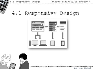
This document discusses media queries and responsive web design. Media queries allow styling to adapt to different device sizes and resolutions. CSS styles can be applied or removed depending on the width of the viewport to optimize the layout for different screen sizes from mobile to desktop.
Report
Share
Report
Share

Recommended
Multiple intelligence theory
The document summarizes Howard Gardner's theory of multiple intelligences, which proposes that intelligence exists in several distinct forms rather than as a single general ability. It outlines the 7 main intelligences - linguistic, logical-mathematical, spatial, bodily-kinesthetic, musical, interpersonal, and intrapersonal. For each intelligence, it provides examples of skills, famous people who demonstrated that intelligence, potential careers, and classroom activities to engage that type of learning. The document was created by a junior gifted and talented class to teach about Gardner's theory of multiple intelligences.
Napping on Your NAP? Local SEO Tools to Fix That Crap
This is a presentation I did for MNSearch on the topic of Local SEO. This covers some advanced tools and tactics to scalably identify issues with your business's Name, Address, and Phone number in directories relevant to Local SEO.
Follow me on Twitter at @scott_dodge.
Seguridad informatica.
Este documento describe las principales amenazas a la seguridad informática como usuarios intrusos, malware, virus, gusanos, troyanos, espías, dialers, spam, pharming, phising y hoaxes. También describe programas de seguridad como antivirus, cortafuegos, antispam y antiespías que ayudan a protegerse contra estas amenazas. La seguridad informática requiere tanto medidas activas como pasivas.
Portafolio de bryan manrique
Este documento presenta información sobre la resolución de problemas. Introduce las características de los problemas, incluyendo variables cualitativas y cuantitativas. Explica cómo clasificar los problemas según su estructura y proporciona un procedimiento para resolver problemas de manera sistemática. También cubre temas como relaciones parte-todo, relaciones familiares y relaciones de orden, con ejemplos para ilustrar cada concepto.
Portafolio de tomo 3
Este documento presenta un libro de texto sobre el desarrollo del pensamiento para resolver problemas. El libro contiene 10 lecciones organizadas en 4 unidades que enseñan estrategias para identificar y analizar problemas, y encontrar soluciones de manera efectiva. La justificación del libro explica que ayuda a los estudiantes a procesar información y resolver problemas rápidamente mediante el aprendizaje constructivo. El documento también incluye una hoja de vida de la estudiante Thalía Enríquez y apuntes de su diario de campo sobre la primera unidad del lib
UiPath Test Automation using UiPath Test Suite series, part 6
Welcome to UiPath Test Automation using UiPath Test Suite series part 6. In this session, we will cover Test Automation with generative AI and Open AI.
UiPath Test Automation with generative AI and Open AI webinar offers an in-depth exploration of leveraging cutting-edge technologies for test automation within the UiPath platform. Attendees will delve into the integration of generative AI, a test automation solution, with Open AI advanced natural language processing capabilities.
Throughout the session, participants will discover how this synergy empowers testers to automate repetitive tasks, enhance testing accuracy, and expedite the software testing life cycle. Topics covered include the seamless integration process, practical use cases, and the benefits of harnessing AI-driven automation for UiPath testing initiatives. By attending this webinar, testers, and automation professionals can gain valuable insights into harnessing the power of AI to optimize their test automation workflows within the UiPath ecosystem, ultimately driving efficiency and quality in software development processes.
What will you get from this session?
1. Insights into integrating generative AI.
2. Understanding how this integration enhances test automation within the UiPath platform
3. Practical demonstrations
4. Exploration of real-world use cases illustrating the benefits of AI-driven test automation for UiPath
Topics covered:
What is generative AI
Test Automation with generative AI and Open AI.
UiPath integration with generative AI
Speaker:
Deepak Rai, Automation Practice Lead, Boundaryless Group and UiPath MVP
Artificial Intelligence for XMLDevelopment
In the rapidly evolving landscape of technologies, XML continues to play a vital role in structuring, storing, and transporting data across diverse systems. The recent advancements in artificial intelligence (AI) present new methodologies for enhancing XML development workflows, introducing efficiency, automation, and intelligent capabilities. This presentation will outline the scope and perspective of utilizing AI in XML development. The potential benefits and the possible pitfalls will be highlighted, providing a balanced view of the subject.
We will explore the capabilities of AI in understanding XML markup languages and autonomously creating structured XML content. Additionally, we will examine the capacity of AI to enrich plain text with appropriate XML markup. Practical examples and methodological guidelines will be provided to elucidate how AI can be effectively prompted to interpret and generate accurate XML markup.
Further emphasis will be placed on the role of AI in developing XSLT, or schemas such as XSD and Schematron. We will address the techniques and strategies adopted to create prompts for generating code, explaining code, or refactoring the code, and the results achieved.
The discussion will extend to how AI can be used to transform XML content. In particular, the focus will be on the use of AI XPath extension functions in XSLT, Schematron, Schematron Quick Fixes, or for XML content refactoring.
The presentation aims to deliver a comprehensive overview of AI usage in XML development, providing attendees with the necessary knowledge to make informed decisions. Whether you’re at the early stages of adopting AI or considering integrating it in advanced XML development, this presentation will cover all levels of expertise.
By highlighting the potential advantages and challenges of integrating AI with XML development tools and languages, the presentation seeks to inspire thoughtful conversation around the future of XML development. We’ll not only delve into the technical aspects of AI-powered XML development but also discuss practical implications and possible future directions.
Introduction of Cybersecurity with OSS at Code Europe 2024
I develop the Ruby programming language, RubyGems, and Bundler, which are package managers for Ruby. Today, I will introduce how to enhance the security of your application using open-source software (OSS) examples from Ruby and RubyGems.
The first topic is CVE (Common Vulnerabilities and Exposures). I have published CVEs many times. But what exactly is a CVE? I'll provide a basic understanding of CVEs and explain how to detect and handle vulnerabilities in OSS.
Next, let's discuss package managers. Package managers play a critical role in the OSS ecosystem. I'll explain how to manage library dependencies in your application.
I'll share insights into how the Ruby and RubyGems core team works to keep our ecosystem safe. By the end of this talk, you'll have a better understanding of how to safeguard your code.
Programming Foundation Models with DSPy - Meetup Slides
Prompting language models is hard, while programming language models is easy. In this talk, I will discuss the state-of-the-art framework DSPy for programming foundation models with its powerful optimizers and runtime constraint system.
More Related Content
Viewers also liked
Napping on Your NAP? Local SEO Tools to Fix That Crap
This is a presentation I did for MNSearch on the topic of Local SEO. This covers some advanced tools and tactics to scalably identify issues with your business's Name, Address, and Phone number in directories relevant to Local SEO.
Follow me on Twitter at @scott_dodge.
Seguridad informatica.
Este documento describe las principales amenazas a la seguridad informática como usuarios intrusos, malware, virus, gusanos, troyanos, espías, dialers, spam, pharming, phising y hoaxes. También describe programas de seguridad como antivirus, cortafuegos, antispam y antiespías que ayudan a protegerse contra estas amenazas. La seguridad informática requiere tanto medidas activas como pasivas.
Portafolio de bryan manrique
Este documento presenta información sobre la resolución de problemas. Introduce las características de los problemas, incluyendo variables cualitativas y cuantitativas. Explica cómo clasificar los problemas según su estructura y proporciona un procedimiento para resolver problemas de manera sistemática. También cubre temas como relaciones parte-todo, relaciones familiares y relaciones de orden, con ejemplos para ilustrar cada concepto.
Portafolio de tomo 3
Este documento presenta un libro de texto sobre el desarrollo del pensamiento para resolver problemas. El libro contiene 10 lecciones organizadas en 4 unidades que enseñan estrategias para identificar y analizar problemas, y encontrar soluciones de manera efectiva. La justificación del libro explica que ayuda a los estudiantes a procesar información y resolver problemas rápidamente mediante el aprendizaje constructivo. El documento también incluye una hoja de vida de la estudiante Thalía Enríquez y apuntes de su diario de campo sobre la primera unidad del lib
Viewers also liked (18)
Napping on Your NAP? Local SEO Tools to Fix That Crap
Napping on Your NAP? Local SEO Tools to Fix That Crap
Recently uploaded
UiPath Test Automation using UiPath Test Suite series, part 6
Welcome to UiPath Test Automation using UiPath Test Suite series part 6. In this session, we will cover Test Automation with generative AI and Open AI.
UiPath Test Automation with generative AI and Open AI webinar offers an in-depth exploration of leveraging cutting-edge technologies for test automation within the UiPath platform. Attendees will delve into the integration of generative AI, a test automation solution, with Open AI advanced natural language processing capabilities.
Throughout the session, participants will discover how this synergy empowers testers to automate repetitive tasks, enhance testing accuracy, and expedite the software testing life cycle. Topics covered include the seamless integration process, practical use cases, and the benefits of harnessing AI-driven automation for UiPath testing initiatives. By attending this webinar, testers, and automation professionals can gain valuable insights into harnessing the power of AI to optimize their test automation workflows within the UiPath ecosystem, ultimately driving efficiency and quality in software development processes.
What will you get from this session?
1. Insights into integrating generative AI.
2. Understanding how this integration enhances test automation within the UiPath platform
3. Practical demonstrations
4. Exploration of real-world use cases illustrating the benefits of AI-driven test automation for UiPath
Topics covered:
What is generative AI
Test Automation with generative AI and Open AI.
UiPath integration with generative AI
Speaker:
Deepak Rai, Automation Practice Lead, Boundaryless Group and UiPath MVP
Artificial Intelligence for XMLDevelopment
In the rapidly evolving landscape of technologies, XML continues to play a vital role in structuring, storing, and transporting data across diverse systems. The recent advancements in artificial intelligence (AI) present new methodologies for enhancing XML development workflows, introducing efficiency, automation, and intelligent capabilities. This presentation will outline the scope and perspective of utilizing AI in XML development. The potential benefits and the possible pitfalls will be highlighted, providing a balanced view of the subject.
We will explore the capabilities of AI in understanding XML markup languages and autonomously creating structured XML content. Additionally, we will examine the capacity of AI to enrich plain text with appropriate XML markup. Practical examples and methodological guidelines will be provided to elucidate how AI can be effectively prompted to interpret and generate accurate XML markup.
Further emphasis will be placed on the role of AI in developing XSLT, or schemas such as XSD and Schematron. We will address the techniques and strategies adopted to create prompts for generating code, explaining code, or refactoring the code, and the results achieved.
The discussion will extend to how AI can be used to transform XML content. In particular, the focus will be on the use of AI XPath extension functions in XSLT, Schematron, Schematron Quick Fixes, or for XML content refactoring.
The presentation aims to deliver a comprehensive overview of AI usage in XML development, providing attendees with the necessary knowledge to make informed decisions. Whether you’re at the early stages of adopting AI or considering integrating it in advanced XML development, this presentation will cover all levels of expertise.
By highlighting the potential advantages and challenges of integrating AI with XML development tools and languages, the presentation seeks to inspire thoughtful conversation around the future of XML development. We’ll not only delve into the technical aspects of AI-powered XML development but also discuss practical implications and possible future directions.
Introduction of Cybersecurity with OSS at Code Europe 2024
I develop the Ruby programming language, RubyGems, and Bundler, which are package managers for Ruby. Today, I will introduce how to enhance the security of your application using open-source software (OSS) examples from Ruby and RubyGems.
The first topic is CVE (Common Vulnerabilities and Exposures). I have published CVEs many times. But what exactly is a CVE? I'll provide a basic understanding of CVEs and explain how to detect and handle vulnerabilities in OSS.
Next, let's discuss package managers. Package managers play a critical role in the OSS ecosystem. I'll explain how to manage library dependencies in your application.
I'll share insights into how the Ruby and RubyGems core team works to keep our ecosystem safe. By the end of this talk, you'll have a better understanding of how to safeguard your code.
Programming Foundation Models with DSPy - Meetup Slides
Prompting language models is hard, while programming language models is easy. In this talk, I will discuss the state-of-the-art framework DSPy for programming foundation models with its powerful optimizers and runtime constraint system.
How to Interpret Trends in the Kalyan Rajdhani Mix Chart.pdf
A Mix Chart displays historical data of numbers in a graphical or tabular form. The Kalyan Rajdhani Mix Chart specifically shows the results of a sequence of numbers over different periods.
TrustArc Webinar - 2024 Global Privacy Survey
How does your privacy program stack up against your peers? What challenges are privacy teams tackling and prioritizing in 2024?
In the fifth annual Global Privacy Benchmarks Survey, we asked over 1,800 global privacy professionals and business executives to share their perspectives on the current state of privacy inside and outside of their organizations. This year’s report focused on emerging areas of importance for privacy and compliance professionals, including considerations and implications of Artificial Intelligence (AI) technologies, building brand trust, and different approaches for achieving higher privacy competence scores.
See how organizational priorities and strategic approaches to data security and privacy are evolving around the globe.
This webinar will review:
- The top 10 privacy insights from the fifth annual Global Privacy Benchmarks Survey
- The top challenges for privacy leaders, practitioners, and organizations in 2024
- Key themes to consider in developing and maintaining your privacy program
Unlock the Future of Search with MongoDB Atlas_ Vector Search Unleashed.pdf
Discover how MongoDB Atlas and vector search technology can revolutionize your application's search capabilities. This comprehensive presentation covers:
* What is Vector Search?
* Importance and benefits of vector search
* Practical use cases across various industries
* Step-by-step implementation guide
* Live demos with code snippets
* Enhancing LLM capabilities with vector search
* Best practices and optimization strategies
Perfect for developers, AI enthusiasts, and tech leaders. Learn how to leverage MongoDB Atlas to deliver highly relevant, context-aware search results, transforming your data retrieval process. Stay ahead in tech innovation and maximize the potential of your applications.
#MongoDB #VectorSearch #AI #SemanticSearch #TechInnovation #DataScience #LLM #MachineLearning #SearchTechnology
Salesforce Integration for Bonterra Impact Management (fka Social Solutions A...
Sidekick Solutions uses Bonterra Impact Management (fka Social Solutions Apricot) and automation solutions to integrate data for business workflows.
We believe integration and automation are essential to user experience and the promise of efficient work through technology. Automation is the critical ingredient to realizing that full vision. We develop integration products and services for Bonterra Case Management software to support the deployment of automations for a variety of use cases.
This video focuses on integration of Salesforce with Bonterra Impact Management.
Interested in deploying an integration with Salesforce for Bonterra Impact Management? Contact us at sales@sidekicksolutionsllc.com to discuss next steps.
Energy Efficient Video Encoding for Cloud and Edge Computing Instances
Energy Efficient Video Encoding for Cloud and Edge Computing Instances
20240607 QFM018 Elixir Reading List May 2024
Everything I found interesting about the Elixir programming ecosystem in May 2024
Columbus Data & Analytics Wednesdays - June 2024
Columbus Data & Analytics Wednesdays, June 2024 with Maria Copot 20
Fueling AI with Great Data with Airbyte Webinar
This talk will focus on how to collect data from a variety of sources, leveraging this data for RAG and other GenAI use cases, and finally charting your course to productionalization.
Project Management Semester Long Project - Acuity
Acuity is an innovative learning app designed to transform the way you engage with knowledge. Powered by AI technology, Acuity takes complex topics and distills them into concise, interactive summaries that are easy to read & understand. Whether you're exploring the depths of quantum mechanics or seeking insight into historical events, Acuity provides the key information you need without the burden of lengthy texts.
Your One-Stop Shop for Python Success: Top 10 US Python Development Providers
Simplify your search for a reliable Python development partner! This list presents the top 10 trusted US providers offering comprehensive Python development services, ensuring your project's success from conception to completion.
Webinar: Designing a schema for a Data Warehouse
Are you new to data warehouses (DWH)? Do you need to check whether your data warehouse follows the best practices for a good design? In both cases, this webinar is for you.
A data warehouse is a central relational database that contains all measurements about a business or an organisation. This data comes from a variety of heterogeneous data sources, which includes databases of any type that back the applications used by the company, data files exported by some applications, or APIs provided by internal or external services.
But designing a data warehouse correctly is a hard task, which requires gathering information about the business processes that need to be analysed in the first place. These processes must be translated into so-called star schemas, which means, denormalised databases where each table represents a dimension or facts.
We will discuss these topics:
- How to gather information about a business;
- Understanding dictionaries and how to identify business entities;
- Dimensions and facts;
- Setting a table granularity;
- Types of facts;
- Types of dimensions;
- Snowflakes and how to avoid them;
- Expanding existing dimensions and facts.
National Security Agency - NSA mobile device best practices
Threats to mobile devices are more prevalent and increasing in scope and complexity. Users of mobile devices desire to take full advantage of the features
available on those devices, but many of the features provide convenience and capability but sacrifice security. This best practices guide outlines steps the users can take to better protect personal devices and information.
Ocean lotus Threat actors project by John Sitima 2024 (1).pptx
Ocean Lotus cyber threat actors represent a sophisticated, persistent, and politically motivated group that poses a significant risk to organizations and individuals in the Southeast Asian region. Their continuous evolution and adaptability underscore the need for robust cybersecurity measures and international cooperation to identify and mitigate the threats posed by such advanced persistent threat groups.
Recently uploaded (20)
UiPath Test Automation using UiPath Test Suite series, part 6
UiPath Test Automation using UiPath Test Suite series, part 6
Introduction of Cybersecurity with OSS at Code Europe 2024
Introduction of Cybersecurity with OSS at Code Europe 2024
Programming Foundation Models with DSPy - Meetup Slides
Programming Foundation Models with DSPy - Meetup Slides
How to Interpret Trends in the Kalyan Rajdhani Mix Chart.pdf
How to Interpret Trends in the Kalyan Rajdhani Mix Chart.pdf
Unlock the Future of Search with MongoDB Atlas_ Vector Search Unleashed.pdf
Unlock the Future of Search with MongoDB Atlas_ Vector Search Unleashed.pdf
Salesforce Integration for Bonterra Impact Management (fka Social Solutions A...
Salesforce Integration for Bonterra Impact Management (fka Social Solutions A...
Nordic Marketo Engage User Group_June 13_ 2024.pptx
Nordic Marketo Engage User Group_June 13_ 2024.pptx
Energy Efficient Video Encoding for Cloud and Edge Computing Instances
Energy Efficient Video Encoding for Cloud and Edge Computing Instances
Your One-Stop Shop for Python Success: Top 10 US Python Development Providers
Your One-Stop Shop for Python Success: Top 10 US Python Development Providers
National Security Agency - NSA mobile device best practices
National Security Agency - NSA mobile device best practices
Ocean lotus Threat actors project by John Sitima 2024 (1).pptx
Ocean lotus Threat actors project by John Sitima 2024 (1).pptx
4.1 responsive design
- 6. <meta name="viewport" content="width=device-width; initial-scale=1.0; maximum-scale=1.0; user-scalable=0;">