
Recommended
More Related Content
Recently uploaded
Recently uploaded (20)
Featured
Featured (20)
Tips for Effective E-Commerce Web Design
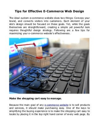
- 1. Tips for Effective E-Commerce Web Design The ideal custom e-commerce website does two things: Conveys your brand, and converts visitors into customers. Each element of your site's design should be focused on these goals. Yet, while the goals themselves are straightforward, creating a simple yet powerful look requires thoughtful design strategy. Following are a few tips for maximizing your e-commerce website's effectiveness. Make the shopping cart easy to manage. Because the main goal of any e-commerce website is to sell products and services, it should make purchasing easy. One of the keys to simplifying the buying experience is to make the shopping cart easy to locate by placing it in the top right hand corner of every web page. By
- 2. doing so, you make it simple for customers to check on their selections so far and to checkout as soon as they finish shopping. Another way to make your shopping cart easy to manage is to include an “Add to cart” button with every product to encourage visitors to make the purchase. In addition, implementing a persistent shopping cart can improve the buying ease of your site. This type of shopping cart remembers what customers have put in it for a certain amount of time, even if they abandon your site. When visitors can immediately access their items once they return to your site, they are less likely to abandon the shopping cart for good, and you are more likely to close sales. Simplify navigation. Visitors to your custom e-commerce website should also be able to
- 3. find their way around easily. To this end, the navigation bar should be easily accessible and clearly organized. For instance, it should be placed in an obvious location, either at the top of the web page or on the left hand side. It should also include clearly labeled categories so visitors can easily locate the kinds of products they want. Limit yourself to five or six relatively broad categories on the navigation bar itself. You can always include drop-down menus with more options under each main category. In addition to a clearly organized navigation, your e-commerce web design should utilize what is called breadcrumb navigation. This is navigation that lists the steps needed to get from looking at a product to completing the purchase, and it shows the visitor where they are in the process. It is typically listed at the top of each page. When visitors know both how to get to the product they want and what steps are needed to purchase it, they are much more likely to complete their purchase on your site. Make searching easy. Simplicity and accessibility should also characterize the process of finding the specific products and services your site visitors wish to buy. The navigation bar will send visitors to areas on your site where there may be dozens, hundreds, or even thousands of items from which to choose. Visitors who know more specifically what they want will need a way to locate it without searching through all of these options. To this end, you should place a search bar in an obvious location (such as the top right-hand corner) on every single web page. Doing so allows visitors to look for the exact items they wish to purchase. By placing the search bar on every page, you allow them to conduct a search whenever they desire. Once again, the simplicity of your e- commerce website will encourage visitors to pay attention to your brand and take advantage of your offerings, because they can do so with a minimum of hassle.
- 4. Utilize clear calls to action. Another way to encourage your site visitors to act is to include clear calls to action. Typically, this action will be purchasing a product or service. However, it can also include signing up for an email list, taking advantage of a free offer, or joining a shopper's club to receive discounts. Regardless of the exact call to action that you choose to implement, the key is to promote it clearly on your website. For instance, bright colors, a large button, and a front and center placement all help to draw visitors' attention to the action you want them to take. Giving site visitors a clear call to action is important in encouraging them to engage further with your company, because visitors want to know what you can offer them and what they should do about it.
- 5. When they have a clear next step in front of them, they will be much more likely to take that step. Use high-quality images. Visitors to your e-commerce website, because they are shopping online, will often depend upon the images of your products to decide whether they want to purchase them. As a result, it is important to provide large, high-quality images of every product. These pictures should not only highlight the product, but do so in an appealing way. Adding a bit of elegance or interest to your images allows you to capture the visitor's imagination and helps them to think about what it would be like for them to own the product themselves. In addition, organizing your images in a clear way allows visitors to quickly identify the main point of each web page and enables them to find the information they want at a glance. Effective e-commerce website development involves implementing many strategies for making your products appealing and easy to find. Those listed above are just a few of the many steps you can take. However, by making the shopping cart easy to manage, simplifying navigation, making searching easy, utilizing clear calls to action, and using high-quality images, you can increase the appeal and the effectiveness of your site.