SlideShare a Scribd company logo
1 of 1
Featured
   Fonts
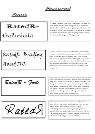
                    I have chosen the font ‘Gabriola’ to use for

 RatedR-            my text within the magazine as I felt it
                    looked simple but yet quite feminine and
                    attractive to the female eye. This font can
                    be seen as mature and appropriate to use

Gabriola            in a female targeted magazine.


                   I have chosen the font ‘Bradley Hand ITC’

RatedR- Bradley    to use as text for my magazine because the
                   font is quite quick, sharp and fun to use
                   within a magazine. Even though this use of
                   text can be used for either male or females,

Hand ITC           the female audience will appreciate the
                   stand out swervey use of text within the
                   magazine.


                   I have chosen the font ‘Forte’ because it is

RatedR - Forte     big and bouncy and quite feminine to the
                   target audience’s eye. As it is big and bold
                   and easy to read, it will allow the readers
                   to have a more enjoyable and easy time
                   understanding and reading the articles
                   and text within the magazine.


                   I have chosen to use the font ‘Remi’ as
                   one of my options as it appears to me as
                   very bold and sharp. I find it eye
                   catching and possibly appealing to my
                   particular target audience. The use of the
                   ‘R’ being flipped around gives the title a
                   unique and edgy look about it.

                   ’

More Related Content

Similar to Featured fonts

Similar to Featured fonts (11)

Masthead Font Styles
Masthead Font StylesMasthead Font Styles
Masthead Font Styles
 
Masthead ideas
Masthead ideasMasthead ideas
Masthead ideas
 
Font types research
Font types researchFont types research
Font types research
 
Masthead font styles
Masthead font stylesMasthead font styles
Masthead font styles
 
Masthead ideas
Masthead ideasMasthead ideas
Masthead ideas
 
Font analysis
Font analysisFont analysis
Font analysis
 
Font Analysis
Font AnalysisFont Analysis
Font Analysis
 
Testing fonts
Testing fontsTesting fonts
Testing fonts
 
Testing fonts
Testing fontsTesting fonts
Testing fonts
 
Masthead designs
Masthead designsMasthead designs
Masthead designs
 
Font Analysis
Font AnalysisFont Analysis
Font Analysis
 

More from shackeliadavis (20)

Analysis 3
Analysis 3Analysis 3
Analysis 3
 
Analysis poster 2
Analysis poster 2Analysis poster 2
Analysis poster 2
 
Analysis poster1
Analysis poster1Analysis poster1
Analysis poster1
 
Contents page analysis
Contents page analysisContents page analysis
Contents page analysis
 
Codes and conventions
Codes and conventionsCodes and conventions
Codes and conventions
 
Contents page analysis
Contents page analysisContents page analysis
Contents page analysis
 
Contents page analysis
Contents page analysisContents page analysis
Contents page analysis
 
Contents page analysis
Contents page analysisContents page analysis
Contents page analysis
 
Contents page analysis
Contents page analysisContents page analysis
Contents page analysis
 
Questionnaire results 2.docx
Questionnaire results 2.docxQuestionnaire results 2.docx
Questionnaire results 2.docx
 
Contents page analysis
Contents page analysisContents page analysis
Contents page analysis
 
Contents page analysis
Contents page analysisContents page analysis
Contents page analysis
 
Vibe case study2
Vibe case study2Vibe case study2
Vibe case study2
 
Vibe case study2
Vibe case study2Vibe case study2
Vibe case study2
 
Vibe case study2
Vibe case study2Vibe case study2
Vibe case study2
 
Vibe case study2
Vibe case study2Vibe case study2
Vibe case study2
 
Location
LocationLocation
Location
 
Location
LocationLocation
Location
 
Front cover analysis
Front cover analysisFront cover analysis
Front cover analysis
 
Codes and conventions
Codes and conventionsCodes and conventions
Codes and conventions
 

Featured fonts

  • 1. Featured Fonts I have chosen the font ‘Gabriola’ to use for RatedR- my text within the magazine as I felt it looked simple but yet quite feminine and attractive to the female eye. This font can be seen as mature and appropriate to use Gabriola in a female targeted magazine. I have chosen the font ‘Bradley Hand ITC’ RatedR- Bradley to use as text for my magazine because the font is quite quick, sharp and fun to use within a magazine. Even though this use of text can be used for either male or females, Hand ITC the female audience will appreciate the stand out swervey use of text within the magazine. I have chosen the font ‘Forte’ because it is RatedR - Forte big and bouncy and quite feminine to the target audience’s eye. As it is big and bold and easy to read, it will allow the readers to have a more enjoyable and easy time understanding and reading the articles and text within the magazine. I have chosen to use the font ‘Remi’ as one of my options as it appears to me as very bold and sharp. I find it eye catching and possibly appealing to my particular target audience. The use of the ‘R’ being flipped around gives the title a unique and edgy look about it. ’