Construction and Architecture Magazine nov dec 2009
•
0 likes•196 views

An architecture project where I had an E-mail interaction with architects Prima Orpilla and Verda Alexender of Studio O&A on the iconic networking website FACEBOOK.

Recommended
More Related Content
What's hot
Viewers also liked
Viewers also liked (20)
Similar to Construction and Architecture Magazine nov dec 2009
Similar to Construction and Architecture Magazine nov dec 2009 (20)
More from Remona Divekar
More from Remona Divekar (20)
Construction and Architecture Magazine nov dec 2009
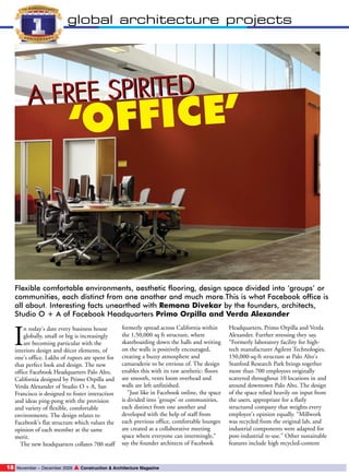
- 1. global architecture projects FREE SPIRITED A FICE’ ‘OF Flexible comfortable environments, aesthetic flooring, design space divided into ‘groups’ or communities, each distinct from one another and much more.This is what Facebook office is all about. Interesting facts unearthed with Remona Divekar by the founders, architects, Studio O + A of Facebook Headquarters Primo Orpilla and Verda Alexander I n today's date every business house globally, small or big is increasingly are becoming particular with the interiors design and décor elements, of one's office. Lakhs of rupees are spent for that perfect look and design. The new office Facebook Headquarters Palo Alto, California designed by Primo Orpilla and Verda Alexander of Studio O + A, San Francisco is designed to foster interaction and ideas ping-pong with the provision and variety of flexible, comfortable environments. The design relates to Facebook's flat structure which values the opinion of each member at the same merit. The new headquarters collates 700 staff 18 November – December 2009 formerly spread across California within the 1,50,000 sq ft structure, where skateboarding down the halls and writing on the walls is positively encouraged, creating a buzzy atmosphere and camaraderie to be envious of. The design enables this with its raw aesthetic: floors are smooth, vents loom overhead and walls are left unfinished. "Just like in Facebook online, the space is divided into 'groups' or communities, each distinct from one another and developed with the help of staff from each previous office, comfortable lounges are created as a collaborative meeting space where everyone can intermingle," say the founder architects of Facebook ▲ Construction & Architecture Magazine Headquarters, Primo Orpilla and Verda Alexander. Further stressing they say, “Formerly laboratory facility for hightech manufacturer Agilent Technologies, 150,000-sq-ft structure at Palo Alto's Stanford Research Park brings together more than 700 employees originally scattered throughout 10 locations in and around downtown Palo Alto. The design of the space relied heavily on input from the users, appropriate for a flatly structured company that weights every employee's opinion equally. “Millwork was recycled from the original lab, and industrial components were adapted for post-industrial re-use.” Other sustainable features include high recycled-content
- 2. global architecture projects global architecture projects carpet and energy efficient lighting. O+A designers interviewed employees about what they wanted from their new headquarters. The Facebook platform used to conduct company-wide polls about design decisions, post construction photos and updates and keep everyone informed of the thought process behind the project. An advisory board of employees from every department collaborated with the design team on the design process, from space planning to finishes to final move coordination. Because the new facility houses employees coming from various locations, the company wanted to maintain each division's distinct identity. The design takes its inspiration from the patchwork nature of Facebook users and employees, bringing together seemingly disparate elements to form a cohesive pattern and using colour and interior spacing to create neighborhoods within the open plan space. The company's executives sit in central areas, accessible to all employees. Large lounges and open spaces provide venues for the community to come together. Reflecting employees' desire for a green headquarters, the facility is the first commercial project completed under Palo Alto's 2008 Green Building the design goal for new facility was to maintain the history and raw aesthetic of the building and create a fun dynamic appropriate for the company's youthful staff. Many walls and spaces are left unfinished: Employees are encouraged to write on the walls, add artwork, and move furniture as needed, allowing the building to evolve continuously. A bright orange industrial crane, left over from the building's previous user, was repurposed by San Francisco sculptor Oliver DiCicco to support a table surface from its heavyweight hoist, offering maximum maneuverability. Referencing the industrial aesthetic of the building, a felt canopy spreads up one wall and onto the ceiling, defining a central meeting area that can double as an impromptu auditorium. Mounted on threaded rods of varying length to achieve an undulating effect, the canopy absorbs sound and is penetrated at intervals by overhead lighting. Excerpts of the interview with founders, architects Primo Orpilla and Verda Alexander Total floor area: 130,000 sq ft No. of floors: 2 Average floor size: 65,000 sqft Total staff size: 700-800 Principal Interior Construction Materials By Manufacturer Wall coverings: Wolf Gordon, One Tree Design, Walltalkers Paint: ICI Paints, Sherwin Williams, Kelly Moore, Benjamin Moore Laminate: Nevamar, Formica Flooring: Constantine Carpet/carpet tile: Nood Fashion, Milliken Contract, Interface FLOR Ceiling: Armstrong Lighting: Day-Brite, Sistemalux, Delray Lighting, Lightolier Window treatments: The Roman Shade Company Workstations: KI, Vitra, Steelcase Workstation seating: Herman Miller, Haworth Lounge seating: Cartwright, Vitra, Bludot Cafeteria, dining, auditorium seating: Vitra Other seating: Commercial Worksurfaces, American Office Furniture, Herman Miller Upholstery: Maharam, Knoll Textiles How did you make the best use of the space available to you? Facebook employees had very direct ideas about what they wanted and didn't want from their space. We did not want a typical campus; we wanted the space to reflect their culture as a dynamic, youthful and innovative company. The company and the site aren't homogenous and the design shouldn't be. We tried to make it a point to include employees in every stage of the design; the advisory group was a huge help with this as was the company's natural inclination to utilize technology. Everything from how the space laid out and functioned to finish details and furniture were run by employees. The beauty of this system is that it is allowed to really understand what the employees were looking for, to really get a deep understanding of what it meant to be a Facebook employee and then to visually represent that. represent that. And, after seeing Facebook’s love of the Ripstik, we actually incorporated it into our design. All areas of circulation are either concrete or flaxseed tile to create easy pathways for people to Ripstik between departments. Tell us about the overall design plan. Did it go as per planned or it was changed? If yes what were the changes made? Facebook is one of the most democratic companies we've ever worked with; we used the Facebook platform for company wide polls about design intent, to showcase renderings so all employees could envision their new space; we even posted construction progress photos and scheduled more than a few meetings by writing on walls. Facebook the site was integral in creating the design; because of it, everyone was constantly connected to the process. We tried to make it a point to include employees in every stage of the design; the advisory group was a huge help with this as was the company's natural inclination to utilize technology. Everything from how the space laid out and functioned to finish details and furniture were run by employees. The beauty of this system is that it allowed us to really understand what the employees were looking for, to really get a deep understanding of what it meant to be a Facebook employee and then to visually Construction & Architecture Magazine How did you go about the interiors, its planning, structural alignment, the furniture, color combination etc? Because each floor plate is quite Conference table: Commercial Worksurfaces, American Furniture Systems, cafeteria, dining, training tables: Commercial Worksurfaces Other tables: Oliver diCicco Design (crane table) Shelving: Rakks Architectural woodworking: Cabinetmaking: West Coast Powdercoat HVAC: Acme, Greenheack, Carrier, Trane, Metalarie, Krueger Security: Schlage Plumbing fixtures: Kohler, Toto, Elkay, Sloan, Delta, Emerson, Chronomite Interior designer: Studio o+a - Primo Orpilla, Verda Alexander, Denise Cherry, Perry Stephney, Virginie Manichon, Structural engineer: KPFF Mechanical engineer: Air Systems Inc Electrical engineer: Elcor Electric General contractor: SC Builders, Inc LEED Consultant: Brightworks Kitchen Consultant: RAS Tech, LLC Furniture dealer: Inside Source, Pod Office Photographer: Cesar Rubio, Jasper Sanidad expansive, we used finishes as subtle visual cues for way finding. Each district was a quadrant of the building and each of these received a different carpet color way. After move in, employees further added to their division identity by writing on walls, hanging flags, or any other designation of their space they saw fit. The overarching principle of this design was itself a statement to sustainability - do what it takes to make the space work. Don't overdesign; if you have desks that function, let's move those over. Why needlessly send them to a landfill? If we need to purchase large quantities of something like carpet, let's make sure it has an extremely high recycled content. If employees work long hours, make sure they have plenty of natural light and if they are working 24/7, let's make our lighting is as efficient as possible. Keep the environmental impact to a minimum and make the space pleasant to be in. What are the materials used and which is the material that is predominantly used? Stained concrete floors, feels like carpet, feels like canopy, ▲ November – December 2009 19 20 November – December 2009 ▲ Construction & Architecture Magazine Any structural or design challenges? If yes what were they and how did you make the overcome them? We wanted to preserve the parts of this building that made it unique, keep the industrial aesthetic and re-use anything we possibly could. We repurposed the lab millwork and utilised in the break areas, creating islands of metal cabinetry with free-standing shelving. Laboratory transformed into kitchen. Additionally, Unistrut that once held chemical piping and gas lines, has been repurposed into tables, holds artwork and performs a variety of tasks not originally intended when the space was first built out. Anything you would like to remake? We recently went back to the space and found numerous graphics spray-painted and wheat-pasted onto columns and walls, each representing a different company event. We love that; it creates a timeline of the employee's experience in the space. We want people to love where they work and to truly feel like the space is theirs; the building will continually evolve and that is part of the design intent. Design is not meant to be elite or untouchable… it should be democratic. ■