
Recommended
More Related Content
What's hot
What's hot (20)
Similar to COLOUR
Similar to COLOUR (20)
Recently uploaded
Recently uploaded (20)
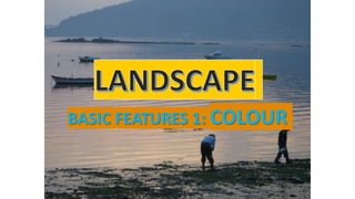
COLOUR
- 1. BASIC FEATURES 1: COLOUR
- 2. Natural landscapes and colours are very closely related. On one hand, some landscape elements give name to specific colours, such as: sky blue grass green forest green Atlantic blue fire red …
- 3. On the other hand, natural landscapes also inspire different colour combinations for a painting or a garden design. For example, a sunset can inspire a warm colour scheme or a forest can inspire a cool scheme with different shades of green. Each colour scheme evokes a different psychological response.
- 4. Colour is one of the most important aspects to the design of any landscape or the description of any scenery. Colour can create a mood, evoke memories, make you smile, relieve your stress or help you sleep. Designers and art teachers are always using terms like warm, cool, glossy, matte, dark or light when they talk about colour. But what do they really mean? COLOUR
- 5. COLOUR has got THREE MAIN FEATURES: 1) HUE: depending on their hue (tono) colours can be warm or cool. 2) VALUE: depending on their value (valor) colours can be dark or light. 3) INTENSITY: depending on their intensity (saturación) colours can be glossy or matte.
- 6. As we said, depending on their hue (tono) colours can be warm or cool
- 7. WARM COLOURS They are made with orange, red, yellow and combinations of them all. These colours make you think of sunlight and heat. They provide a sense of intimacy and make you feel cheerful and even passionate. From happiness to violence.
- 8. COOL COLOURS Cool or cold colours are blue, green and light purple. Cool colours remind us of water and sky. They have the ability to calm and soothe. They make you feel relaxed but also sad.
- 10. The Grand Canyon, Colorado (USA) Uluru Rock, Northern Territory (AUSTRALIA) A forest in Autumn in Canada
- 11. A Galician forest A lavender field in Guadalajara Cies Islands, Galicia An ice-canyon in Greenland
- 12. Value is the lightness or darkness of each colour. Depending on their value colours can be DARK or LIGHT. Artists add white to make a colour lighter (a tint), add black to make a colour darker (shade) or add white and black –grey- to make a colour a different tone.
- 13. Let's take red, for example. When white is added to red, it turns pink, a tint of red. When black or grey is added to red, it turns maroon, a shade of red. RED RED + WHITE = PINK RED + BLACK = MAROON
- 14. Value is important in the landscape because the human eye is drawn to tints and shades, especially when tints, shades and tones are used close together. This creates a rich visual combination that is more complex and interesting than simply one color used repeatedly without any variation.
- 15. Some colours are dark in themselves, like violet, and others are light in themselves, like yellow. Dark colours are stronger tan light colours.
- 16. Artists use colour value –darkness or lightness- to create different moods. Dark colours: in a composition suggest a lack of light, as in a night or interior scene. Dark colours can often convey a sense of mystery or premonition.
- 17. Light colours: often describe a light source or light reflected on a part of the composition. Light colours can convey harmony. On the other hand, colours get lighter as they go into the background and that creates distance in the landscape. Under Vanilla Skies” by Lori McNee This serene environment was created by using light-yellows and varied greens
- 18. As we said at the beginning, depending on their intensity colours can be or matte
- 19. When several glossy or intense colors are used together, they increase the intensity of one another. In contrast, when matte or less intense colours are used together, the overall effect is softened and less intense.
- 20. MATTE OR GLOSSY A glossy image is shiny and makes colour brighter, richer, and more vibrant. When there is a lot of light, however, glossy can blind because of light reflection and texture is difficult to see. A matte image is less glaring and makes the colour darker and duller. However, it usually improves texture.
- 22. Glossy makes colours brighter, more intense. Matte makes colours duller, but adds texture.
- 24. 1) Depending on their _____ (tono) colours can be _____ or _____. 1) Depending on their _____ (valor) colours can be _____ or _____. 1) Depending on their _____ (saturación) colours can be _____ or _____. Can you remember the three main characteristics of colour?