
Recommended
More Related Content
What's hot
What's hot (20)
Similar to Analytical Paragraph Writing
Similar to Analytical Paragraph Writing (20)
Recently uploaded
Recently uploaded (20)
Analytical Paragraph Writing
- 3. WHAT IS ANALYTICAL WRITING? A form of descriptive writing which is written on the basis of a given chart, graph, data, outline, clues, table etc. It requires analysis and comparison of the given facts and drawing conclusion based on the given data.
- 4. In simple words Analytical paragraph is nothing but arranging information in a logical sequence.
- 5. FEATURES OF ANALYTICAL PARAGRAPH ● It should be brief but must include complete information. ● It should state the facts that are provided. ● It should have simple and accurate language. ● It should mention figures and quantities appropriately. ● It should use the same tense throughout, as far as possible. ● It should not provide any personal observation or response. ● It should preferably use the passive form of the verb.
- 6. ELEMENTS ● INTRODUCTION ● BODY ● CONCLUSION Word limit : 100 - 120 words
- 7. INTRODUCTION ● Describes the graph ● Introduces the topic of the graph ● Explains what the graph shows ● Outlines overall trends or patterns 1 - 2 sentences
- 8. HANDY PHRASES FOR INTRODUCTION ● The chart given above describes ● The table suggests ● The data given provides information about ● The figure clearly shows ● The line graph shows ● The pie chart illustrates
- 9. BODY ● Elaborates the trends in detail ● Illustrates the trends using data from the graph ● Picks up some information from the input ● Compares and contrasts the data
- 10. HANDY PHRASES FOR DESCRIBING TRENDS ● There has been a gradual increase in ● A pattern of growth in --- can be seen ● There is a striking increase in ● Increased to a peak/ its maximum/ its highest number ● Reached a low in ● The number of --- is likely to steadily grow after ● The number/rate of --- is starting to fall/ decline ● The rate is expected to decline by/ will probably decline
- 11. HANDY PHRASES FOR DESCRIBING QUANTITIES ● One third / fourth of ● Twice as much ● Almost equal ● The highest ● The lowest ● Nearly ● Approximately ● Close to
- 12. HANDY PHRASES FOR CAUSE AND EFFECT RELATIONS ● This may lead to ● It may cause ● This is a problem stemming from / caused by ● It can give rise to
- 13. HANDY PHRASES FOR ESTABLISHING A RELATIONSHIP OR CONTRAST ● In contrast with ● In comparison to ● As opposed to ● But in the opposite case ● Striking / notable / noticeable difference ● Similarly ● When it comes to
- 14. CONCLUSION ● Gives an overall view or summary of the graph ● Draws a simple conclusion from the data 1 - 2 sentences
- 15. HANDY PHRASES FOR CONCLUSION ● Overall it shows ● Subsequently ● In a nutshell ● For the chart given ● In short
- 16. POINTS TO REMEMBER ● Choose wisely the important information. ● Do not include any personal opinions, conclusions or observations but simply stick to the facts. ● State correct facts. ● Organise the important information properly. ● Look for the differences/ changes that are prominent.
- 17. Q: Study the chart given below, which is the result of the survey conducted in the public schools and government schools of Vadodara. This depicts the types of activities the teenagers (Age 13- 19 years are involved during their leisure time). Complete the summary in about 80 words.
- 18. Q: The following figure shows that death due to violence has increased considerably during recent years. Write its interpretation in 100 words on how educated youth can play a major role in establishing peace in society.
- 19. Role of youth in establishing peace in society Youth and peace are interlinked in society. Youth can play an important role in establishing peace in society. In a survey conducted, it has been found that number of deaths due to violence has increased enormously since the nineties. Death rate was 2.5 in 1990. But in 2010, it has increased to 7.5. It is really very sad. It must be checked. Our youth can play a major role in controlling this crime graph. They can contribute towards establishing peace in many ways. They can awaken the people towards the necessity of peace. They can help the police in catching the criminals. They can bring the criminals in the mainstream by educating them and they can do much more.
- 20. Q: The pie chart shows the proportion of people from different households living in poverty in the UK in 2002. Write an analytical paragraph to describe the information in 100-120 words.
- 21. The given pie chart illustrates seven different categories of households living in poverty in the UK in 2002. It is clearly evident from the pie chart that 26% of the total poverty-stricken households are those of sole parents. Single people without children account for the second highest proportion with 24%. In contrast to couples without children that accounts for just 9%, couples with children account for 15% of the poor households. Single aged persons and aged couples proportion for 12% together for poor households. Overall, 14% of all households in the UK were living under poverty. The younger generation had a greater poor percentage than their aged counterparts. Couples without children had better economic conditions than those with children.
- 22. Q: The graph given shows estimated sales of gold in Dubai in 2002. Write an analytical paragraph describing the line graph in around 150 words.
- 23. The line graph depicts the estimated sales of gold in Dubai for a period of twelve months in 2002 in millions of Dirhams. In January 2002, the sales stood at 200 million Dirhams. It steadily increased through the next month and peaked to 350 million Dirhams in the third month of the year. However, the gold sales started to plummet over the next three months and hit 110 million Dirhams in the month of July. Unexpectedly, the sales doubled in August before coming down to the same level as in July for the month of September. For the next two months of the year, the gold sales levelled off to 180 million Dirhams and then slightly increased in December. Overall, the estimated gold sales fluctuated in 2002. The sales were the highest in the month of March and lowest in the months of July and September. The sales at the end of the year were almost the same as they were in the beginning of the year.
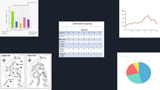
- 24. Q: The following table shows details about the internet activities for six categories for different age groups. Write an analytical paragraph for the table given in around 150-200 words.
- 25. The given table suggests the internet activities of seven age groups ranging from teens to those in their seventies for six different kinds of activities. The table shows that the younger generation is more interested in online games and news while the older generation spends time on the internet to research and buy products. It is evident from the table that teens mainly use the internet for games (as high as 81%), news and downloads and are interested in searching for people or friends or doing any product research. The middle-age group (people in 20s to 60s) is highly interested in getting news, doing product research and buying products, the percentage ranging from 70-80%. The internet activity which gets the least time is searching for people. All the age groups spend less than 30% of their internet time on the same. The amount of time spent on downloads decreases with age and gets as low as 6% (for people in 70s). Overall, the table suggests that teenagers are most likely to spend time playing games and doing downloads. On the other side, older people are interested in researching and buying products. People spend the least amount of time searching for other