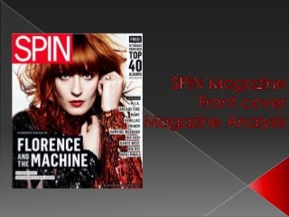
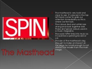
The mastheadis very bold and
clear to see. It’s placed in the top
left hand corner to grab our
attention immediately as this is
where we first look.
The colours (red and white) are
strong and work together well.
These are typical colours used in
a music magazine.
The word ‘SPIN’ links into music as
it could be a spinning record or
cd.
The size of the masthead is big
enough to make an impact on
the page but small enough to not
distract the reader from the main
image.
3.
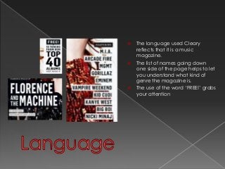
The languageused Cleary
reflects that it is a music
magazine.
The list of names going down
one side of the page helps to let
you understand what kind of
genre the magazine is.
The use of the word ‘FREE!’ grabs
your attention
4.
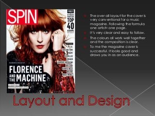
The overall layout for the cover is
very conventional for a music
magazine. Following the formula
one artist= one page.
It’s very clear and easy to follow.
The colours all work well together
and the composition is clear.
To me the magazine cover is
successful. It looks good and
draws you in as an audience.