1. Colour scheme: the colour
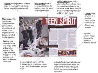
Layout: one page of text and one Drop capital: this has scheme has been altered from
page of imagery this is a classic been used to show the the magazines colours to suit
layout for double page spreads audience that the text is the artist. Black, white and red
formally presented could be symbolising the band
and there dark music Layout: three
columns of is
Main Image: This another
main image classic layout
shows me there technique of
personalities, double page
which I think will spreads
appeal to the
target audience Separate
because of what smaller images
the bands doing showing the
Caption: this audience
shows what the different stories
lead singer is like
and can also
appeal to the
target audience.
The colour of the
font is in red
which makes her
seem dark. Every paragraph starts with the Instead of just showing the bands
firsts two words in bold and colour singer the photograph shows the
in red I think this has been done to whole band. This could suggest
show that all members are equally as
important